|
| Group |
Round |
C/R |
Comment |
Date |
Image |
| 34 |
Nov 21 |
Comment |
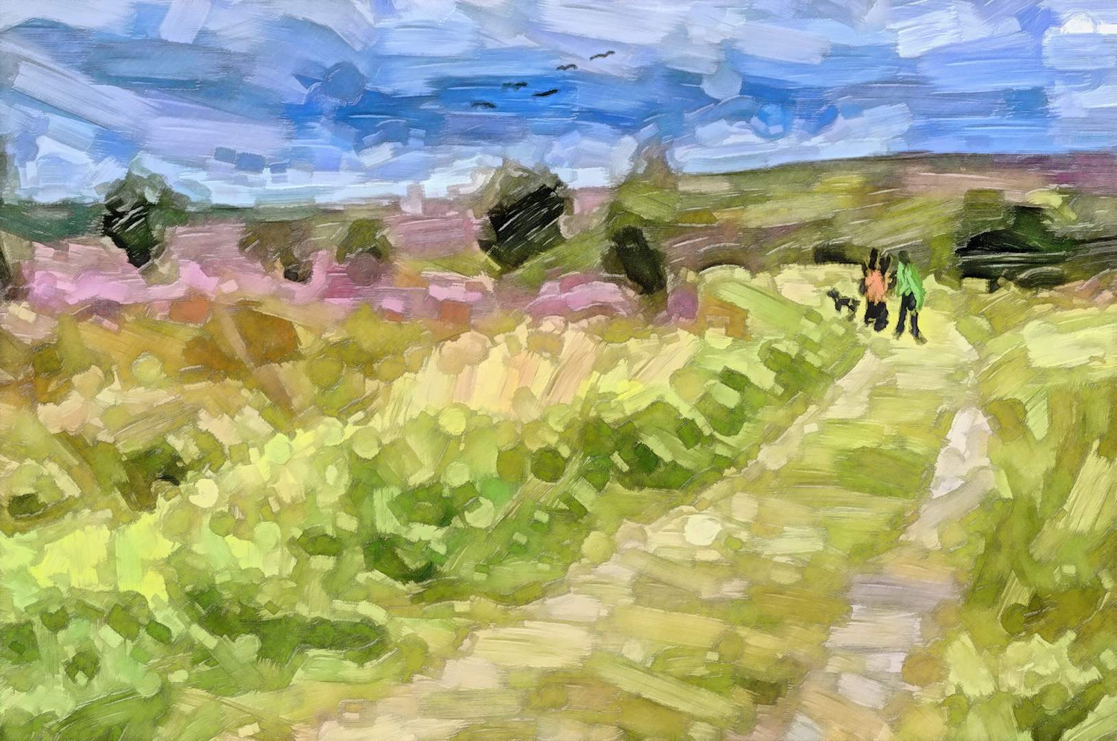
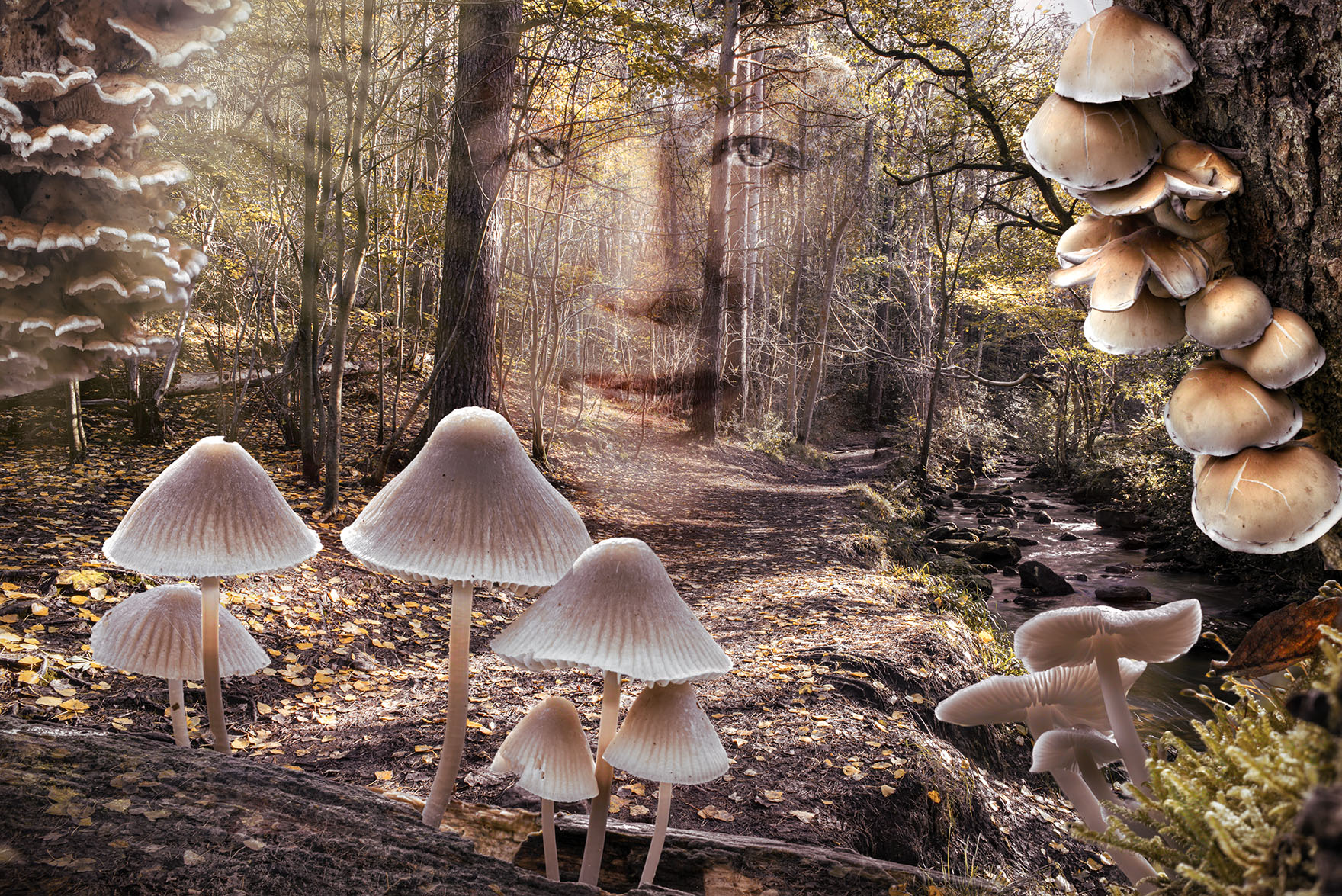
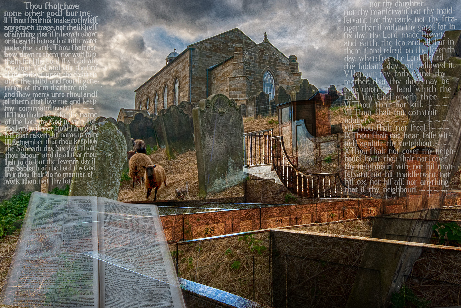
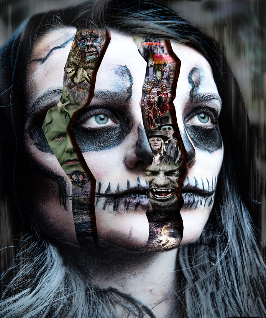
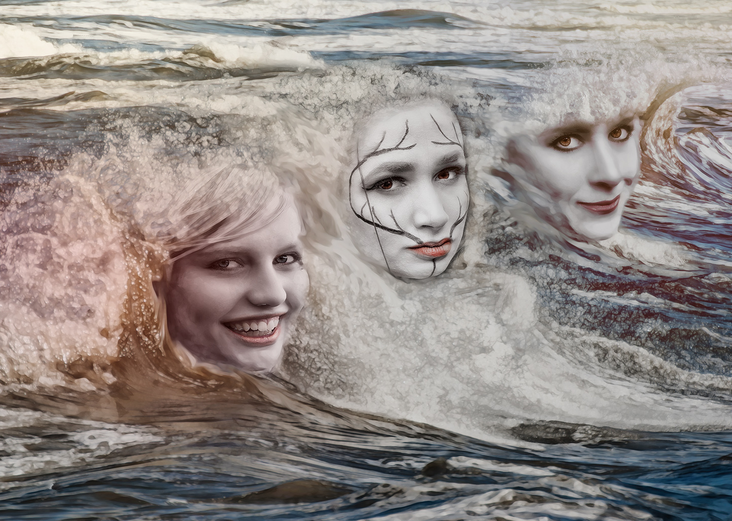
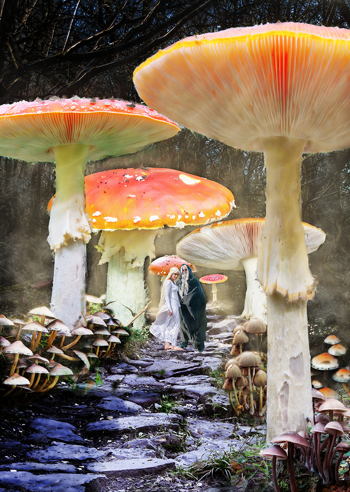
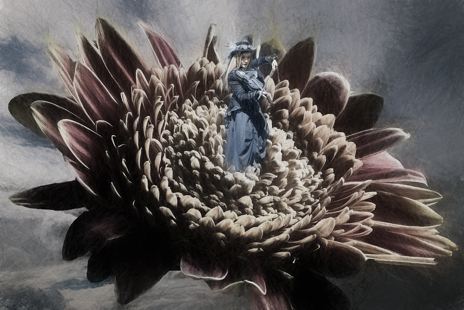
What a hoot! I can see why you wanted to use the fungi and placing the various elves etc was a good idea.
Personally I prefer Original 2, as your finished image seems too disjointed for me - I can see that for a child, there's lots to find and look for, but there's not anywhere to rest my eye. With the musicians it's a lot more fun and there are still lots of things going on in there. I also like the vibrant colours in Original 2.
I think Oiginal 2 just needs a border - I've given it an autumn leaves look, with a vignette to bring the eye into the centre a bit. |
Nov 9th |
 |
| 34 |
Nov 21 |
Comment |
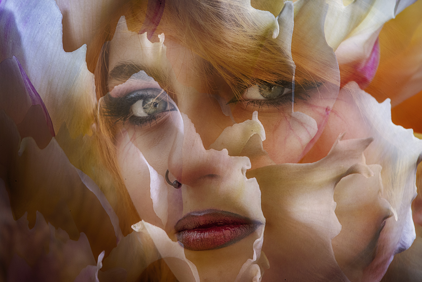
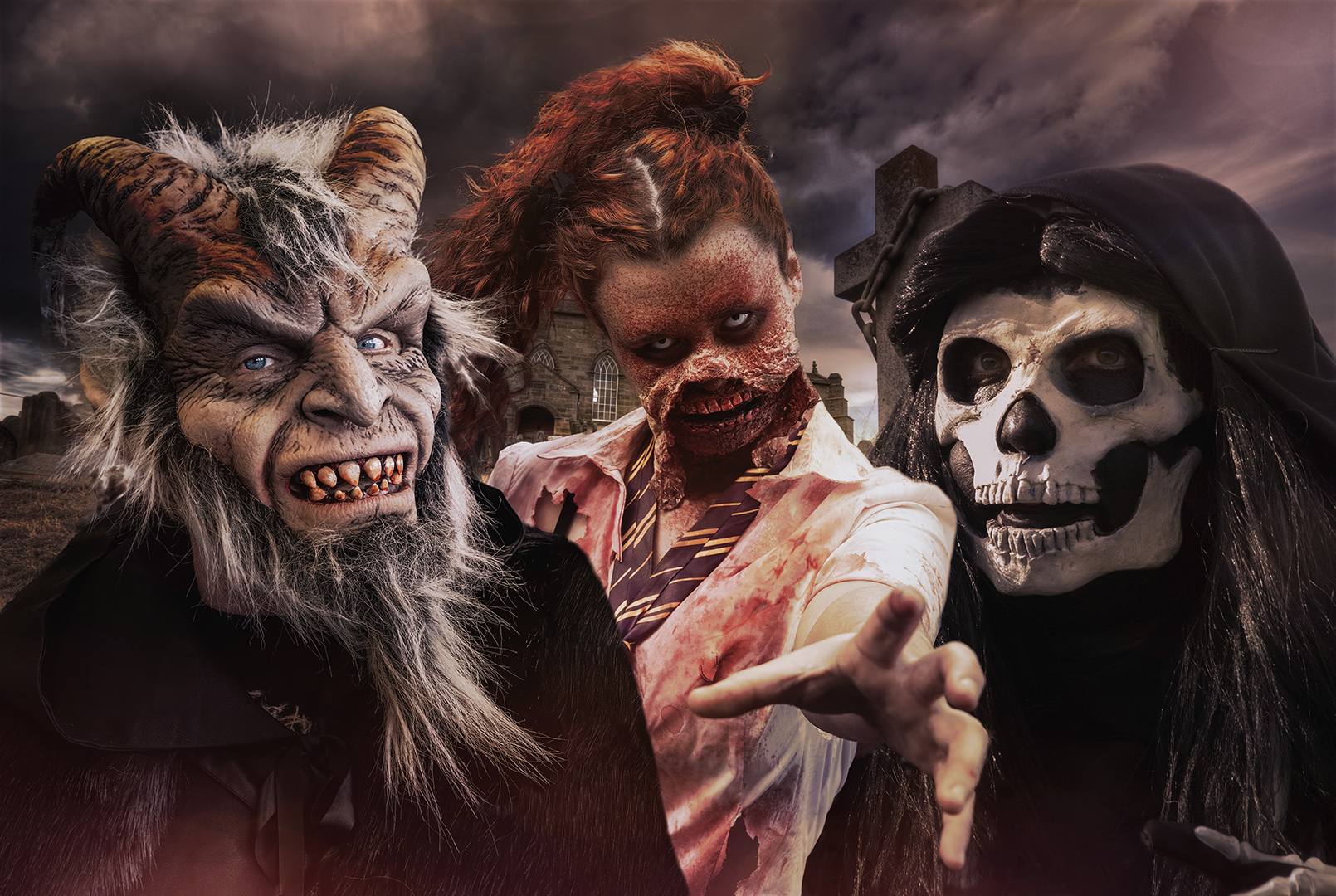
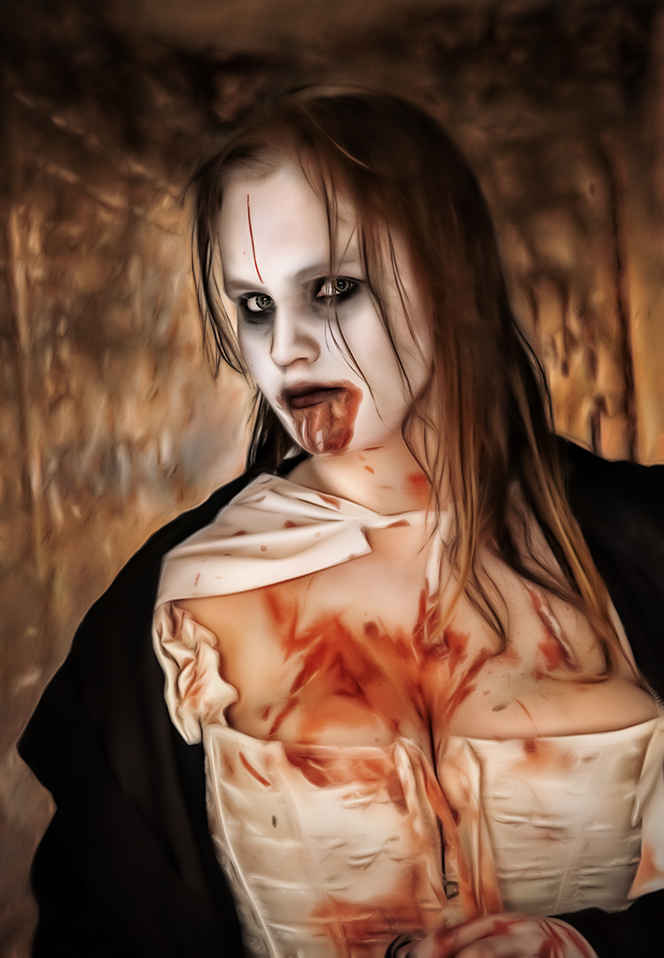
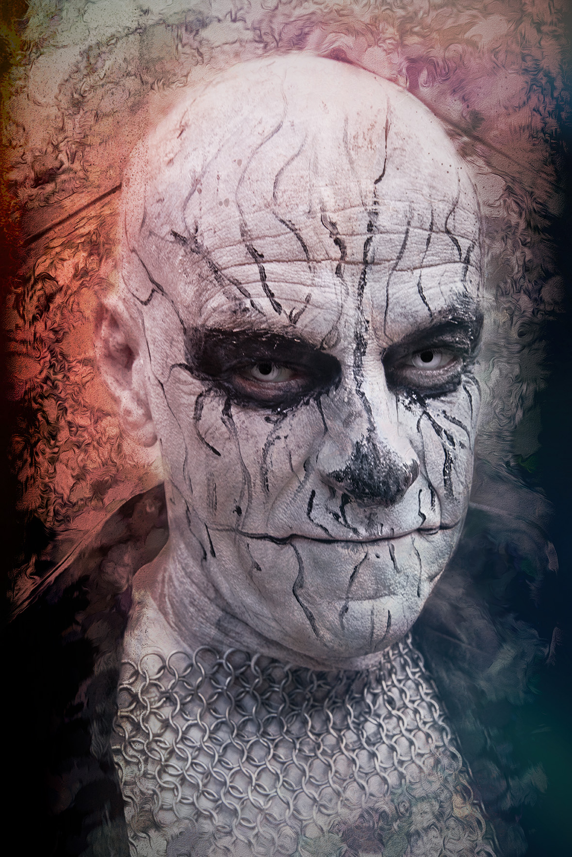
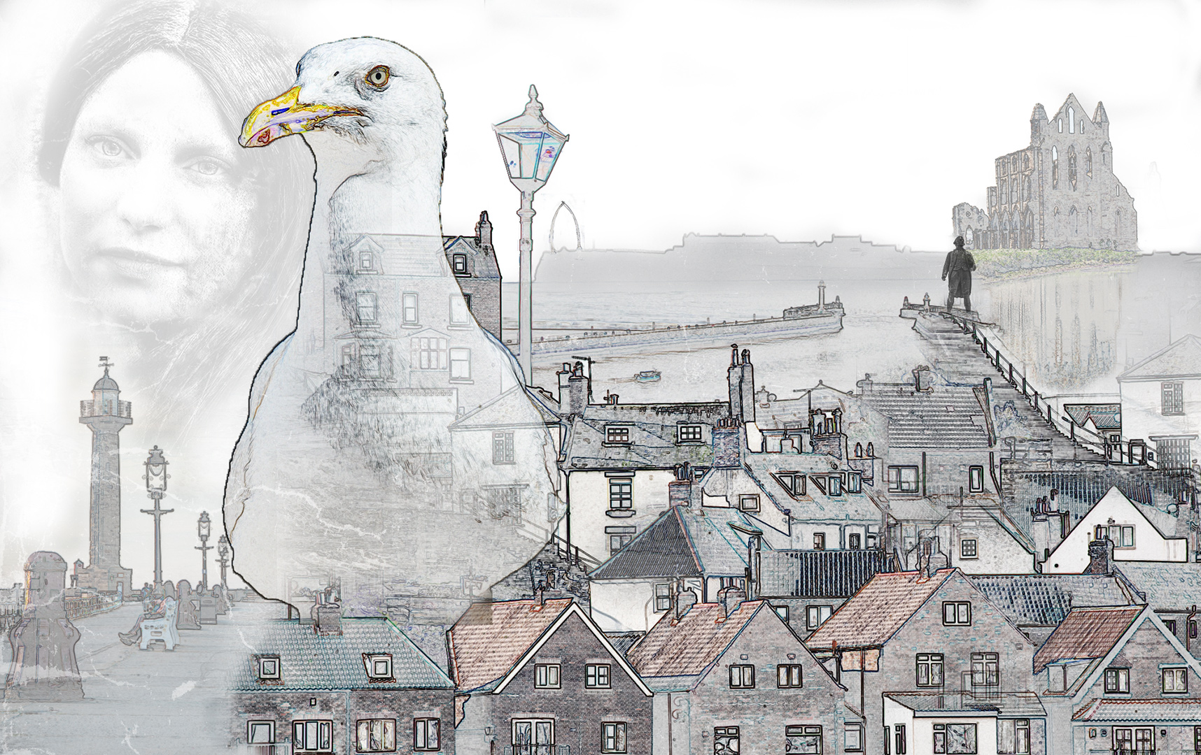
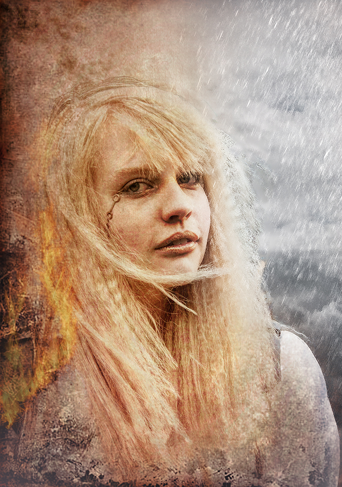
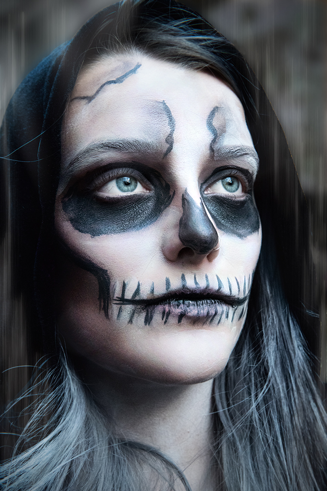
This is great. Let's hope you flounder with next month's image too!
The overall effect is quite different to your usual images and quite inspiring. Thanks.
The textures and splatter brushes work well with the image.
Don't tell the model (or her mother) that you don't like her eyes! |
Nov 8th |
| 34 |
Nov 21 |
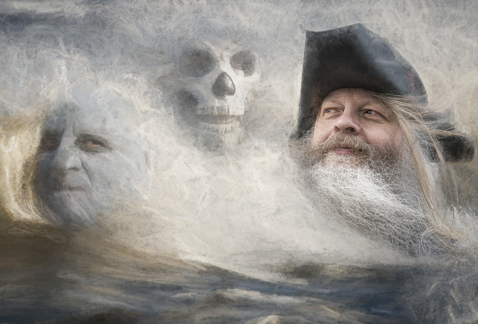
Comment |
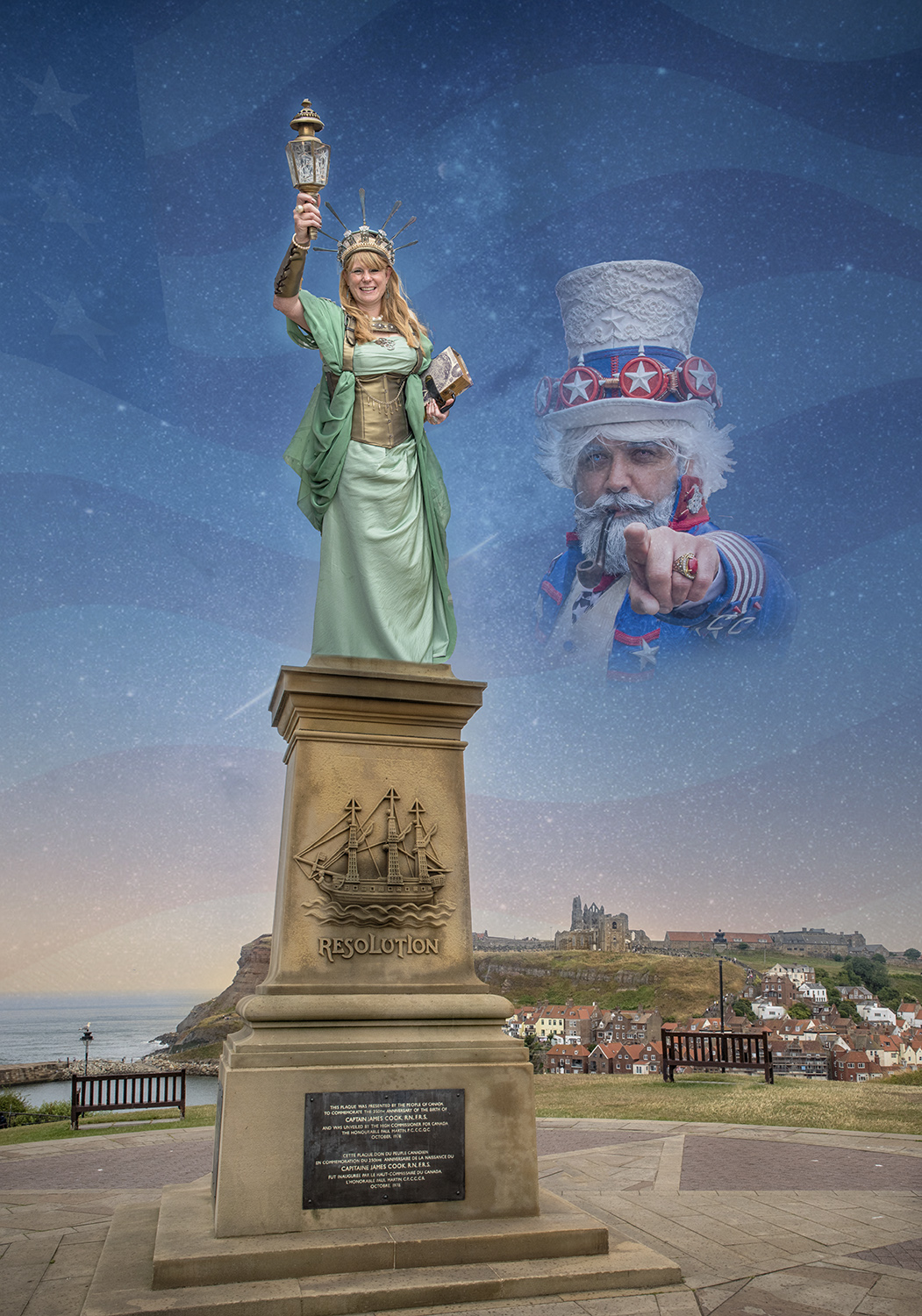
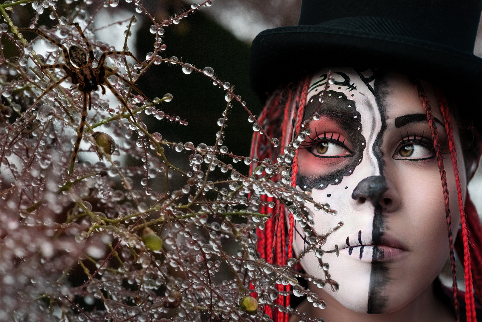
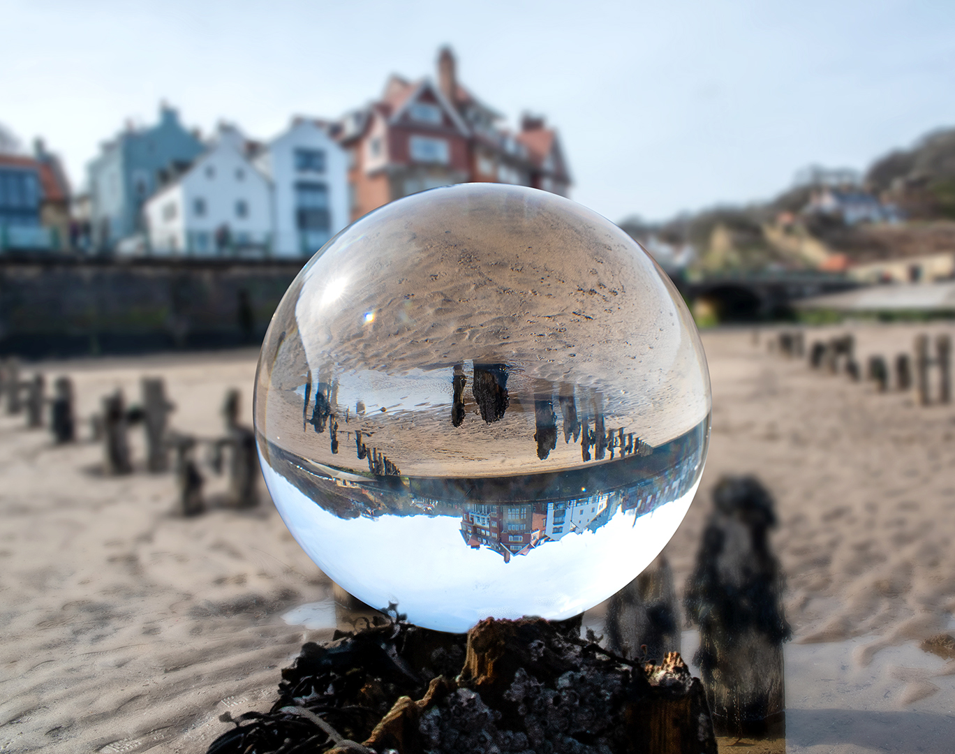
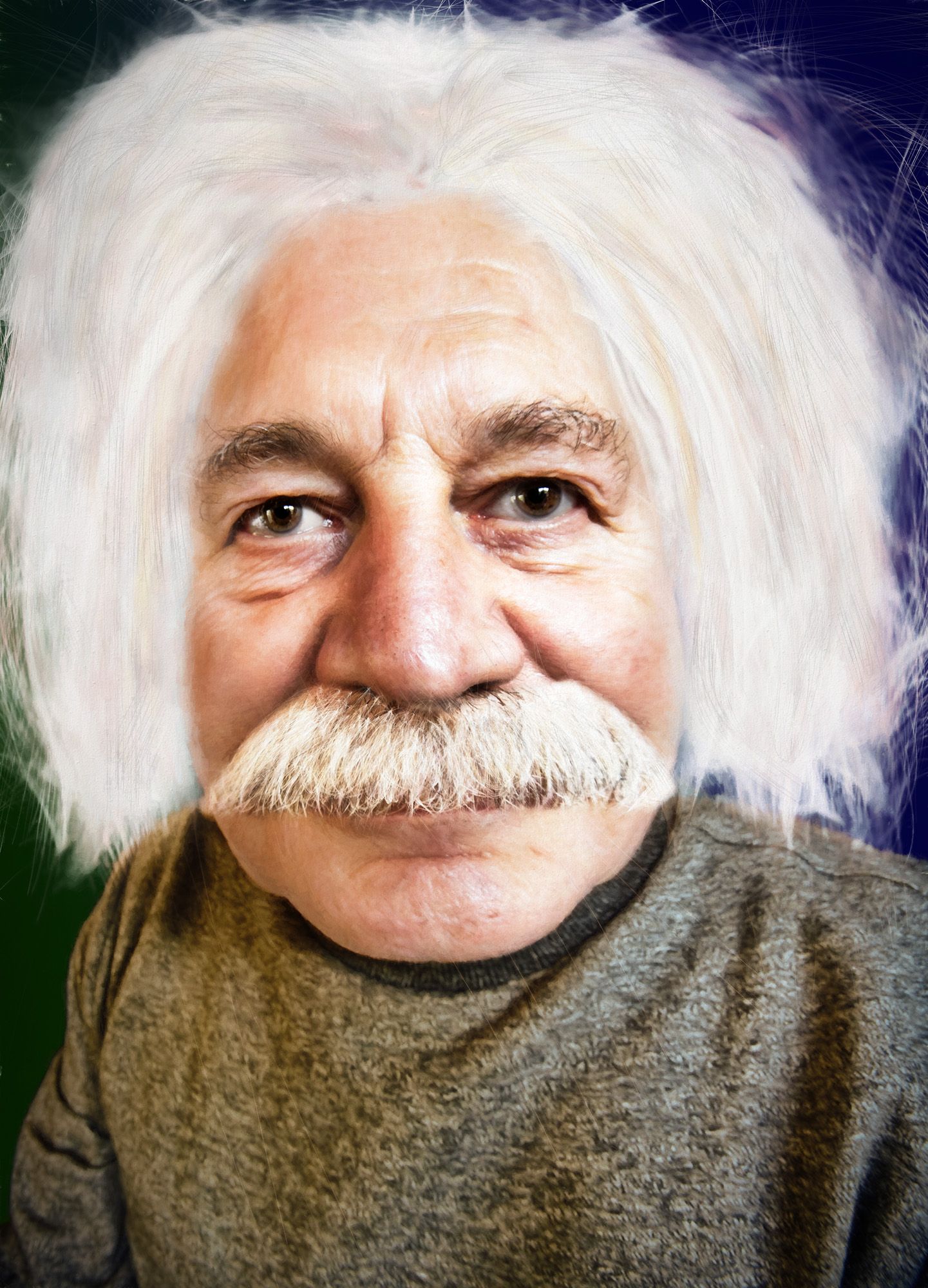
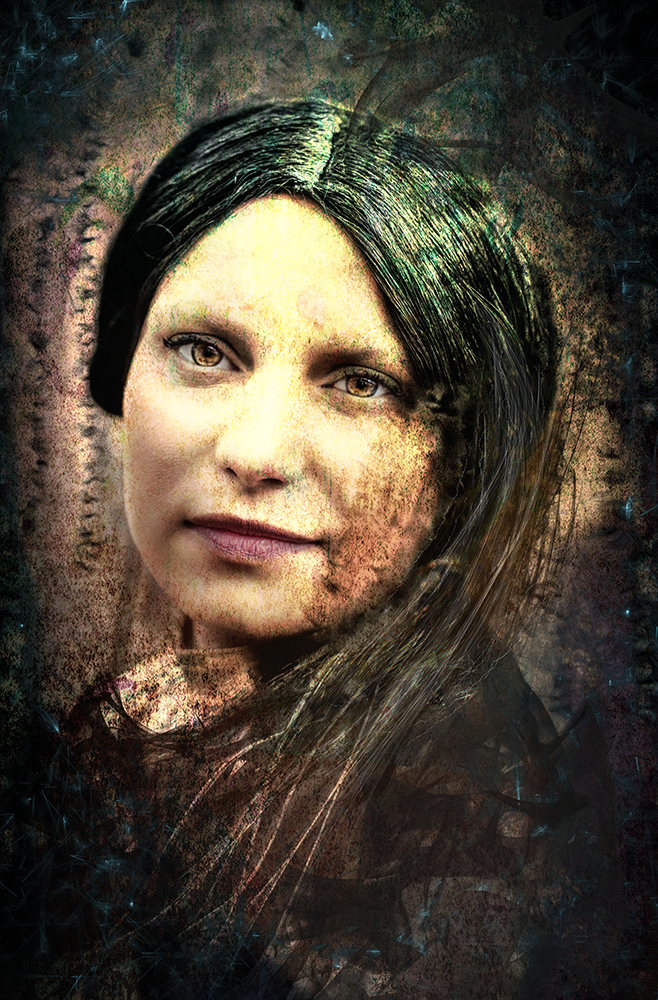
You've succeeded in creating the night lighting. This is a superb result. Thanks for showing the layer stack - it explains things a lot.
Have you tried Topaz Mask AI? It's an excellent tool for selecting complicated outlines (particularly hair).
Also, holding the Alt (Opt) key while you click 'Merge Visible' (From the dropdown at the top right of the layers palette) does the same as Ctrl/Opt/Shift/E. I find it much easier. |
Nov 8th |
| 34 |
Nov 21 |
Comment |
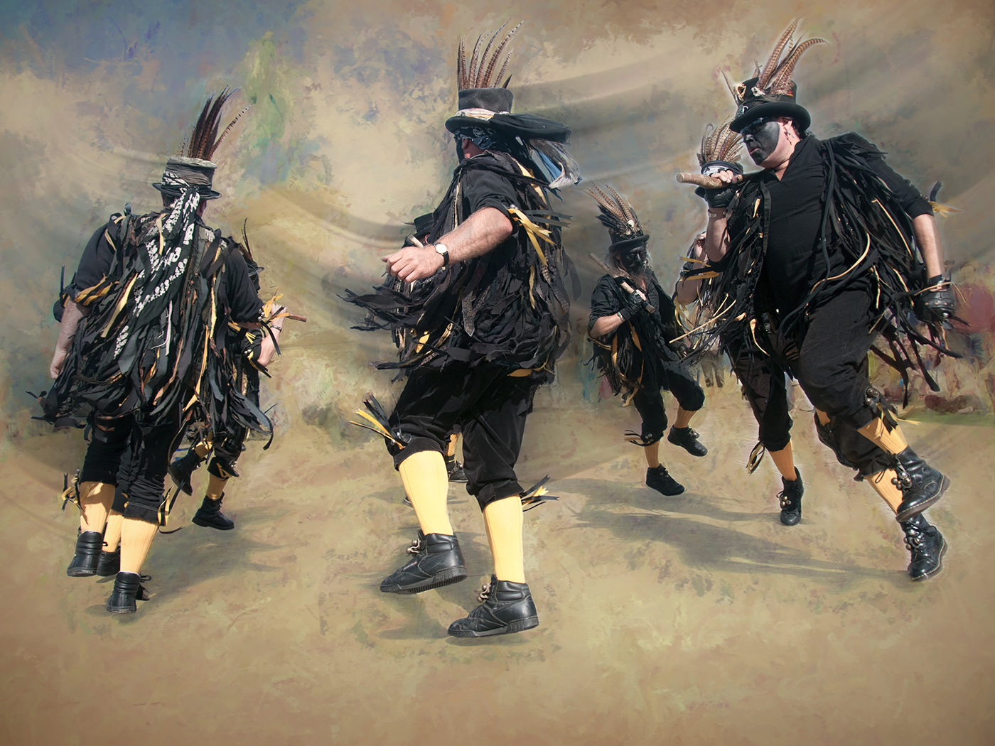
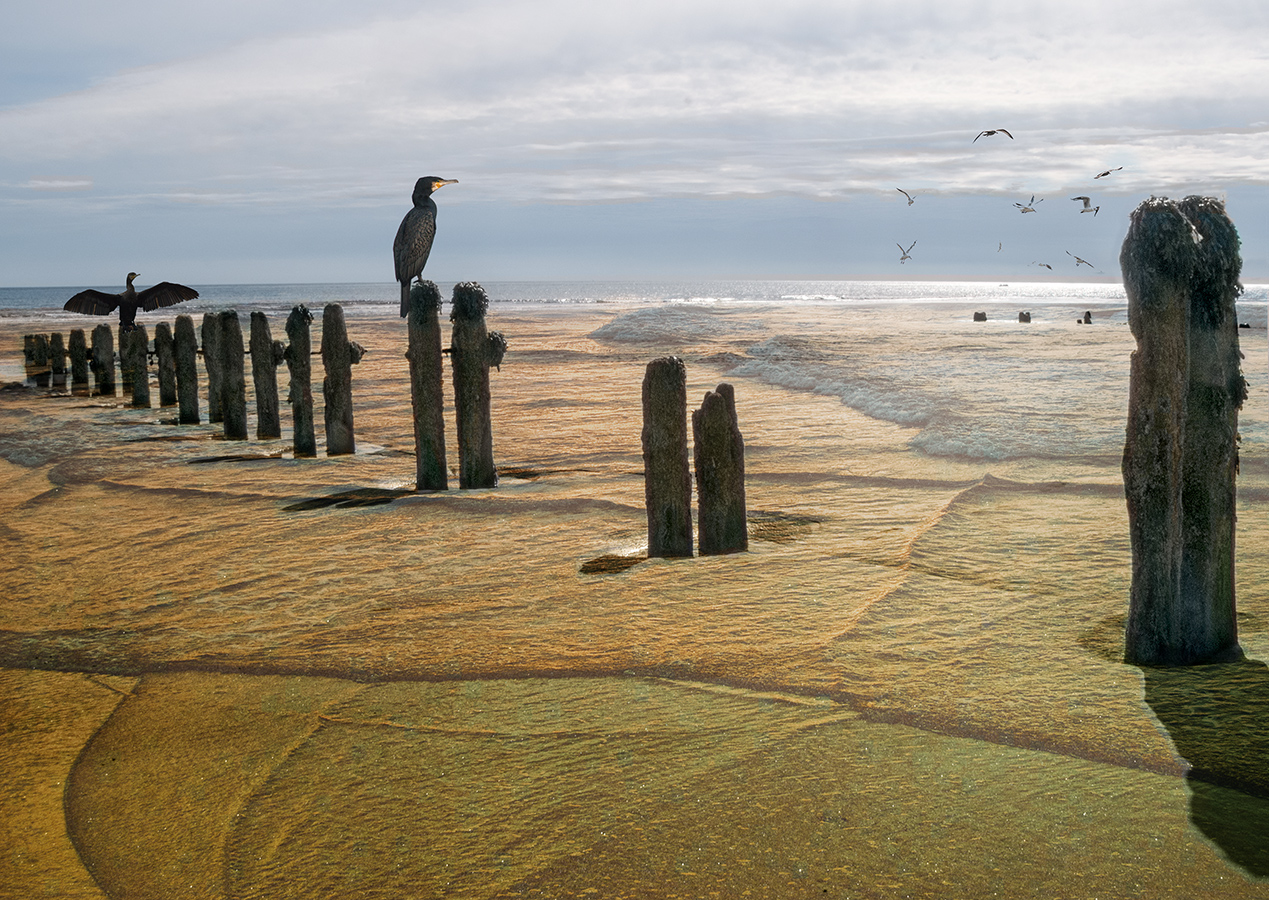
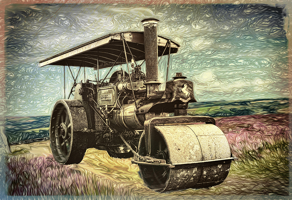
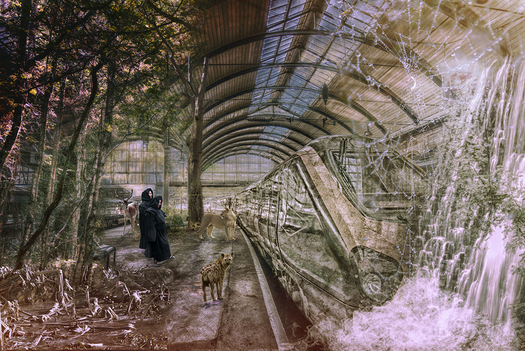
It seems that you and Candy are both enjoying the scrapyards this week!
The treatment you've used here is excellent (although I wonder about the value of focus stacking then applying texture to covber the detail).
I'll have to look deeper into Nik Color Efex. There's lots to learn! Thanks |
Nov 8th |
| 34 |
Nov 21 |
Comment |
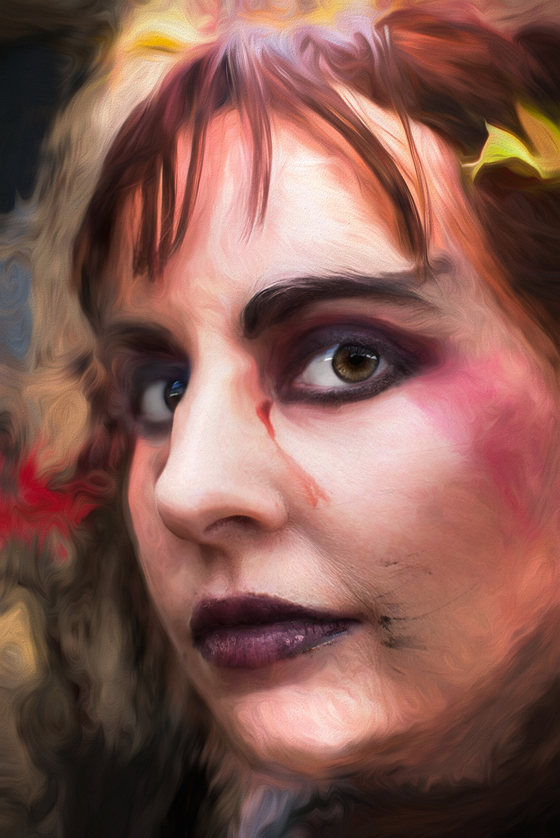
An interesting way of working the image, to good effect. Thanks for the explanation. I spend quite a lot of time playing with the available tools and various plugins to see how things turn out.
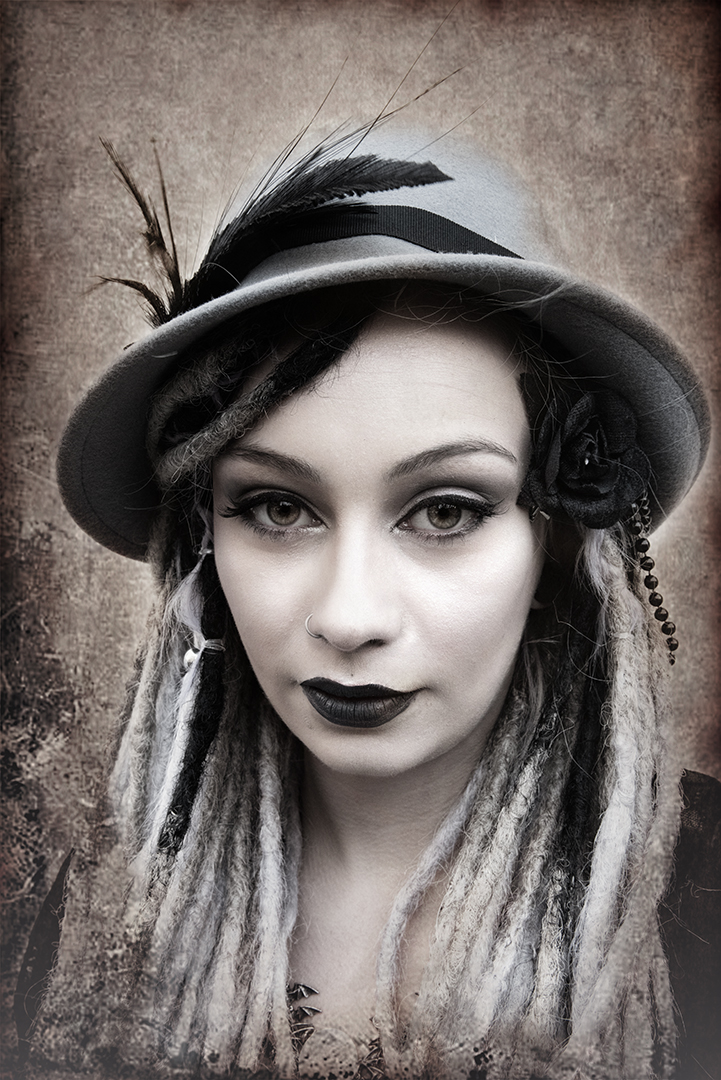
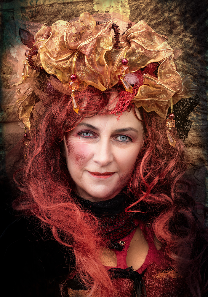
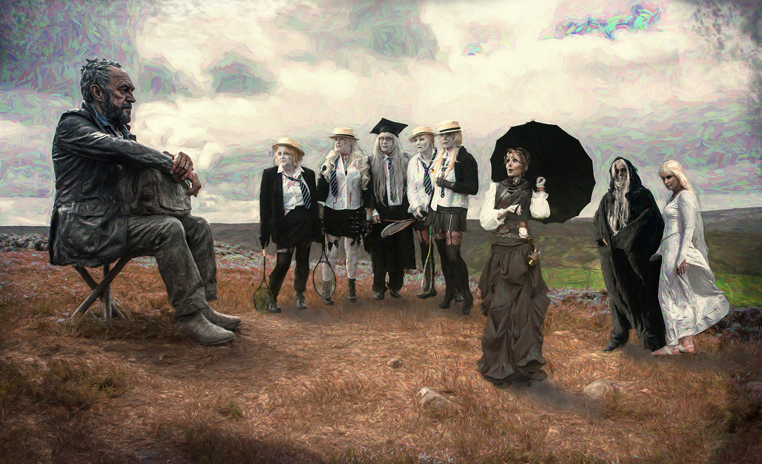
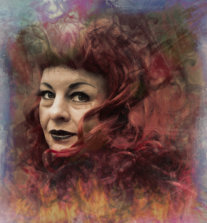
I've attached a Goth from last weekend - she's had Portrait Pro, Redfield Barbiedoll, Redfield Quad Pencil, B&W adjustment, Saturation adjustment and Topaz Studio 2 impression plugins, all with layer masks of course. A lot more than you've used, but who's to say which is the better outcome? As long as we're happy playing and happy with the result! |
Nov 8th |
 |
| 34 |
Nov 21 |
Comment |
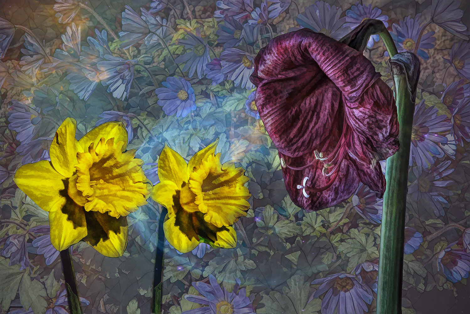
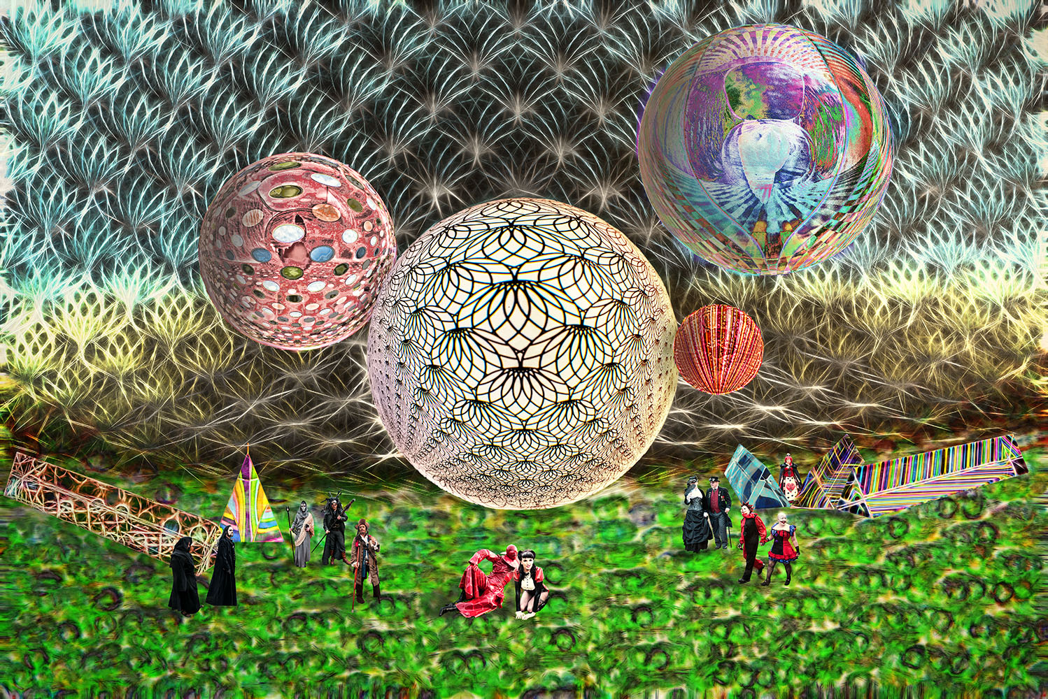
I really like this. The treatment of the various parts is excellent.
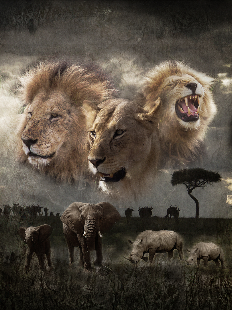
I feel that the frog should have a greater presence in the image. He's fighting for attention with the rest of the image. Maybe a shadow as suggested by Jan would help, or maybe toning down the background a touch.
Whatever, I think you've done an excellent job here and it's brightened my day - Thanks. |
Nov 7th |
| 34 |
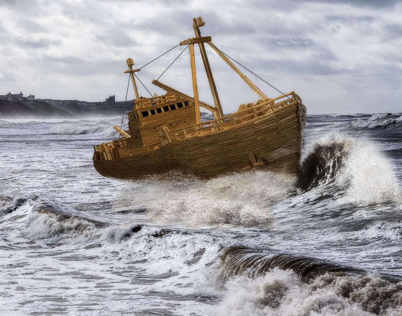
Nov 21 |
Reply |
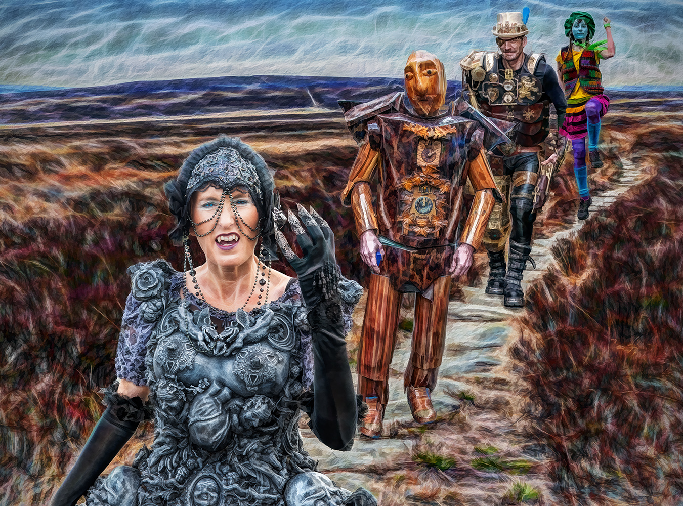
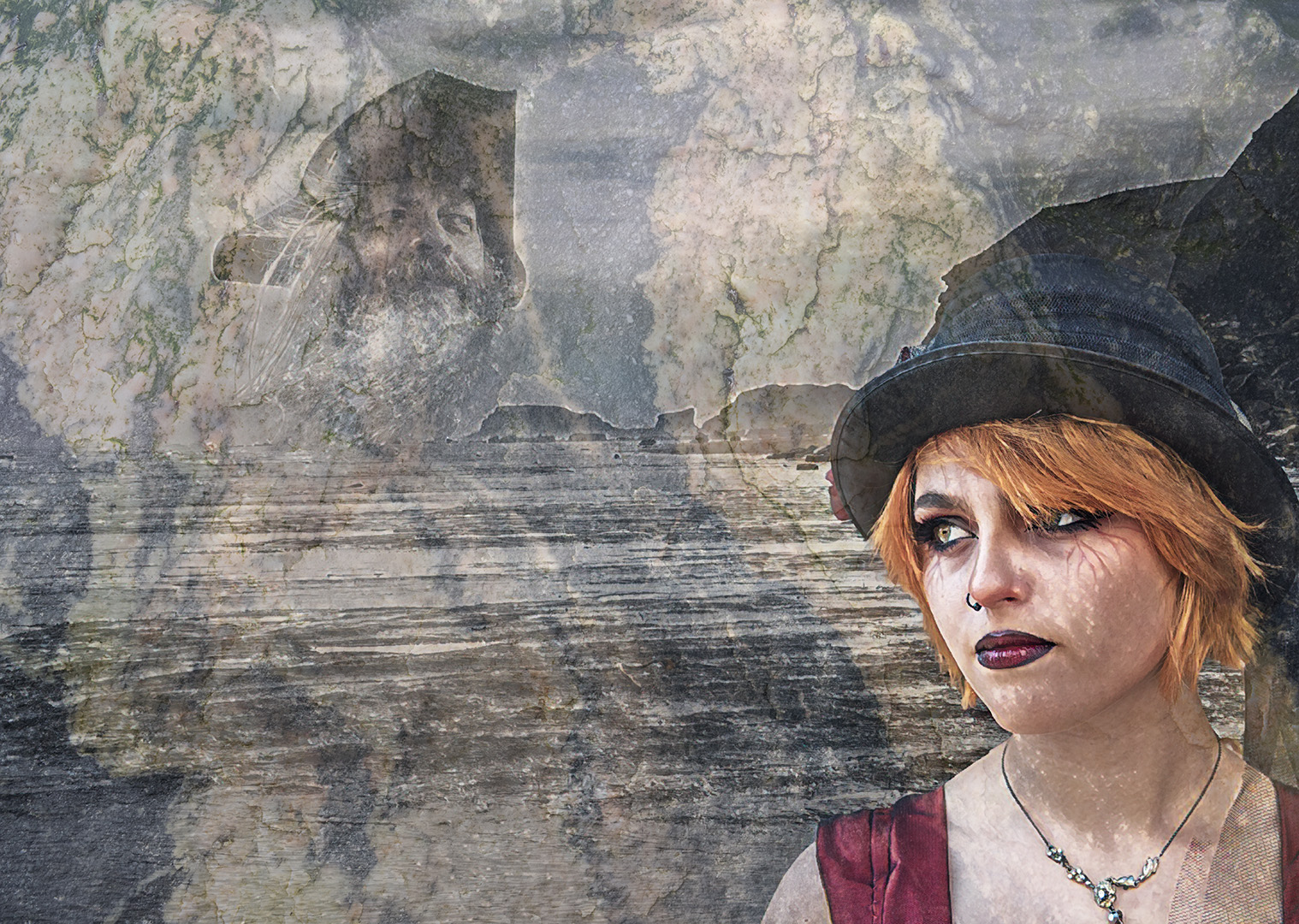
Thanks Jan
It seems that Turner had it right - his train was very small in the painting. I was tempted to include the viaduct at awhitby, but getting the photo angle would have needed a drone, so I gave up on that. As it was, I think the rocket would have been lost at the smaller size, but I think you're right about giving it more headroom.
Thanks for your suggestion. Here's the Turner painting which was the inspiration - the result was far from it! |
Nov 7th |
 |
6 comments - 1 reply for Group 34
|
6 comments - 1 reply Total
|