|
| Group |
Round |
C/R |
Comment |
Date |
Image |
| 34 |
Sep 19 |
Reply |
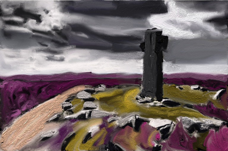
I was probably a bit unfair about playing on the pad. I sometimes play with Procreate, to make things like this painting of one of the moorland crosses. Not a photo editing, but still a doodle! |
Sep 13th |
 |
| 34 |
Sep 19 |
Reply |
Thanks Georgianne. Useful suggestions. Why not just use a brightness / contrast adjustment layer and use the layer mask for the selective areas - that would preserve the complexion of Miss Muffet. |
Sep 12th |
| 34 |
Sep 19 |
Comment |
Thanks for the insight Jan. Playing with my phone or pad with images is something I've never really got into.
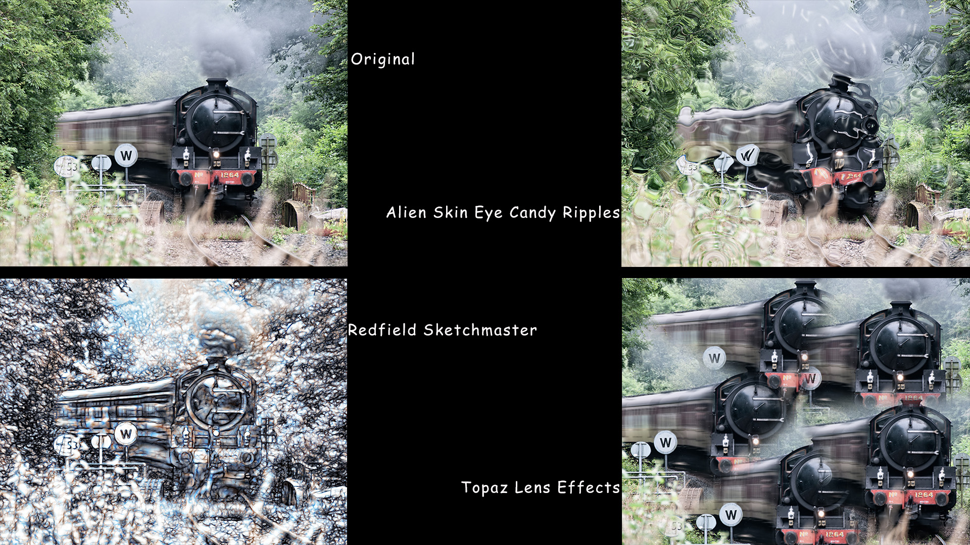
I've had a look at iColorama which looks interesting, but I'm still not convinced I'll use the pad for editing. Thanks for the info and I may look into it again. In the meantime I've got a very comfy chair in the study and a well placed glass of Martell VSOP, iTunes for my music and I'll play for hours with the Photoshop plugins I already have (I'm a glutten for plugins!) I knocked this up in the last 20 minutes:
|
Sep 9th |
 |
| 34 |
Sep 19 |
Comment |
A nice gift for your Granddaughter. Well done.
Did she have a favourite from the three versions? |
Sep 8th |
| 34 |
Sep 19 |
Comment |
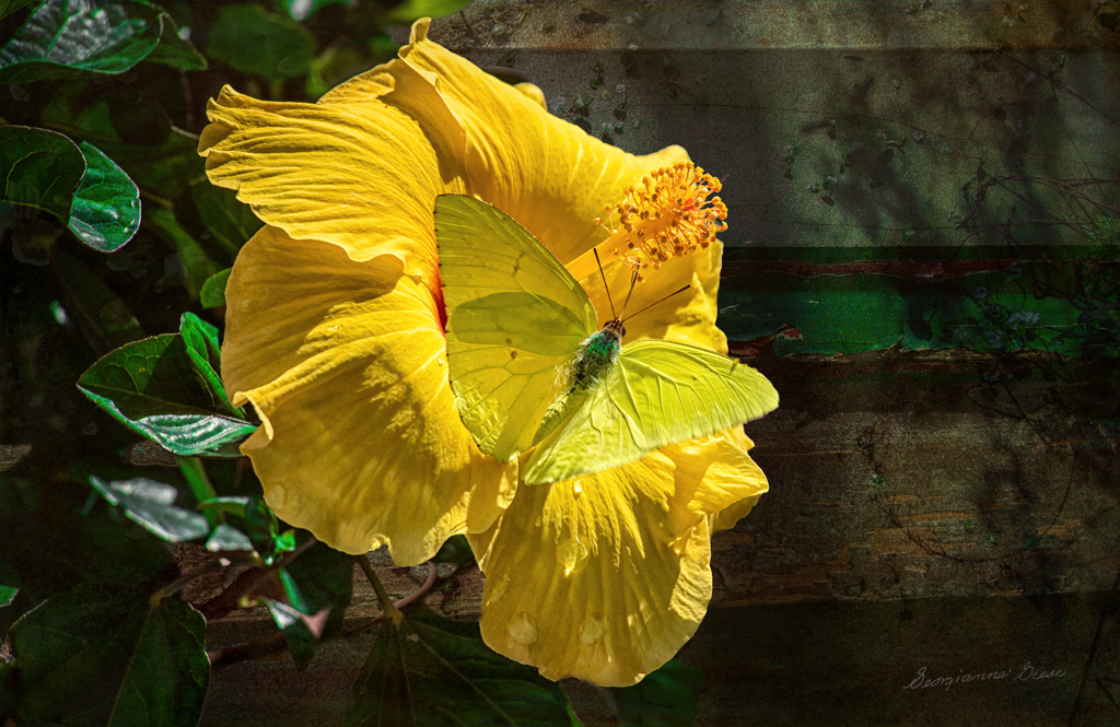
I like what you've done with the background layers. Thanks for your detailed processing.
It's a good image, but I feel it could be improved upon. There are some leaves in the top right which are blurred, so they don't fit in with the boards of the background. Also the edges of the flower are so sharp that it makes them almost 'cut out'.
To get around these little niggles I applied Topaz Effects 2 > Peeling Paint at reduced opacity then added a vignette.
A couple of hints:
Instead of the copy / paste method of adding layers, why not just drag the images onto the stack - this will create a smart object which you can then easily work on with everything that Photoshop (and all your plugins), to change at your whim. Then rasterize the smart object when you've finished playing.
Stamping up is easier if you hold down the Alt Key when selecting 'merge visible' |
Sep 8th |
 |
| 34 |
Sep 19 |
Comment |
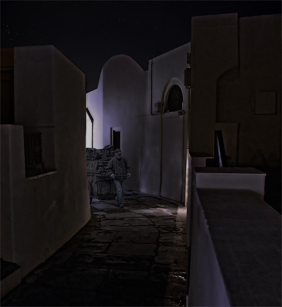
I like what you've done here. The composition works well and your treatment fits the scene.
I have a sight problem with the light lines along the skyline, which make it so obviously 'cut out'. I've tried to reduce these using a fill layer with the sky colour selected and used a layer mask to paint out the light lines.
To add a little interest in the sky I added a few stars using Anthropics Landscape Pro at low opacity.
It's worth noting that a black sky merges with the black of the background on the website, so I added a very small, grey stroke, to define the image on the page. |
Sep 8th |
 |
4 comments - 2 replies for Group 34
|
4 comments - 2 replies Total
|