|
| Group |
Round |
C/R |
Comment |
Date |
Image |
| 34 |
Jun 19 |
Reply |
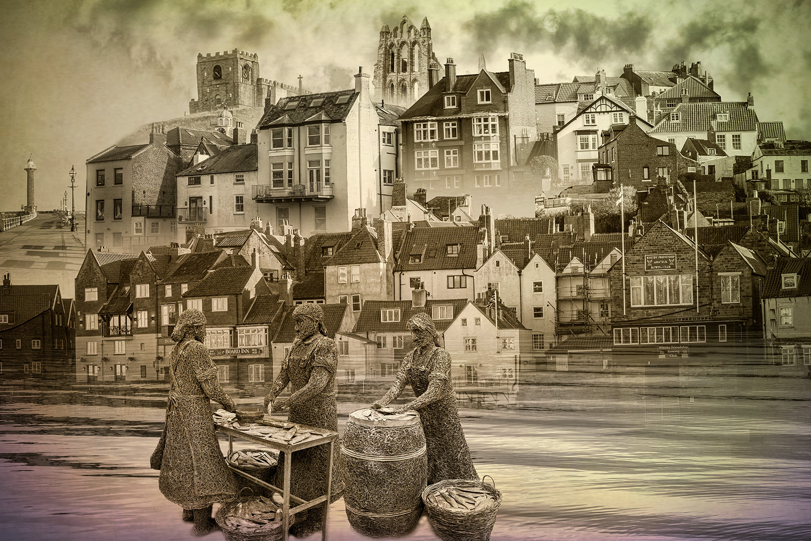
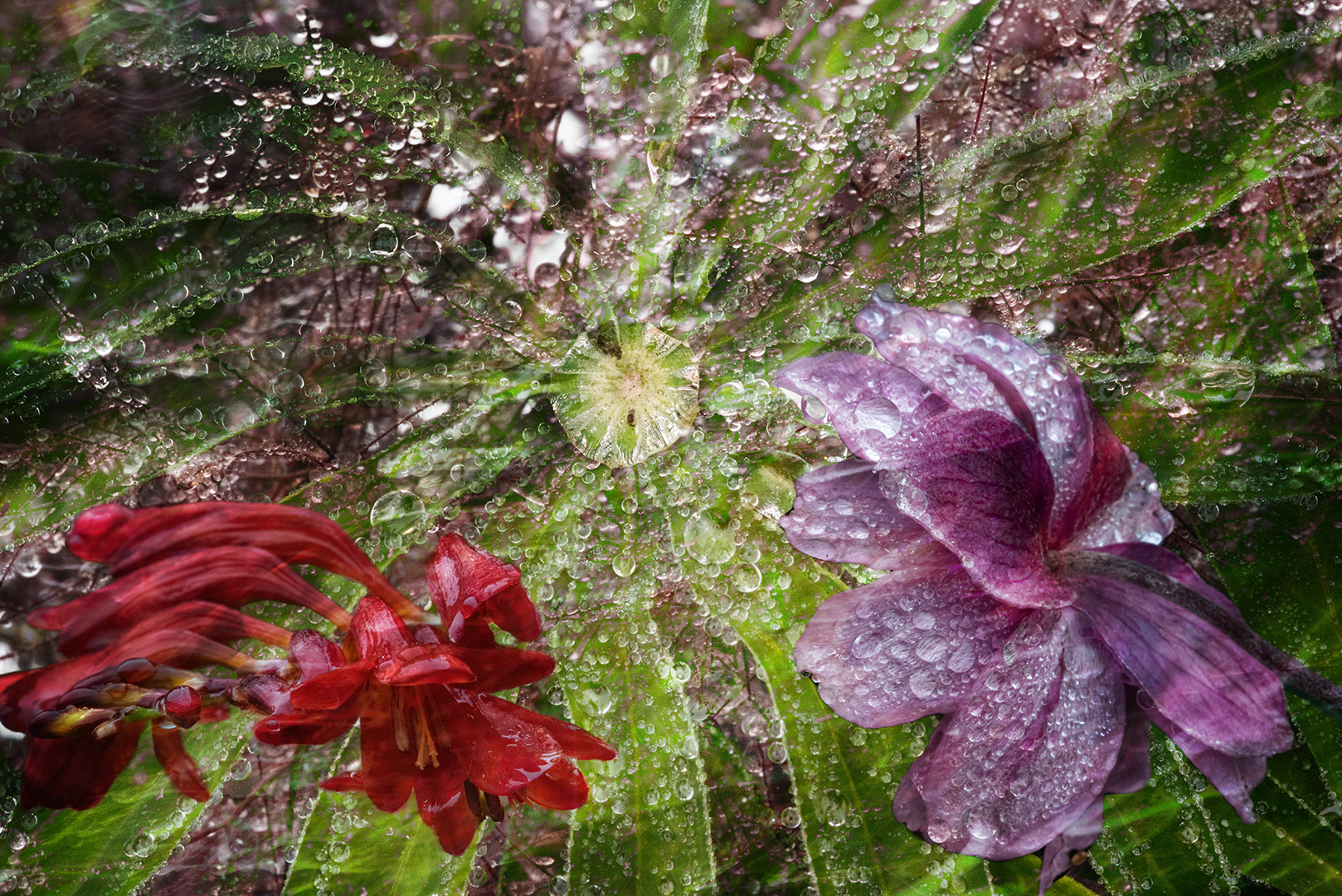
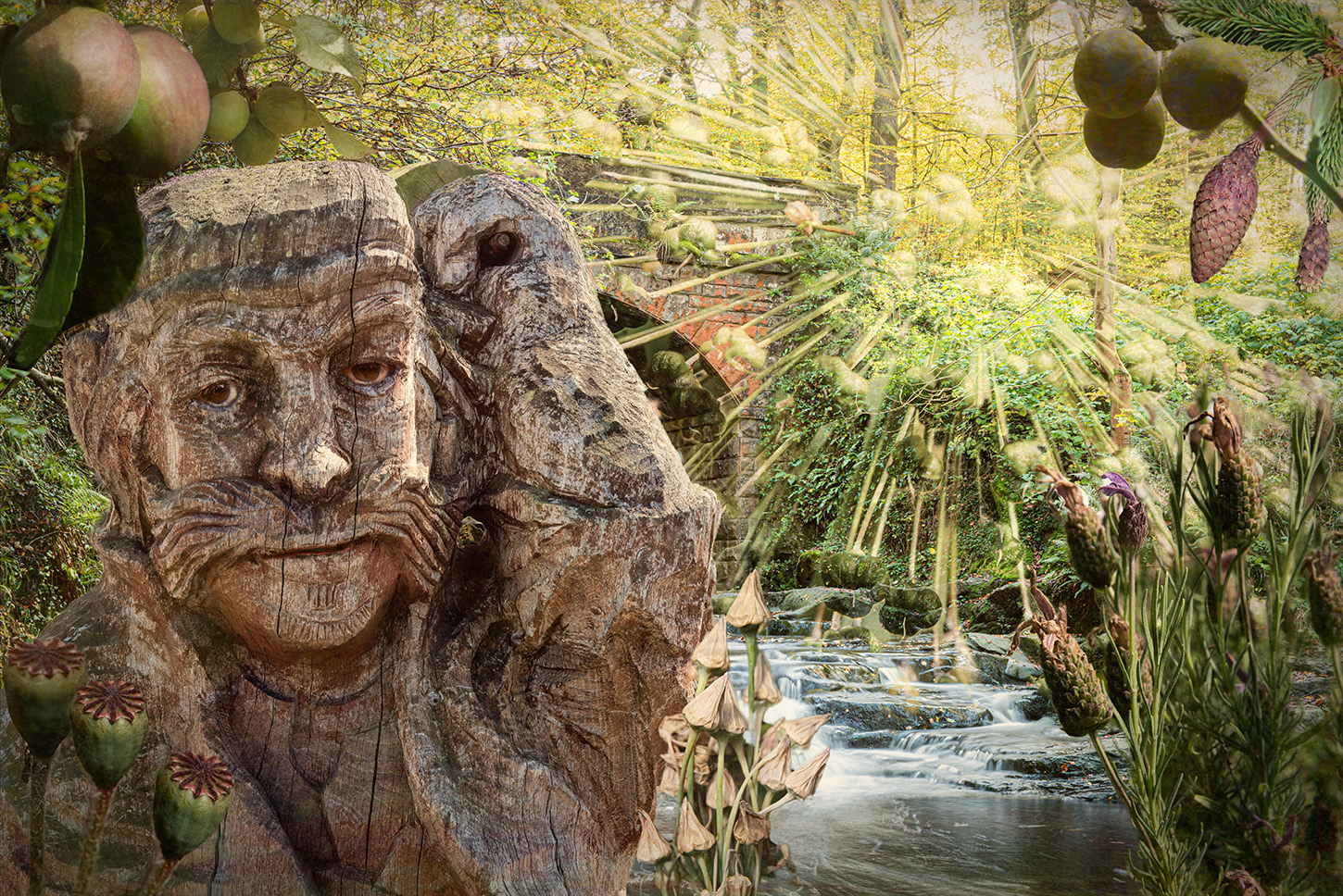
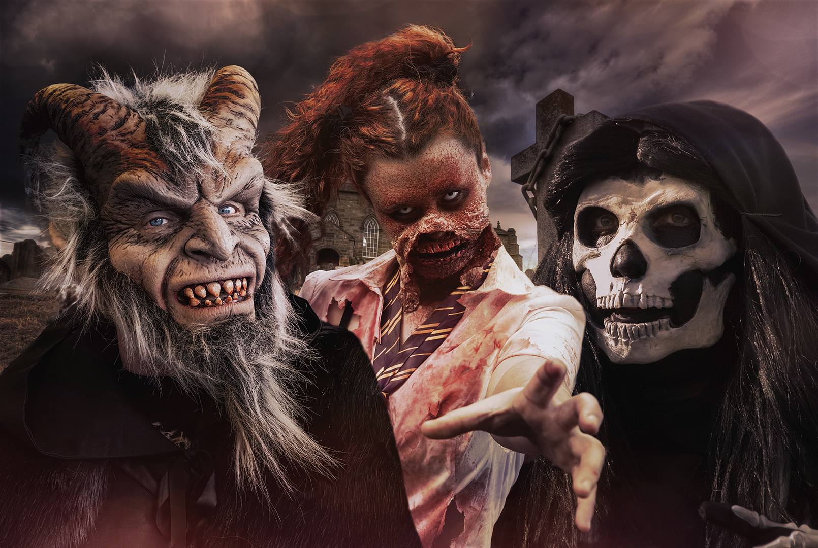
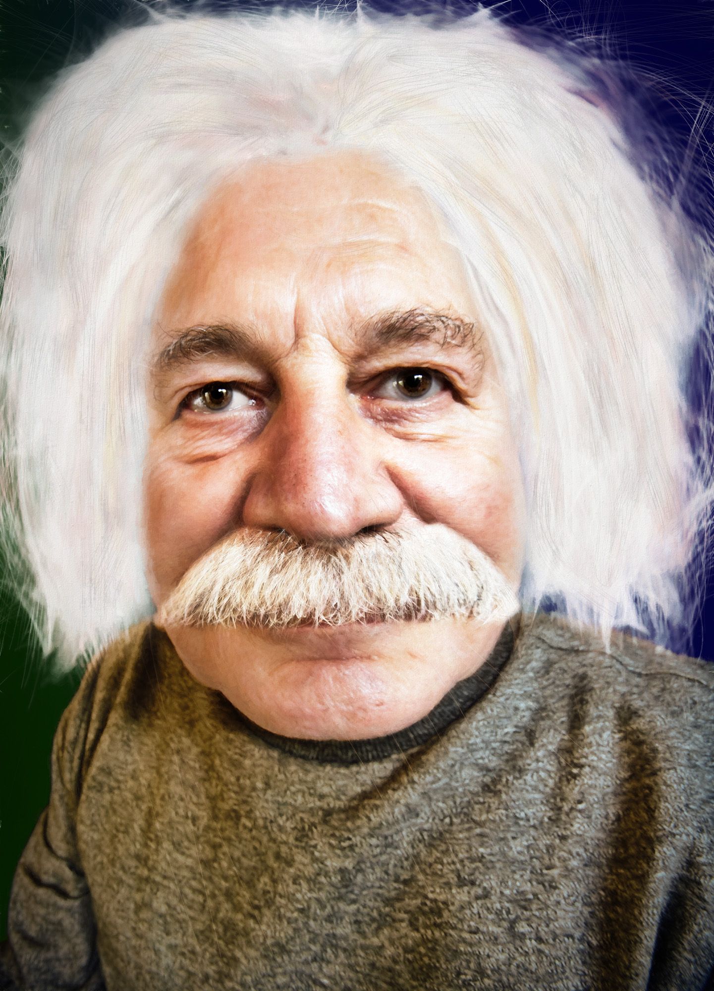
Hi Alan. Please send me your witch's brew - I'm always up for new ideas.
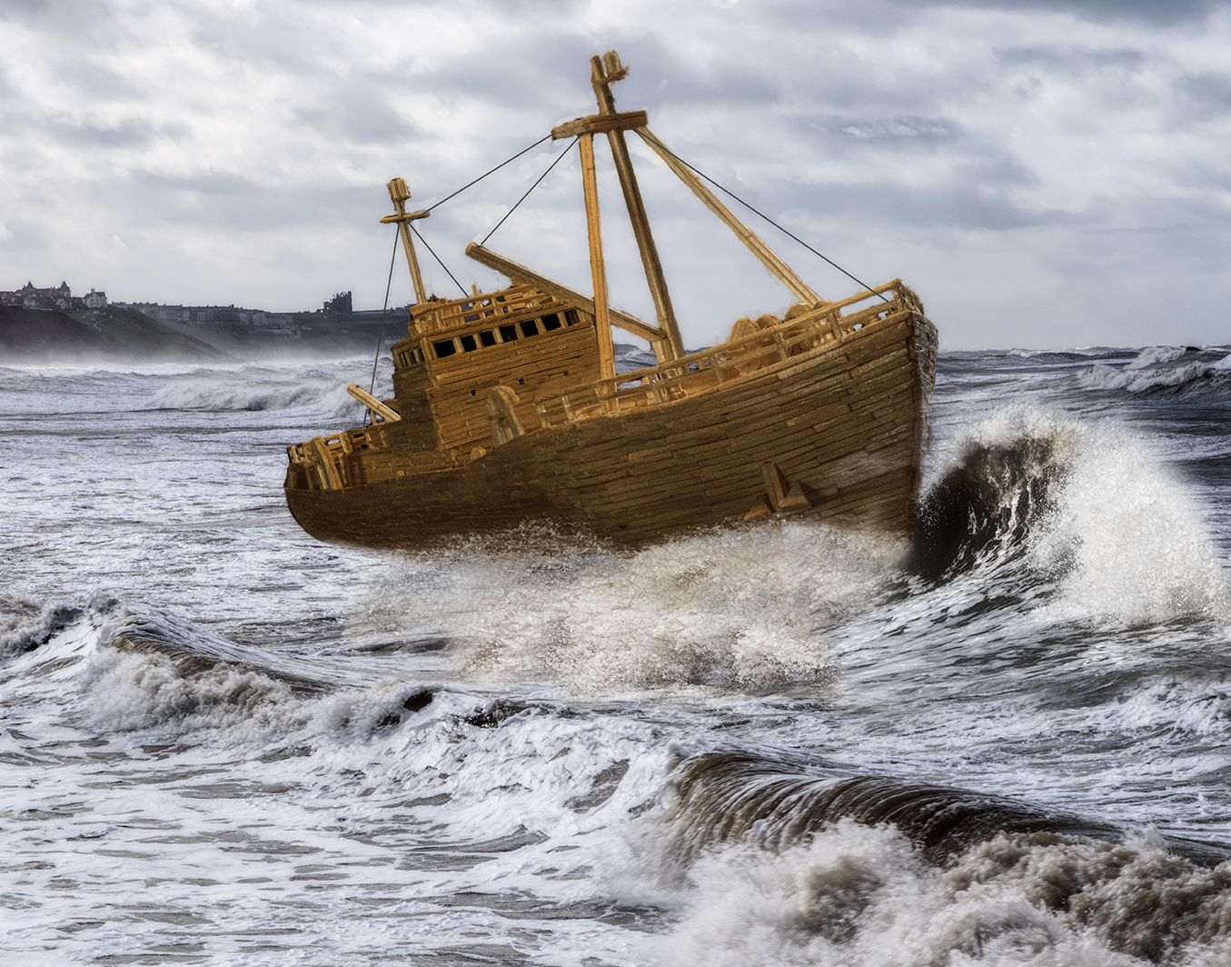
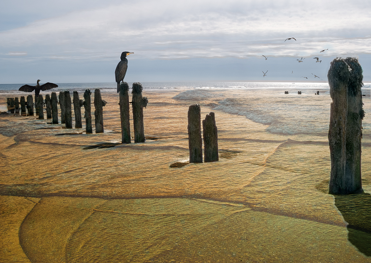
Waves build up over hundreds of miles and have quite a body of water to keep them going. Wind off the land will take the tops off the waves as they break and as can be seen on the waves to the left of the island, the spume is being blown back out to sea. If the wind direction is maintained for a few days, the swell will eventually dissipate. |
Jun 11th |
| 34 |
Jun 19 |
Comment |
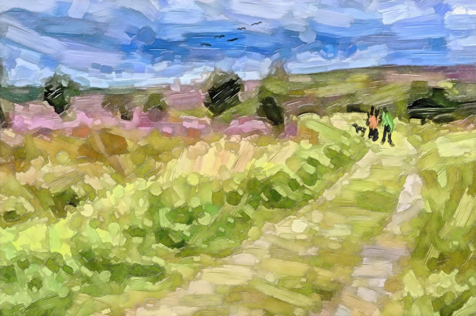
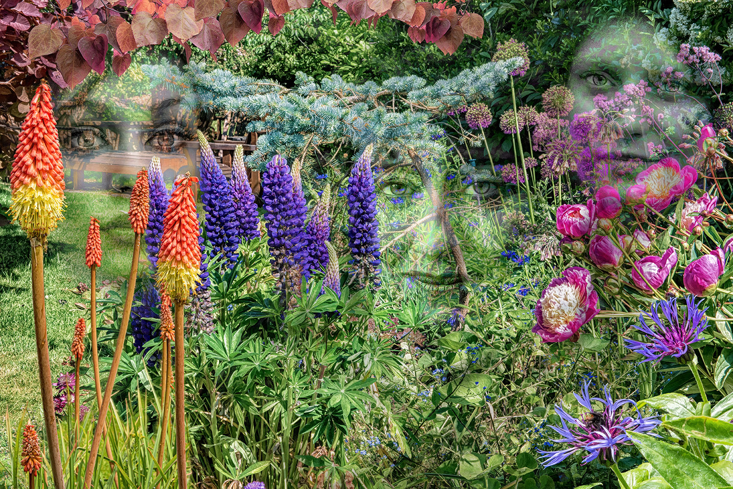
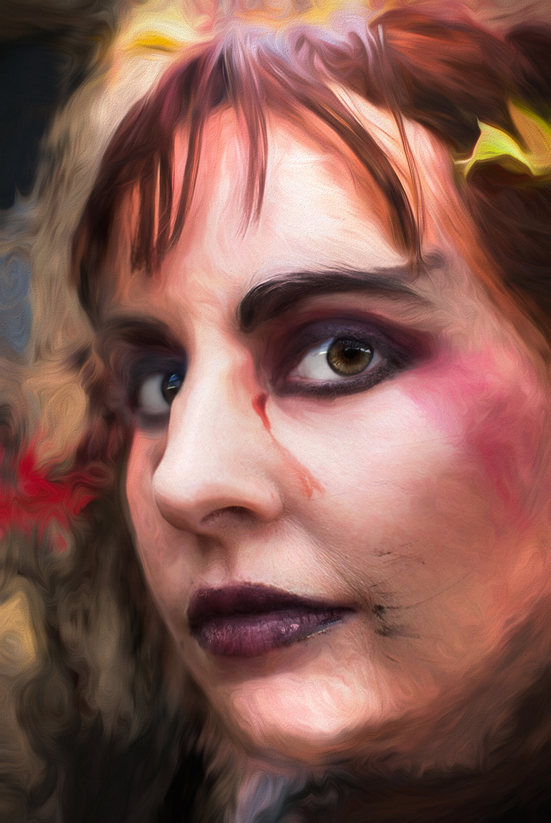
And another view of the same: |
Jun 10th |
 |
| 34 |
Jun 19 |
Comment |
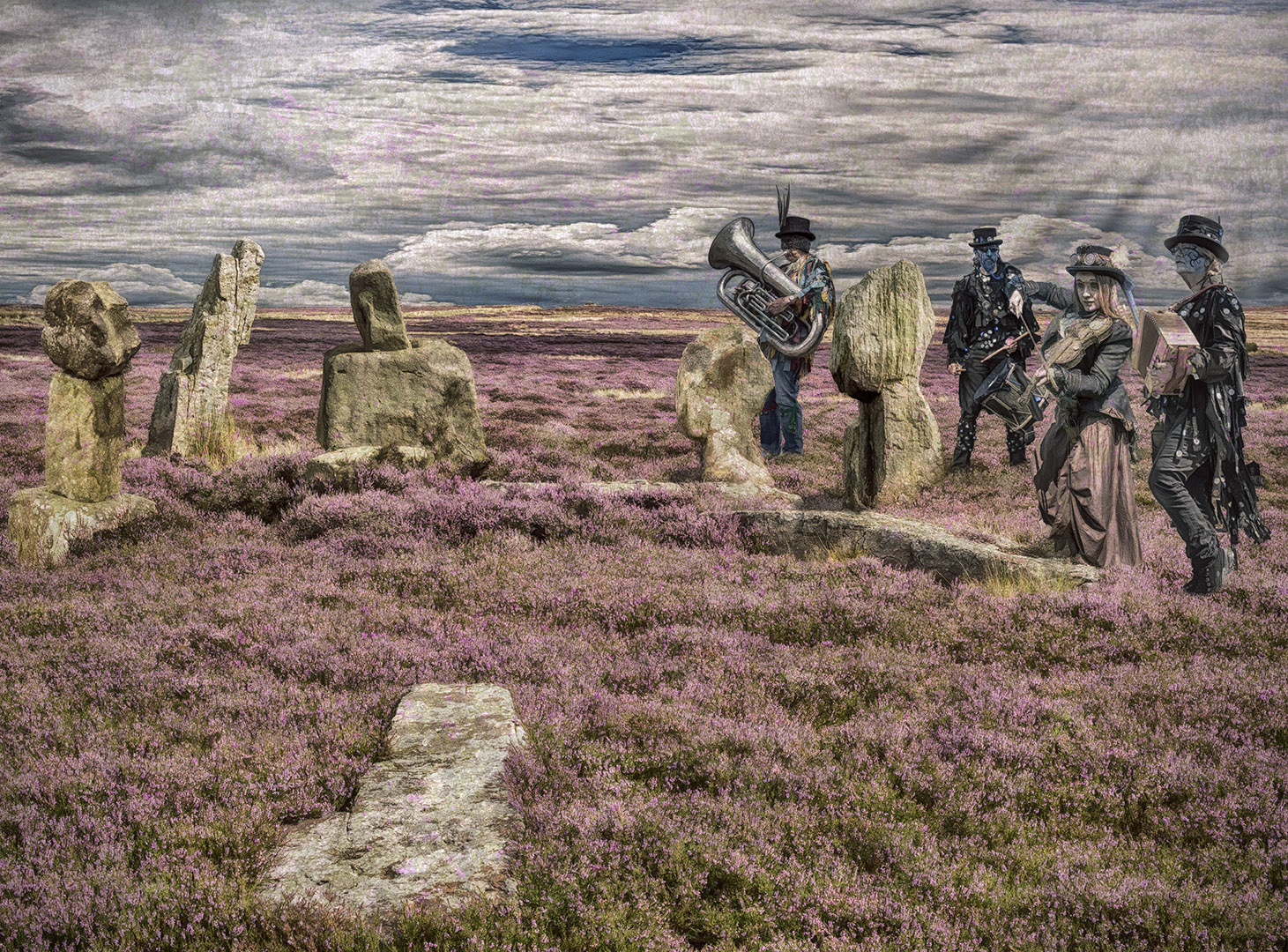
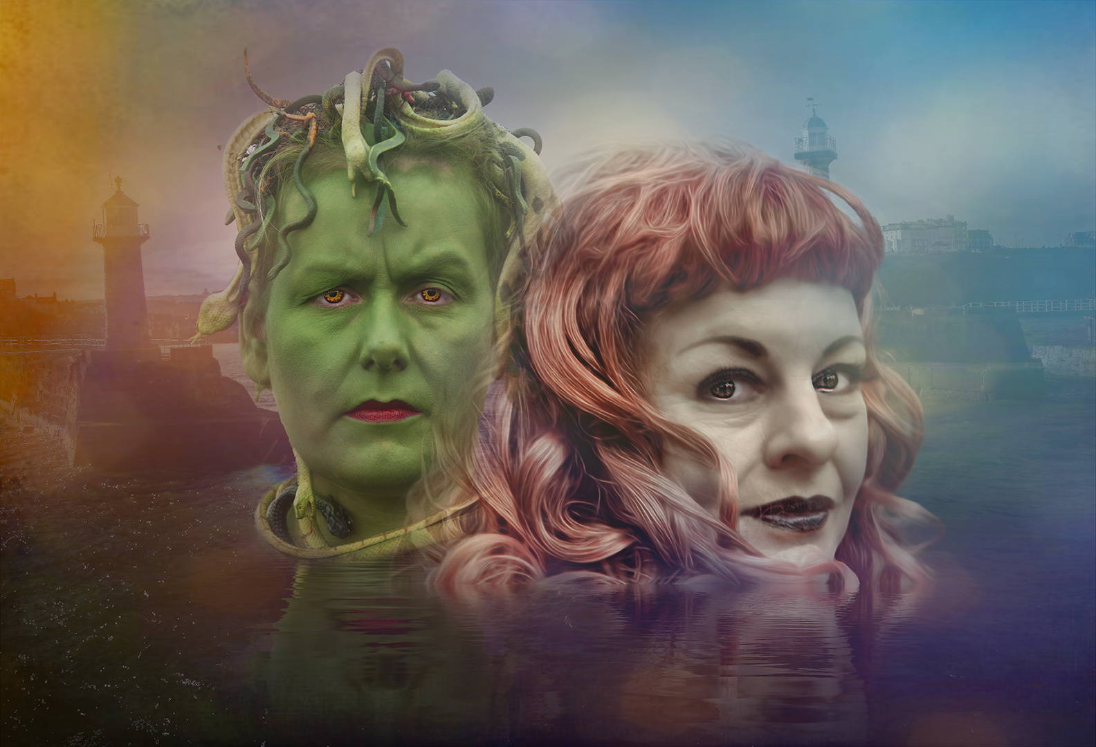
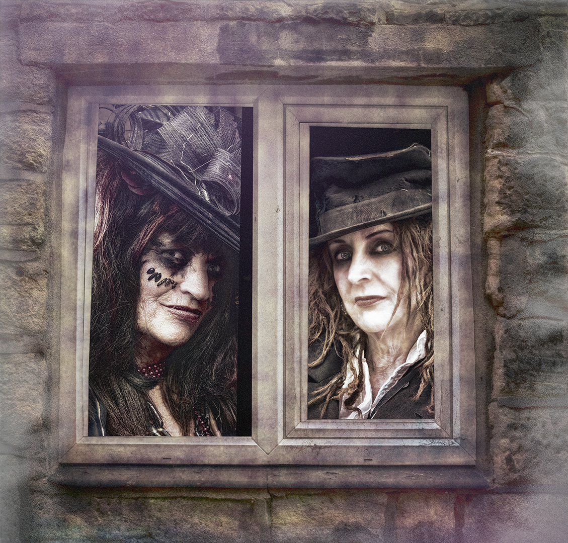
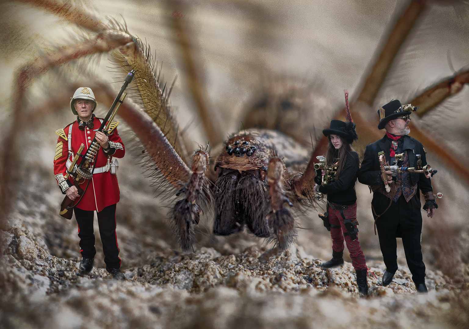
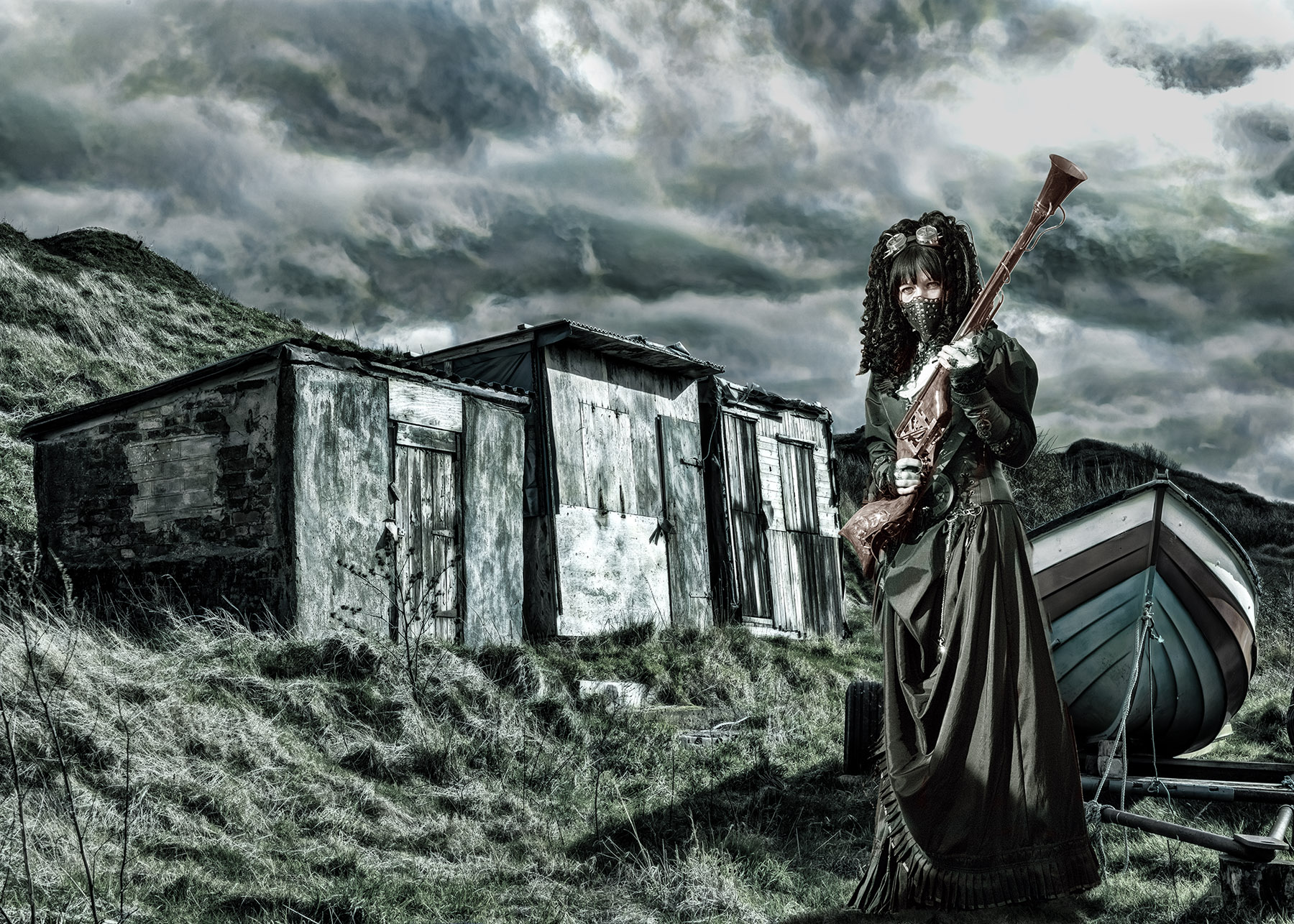
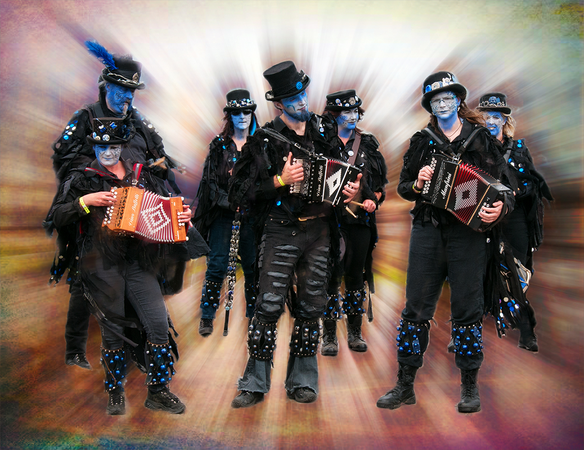
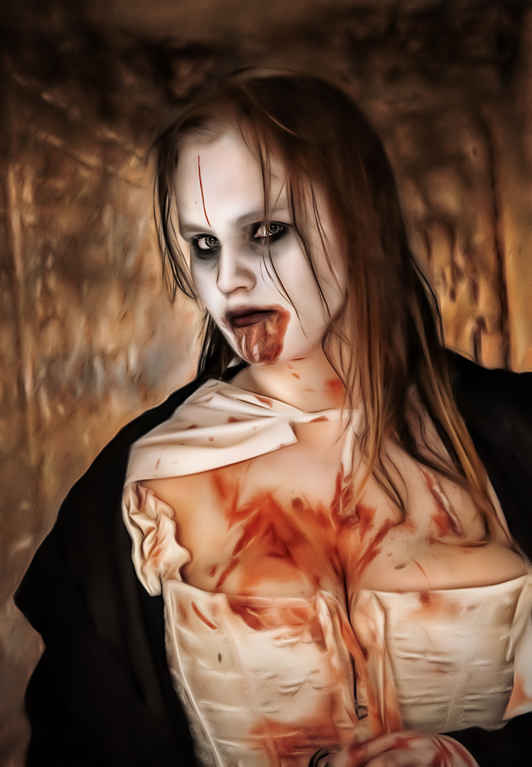
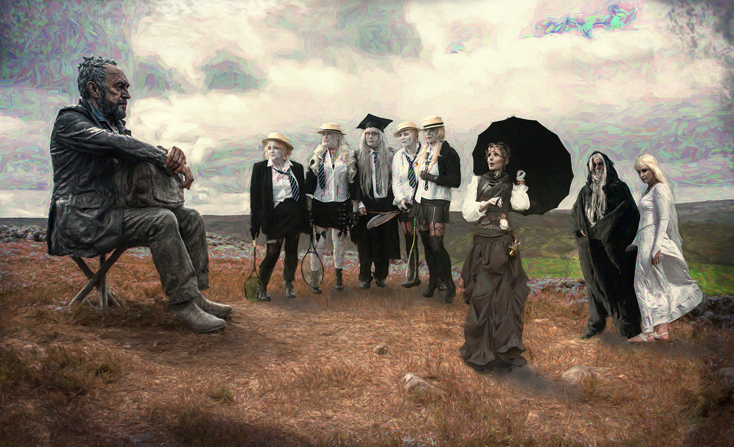
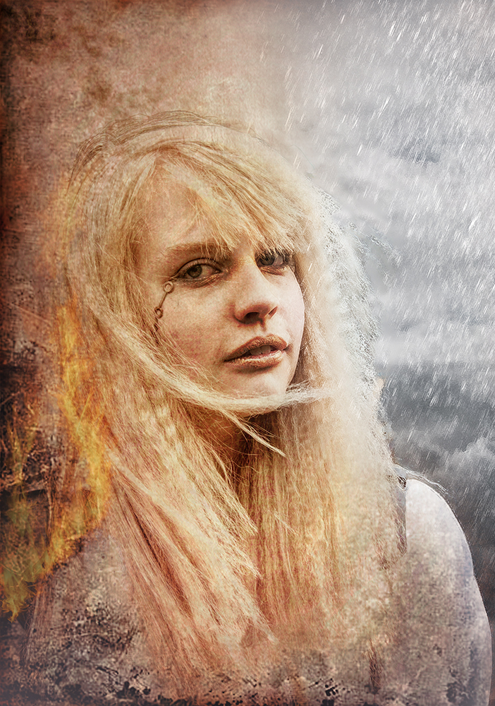
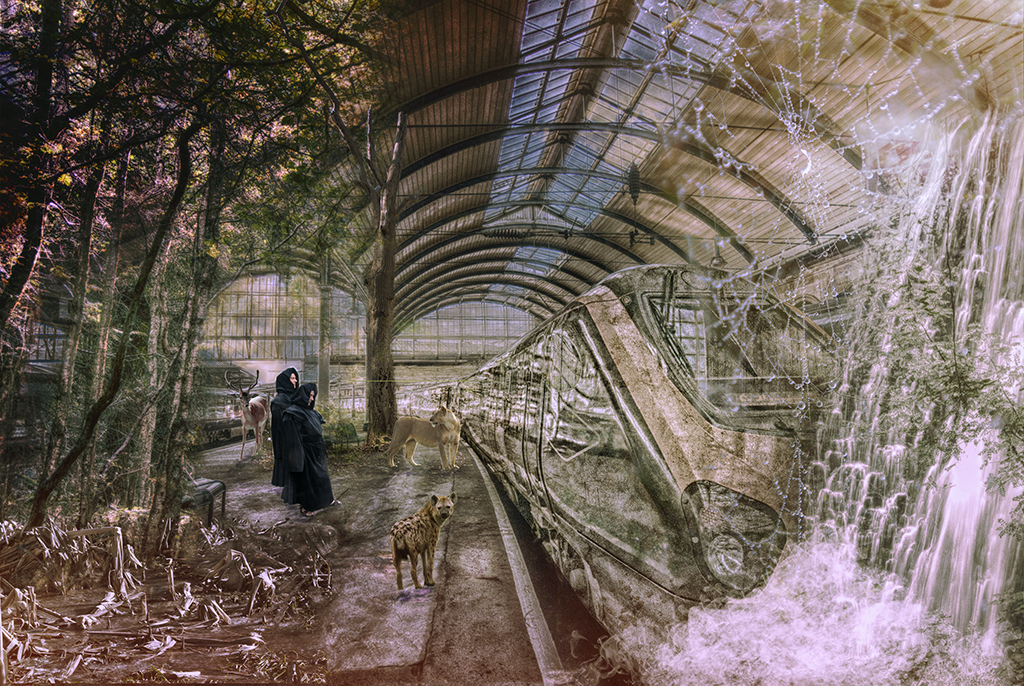
Yet again you've got my nomination for image of the month!
Just wonderful. Everything about it just fits!
I love your imagination and skills. You're lucky to have a willing model too!
Thanks for making me smile yet again.
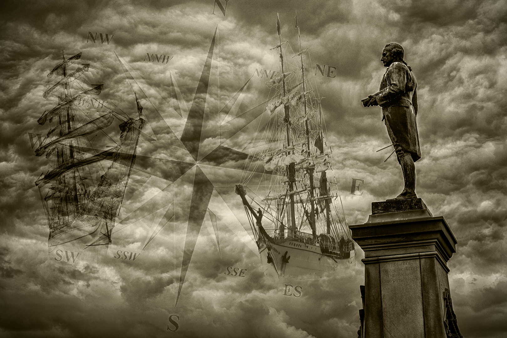
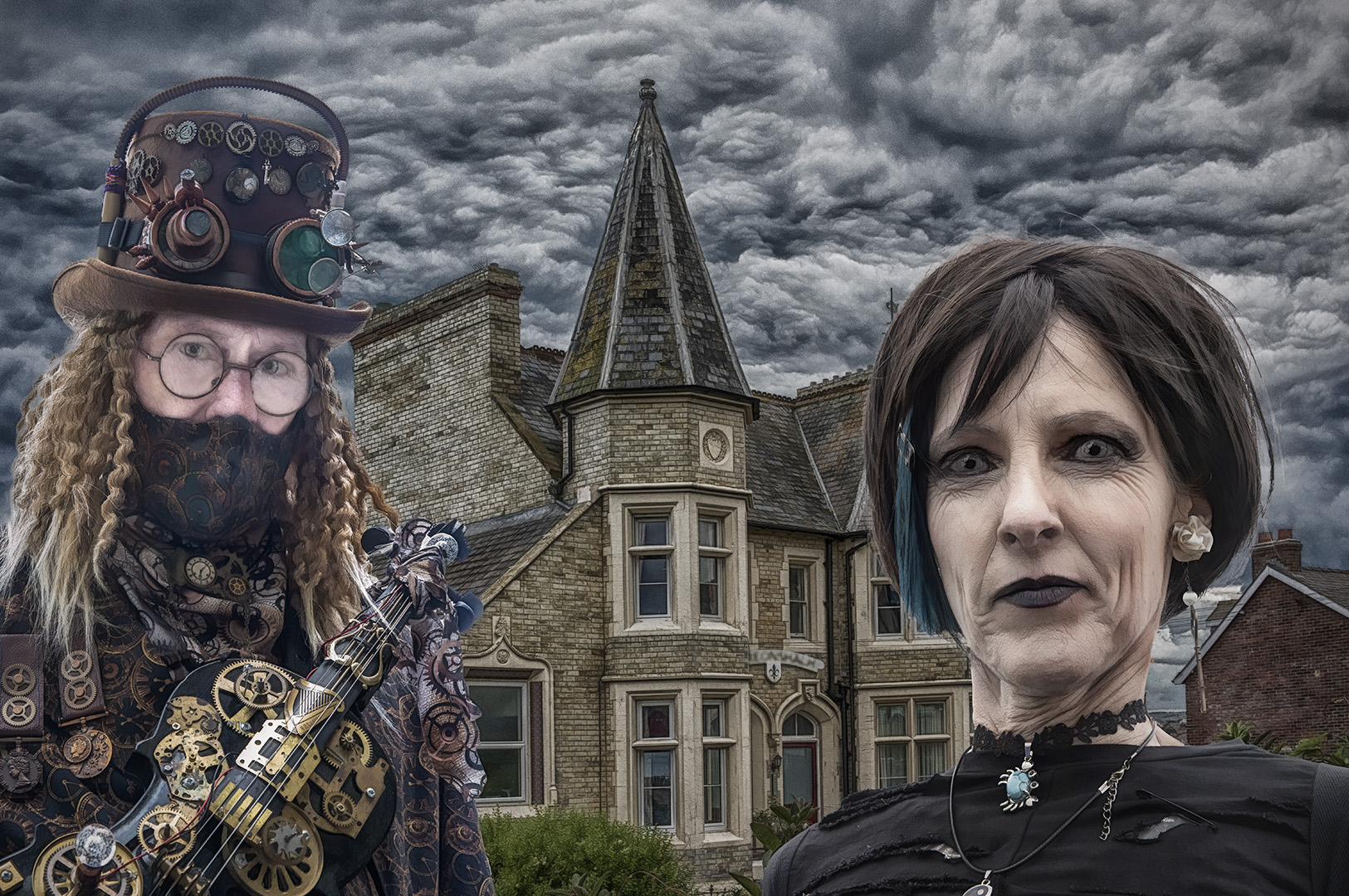
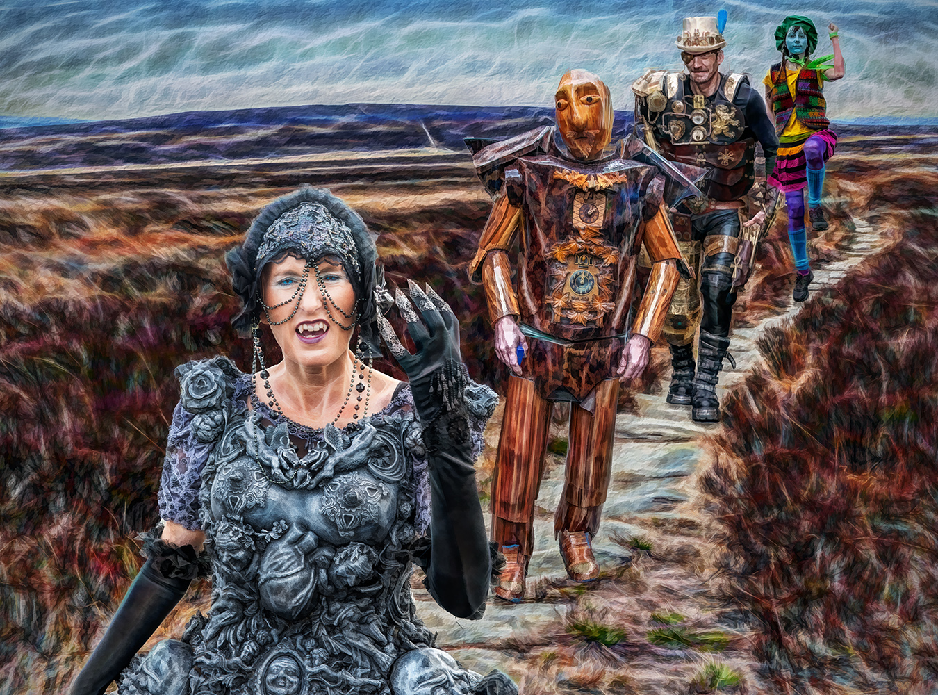
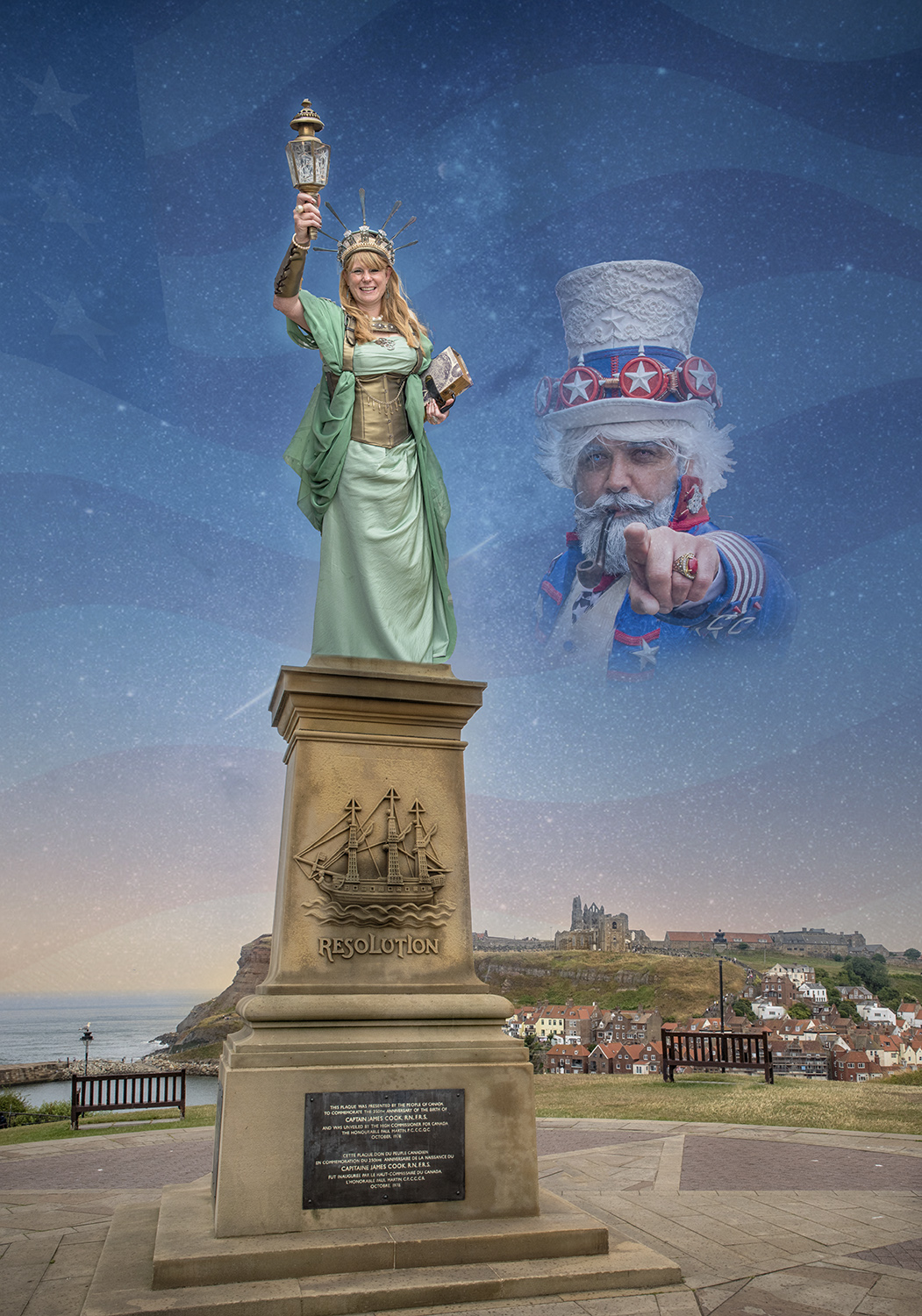
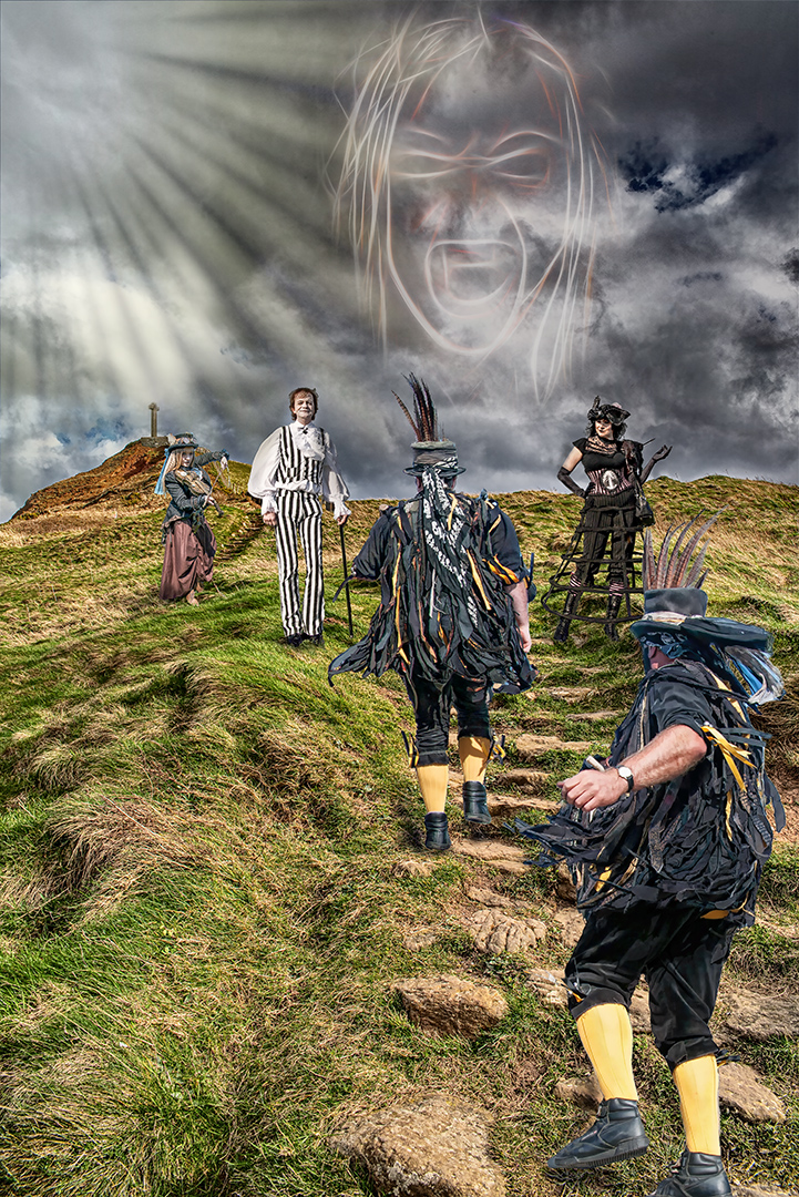
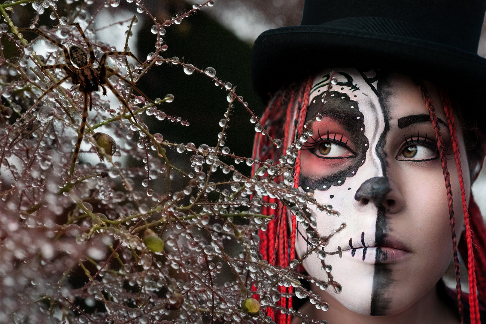
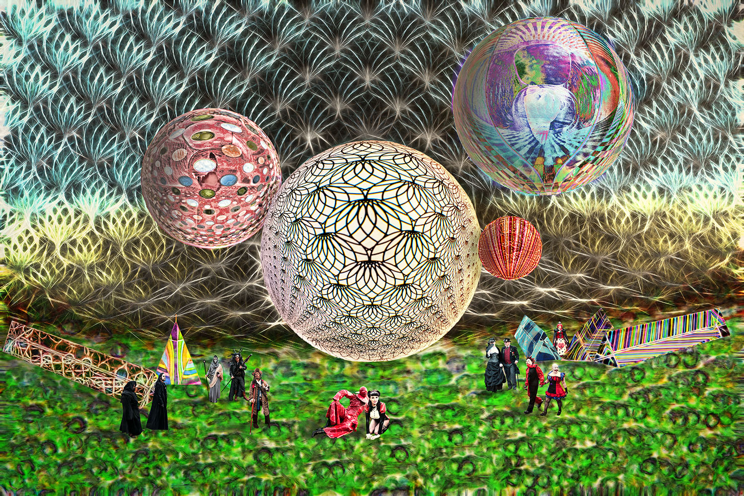
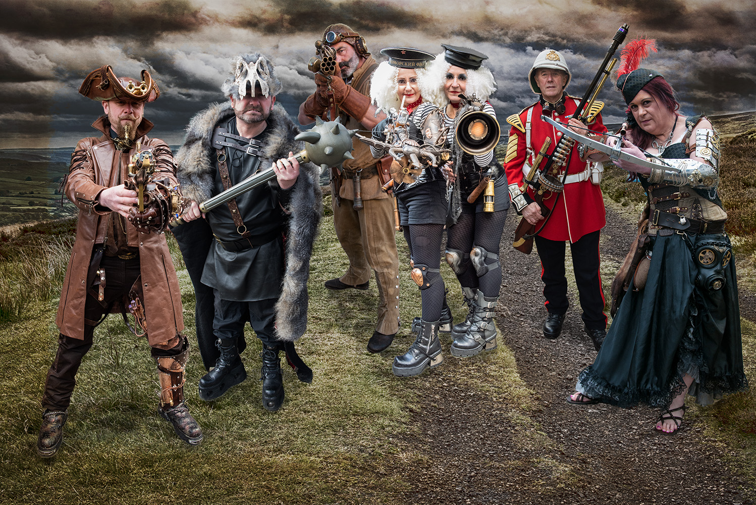
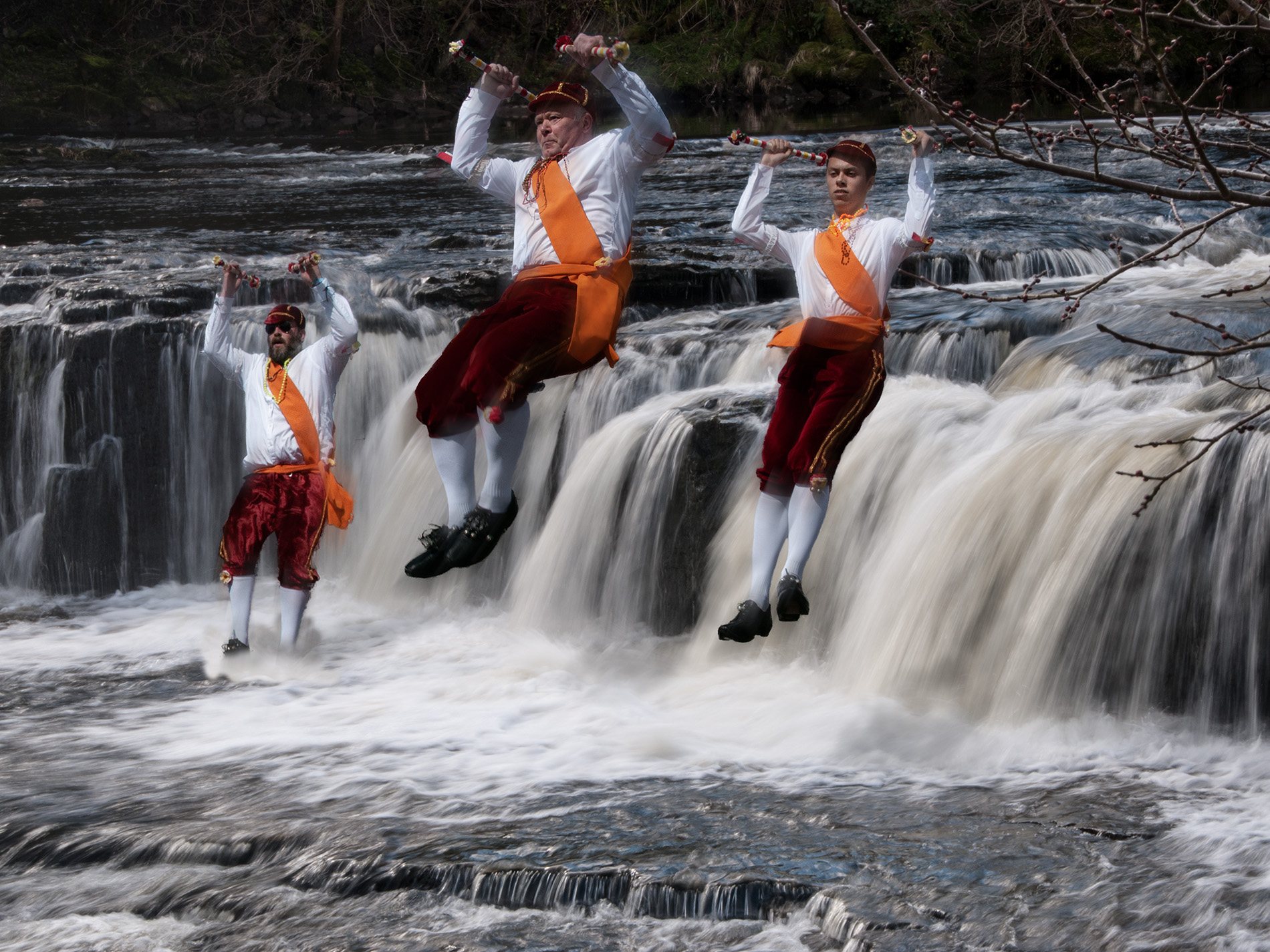
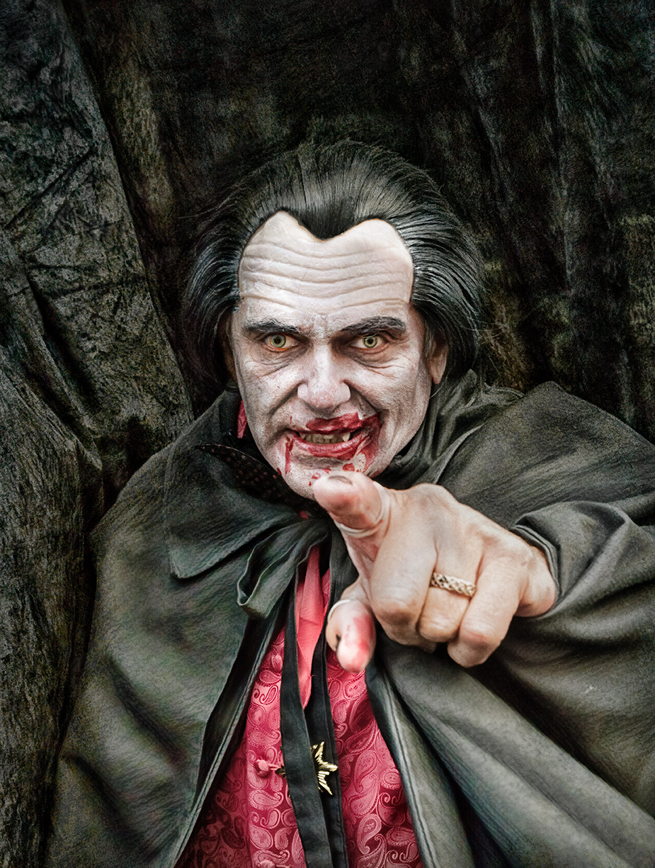
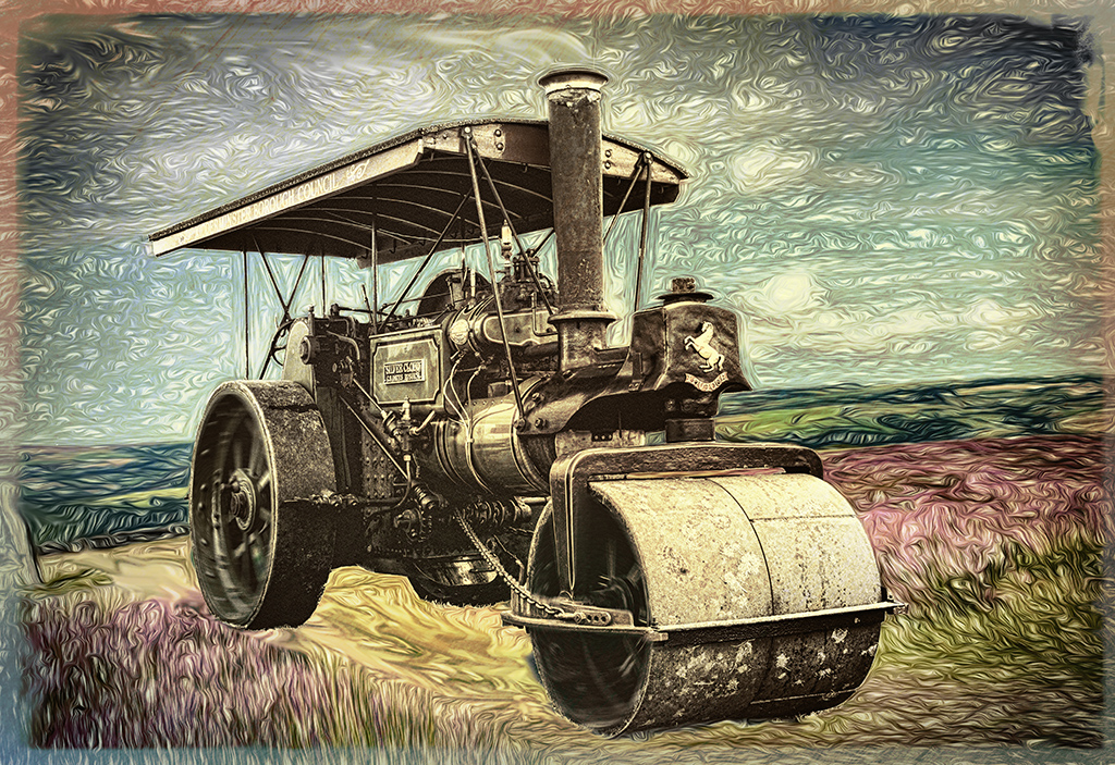
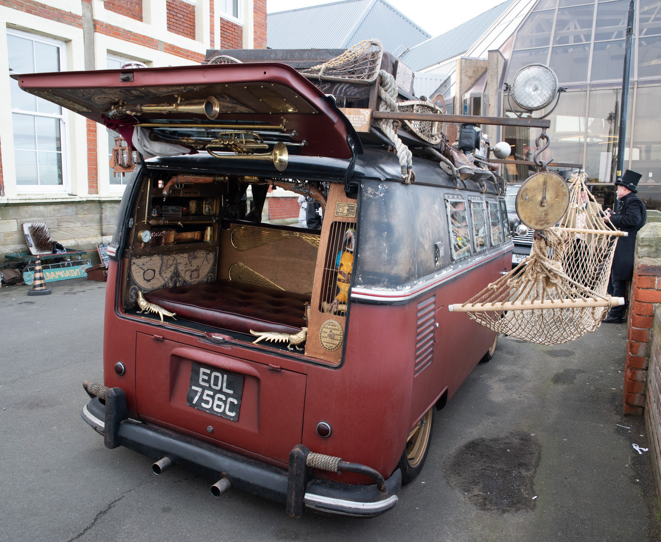
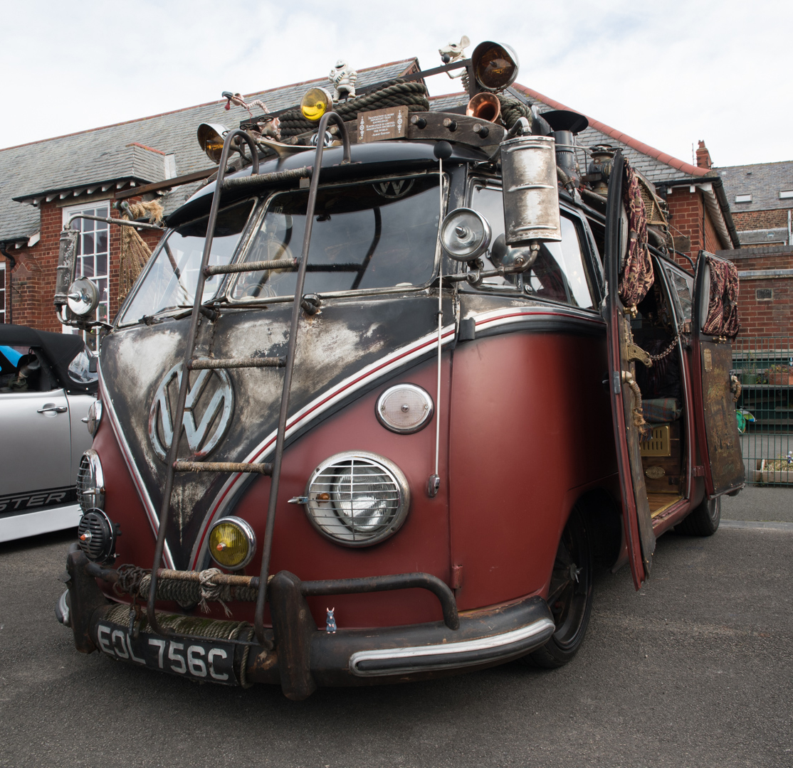
You'd enjoy our Goth and Steampunk weekends - here's an image of one of the Steampunk transports: |
Jun 10th |
 |
| 34 |
Jun 19 |
Comment |
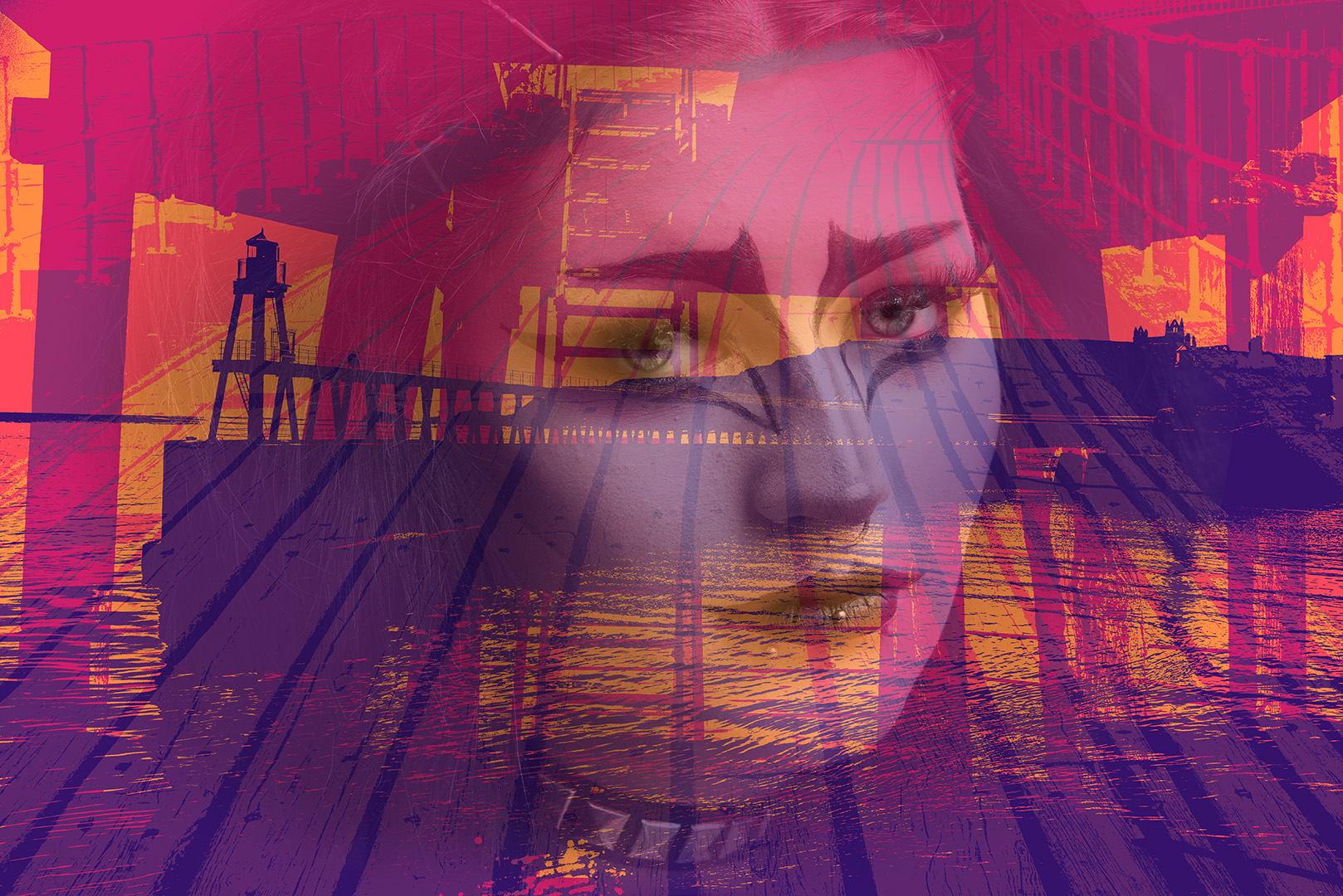
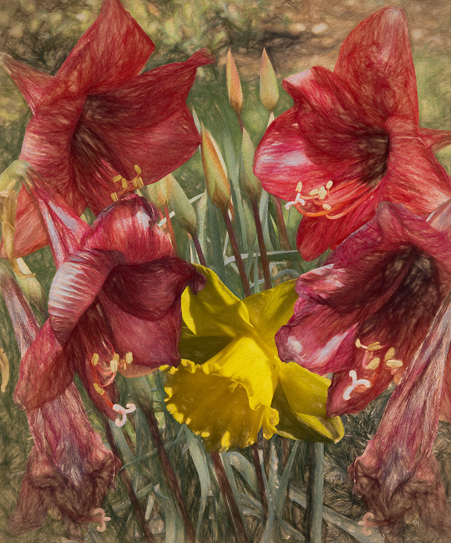
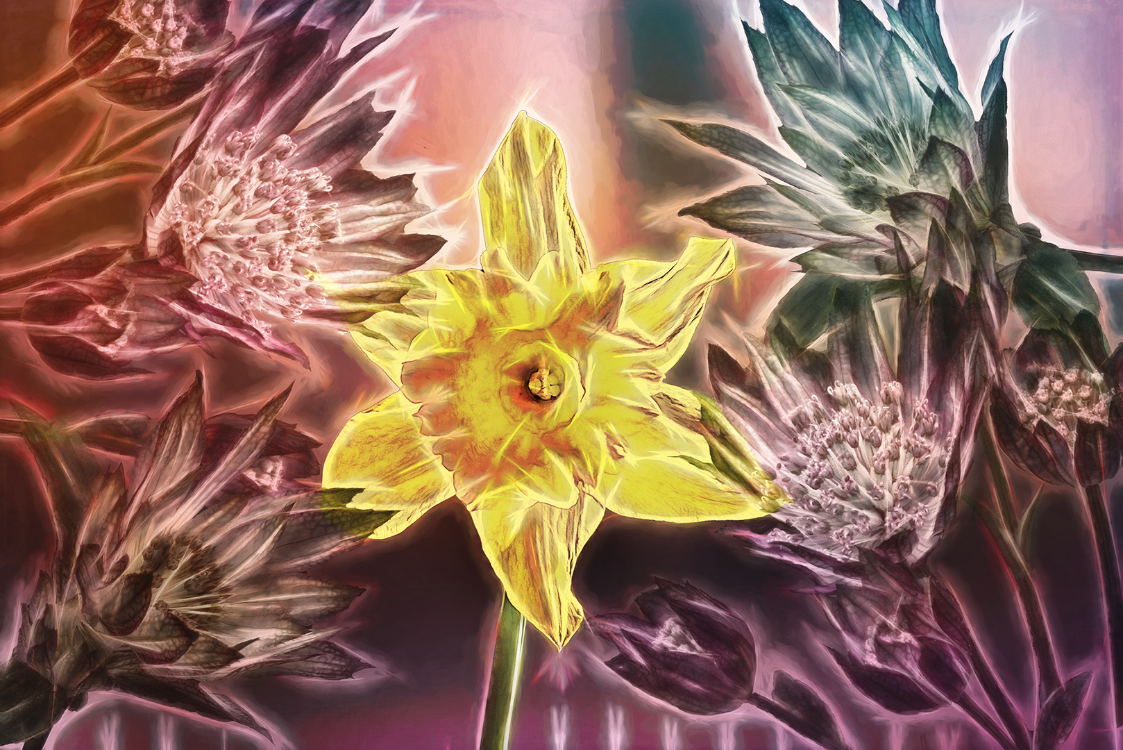
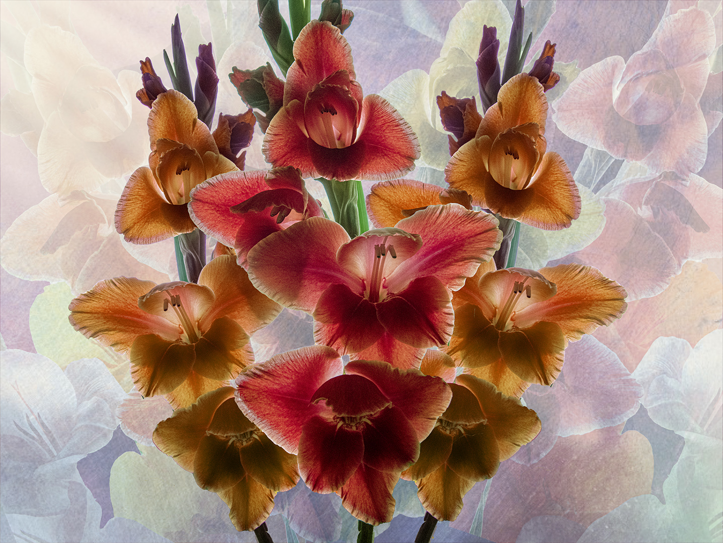
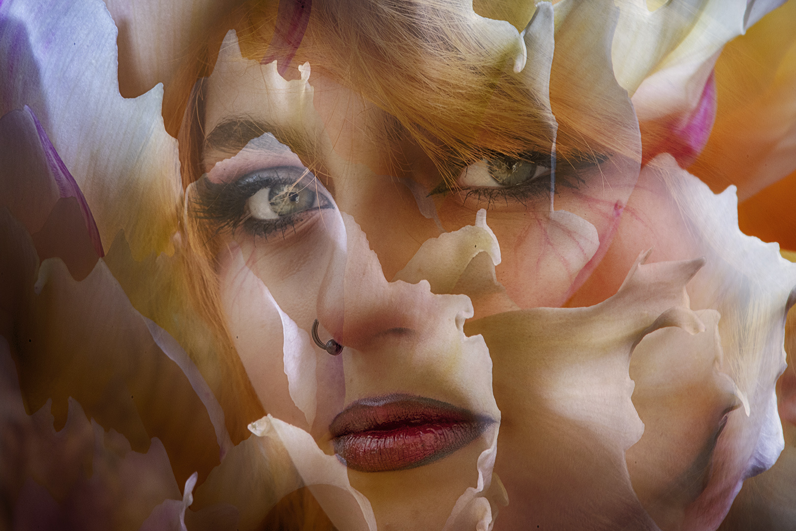
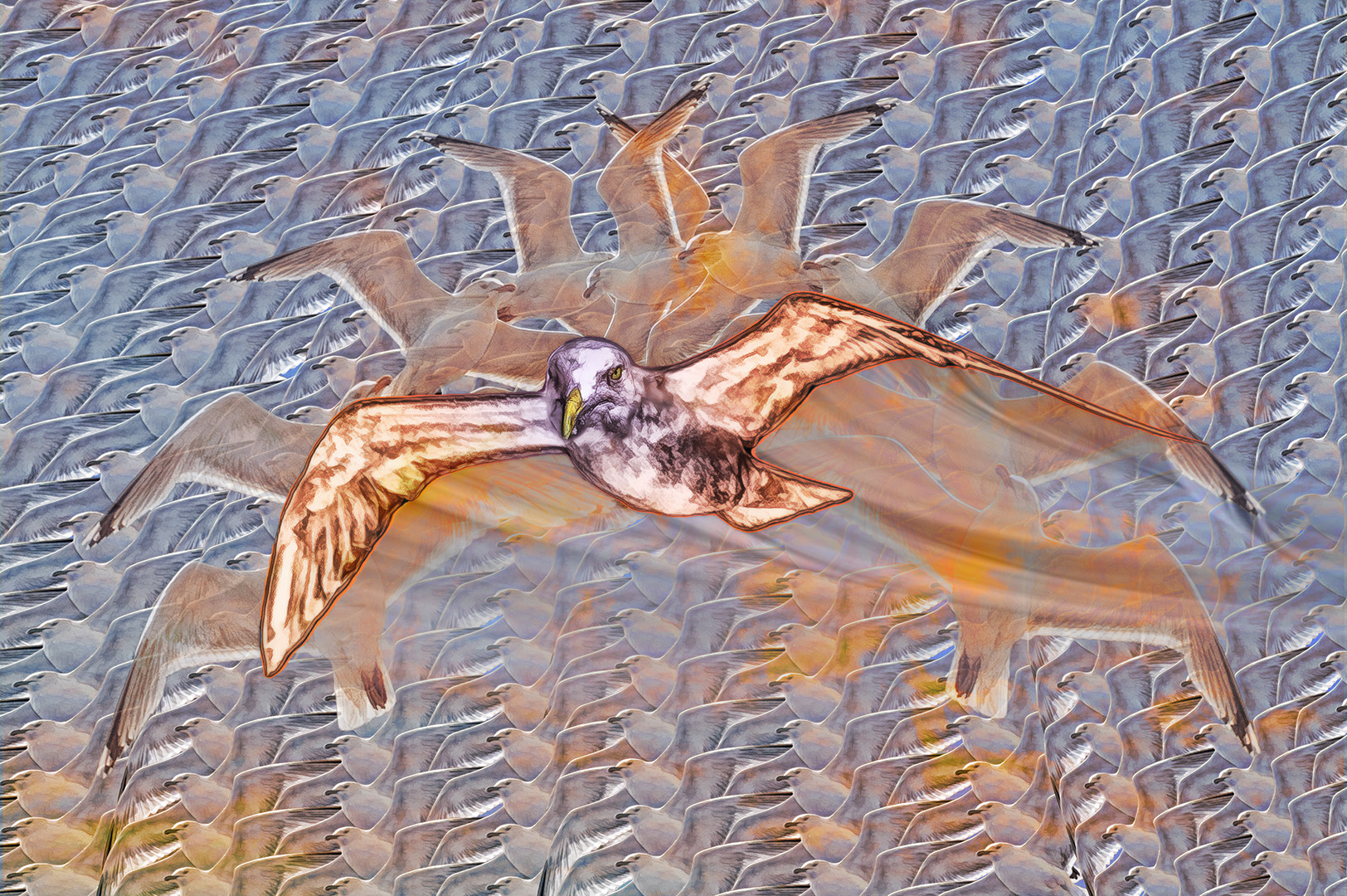
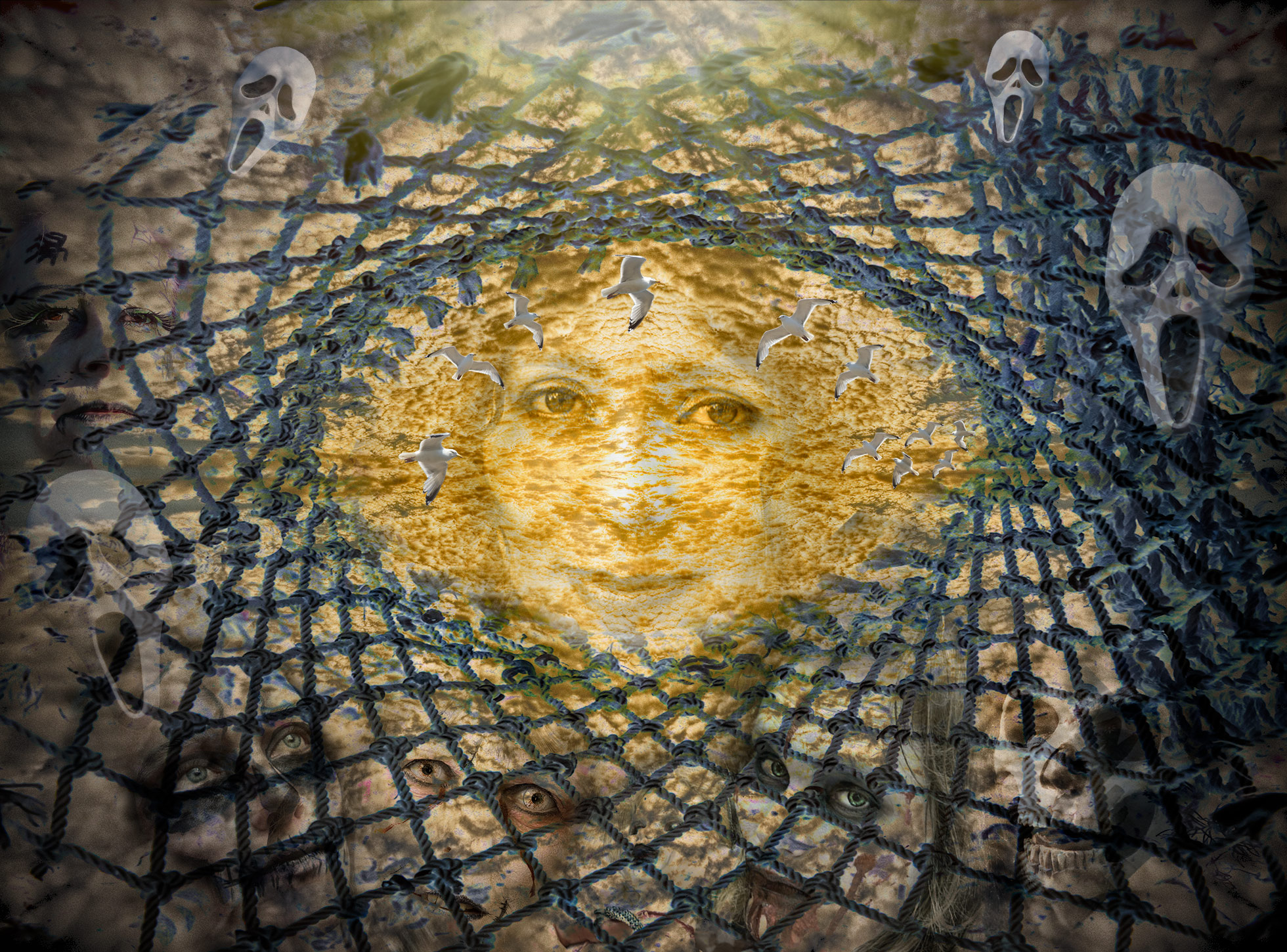
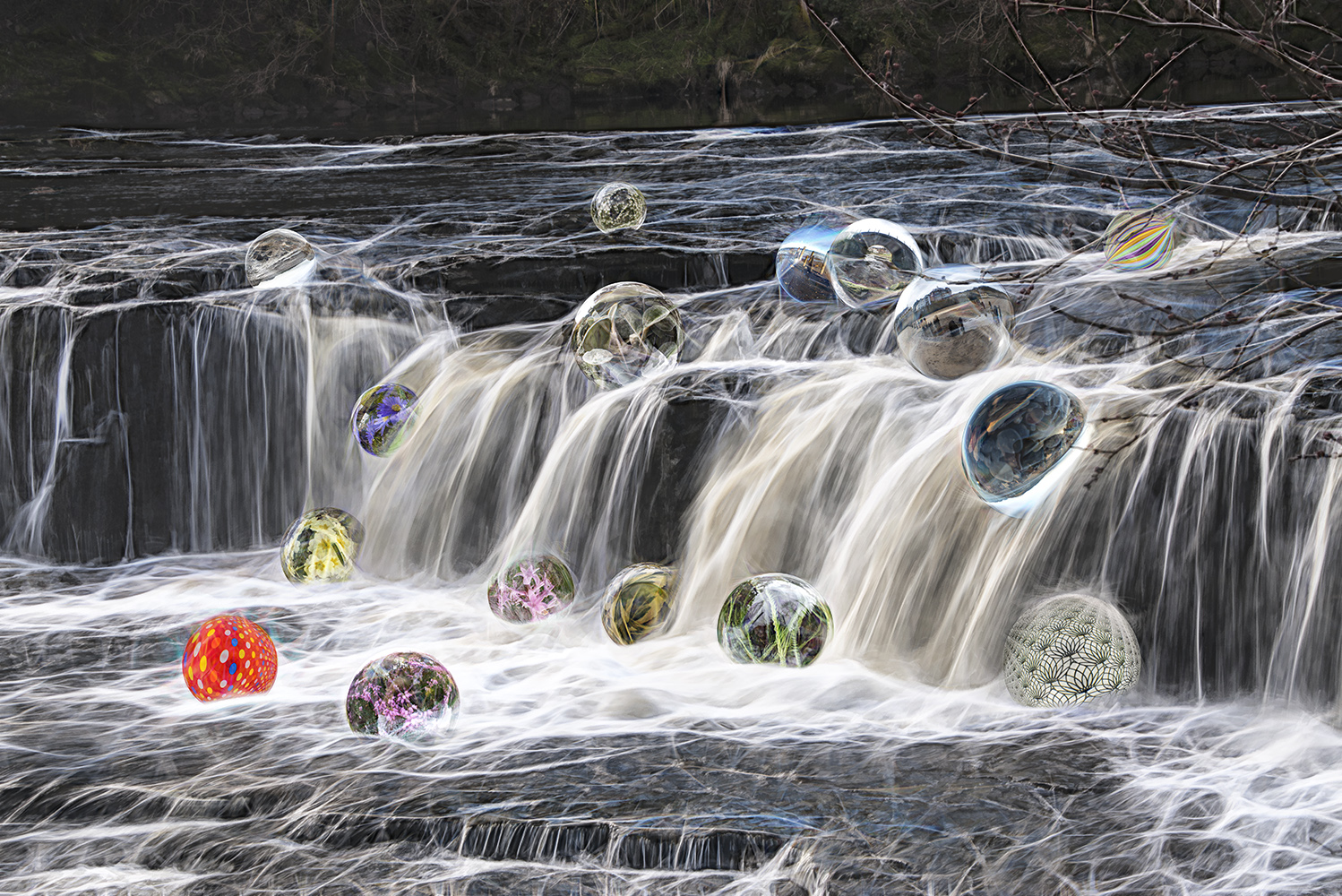
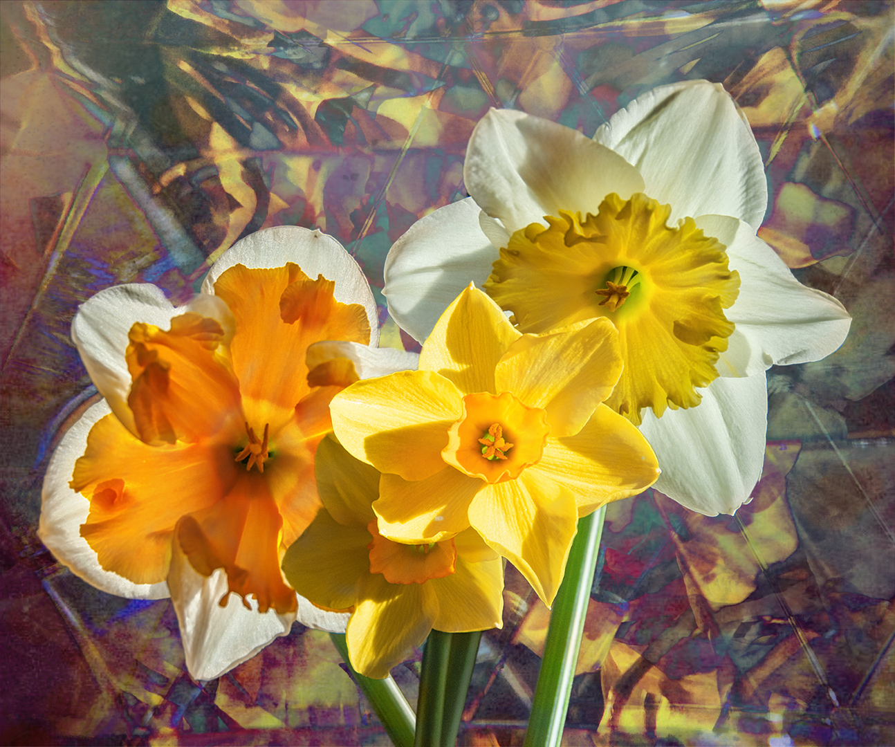
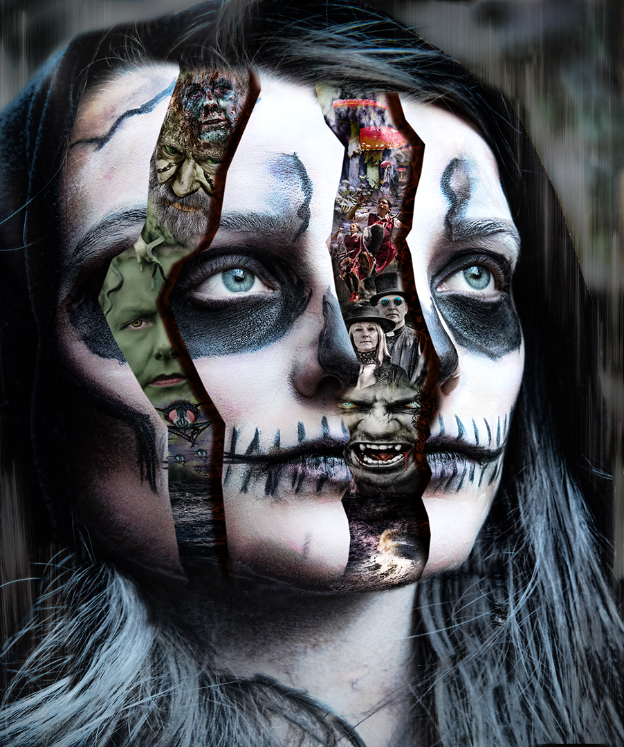
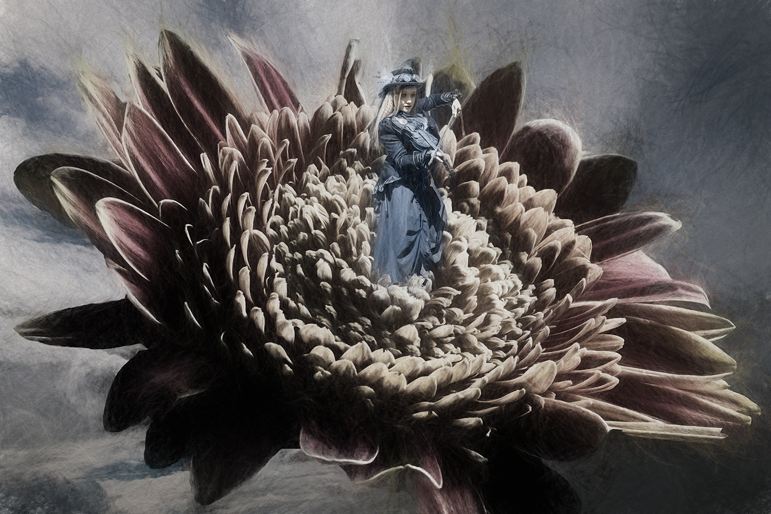
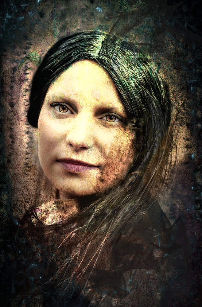
Thanks for a wonderful image. It's amazing what can be done with swirls!
I think it was Helen that first showed us the twirl effect - in April 2017, then Georgianne showed us the link in February 2018. The link is given on the 'General Info' tab at the top of the page.
Thanks again for your image. I know you're still having computer problems, but you keep these fine images coming! |
Jun 10th |
| 34 |
Jun 19 |
Comment |
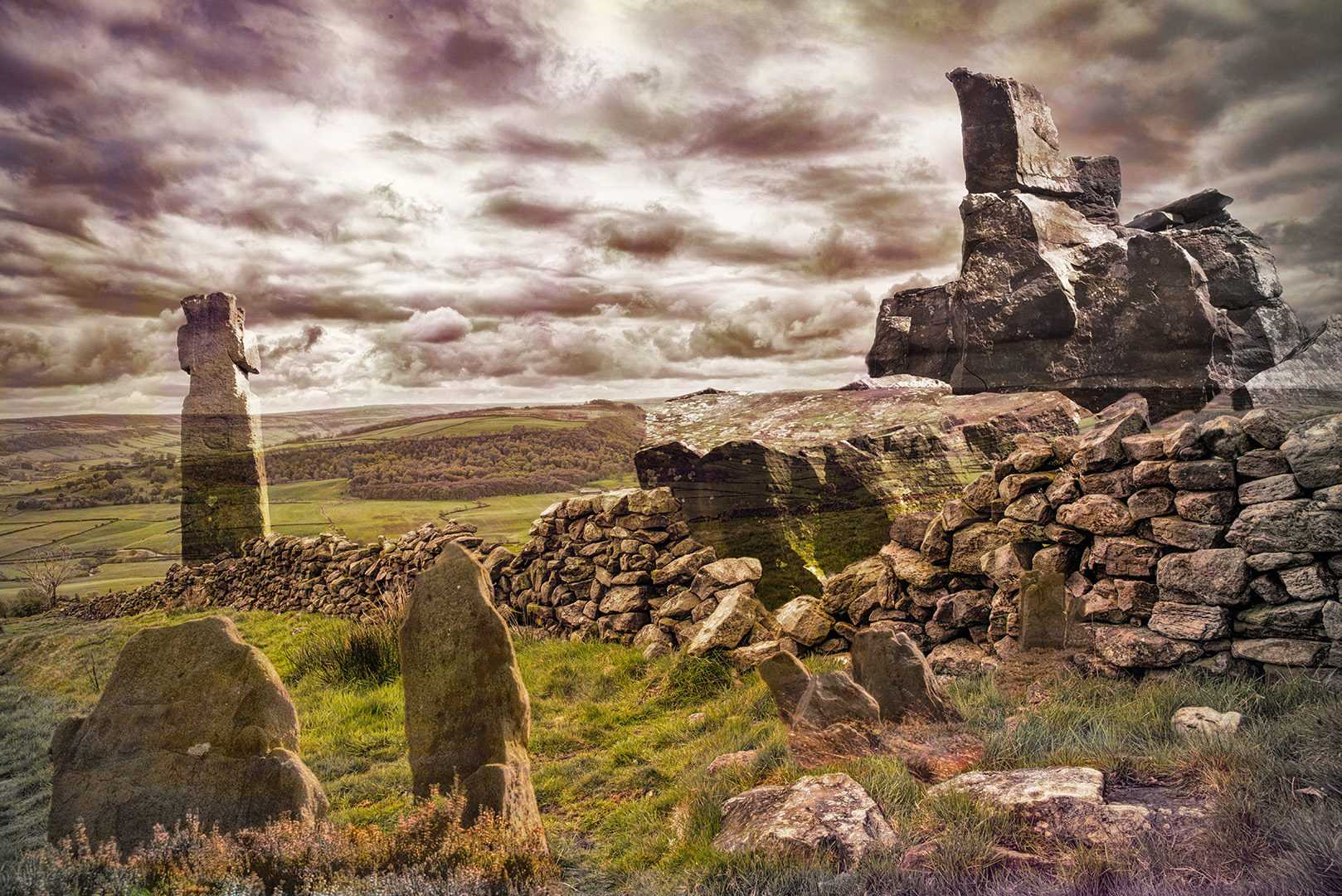
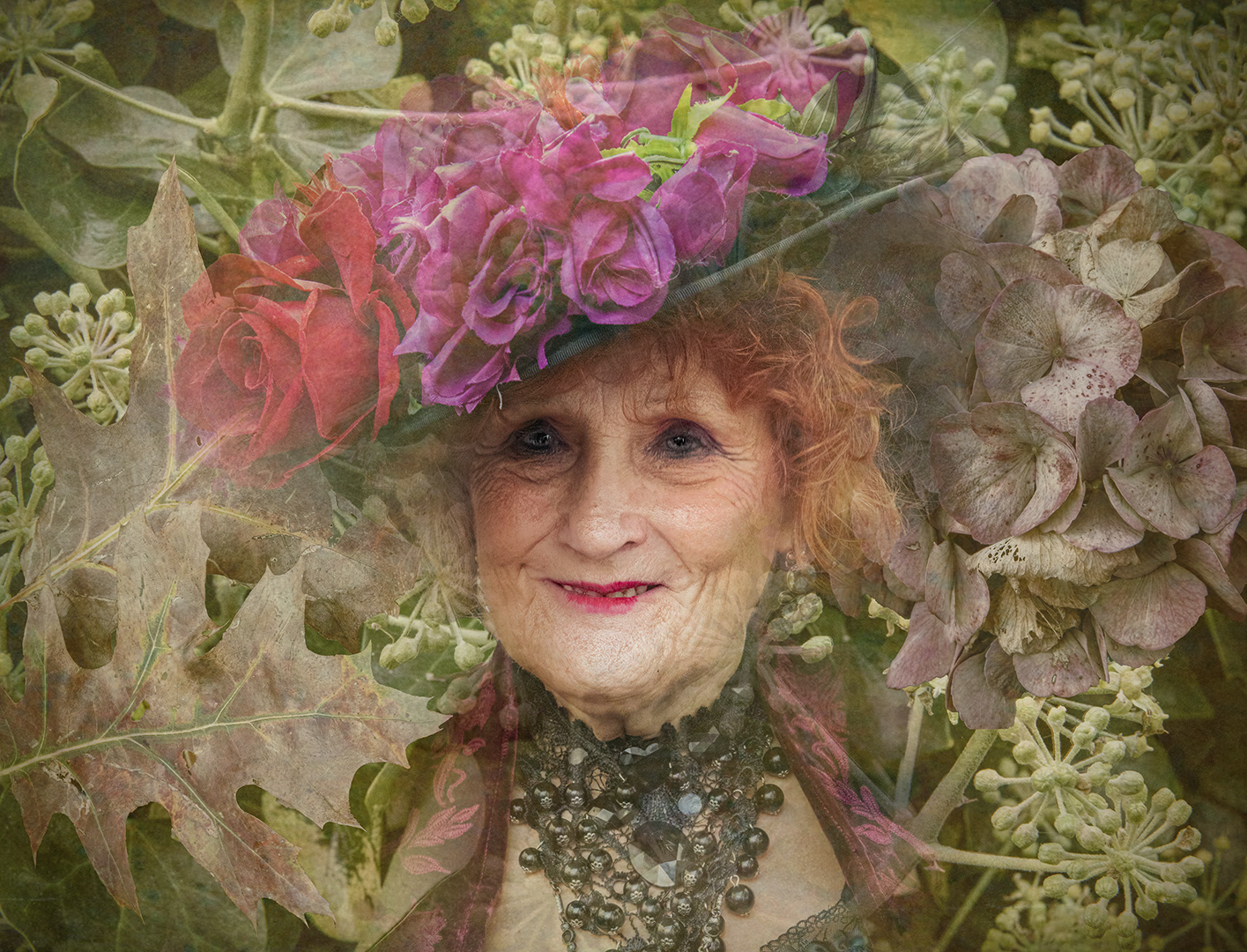
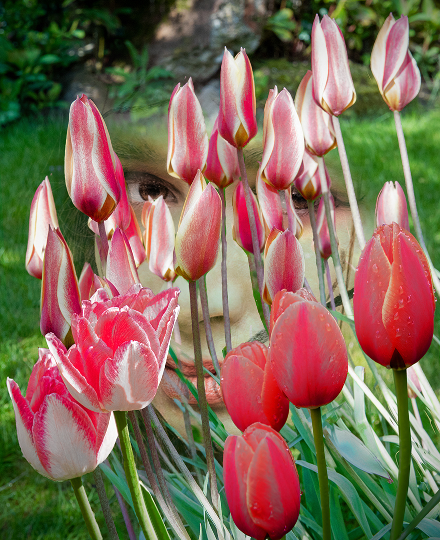
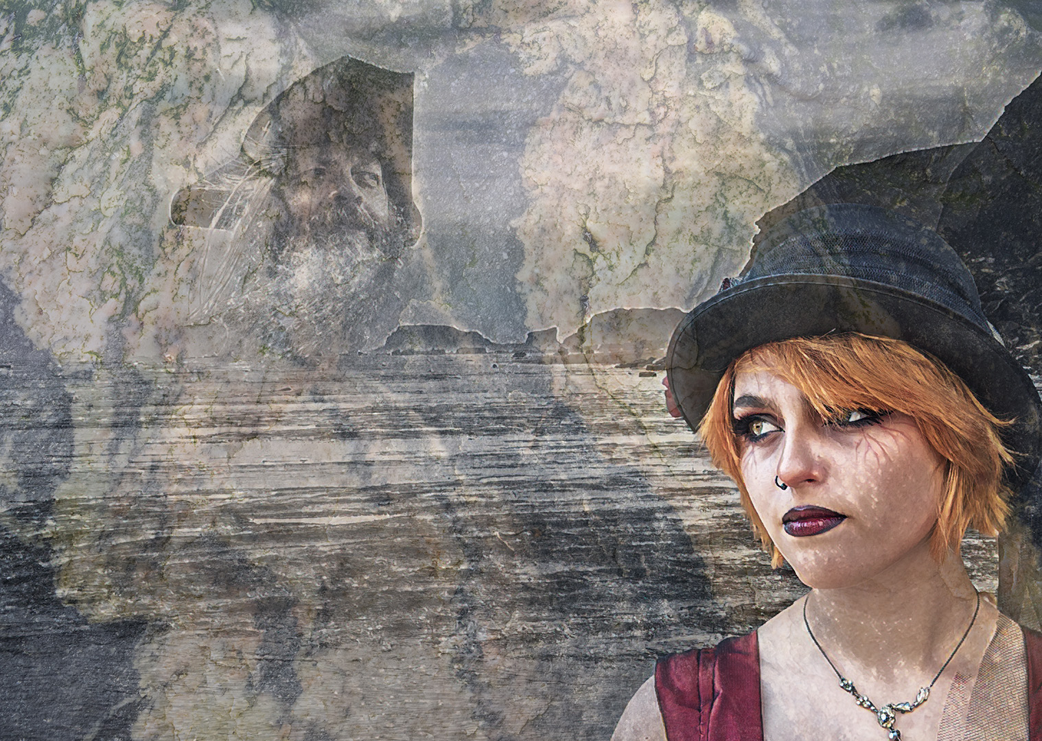
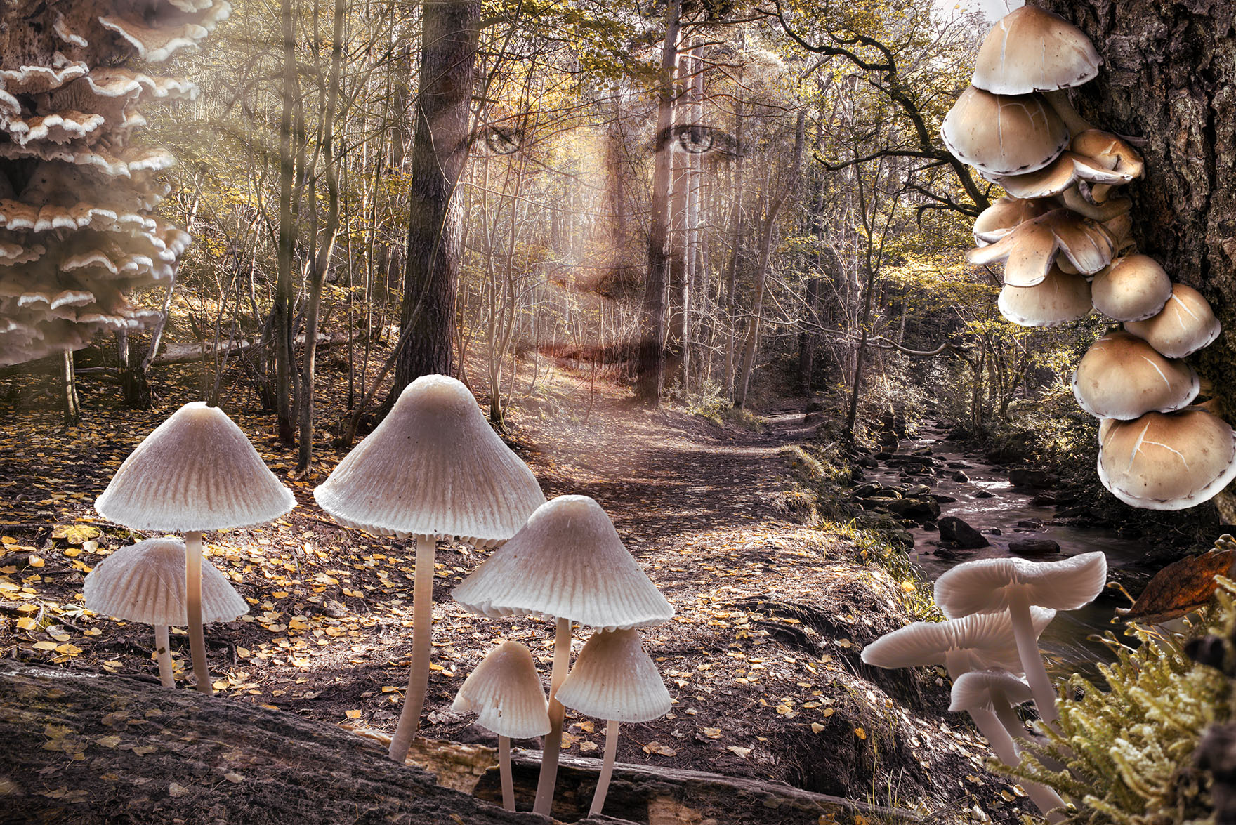
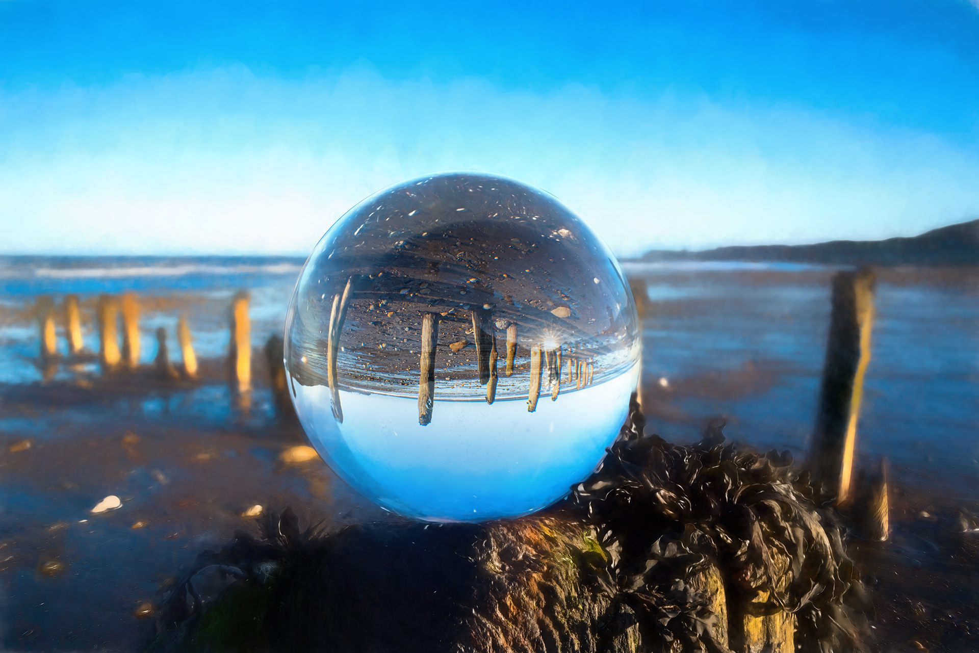
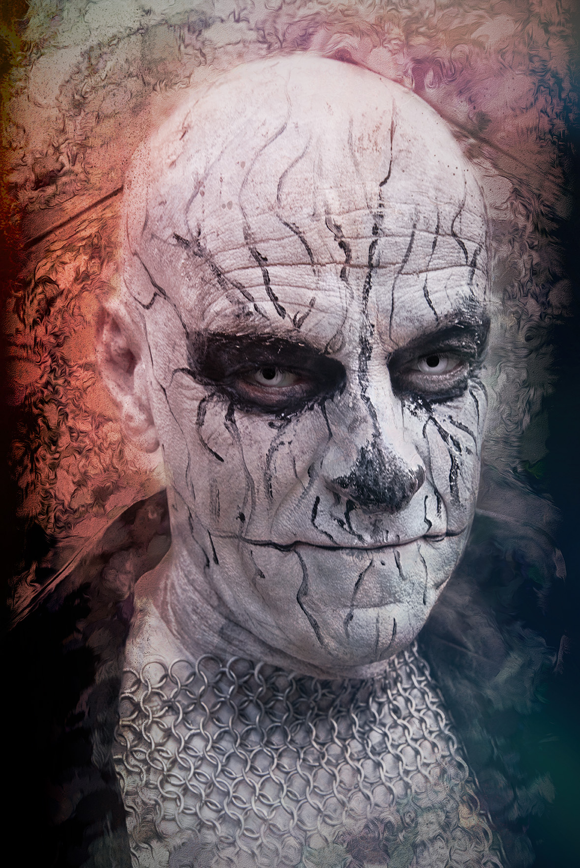
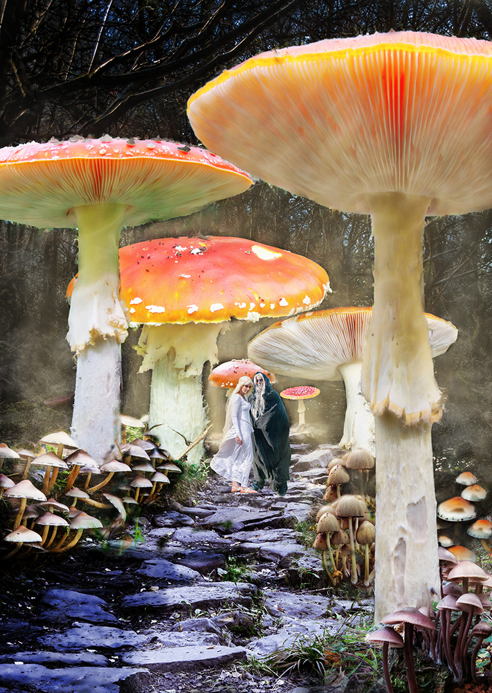
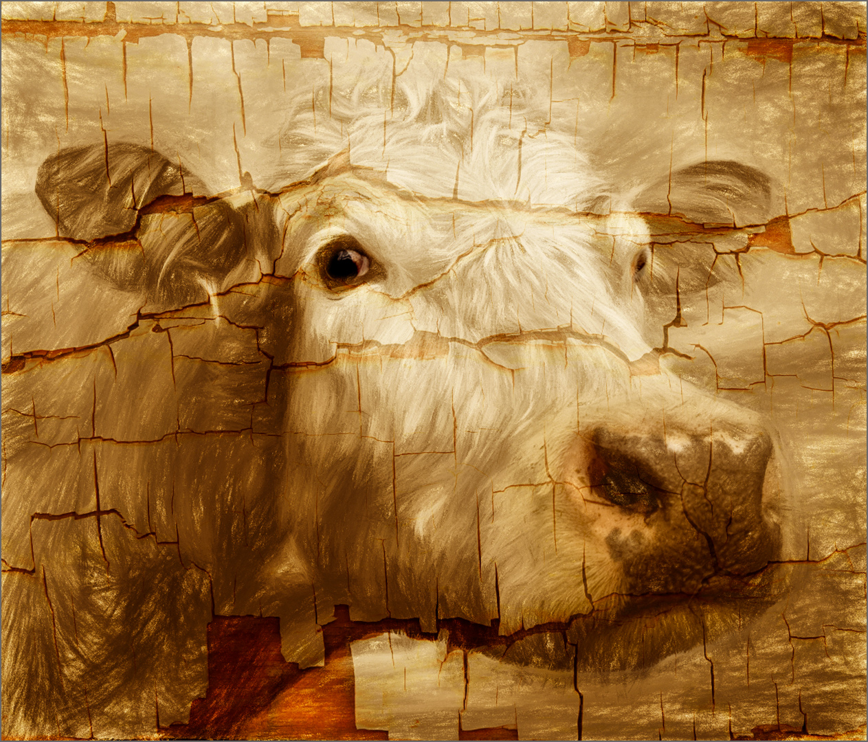
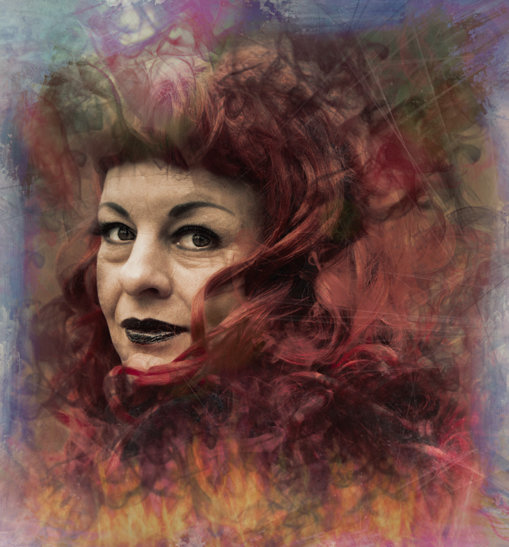
This is excellent.
You've created an almost mystical image which works so well.
I think the use of the texture (along with your composition) is what's made it so successful.
Well done Georgianne and thanks for the detailed explanation to go with it. |
Jun 10th |
| 34 |
Jun 19 |
Comment |
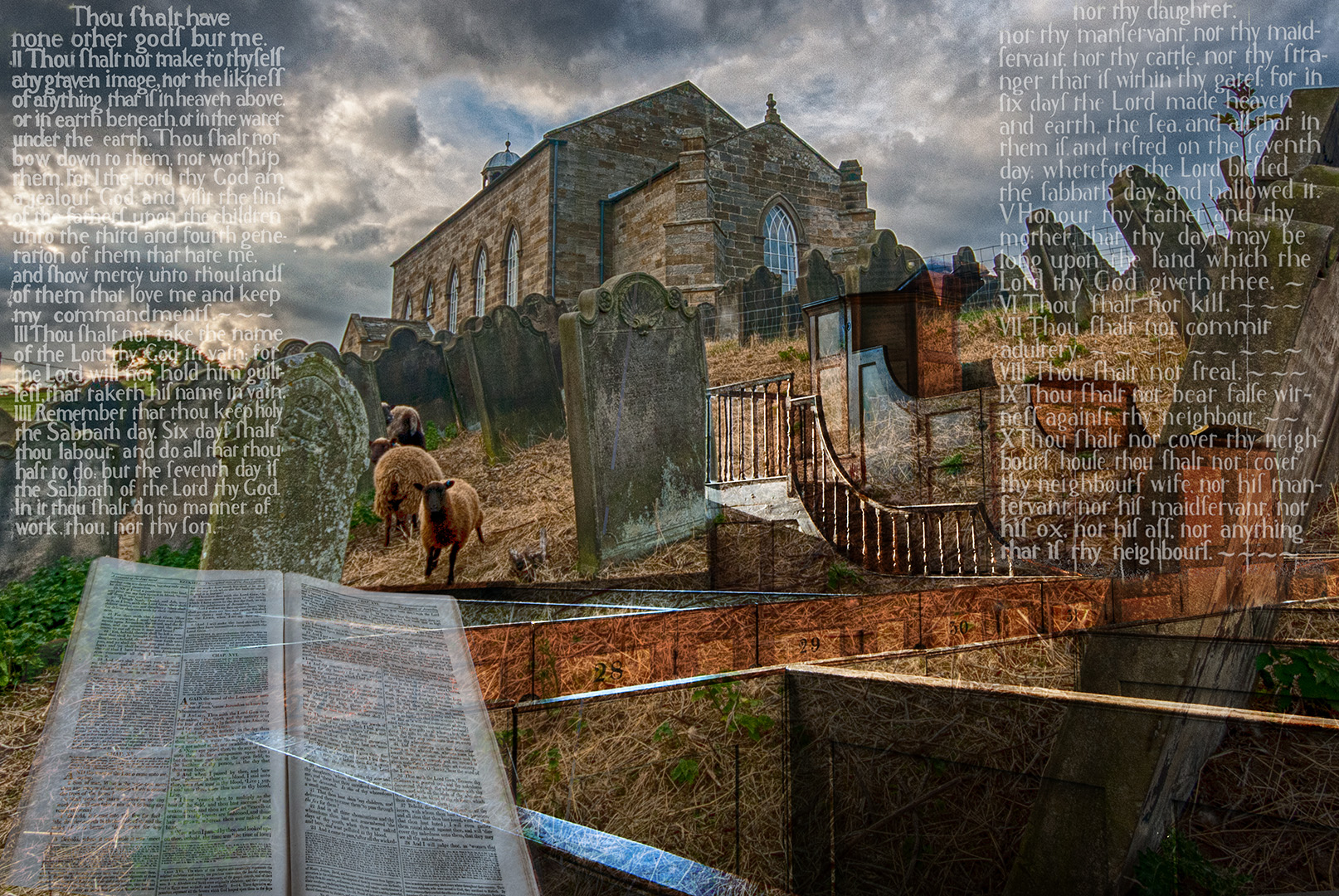
An interesting composition, but one that's left me wondering a little.
For me, the sheets of music should be blowing away from the composer / piano, towards the ballerina, (who's dress is blowing in that direction, as are the tops of the waves in the distance) and not floating straight up. Some reduction in size as they get further away may help.
It's a shame the piano is out of focus too - everything else in the image is sharp, so it can't be construed as being a lens effect, as the composer at least would be out of focus. The original of the piano is crisp, so it must have been something that went wrong with the selection (unless it was intentional).
The shadows also need some attention, as those of the composer and piano are in a different direction to those from the sheets of music and ballerina. these could be corrected on the individual layers, using the navigation tools (with Ctrl and / or Shift), or the warp tools.
Sorry if it all sounds a bit negative, but there's a potentially good image here, with a bit more work.
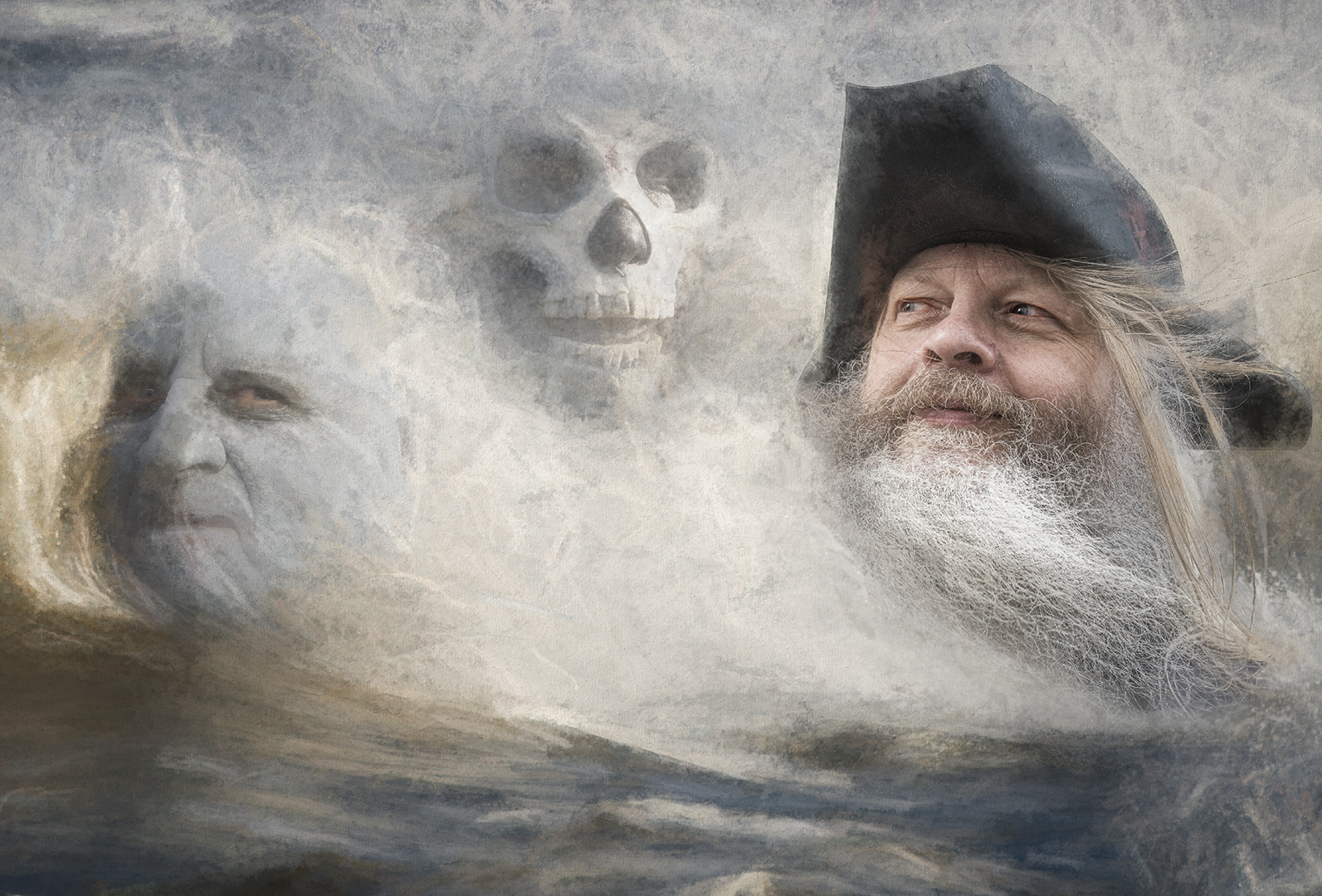
By the way - What is your witch's brew? |
Jun 10th |
| 34 |
Jun 19 |
Comment |
A very effective image. You've worked it well.
Since Alan talked about the line around the moon, it causes me to look at it - easy enough to remove with a small feather on the layer mask when you selected the moon - did you know that you can use the selection tools on a mask (it makes life easier). It's probably be a good idea to paint over the area in the grass where the moon can be seen (slightly).
But these are nit-picking points. I still like your image. It works well. |
Jun 10th |
6 comments - 1 reply for Group 34
|
6 comments - 1 reply Total
|