|
| Group |
Round |
C/R |
Comment |
Date |
Image |
| 34 |
May 17 |
Reply |
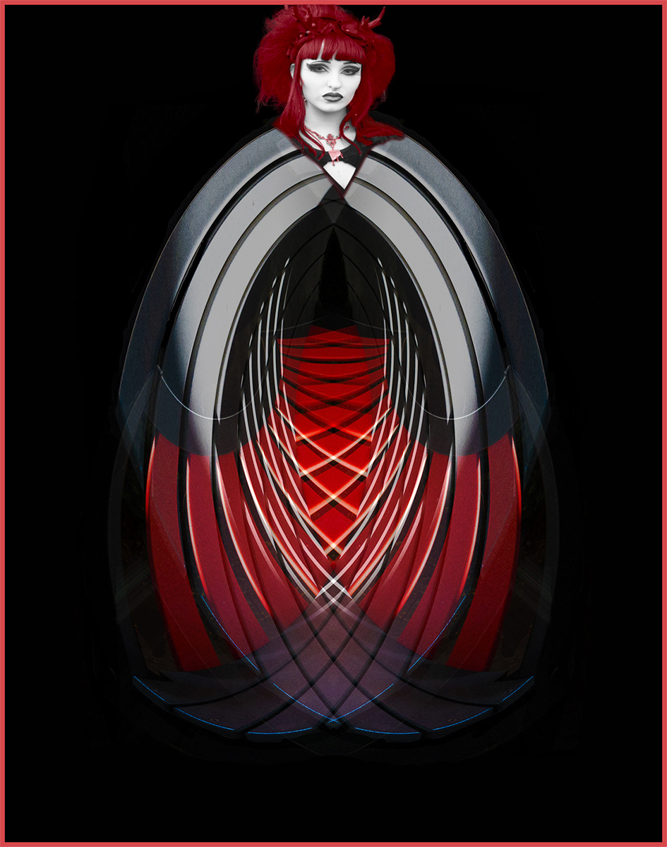
The people who come to the Goth weekends are a photographer's dream. They come wanting to make a statement (although sometimes it's hard to work out what it is!) and they're always keen to have their photographs taken. Some of them come as groups - there are many different genres - and they all enjoy the concerts (a relatively laid back one on the Friday night and a distinctly heavy one on Saturday) but they all come to enjoy themselves at a venue where almost anything goes. They're generally really nice people, despite some of their looks. I grab the shots when I can (great for street photography) but many are happy to pose - I leave them with a card, or they give me their e-mails for me to send the finished images. I've made quite a few regular friends along the way. Roll on October! |
May 8th |
| 34 |
May 17 |
Reply |
Thanks Jan
I'll ask for different eye positions next time. This last event wasn't quite as good - mainly because of the strong Northerly wind and rain. Hopefully October will be better! |
May 8th |
| 34 |
May 17 |
Comment |
An excellent job. Well done.
I agree with Phil about losing the portrait, to a degree - mainly because her mouth now seems to have a sneer. It would be better if the shape of her mouth had been retained.
I'd maybe have brightened the whole image too.
Adding the border under the gradient layer is a good idea.
Thanks for the instruction. |
May 8th |
| 34 |
May 17 |
Comment |
Well done Helen. It works well.
I agree with Phil's crop suggestion, as I feel there's too much black background - so I've cropped it.
I also burned a small shadow below the dancer - you can see where it would land from the ground below the dancer.
These are minor alterations - what you've done is excellent. Well done. |
May 8th |
 |
| 34 |
May 17 |
Comment |
I too like the B&W version, but why not do a mix?
I added a B&W adjustment layer with light purple tint above the B&W version, in Lighten color mode. I then placed original 2 on top of the stack in color mode at 25% opacity, then Nik vivesa to increase the saturation and structure.
Now there's some of both versions. |
May 8th |
 |
| 34 |
May 17 |
Comment |
You've made an excellent job of this Candy. I particularly like what you did to the wall.
My personal preference would be to have it a little brighter, for the digital display (especially with a black background), so I've increased the brightness using Nik Vivesa. For a print it will be fine! Well done. |
May 8th |
 |
4 comments - 2 replies for Group 34
|
4 comments - 2 replies Total
|