|
| Group |
Round |
C/R |
Comment |
Date |
Image |
| 34 |
Jan 17 |
Reply |
Hi Jan
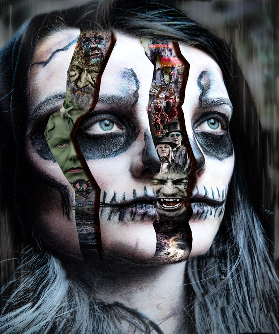
I had an idea to convert a layer to 'threshold' mode (altering the amount until you get the amount you're after) and then use a layer mask with the quick selection tool, which I used a few months ago. That made the separation much easier (I didn't use it here) and then apply the mask to the original layer - you can always tweak it a bit afterwards if required.
I doesn't work with all images, but it's another tool. |
Jan 22nd |
| 34 |
Jan 17 |
Comment |
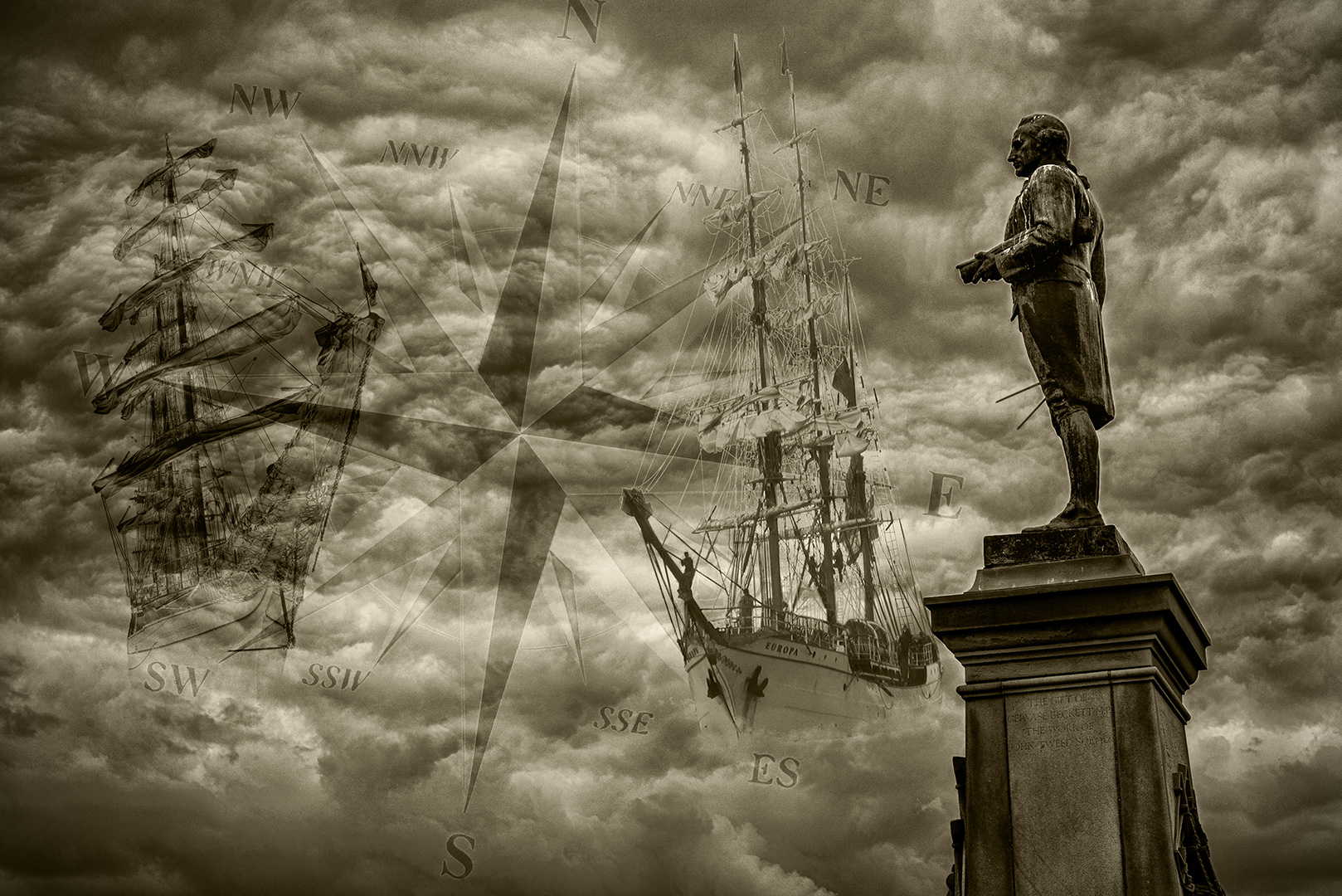
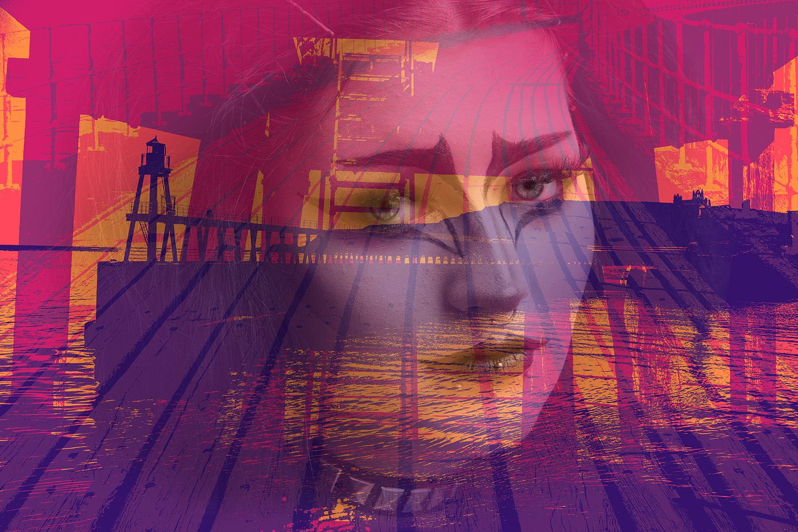
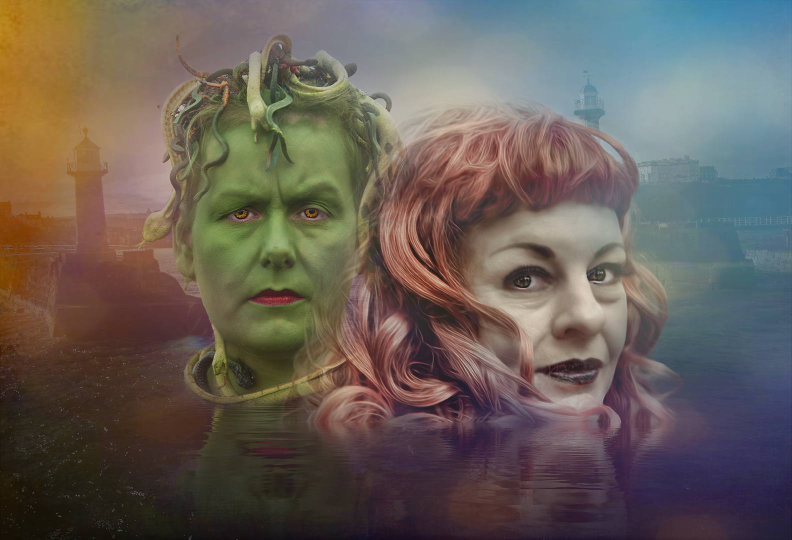
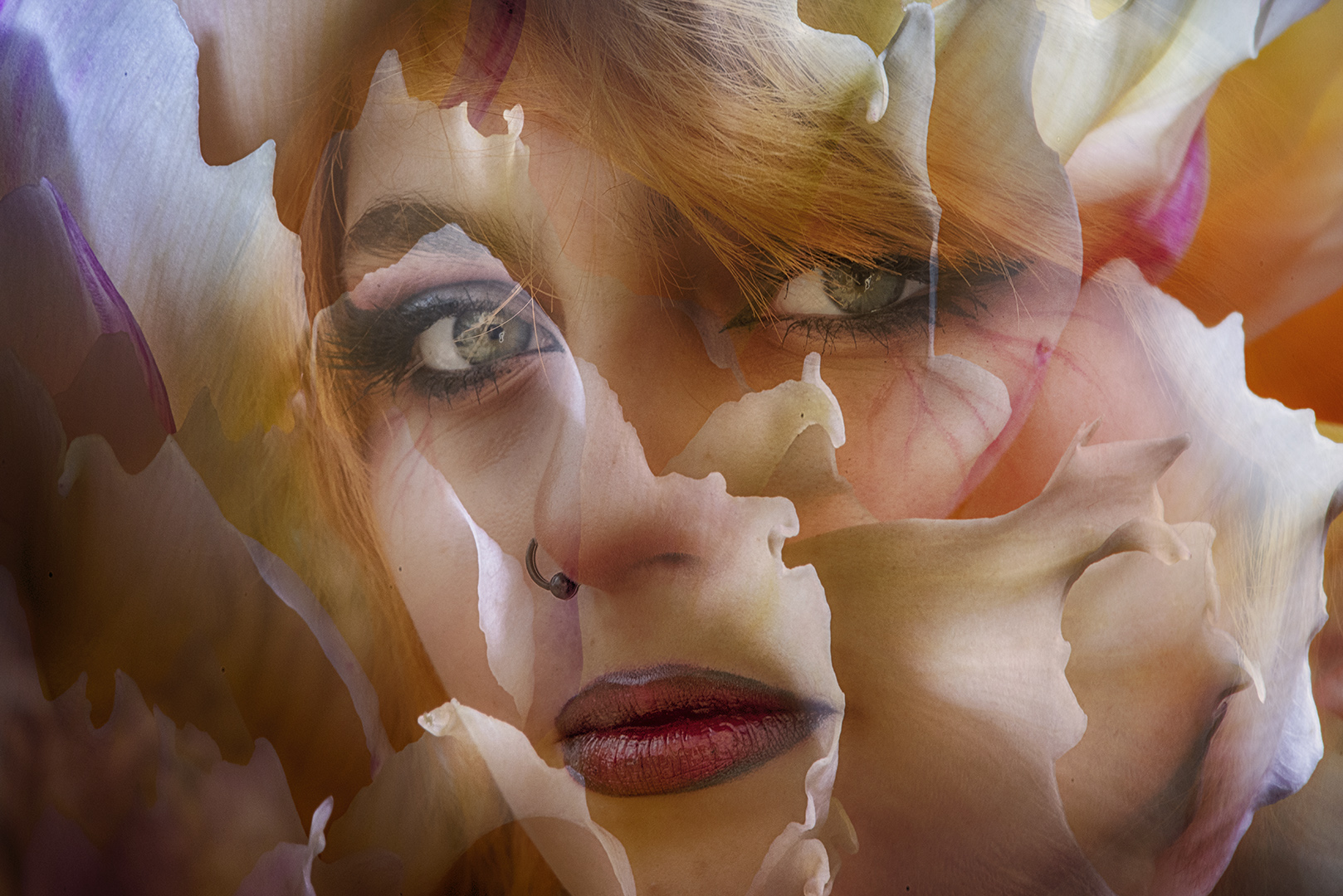
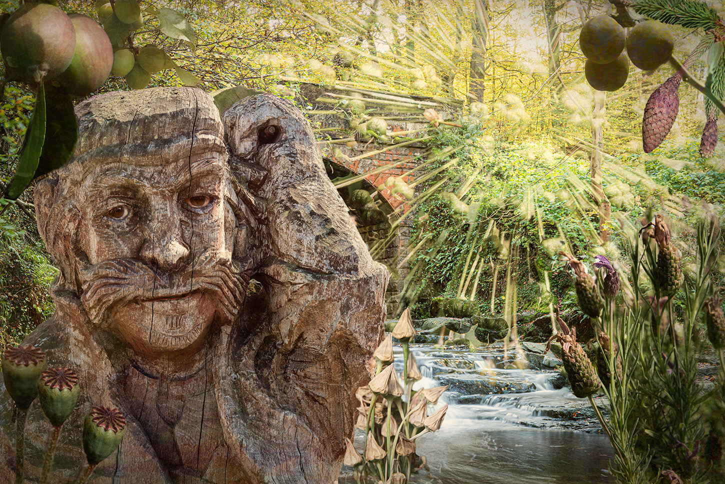
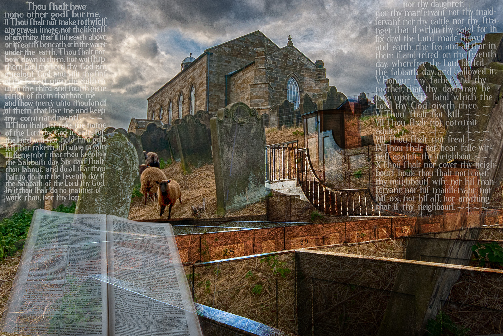
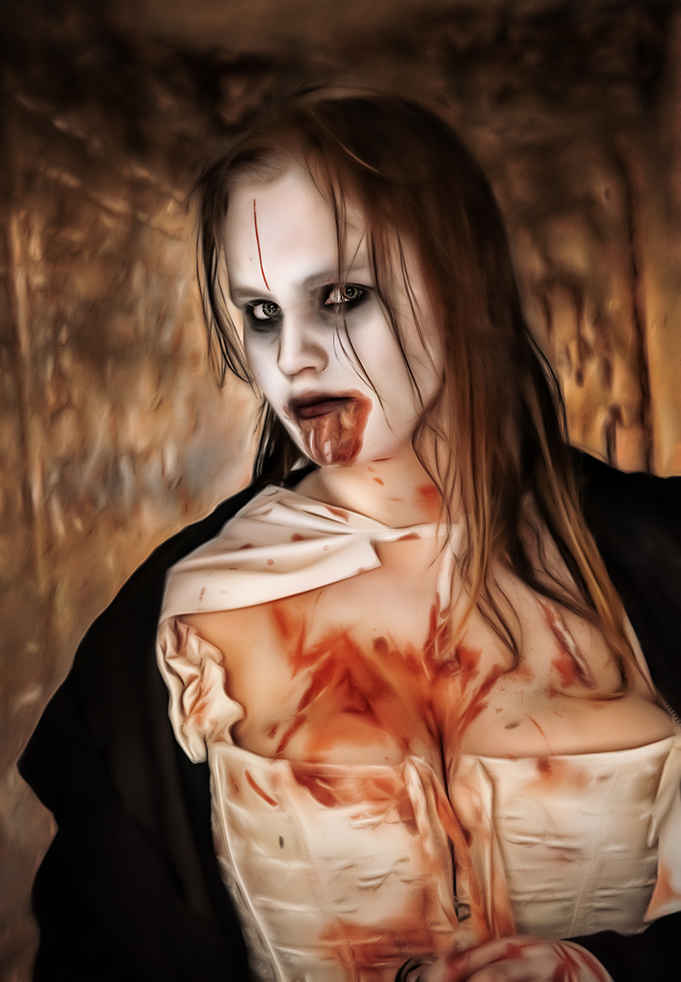
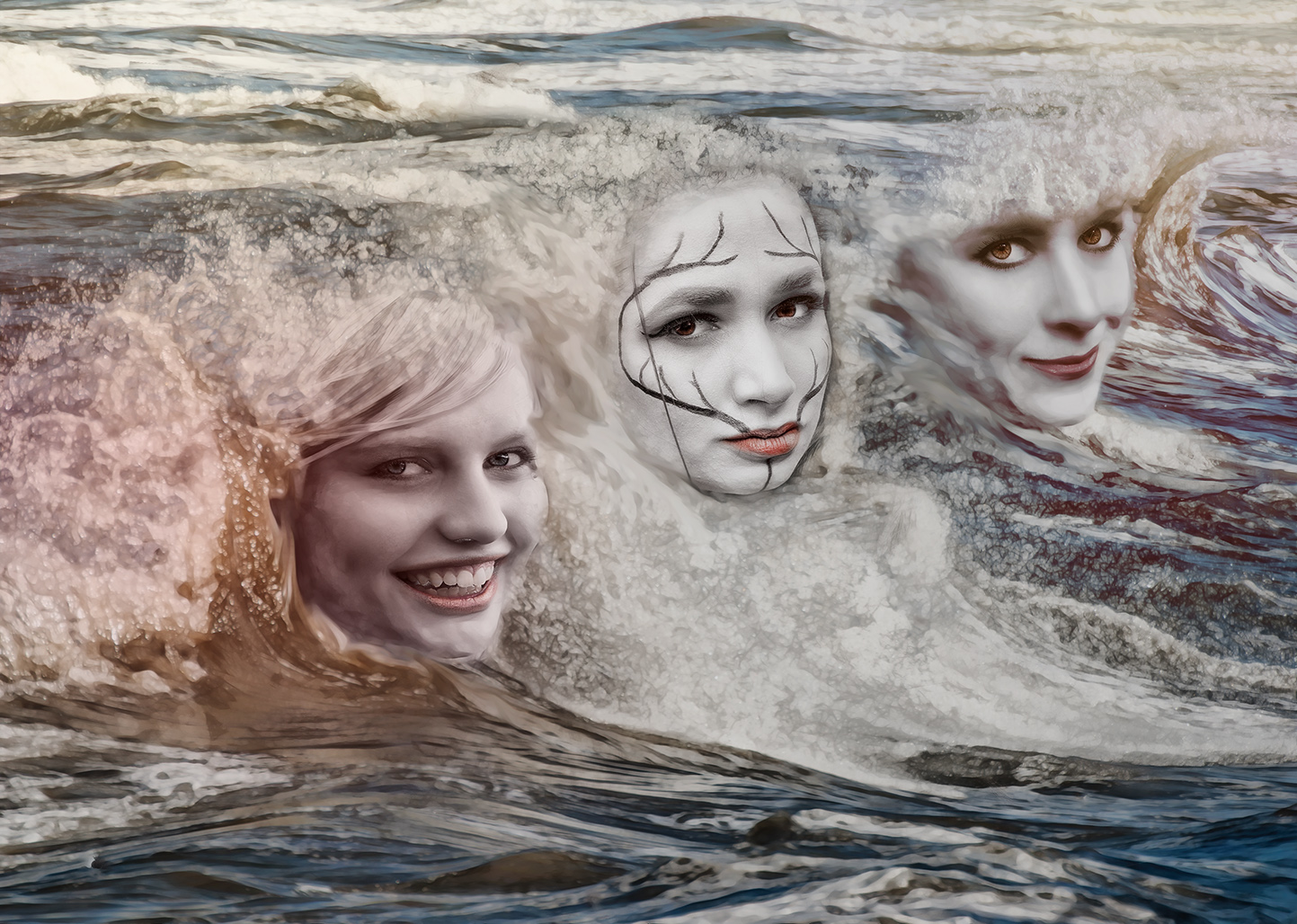
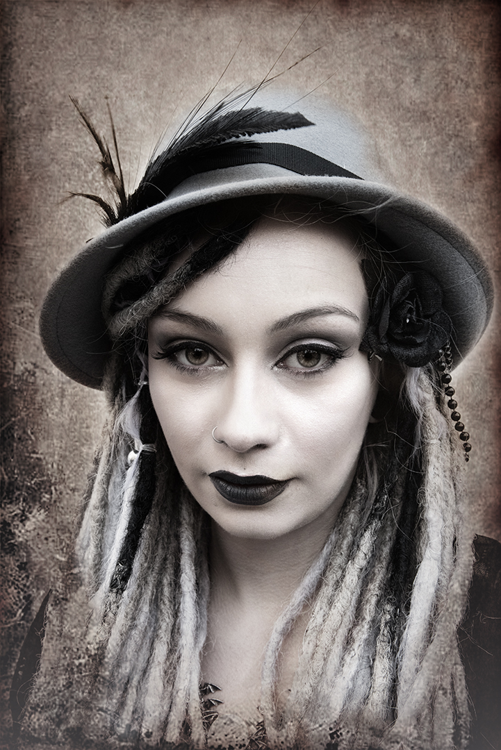
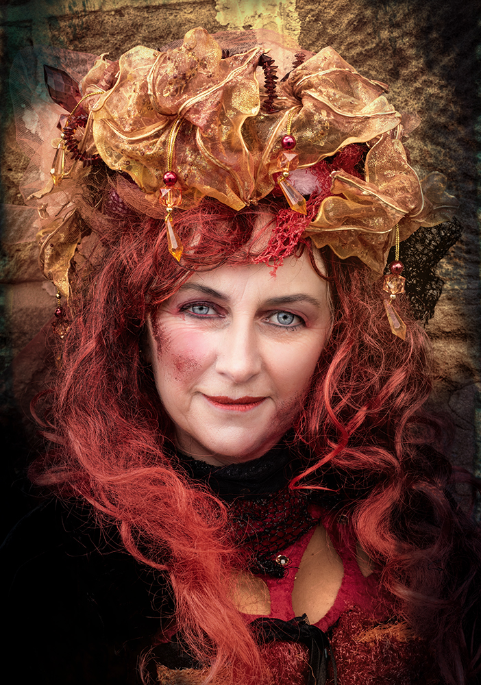
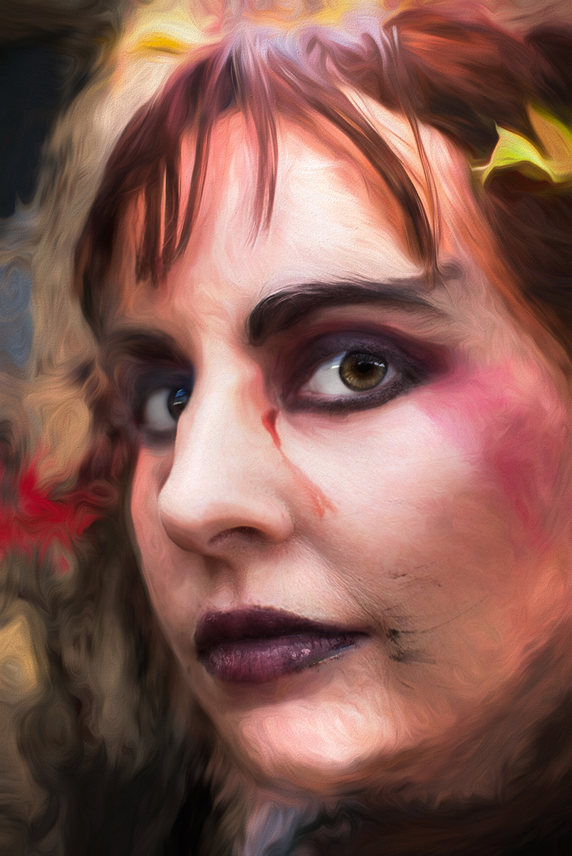
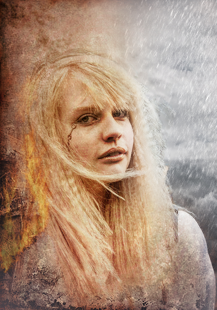
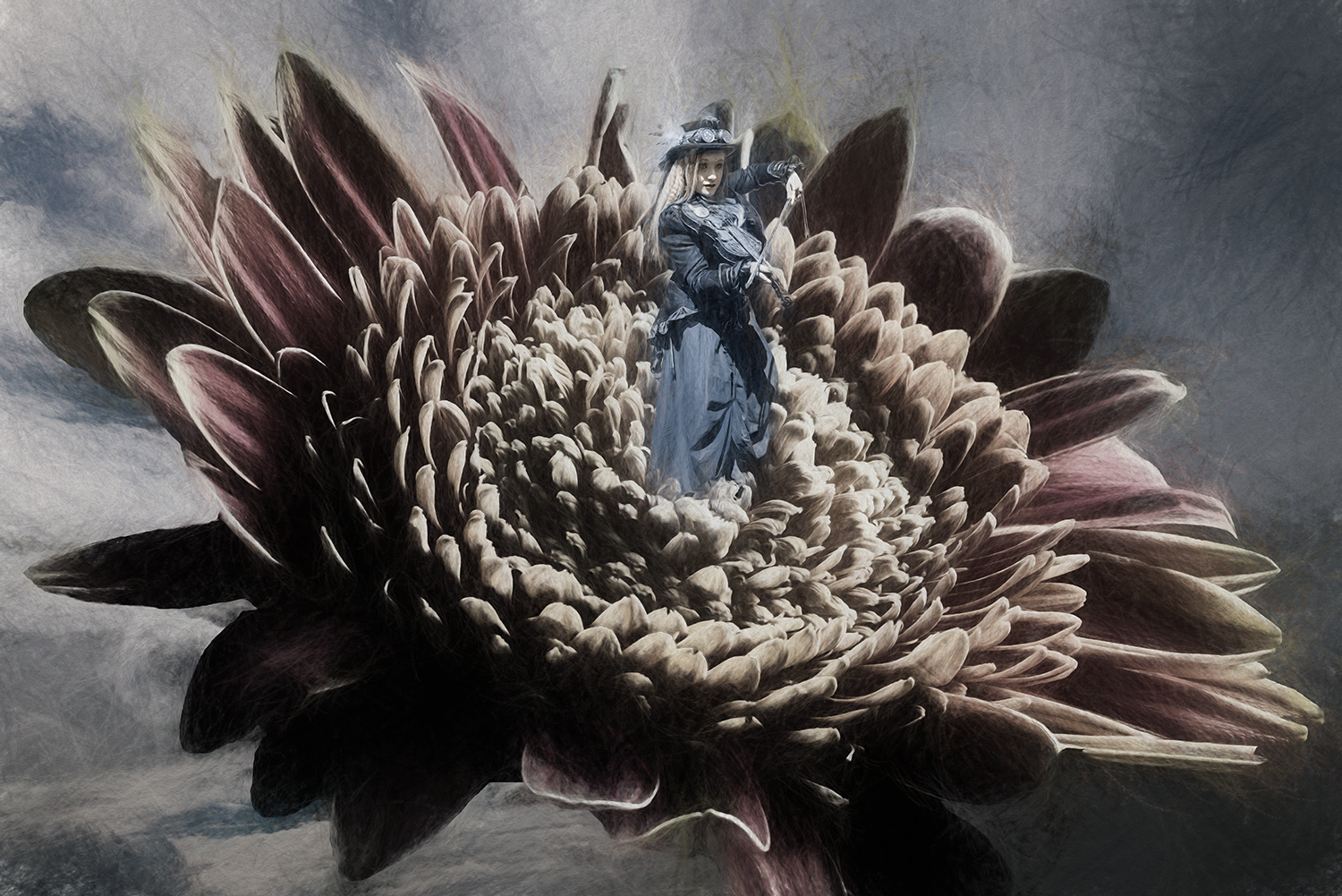
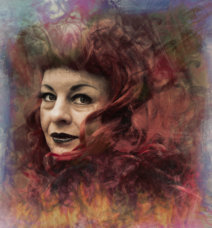
Excellent. I like the effect you've created.
How good to have a good looking model who's happy to play.
The streaks work well and the highlight and gold in her eye are very well done.
My favourite image this month. Well done. |
Jan 8th |
| 34 |
Jan 17 |
Comment |
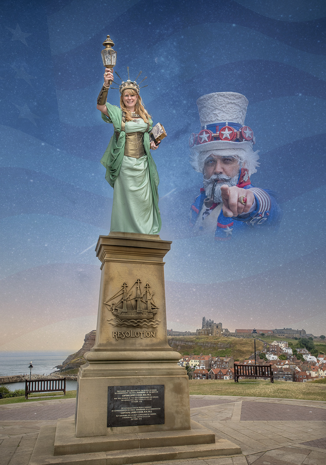
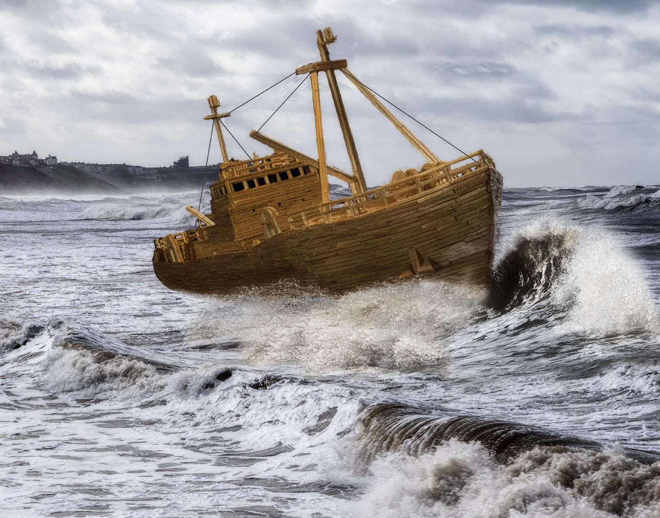
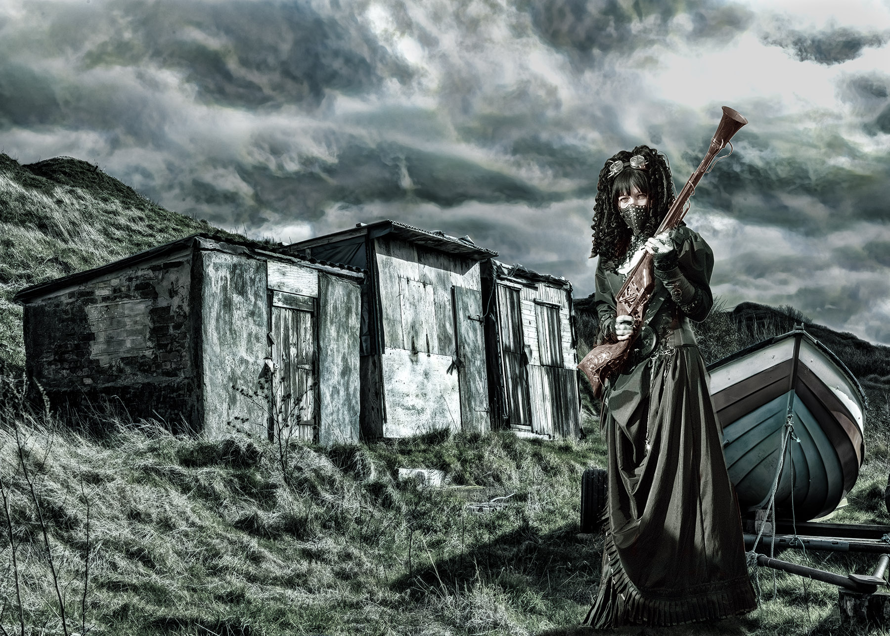
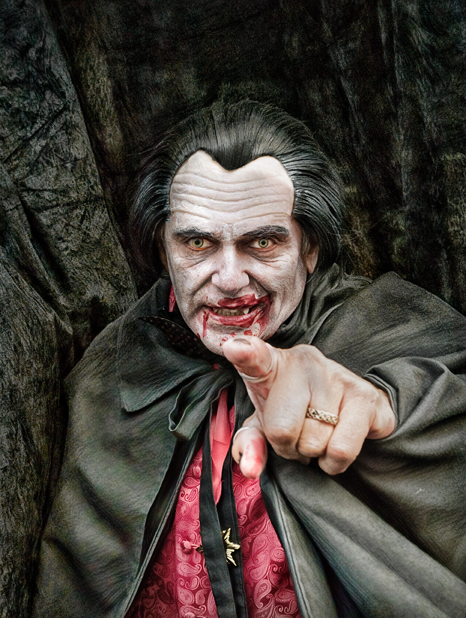
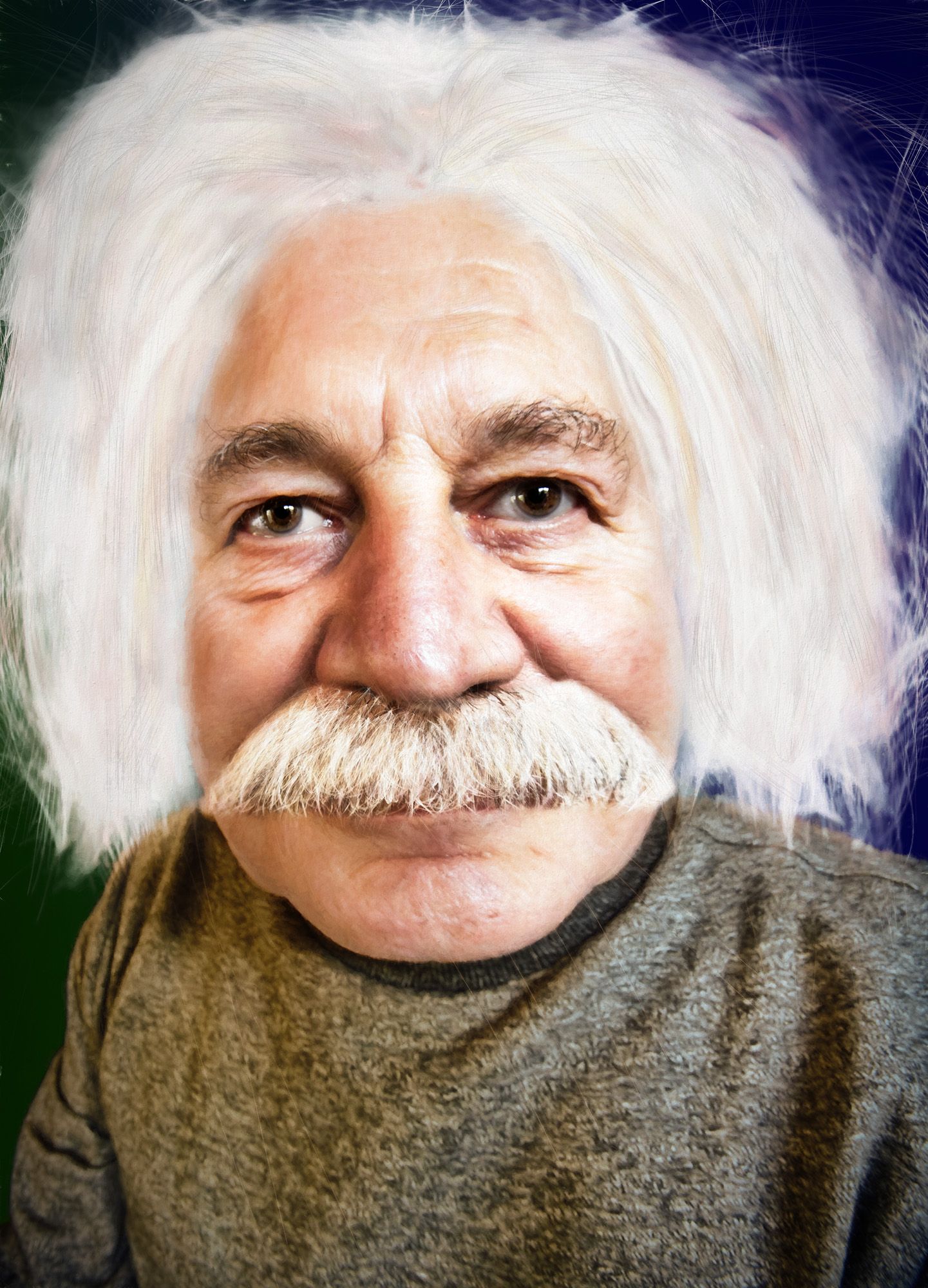
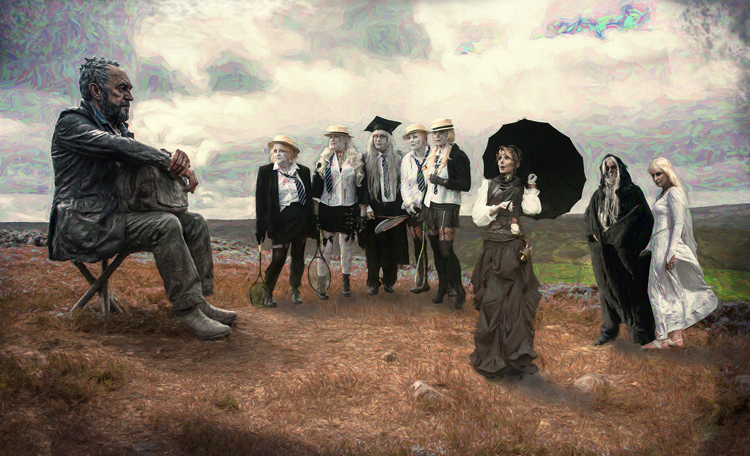
A good effort and a good result.
You're right that there are other ways of producing a similar image, particularly with layer masks. You may find the warp tool useful too, if you wanted to make the hole in the door a different size / shape. But all in good time.
I'd have got rid of his shades and maybe stuck his head out through an enlarged hole - but that's just my preference.
Well done with what you've produced. |
Jan 8th |
| 34 |
Jan 17 |
Comment |
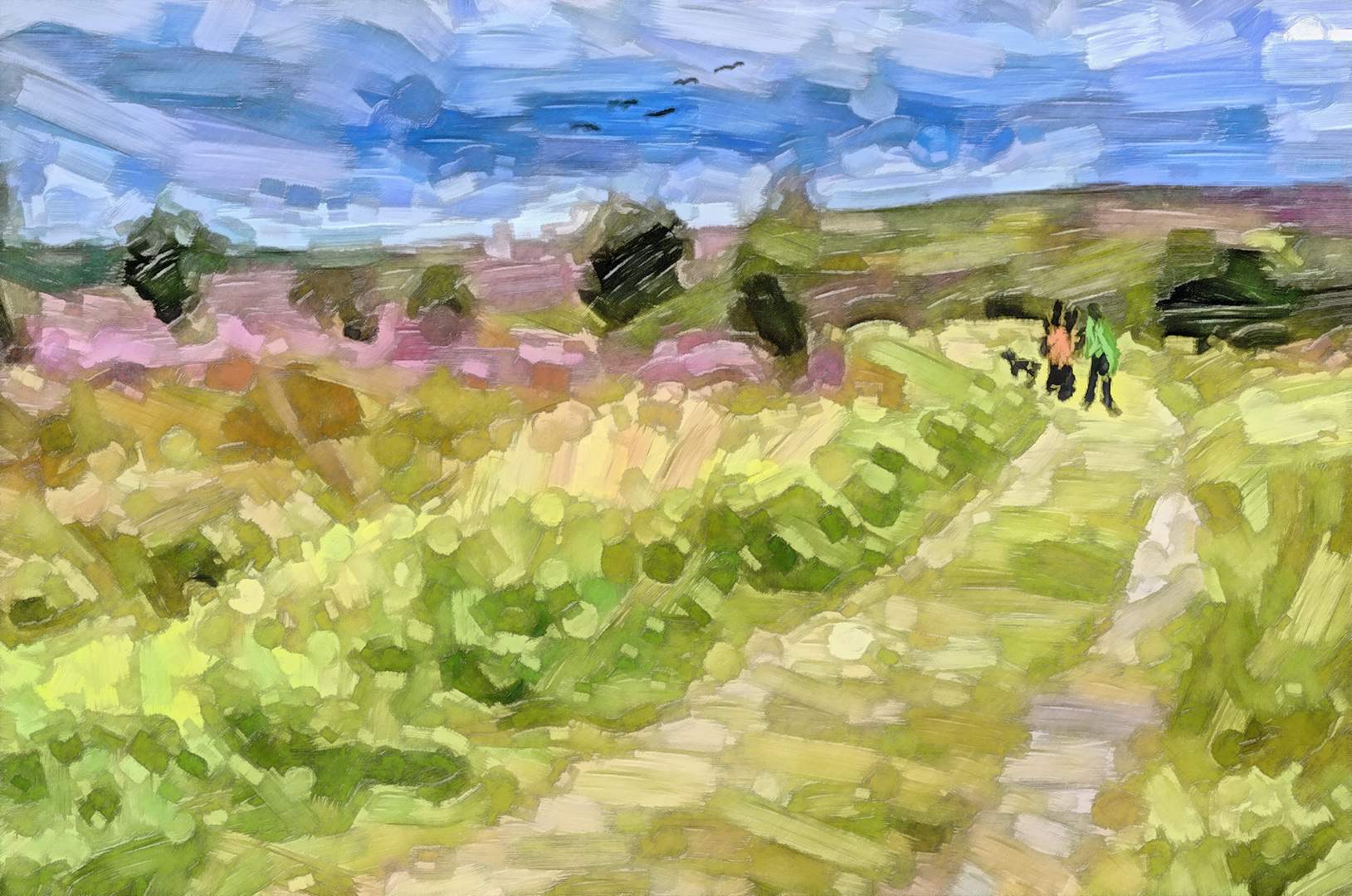
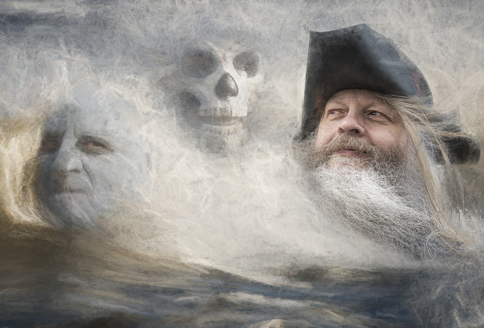
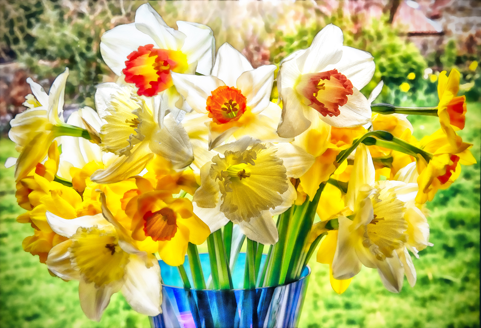
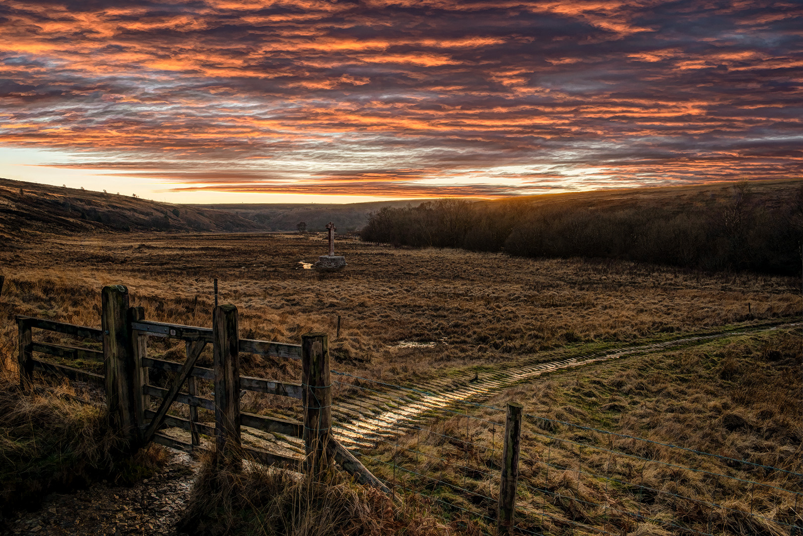
It's good to play in Lightroom - there's so much to offer in the adjustments.
I agree with Phil that it's not quite right for a moonlight effect - more like infrared.
I've played with hue / saturation, Levels and curves adjustment layers to give what I think is nearer the 'moonlight' colouring, but it's still not perfect.
I like the crop and the elimination of the distractions, top and bottom.
A good exercise. Well done. |
Jan 8th |
 |
| 34 |
Jan 17 |
Comment |
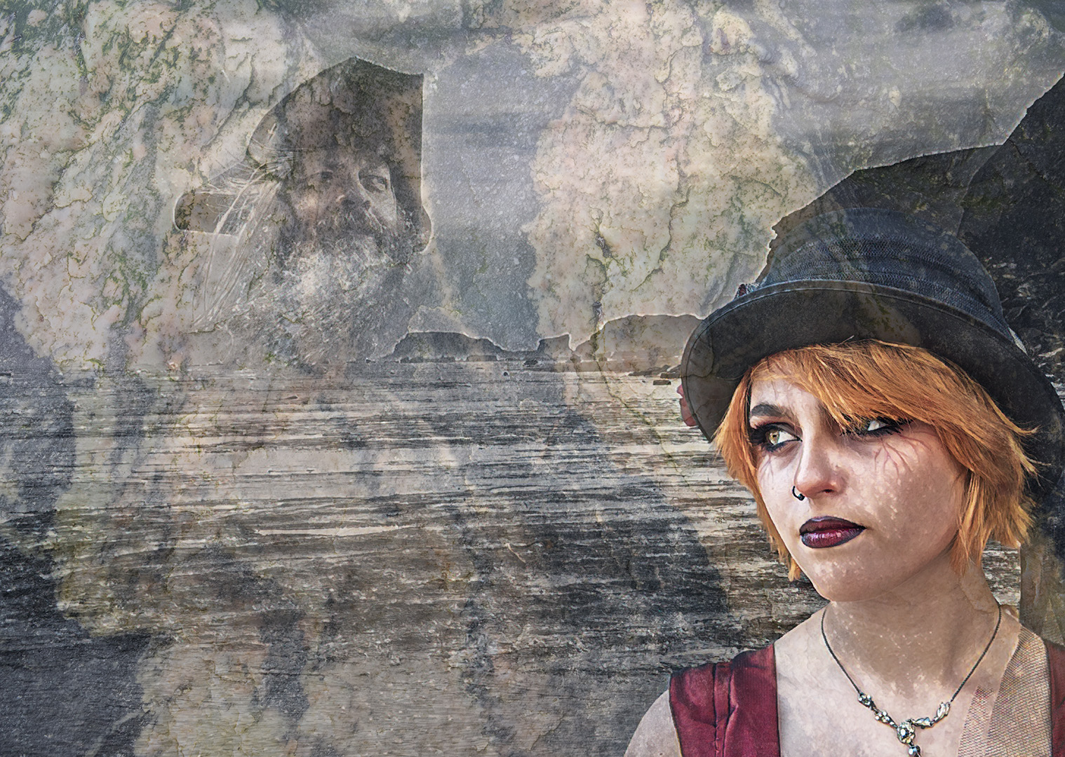
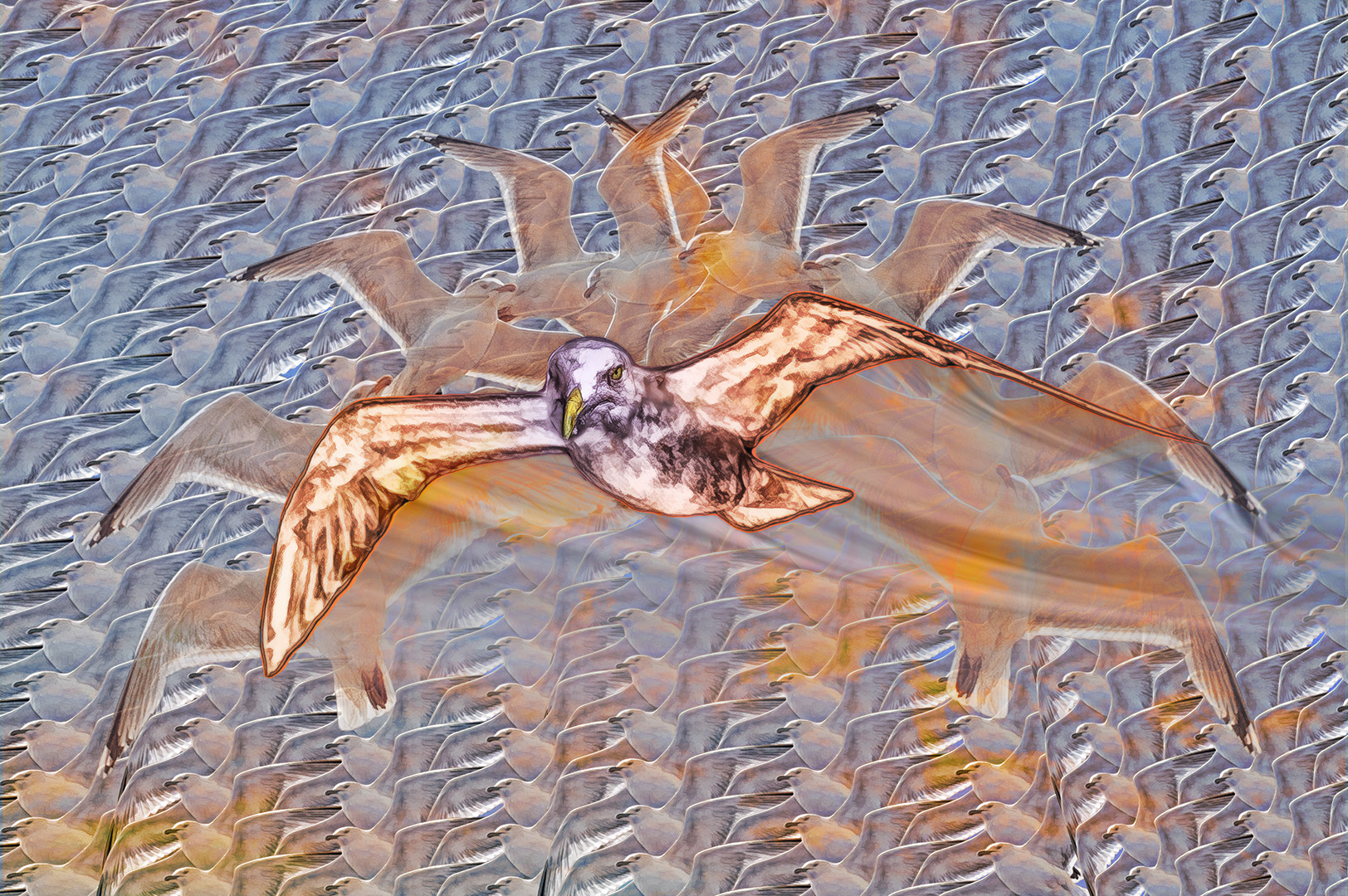
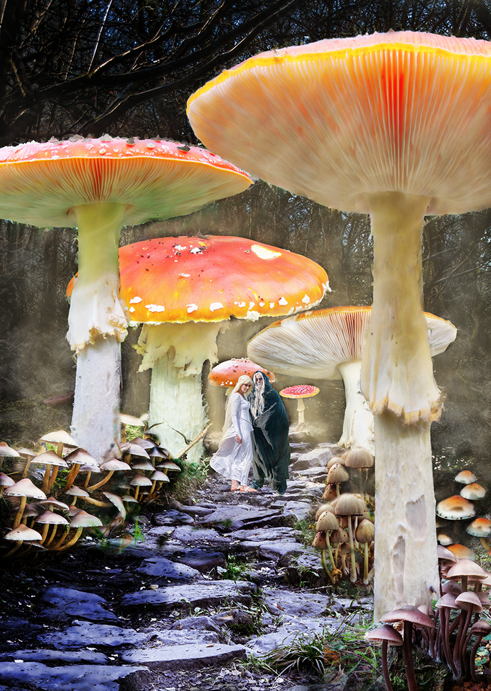
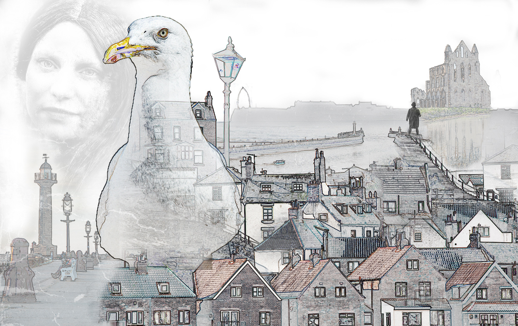
I like what you've done here, but I agree with Phil, that the image needs balancing somewhat. Maybe it's me, but it seems too bright altogether. The background needs toning down a tad, so the bird becomes the subject, rather than part of the whole.
It would have been good to have the original images, so I could have followed your steps better.
A good effort. Well done. |
Jan 8th |
| 34 |
Jan 17 |
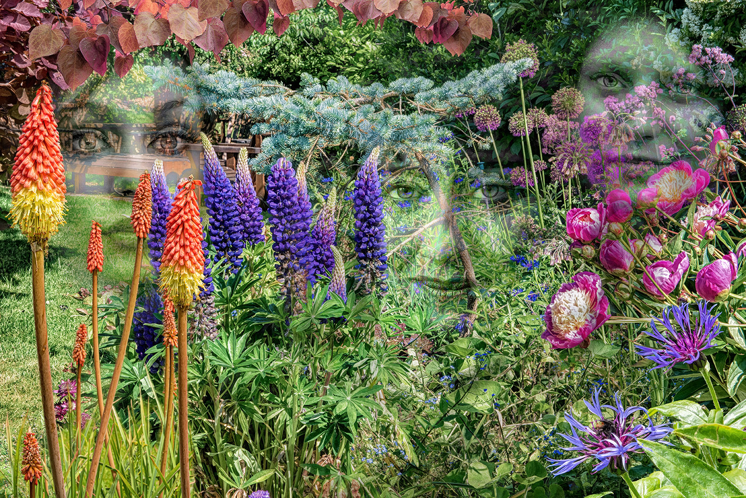
Comment |
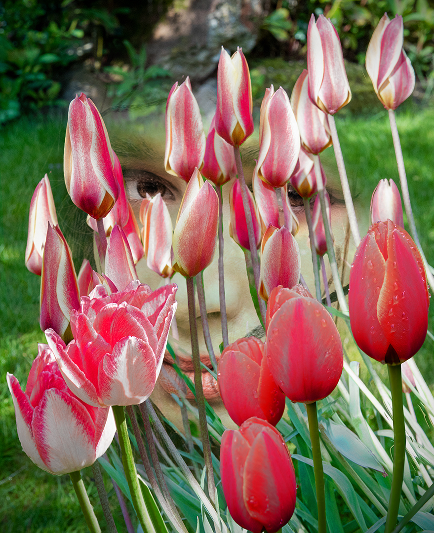
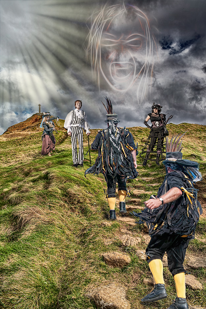
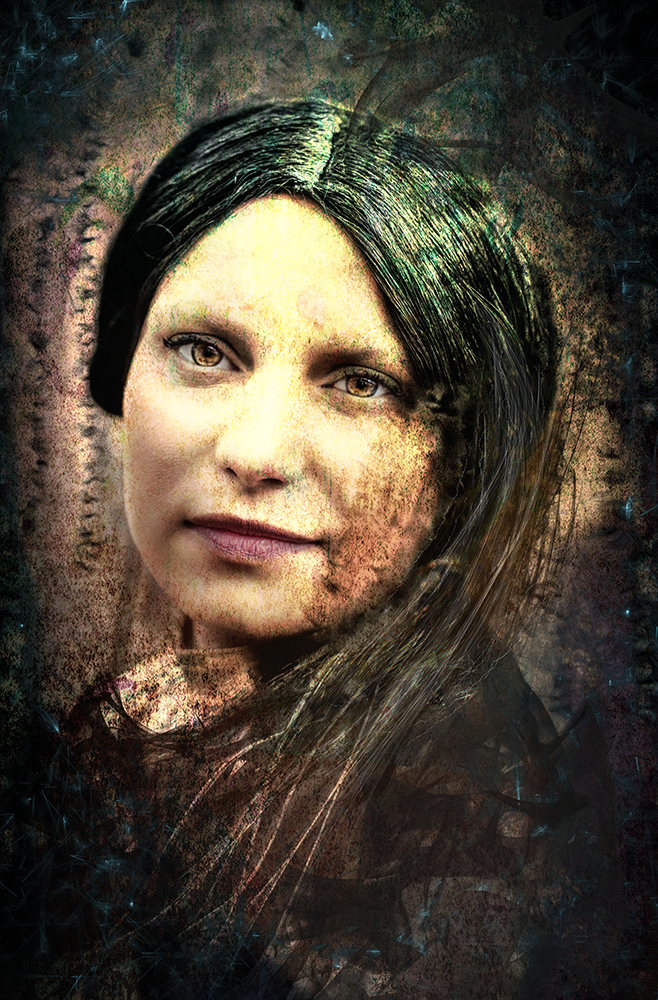
I like what you've done here and I like the blurry green area. But I think the ethereal feel could be enhanced by adding just a little more colour here and there - hopefully this ties the main part of the image to the background. Maybe not, but I think it was worth a try.
I like your image as it is, but I couldn't resist myself! |
Jan 8th |
 |
| 34 |
Jan 17 |
Comment |
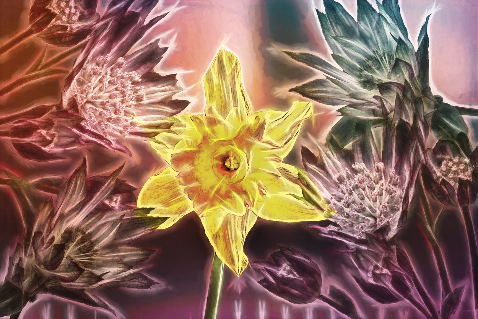
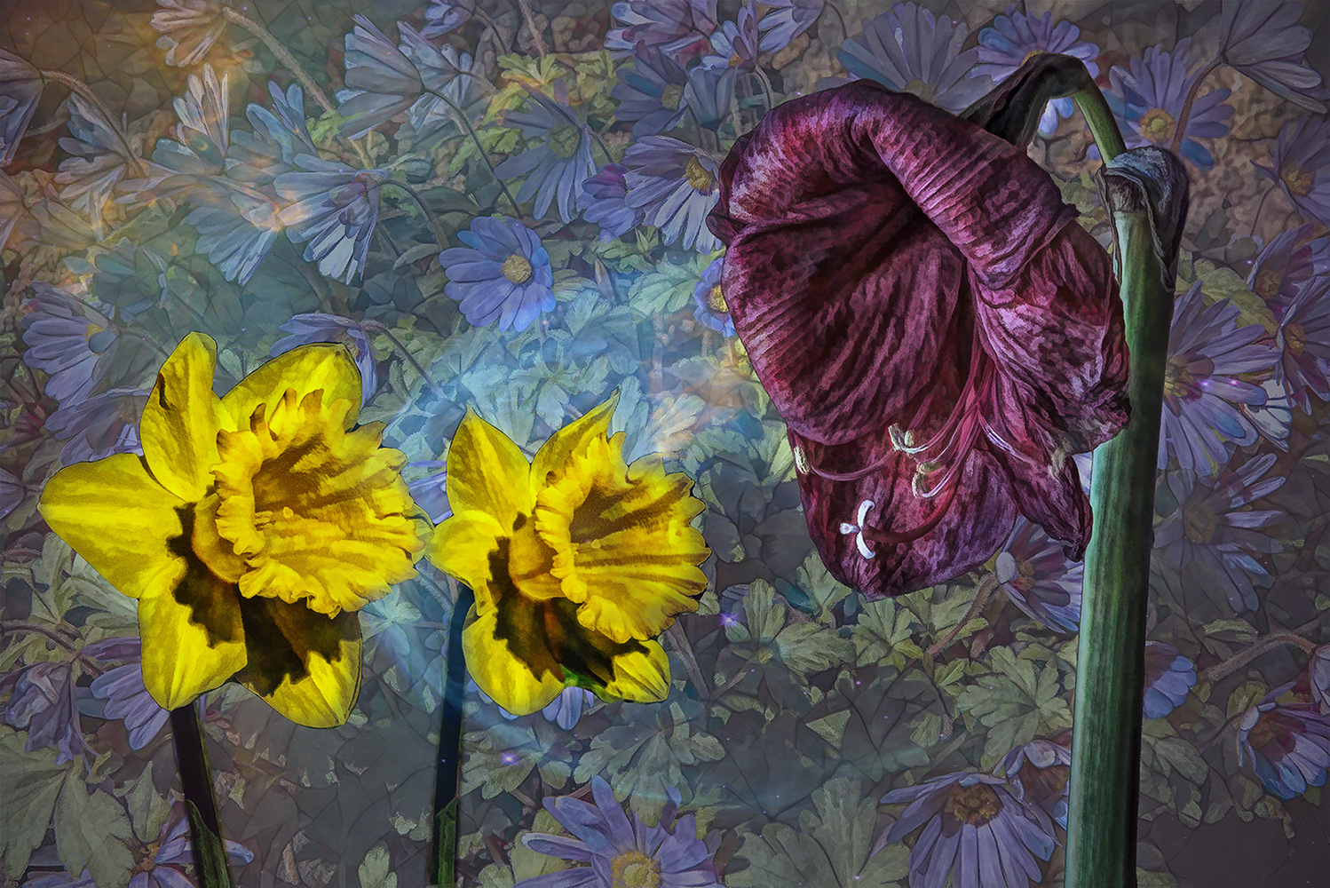
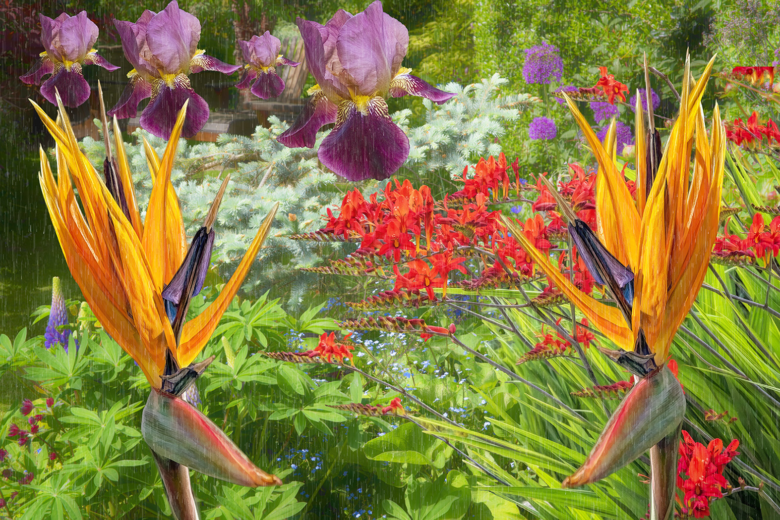
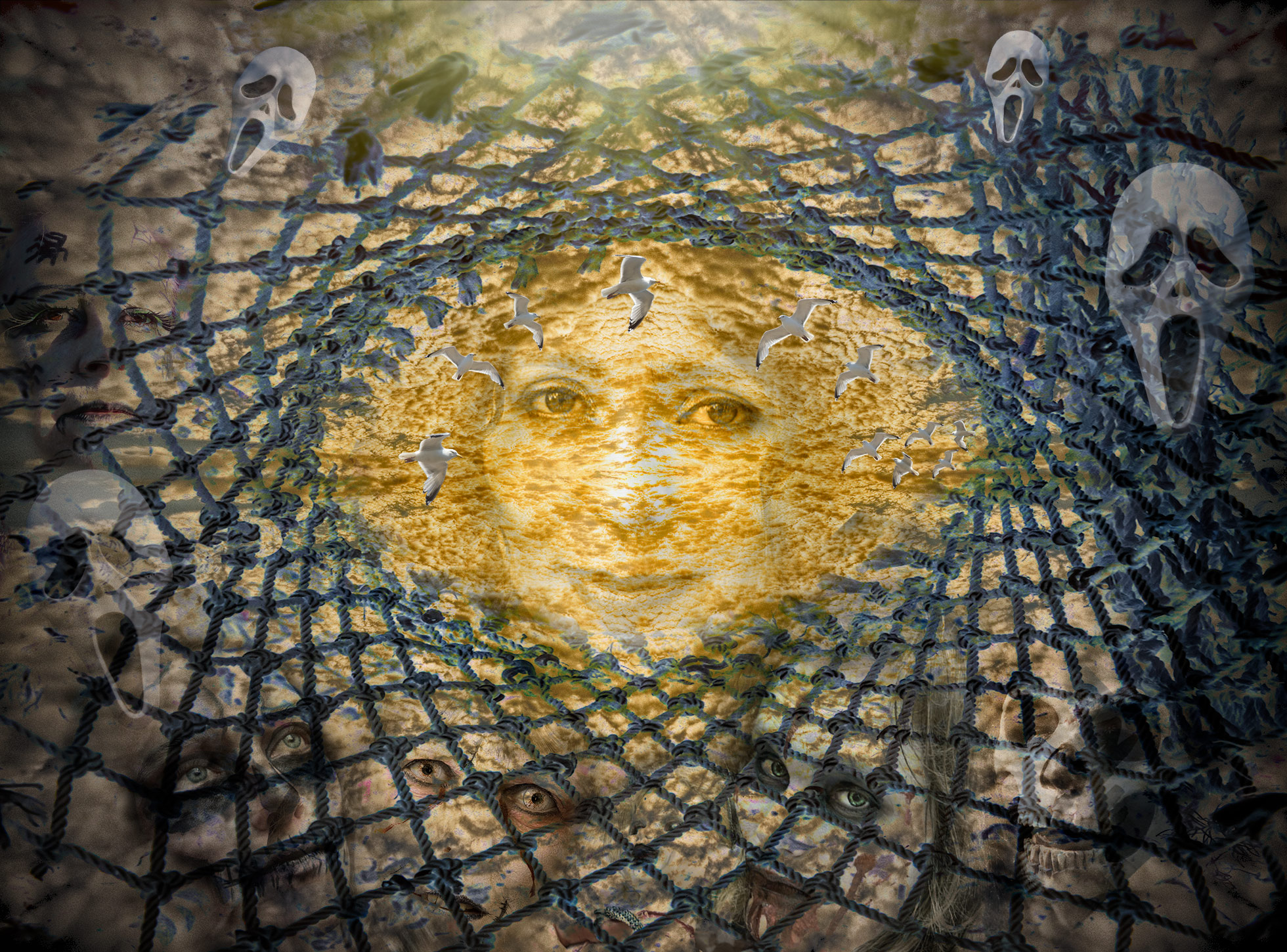
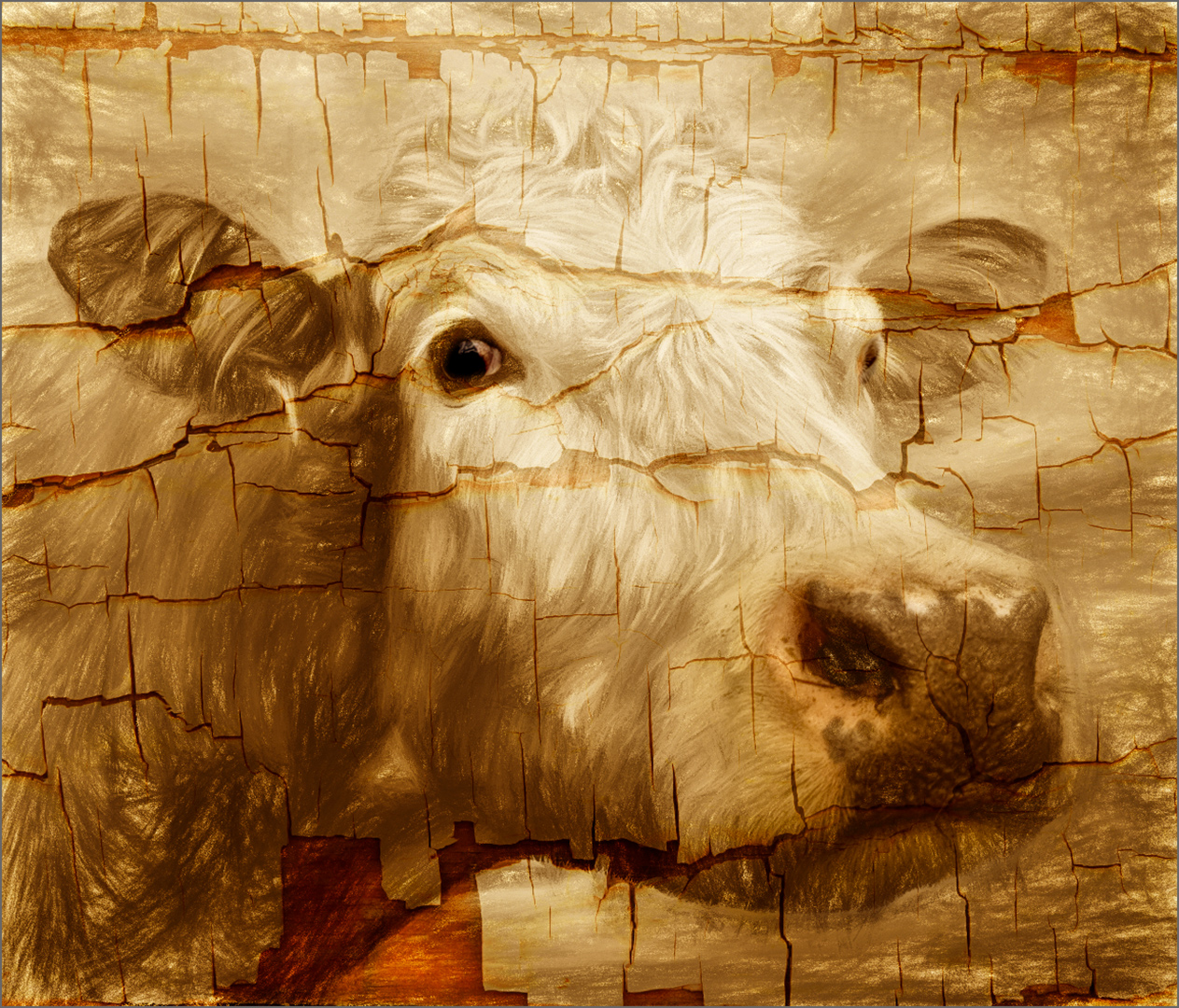
An excellent result. Well done.
As Jan showed, it's asking to be be played with some more. I also felt the background colour needed changing, so I used a complementary green to give some contrast.
I also used Topaz Impression to put a bit more interest into the background and used darken mode on the new layer, to bring your composition back into focus.
Obviously these are just my own playings around. I still think your image is superb. |
Jan 8th |
 |
| 34 |
Jan 17 |
Reply |
Yes - I used a layer mask - it's not as time consuming as you'd think. Use different sized brushes with lower opacity (which you can go over again if necessary) and it gets fairly straightforward. I also use a graphics tablet, which makes it feel much more natural (I think so anyway!). |
Jan 1st |
6 comments - 2 replies for Group 34
|
6 comments - 2 replies Total
|