|
| Group |
Round |
C/R |
Comment |
Date |
Image |
| 28 |
Apr 17 |
Comment |
I have shot a lot of film, and think if you put a little dark green in the shadows, or orange in the sky, you could have achieved the look a bit better. I love the scene, just would like a bit more pop of color in the sky. |
Apr 26th |
| 28 |
Apr 17 |
Comment |
I kinda like the words on the curve. It makes you take more notice of them. I think I would get the whole title showing. It is like they are floating on a plexaglass curved sheet in front of the marble wall. Would be perfect if you could have had an Army/Air Force/Navy cap in his hand so you could see it, just so it would be clear to those non-military who the guy is.
This is really good!!
|
Apr 26th |
| 28 |
Apr 17 |
Comment |
It does have that 60's film look! I love the subject and what Ed has done with it. Thanks Ed. RIP. |
Apr 25th |
| 28 |
Apr 17 |
Comment |
I like the effect, but agree on cutting just a bit off the right side. It makes the man more dominate, without taking the street out of the photo. |
Apr 25th |
| 28 |
Apr 17 |
Comment |
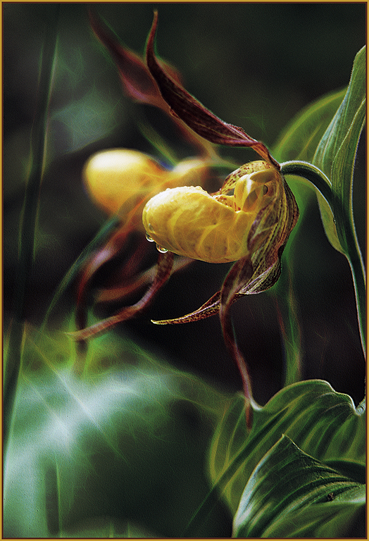
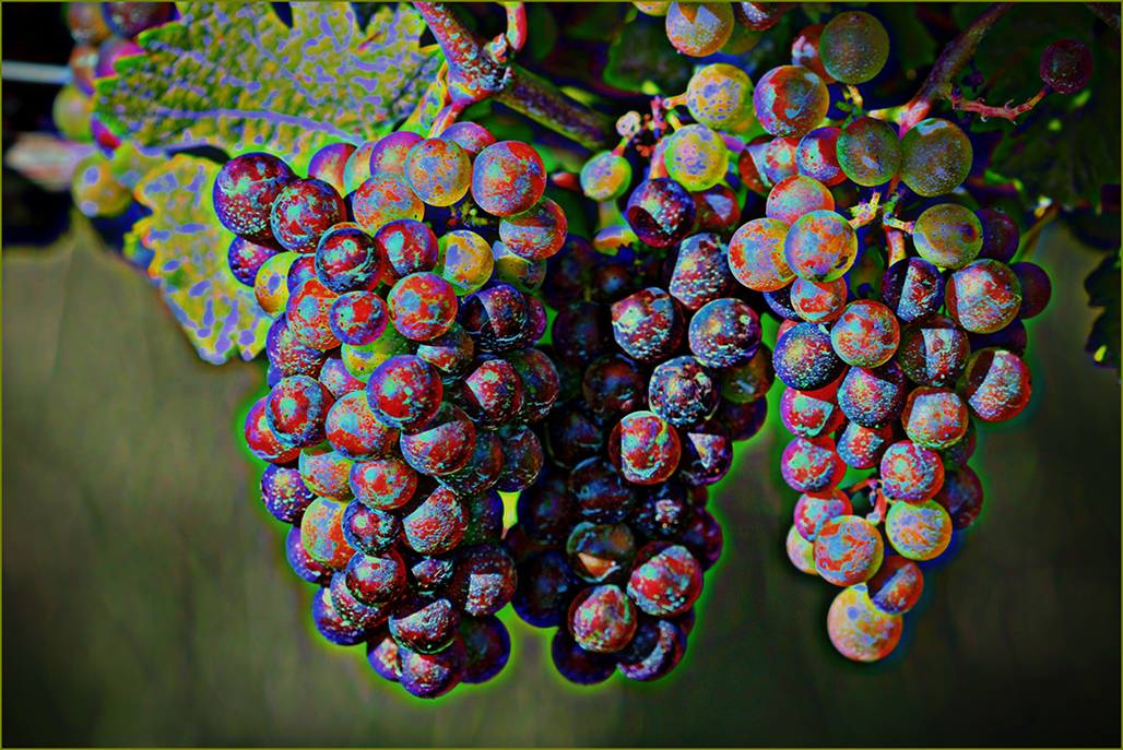
I would see if the background color could be toned a little. It conflicts with the flowers. I like what you did and think that is about the best you can get it.
I did drag the shot onto my second monitor, and the oranges are a bit less overpowering, but you cannot control the monitor/projector in a competition, and may find that the oranges will show too bright. I would try sending the shot to a couple of different computers/phone/tablet to see what it looks like and try to get your best coloration on the most screens. |
Apr 25th |
| 28 |
Apr 17 |
Comment |
I would like to see a bit more definition on the right eye glasses and a little less curve on the right inner thigh.
I really like the pose and the model and hope you also have a full height of this pose also. |
Apr 25th |
6 comments - 0 replies for Group 28
|
6 comments - 0 replies Total
|