|
| Group |
Round |
C/R |
Comment |
Date |
Image |
| 3 |
Dec 25 |
Reply |
Well, my suggestion and I like it a bit better than the original. |
Dec 7th |
| 3 |
Dec 25 |
Reply |
Andres,
I like the blue hour one better, but I would not include so much of the lake, jug below the sharp line until the lake takes on a bright blue look. That is, I would crop to a little below the straight blue line for that one. The background an really be seen which makes it more interesting to e. |
Dec 7th |
| 3 |
Dec 25 |
Reply |
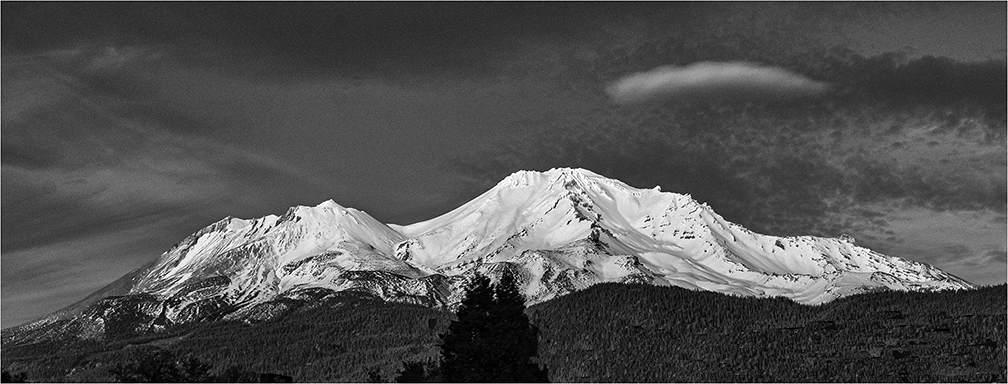
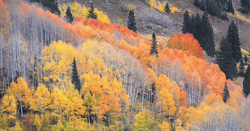
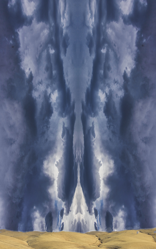
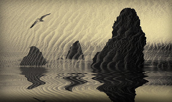
Thank you, Robert. Wjen our camera club takes a weekend trip fro the fall color in the Sierras, we do drive through part of Yoseite on the way, so not so far from one another. Mono Lake has always been a good photographic site. If you go, I will keep my fingers crossed for good weather for you.
|
Dec 7th |
| 3 |
Dec 25 |
Comment |
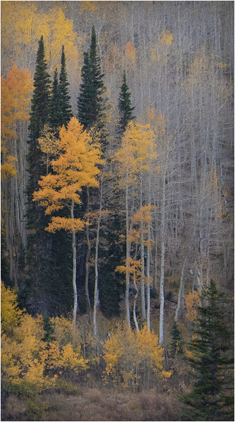
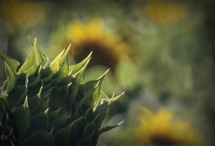
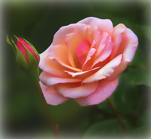
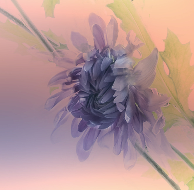
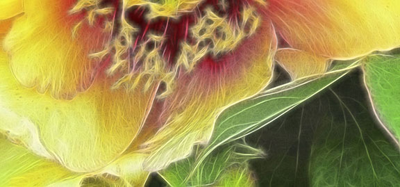
Mary An, Good cropping, in fact perfect in my opinion. The light on the pinecone strengthened really makes the image stand out from the original. Looking at the backsides of the yellow leaves, which are much lighter in color makes this even more interesting. I love the curves and s of the leaves. It also gives great color contrast. I think you foudd a lovely nature close-up and captured it very well. |
Dec 1st |
| 3 |
Dec 25 |
Comment |
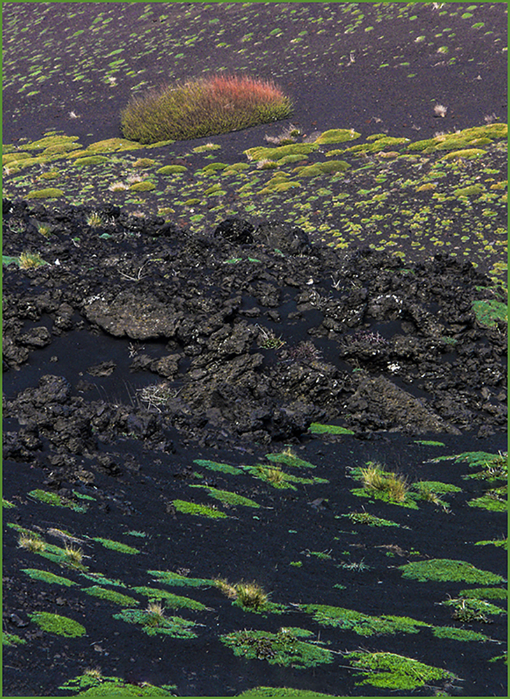
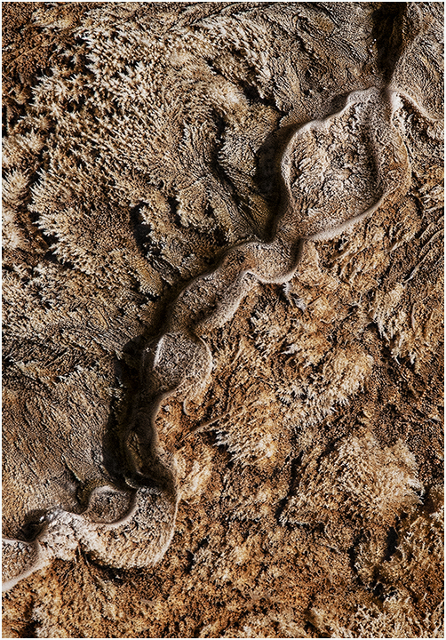
Kieu0Hanj, This looks like a very interesting area of China. The rocks have no unusual color at least to my poor eyesight.. I would love to see them looking redder but nothing you could do about that except to fake it. I really like the greenery between the rocks; it gives sense of delicacy to the image. My oe suggestion is to crop ou some the left side to bring the karst in the middle to the left. If you crop carefully, the image will look like the circle of rocks goes around the whole image, which gives a different perspective to it. Nice shot. |
Dec 1st |
| 3 |
Dec 25 |
Comment |
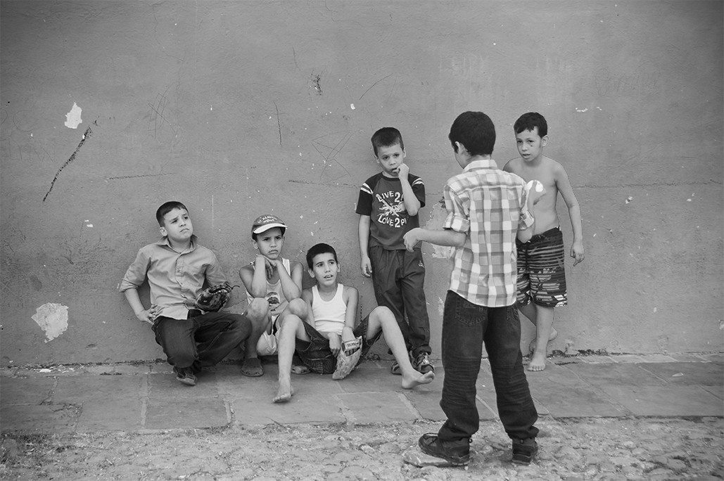
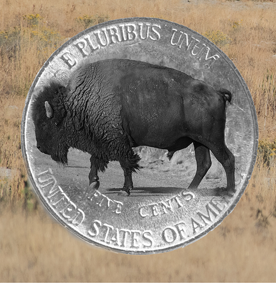
Ruth, Good catch. This also happened to me when in Yellowstone where a group of. f foreign tourists were wandering around right in a group of Bison. I warned the and hoped that they took it to heart. What fools these mortals are!
Your composition is excellent and the bison nearest to the man looks really threatening, but because of the size, may be a female. They may be less vicious.In any case, you have told us a great story. Well cone. |
Dec 1st |
| 3 |
Dec 25 |
Comment |
Robert, The concept is great - taking the stone work of the Bridge of Sighs as a frame. You are right that, unfortunately, the rest of the photo was not very sharp. You can't just go back there and do it again, probably. But. if you could, you might have made multiple images changing the focal point each tine and combining them eventually into a focus sucked image , sharp front to back. Otherwise the composition is great and th picture really beings you into Venice at some of the most iconic views there. |
Dec 1st |
| 3 |
Dec 25 |
Comment |
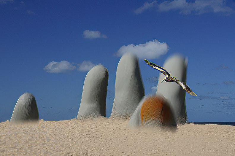
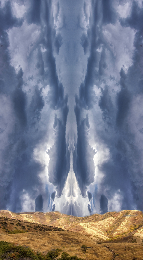
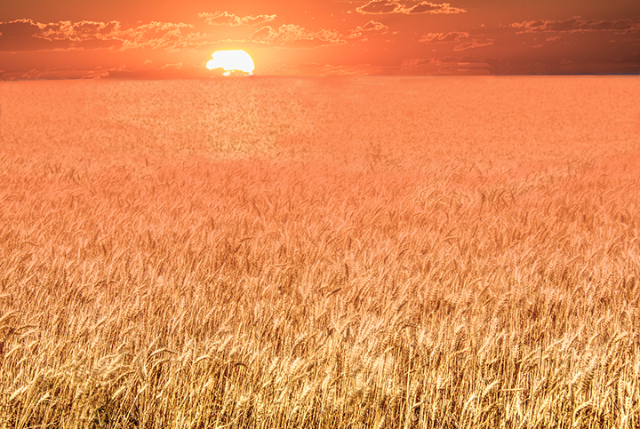
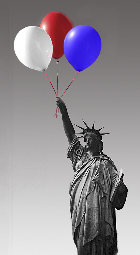
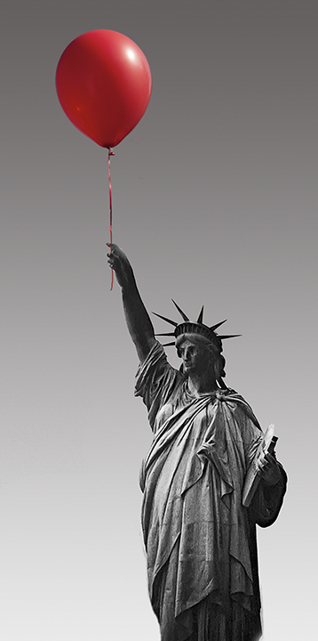
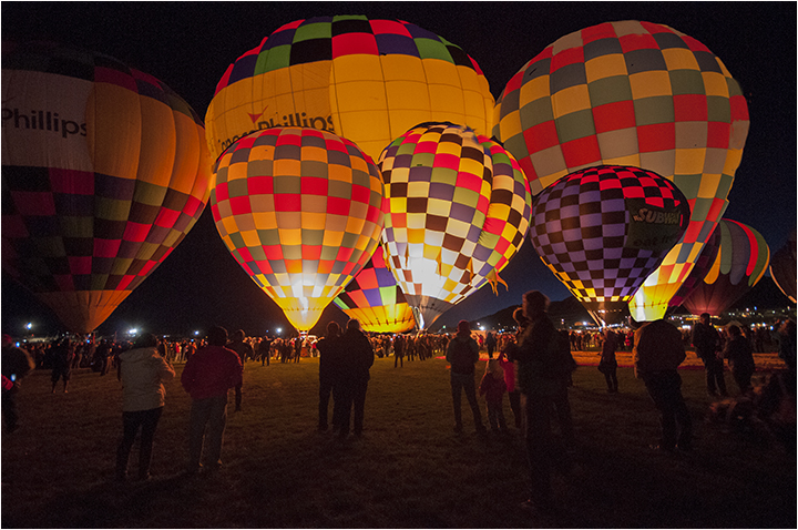
Abdres, What a beautiful place to visit. The night shot is. lovely, with almost every building lighted up. What makes this most interesting is the reflection of the lights in the lake at the slow shutter speed, which gives. cascade of color in the waters and helps carry the lighting much further than a simple reflection. The only suggestion to make it even better would be to take it during the blue hour, but often the lights don't go on until after the light from the sky has totally disappeared. In any case, a great shot. |
Dec 1st |
5 comments - 3 replies for Group 3
|
| 41 |
Dec 25 |
Comment |
Brad, ON another topic: I hope with our new group we are going to get feedback from all of the members. I know they have until the 25th and this is a busy month. |
Dec 14th |
| 41 |
Dec 25 |
Reply |
I think you're right absit that, Ian. |
Dec 14th |
| 41 |
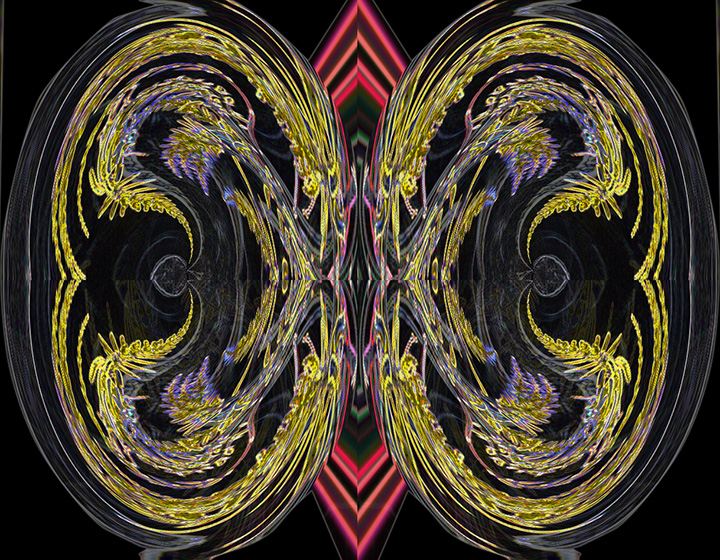
Dec 25 |
Reply |
Yes, this does seem like a Magrite. It certainly gives that feeling. I admire your train of thought. So no particular reason to combine the two. It just feels right |
Dec 8th |
| 41 |
Dec 25 |
Reply |
You are probably right about the web being too bright. Unfortunately, I no longer have the two layers so I could make the change as the image was flattened. |
Dec 8th |
| 41 |
Dec 25 |
Comment |
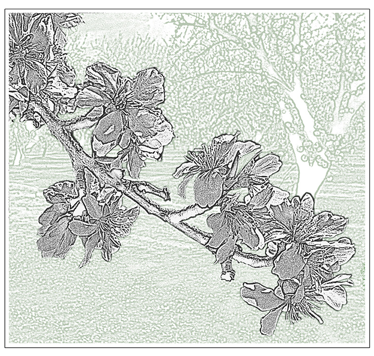
Robin,
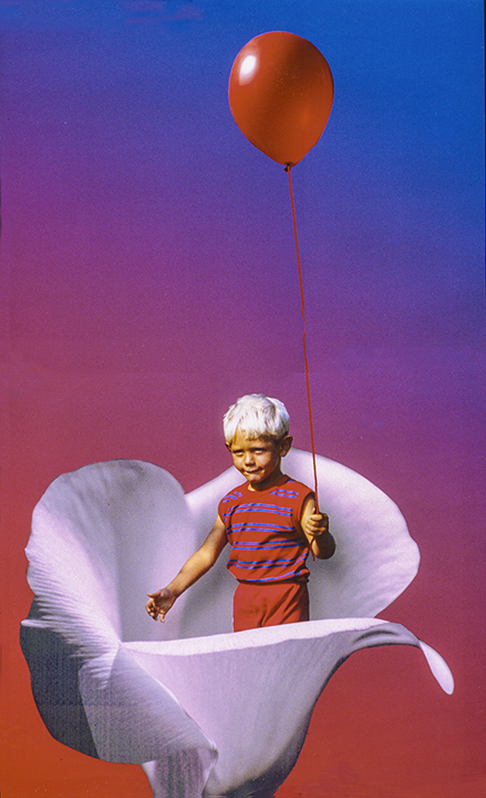
You have doe a nice job combining the flowers with the darkened face of the young girl. I thin hiding her smile behind the flowers helps with the concept. Although the log or whatever it is makes a nice base for the flowers, I suggest removing it and leaving just the stalk and flowers in fllront of the lovely young lady. That part of the image is very bright and may distract a little from the girl hiding behind the forget-me-nots. Nice concept, well handled. |
Dec 7th |
| 41 |
Dec 25 |
Comment |
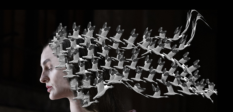
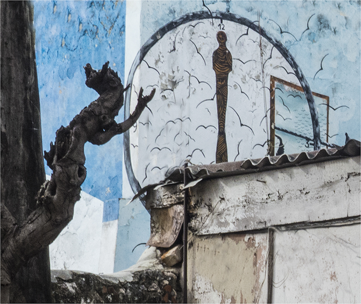
Nadia,
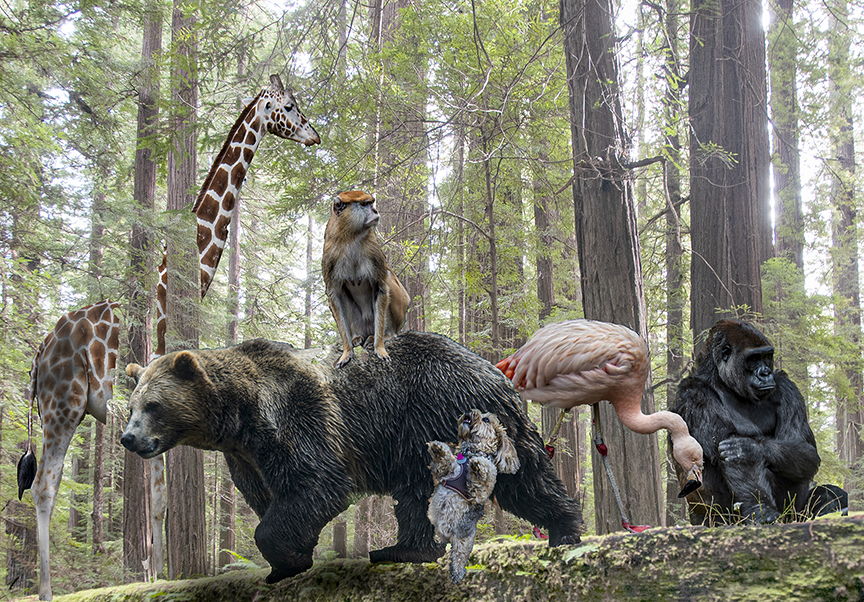
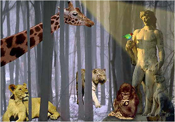
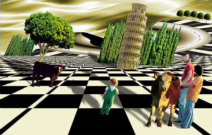
This is a very complex composite, very nicely done. I am happy when someone this of a thee in advance and puts it together as you have done. The lighting you have chosen works so well for this as it brings the viewer to the woman waiting. I see that in addition to the different layers, you have added turkeys?, birds and a clock. T hat takes it all the more interesting. The darkness on the left helps obscure anything that is not in keeping with the time period of this composition. Excellent work. Congratulations on a job well done. |
Dec 7th |
| 41 |
Dec 25 |
Comment |
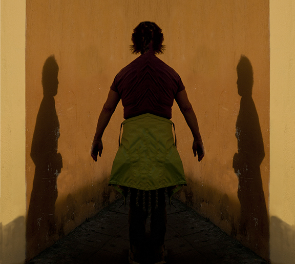
Brad,
Thanks for having us as members. As Barbara most likely told you, the other creative groups were struggling wit retaining members, so it makes sense to have a whole seeven-member group. Let's try to keep us together.
I love your abbey, double exposed, with the semi-opaques residents of the arches. You chose well in your placement of the people, especially with the hands in prayer of the head person. I have no suggestions for improvement. Very nicely done and thought out.. |
Dec 7th |
| 41 |
Dec 25 |
Comment |
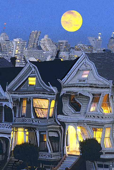
Brad,
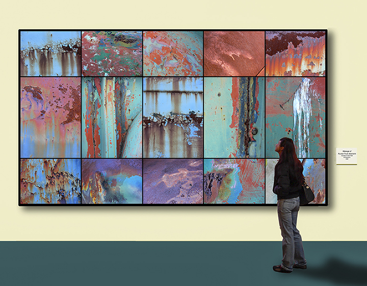
I admire your efforts to combine the two images. The technical work you did is excellent although I am not familiar with the generative fill in Photoshop. My iMac is partial broken and I can't upgrade the OS behind Big Sur which doesn't allow me to use the newer. PS actions. Ayway, I like what yo did but I do have a question about the two images going together. what was your thought abut why the female dummy would show the desert behind her. For some reason I can't see the two of th m together. However, the overall look is very intriguing and this certainly falls under creative. You did a lot of work on this, and I congratulate you on that. Your technique is perfect. |
Dec 7th |
| 41 |
Dec 25 |
Comment |
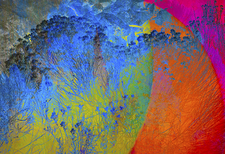
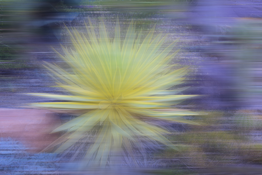
Ian,
First of all congratulations for your long article in the PSA Journal this moth. It was too long from me to read with my AMD but I enjoyed the photos very much.
This image of the triangle is quite beautiful, starting with the original. Changing the background works well and I like the slight reflection in the background under the triangle. Nice work. |
Dec 7th |
| 41 |
Dec 25 |
Comment |
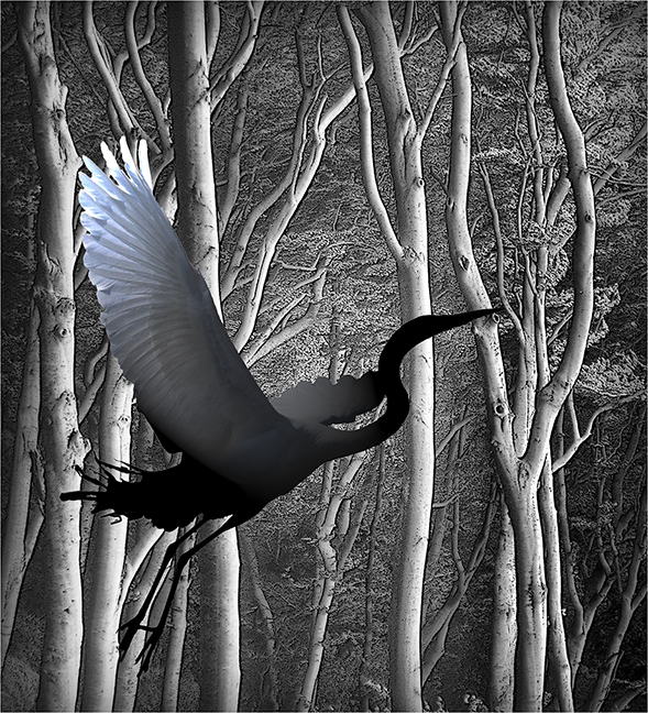
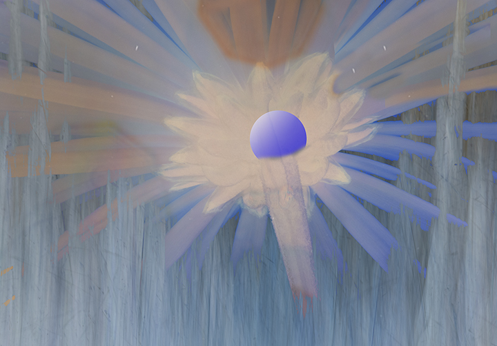
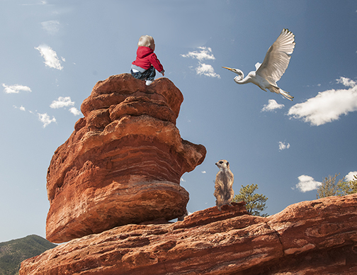
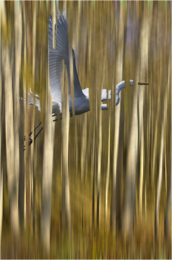
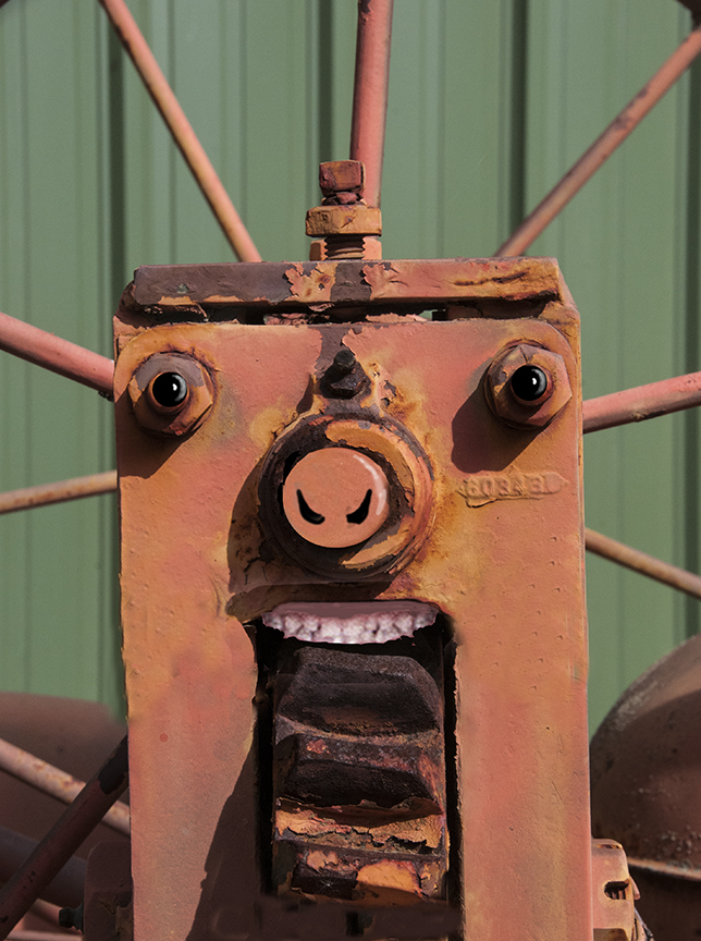
Tom, This is simple but because of that, it gives the image a lot of impact. The crown of light is what makes it creative, of course. I like the composition, which fills the frame. It gives a feeling of an angel because of the wings and the white dove appearance. My only suggestion is to clone out the feet of the bird and just let us enjoy the beautiful feathers. Nice job. giving us a simple, yet eloquent heavenly figyre. |
Dec 7th |
7 comments - 3 replies for Group 41
|
12 comments - 6 replies Total
|