|
| Group |
Round |
C/R |
Comment |
Date |
Image |
| 3 |
Oct 24 |
Comment |
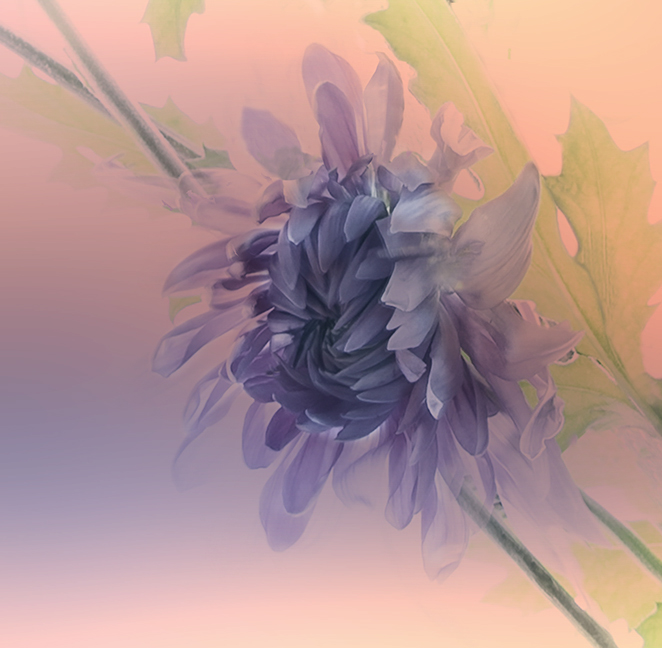
Mary Ann, A beautiful shot of the Bird of Paradiaw. This is actually a difficult flower to photograph because of its size and angles. Something is bound to go out of focus, as the section in the foreground did. You could work around it, especially with a tripod by changing the focal point on a couple of images of the same flower and combine then in PS.
I really like what you did with tge background. Not only us ut out of focus, but it has pleasant diagonal lines the add tot the image. Good job. |
Oct 5th |
| 3 |
Oct 24 |
Comment |
Kieu-Hahb,
This was a lovely juxtaposition between the old cannon and the beautiful homes on the cliff to the right.. A couple of suggestions: 1 I would use the clone tool or something simillar to get rid of the white fence, which is very bright and also modern-looking 2. Perhaps a little more light on the back of the cannon would make it stand out ore. But it is a wonderful shot. You placement of the gun is off-center and the old sea wall works so well. Mostly just get rid of the white fencing. or pipes. Good seeing. |
Oct 5th |
| 3 |
Oct 24 |
Comment |
Ruth,
I like both versions. The lighter original needed to have most of the sky removed, which I see you did in your final image. For me the final is a bit too dark; I would prefer something in-between the two, but it is very lovely. I agree with you chose to adda white line around it to make it stand out from our DD black background. Nice work. |
Oct 5th |
| 3 |
Oct 24 |
Comment |
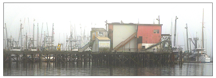
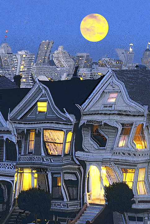
Robert,
I really appreciate your shot of the early morning wharf in San Francisco. I like that you kept te strong feeling of the fog, which is so traditional for SF. Your cropping was excellent. I would look to whatever was floating in the water that is black and perhaps remove it in Photoshop, very easy to do now. Otherwise and excellent reminder of the city and interesting lights and reflections early in the morning. Good job. |
Oct 5th |
| 3 |
Oct 24 |
Comment |
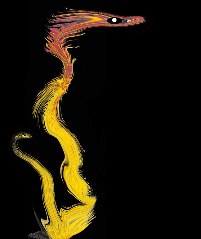
Michael,
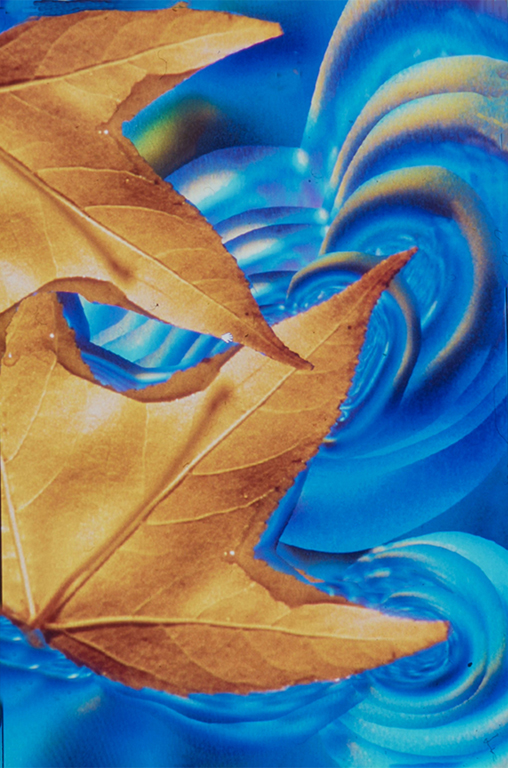
I've tried for well over an hour to send you a message with a file attached, but it has failed every tine. I get this strange message with the big number 403 attached. So I will just describe it. I love that you used the ICM to produce this shot. At first I thought it was the Eiffle tower, bu read your description. I have two suggestions. One is the slightly straighten it as it looks like it's leaning a little to the right to me. The second is to get rid of the two bright rectangles below. You could either darken the considerably or you cold crop then out and stretch the city scape part using the Transform tool and adding canvas at the top to give you room .
Great thinking, in any case/. |
Oct 5th |
| 3 |
Oct 24 |
Comment |
The kayak and the reflected sunlight are two extremely important elements in your final shot. As it is, it is very compelling, e specially in the great empress of the water in such a busy place. Ideally, the rower would be in the shaft of rreflectedted sunlight instead of on his own,, but we can't have everything perfect. I thought abut copying out the rower and placing hi in the lighted reflection, but the lighting on hi would be quite different and would not match the concept. This is a lovely image and you did a great job with it. |
Oct 5th |
6 comments - 0 replies for Group 3
|
| 18 |
Oct 24 |
Reply |
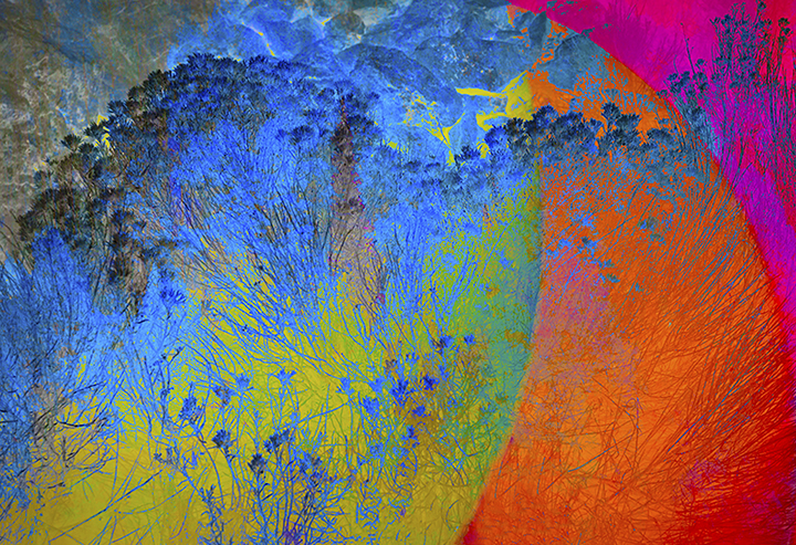
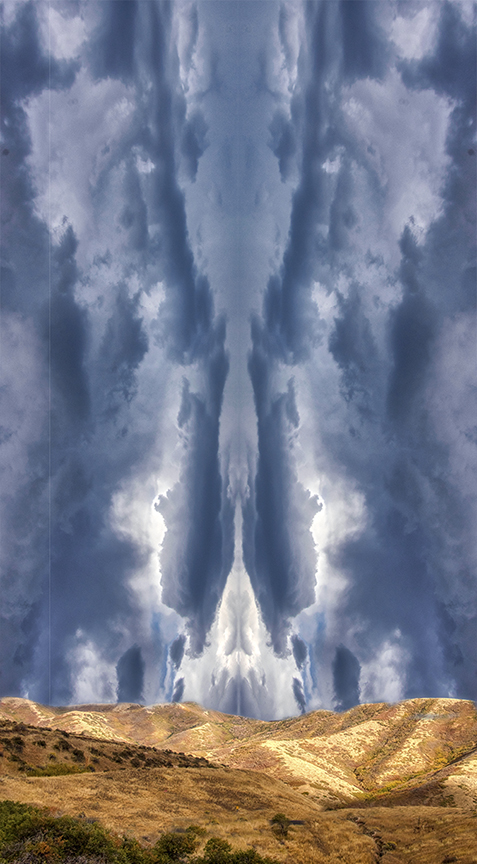
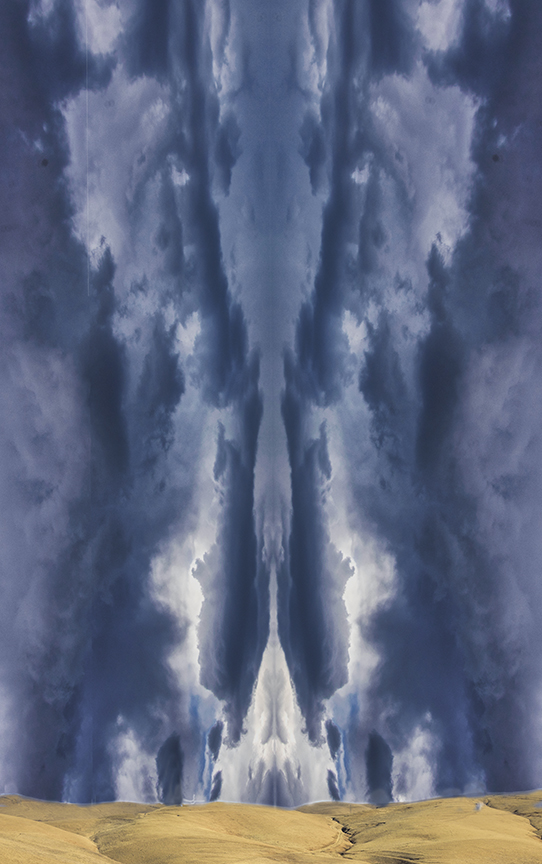
Bob, I am glad you gave it a try. I don't know anything about any clouds, could be my macular degeneration does not help with details. I intend to continue working with images until I really can't see much anymore, but the details will be lacking. I like what you did with the colors, intensifying them. I had already done that once, but probably not enough,. My original version was in the form of a slide scanned into the computer. The original originals, I really can't remember, but at that tine it was harder to work in Photoshop than it is now. Thanks for the suggestions. |
Oct 5th |
| 18 |
Oct 24 |
Reply |
Yes, this is much more "creative." I like it as it goes a step further and we can no longer just look at this as an In-camera movement photo. Good work! |
Oct 5th |
| 18 |
Oct 24 |
Reply |
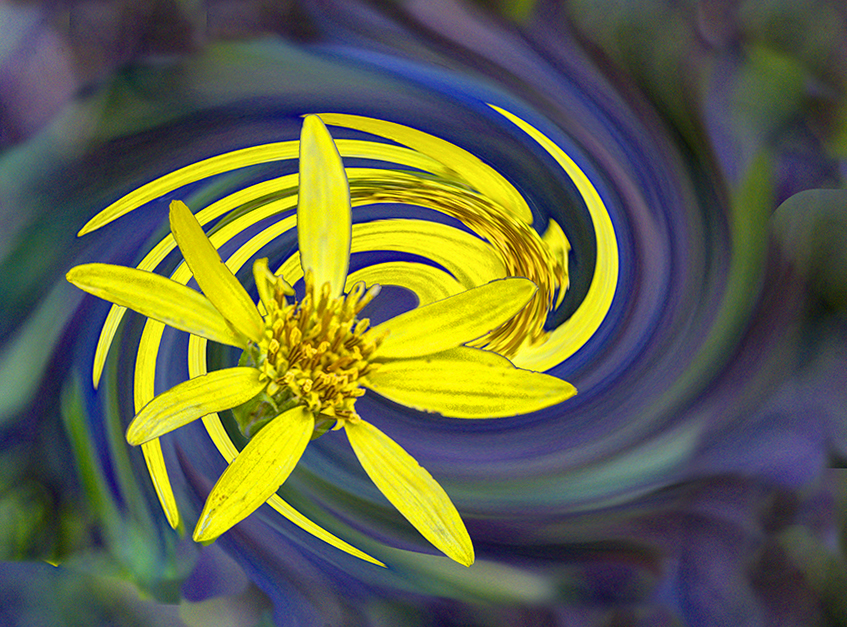
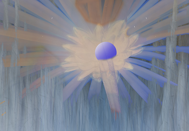
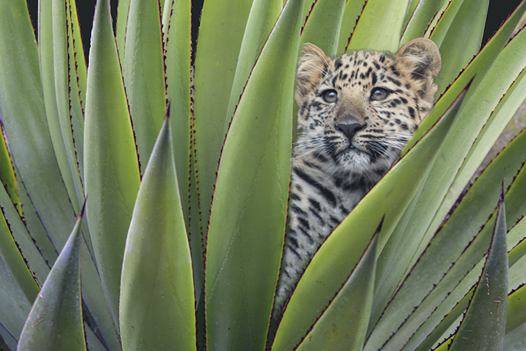
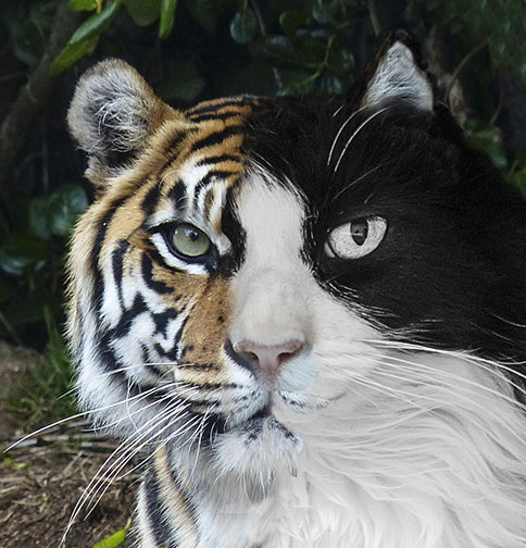
To me, what would make it more creative would be a person or a tiger peering out between the stems. You could use liquify to pull the stems away from the eyes and nose and mouth.
Barbara said,
CREATIVE . This section is not for beginners but is for those
whose images are dedicated to altered reality and who have
experience in Adobe Photoshop or the like--in other words
designed for the crème de la crème of digital imaging. These
members are committed to altering the image so that it departs
from the reality of the original photograph. A camera or other light gathering device could never solely capture such images as they appear in the altered image. A simple added filter does not qualify the image as Creative.
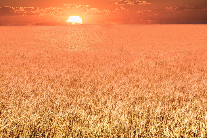
I understand Thant you feel your wheat field is unique and not what we would see in real life, and I can go with that, but for me it doesn't have a strong sense of creativity,,. I would hope that you could understand that.
I was administrator for two creative groups a few years ago, so I have some idea of what Creative is. A creative idea that could look realistic or an abstract that makes sense.. |
Oct 3rd |
| 18 |
Oct 24 |
Comment |
The final product does look like one of those ads, maybe saying too much ice will spoil your cocktail?? Your original is quite similar to the final product, so that kind of means you didn't do a lot of work trying to create this in the digital world, but in the actual world. . If we couldn't't see where you started, this would be a very creative image and I would be asking how you did it. But in this case the creativity started in the camera and when you set up the scheme for your camera. By the way, How did you get the ice cubes too bounce out of the glass? That's very creative. A lot of work to produce a fascinating final "ad." |
Oct 3rd |
| 18 |
Oct 24 |
Comment |
Bob,
I don't recognize your name. Are you a new member? If so, welcome to the group. I like what you did to your original, which was not distinguished.. You did enough work on this so that it is unrecognizable from your original. I like the blues you created. the sky is wonderful now and you can appreciate the hills falling off in the distance. I
m glad you kept working on it until you found something you really liked. Good job. |
Oct 3rd |
| 18 |
Oct 24 |
Comment |
Ian,
Please look at what I wrote for the whearfield, as it also applies to your submission. I see only one filter to give it texture and nothing further. Please read Barbara Milller's letter agin and tell me what you think as to how this follows the creative definition. The picture itself is kind of creative, but that is not what you started with, apparently. Going from a person who looks like a photograph to the chaaracature that we see here would be creative, but you gave us this creation already done and the only difference I see between the original and final is the textured background. Sorry to be so dismal abut this, but I would really like to see some creative thinking and work to produce something that is quite different from the original or has, at least, a creative concept that one can enjoy.
|
Oct 3rd |
| 18 |
Oct 24 |
Comment |
Funther,
I did not comment last month because we are still recovering from the death of my husband, but I did read Barbara Miller's comments on what makes a creative image.e. I'm sorry to say that your wheat field does not meet the criteria she mentions.. I believe she said that a strraight shot was not fitting the creative category and this is basically it. You shot is pleasant, but to me has no creative aspect to it. I think it is necessary for the members of this group to either come up with images that are actually creative or to go to some other group. I hate to say it, but this tie most of the work does not IMHO fit creative. Barbara also said that the use of a single filter would not a creative make and that goes for some of the other photos this tine.I don't understand why we can't take some time to work to produce something that looks very different from the original. |
Oct 3rd |
4 comments - 3 replies for Group 18
|
10 comments - 3 replies Total
|