|
| Group |
Round |
C/R |
Comment |
Date |
Image |
| 3 |
Jul 24 |
Comment |
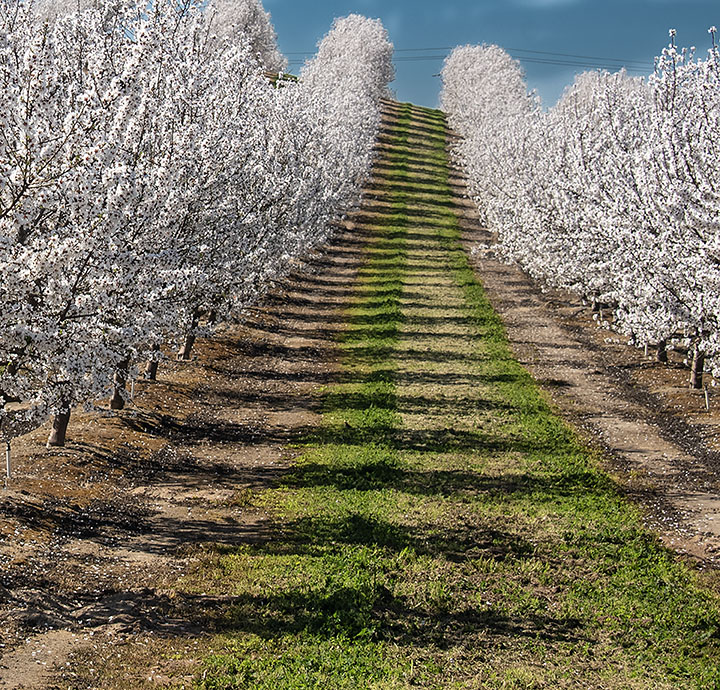
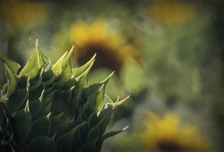
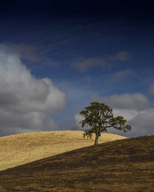
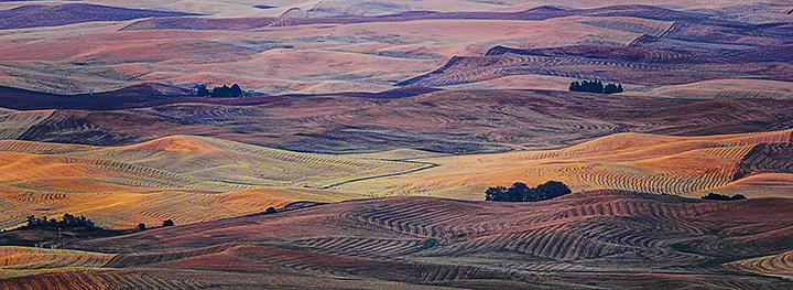
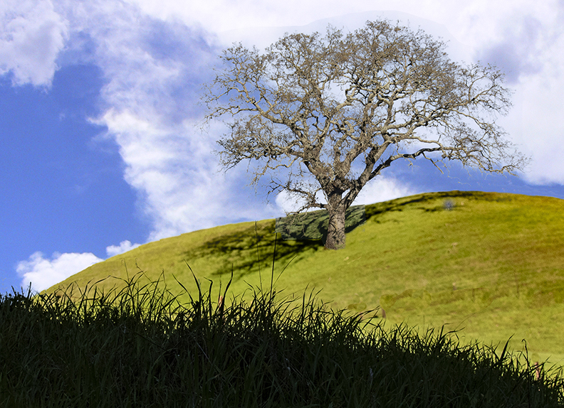
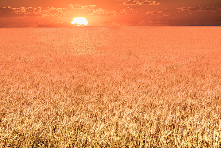
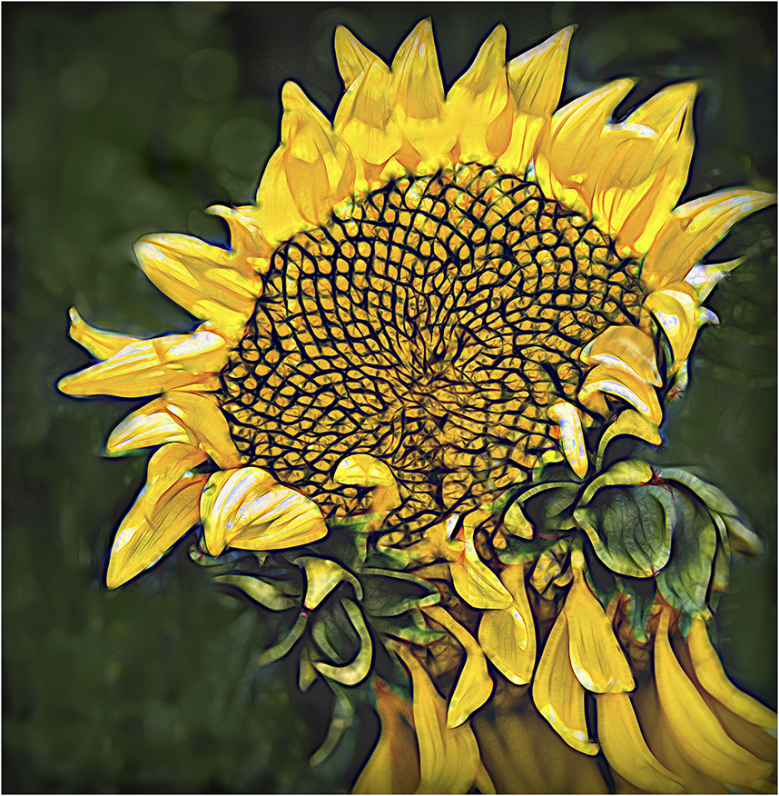
Mary Ann, I wonder if this was taken in California as I know there are a number of sunflower farms around that allow photographers access, although grudgingly. I think they want to direct us to acceptable places so we don't tromp all over the flowers, which are, of course, their bread and butter. Although the horizon is pretty centered, I could see no way of cropping this to avoid it. You don't want to cut ou any of the beautiful flowers and you can't cut out the sky without removing part of the tree, so you are stuck with a horizon in the middle Nonetheless, it is a charming photo with a great sky, showing the beauty of agriculture and the wonderful oak trees of the area. Good for you for using focus stacking. It is about the only way to get that sharpness front to back. Good job! |
Jul 16th |
| 3 |
Jul 24 |
Comment |
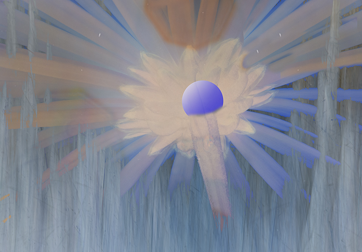
This is also unusual photo. You caught the artist in the shade while her work is emblazoned by the sun. She is wearing black which also makes her secondary to her work of art. It looks like she may be painting her view of the background buildings as some of the colors match. The angle you chose is perfect, emphasizing the artwork and making the artist a secondary element in the image. I really like your composition and the story is educational for at least me. I never had heard of using the cake-decorating method to produce a painting. Nice work. I have no suggestions for improvement. |
Jul 16th |
| 3 |
Jul 24 |
Comment |
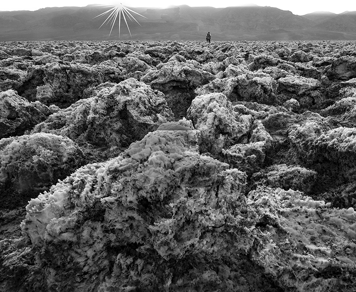
You cropped in nicely on the ice oddity. Very interesting crystalline formation. Totally new to me. I'm so glad you were able to show it to us. You did a good job with the cropping and it made sense to turn it into a monochrome as the ice is colorless. There doesn't seem to me to be much more you could have done than you already accomplished using our heavy duty helpers, PS and Lightroom Exciting photo. You might see if a newspaper would be interested to show this unusual formation. Maybe wait until next winter.
|
Jul 16th |
| 3 |
Jul 24 |
Comment |
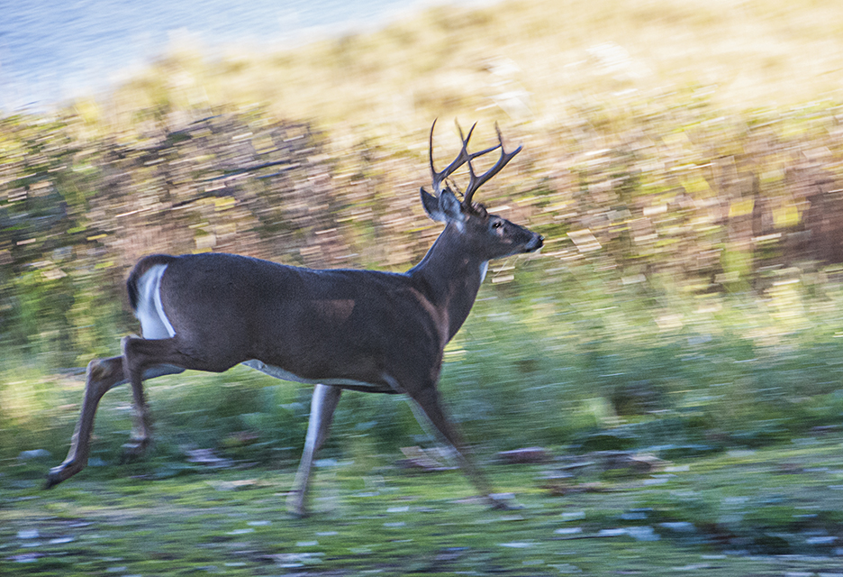
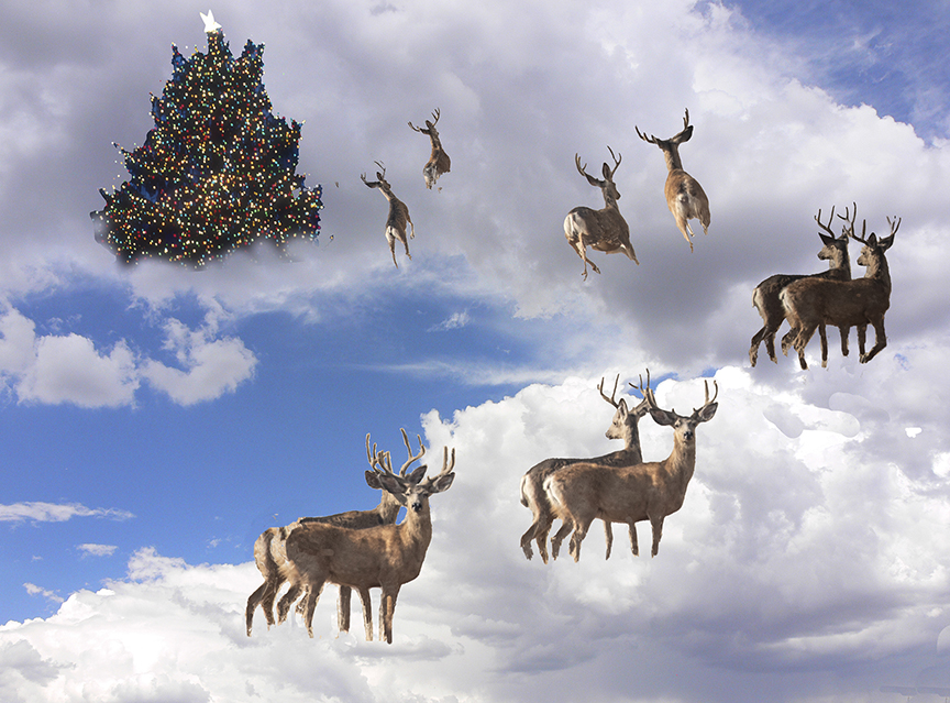
Looks like they had a lot of food available, so no flowers, hopefully. You did a good job lightening the deer's face. He's nice and sharp throughout. His pose is wonderful.
"Just turn a little that way, thanks." Sorry about the vegetation that is so out of focus on the lower let, but it is not too distracting, and does show off the fact that the stag himself is quite sharp. You were lucky to get him to give you that great pose. |
Jul 16th |
| 3 |
Jul 24 |
Comment |
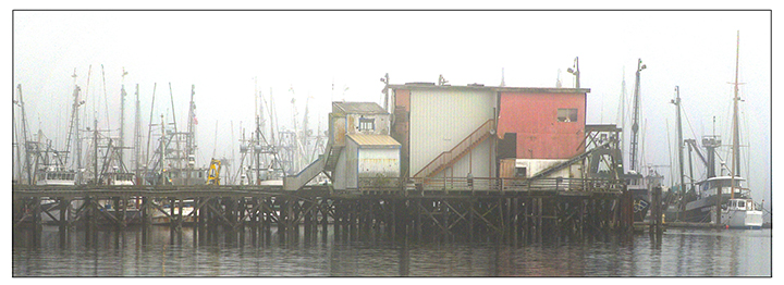
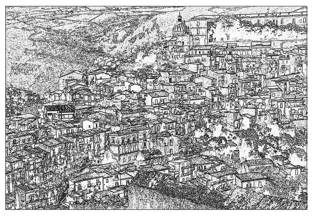
Michael,
The colors immediately catch your eye on that dull day you had.I would not be surprised to learn that this may have been your best shot of the village. Well placed in the frame and, once again, the colors of the old boats stand out so well through themurkey light. Like taking fall colors in the rain. You also had an organized composition, which may have been part luck and partly your good eye. |
Jul 16th |
| 3 |
Jul 24 |
Comment |
This is a wonderful photo. You were so lucky to get the sun just on the trullo. The centering of the interest point works well, especially since the buildings do not match right and left but have similarity to each other that makes is much more interesting than just flipping the image to achieve mirror symmetry. The color is also perfect, beautiful, yellow range with a blue range.. Very well done. Good seeing. |
Jul 16th |
6 comments - 0 replies for Group 3
|
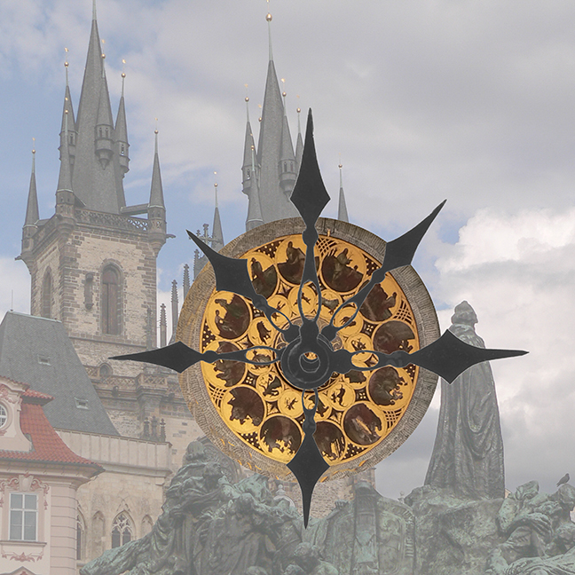
| 18 |
Jul 24 |
Reply |
You are right about the cows. I should have thought to try to turn at least oe of them toward the ship. My spaceship concept is that it could be anything as we have no idea where they would be coming from. However, I am going to try to do something else with the astronomical clock. Thanks. |
Jul 17th |
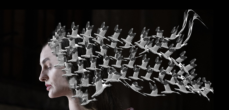
| 18 |
Jul 24 |
Comment |
Yolandi, I like the idea of the double exposure but I find that cutting off the triangular shape of the head at the nexck is a little too extreme for me. Your beautiful daughter seems to be diminished by this method. Maybe you could have reversed it and had her in full opacity at the top and a lower opacity at the bottom. Otherwise, I wold look for a different background for her, if she were mine.But your idea of the double exposure is a good one and I wold keep trying to see if you could find something that brought out her beauty. |
Jul 17th |
| 18 |
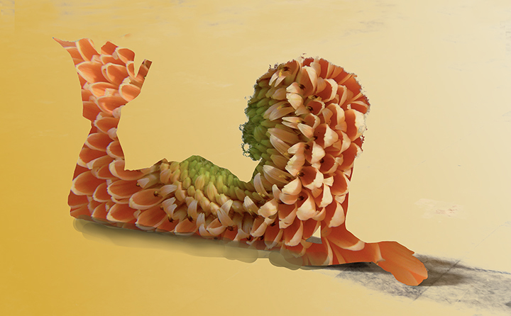
Jul 24 |
Comment |
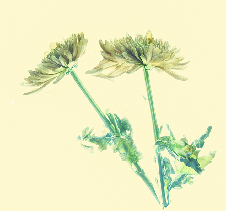
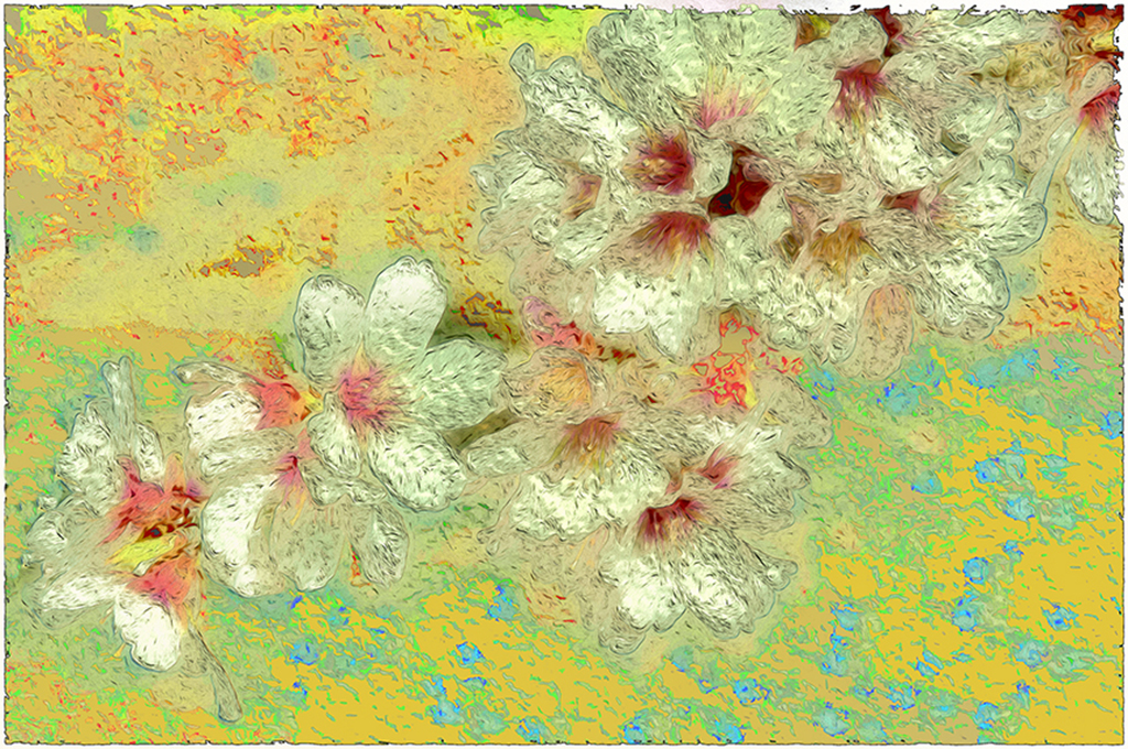
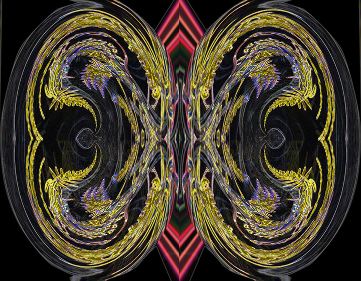
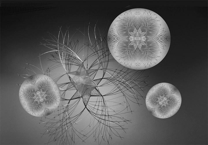
First of all compliments on your macro work. The flower in the big room sure didn't look like your tight close-up of it you are showing us. The close-up is much more interesting than the whole flower as the middle is quite entrancing. I'm not sure that adding the two inserts shows what you are trying to achieve. In any case, I would suggest using the bevel in the same direction rather than opposed. Your composite certainly takes it Ito the realm of creative, but maybe a few more of the inserts showing different sizes until you reach the really close-up that we are enjoying . Interesting idea, in any case. |
Jul 17th |
| 18 |
Jul 24 |
Comment |
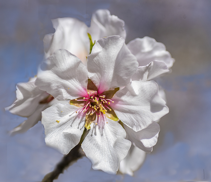
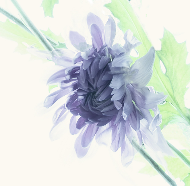
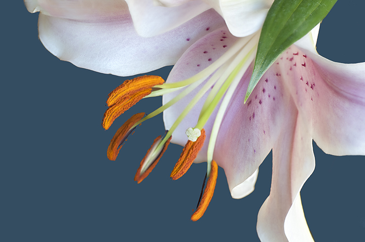
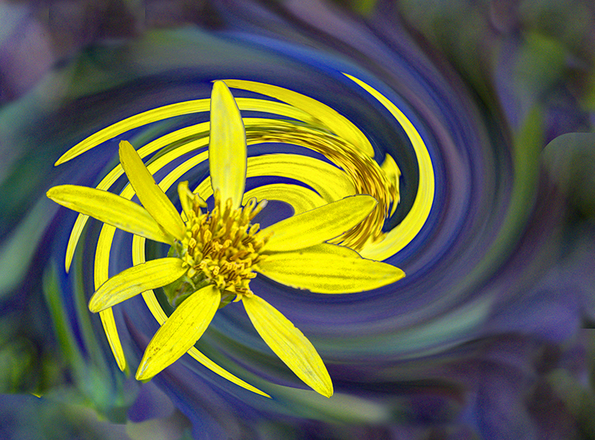
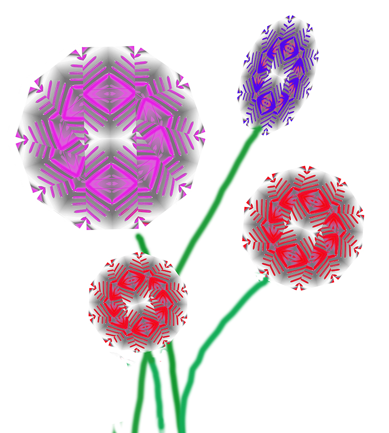
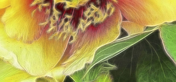
Gunter, Your flower (I wonder what it is, a tulip?) is creative sufficiently because of the unusual cropping and colors. The blueish petals and almost yellow (toward green) complement each other on te opposite sides of the color wheel. Choosing a diagonal angle gives it a lot more strength and the thrust of the bluish-purple petal works so well in that regard. The two light petals to the left and right make an interesting background. Because of my bad eyesight it took a few minutes to realize they were also petals and not just a textured BG. I also appreciate your composition. Glad you used focus stacking as that insured the sharpness theoughout the flower. Nice work. |
Jul 17th |
| 18 |
Jul 24 |
Comment |
P.S. It's also nice that we are attracting outside critiques. That is what I think the directors are trying to encourage. So many thanks to them for joining us. |
Jul 17th |
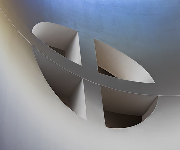
| 18 |
Jul 24 |
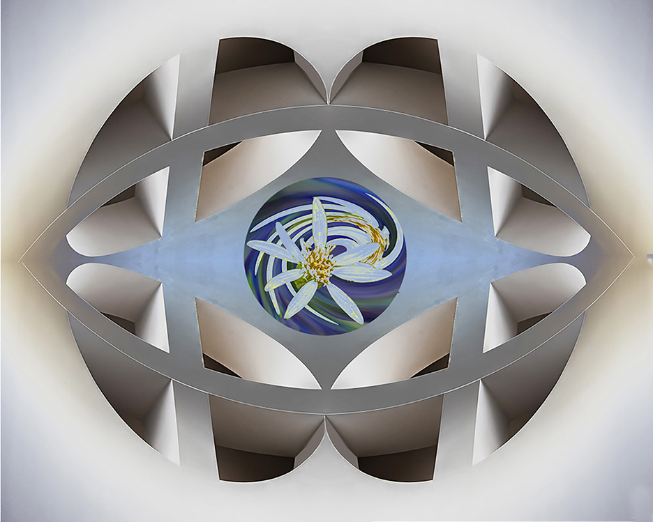
Comment |
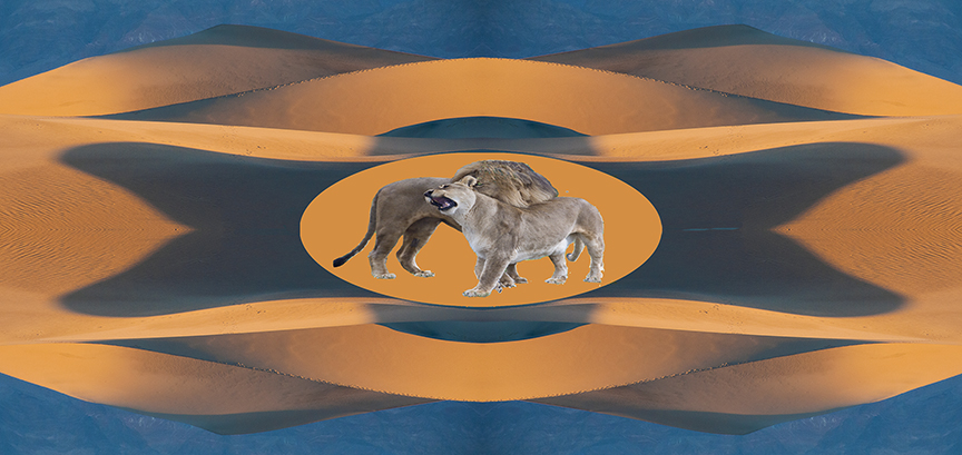
Ian, This is so attractive. I really prefer it as an oval. The colors are great and I think you did a good job adding the red stroke around the oval. You are right that the thin pie shaped area in the upper left is distracting from the rest of the image. You might try outlining it and content aware or the newer AI filter - Generative Fill - in Photoshop,which I do not have yet to get rid of it. Otherwise, it's really pretty and enjoyable to look at and study. |
Jul 17th |
5 comments - 1 reply for Group 18
|
11 comments - 1 reply Total
|