|
| Group |
Round |
C/R |
Comment |
Date |
Image |
| 3 |
Jun 24 |
Comment |
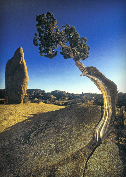
Mary Ann,
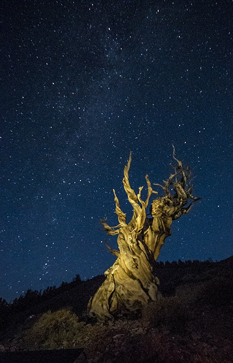
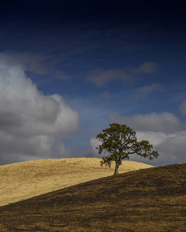
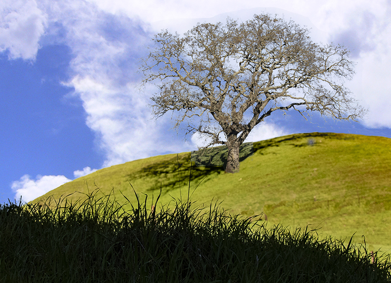
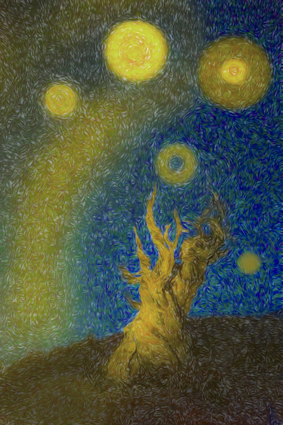
It is a great opportunity to take night photos, especially the milky way. I like the second version you came up with as it had a lot more light Since I have AMD, the dark items are really dark and difficult for me to see. I like the idea of quickly throwing light n the tree, maybe with car headlights or a strong flashlight. It would make the image more appealing as there would be more contrast. I'm afraid that's all the critique I can give.
|
Jun 13th |
| 3 |
Jun 24 |
Comment |
The musician is captured perfectly. The lighting is just on hi and all of him. I can imagine the fun of the accordion capturing the attention of the onlookers ,singers and dancers. The composition is excellent. I have no suggestions except to attach a CD of his singing and playing. Nice work |
Jun 11th |
| 3 |
Jun 24 |
Reply |
Yes, I should have done a better job on this one. |
Jun 11th |
| 3 |
Jun 24 |
Comment |
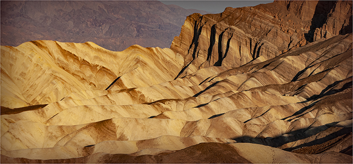
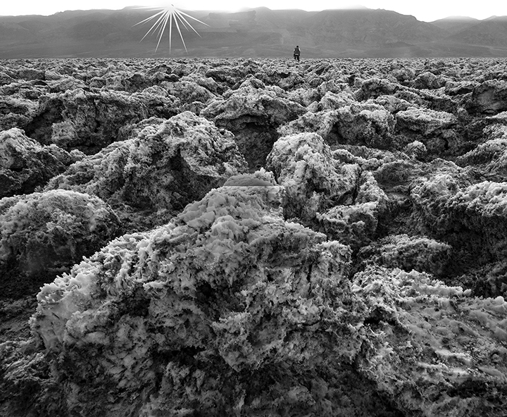
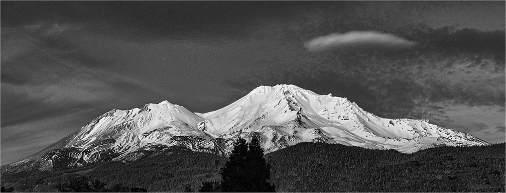
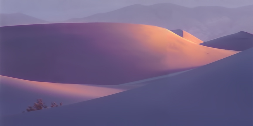
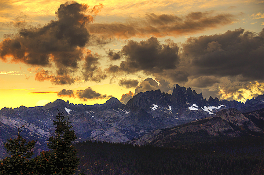
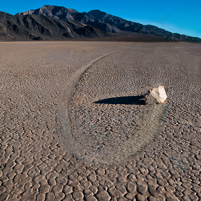
Ruth, Death Valley is one of my favorite places. It takes some grit to get up very early to get Zabriskie Point at its fairest. I think that is the area you were visiting. The young lad was brave tog out onto the land there, but I think you'll agree that the most important part of the photo are the interesting hills, and not the guy. I would suggest, as others have, to crop out most of the foreground, leaving hi in there, but just barely,. You also might consider going wild with the Vibrance tool and really bringing out the color differences between the hills.Glad you liked Death Valley. So much to see there. glad they made it a National Park |
Jun 7th |
| 3 |
Jun 24 |
Comment |
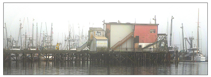
Robert, You are clearly an expert in Photoshop ors Lightroom to bring out the houses against the other shore tso beautifully,, I think it would be helpful to all of us if you described what you did in more detail Your photo makes us all wis we had a vacation home in Virginia. You also might consider cropping the sky down a bit to get the horizon a little more out of the center. Beautiful shot.
|
Jun 7th |
| 3 |
Jun 24 |
Comment |
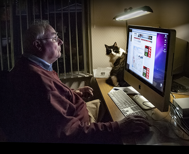
You did a great job of bringing back his eyes, which makes all the difference, Grab shots from the car or of a passing vehicle can work out very well if you have some luck on your side. The capture of the young Indian boy is really great.Good shooting and post processing |
Jun 7th |
| 3 |
Jun 24 |
Comment |
I'm not sure what Robert did with tge background ,but after choosing the entire background, you would have to use a mask to get a gradual but as you got further into the trees behind the two it looks like Robert ddid that. |
Jun 7th |
| 3 |
Jun 24 |
Comment |
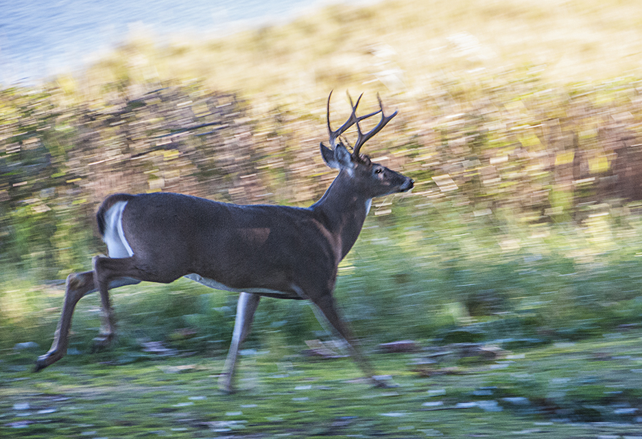
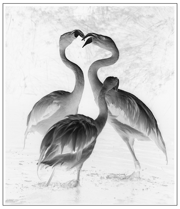
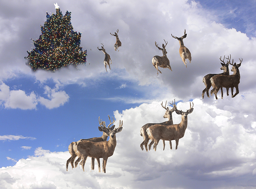
I love that the are so in coordination with each other you certainly goy their attention. The background was also very much I focus, which leads to a conflict of the horns with the background. To avoid tat toy wold have to use a wider aperture, giving the separation from the background. You might try the subject filter to outline the buck, then reverse it so the the rest of the photo is select4ed to either blur and darken that area. They are a wonderful set of animals in any case. |
Jun 7th |
| 3 |
Jun 24 |
Reply |
Ruth, I do't see the monotone, but for some reason the color did seem o reduce despite the fact that I used vibrance. I really don't know what happened. |
Jun 7th |
7 comments - 2 replies for Group 3
|
| 18 |
Jun 24 |
Reply |
Thanks, Yolanda. Are you a new member |
Jun 29th |
| 18 |
Jun 24 |
Reply |
Gunter, I like your version better than mine. It has a lot more drama. Thanks for sharing. |
Jun 29th |
| 18 |
Jun 24 |
Reply |
I like this version better. At least it has a more moody feeling because of the blue darkening the wold scene. |
Jun 29th |
| 18 |
Jun 24 |
Comment |
PSS The description for the creative groups is Barbara Miller's definition which was mentioned earlier. |
Jun 29th |
| 18 |
Jun 24 |
Comment |
I guess I am the villain here. I have worked in creative for well-over 30 years and was responsible for having the creative definition changed for our council, which is the Northern CA Council of Camera Clubs. I think the definition for creative at PSA has been expanded, as well. The N4C definition is:
Creative photography is producing an image through the use of imaginative skill or originality of thought including the altering of reality. No image should be eliminated from competition simply because it looks realistic, provided it shows originality of concept. Creative images may include modifications in the darkroom, on the computer, or in the camera, as well as unusual points of view, imaginative use of subject matter or lighting, or any other presentation that begins with the maker's photograph or a collection of photographs. All Creative images must be consistent with the standards stated in the preamble to these definitions. In Creative image competition the title is read when showing the image.
The PSA definition is: The PSA definition of Creative is "Altered Reality." The image may be of any subject matter and must obviously display a change in natural color, form, shape or any combination of these three. All images must be original and may not incorporate elements produced by anyone else.
The PSA definition, in my estimate, actually contains more encouragement to produce something really abstract, but does not encourage just fixing up an emerge so I looks better..
that should be left to the General DD categories., IMHO.
Joan |
Jun 29th |
| 18 |
Jun 24 |
Comment |
Jim, You certainly improved the image with your corrections, but if you look at it you can't tell that it has been substantially corrected or changed . I would like to see the door of the church open and a glowing person walking in, or maybe an angel above taken from a cemetery statue. To me "creative" needs more than just correcting something to look better. Maybe we should run this past the overall director of DD to see what she has to say, Ms. Miller, |
Jun 15th |
| 18 |
Jun 24 |
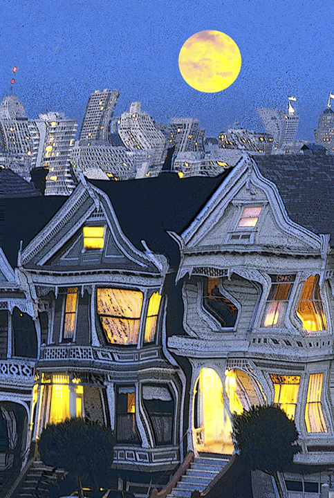
Comment |
What an intriguing idea to chang e daylight into an evening shot. I guess they do that frequently at the movies, or at least used to. You have gone to a lot of work ad I congratulate you on your workover. It certainly seems like an evening shot. I wonder if you had a chance to go back in the evening and take the shot of those buildings as comparison. That would be fun. |
Jun 15th |
| 18 |
Jun 24 |
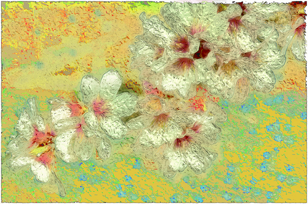
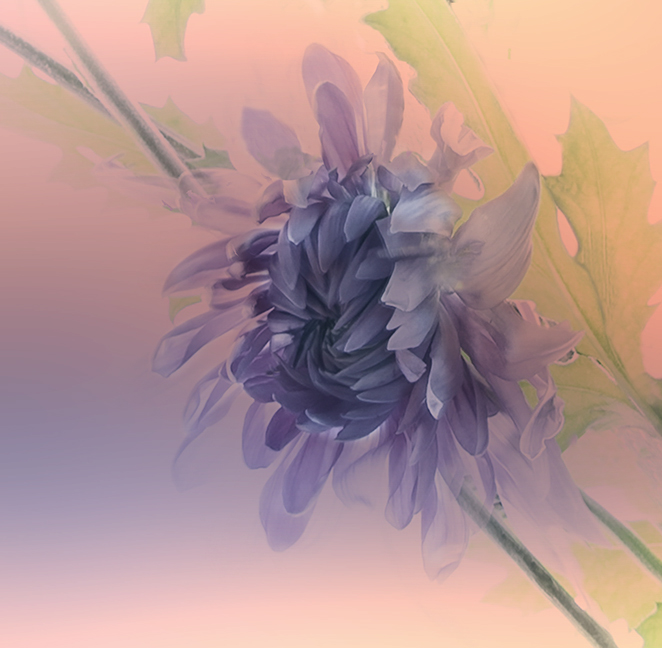
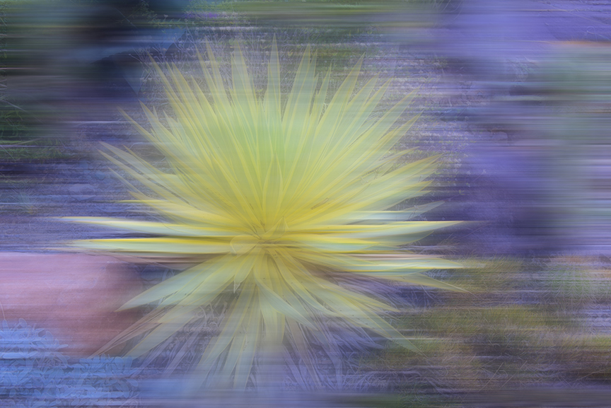
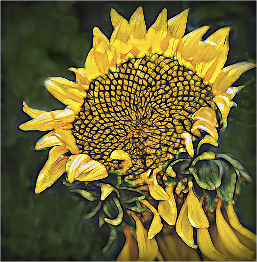
Comment |
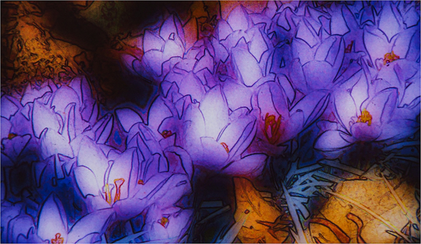
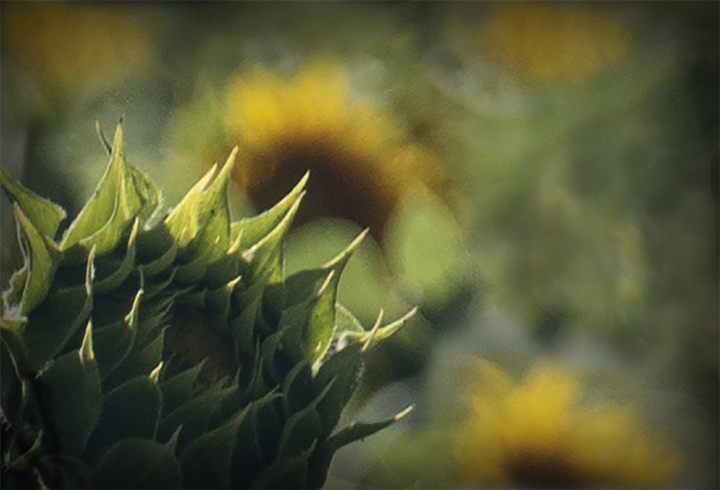
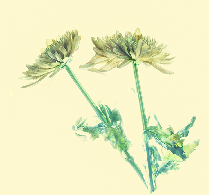
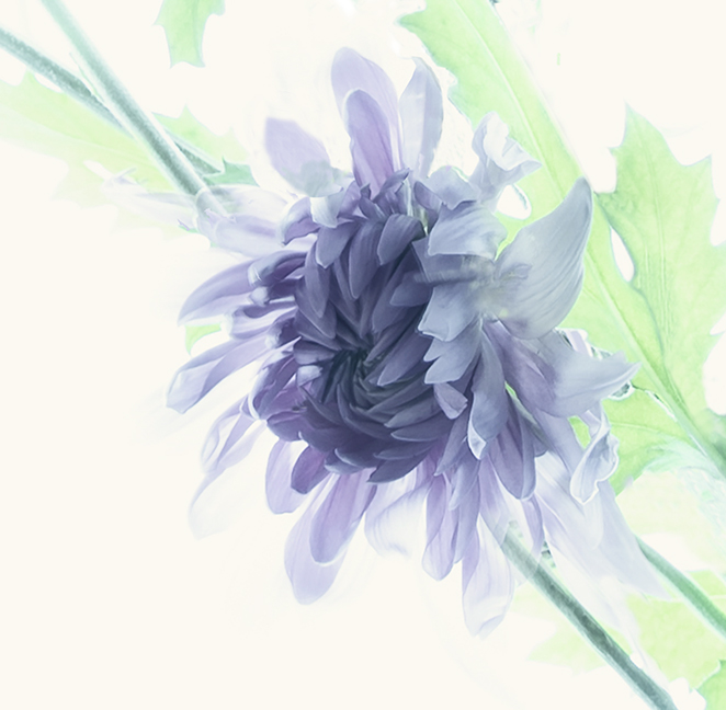
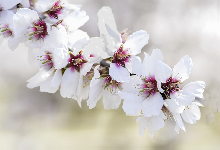
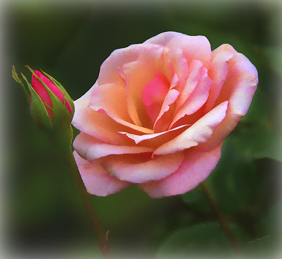
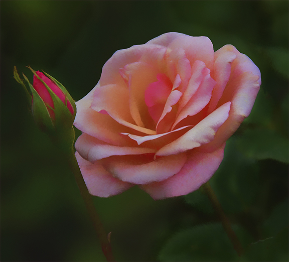
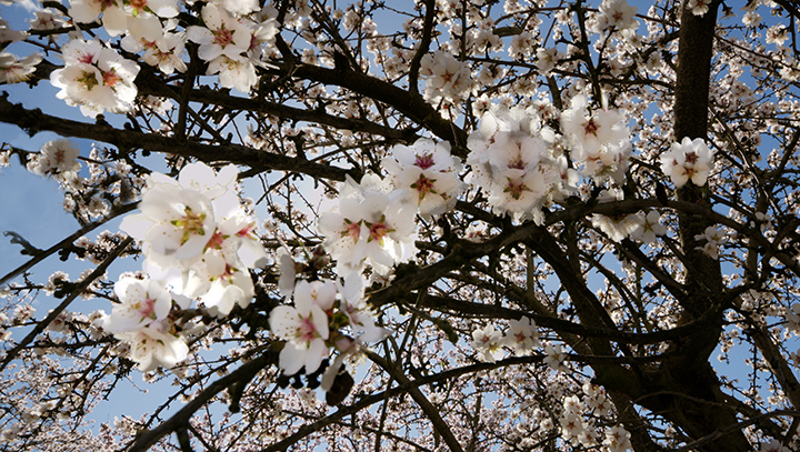
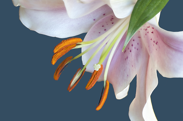
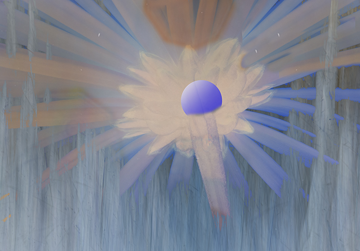
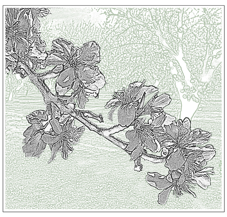
Gunter, You have achieved a beautifully lighted composition, with the higher intensity of the light on the top petals. Whatever you did worked very well. I have no suggestions for improvement. Good job! |
Jun 15th |
| 18 |
Jun 24 |
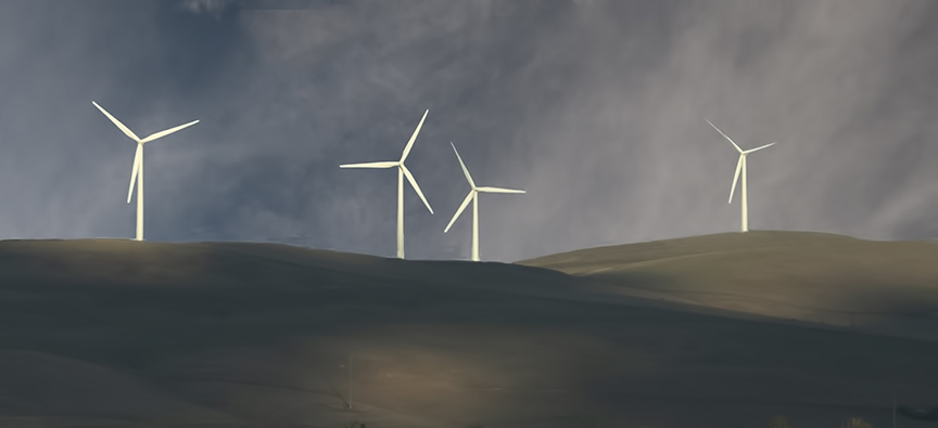
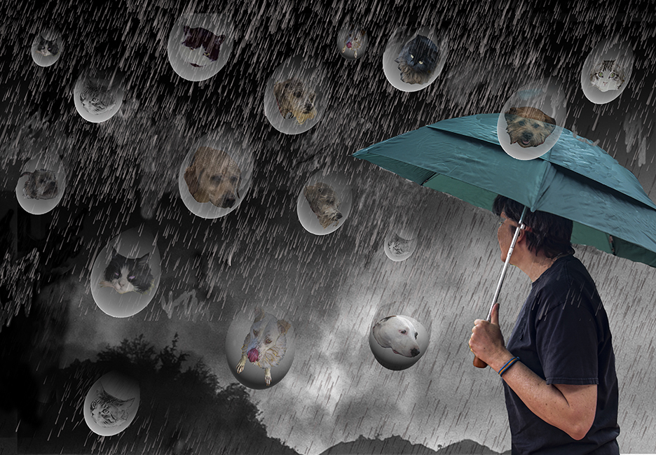
Comment |
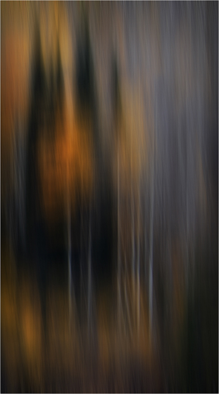
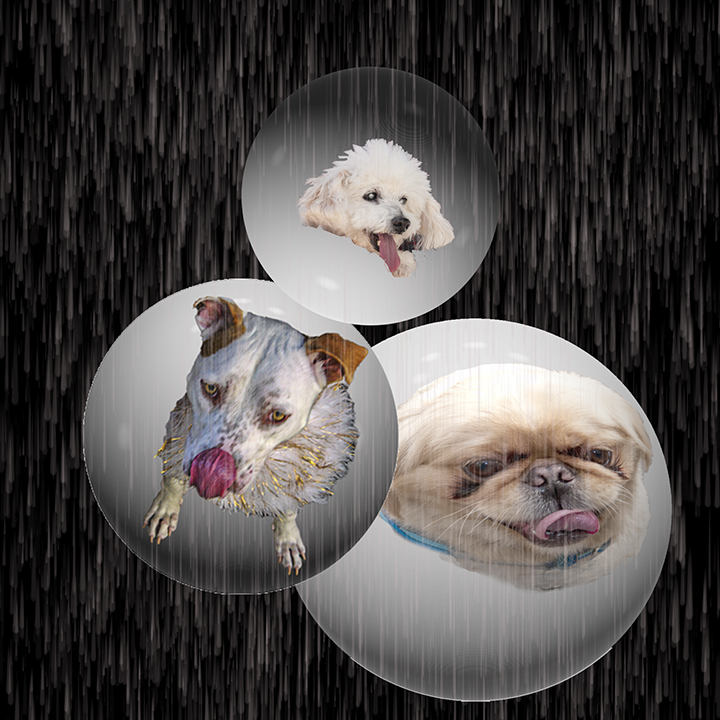
Help! I need to have something sharp. Maybe in the foreground where , theoretically, the rain is less, therefore less fogging up of the image in that area. I think the only way to do that would be if the original image had some sharpness and you used a mask which has a graduated strength, giving the foreground more sharpness and getting more and more out of focus as you go back into the picture. Sorry, maybe because of my AMD I need something to grab my attention as being sharper than the rest of the photo. AMD is adult onset macular degeneration, which I am fighting as best I can before it reaches an impossible state. |
Jun 15th |
| 18 |
Jun 24 |
Comment |
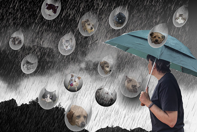
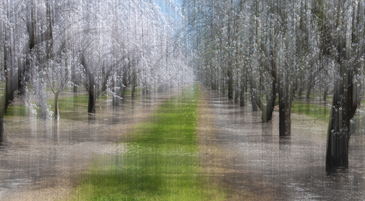
Why is no-one critiquing these images this month? I have my excuses, but dos everyone have then?
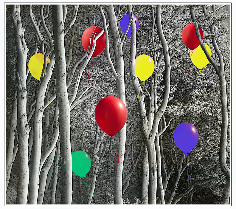
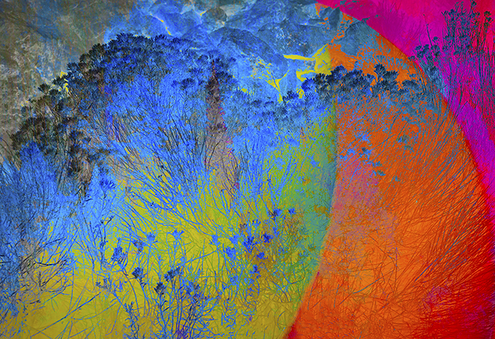
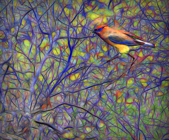
Anyway, You image takes on a fairy0tale-like feeling with the blues of the trees really making this original photo into something special. To make it even better, I would suggest removing the buildings or whatever they are on the land. It shouldn't be too difficult using the Photoshop clone tool. Otherwise, I really love the feeling of something totally out of this realm. Good work, Ian. |
Jun 15th |
7 comments - 3 replies for Group 18
|
14 comments - 5 replies Total
|