|
| Group |
Round |
C/R |
Comment |
Date |
Image |
| 3 |
Feb 24 |
Comment |
Mary-Anne,
I love that you managed to get the height of the village as an important part of this image. It goes up and up. The cobblestones and interesting architecture make us think of E Europe, in this case, Portugal.there's a nice contrast between the people who are mostly in dark clothing and the light as it goes up the buildings, leading us up the hill. Crropping out the sky was wise. and adding more color to the building's was an excellent idea. You really give us the feeling of that place . I love how talll the buildings are.
|
Feb 22nd |
| 3 |
Feb 24 |
Comment |
Kieu-Hanh, This photos makes me think of a set of strange -looking Christmas trees, decorated for the holidays. In any case it does give of feeling of desertion fro the season. Th is is a photo of beach umbrellas that we never notice or rarely see, which makes it unique. The sand is almost empty, only one couple out there. well past prime time for enjoying the beach. I would suggest that you clone out the road in the sand, if possible and just put in more footprints to match the rest of the sand. The footprints, by the way, do make you think that this is just a short hiatus and the crown will be black soon.
Very interesting photo.
|
Feb 22nd |
| 3 |
Feb 24 |
Comment |
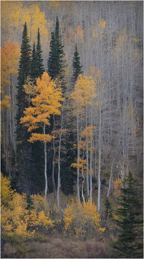
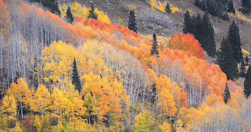
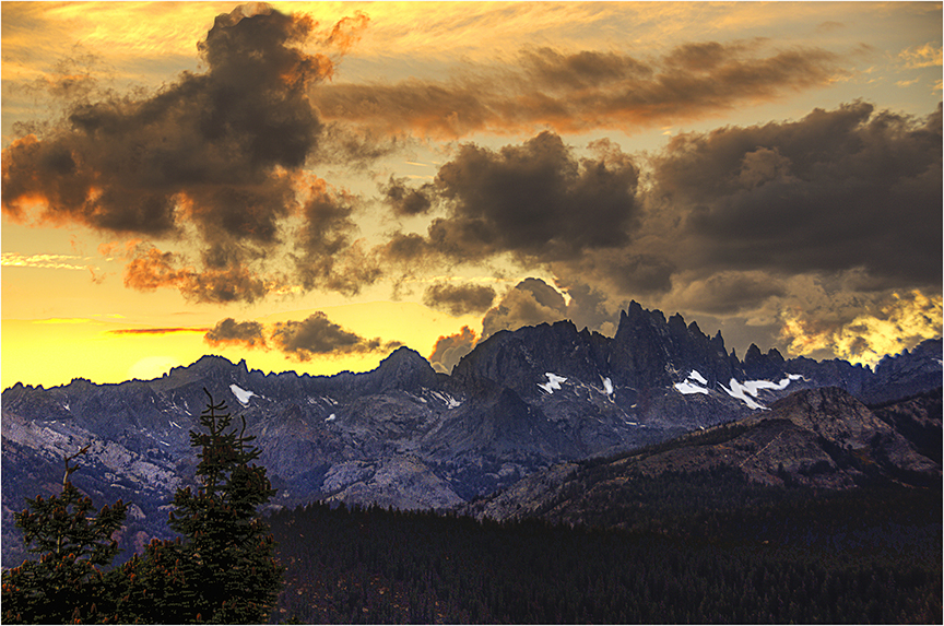
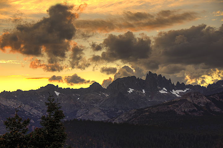
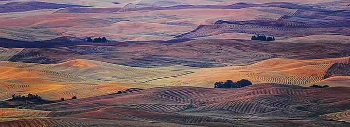
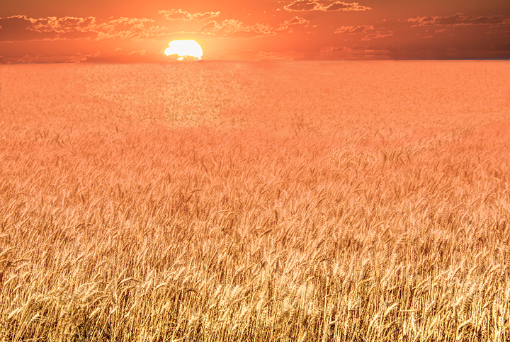
Your lovely fall. photo really sh ons us the need to go out and photograph fall color. If it's close by, all the merrier.
Your composition is terrific. The rip please in the water balances tge mountain peak very well... Bringing up the color a little is what one should do with the vibrance tool as the colors of the leaves are what makes the photo. You darkened the sky just enough to show some clouds and take away the bald sky of the original. . I have no suggestions for improvement. The lake reflection helps extend the beautiful colors. and fill up negative space. |
Feb 22nd |
| 3 |
Feb 24 |
Reply |
That's a great idea. Thanks,. Kieu-
Joan |
Feb 22nd |
| 3 |
Feb 24 |
Comment |
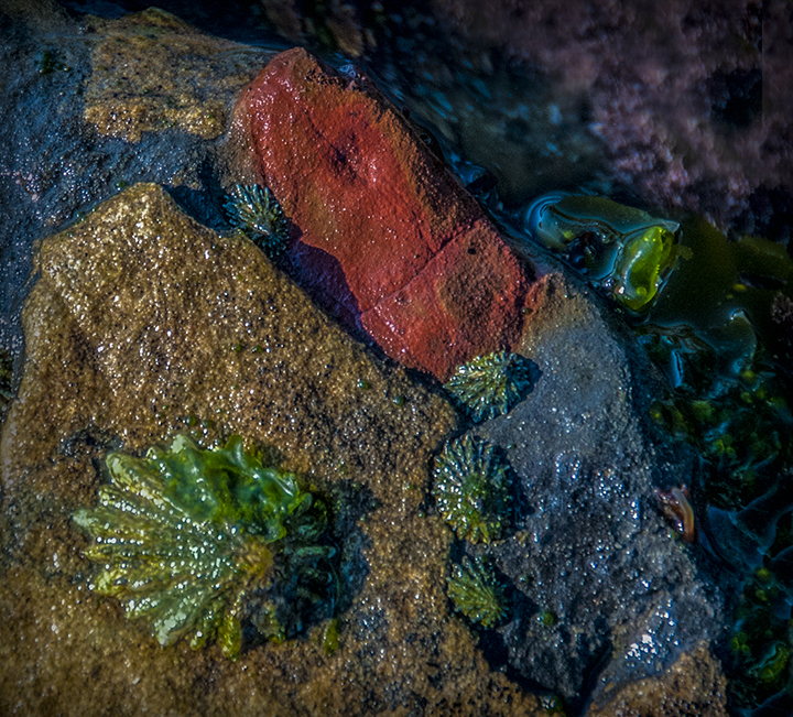
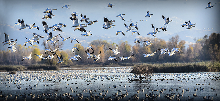
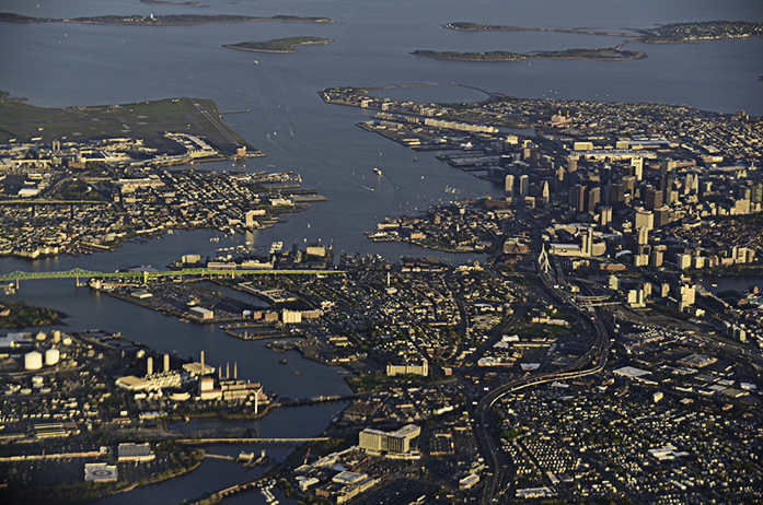
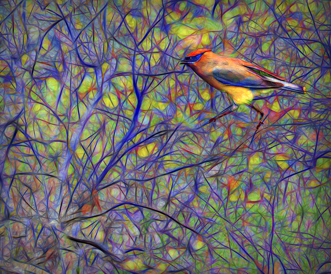
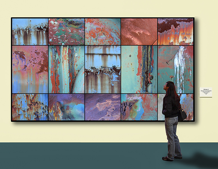
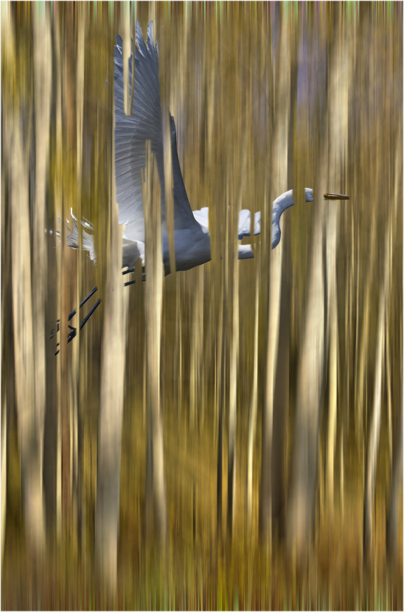
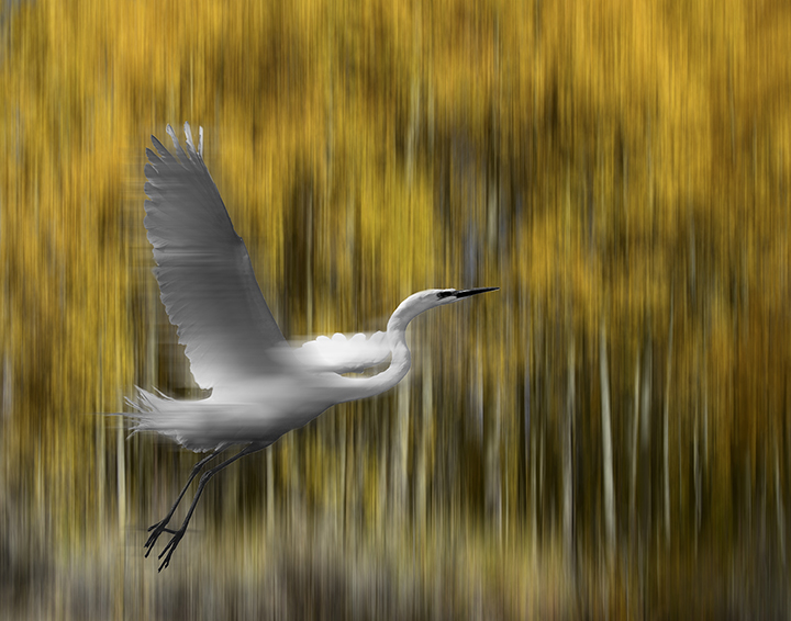
This is a wonderful presentation and illustrates something I have mentioned many times as past judge. The high number of pixels allow us the crop waaaay in without losing the sharpest necessary for prints or projected images, which is about anything connected with a camera club these days.I assume you were on a tripod, but image stabilization is so advanced these days that even long lenses like your can be handheld. I love the flying of the wings and tail feathers. Glad it was the bright red male cardinal. I really en. joy this shot. Excellent work. |
Feb 3rd |
| 3 |
Feb 24 |
Comment |
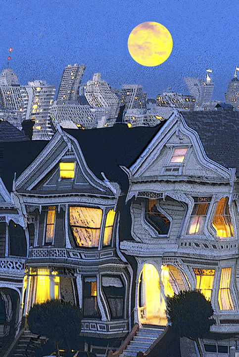
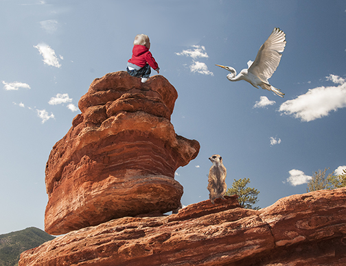
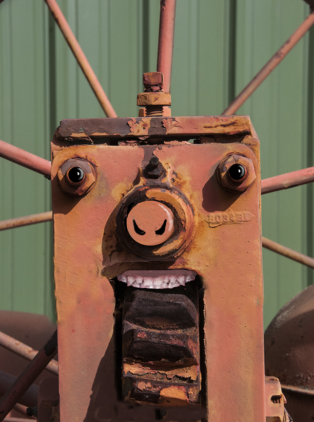
Michael, What a good find. A bird apartment. What fun! I had never seen one before. You caught quite a few birds on it, flying toward it. I am intrigued by the small entrance with a bigger box, presumably for the. next on each house. You had a cloudy sky so that there were no distracting shadows and we can see very well exactly what they look like. You chose to center it in the frame, but that doesn't bother me.. The fence acts as a leading line to bring us there, as if we w wouldn't have gone there immediately anyway.
Thank you shor showing us something different and increasing our knowledge of people accommodating the bird world. |
Feb 3rd |
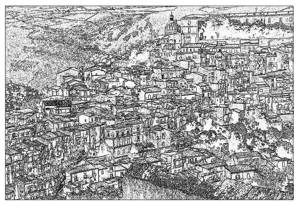
| 3 |
Feb 24 |
Comment |
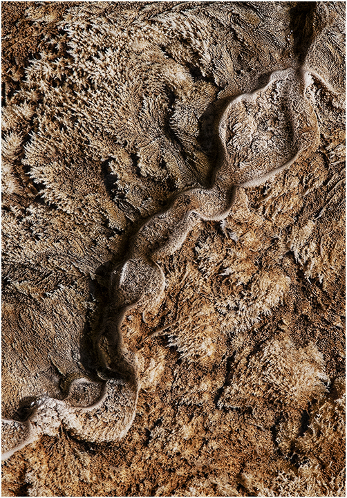
David, Are you a new member? Your name doesn't sound familiar, but the I am very bad with names. If so,, welcome!
You have captured a lovely close-up landscape whichch is all about the lighting.Te brightest areas show the tiny brook coming down the hillside and flowing between the rocks. There is a nice diagonal fell here. The play of light and shadow is well handled. There is so little water showing that I would have trouble knowing what speed you took this photo. I like the use of the bright branch to partially fill the shadow area in the upper left. I find there is a balance between that raker area and the rocks on the far lower right. It looks like you added a dark vignette on all four corners keeping our eyes in the center and most important part of the image..Nicely see and photographed. |
Feb 3rd |
6 comments - 1 reply for Group 3
|
| 18 |
Feb 24 |
Reply |
You're right about the shadows. I recently submitted it to ur club in creative and did pt in a hint of shows. I think it got a third. |
Feb 22nd |
| 18 |
Feb 24 |
Comment |
Jim,
Very creative idea. I think you did a great job and, if I had been judge, I would have awarded you some high place for your ingenuity. I'm not sure I see much difference between the original and the final product. It is well-photographed, fills the frame well and has an excellent creative concept in your presentation. Good work! |
Feb 3rd |
| 18 |
Feb 24 |
Comment |
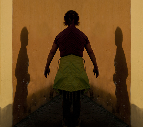
Chan,
Good work! The man is photographed so well to start and I like the concept of adding a blue layer which does two things: 1 fives us the blue-gold color contrast and 2. Makes the final image more creative and subtle. The blue feels like colored shadows which give interesting darkness to the man and his accouterments. Using the window frame as your chose to frame it is interesting, not just a simple frame but one that has tension because of the two sections that are still showing parts of the background wi the the man. Some judges might say that the. small section of the BG shouldn't be there, but I find them quite delightful. The other items you have included give a good compositional balance to the shot. |
Feb 3rd |
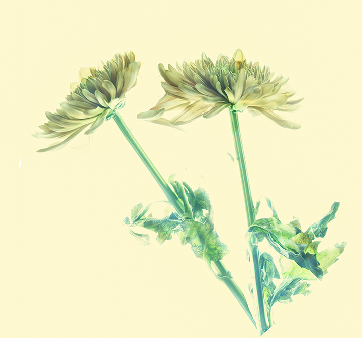
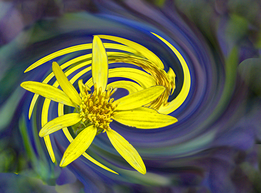
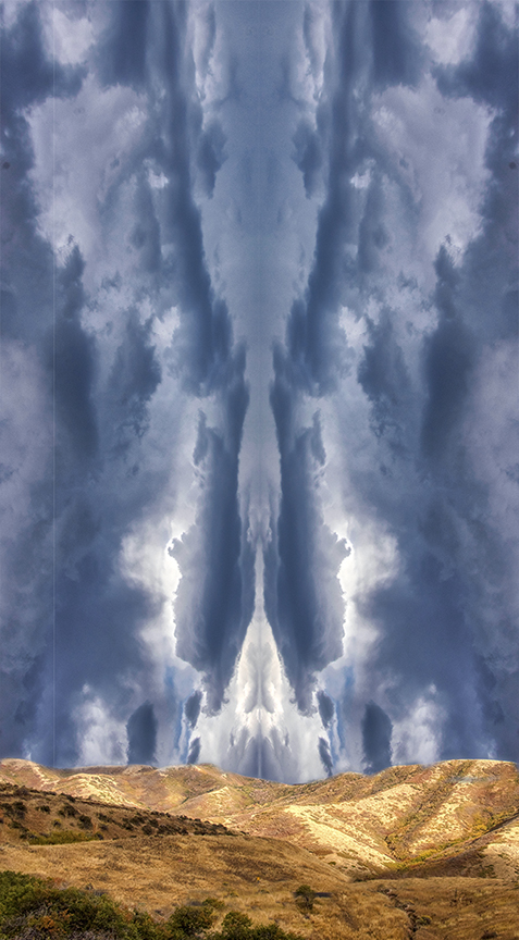
| 18 |
Feb 24 |
Comment |
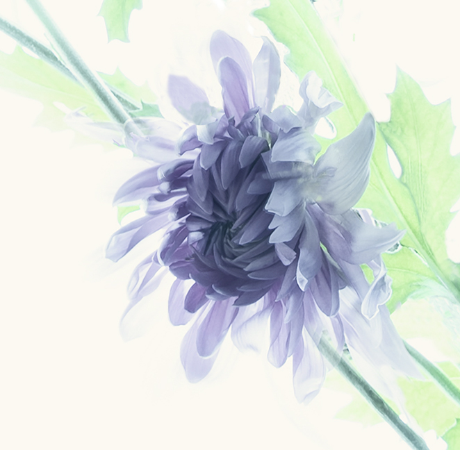
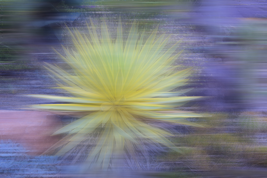
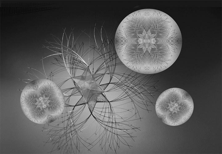
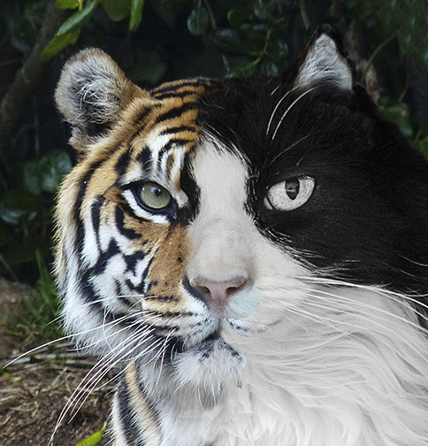
Gunter,
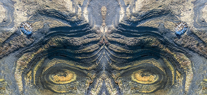
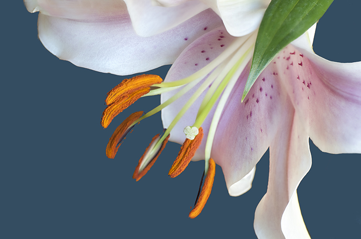
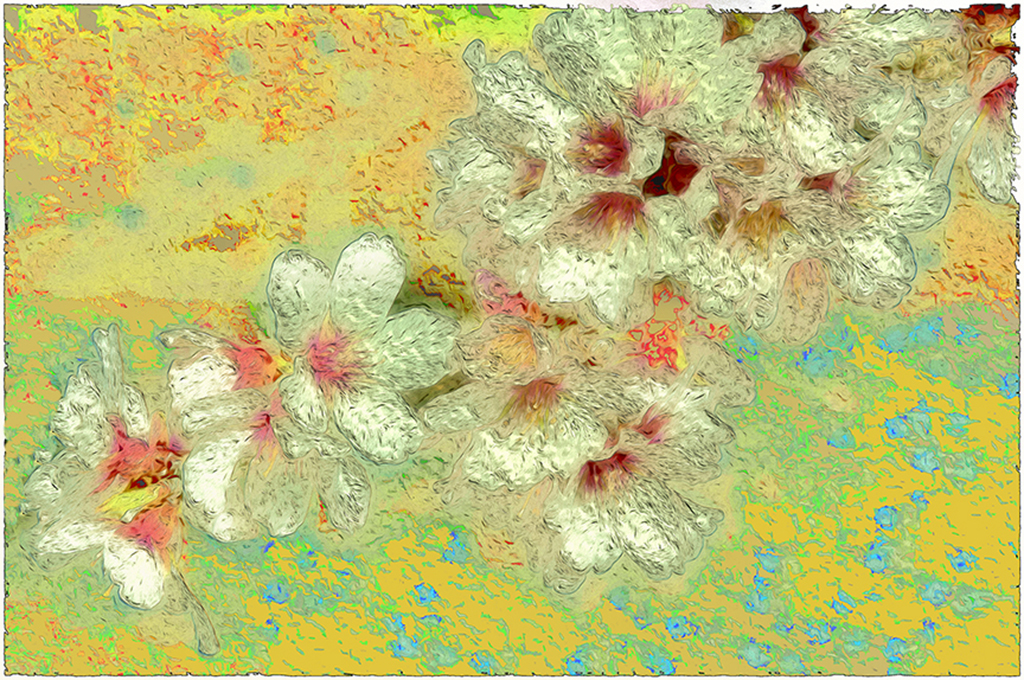
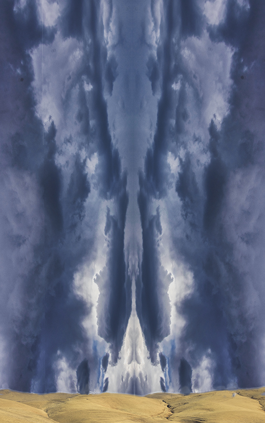
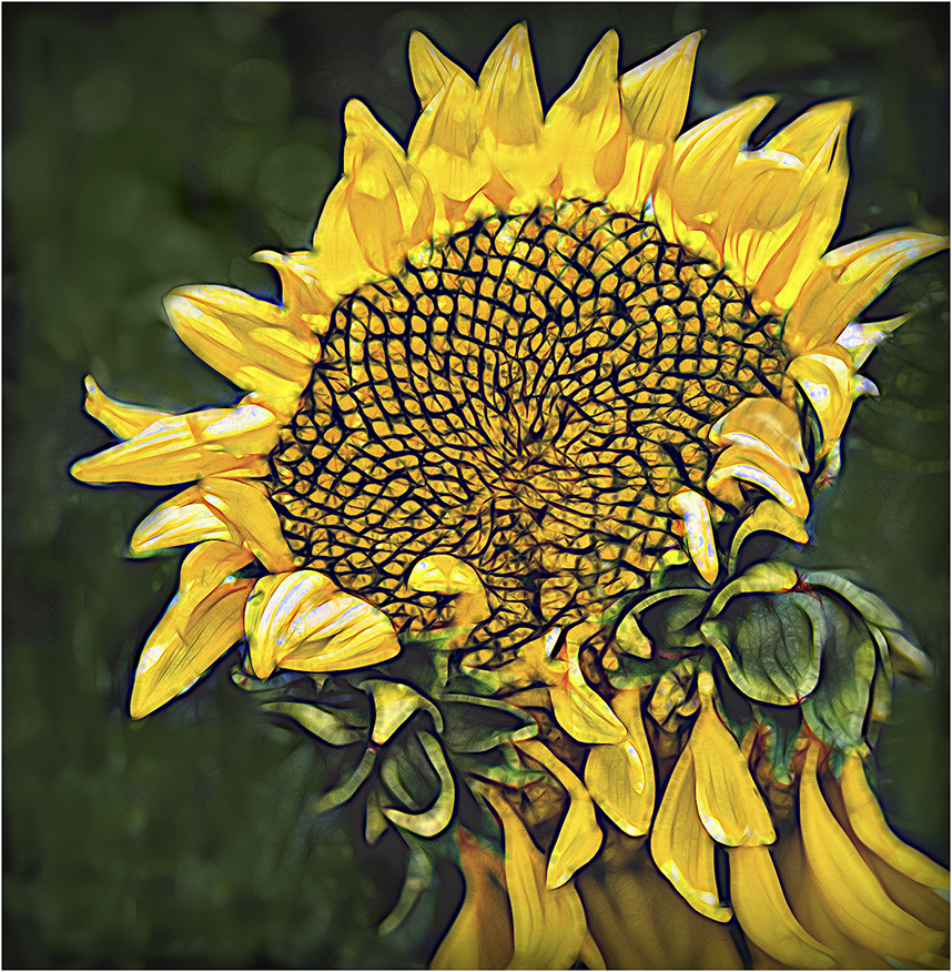
I love what you did here. . A great eye for picking the right section of the flower ad changing what was a boring white flower into an exciting composite with a wide range of black and white. Flipping the segment in an opposite direction works extremely well. I'll have to remember that. The only suggestion I have would be to make the image a bit brighter so that we actually have some close to real white areas. So try it if you Want by using the Camera Raw filter to lighten the white areas. Otherwise, and even as is, it is a wonderful treatment and a great idea. |
Feb 3rd |
| 18 |
Feb 24 |
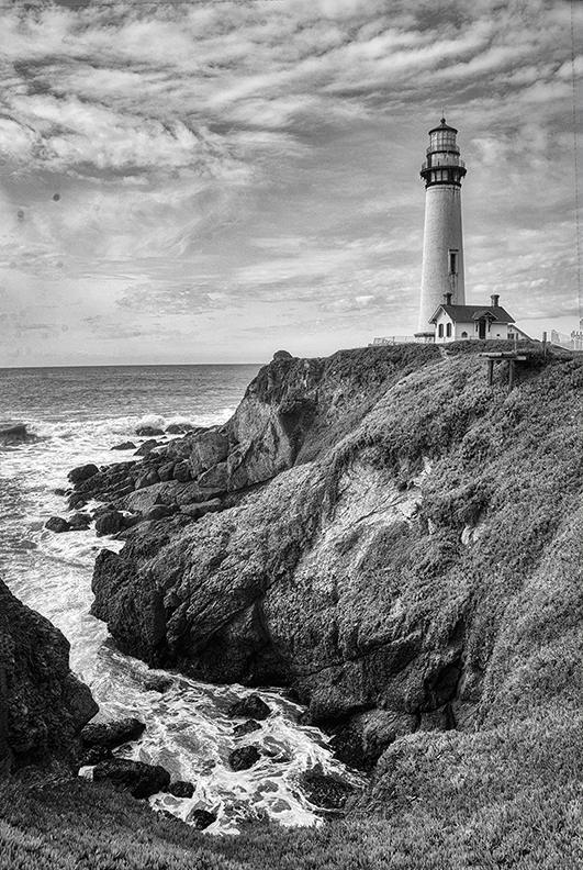
Reply |
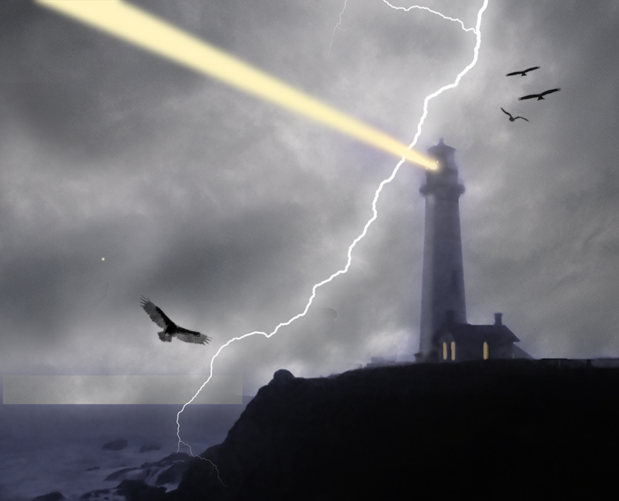
PS. I went to that PSA conference, as well and probably have shots of that lighthouse. |
Feb 3rd |
| 18 |
Feb 24 |
Comment |
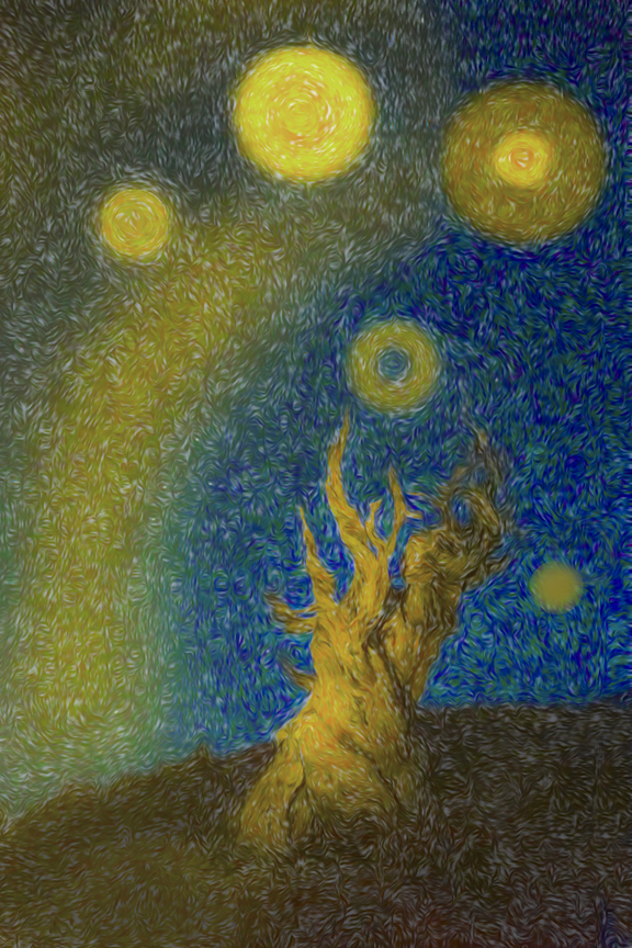
Andrew,
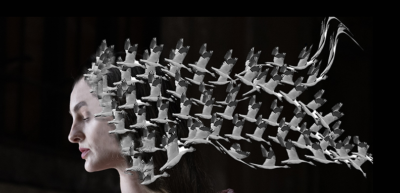
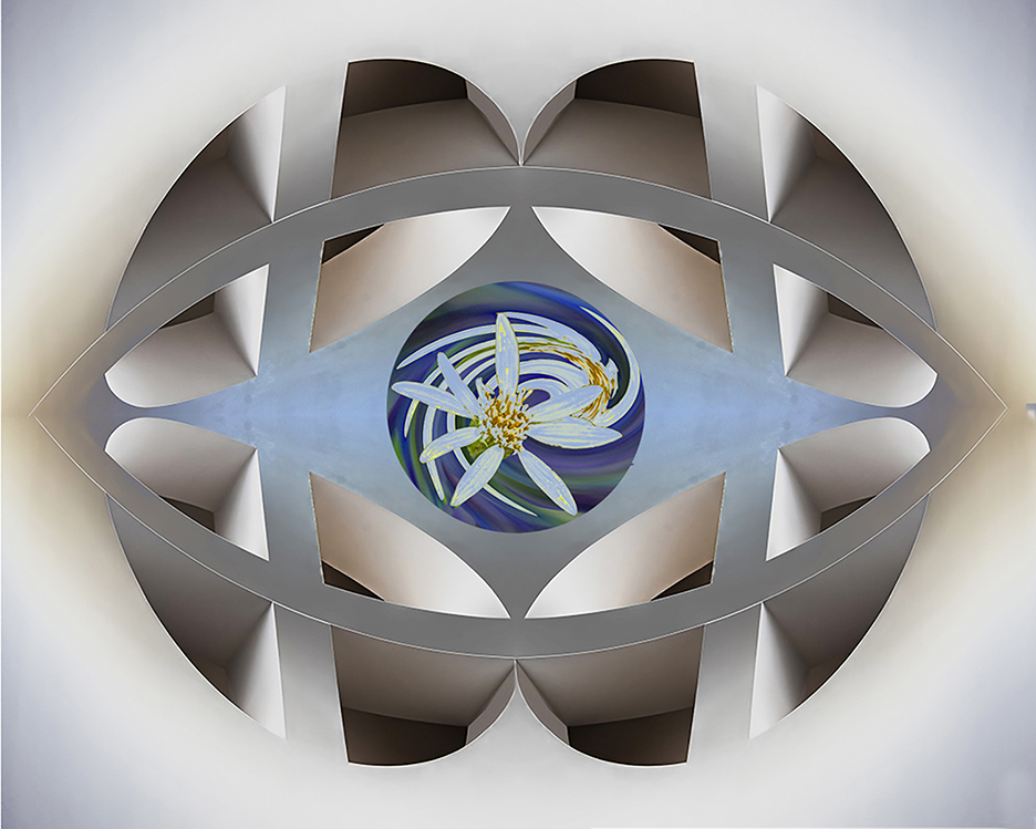
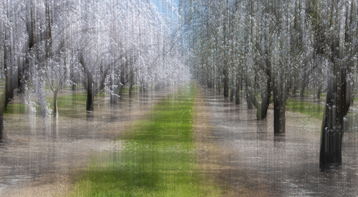
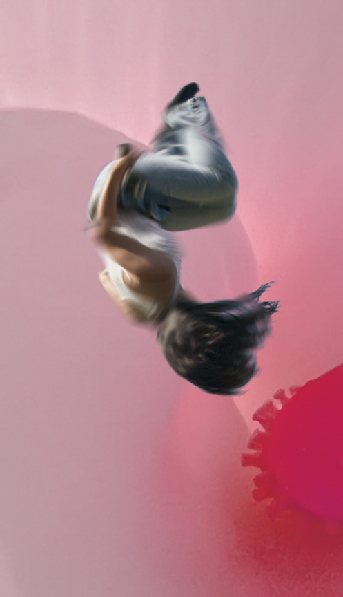
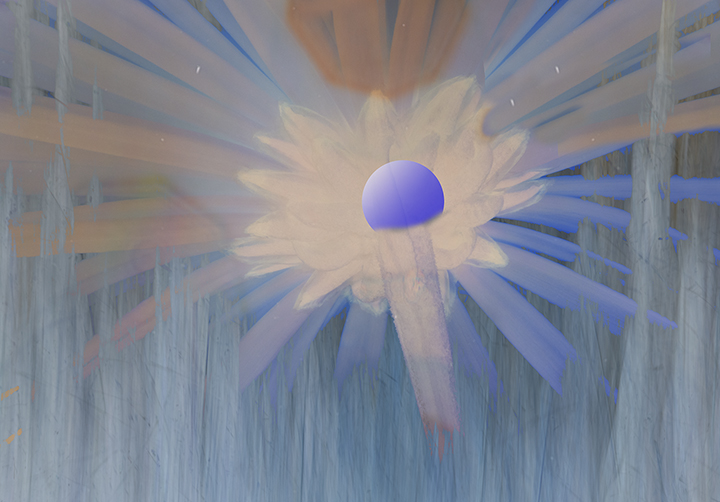
I like what you came up with.. It is similar to the Orton effect, which is placing an in-focus shot with an ut of focus one and blending the layers. I am not a big fan of using filters only to change an image to creative., but I've always been a big fan of the Orton method which dates back to slide photography In the old days you took two slides of the same image, one in focus and one somewhat out of focus. You had to put then together in a slide frame to achieve e the look and you also had to lighten the exposure of each so when they came together, the proper exposure was achieved. This can be done with a single page in Photoshop, as well and I assume Topaz has Mae it even easier. Thanks for showing this to us. |
Feb 3rd |
| 18 |
Feb 24 |
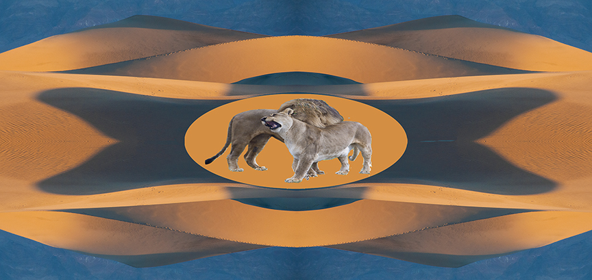
Comment |
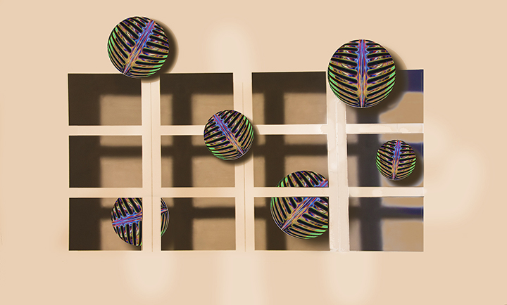
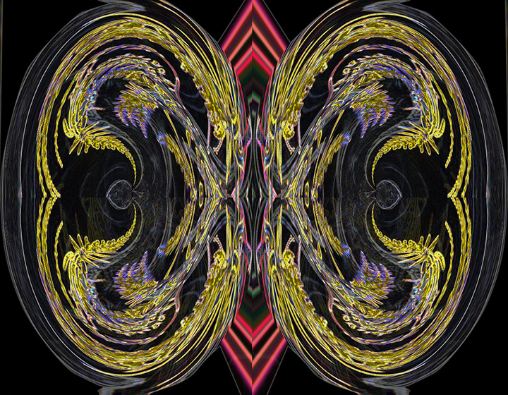
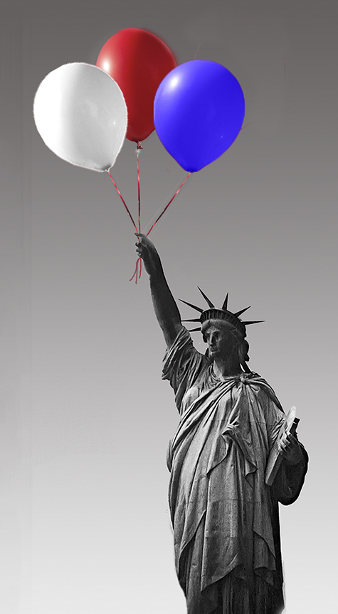
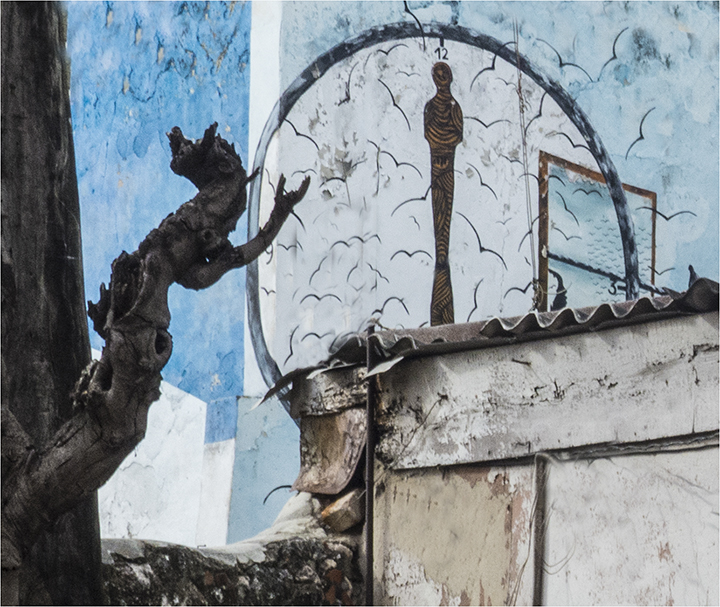
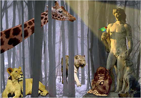
What a wonderful sculpture to find on a w all! You have done a good job working wi th the extracted lion king, duplicated it and removing the background. This complies with the creative aspect nicely. I wonder how it would look flipped the other way. which I am including. This is a fun project. Good work. |
Feb 3rd |
 |
5 comments - 2 replies for Group 18
|
11 comments - 3 replies Total
|