|
| Group |
Round |
C/R |
Comment |
Date |
Image |
| 3 |
Jan 24 |
Reply |
Thank tis ask fir tier Judd cinnebts, And a VeryHappy New Year to you all. |
Jan 24th |
| 3 |
Jan 24 |
Comment |
However. you crop this, , and it does need cropping from th original, as long as you have the pelicans against the white water so they stand out is the most important thing. Your original crop and Michael's are both good and bring out the dictum that it is always a good idea to take a wider view than yo want. That way you always have the option of cropping t what behooves you best. Both of those crops are well seen.. As for the long lens, I find that my long lens is used almost exclusively for tighter shots of birds, not landscapes. We have so many pixels now that we can crop and even print from a tiny cropping of the original ad it still looks good. |
Jan 24th |
| 3 |
Jan 24 |
Comment |
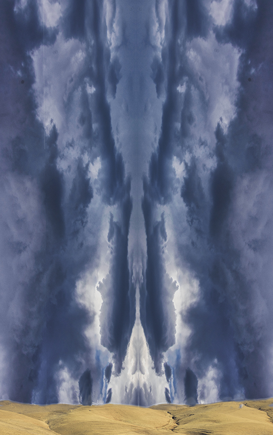
This is a stunted tower . I am not familiar with the architect. This makes a great reminder of visiting that part of Spain, But Ruth, the lighting and tine of day do not help much with this image. It is pretty much of a recon shot and it would be great in a slide show of your trip.
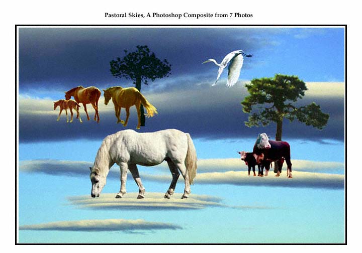
The cloudy sky acts as a huge Lightbox which gives us a good examination of all of the tower. No distracting shadows.Also I like how yo placed the older horse in the background. Good planning there. The sky could be cropped down a lot perhaps. |
Jan 24th |
| 3 |
Jan 24 |
Comment |
Ruth,
Where is Cottonwood Pass? Reading all of the comments, I see it is in
Colorado.
I have to admit that my AMD is bad enough so I really couldn't see any difference between the two photos although it sounds like you did a lot of corrections.
I like the scene that Michael concocted from your image.
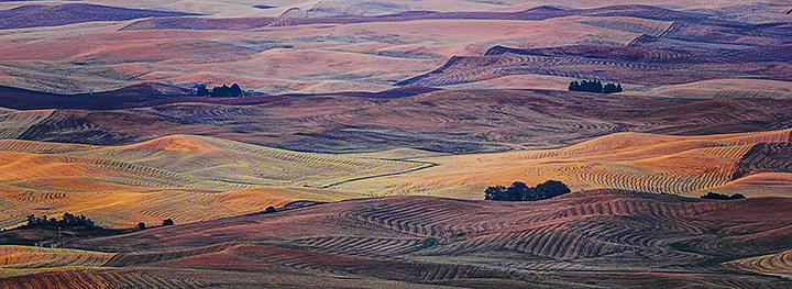
whatever he did, there is more impact. We also have great landscape possibilities in CA, but it has been a long time since I went into the Sierra for shooing, not only because of my eyes, but also my age. it is great fun to work on old images in Photoshop.
You took advantage of having an interesting sky and such a beautiful lake. It works well. |
Jan 24th |
| 3 |
Jan 24 |
Comment |
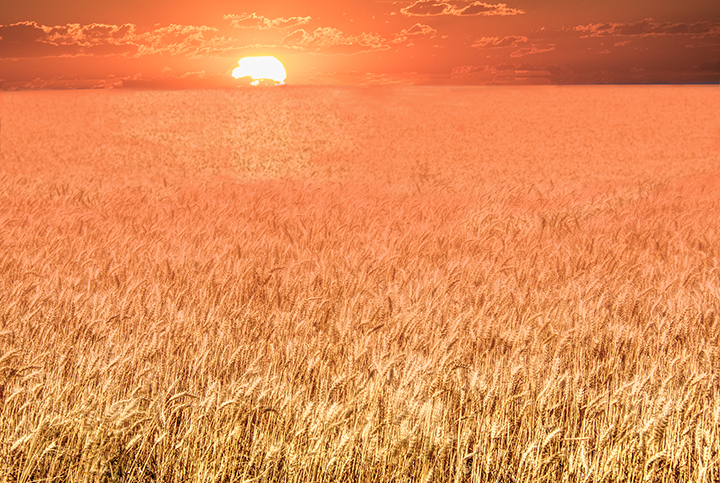
Sorry to be so late, but it has the advantage of seeing what everyone else has written When I first looked at your image, I thought, too much negative space, the space being the clear blue sky, You cropped it down which helps some. Although I. agree that adding a different sky take away from the purity of what the day was really like, if presented as a pictorial image we can do whatever we want using programs like Lightroom and Photoshop.The picture you showed with the clouds in the sky works better fro me, but has the danger of not being able to show where the clouds are making shadows on the mountains. This might make the sky substitution more difficult that just a simple substitution. Nice shot of Zion. Maybe a different time.of day would help it even more. |
Jan 24th |
| 3 |
Jan 24 |
Comment |
Michael,
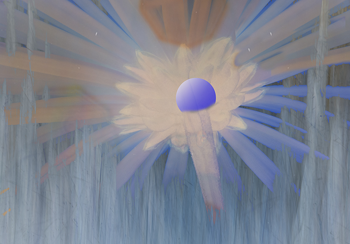
I like both versions.. The thing I am missing in your creative version is the depth of field along the horizontal swath of the mushroom. It is great that you must have got down on your belly to take this shot. The stalk is wonderful ad the mushroom itself is sharp throughout. In the creative shot, there Is a feeling of black rain coming down due to the stalks of unleaded plants, which is what most of the others seemed to dislike, as well. On the original, there is a bright section of light just behind the mushroom, which you have managed to remove from the creative version. That is a good idea.. Something of great value shows though on both versions. |
Jan 24th |
| 3 |
Jan 24 |
Comment |
The larger format is intriguing to me rather than the tight crop. I think the left first t section should be cropped out and the center post darkened considerably. That would put the great lighted e car in the 1/3 position in the frame and yet allow us to see the surroundings that are also reminiscent of the time. The old materials , whatever they are, make it mm opinion, more interesting. Lovely old car. |
Jan 24th |
6 comments - 1 reply for Group 3
|
| 18 |
Jan 24 |
Comment |
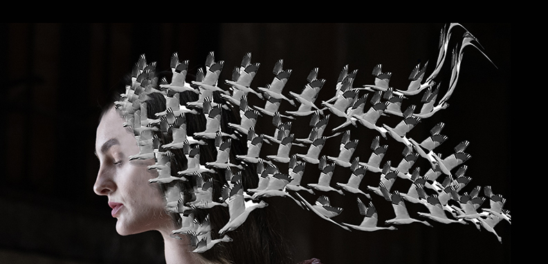
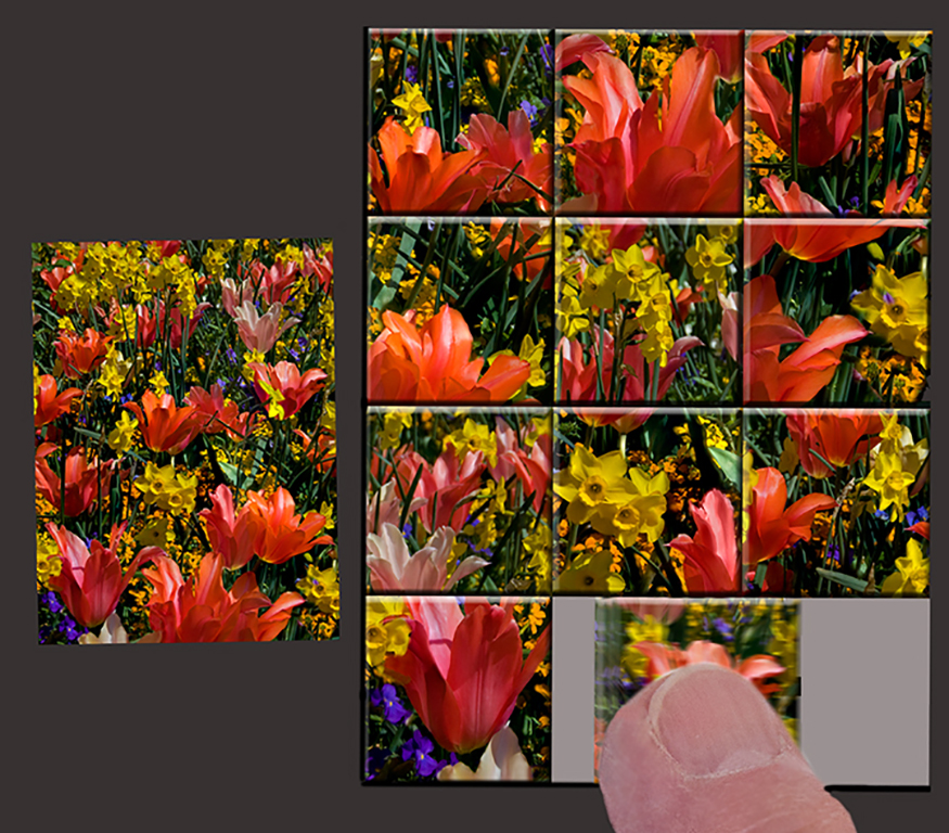
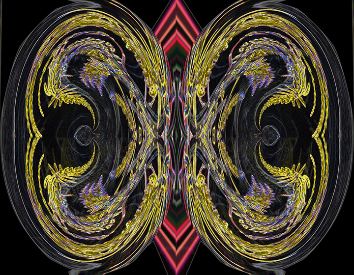
Well, your new version is much more eye-catching the tge original, which almost looks like a monochrome. I like the use of red and yellow in the final version. By my criteria, however, the final copy doesn't look like anything creative had happened. I could have looked like that originally, possibly. I think we are getting tinto. the se of creative techniques vs. the creation of new ideas for the image. For me, you need to do more to make it really creative. I can't give you an example, but maybe putting a seal somewhere in a way that it looks different from the rest of th picture. Or little people walking along the ledge of the widow.
|
Jan 24th |
| 18 |
Jan 24 |
Comment |
Chan,
I love what you accomplished with your various layers., T he use of parts of the top pictures as part of the backgroun has made the music look like a very dirty old piece of music, that somehow goes with the very old instrument. I may be the only one to disagree about the color of the background. I like the way it blends right in in your version. I thank you did an exemplary job. |
Jan 24th |
| 18 |
Jan 24 |
Comment |
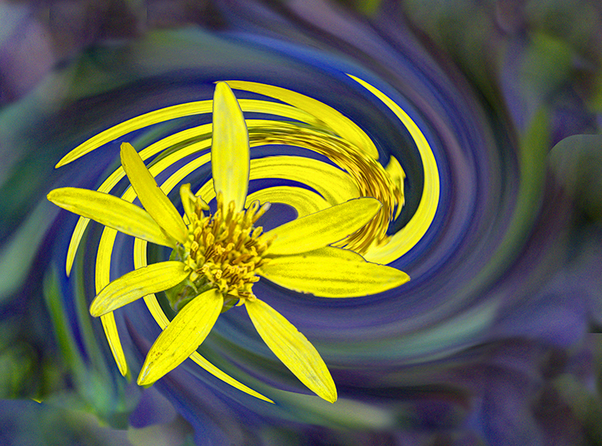
This is quite creative. Adding the colors makes it instantly more appealing although I reallyT love your original one with what took like draped flags. You did an excellent job combining the two images. The title is perhapsis a bit misleading.. Call it something it now resembles rather than a part of the city, of which it no longer has any kinship
I like you use of colors; they go well together to produce an abstract that no longer can be recognized. |
Jan 24th |
| 18 |
Jan 24 |
Comment |
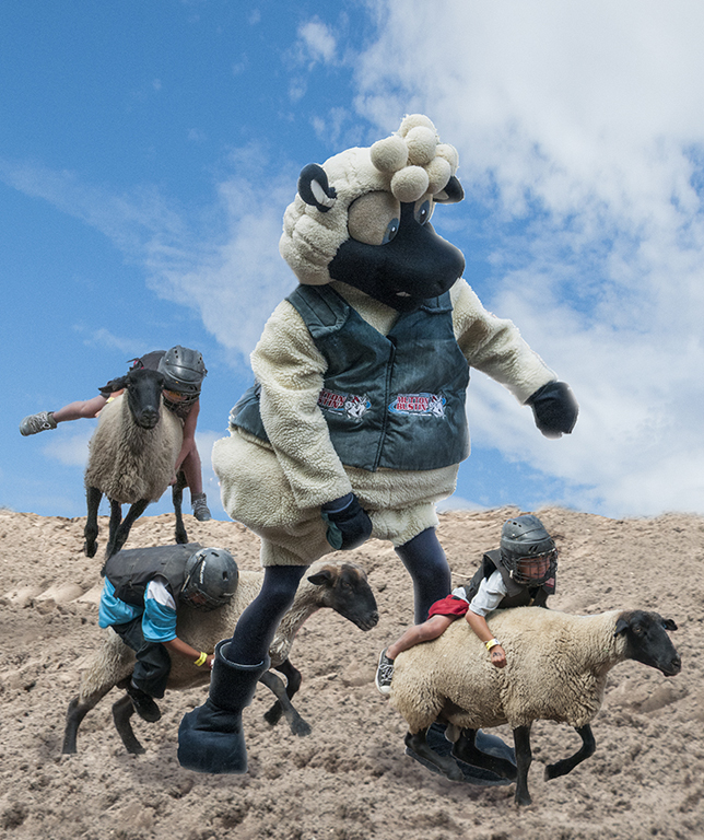
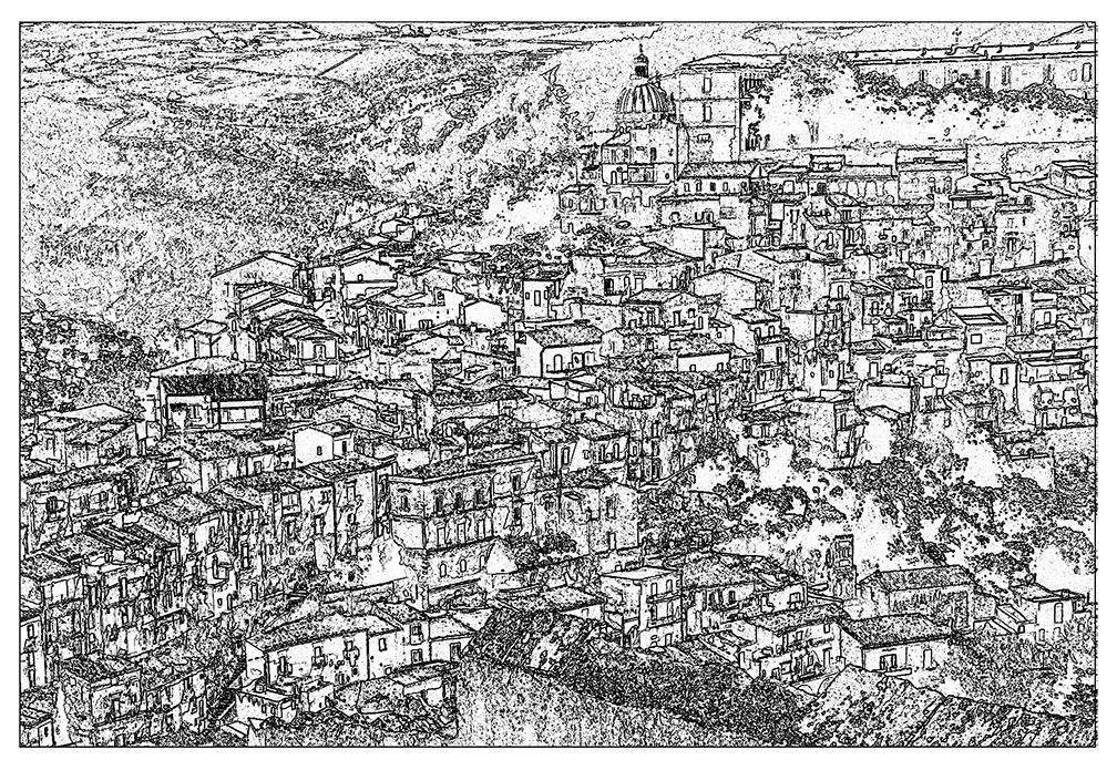
It does look more esthetic with the posterization. Once again, I wold say that it could use more of a creative idea than just changing the overall look to a more illustrative final product. One suggestion would be to remove the guy on the right hand side of falling out of the picture. That is not an east task with cloning and cropping would take to part of one of the front, m ore prominent person and sheep. So may not be possible. I suppose we're not supposed to use AI, but I heard it take things out of a picture quire well. |
Jan 24th |
| 18 |
Jan 24 |
Comment |
Ian
I. like the color change. It makes the whole image look cleaner. But I have said this before, to me this is not a creative image. Just using a filter unless the filter really changes the look of te whole image is not enough. I do prefer creative ideas and I understand when this gets too busy.. This has been a bed time for me with my husband in rehabb, working on Fotolave which is a three da weekend conference, a very sick sister and more problems with my eyes. I apologize if it don't get everyone critiqued.. Th is is the last day and my ty ping gets only worse. |
Jan 24th |
5 comments - 0 replies for Group 18
|
11 comments - 1 reply Total
|