|
| Group |
Round |
C/R |
Comment |
Date |
Image |
| 3 |
Jul 23 |
Comment |
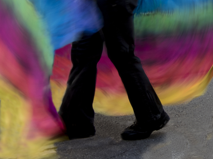
The rainy day gave forth with colorful umbrellas on the two waving to the church. It makes the sky more interesting and the reflections on the walkway are very nice. The straightening and the saturation increase have helped considerably. I do't think I'd change anything either. The new iPhone cameras as excellent from what I've heard, so no problem there. I envy your trip to Spain. My favorite spot when we visited was Barcelona and GaudI.
|
Jul 25th |
| 3 |
Jul 23 |
Comment |
Ruth,
Such a nice thing to do. Also your accommodating the woman via her lamp. I think the lamp helps with the portrait and the conversion to black and white is also valuable. Not because the color versionwas too bland, but because portraits seem stronger in black and white. Maybe we are just used to that. It does make it look more professional. In order to give more headspace above, you would need to add canvas in the Photoshop canvas and try to fill it in with content aware, not always an easy thing to do. As is, I find it quite a lovely portrait of Enid. Maybe her legs in black could be lightened up a bit, my only suggestion. |
Jul 25th |
| 3 |
Jul 23 |
Comment |
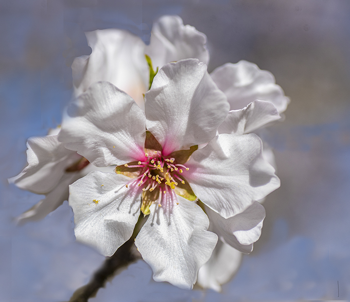
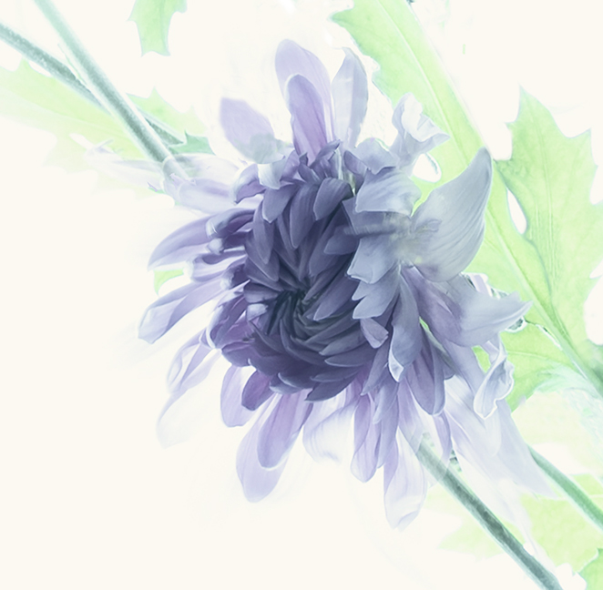
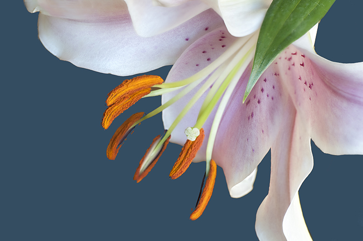
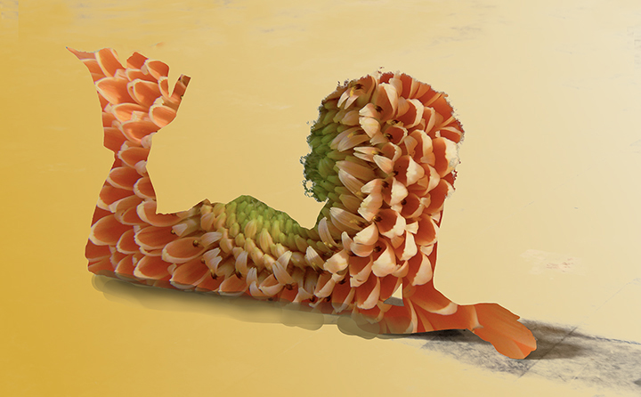
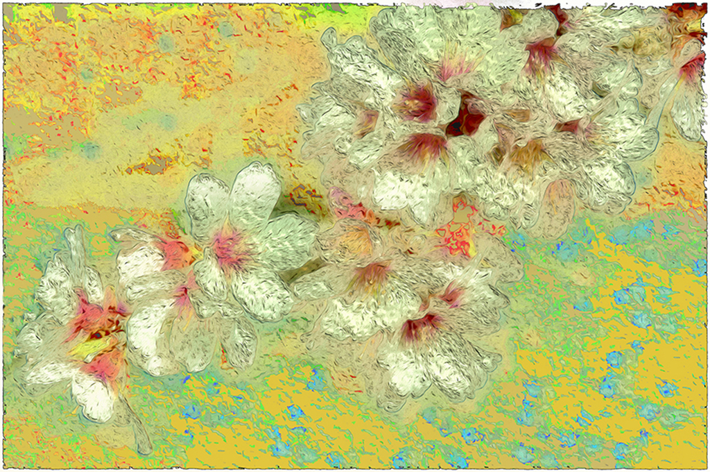
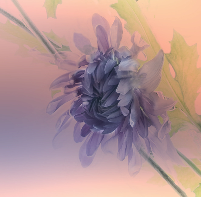
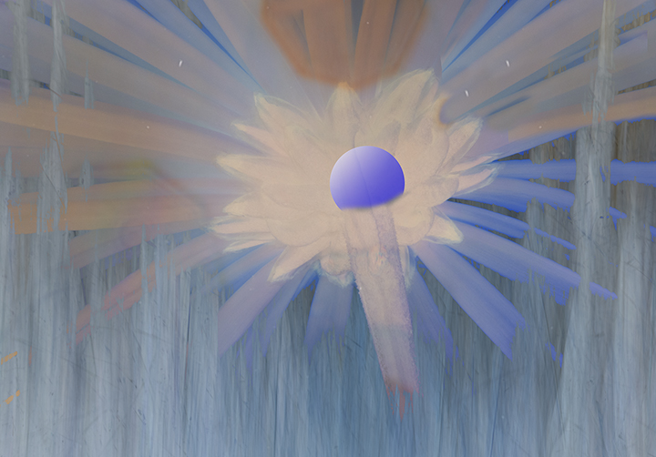
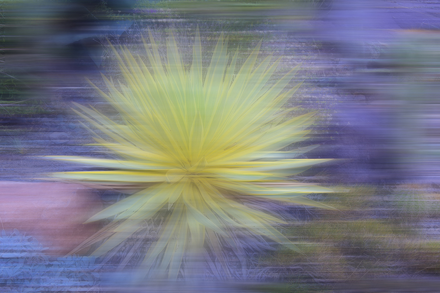
It looks like it's in ice and you have changed it from a dead-looking flower into something that is fresh and glowing in the ice. It's nice that yo can see the little pieces of ice to give it character. I particularly like the ice across the stem. Congratulations on your ice project. We all need something like that to take us out of our ruts. |
Jul 5th |
| 3 |
Jul 23 |
Comment |
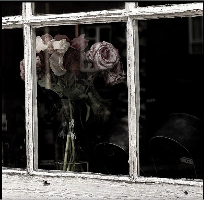
Michael,
Yor switching this to monochrome turns it into a fine art piece. It makes the viewer spend some time looking at it and the white window surrounding it is a fitting frame.. The fact that the window is al old and cracked with peeling paint sustains the concept of ld and dying quite well. The only thing I see that I would have removed is the swath going from center to lower left I have no idea what this is - a reflection- or something else but it doesn't seem to have anything o to do with the bouquet. I am sending a suggestion. |
Jul 5th |
 |
| 3 |
Jul 23 |
Comment |
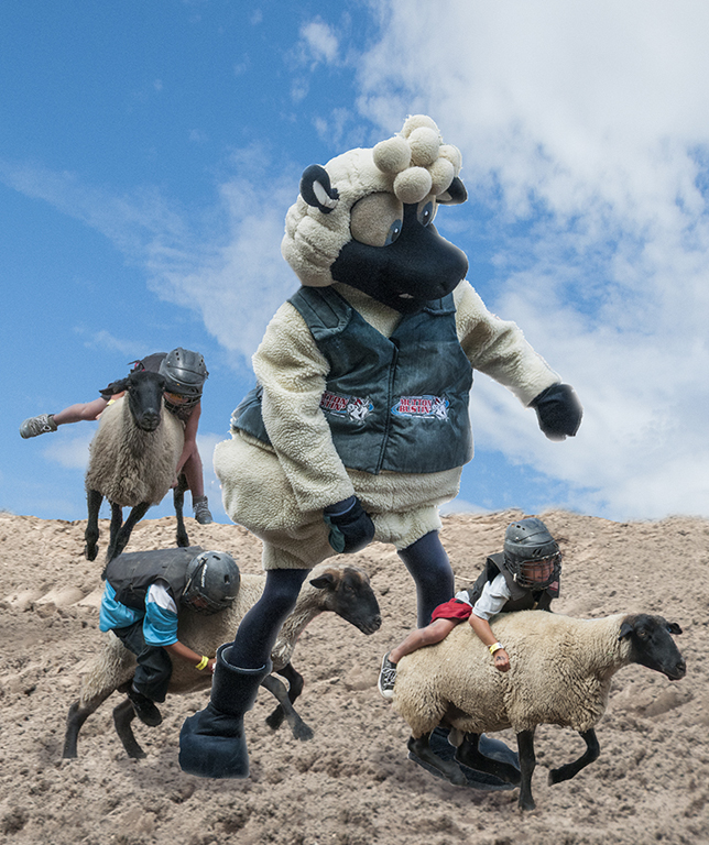
Thank goodness for RAW images. The black bear is difficult to photograph because of his dark fur, but with your further work on him, we are enjoying a wonderful shot of the bear showing his face vert well and also most of his other fur is really brought out. Is this one of those places where they set the animals up for you or was that an unexpected find? In any case, it is very well done and we can all enjoy it. It think that the bear is in the tree is a big plus for interest. Also whatever you did to hide the unwelcome bokeh was perfect. Couldn't t tell at all. This would t theoretically rule ut using it in a nature competition, but it's great for pictorial. Cubs will often climb up trees to be safe from prey, but mama bear stays below to look after them. Having a full-grown bear in the tree is a real point of interest. |
Jul 5th |
| 3 |
Jul 23 |
Comment |
Mary Ann,
So glad you found a live insect among the lavender. We wet to a lavender farm one time, but turned out to be a little too early. I would love to see a pic or two of the lavender as well as the insect.
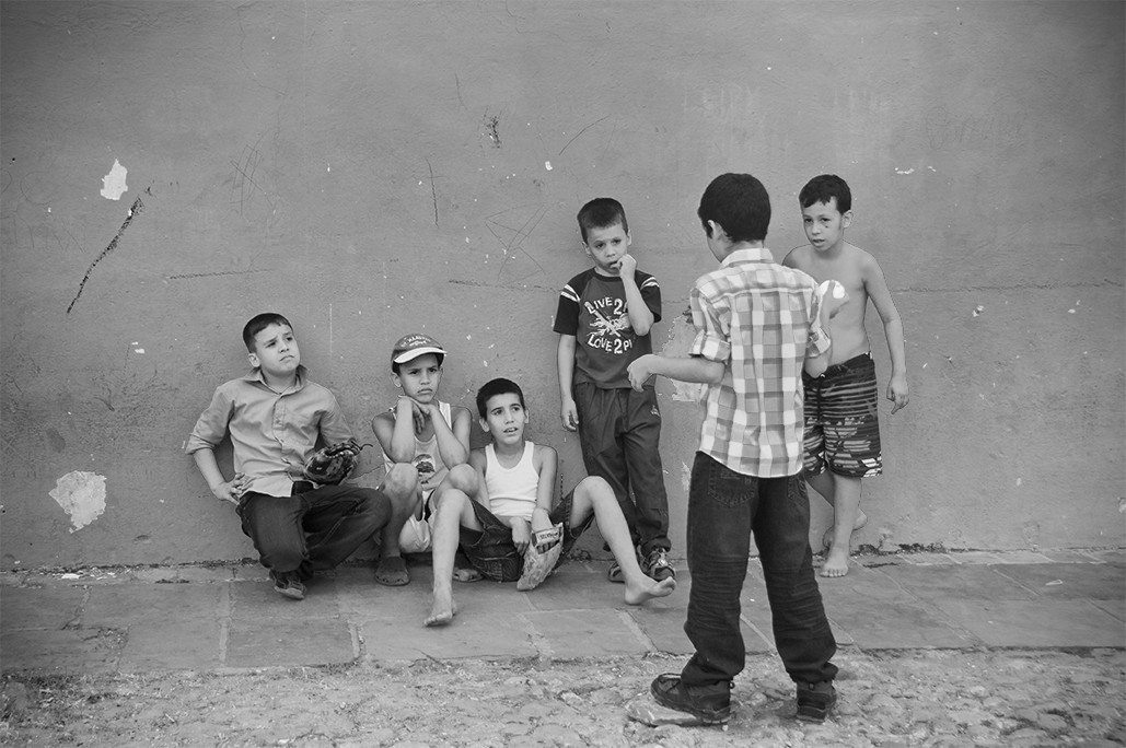
I agree with LuAnn that you need to crop in closer so we can enjoy the dragonfly more. Because my eyesight is limited to due AMD, I wasn't sure is the wings on the right were partially missing because of damage or because of moving too fast to catch all of them Maybe it is the angle of the shot. Anyway, it is an interesting image of the dragonfly or skinner and I congratulate you in getting it. They are hard to find. |
Jul 5th |
6 comments - 0 replies for Group 3
|
| 18 |
Jul 23 |
Comment |
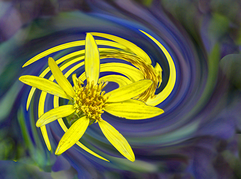
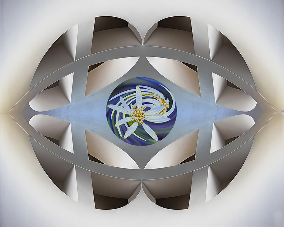
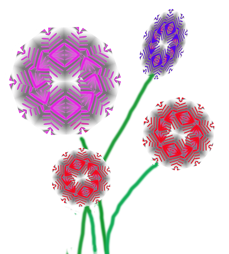
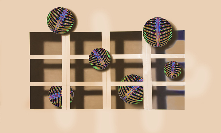
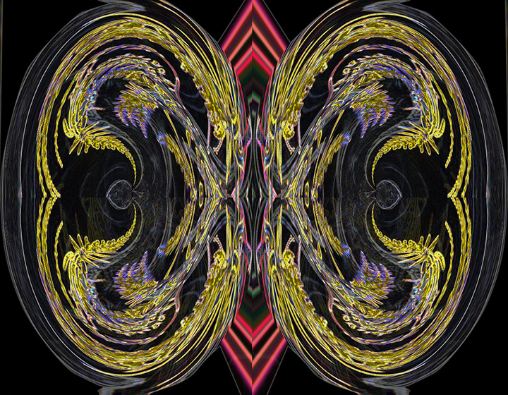
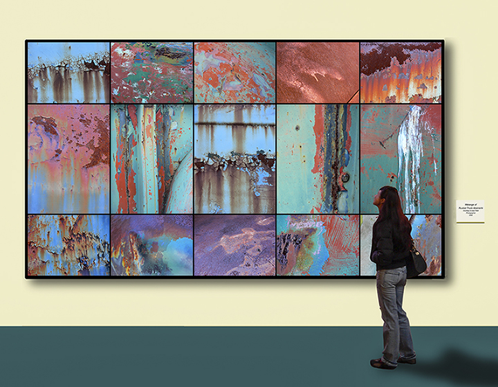
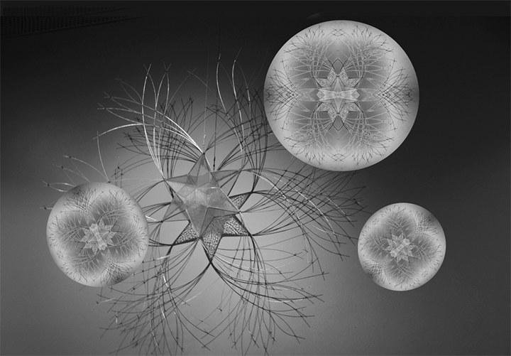
Not familiar with the program you used, but it seems to do a very interesting job in an abstract combination of the top two images. The circular one certainly goes well with the flower background, The background gives it a three-dimensional feeling and the use of not full opacity in the flowers helps this concept. You have achieved aa successful abstract. Something really different. Thanks for introducing us to the new application. I like the way the white areas and black areas cut into one another. Altogether a good job. No suggestions for change. |
Jul 25th |
| 18 |
Jul 23 |
Comment |
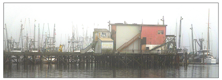
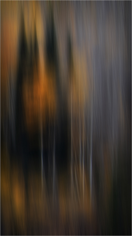
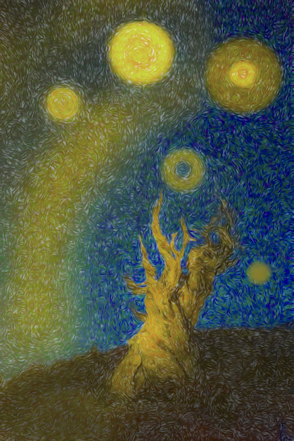
Although I a not a fan of using a single filter to convert reality into creativity, this one is very pleasing. It does make the image into a painting. I prefer to leave the right side as you have already cropped it, intact It gives me more of a feeling for the waterfront. When I first looked at it I thought it was a guy unloading his bike. I wonder if there is any way to get the painting to look from realistic. Once again we have the three primer colors, which is good because you have not overwhelmed us with any one of then. I do like what the filter has done in smoothing out most of the original photo. It gives it a bit of an impressionistic artistry.
I would have liked to have seen the original. |
Jul 25th |
| 18 |
Jul 23 |
Comment |
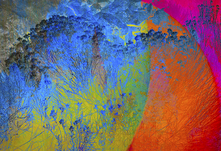
This is the kind of stuff I often do with my images to make them more creative. You can't see the relationship between your final image the the original. It strikes me as an original abstract painting. You used the three primary colors throughout. When it gets this abstract, I really can't offer any suggestions because it is Artis inspired. I like the blue flowers in the bottom half because it brings a connect between the bottom and top half of the image with the colors. I think this is a lot of fun and that yo did a very good job. |
Jul 25th |
| 18 |
Jul 23 |
Reply |
To tell you the truth, I am not sure what filters I used, but I may have gone into the PS Filter Gallery, which gives a wide range of possible filters you can utilize.. I truthfully don't remember what I did for the background either. I tend to play with my images quite a bit from time to time and when I like something, I'll stop. I wish I could be more specific for you. It's also possible that it is one of the Nik filters. |
Jul 25th |
| 18 |
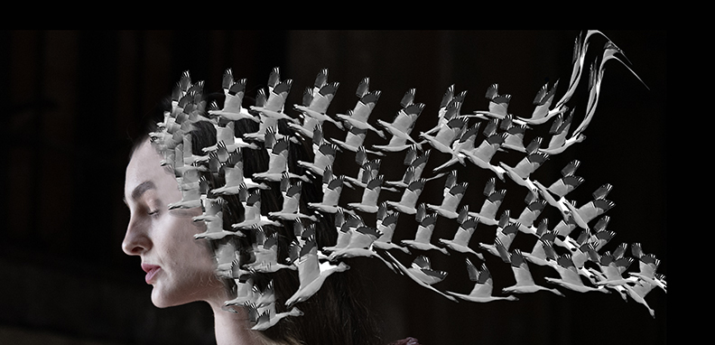
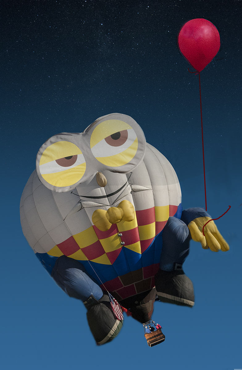
Jul 23 |
Comment |
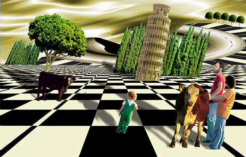
I love the title. It's an interesting idea that is pretty well executed. I would like to see her standing out a little more. Maybe you could change the brightness of the "queen
or give her more contrast. The other thing I would suggest is that she should have some kind of shadow even though she is in the shade. It would make it a little more realistic. Otherwise, she is well- placed and you did a good job extracting her from her original photo. Having the sun fall on her shoulders works well in making her look more realistic in this strange dancing stage. |
Jul 3rd |
4 comments - 1 reply for Group 18
|
10 comments - 1 reply Total
|