|
| Group |
Round |
C/R |
Comment |
Date |
Image |
| 3 |
Jun 23 |
Comment |
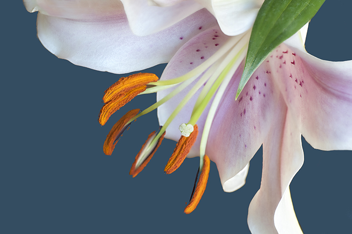
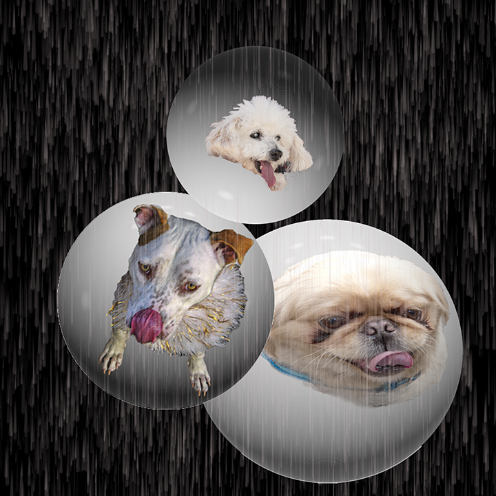
Addendum: I like what LuAnn did to the background. Making it go out of focus is a good idea, Maybe keep the window itself sharper might be more realistic. |
Jun 14th |
| 3 |
Jun 23 |
Comment |
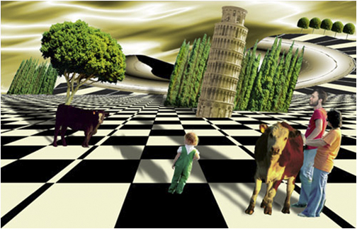
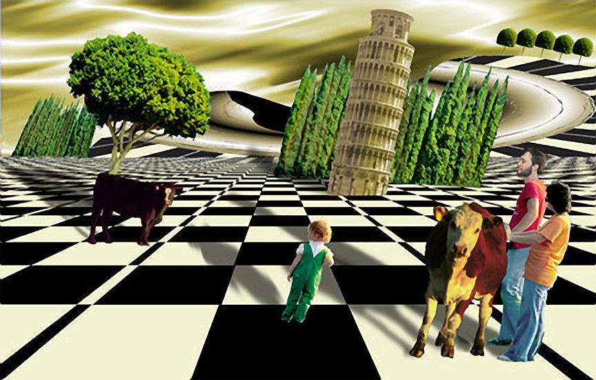
Mary Ann,
These guys look like twins! For me, I wouldn't worry too much about the reflections the table and checkers board, but on the distraction of the outside. I wish the windows had not been so clear as the people outside catch my attention. I'm not sure that darkening all the window area wold work. Maybe brightening them a lot would be better. In general, I think you did a good job catching these two men having a good time with their game, and it's a plus for the iPhone. |
Jun 14th |
| 3 |
Jun 23 |
Comment |
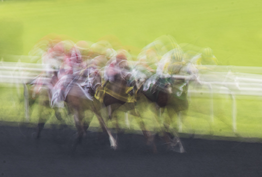
Kieu-Han,
Your capture of the many bicyclists coming around a curve is very exciting. The cyclist in red is almost sharp. It is almost impossible to get a truly sharp image of oe of these riders and you cam close. The shutter speed of 1/40 sec you gave us, is fairly fast for panning as typically it is you 1/155 second. The reason I like this is because it speaks motion and fast motion, at that. It gives a feeling of excitement to the image which is fine as is, as far as I'm concerned. The colors are good with the rider in red in the center and the cropping, although slight, helps with it. Since this is an image with no real center oof interest, the cropping is actually not necessary even though the lead rider is somewhat cut off. I think that is fine. |
Jun 14th |
| 3 |
Jun 23 |
Comment |
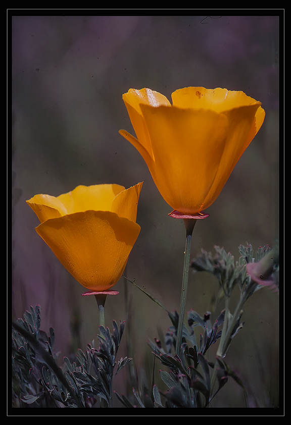
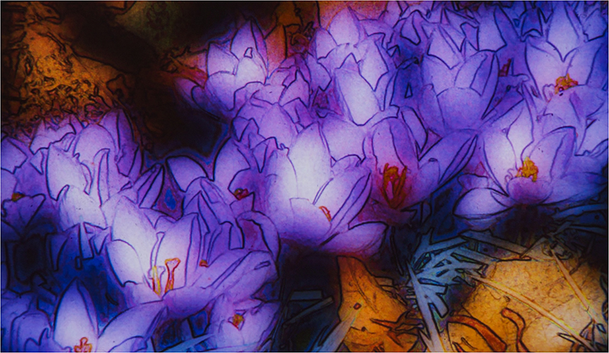
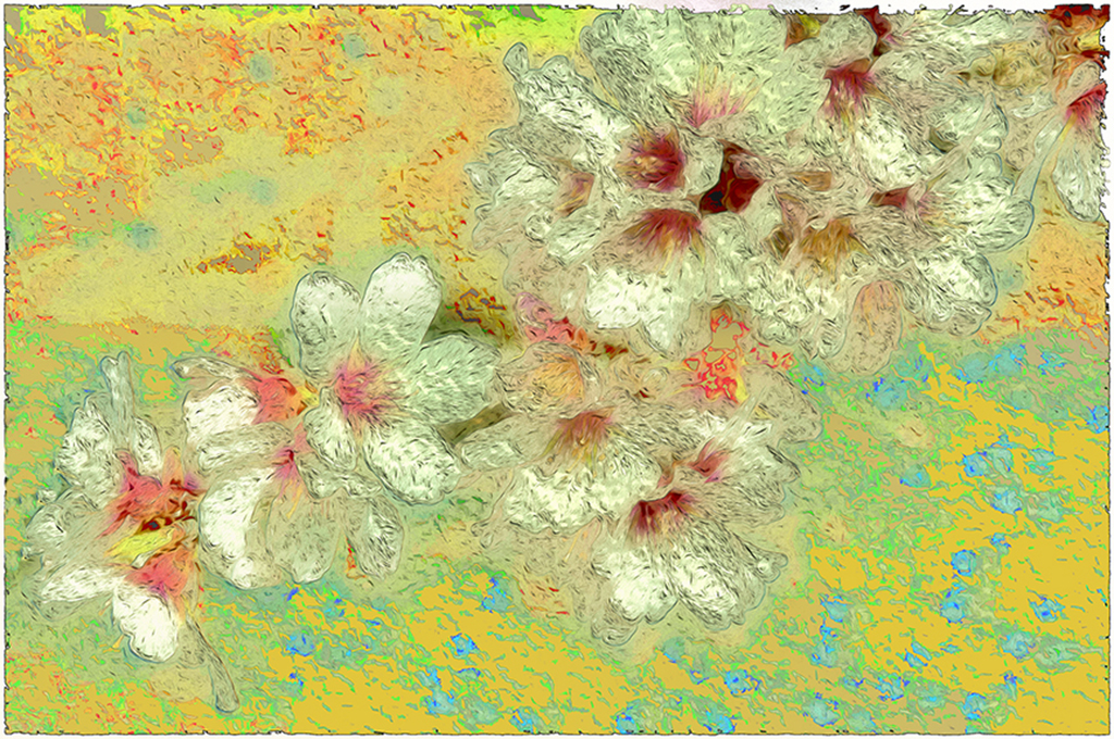
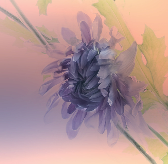
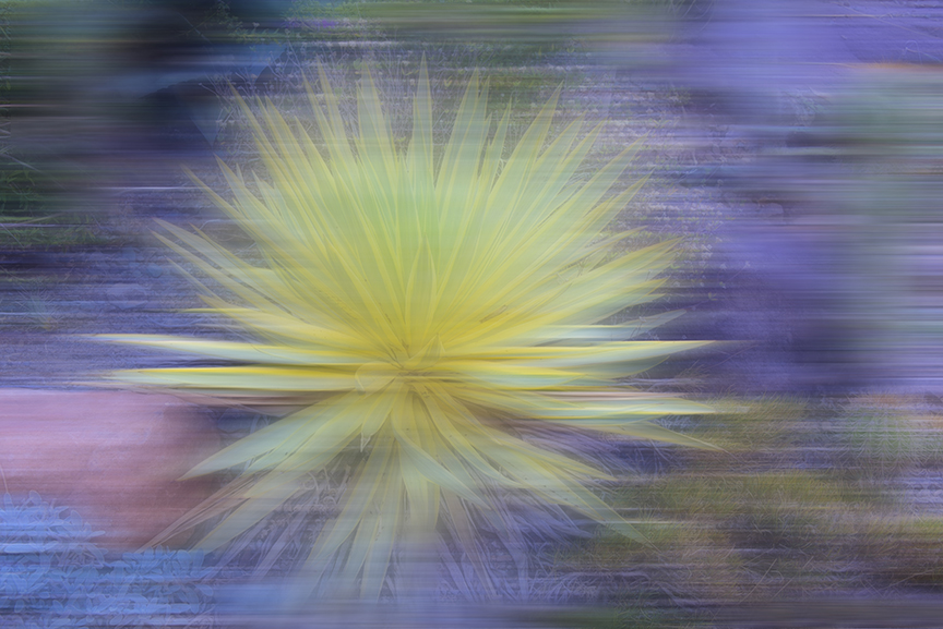
I like it just the way it is. Yes, you could add some space at the top to give more breathing space for the tulip on the left, but the way that tulip is so different from the other two is what makes the picture for me. I wouldn't change anything else. The use of ice to make this different works very well and I admire the subtlety of tour final image. |
Jun 14th |
| 3 |
Jun 23 |
Comment |
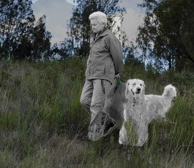
Ruth,
The. concept is wonderful. The older woman and tge dg seem be thinking about two different things for sure, The woman is contemplating, as you suggest, while the dog is vert interested in his surrounding. I think that the subject needs to be lighter and the background darker and maybe a little blurred to take away from the same cast as the subjects. I am attaching a rather badly done idea of what I mean. I also dared the sky and cropped it. |
Jun 11th |
 |
| 3 |
Jun 23 |
Comment |
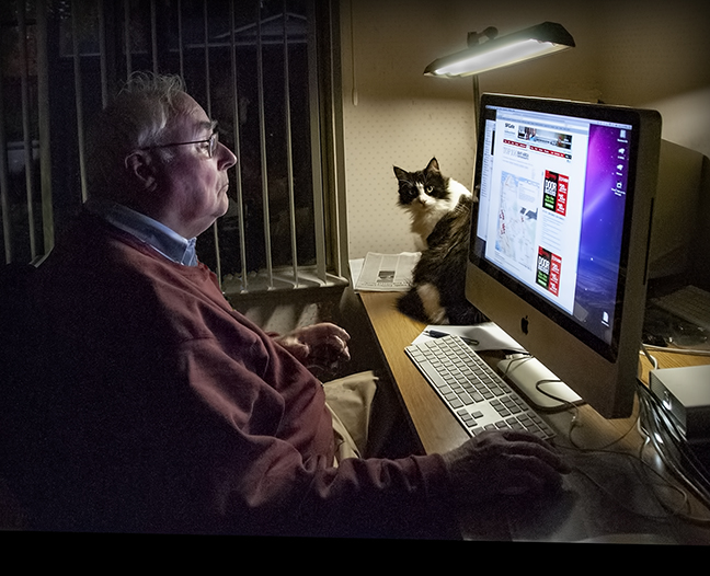
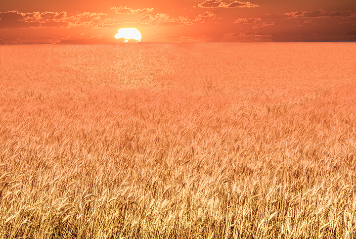
Michael,
I love this shot because of the simplicity of the subject and the the great orange background. It certainly gives a feeling of place. The warm color really holds the image together. In truth, I did not see much difference between your original and the one submitted by Kieu-Hanh. I would change nothing in this image. The girl working on the computer, not Mac, no apples, is concentrating on her work, and never sees the photographer. The two windows in the background help with the composition and the street lamp and the edge of the umbrella complement each other. You have caught a moment in time.. |
Jun 11th |
| 3 |
Jun 23 |
Comment |
LuAnn,
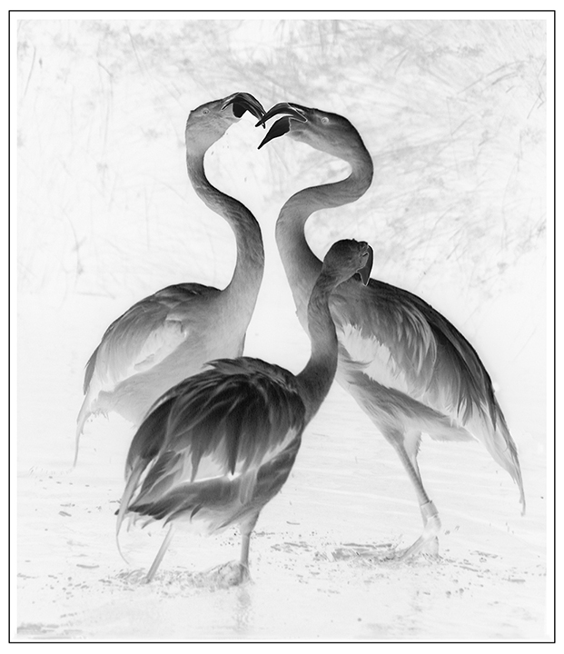
With all of the feedback from the other members already, mine will still be something different. I read your description of why you chose that cropping. But I must speak for myself. I feel that the image of the water reflections above the turtles is extremely busy and distracting from the turtles. and I would do away with most of it. I would crop almost all of it away to bring out the turtles and the wonderful ripples below them. The centering of the turtles Is not a problem fro me, but I would like to enjoy the turtles and all of that stuff above them pulls my eyes away. I would suggest that since that intrigued you, to have taken another shot of those reflections but make it sharp and submit it as another entry another time. |
Jun 11th |
7 comments - 0 replies for Group 3
|
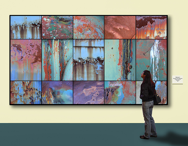
| 18 |
Jun 23 |
Comment |
Jim,
I love your original photo, great composition and subject. I also think the final presentation is more interesting that the original, but I have to express my concept of creativity. . For me, it is a creative idea, not the use of simple filters to make it look more exciting. Please check with Barbara Miller about that and see what she has to say about it. |
Jun 14th |
| 18 |
Jun 23 |
Comment |
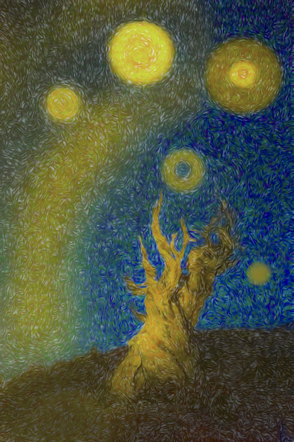
Tom,
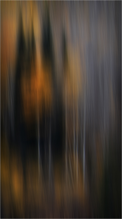
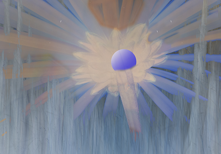
It sounds like yo u are a new member of this group. Good to have you.I like what you did with your original, but it would be even nicer if you told us what your steps were. This one reminds almost of a great fire in the distance. or it is raining from a volcano as you can see showers of something. Please tell us what you did and what your concept was. Thanks.. |
Jun 14th |
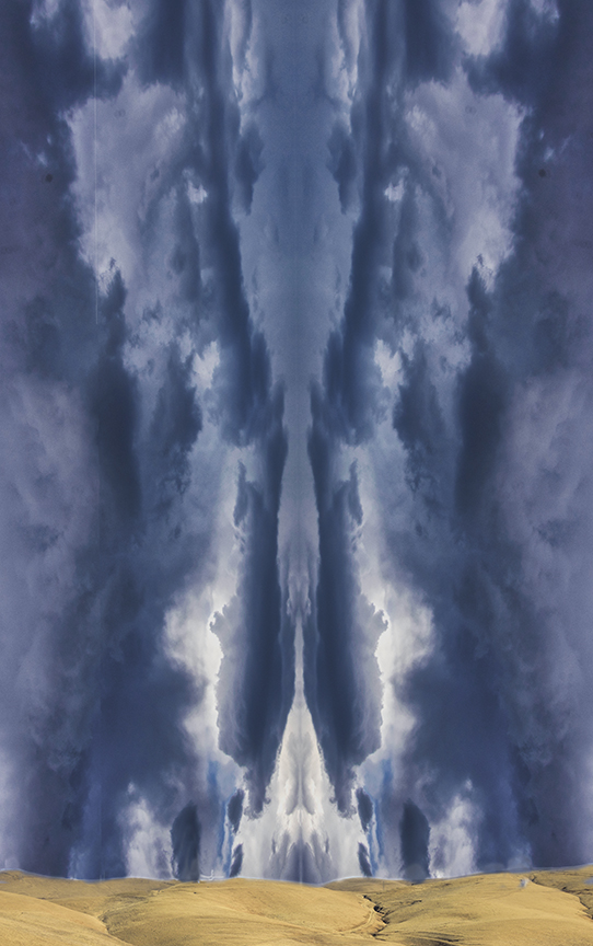
| 18 |
Jun 23 |
Comment |
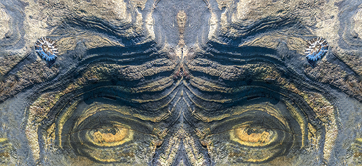
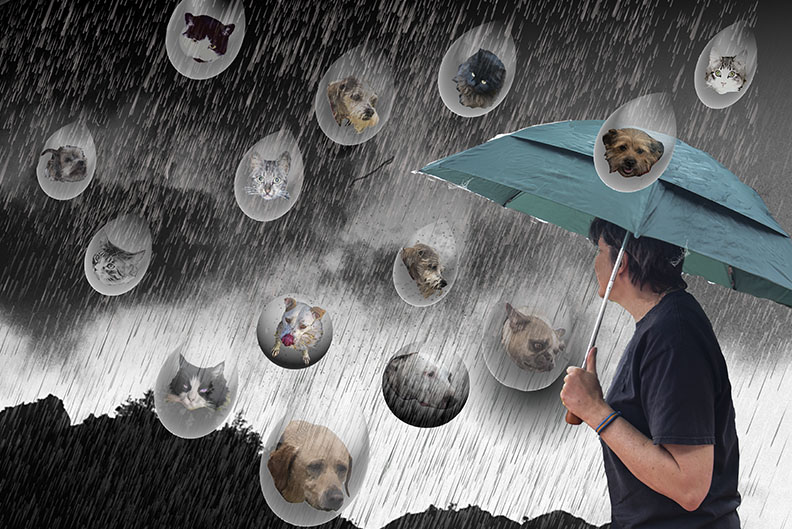
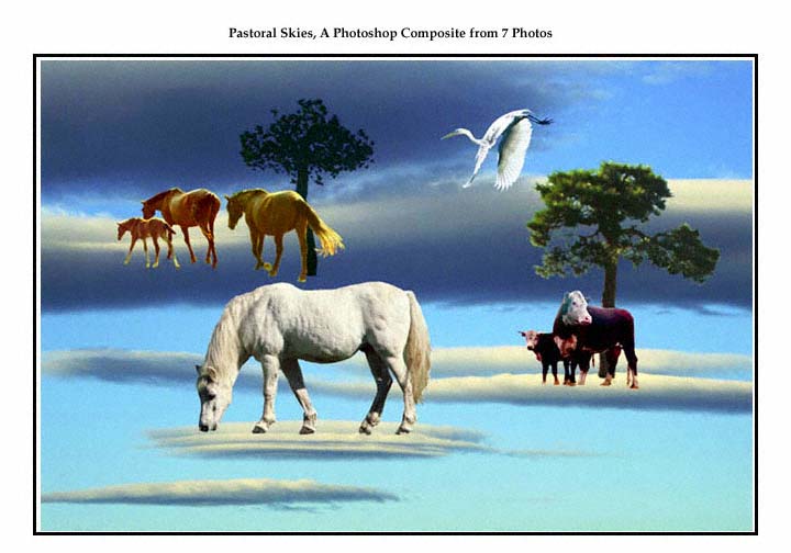
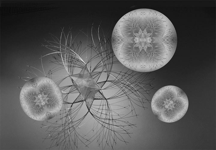
I think your composite of the waves and colors from the oil and bubbles photo is an e excellent combination. When I look at it , it reminds me of a planetary sky photo with the bubbles looking like planets and the waves looking like long telegraphic phenonemoal that one finds from the Huubbel or the new telescopic satellite. Good job. |
Jun 14th |
| 18 |
Jun 23 |
Reply |
Ian, Here is what that looks like. I'm not sure, I think the larger contrast is better. but we cn now compare them. |
Jun 14th |
 |
| 18 |
Jun 23 |
Comment |
Andrew,
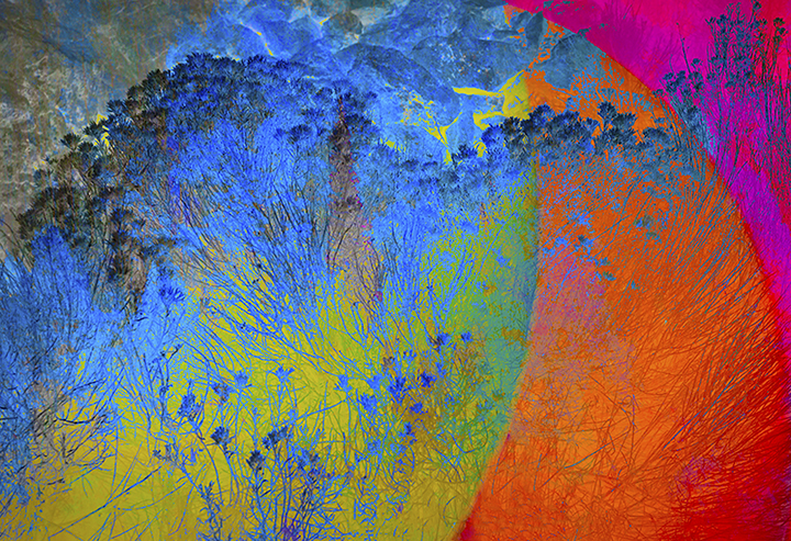
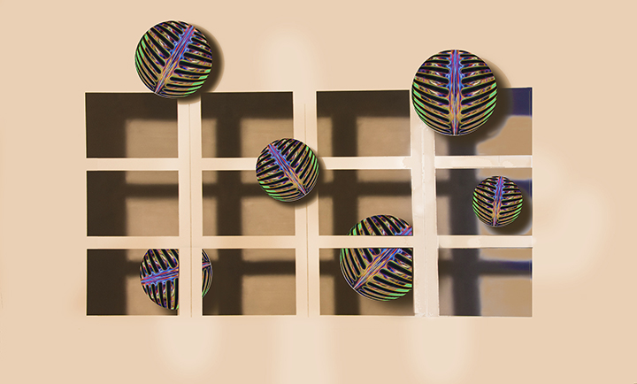
Your finished product is definitely "creative." The sky alone could be a separate image in true abstract, so that's one thought. I am not a fan of using just filters to make a creative image; I prefer an idea that is creative.. So your final image, although a long ways from the original, is not as interesting as one that has a creative idea behind it, to me. The clouds are crazy, and as I mentioned, maybe making them a solo image would be better that the two parts of this image. But I wish I could gp to this beach and see the chairs. It d looks fascinating. |
Jun 14th |
| 18 |
Jun 23 |
Comment |
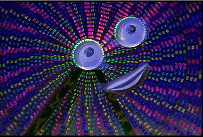
Ian,
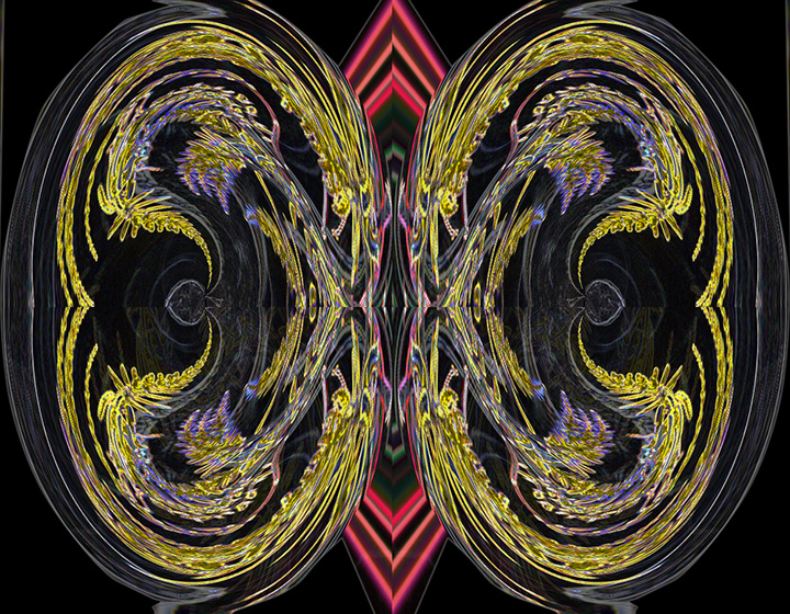
When I fist glanced at this image as a thumbnail, I thought you had put in a zipper that opened into the water. This is a creative ploy that has been used in creative images for some time. However, on lookin g closer, and reading your discussion of what you did, I see it is something quite other. Nice job with this and I really like your frame which glows marvelously This place looks like a really interesting spot to visit. |
Jun 14th |
5 comments - 1 reply for Group 18
|
12 comments - 1 reply Total
|