|
| Group |
Round |
C/R |
Comment |
Date |
Image |
| 3 |
Mar 23 |
Reply |
I really like what you have done to improve the photo. It has much more punch. Glad we were able to help. |
Mar 21st |
| 3 |
Mar 23 |
Reply |
Michael,
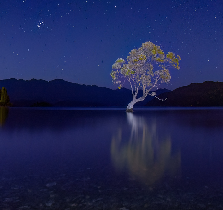
I understand where you're coming from. And I am very glad to hear tge tree remains for the photographic community. Your black and white image to me, although a different approach pales with your color image because the tree is no longer highlighted with your lighting effects. The biggest problem with the B &UW is that the tree melds into the hills in the background, so I much prefer your color version. It is really beautiful and as the maker, you were achieving your version of how small the tree is in the vast expanse of the heavens, but yet it is there, beautiful to behold. |
Mar 11th |
| 3 |
Mar 23 |
Comment |
Mary Ann,
You. have definitely achieved the feeling of winter. The snow of course, and a darkened sky with no sun. The creeks makes a nice pathway to lead us through the image. Getting rid of most of the sky was a good move as its brightness takes our eyes away even from the snow. My only suggestion is to make sure the trees are vertical. There is a feeling that they are tilting slightly to the right. |
Mar 6th |
| 3 |
Mar 23 |
Comment |
Your composition is great. I love the tree acting a as an important element and frame for the image. The only suggestion I have is to darken the boats in the background a little bit. Nice seeing. |
Mar 6th |
| 3 |
Mar 23 |
Comment |
Ruth,
I admire that you tried to turn this color image into a black and white. Unfortunately for me, it doesn't work because the outcome, almost no matter what, is way too busy. I tried a bunch of Black and Whites in Silver Efex Pro and none of then worked very well for me. Instead I took the color photos, which has a lot of potential and worked with that. I used a mask in Levels, darkening it overall, which really brought out the yellow in the trees.. I then darkened the very bright spot in the upper left with a black brush set at abou 10% opacity. I also used the dodge tool in Photoshop to lighten the waterfall slightly. Some images just don't do well in conversion to monochrome and I'm afraid this is one of the n, Cropping way in as Stuart suggest is a possibility. |
Mar 6th |
 |
| 3 |
Mar 23 |
Comment |
LuAnn,
I think it is a cyclamen and it is a favorite indoor flower to have by a kitchen window.
Your version appeals to me more than the heavily cropped for the bds photo but I would remove the out of focus flowers behind the top blooms if it were my picture. My cropping took too much off the bottom which I would leave as it was.
|
Mar 5th |
 |
| 3 |
Mar 23 |
Comment |
Mike,
This is a fantastic shot. I wish I could have gotten o New Zealand when the tree was still extant. I understand it is now gon. You have captured it perfectly with the faint glow of the projected lights on the tree and the wonderful starry sky, You did a great job. The only suggestion is that you crop in on the tree. As it is, it is somewhat centered and I would suggest the crop I am attaching. But the best thing about cropping is that you always have the original to go back to and cop or not crop as you choose. Wonderful job! |
Mar 5th |
 |
5 comments - 2 replies for Group 3
|
| 18 |
Mar 23 |
Reply |
Andrew,
I just wanted to say the your original is also wonderful. How did you take that photo? She's a lovely lady. |
Mar 21st |
| 18 |
Mar 23 |
Reply |
Jim, T his looks better, much sharper. I was having trouble with Topaz Sharpen AI, so I ended up buying it again. That was stupid, bug something you just give up dealing with manufacturer. I was curious how I got the colored swirls to the upper right. It was not a sandwich, but it could have been something I did and then had it remade into a slide, since at the tine there was no digital copy. at that time. |
Mar 11th |
| 18 |
Mar 23 |
Reply |
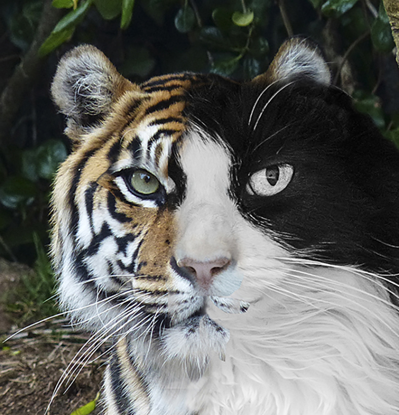
Well, one was our cat and the other a tiger at the San Francisco zoo. It could have been the one that escaped or attacked someone and was put down. quite a few years ago. So sad when people taunt the animals in the zoo. |
Mar 6th |
| 18 |
Mar 23 |
Comment |
Nice job, Mike.
This technique is not new but always impressive. I did one of a cat and a tiger years ago.
I like the way the branches frame her head, b the way and the feeling of Floridaa. The only suggestion would be to darken the bright spots in the water as it takes my eye away from the lovely combo.
Good creative thinking, as usual. |
Mar 5th |
 |
| 18 |
Mar 23 |
Comment |
Ian,
I like your outcome for the bush of catkins. Your original caught the basic idea and using some filters to help clean it up and make it more creative certainly gives it some oomph. In my opinion, however, it would be more fun if you changed something such as the color of the catkins maybe make them red or blue, added something to the photo such as a colorful bird. How about a parrot? For me, I need more to make it really creative. The border does add to it.
|
Mar 4th |
| 18 |
Mar 23 |
Comment |
Andrew, I really like the result I, am a big fan of Van Gogh, but I am not such a big fan of using just a painterly filter to create a creative image. I do think you should add something too make it your own creative image. Nevertheless, it is an outstanding effort and really appears painterly and Van Goghish. |
Mar 4th |
| 18 |
Mar 23 |
Comment |
This is a great photo in keeping with one of the worlds's best. Take a look at the work of Michael Wolf. He is a German photographer who I ran across looking for the best photographers in the world.,
https://photomichaelwolf.com
Nor for your critique. I think you did an amazing job. The people standing at the railing of their rooms, the laundry, the window reflections, the great touches of color. The painterly or feeling of a line drawing you have achieved are all wonderful. What an exceptional piece of work, Jim! |
Mar 4th |
4 comments - 3 replies for Group 18
|
9 comments - 5 replies Total
|