|
| Group |
Round |
C/R |
Comment |
Date |
Image |
| 3 |
Jan 23 |
Comment |
Mary Ann,
This must b in CA or some southern state. The lemons are burgeoning out right now in our backyard in n Danville, CA, Bay Area. Your composition is quite interesting, leaving the one. bowl against the other so that you have more to the picture than just the lemon bowl. I like e how you blurred everything except the lemons in their environment. The lighting is subtle, but perfect. The only thing I might change is the cut lemon looks like it's been standing around awhile, maybe a little fresher cut. Otherwise I think you have done great job showing us a still-life that inspires us to go out and make lemonade, maybe. |
Jan 21st |
| 3 |
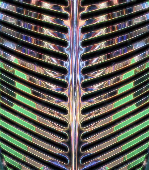
Jan 23 |
Comment |
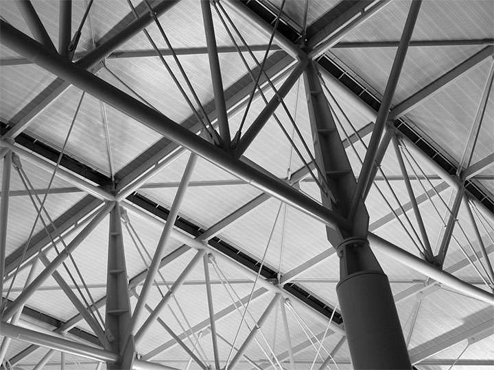
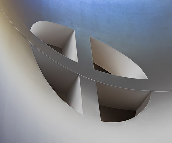
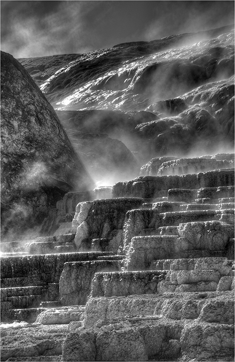
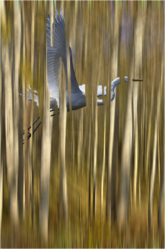
A strong graphic image. The columns circling around make a great composition, and changing the image to Black and white, makes that even stronger. You might consider removing one set of branes that you left between column three and four. The shadows really help give this three- dimensionality. Showing the round roof of the aerial also helps give this not only a base but a top to finish off the feeling of completeness. . |
Jan 21st |
| 3 |
Jan 23 |
Comment |
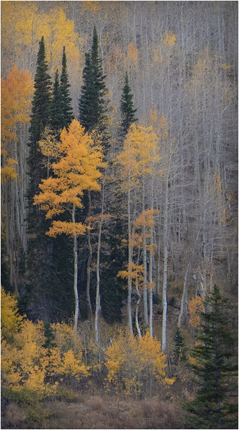
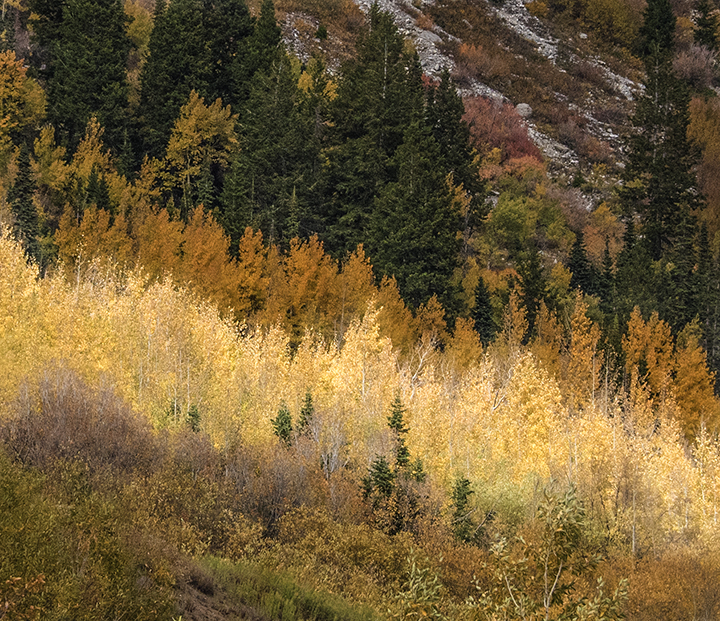
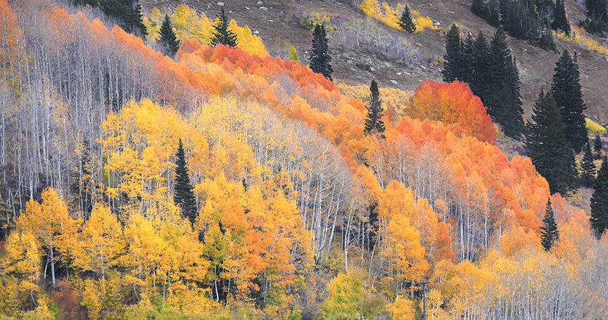
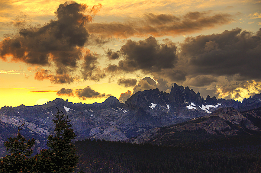
After reading the comments, I would like to say that the brightness of the front aspen does not bother me as I have done a lot of photography in the Sierras near rout 395 in CA/ Nevada. The light behind the aspen can really make them stand out and and thus, I am use to seeing trees that capture the sun, so to speak |
Jan 21st |
| 3 |
Jan 23 |
Comment |
Ruth,
I love your wide-angle landscape with the trees at their loveliest and the maintains a very fitting backdrop. Perfect timing for the fall photo. What you did to give more oomph to the original works very well, no suggestions there. The only thing I would watch is the brightness of the sky over the mountains in the middle. Maybe darken that area just a bit ad it would look more like a storm and give even moire contrast to the image., in my opinion.
BTW, I try not to read what the others have said when I give my comments, so they may seem repetitive. |
Jan 21st |
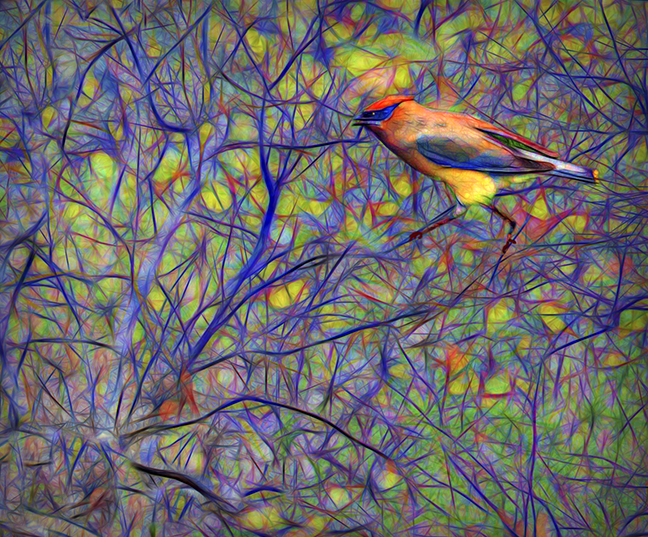
| 3 |
Jan 23 |
Comment |
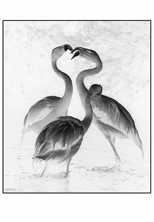
Great story about the butcher bird. I had never heard of it before and I see that he or she has some "meat" awaiting on the left branch up a bit. Good to have cropped in and the bird is caught well, fairly sharp and the food hanging from the beak is quite appealing - to the bird,. I would crop in a little from the right just for the sake of completion . So glad she or he happened to come by before you left the area.
I don't 't see a real real problem with the camera settings, as the bird has a nice catch-light in the eye. |
Jan 21st |
| 3 |
Jan 23 |
Reply |
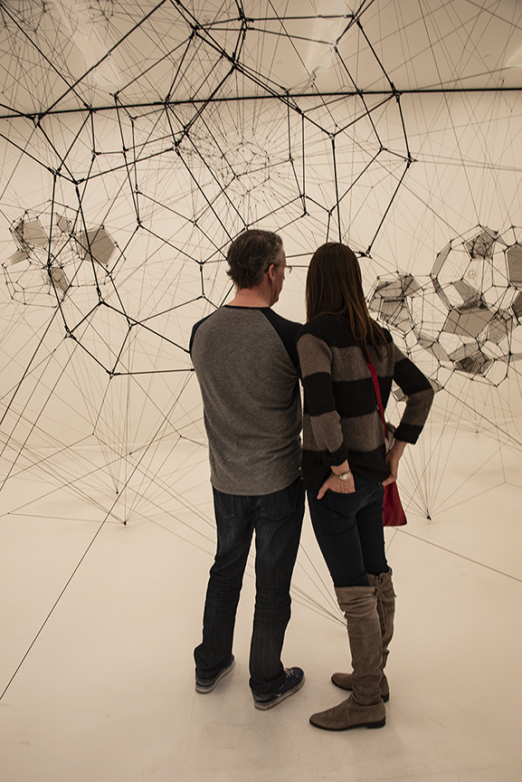
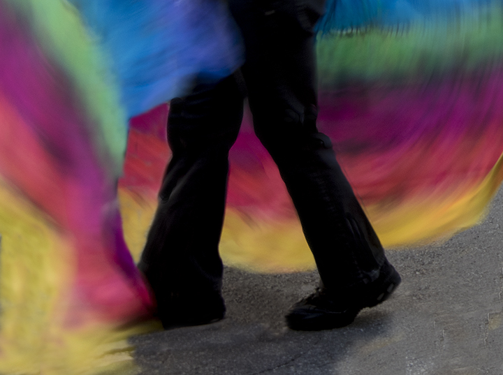
A very different interpretation. Here the people are again OOF, but see much more interested in the artwork. I kind of hope that three depressed people leaving the art museum is not a judgement of the artwork there, so do prefer your second photo from that point of view.
|
Jan 21st |
| 3 |
Jan 23 |
Comment |
Sorry to be so late with my comments. I like that you used the ICM,which has been making a comeback recently, or so it seems. The three people are a good number and I like the abstract color "painting" on the eft side. The only question I have is that all three of the folks depicted seem kind of depressed with heads down, not enjoying the painting. and I would like to see at least one of them looking at it. |
Jan 21st |
| 3 |
Jan 23 |
Reply |
Thanks for you kind comments.
The judge at camera club thought that most of the right side should be cropped off. I did disagree with her in my mind because I thought it lost the Rule of thirds placement in that case. Someone else thought that the bridge should have been cleaned up of the peeing paint. I could do that easily, but then, would it be a real bridge? |
Jan 21st |
| 3 |
Jan 23 |
Reply |
My eyesight Is not very good, but I took yhsy tom s long fidysnvr sexy snf elf think yay npyj yer ntofhr smf npsy epi;f nr om jr djst[ xpmr/ fpm yer pyjrt jsmf... yer nosy sed ,pbomh. dp yjsy ,su svvpimy gpt yjr foggrtrmvr/
Thanks for your comment. |
Jan 21st |
| 3 |
Jan 23 |
Comment |
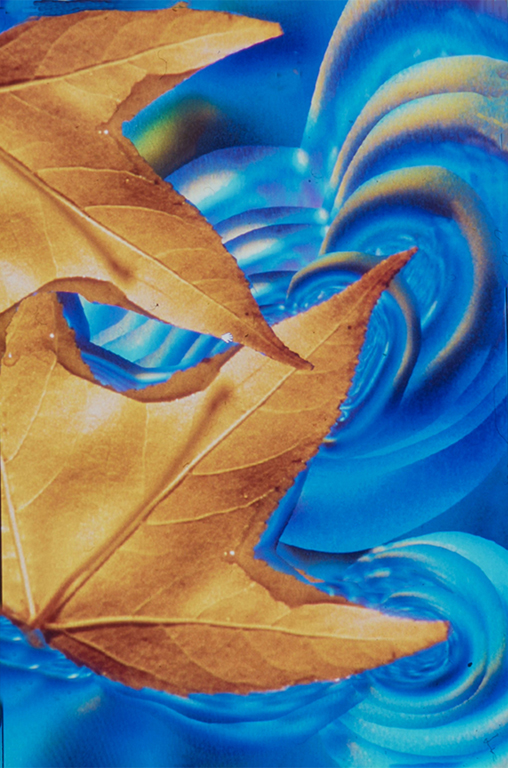
LuAnne,
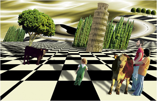
This certainly unusual. In the abstract I see a face that almost looks like it was pasted onto a real face underneath I'm the area that is more realistic looking. I congratulate you on really thinking creatively.The white border around the abstract portion makes it even stronger and more unusual. The color really stands out and the texture of the abstract is of interest. Who would have though of putting the original whahateveritis together with a background that is also mysterious to show us something that falls into the creative category |
Jan 21st |
7 comments - 3 replies for Group 3
|
| 18 |
Jan 23 |
Comment |
The interesting thing to me is that only part of the photo has the streaks. The castle is looking normal, although a little blue, and the people enjoying themselves are not particularly distorted., so I am wondering how you managed that. It doesn''t matter how you did it because it is very colorful and feels like soothing one would see on New Year's Eve. Good job!! |
Jan 16th |
| 18 |
Jan 23 |
Comment |
It sort of looks like a straight shot to me, but we have no info. If does five a feeling of three-dimensionality as though the skeleton were climbing out of the pumpkin. Interesting seeing. If you make it yourself fro a pumpkin and a skeleton, more kudos to you. |
Jan 16th |
| 18 |
Jan 23 |
Comment |
Andrew,
I love the anonymity of the models ad the shadows. Since I couldn't see the original, I don't know what changes you made, but the overall effect is certainly fascinating. You might try getting ri of the brick wall behind them, Turing it to black t make the models stand out even more. , Notice that the ties really take the limelight. I guess with all of thee red and blue controversy in America, I tend to notice ties more. Trump always heard a red tie and Biden never a red tie.
|
Jan 16th |
| 18 |
Jan 23 |
Comment |
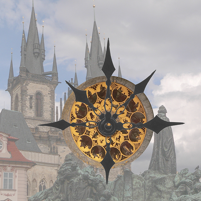
Adding the colors make it a lot more interesting Gand the black background makes the clock really Stan out. I'm wondering if you could do something more with it to make it even more creative, such as distorting it in some way, or adding animal or person to the clock in some spot. Pretty clock
Here's one example, but hardly the only one that could be given. |
Jan 16th |
 |
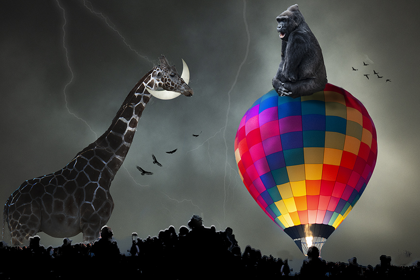
| 18 |
Jan 23 |
Comment |
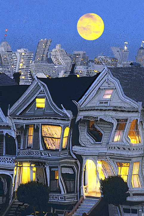
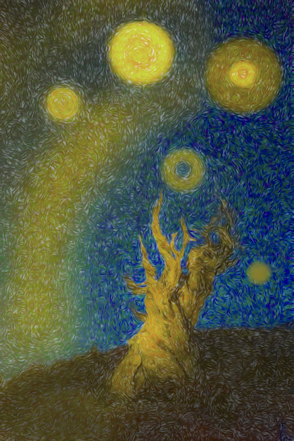
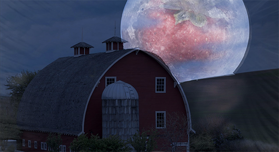
Mike,
The combination of all four phots is certainly interesting. However, I wold make the moon a lot lighter because the overall photo is quite dark due to the "time of day." I think it would give it mi ore punch. Otherwise, once again a great composite and a good story.. |
Jan 16th |
 |
| 18 |
Jan 23 |
Reply |
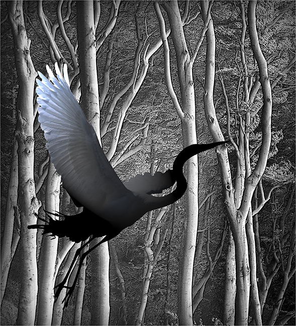
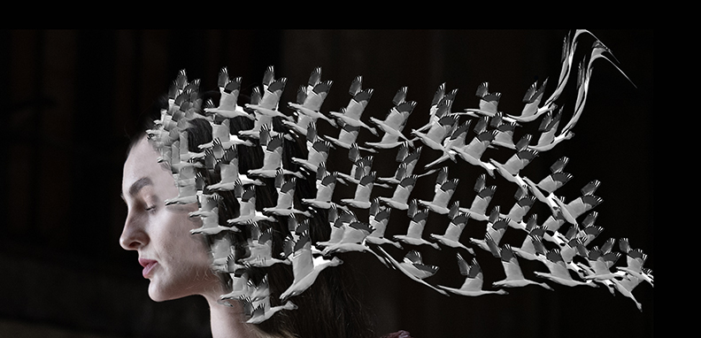
Ian,
Here is one of the originals. Strangely, the extraction in better here than in the final one for my card. The real original was taken in an empty field with all of the birds showing. I can't find it easily, unfortunately. |
Jan 16th |
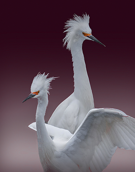 |
| 18 |
Jan 23 |
Reply |
Mike, thanks for you comments. I tried about four times to remove those red streaks around the head using Select Color Range, and erase using content aware. I also tried once using white, but I couldn't get rid of all of them, unfortunately. |
Jan 16th |
5 comments - 2 replies for Group 18
|
12 comments - 5 replies Total
|