|
| Group |
Round |
C/R |
Comment |
Date |
Image |
| 3 |
Dec 22 |
Comment |
Mary Ann,
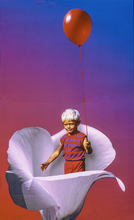
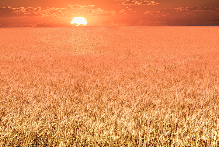
You certainly fixed the original image quite well. The little sliver of a moon just showing in the sunset works very well. Flipping it as LuAnn suggests does bring up the question of whether the moon actually every looks like that. I am not sure, as I too am moon ignorant. However, I would like to see this without so much foreground of black, maybe remove it altogether or cut the amount of black from the bottom by cropping. It is always so enchanting to see a wonderful combo shot of moon and sunset, not often seen. If LuAnn's version appeals to you you can alway cut out the moon, fill in with content aware and flip the moon and repast it where you want. |
Dec 17th |
| 3 |
Dec 22 |
Comment |
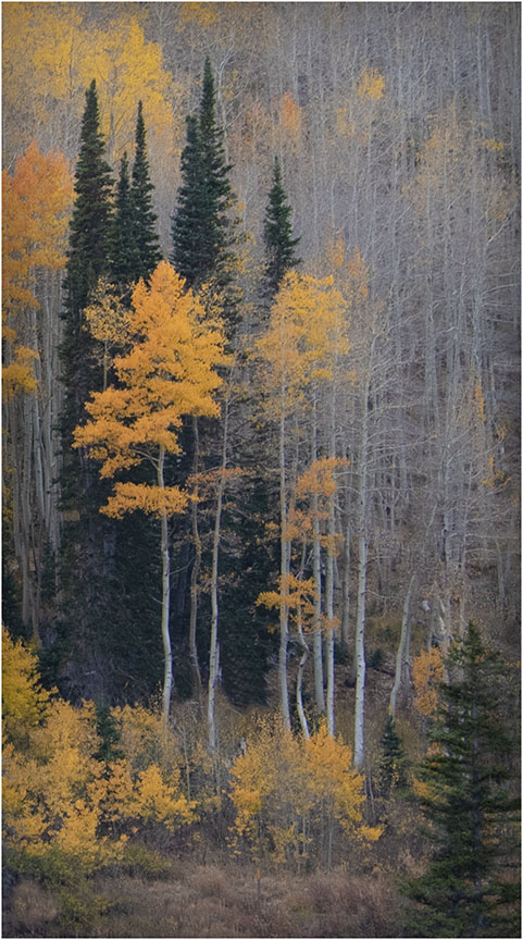
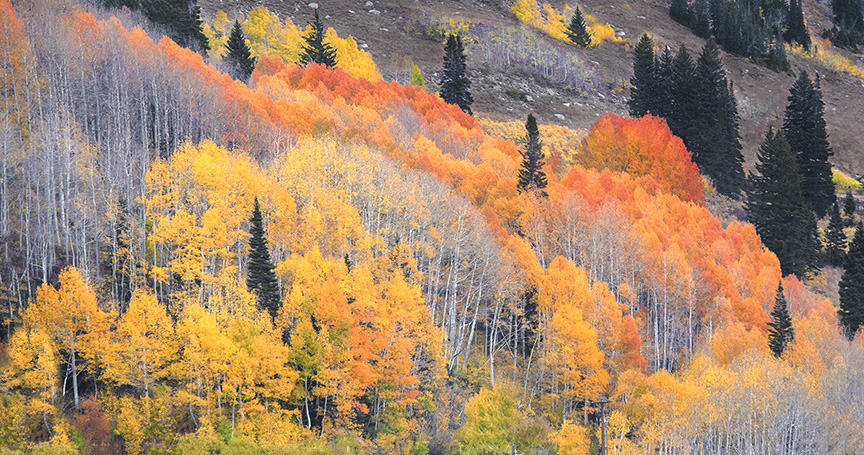
The original was already a lovely autumn scene. The use of the oil paint or whatever you used does enhance it to some degree. It gives it more of a painterly look. Centering the bridge is OK with me and the colors are really perfect for that time of year. I'm not sure if the painterly look was necessary to enhance a photo that was in and of itself quire impressive.. |
Dec 17th |
| 3 |
Dec 22 |
Comment |
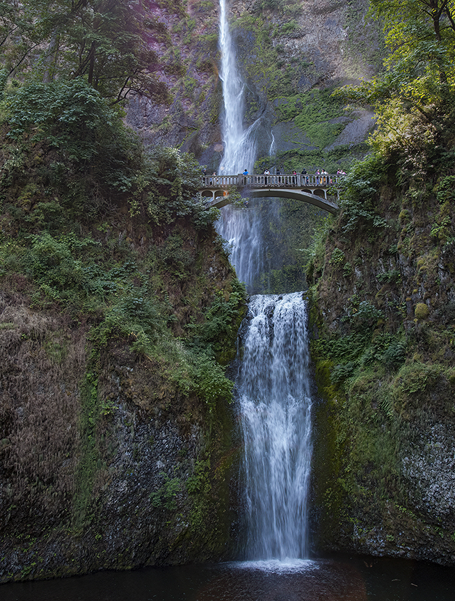
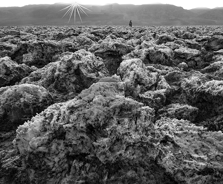
Your composition is quite good. I love what you did with the sky, the vibrance and the shadows. We can see well-enough into the shadows. to appreciate the rock formations. Arches is an interesting sojourn and has an amazing number of great photographic opportunities. Late afternoon is a wonderful time to capture the excitement of the national park. I do find my eye bouncing a little back and forth between the light spots on the left and the large block of stones lighted on the right, but darkening the light on the left will not help with this, so I think you did very well and I'm glad you got out to Arches. |
Dec 16th |
| 3 |
Dec 22 |
Comment |
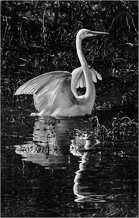
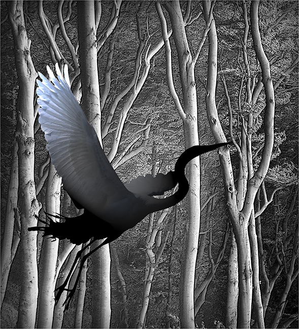
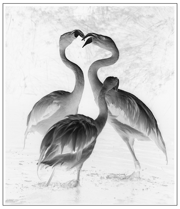
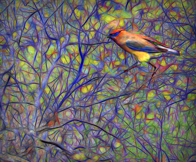
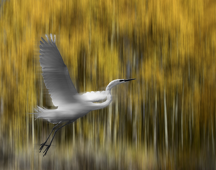
I really like what you did in converting to high key. It works well. The conversion to a vertical, I' not so sure. Maybe add some below the original bird and keep it in a more horizontal position so the bird has more room to fly into. Otherwise he is beautiful in high key. |
Dec 16th |
| 3 |
Dec 22 |
Comment |
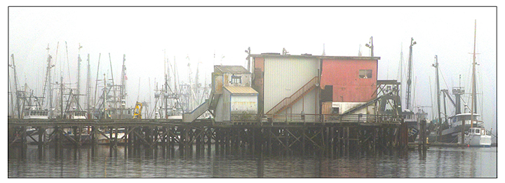
This is perfecto. I t reminds me of some painter, not Magrette but someone like him who has the opportunity to really show up what is important. The impact of the BOWL letters with their various colored backgrounds is truly impressive. I love this image. Whatever you did to improve it from the original worked so well. I can't imagine making it any better than it already it. I love the centering, the simple colors of the building and the holder for the neon letters. I wonder what it would look like lighted up. But no matter as it is so wonderful as it is. Simple with a huge impact. I suspect changing the sky to darker clouds, was a really positive step in this conversion. |
Dec 15th |
| 3 |
Dec 22 |
Comment |
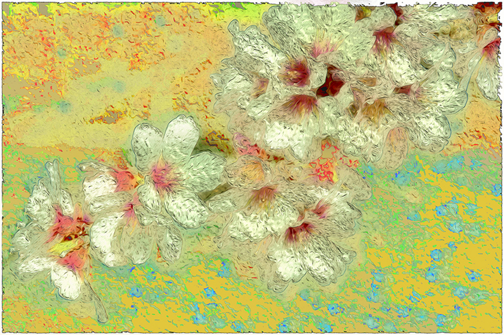
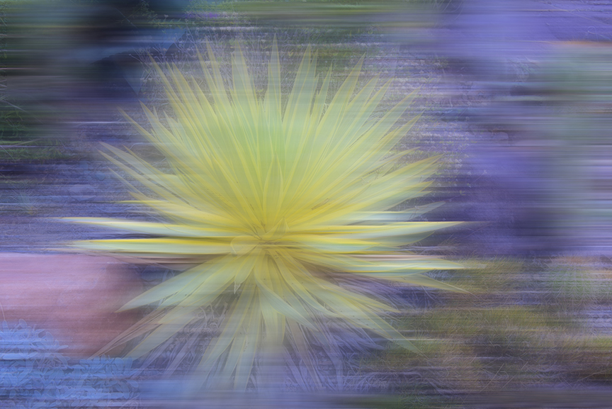
LuAnn,
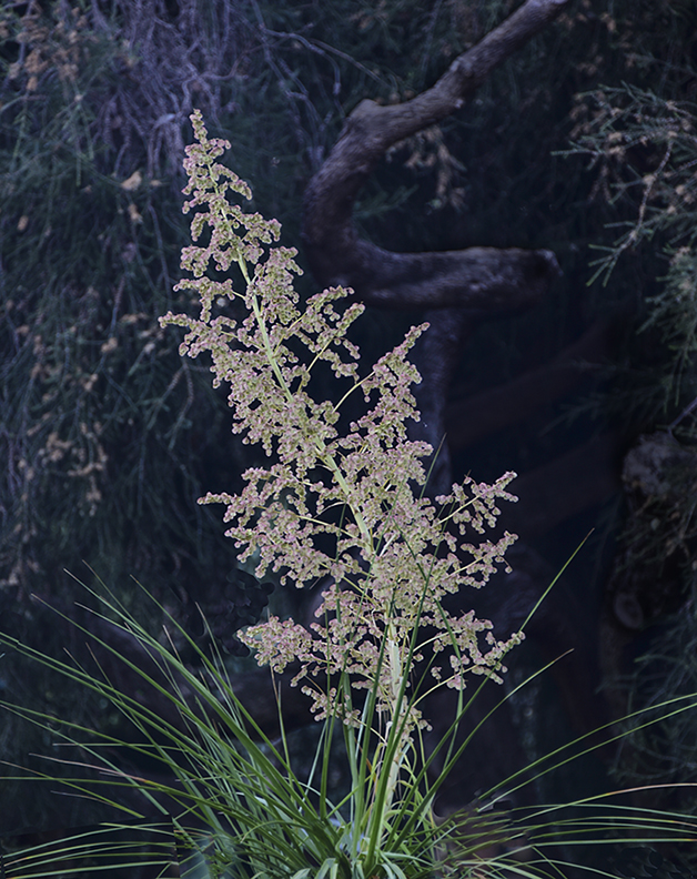
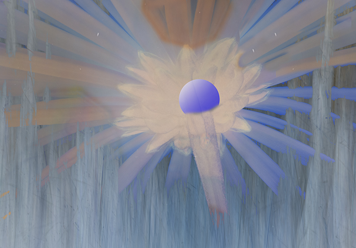
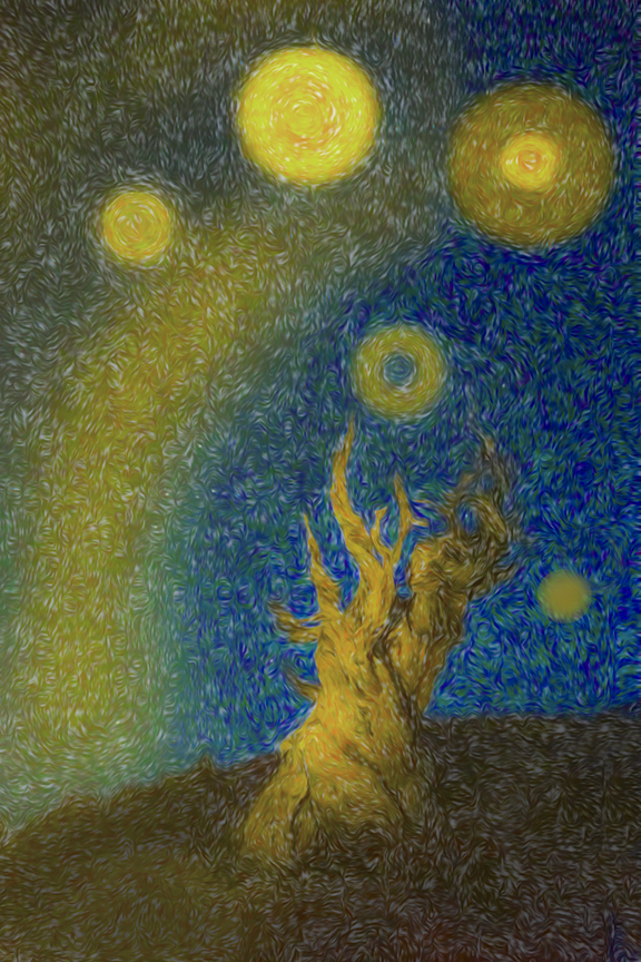
This is mysterious enough. I thought at first it was a mountain in the background and flowers in the foreground. Closer perusal, plus reading your comments let me to the photo being the side of a car e, maybe in snow, and I think he yellow foreground is lichen. Since it is looked at as an abstracts my initial impression is probably more what you're looking for, since abstract is not something that can be easily described. I like the way you cleaned up the original giving it more life and changing the black spots into unnateable streaks. My feeling is winter landscape with an icy feel on everything.. I have no idea how to improve it. It's quite lovely and interesting as it is.
|
Dec 15th |
| 3 |
Dec 22 |
Comment |
Luann,
Thanks for taking son much tie too work on my image. I do like the smoothness of the image you have created. My eyes are not so good, so I usually do't notice things like noise unless it's extreme. I remember fooling around with the contrast on this to up it a bit. Your version has less contrast, but is still very lovely.
|
Dec 15th |
7 comments - 0 replies for Group 3
|
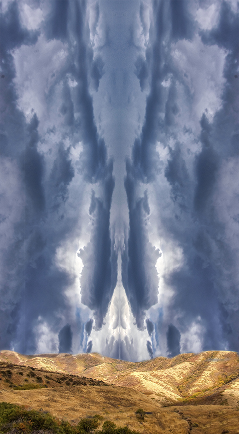
| 18 |
Dec 22 |
Comment |
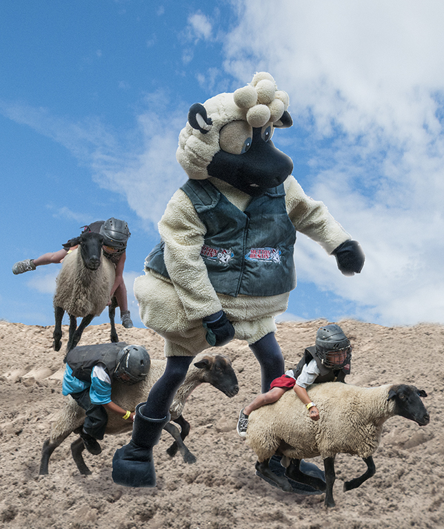
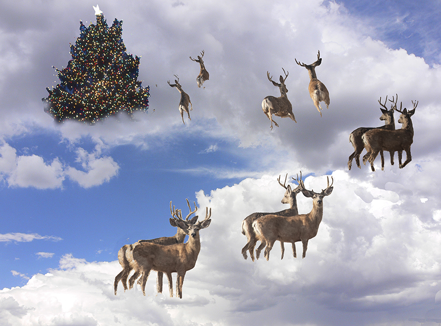
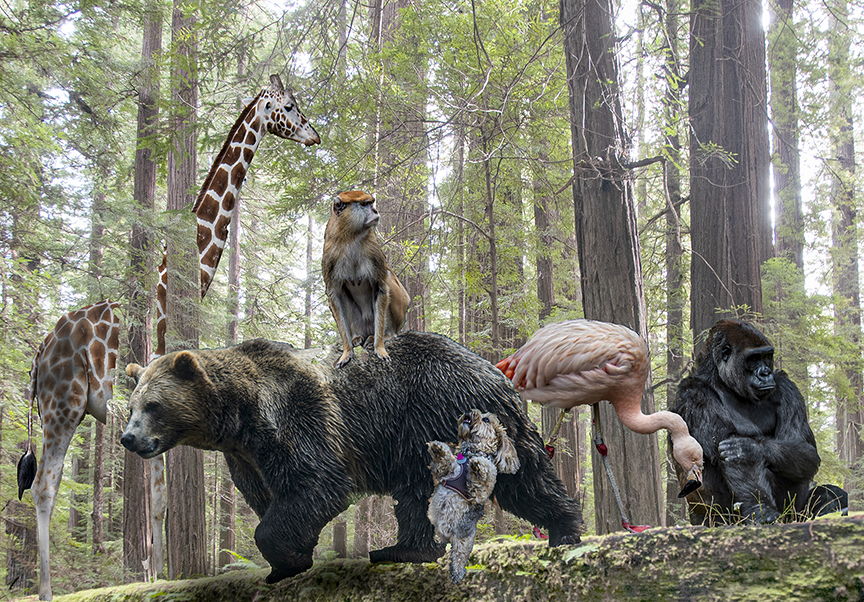
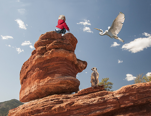
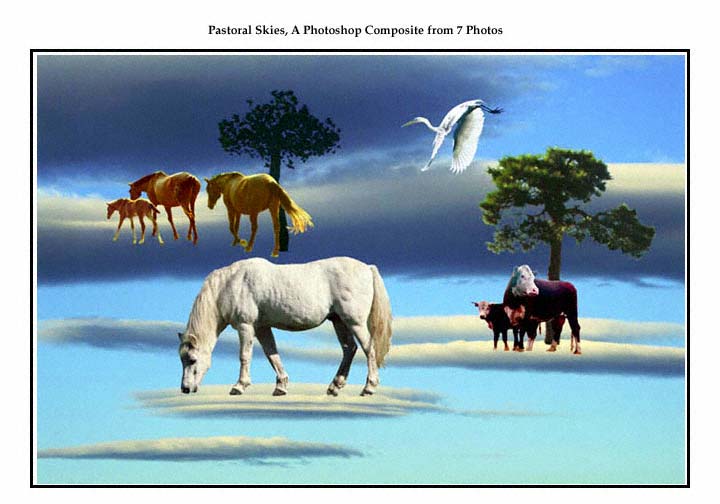
I love the lighting of the canyon. The way the light catches on the edges of the gouged out rocks is wonderful. Changing the sky was a good idea as it gives more impact, but remember the sun is coming in strong, so when you planted the goat, the shadow should have been shifted if you could do it so it looked like the sun was hitting the goat at the same angle. Also maybe have the goat a little further back so it would be entirely in the sun so its head would stand out more. You might also consider putting sunlight on the right side of the goat to match.
The concept is great and I really appreciate your work.
We also appreciate your in-depth comments. |
Dec 16th |
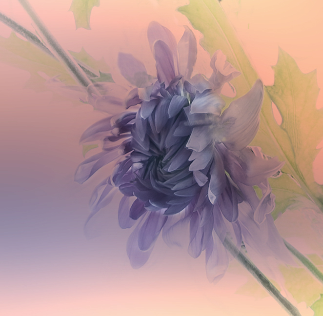
| 18 |
Dec 22 |
Comment |
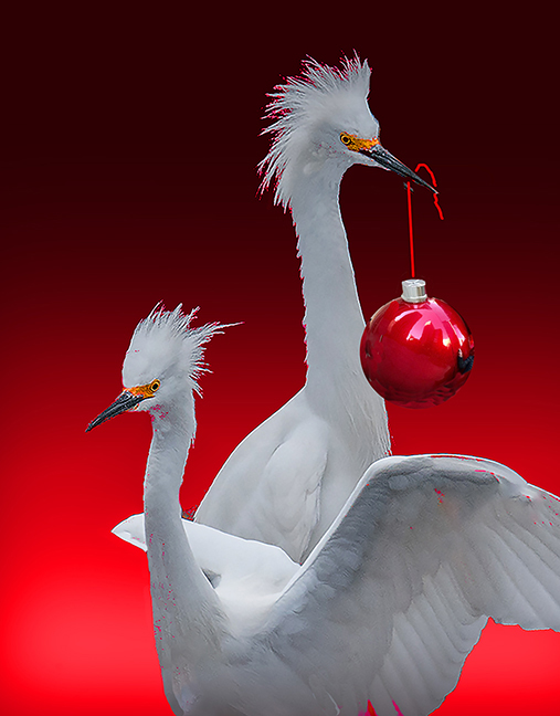
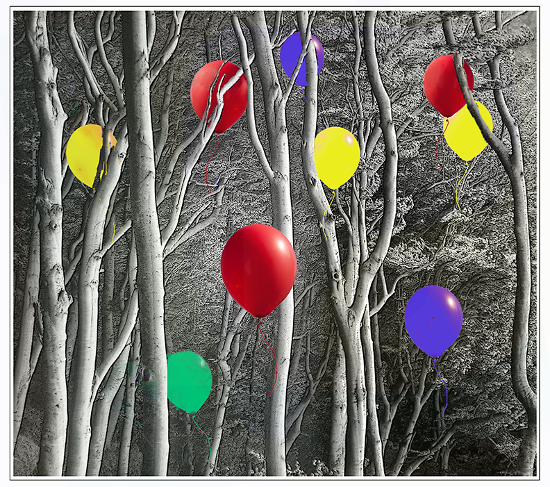
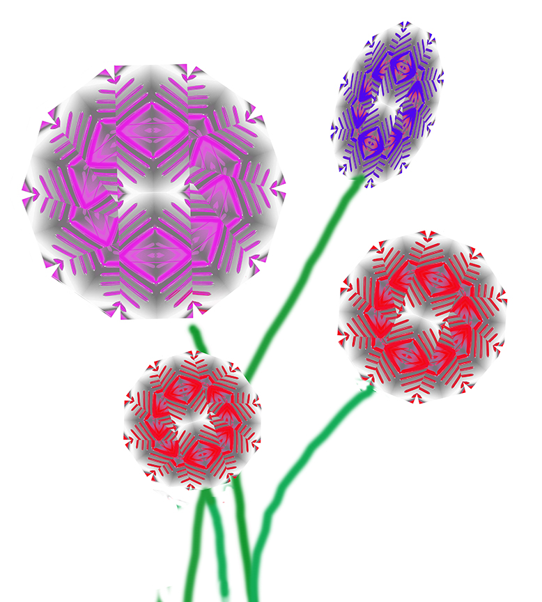
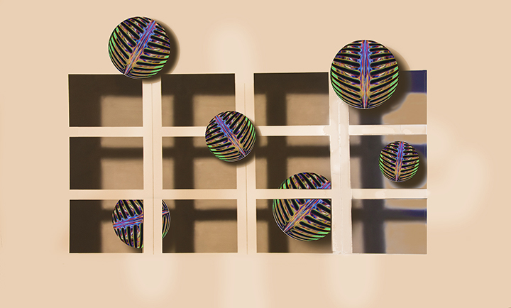
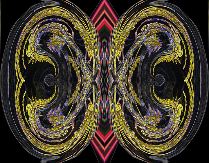
It's a powerful image now. The only thing I would suggest is to add stems. I feel like they're floating in a colorful space. I like what you've done to improve the image and make it into a creative one. |
Dec 16th |
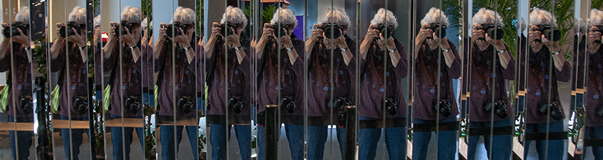
| 18 |
Dec 22 |
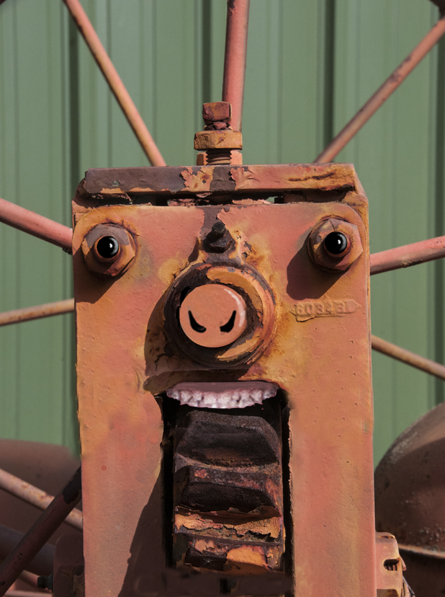
Comment |
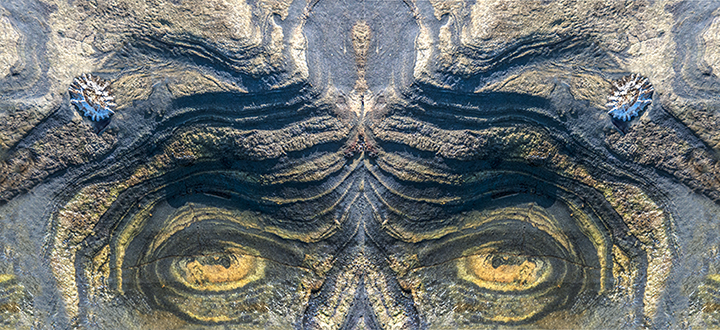
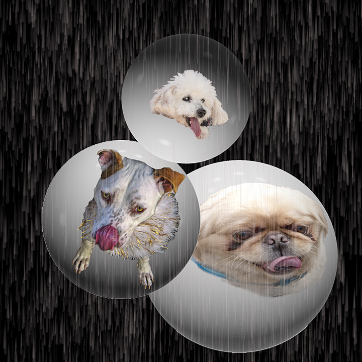
All I can say is good seeing. It does indeed look like a sad face. Did you do anything else with a texture or something? One of the creative concepts is finding something unusual in something commonplace and you have done that. |
Dec 16th |
| 18 |
Dec 22 |
Comment |
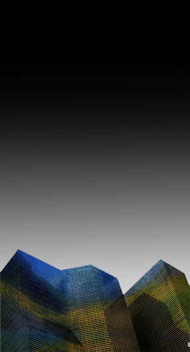
Andrew,
This strikes me as a monolith that has too much power in the frame. What you have done with the orbital is a lot better, but it still seems to overwhelm me with big buildings. I think part of the trouble for me is that I'm not partial to these colors. Olive green has always been one of my least favorite. You might try this with another color combination, or you could add a lot of sky, making the buildings small at the bottom of the frame. The image I'm showing was m attempt to make more sky but for some reason I couldn't get a sky to go in so I just put in a graduated "sky"" to give the concept. |
Dec 16th |
 |
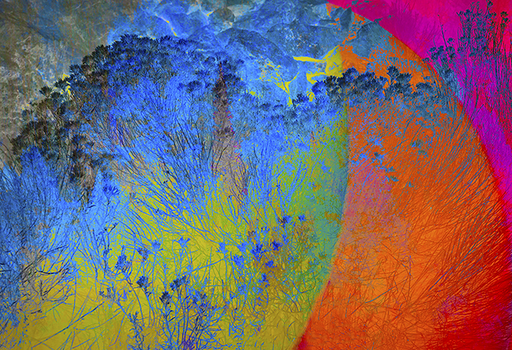
| 18 |
Dec 22 |
Comment |
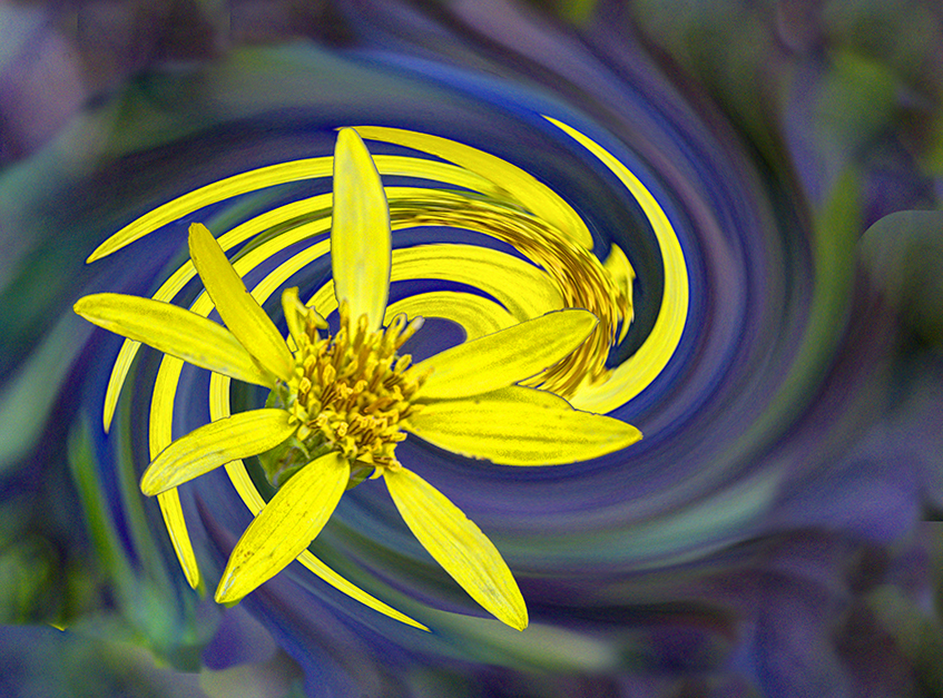
What you did raised the level of the original to a new high. So much more interesting and quite lovely. Those filters are new to me, so I will check then out, thanks.
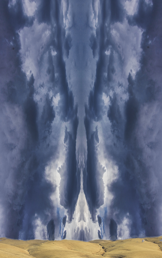
The blues and golds work so well for the color contrast. Did you shears and twists affect the clouds also, or did you extract the original seethed first? The clearness of the worked-on photo helps so much also.. You filled the frame perfectly. |
Dec 16th |
| 18 |
Dec 22 |
Comment |
Continuatioh of my reply. It is called the Orton Effect named after Michael Orton in the 1980s. It was used to great effect on rusted junk and trees. Int gives an interesting glow to scenes.
|
Dec 16th |
| 18 |
Dec 22 |
Reply |
Mike,
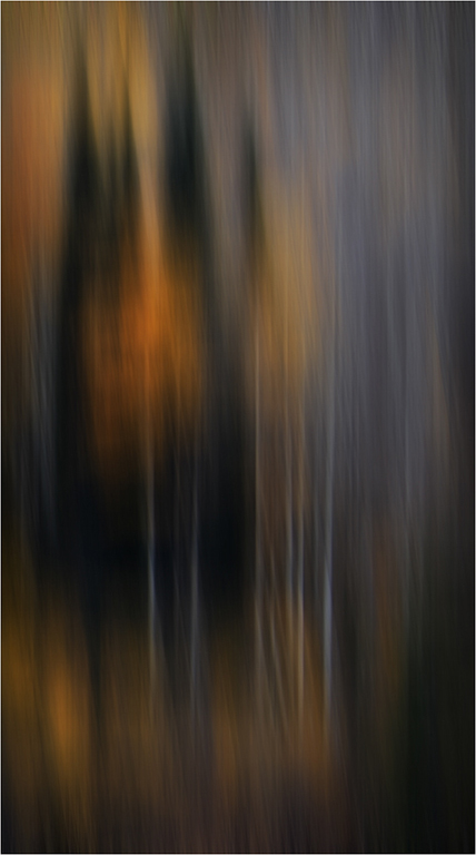
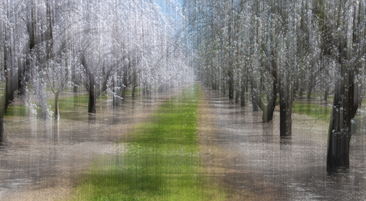
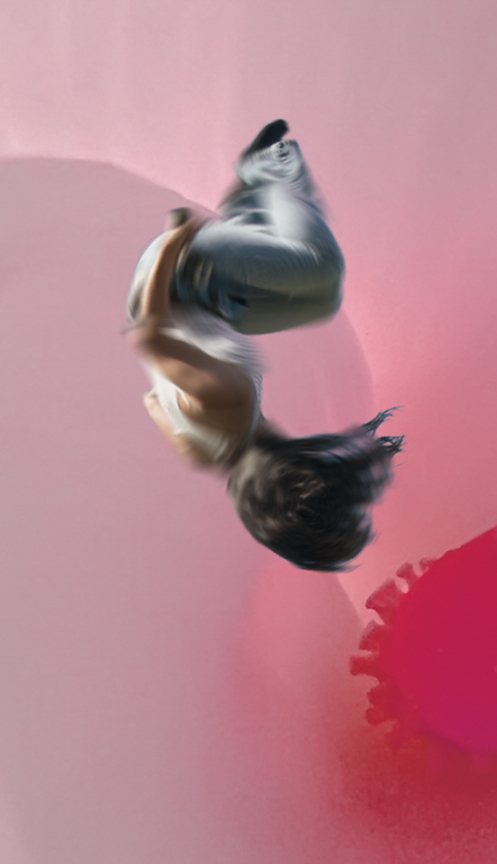
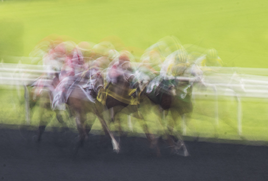
there is a Canadian school of photographers who have used the in-camera motion techniques for many years. That is s Richard Martin, the initial one is Freeman Patterson, and Andre Gallant. I I found out how to imitate the looks in Photoshop. Another technique which I haven't seen for awhile was originally with slides. You took one slide sharp and at least +1 exposure and the second slide of the same object on tripod at different blurriness. You put the two together to produce a ver interesting look whose name I'm trying to remember. The PS method fo that was to take any image, duplicate it, set one at brighter than normal exposure and the other at regular exposure and blurry. Copy one into the other file and combine the two layers using Multiply for the blend mode. I'll show one of these next time. |
Dec 16th |
6 comments - 1 reply for Group 18
|
13 comments - 1 reply Total
|