|
| Group |
Round |
C/R |
Comment |
Date |
Image |
| 15 |
Aug 22 |
Comment |
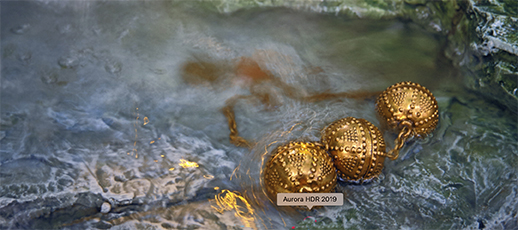
This image gives me the feeling of three gold pearls inside an oyster shell. That doesn't explain the little waterfall, but the entire background for me is a bit soft and hazy, which is fine. I love how the gold balls have a golden reflection. If it were mine, I might consider cropping off part of the top of the frame. It looks like a really unique piece of jewelry and a good idea, as well. |
Aug 23rd |
 |
| 15 |
Aug 22 |
Comment |
Rick,
I like both version, as well. The BG is too close to the lilies to logically make it go out of focus, so you did well with your cloning out distractions. I wold like to see a little more space on the bottom of the image when you have added your famous frame to it. I also think the flowers on the right cold be cloned out as they are inconsistent with the rest of the BG. But you have captured the lilies so beautifully with the raindrops, so sharp and great color contrast between the pink and the green.
Thanks for finding this shot. |
Aug 23rd |
| 15 |
Aug 22 |
Comment |
Linda,
I agree with Kristi and Rick abut the clothing in the upper right. The concept is wonderful. The manicurist would love to get her hands on the two undecorated sets of nails. The black hand on the left is so much bigger than the other two. She must be a big lady. I wonder if there is a way to intertwine all three, maybe on partially for each person, but to lend a consistent feeling throughout. |
Aug 23rd |
| 15 |
Aug 22 |
Comment |
Yes, I like it better Kristi. With my eyesight I cana' see dust spots well, if at all |
Aug 14th |
4 comments - 0 replies for Group 15
|
| 21 |
Aug 22 |
Comment |
Mike,
I take it back about the blurriness. I have a lot of trouble with my eyes. When I looked closer, it seemed to be sharp. My bad. |
Aug 24th |
| 21 |
Aug 22 |
Comment |
Your methods to produce interesting cubs or 3-dimensional rectangles or boxes really works well here. Something a little different. I like the way the photo wraps around the box and also somehow flows into the pad under it. The use of the image continuing on the pad and the shadow below it brings this all into an unusual combination that is definitely creative. My only question is the sharpness of the final image. The original in quite blurry and it looks like you may have used that to put your box together. Otherwise, great ! |
Aug 24th |
| 21 |
Aug 22 |
Comment |
Hazel, for a first time effort, I really like it. Your colors work well together ad you have chosen thee images that also, in my opinion, work well together. The final effect is a lovely pictorial image, IMHO, rather than a creative one. You have used some interesting help tools in Photoshop, which I think did justice to the final image. BTW, I think the first flower is a cone flower because of its orientation. I do like the slight haziness of the triptych which makes it a bit more mysterious. As I said, I really like your final product, but more for pictorial than creative. |
Aug 24th |
| 21 |
Aug 22 |
Comment |
Steve,
I do like your finished product of f the kaleidoscopic filter o n the tree. I don't understand how you got those realistic looking windows on the left as I don't see anything like that in the original image. The curved ceiling makes for great interest in this image. As a fellow creative person, I would suggest that we stay away from single filter effects as it becomes less of our own creative effort than the entire work of the filter. But a great outcome using this filter. |
Aug 24th |
| 21 |
Aug 22 |
Comment |
This is definitely an unusual creative combination which is different enough from the original and take a picture of the entire birds so that it works. I do find that the final result is very similar to the original, including the white streak, which doesn't show up in the original 2 with the shite background. I suggest losing that streak and the lightish formation to the right, leaving only the birds. The concept of Turing then upside down does make it more abstract, but still it is an interesting take on the flamingos. They are, by the way, incredibly red. Interesting take on a familiar subject. |
Aug 24th |
| 21 |
Aug 22 |
Comment |
Brian,
Since the car in the tulips is a a very strange combination, I am glad that you totally changed it to something that has a lot of dynamism. It sounds like you used every filter in the book. I have not looked at the website you mention, but should do so. It seems like all colors are leading to the center. A totally abstract image in the end. I am curious as to where the red streak came from as I see no red in the regional image.
good work!
|
Aug 24th |
6 comments - 0 replies for Group 21
|
10 comments - 0 replies Total
|