|
| Group |
Round |
C/R |
Comment |
Date |
Image |
| 15 |
Apr 22 |
Comment |
Kristi,
I see at least seven starbursts and they seem quite sharp to me, better than your original . I think making the image darker has helped a great deal here. The lights are more appealing. The curvy streaks in the middle right of cars coming toward you are really intriguing. I don't see anything you have to actually dislike about this. I think it's lovely, |
Apr 18th |
| 15 |
Apr 22 |
Comment |
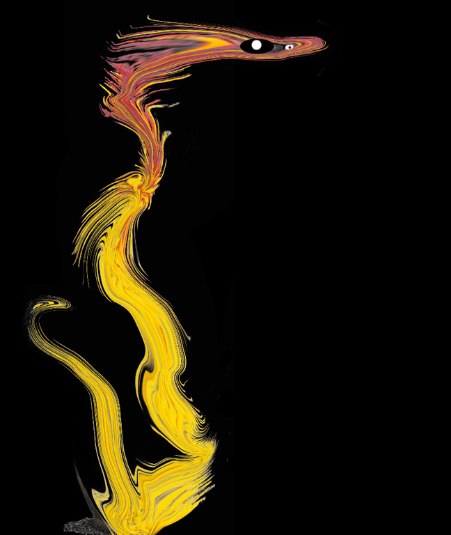
Jeri,
When I first looked at this I thought it was a creation by you. The eye was like a lemon slice and the feather sort of like cabbage. I was thinking, how creative of you. Then I finally realized it was a real parrot or macaw. A definitely different shot of such a beautiful bird. I'm not sure I would crop it at all as the eye is not centered as it stands. Really sharp and goes to show what the iPhone cameras can do.
Well, it almost looks good enough to eat.
|
Apr 18th |
| 15 |
Apr 22 |
Comment |
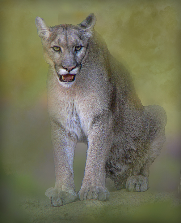
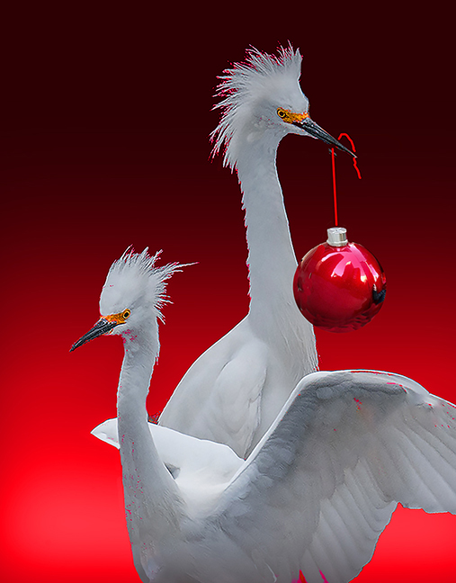
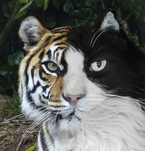
Fell in love with him right away. He is a h handsome devil. I have no suggestions for improvement. The colors you placed on him and the frame match perfectly. There's a certain Piccasoish look to him, especially in his neck area. Very pleasing to study. Where di your get your model? |
Apr 18th |
| 15 |
Apr 22 |
Comment |
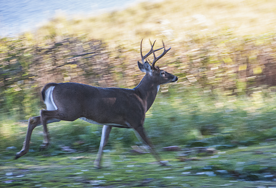
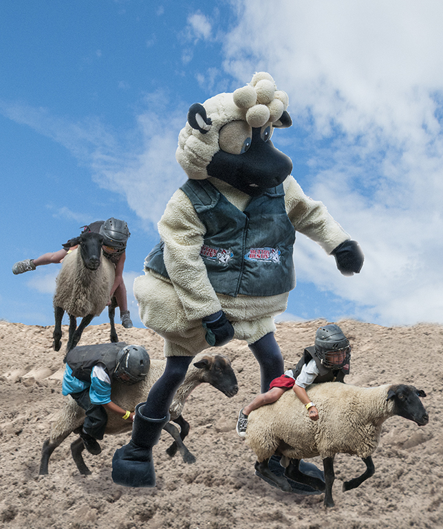
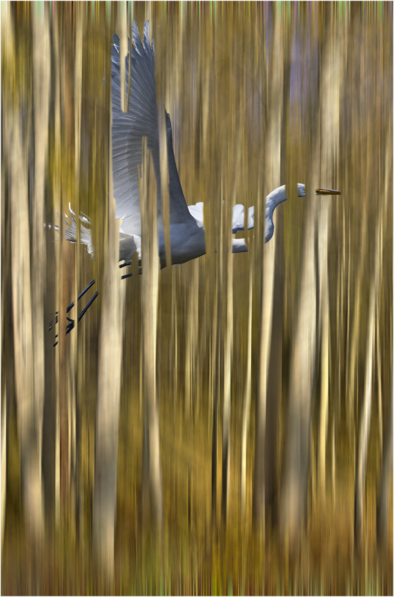
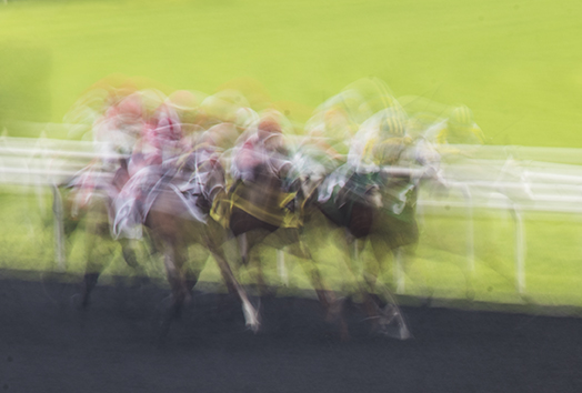
You did a great job with your panning. - almost tack sharp. I like your sense of humor here. Couple of thoughts: the image looks like it's running uphill from right to left, which is easy to fix. Also you may not need so much foreground, especially since it is harder to see the movement of the inert areas. Very nicely done, |
Apr 18th |
| 15 |
Apr 22 |
Comment |
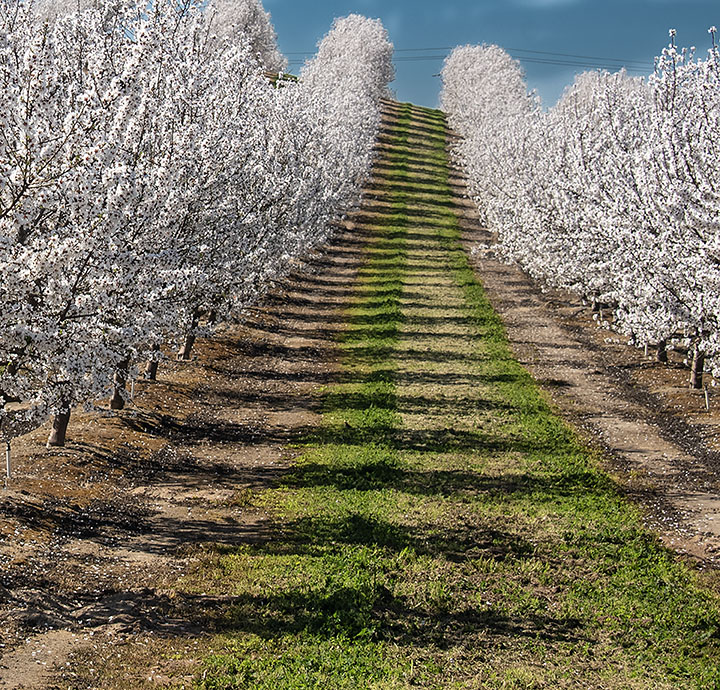
Linda,
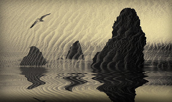
Very appealing selection. I like how the ripples are just the right size to make this interesting. There is a lot of symmetry with a middle tree flanked by one other on each side. I wonder how it would be if you just used the bottom half of the image, the tops of thee trees as another option, Photographer's choice. |
Apr 18th |
| 15 |
Apr 22 |
Comment |
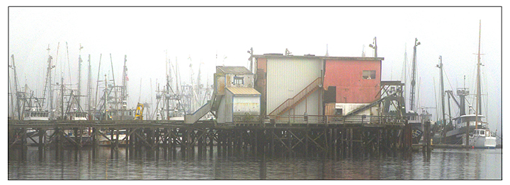
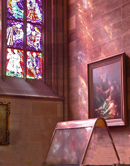
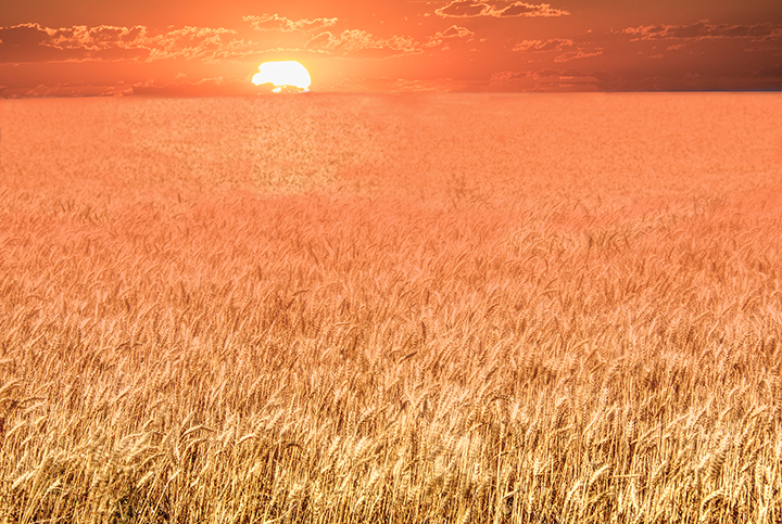
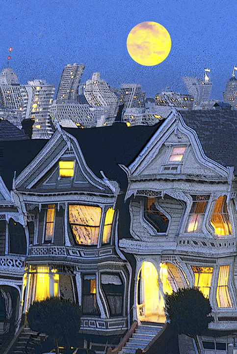
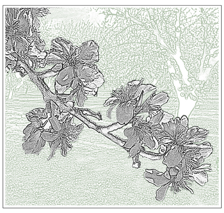
It looks like a great perfectly exposed overall image that really captures the thrill of Niagara Falls. Despite having been raised in NY, I'm not sure I ever got there. It was the ultimate honeymoon spot, as I recall. For some reason, the heavy mist in the middle of the photo bothers me a bit and I'm not sure how to change that. Maybe another photo from a different angle would do it where the mist is more to the side. Maybe crop a little off the left side, but not too much as. the falls over there are very important to the image of Niagara. Otherwise, a lovely shot on a great day. Although it is indeed a wonderful thing to see, I suspect that when I was. young, newly married couples went there because it was close and not too expensive. Things have changed. |
Apr 18th |
| 15 |
Apr 22 |
Reply |
Kristi,
That might be a good idea. Right now I don't have the time to try it but it makes good sense. |
Apr 11th |
6 comments - 1 reply for Group 15
|
| 21 |
Apr 22 |
Comment |
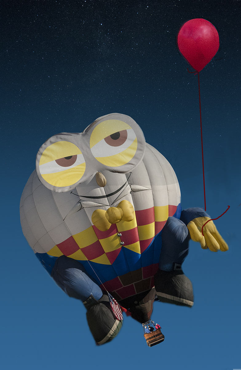
Mike,
I love your creativity and how you kept changing the image to get better and better. Think you did a wonderful job, but your revision is even better. The original lamp looked a bit distorted, which is not problem in creative. Your ideas about including a good photo of NYC inside the apple is great. You have done a really excellent job. It reminds me a bit of Magritte. I think he liked apples. |
Apr 18th |
| 21 |
Apr 22 |
Reply |
That line is from "Oh, Suzanna.." Did he write that.? 've been humming it lately for some reason along with "My Darling Clementine." |
Apr 18th |
| 21 |
Apr 22 |
Comment |
Well, It looked brighter using the vibrance tool alll the way up, but when I put it on the comment page, it turned dulll again. Don't know why |
Apr 18th |
| 21 |
Apr 22 |
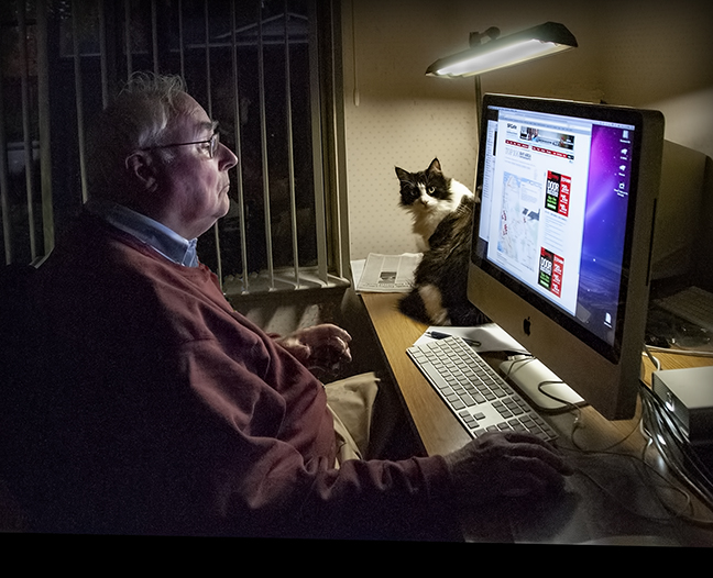
Comment |
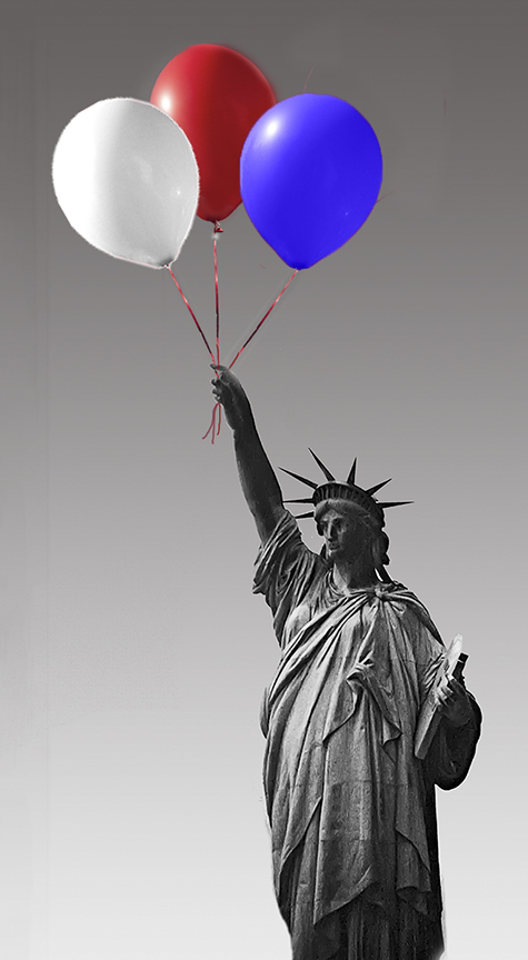
Peter, A great story of how you met your wife.
Good thinking to change the parachute jump into a space station. Very well done. I would like to see it a bit brighter in the framing od black sky and stars. The black tends to dull things a bit. |
Apr 18th |
 |
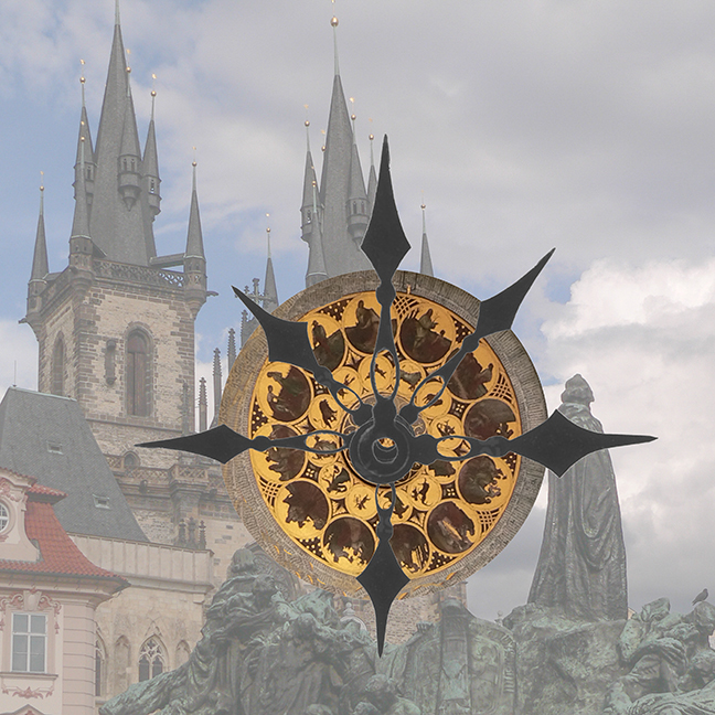
| 21 |
Apr 22 |
Comment |
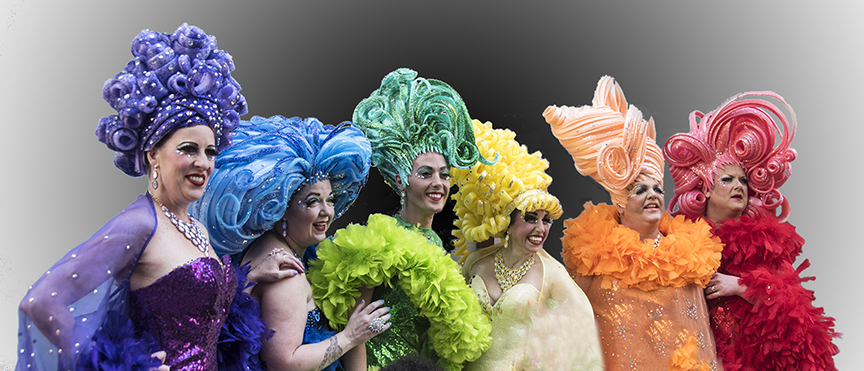
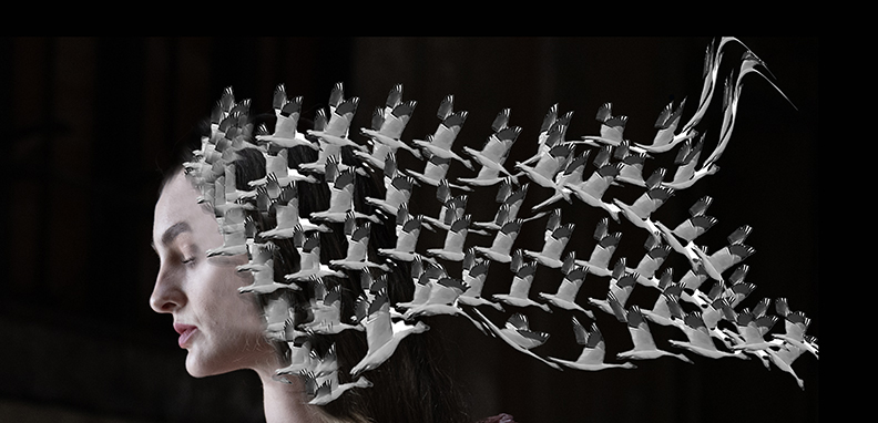
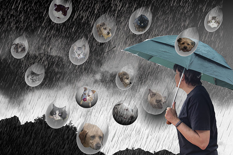
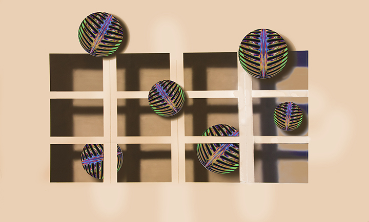
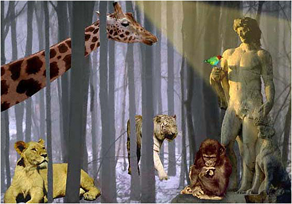
The colors are really impactful. Her headdress is quite imposing. Poseiden in peeking into the photo, but in a way that is very unobtrusive. I suggest cropping off some of the bottom as the bridge looks a lot like a bust and if that lower part is cut off, wqouldnothave quite the same feel, more like a person, or god. I also like the leafy effect you have created for the background. I wonder how it would be if the pits other face caused by aginwere removesd so she lookedrealy young and beautiful. |
Apr 18th |
| 21 |
Apr 22 |
Reply |
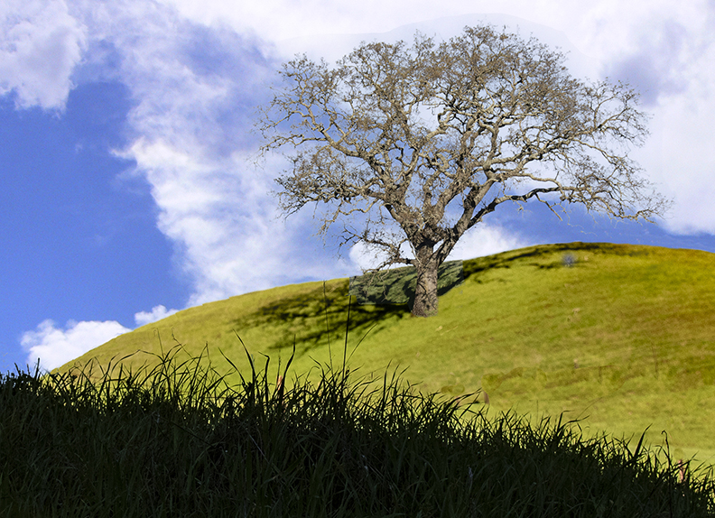
Brian, Thanks for you kind workds. Steve is most likely right doubt the focusing problems . I took a tree that looked sharp to me and covered up the original. Since they were different sizes, I had to change the size to match the original image. So it is likely that the grasses in the middle are not sharp but should be. I'm not sure I could achieve that as neither original may have had sharpness in those intermediate places. I don't have a problem with the sky clouds as skies can be anything. The shadows o the tree might be different, of course. |
Apr 18th |
| 21 |
Apr 22 |
Comment |
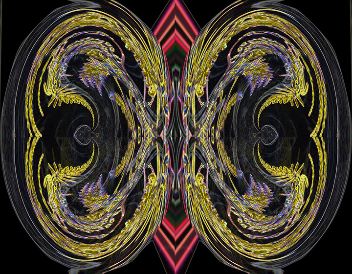
I have tried what I remembered. There is a limit on the number of colors most likely, but by rasterizing the type, you can easily fill it with a gradient of colors. |
Apr 11th |
 |
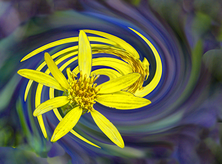
| 21 |
Apr 22 |
Comment |
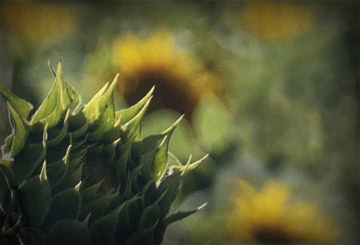
Steve,
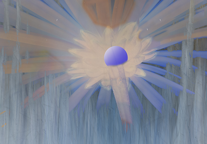
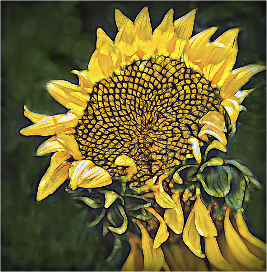
I was not aware ofPaul Mavrides. until you brought him up. I'm still not sure of your title, "This is Why we Can't Have Nice things," when the sunflower seems to represent nice things to me and I don't see the logic here. It is interesting to note that the sunflower is very important right now because it is the symbol of the Ukraine.
As for your image, the sunflower is well captured. I remember from a long time ago that it was possible to fill in type with a gradient color but turning the type layer into a regular layer and outlining the type with marching ants. You could then fill it directly with gradient colors you chose. You could also add a line around the text. I wonder if that is still possible. I will try it and see. In general, your concept is very creative and I applaud you for it. Let you know.. |
Apr 11th |
6 comments - 2 replies for Group 21
|
12 comments - 3 replies Total
|