|
| Group |
Round |
C/R |
Comment |
Date |
Image |
| 15 |
Mar 22 |
Comment |
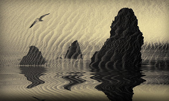
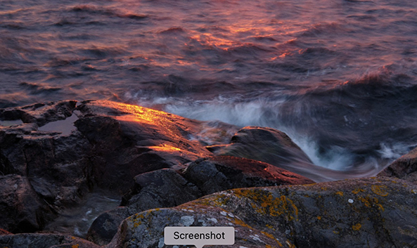
Kristi,
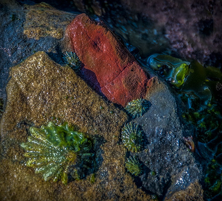
You have really caught the colors of late day in the water. that is the prefect time to photograph the beautiful sea. I would like to suggest that you crop in even further to where the colored rock and crashing water is even closer to us. I submit a suggestion from cropping.
|
Mar 24th |
 |
| 15 |
Mar 22 |
Comment |
Jeri,
When I first look at this, I was not very impressed. But when I looked again, I appreciated the color s an textures a lot more. The reds of the bricks and the blue plaster repairs make an interesting contrast. The last whitish plaster job certainly adds to this. It is sort of like archeology, going back to finding the original, which could be many years old. |
Mar 24th |
| 15 |
Mar 22 |
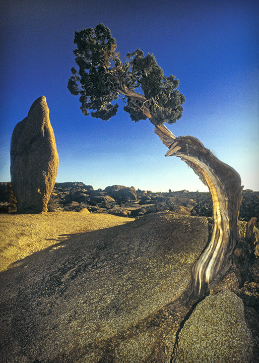
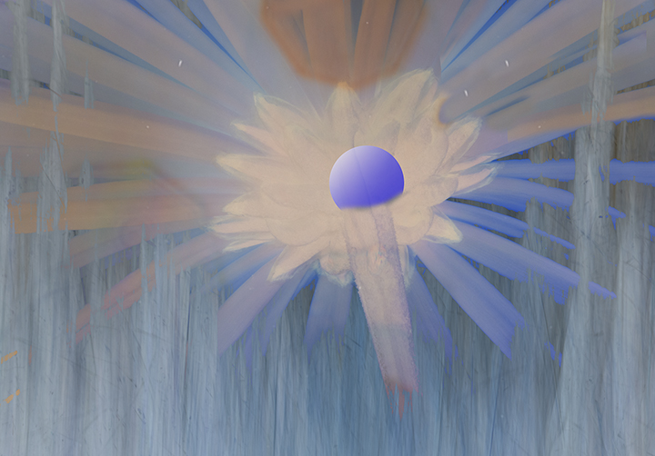
Comment |
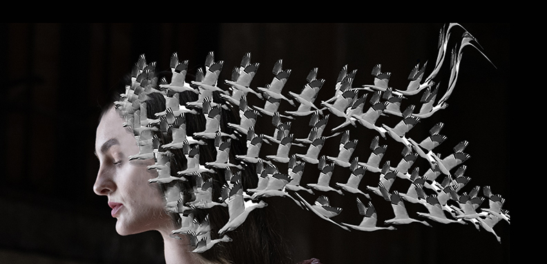
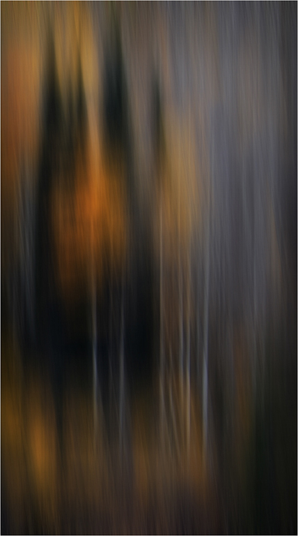
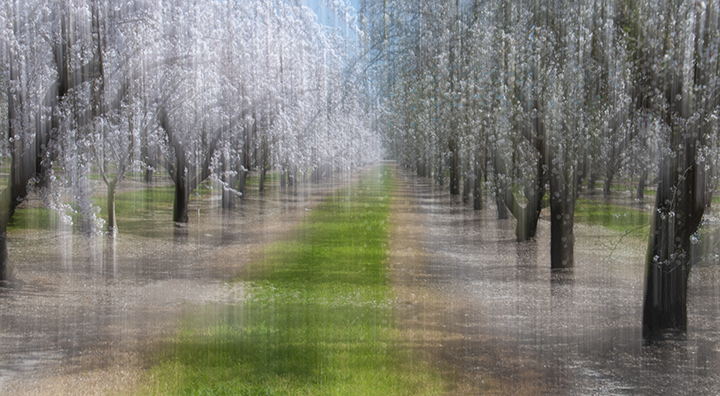
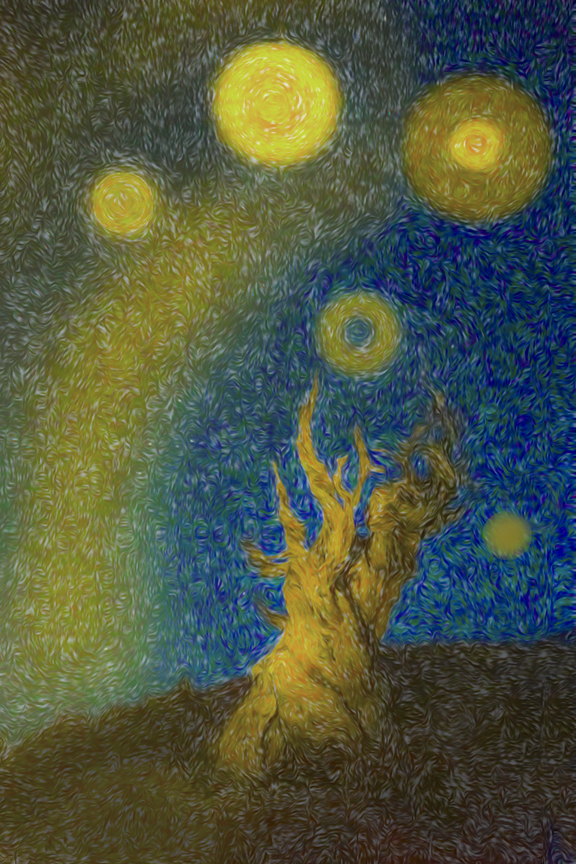
The heat of the day is caught in your impressionistic combination of the the tree, the sky and the moon. The strong reddish-yellow cast to the photos is what makes it remarkable. What kink of tree is it It reminds me of something out of Africa. Fills the frame beautifully. Nice work again! |
Mar 12th |
| 15 |
Mar 22 |
Comment |
Linda,
I like what you did to catch the interior of a charming old railroad car and duplicating it. That gives is so much more impact. It makes you wonder what the white building is in the middle. Very well photographed. I see the vertical reflection, but not the horizontal one. Can you clarify? |
Mar 12th |
| 15 |
Mar 22 |
Comment |
Christine,
I am so sorry that it took me so long to get up your image. Hopefully, it won't apple again. In the meantime, welcome to DD study Group #15! |
Mar 12th |
| 15 |
Mar 22 |
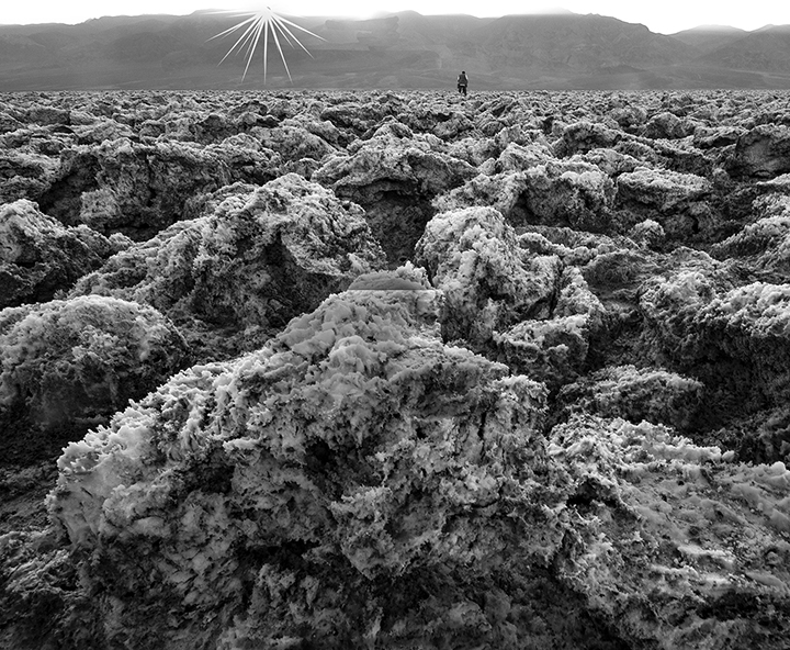
Comment |
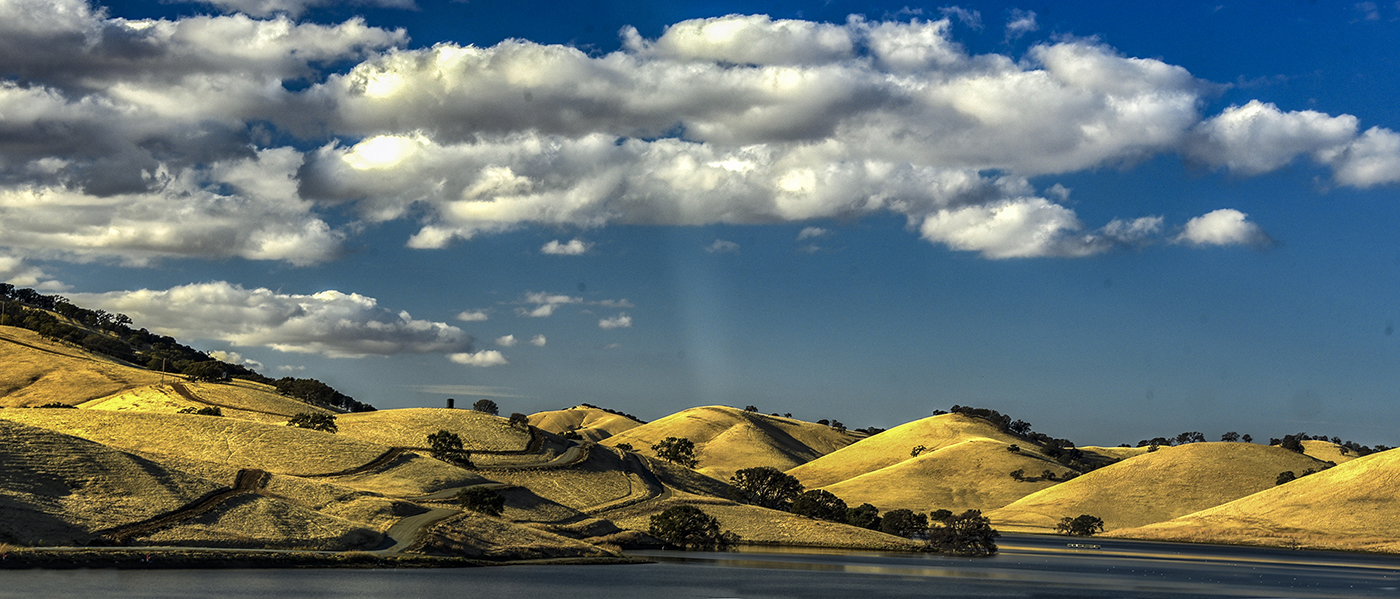
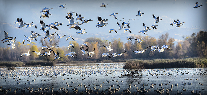
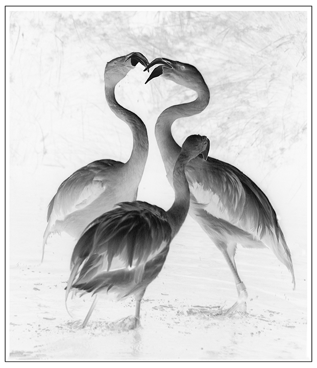
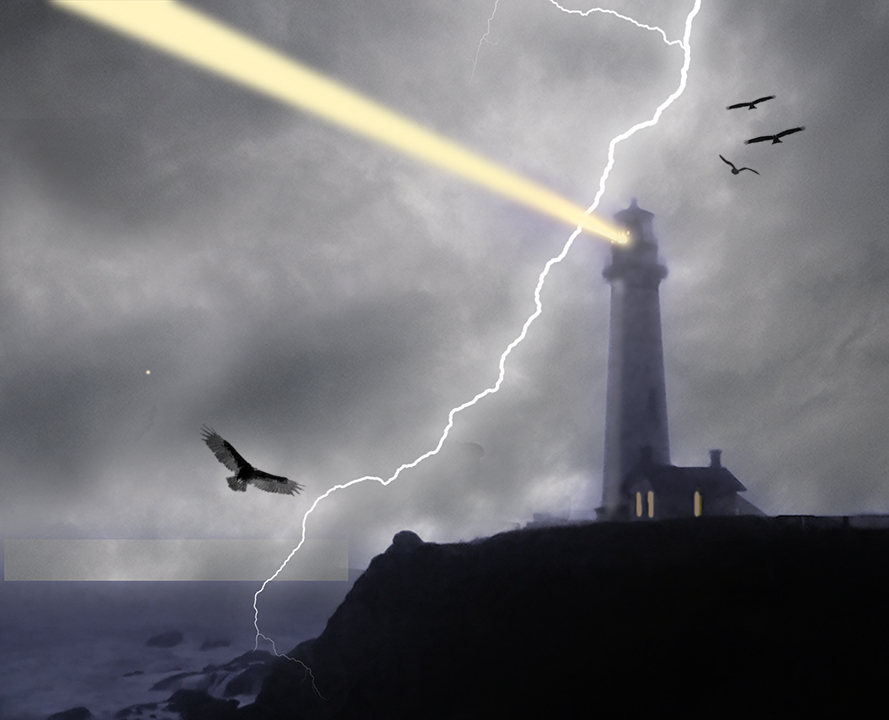
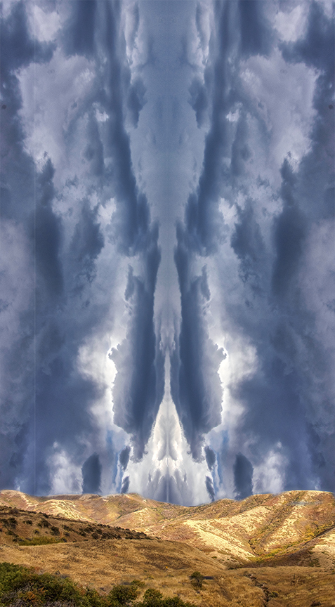
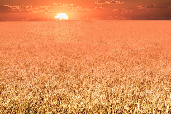
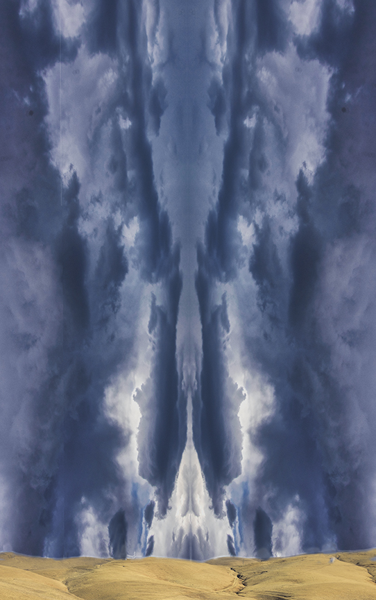
I love your clouds and the interesting blue ray shooting off from the sun. The clouds are quite interesting You tried to dull the sun somewhat and that helps. The bright reflection of it in the water certainly draws the eye into the image. You already have given the clouds top priority, letting them fill more than half the frame. Maybe even cropping a little more of the water reflection might make it even stronger. Centering the sun doesn't bother me because it has a feeling of symmetry that is enhanced by placing the sun in the middle of the frame. |
Mar 12th |
| 15 |
Mar 22 |
Comment |
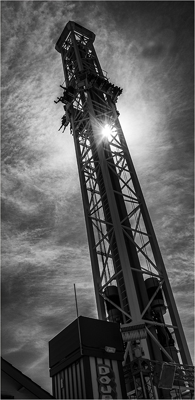
I see a strong graphic design, made by the architect, of course. I love night photos of lighted buildings. This has a nice horizontal repetition, which is intriguing. . I particularly like the blue lines which repeat and work so well with the yellow lighting. Kristi's idea of isolating the street lamp is a good one, I think. It gives a strong center of interest that might be missing from your original. Nice lighting on the building. I used to just let the camera find the right lighting for my night shots and it usually worked pretty well. That's called lazy photographer's option. |
Mar 12th |
| 15 |
Mar 22 |
Reply |
Kristi,
That's so nice. I did have an error when I put in the sharper trend I forgot to check the ground around the tree and that needed some clone work, as well. |
Mar 12th |
7 comments - 1 reply for Group 15
|
| 21 |
Mar 22 |
Reply |
This is the question of how to define Creative, I assume. And what is more eligible for a dd group called creative. we could certainly have a looser definition for what goes here than what goes in SA or our local N4C competitions labeled Creative. If you want, I will try to pot it to our forum. |
Mar 25th |
| 21 |
Mar 22 |
Comment |
Mike,
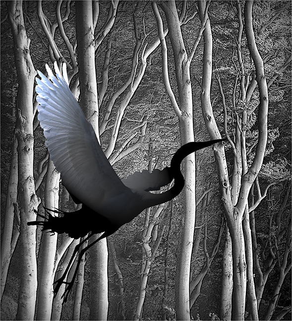
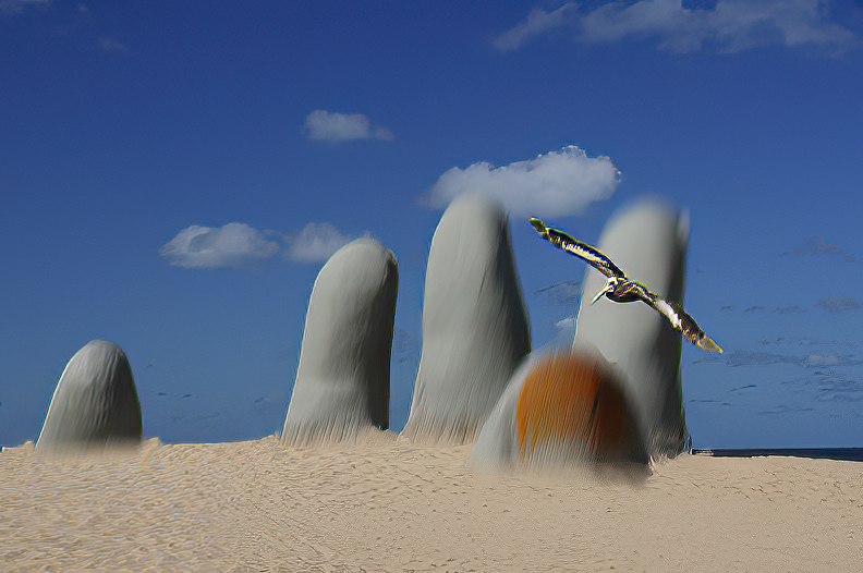
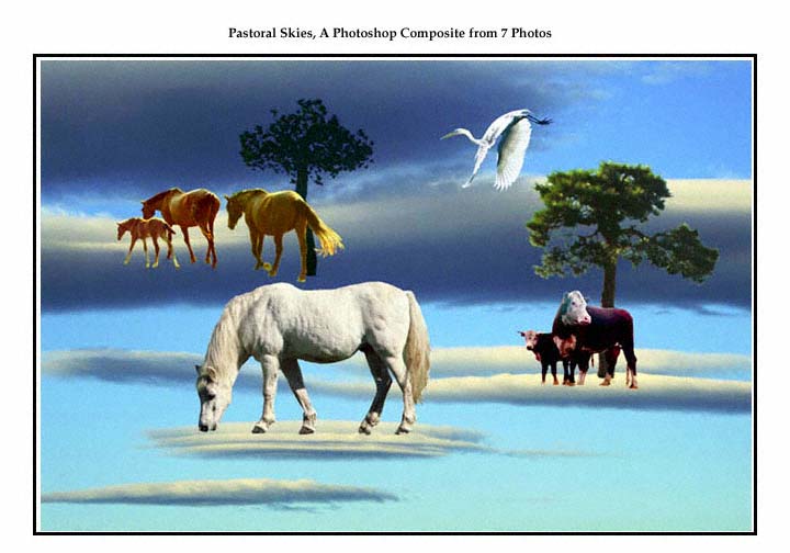
First of all welcome to the group. I can't remember whether you joined us last time or not, sorry about that. Your composite is very simple, yet enhances the image significantly. You have put the clouds and bird into the photo extremely well. they look like they were always there. This images is an example of a photo that is altered but the new image does not look like altered reality. It has simply made the original a lot ore interesting. I like how you brought in the golden light on the sand castle and did such a great job compositing the clouds and bird.
I wrote thiss before I read the other comments, which I think is fitting. I stilll like the color of the golden light but I must admit that the monochrome image suggested by Brian is better still. The biggest r problem with the image is that, although you used creative techniques, it would not hold up in camera club creative because it is too realiastic. In our Concil we have changed the definition of Creative to include composites that look realistic, but they must also have a creative concept, which I Donn't see here. for instance, someone I know put together a photo of a beautiful banana. In the mirror reflection you saw an old, rotten one and he titled the photo "The Banana of Dorian Gray." the parts of the image were realistic, but the concept was creative.
I think your image would do very well in pictorial. it's really lovely. |
Mar 24th |
| 21 |
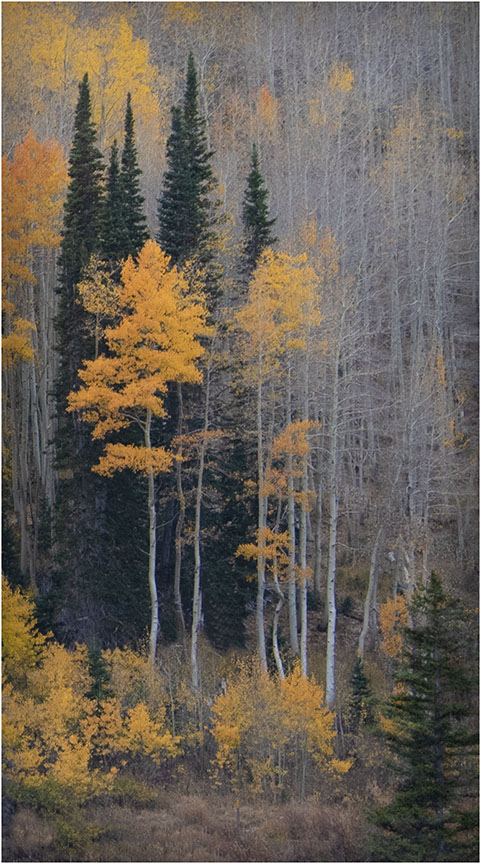
Mar 22 |
Comment |
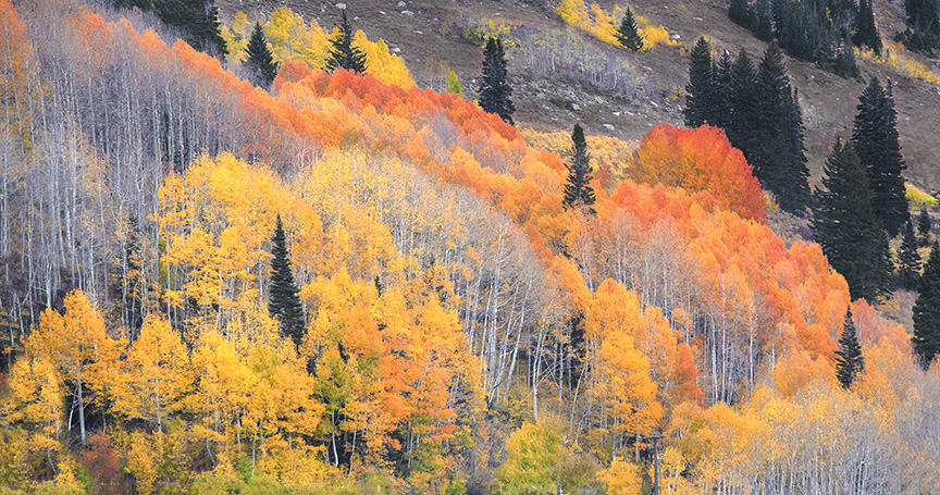
Hazel,
I really like this image because of many reasons - the colors which speak of fall, the way you make it not sharp so we enjoy a feeling autumn and the smalll lines that you can find if you look closely, which gives me the feeling of a reflection. Brian, I prefer the original composition to the flipped one, but we all have our preferences. The image gives me the feeling of trees in autumn that have been reflected in the water which is making the image hazy. Very nice work, Hazel.
|
Mar 24th |
| 21 |
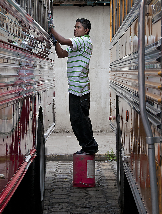
Mar 22 |
Comment |
Steve,
I'm glad you were able to get such a good conversion from the original images to one we can appreciate. That is, see. It is a bit busy. Maybe you could have darkened the arch to about where it was in the original, while keeping the other aspects as light as you final achievement. Here's a though of mine. Make the bus the center of interest by darkening the people and cars down below somewhat not as dark as your original, of course. With a darker arch and a darker foreground, the bus would take center stage perhaps.
I did't want to crop the bottom but the screen photo had crap in it that I wasn't sure how to get rid of.
|
Mar 24th |
 |
| 21 |
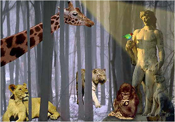
Mar 22 |
Comment |
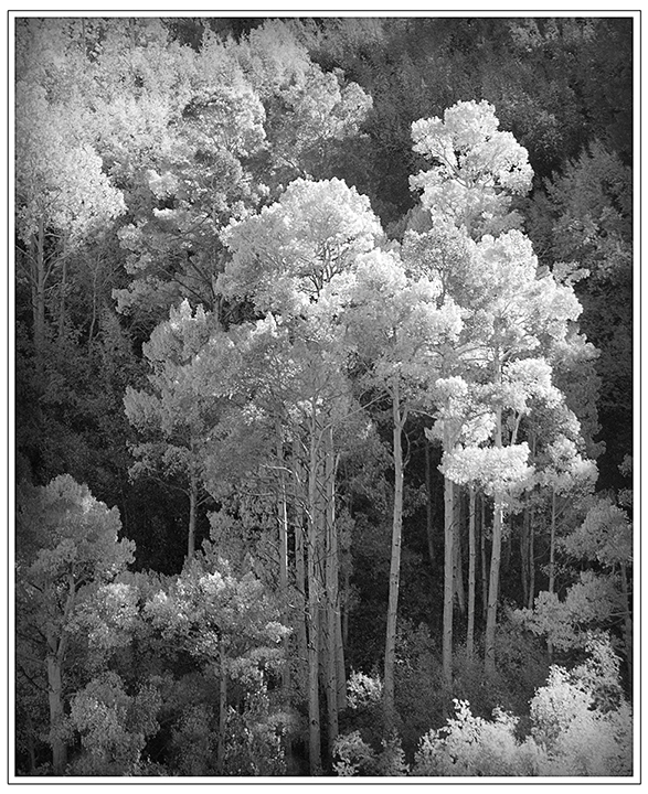
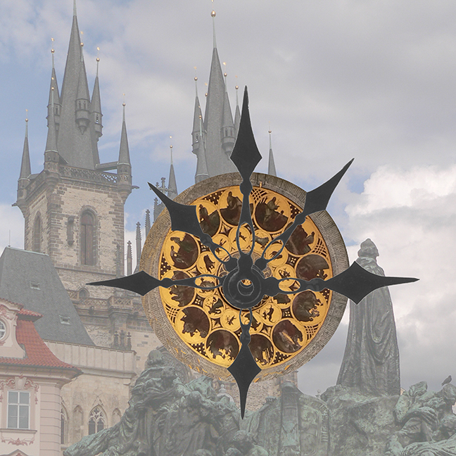
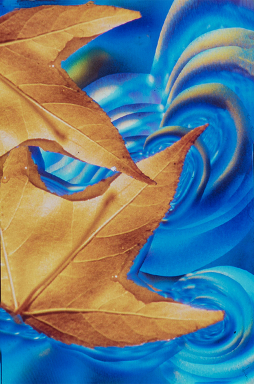
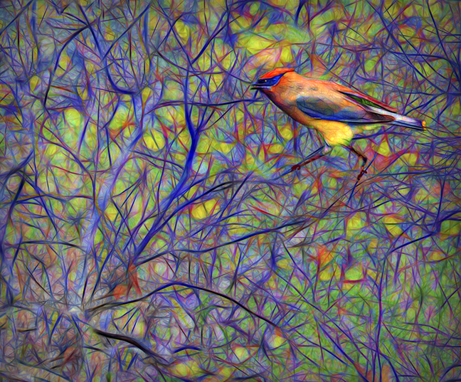
Skip, I am not very informed about how infra-red photography can change images. I would love to see the original in a regular photo mode to see what you have achieved with all of your work. The gold with the blue is very appealing and must have changed the original dramatically. It kind of looks like King Midas came by. Very nicely done The dark red leaves make a good contrast from the gold and blue and set it off so well. The way the brush is broken up around the statue is quite fascinating, forming an intriguing mosaic. Looks like you went to a lot of work
BYW, a hearty welcome to the group. We are happy to have you, especially if you come bearing gold.
|
Mar 24th |
| 21 |
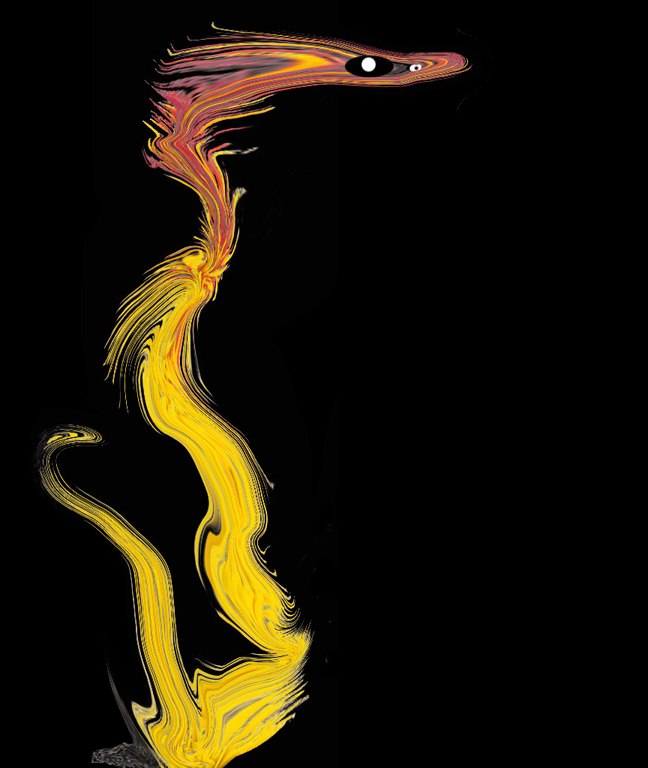
Mar 22 |
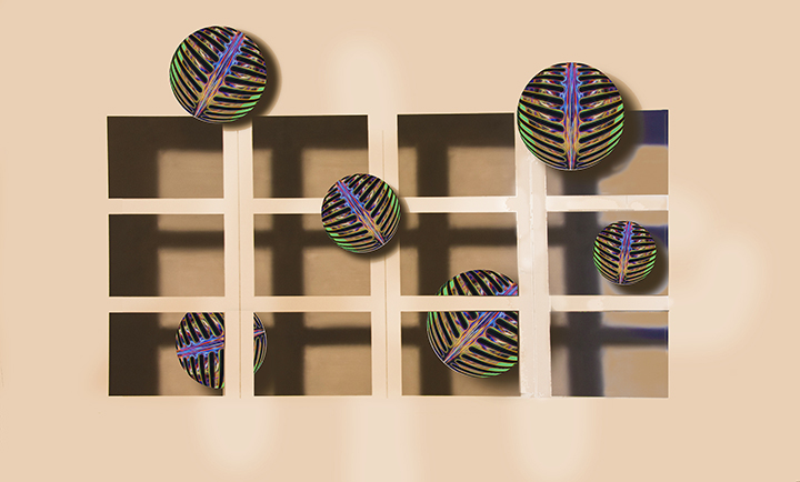
Comment |
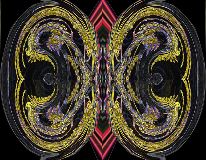
Brian, turthfully I see no relationship between the copper-colored circle and what you have created. I admire your taking this to the ultimate extreme in both minimalism and taking your clue from the copper circle. You will have to be a little more informative as to how this final is related to the original. I do see some of the colors in the lines that you have created. I assume you are a music afficianado, giving us the treble clef. If you can elucidate further, I would appreciate it. |
Mar 24th |
| 21 |
Mar 22 |
Reply |
Brian,
Many thanks for that nice comment. I was hoping to find a way to create a colored brush, but have since discovered that that is not possible. Apparently, the brushes you make are all in black and white. I am still thinking about how to do it in a work around using Actions. The reaps I am thinking of this was to perhaps add another layer of colored brushes of either flowers or leaves to this image. I'm still thinking fo how to do it. I'lll let you know if I succeed. |
Mar 24th |
5 comments - 2 replies for Group 21
|
12 comments - 3 replies Total
|