|
| Group |
Round |
C/R |
Comment |
Date |
Image |
| 15 |
Jun 21 |
Comment |
Kristi,.
I don't know what happened to my comment, which was very long. I told about the Orton effect, which is what.I think you were doing. One exposure is sharp and the other diffuse either done in the camera (in which case the exposure would be automatically corrected), or done in photoshop. You can take any photo you already have, but some work out better than others. Change the background layer to Layer 0, copy it so you have two layers of the same image. Go back to the original and chang the exposure to +1 at least. Go to the copy and blur it using Gaussian blur. The amount of blur can be changed by practice to what you prefer. Also increase the exposure by about +1. Not set the blend mode to Multiply and you will have your interesting Orton effect. |
Jun 28th |
| 15 |
Jun 21 |
Comment |
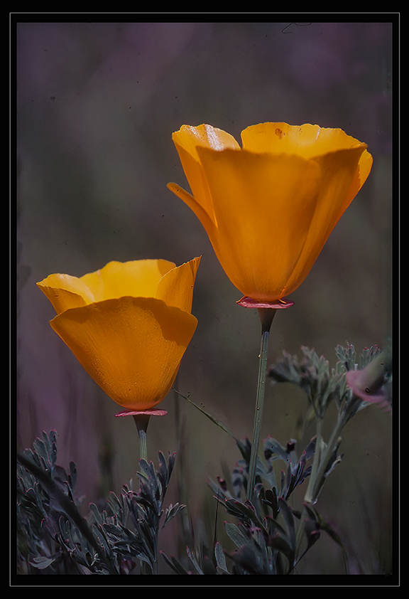
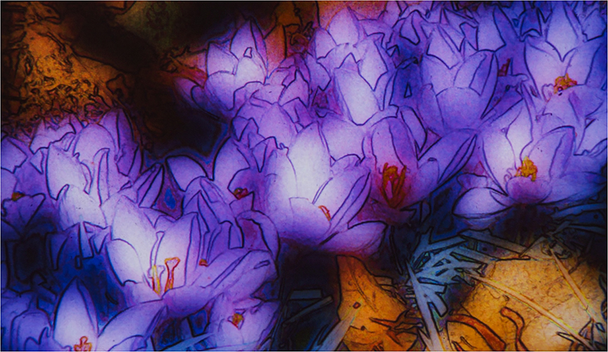
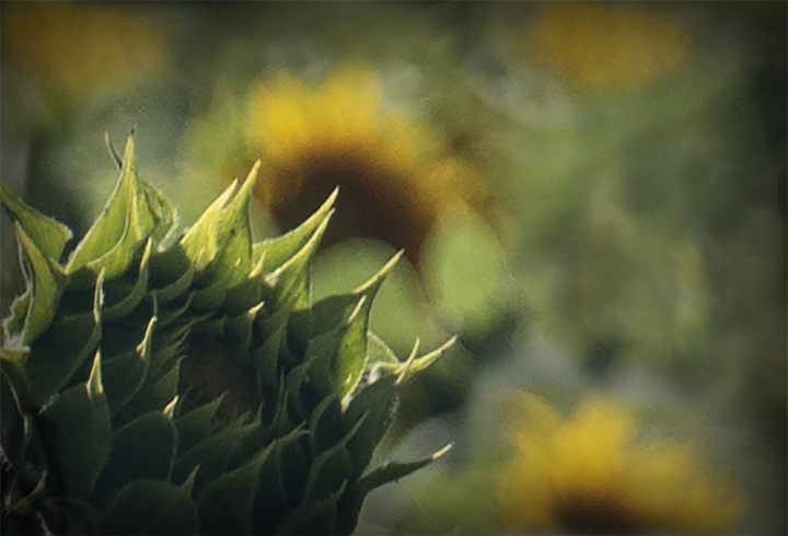
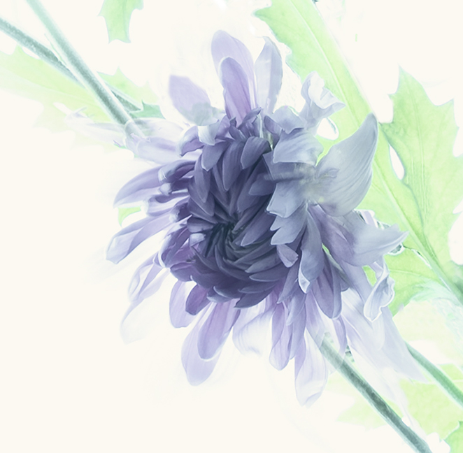
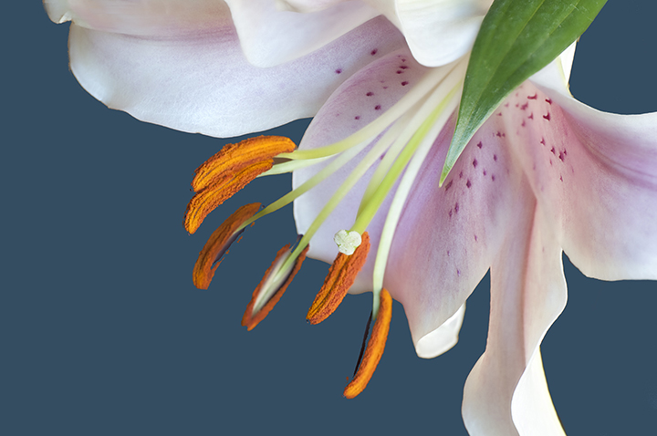
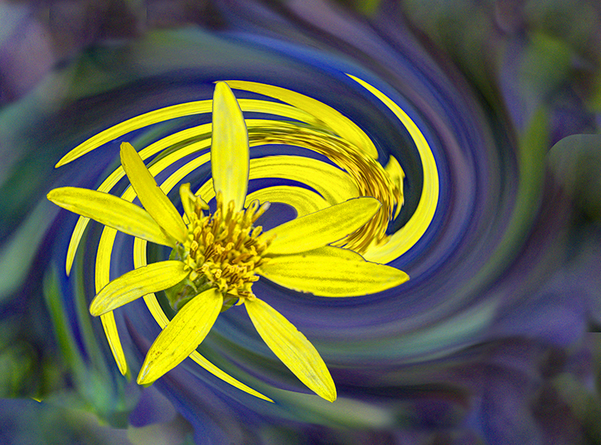
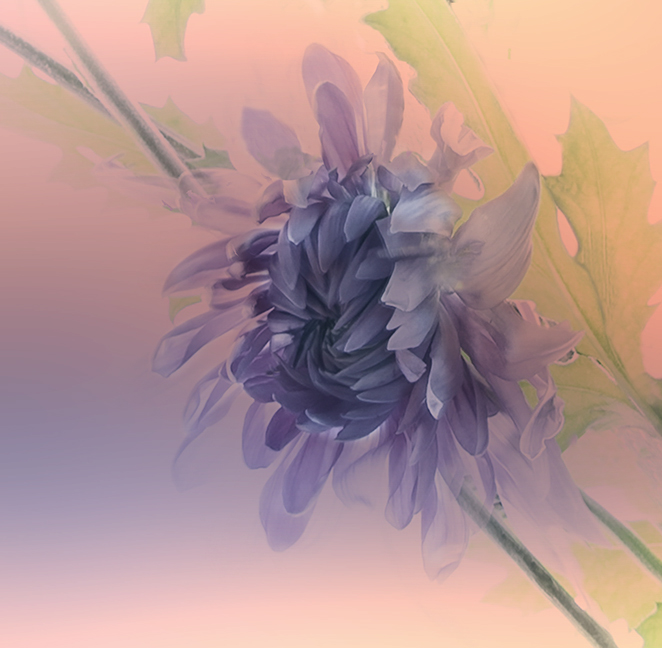
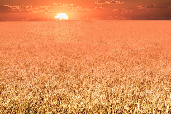
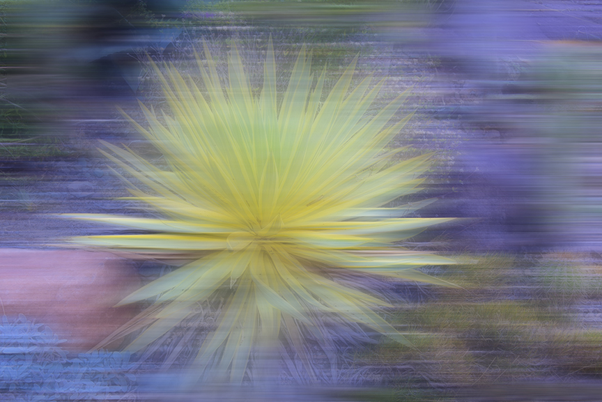
Jeri,
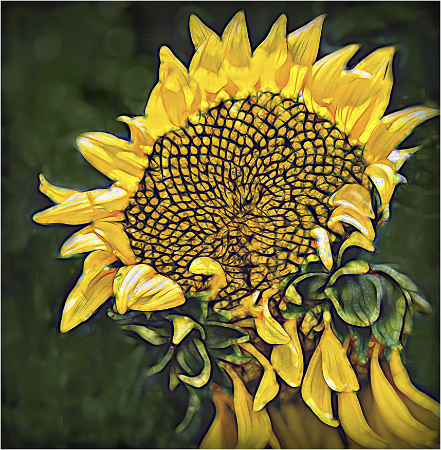
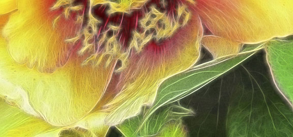
Lovely golden close-up. I agree with Kristi about removing the shadow. I also contemplated whether you should leave the bright petal at the middle left. Not sure about that. You have achieved your title's attribute of gold dust with the lovely pollen covered stamens.
I hope you are enjoying your travels!
|
Jun 24th |
| 15 |
Jun 21 |
Comment |
Rick,
I will ask you to please comment on the other members' images.
Thanks,
Joan |
Jun 24th |
| 15 |
Jun 21 |
Comment |
Rick,
I will ask you to please comment on the other members' images.
Thanks,
Joan |
Jun 24th |
| 15 |
Jun 21 |
Comment |
Rick,
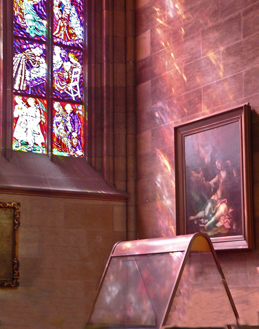
the colors and lines are fantastic! It's prettier than 99% of the churches I have seen, and I've seen a lot. I love the way the colored lines on the right and left seem to flow through all of the color spectrum. You've loft just enough space around the window itself. The black is just the right size. I don't see anything to change here, It is really lovely. |
Jun 24th |
| 15 |
Jun 21 |
Comment |
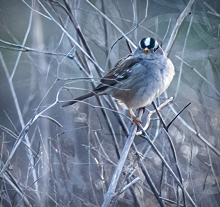
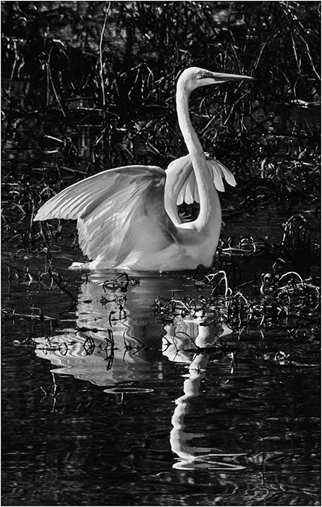
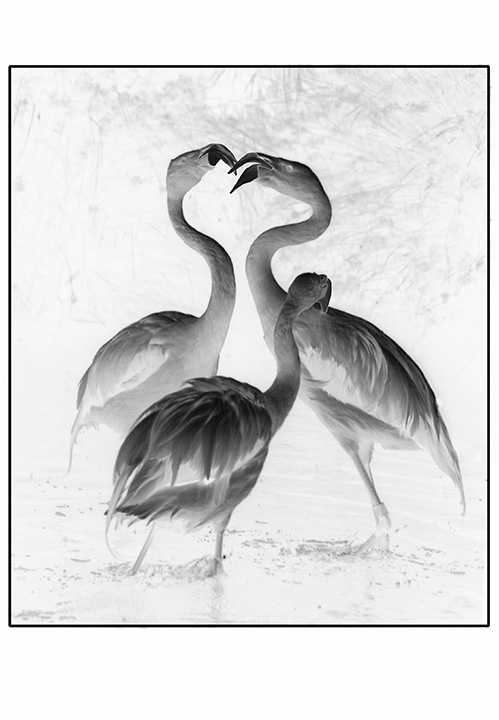
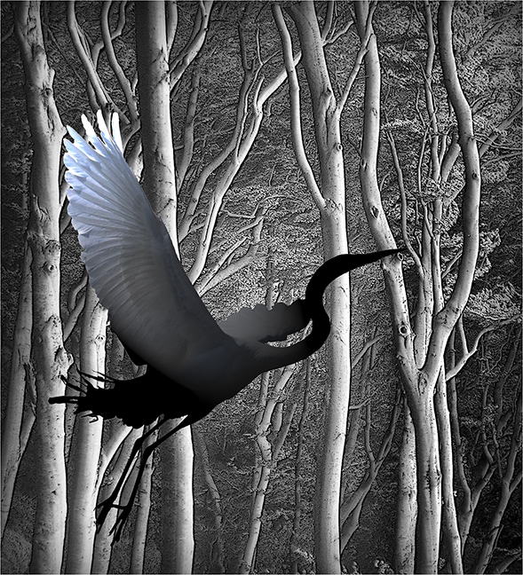
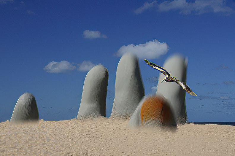
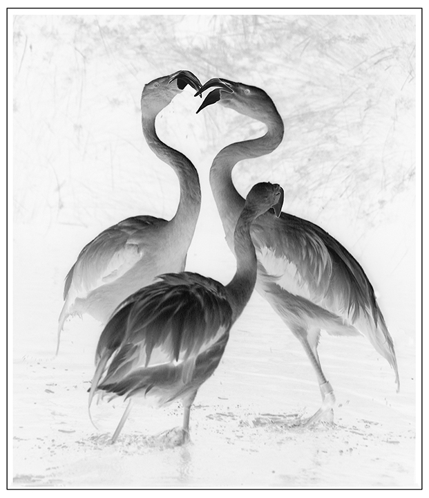
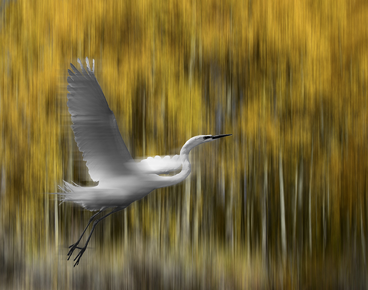
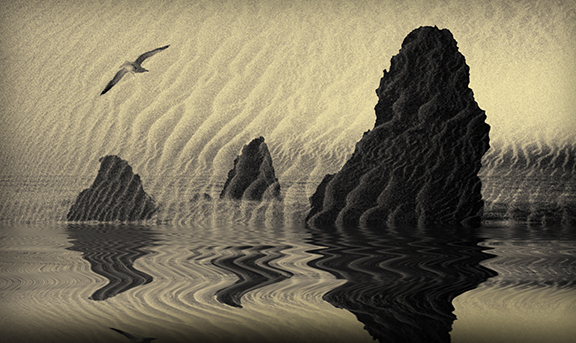
Perfect shot of a great blue flying, fits the frame perfectly. The bird and the water have almost the same colors, which gives him an inkling of camouflage. You have made an impressive capture. Good work! |
Jun 23rd |
| 15 |
Jun 21 |
Comment |
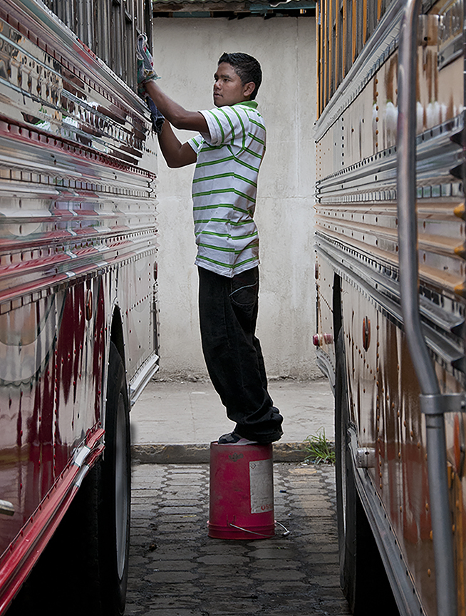
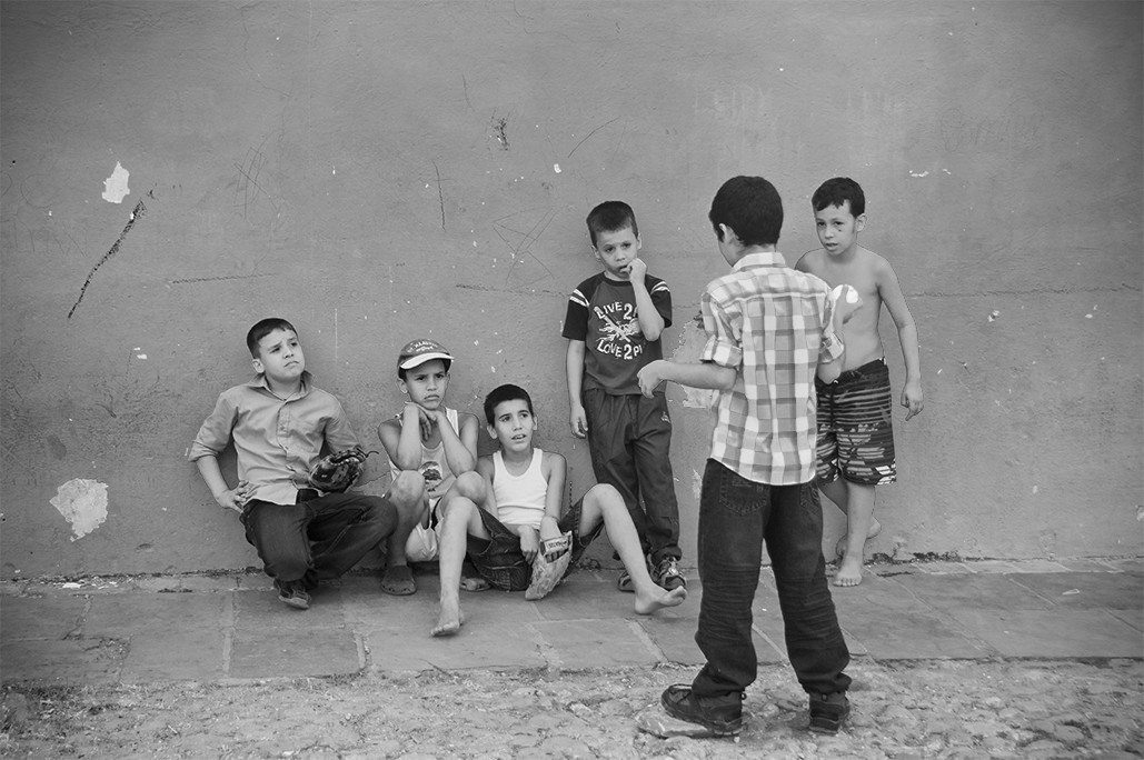
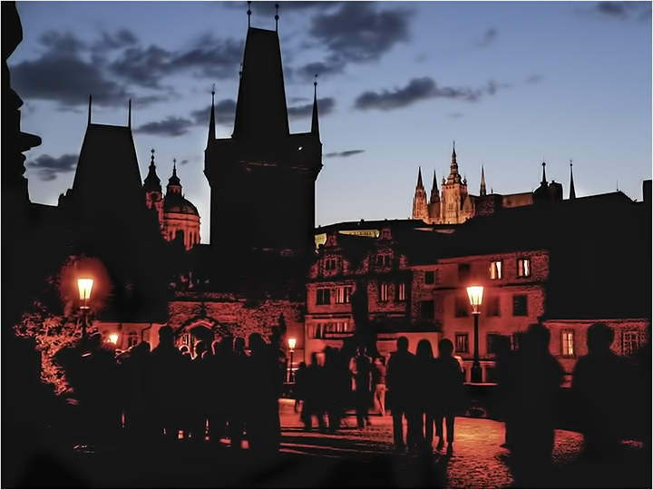
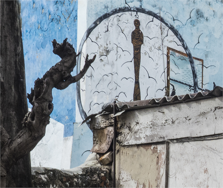
I ove the strenth of this image. The colors of white, brown, tan and black really look good together, giving the overall image a sense of a modern painting. I agree that removing the street light and its shadow would clarify the man image a bit. The man, who looks like someone is contacting him (the photographer?) gives a bit of mystery to the whole concept. A very nice street photograph. Looking at it more closely, you could crop out the street light altogether and remove the residual shadow of it with the clone tool. Maybe give it a try. |
Jun 23rd |
| 15 |
Jun 21 |
Comment |
Here is one attempt to lighten the foreground. What do you think? |
Jun 23rd |
 |
| 15 |
Jun 21 |
Comment |
Bruce,
Are those flowers in the foreground with the grass? Myeyes are not very good, but they almost look like blue blossoms. Even if not, I agree that the foreground is a bit too dark and could use some judicious cropping. If those are flowers, I would have tried to lighten the foreground considerably. I do like the softness of the grass blown in the wind, does make you want to walk in it in your bare feet. Again, I do think that the foreground could be lightened, maybe using a layer using Levels and painting in the areas you want lightened. You wold need to lighten the whole image using levels, then using a soft, large brush with a black mask on the levels layer, paint in using white and whatever opacity you think would be good, so you can really see that beautiful grass.
|
Jun 23rd |
| 15 |
Jun 21 |
Reply |
Kristi,
I think you are right. Thanks,
Joan |
Jun 13th |
9 comments - 1 reply for Group 15
|
| 21 |
Jun 21 |
Comment |
Janice,
Getting in late here, I see. Brian had a lot of fun.
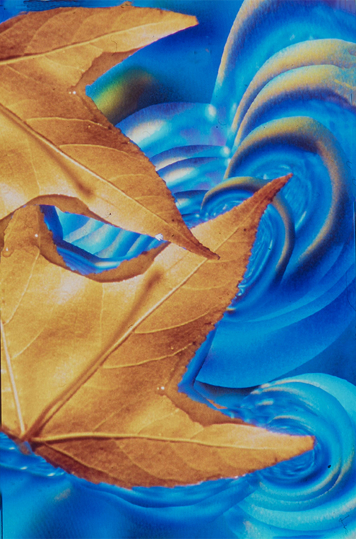
I am going to say that I like the rectangular version and also the original way you have it oriented. I think the colors are much stronger in your first image, which appeals to me. To me, the most important aspect of this image is the curve of the leaf. Anything behind that does not make me more impressed. In other words, I like the way the leaf fills the frame in your original creative image the best.
The yellow color on the edge of the leaf really helps with this. |
Jun 14th |
| 21 |
Jun 21 |
Comment |
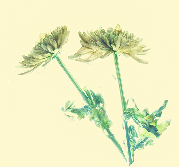
Hazel,
Your use of colors and textures works so well. Goes to show that often the wilted, older image can be wonderful. Were you using the texture technique taught by Marie Altenburg of PSA? She will be giving us the talk in August.
I'm not sure if making a replica of the tulip and producing it as a reflection, sort of, works for me. I think the tulip just on its own would be enough. Lovely idea.
This is how Marie makes an interesting border that approaches what you were doing:
Open image. Make a rectangular marquee around the area that you want for the border. Copy it onto another layer. Go to the bottom layer and use the Curves tool in Photoshop. You will then see a really pretty border appear. |
Jun 14th |
| 21 |
Jun 21 |
Comment |
Your more colorful and glowy version really catches one's eye. It is good that you were able to change the clothing and outlines of the walking people into a neutral gray, thus letting the colors you introduced really work their magic. I have to admit to looking at the kids in the background; perhaps you might have considered removing them for their distractions. |
Jun 14th |
| 21 |
Jun 21 |
Comment |
Peter, I love the multiple exposure of the flags and the interesting ripples you achieved. I have to admit I have no idea if the planes are in the final image, as I can't find them at all. The textured background you have achieved works remarkably well.
The space you have creative over the flags give them room to wave wildly . It's a really beautiful image. Thank you. |
Jun 14th |
| 21 |
Jun 21 |
Comment |
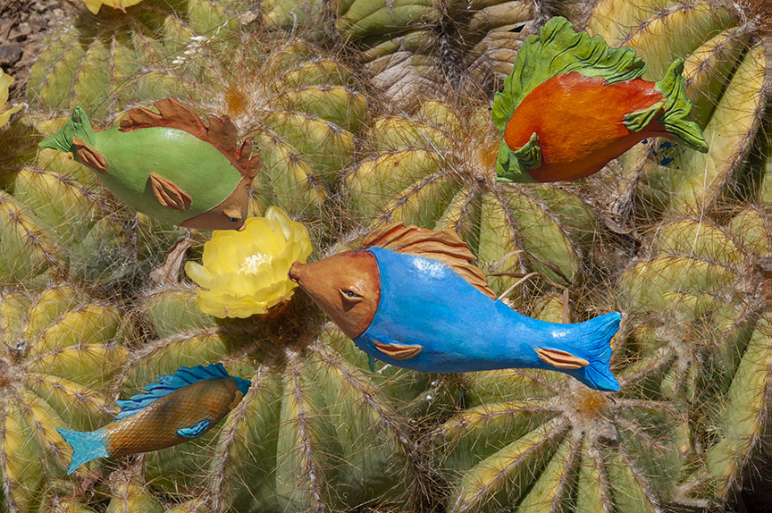
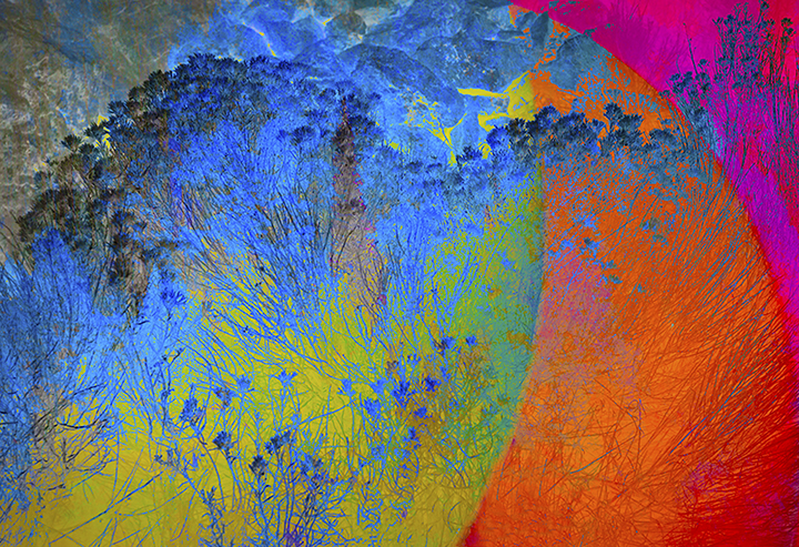
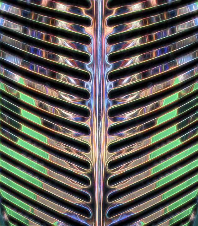
First of all, glad you're participating again, Charles.
I like what you've done with the colors here. It's kind of like molten gold, flowing over and around the rocks. Your composition is excellent, in my opinion. The puple cast in the sky goes so well with the gold colors, complementery. The reduction in the number of colors helps, as well. Simplifies the sky. I have no idea how you worked in the textures and colors of the leaves, but you certainly succeeded. I love the leaf photo, by the way.
Keep on sending in your photos. We await them expectantly. |
Jun 14th |
| 21 |
Jun 21 |
Comment |
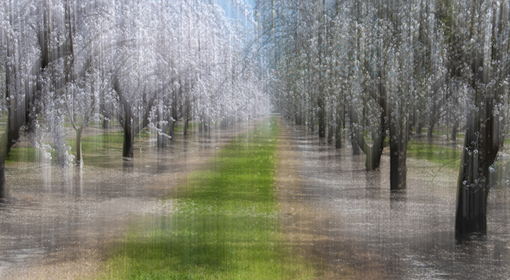
Brian,
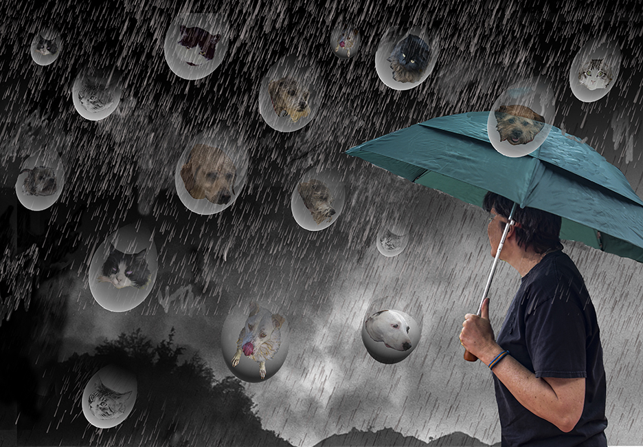
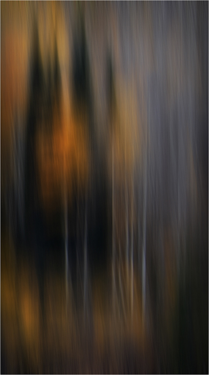
This is certainly mysterious. I assume you partially moved the camera on the garden part; this is truly an abstract. I like the use of the raindrops coming down the wall as a means of making the final image less bright.e. I'm not sure if doing that helped the image. I kind of like the original which was brighter. That is, the combination is fine, but maybe leave a little more color in the overall image. Flood is a wonderful filter, and works particularly well here because there is the impression of a rain storm. The whole composition reminds me of umbrellas in the upper half, or maybe the Sydney opera house. |
Jun 14th |
| 21 |
Jun 21 |
Comment |
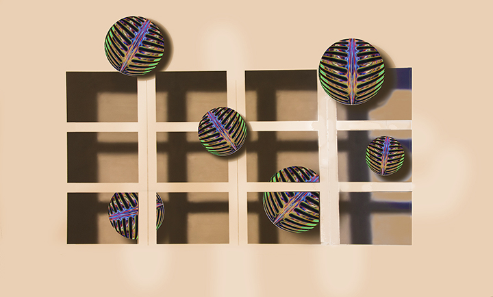
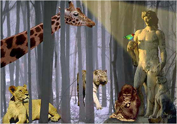
A general comment about images added by members other than the maker: I talked to Tom Pickering, who is our webmaster, and he agreed to get rid of the "Remove" below the image, which I kept hitting, thinking it would blow up the image. This is just for our DD group, as apparently there have been images that needed removing in some other groups. We would never do a nasty, naughty image, would we?
To enlarge the photo, just click on it. |
Jun 14th |
| 21 |
Jun 21 |
Reply |
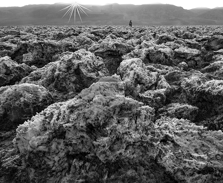
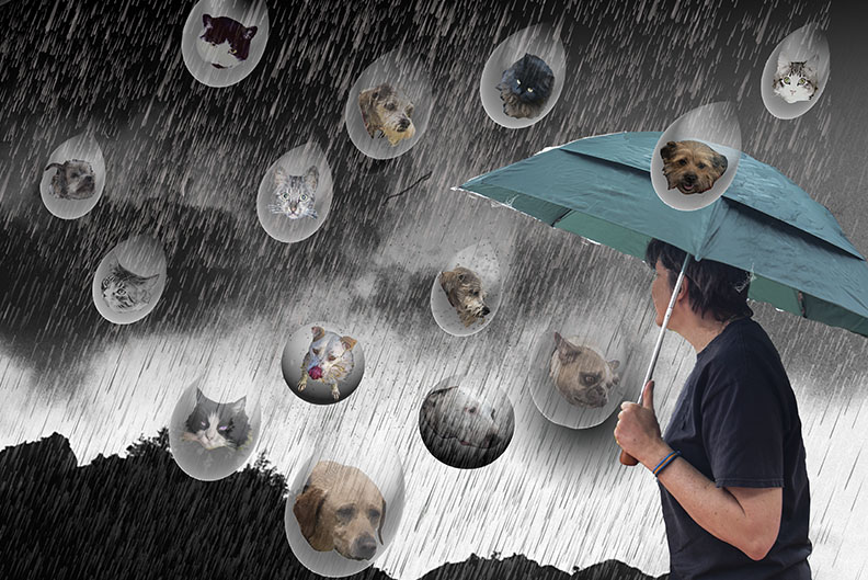
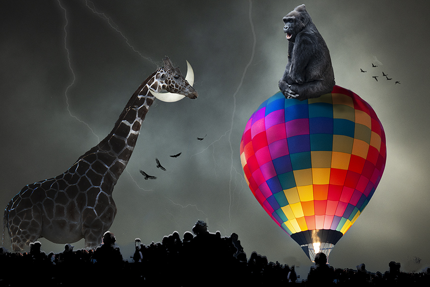
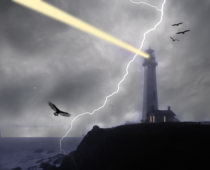
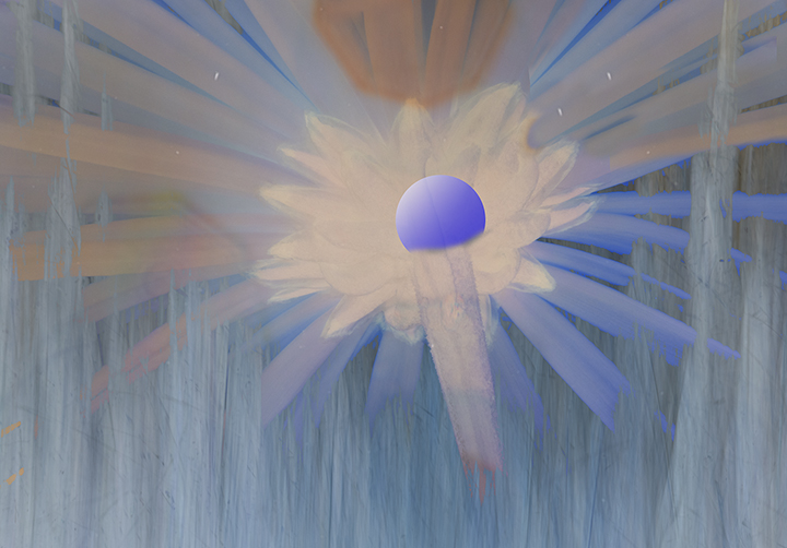
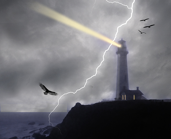
Wow, Brian, You really got me on this one. I have in the meantime figured out how to make the beam fade out. I needed to use a mask, which worked perfectly. I also finally spotted the rectangle that Janice was talking about and tried to fix it. I have no idea what caused it. I am enclosing the updated image.
When Iook at it I do't feel the same way, Brian. The birds follow the diagonal of the lighting flash and except for the lighting and birds, and sky, of course, I added nothing new. I did get rid of the blue, which was too much, I thought. |
Jun 14th |
 |
| 21 |
Jun 21 |
Reply |
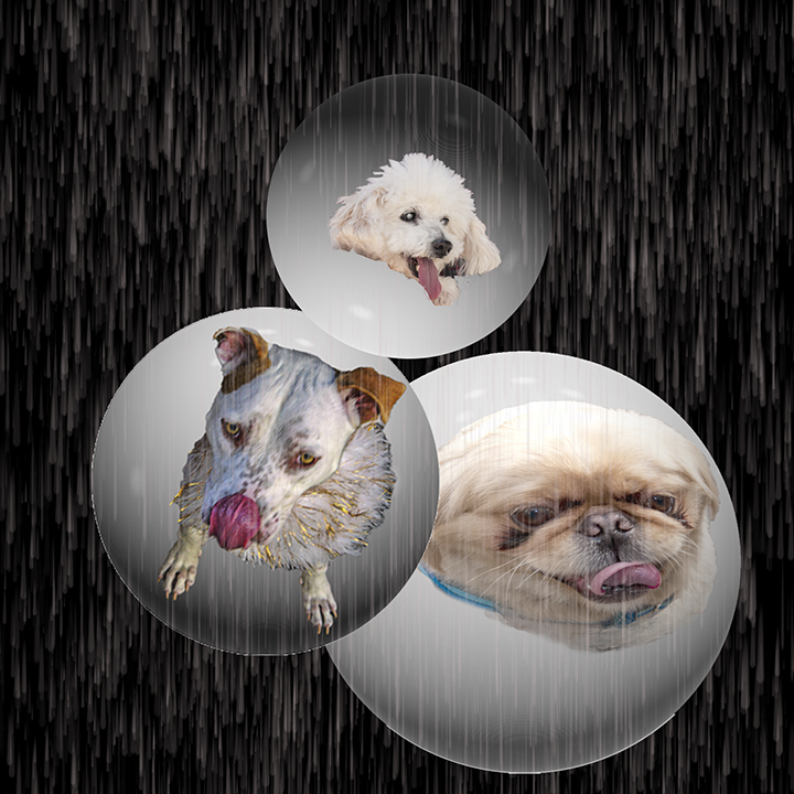
Janice,
Not sure what the rectangular shape in bottom left is. You're not talking about the water/ociean are you? I have macular degeneration and I can't see things like noise very well any more. |
Jun 14th |
7 comments - 2 replies for Group 21
|
16 comments - 3 replies Total
|