|
| Group |
Round |
C/R |
Comment |
Date |
Image |
| 15 |
Nov 20 |
Comment |
Hi, Kristi,
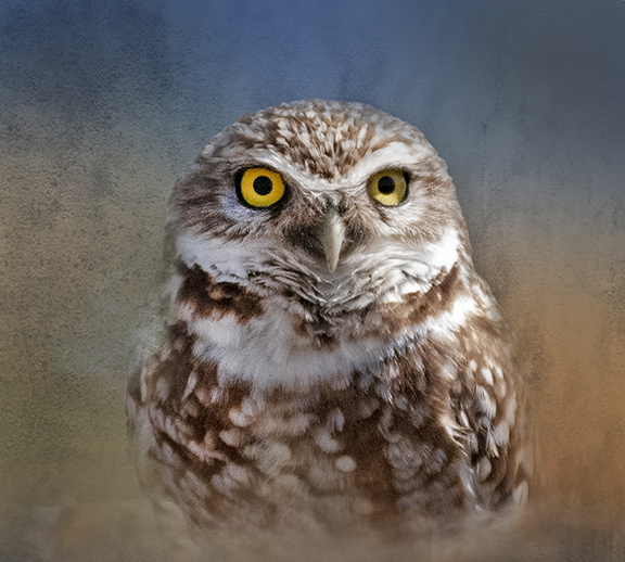
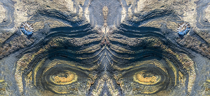
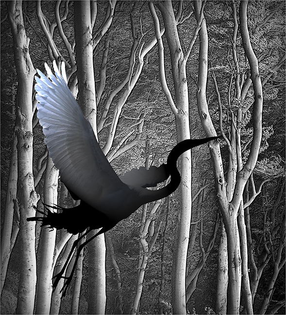
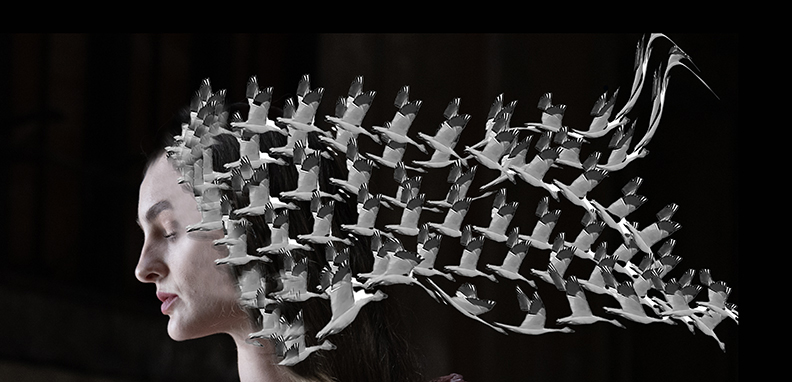
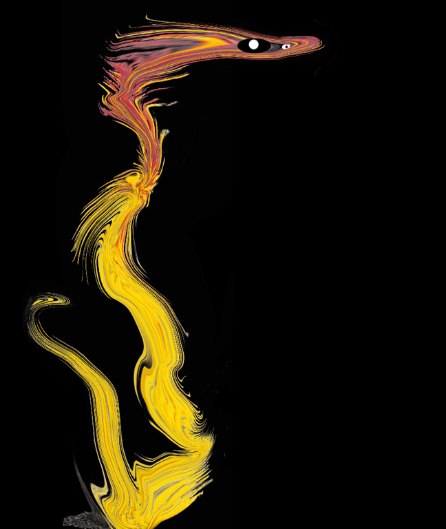
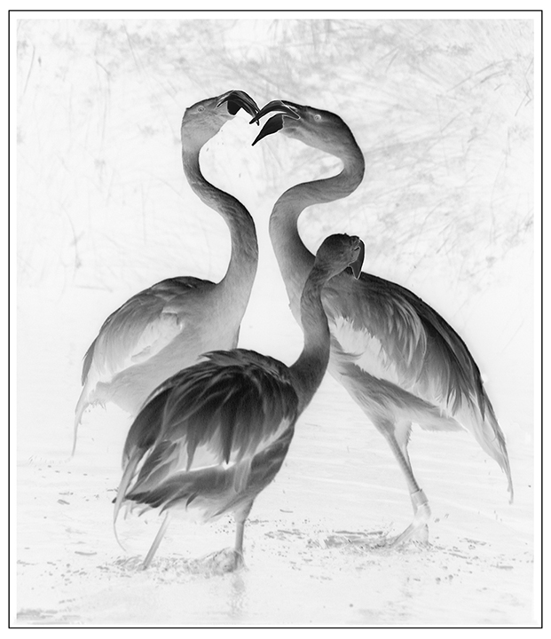
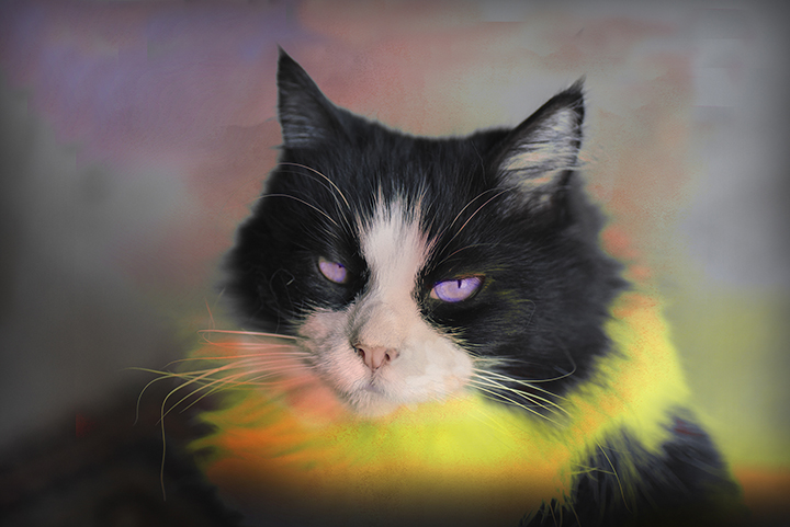
Sorry to be so late with my comments. I agree that the overall originally presented image is too dark. I like the concept of extreme lighting where only part of the image can be seen fading into a black background. The thing that bothers me the most is the eye. I feel that it is too bright and should be darkened somewhat. Otherwise it is a good attempt at extreme lighting on a profile. |
Nov 25th |
| 15 |
Nov 20 |
Comment |
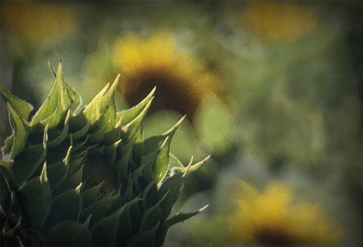
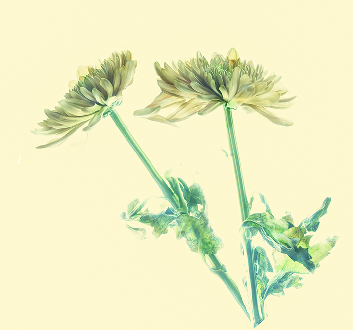
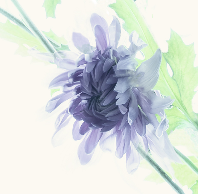
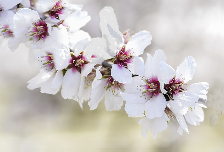
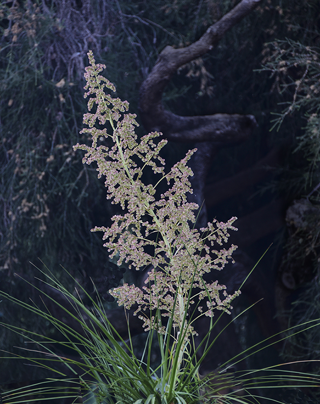
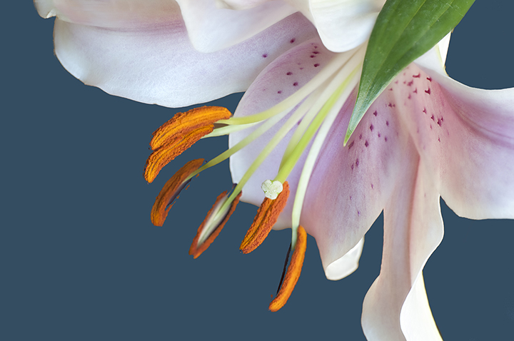
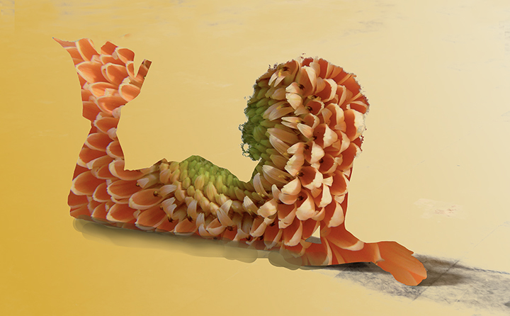
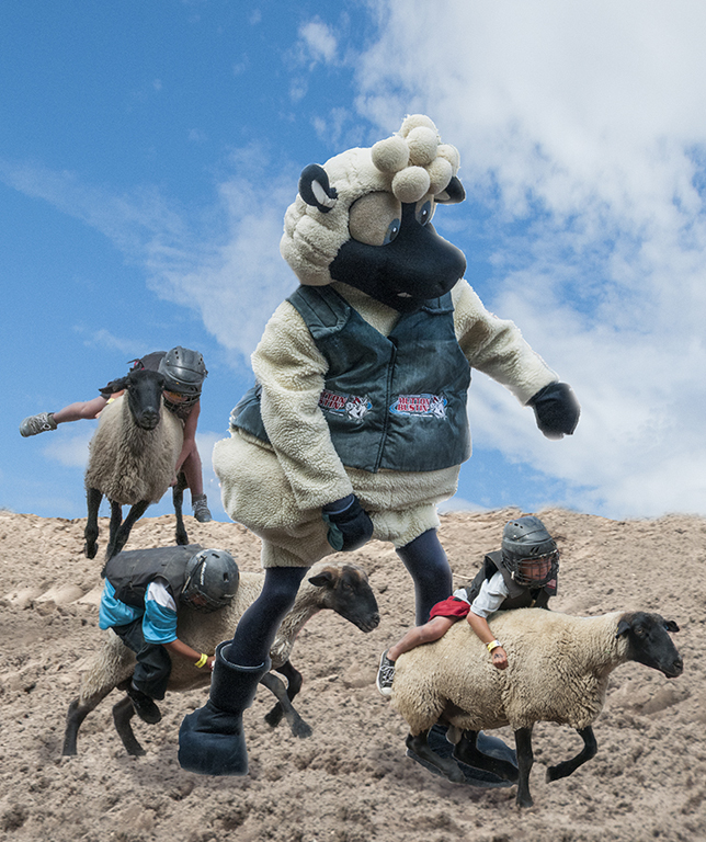
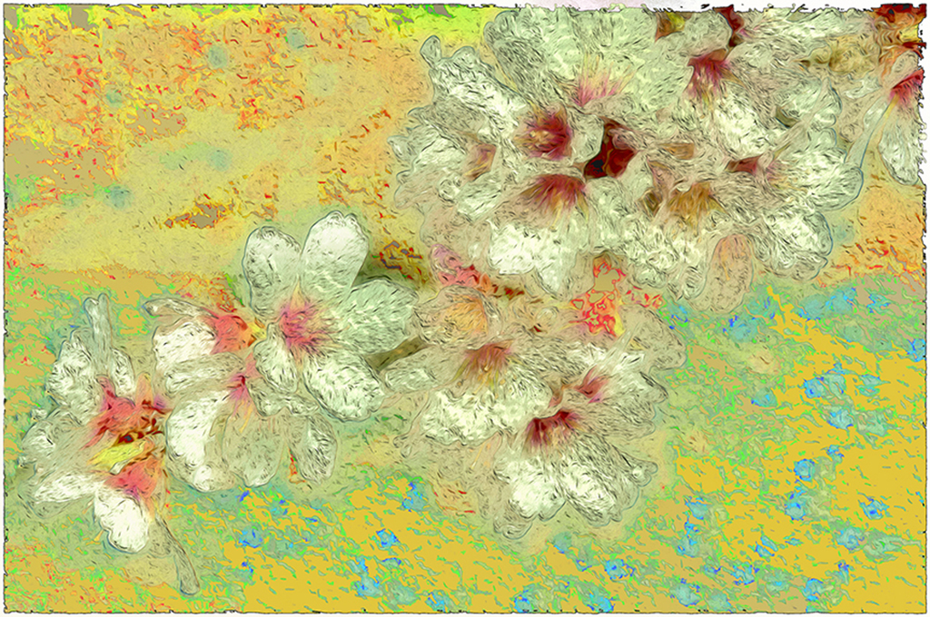
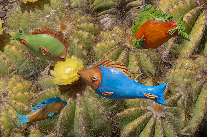
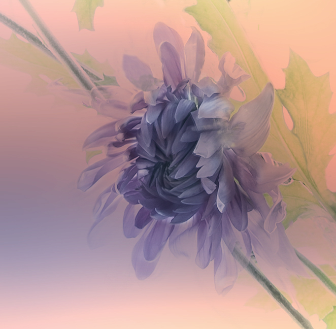
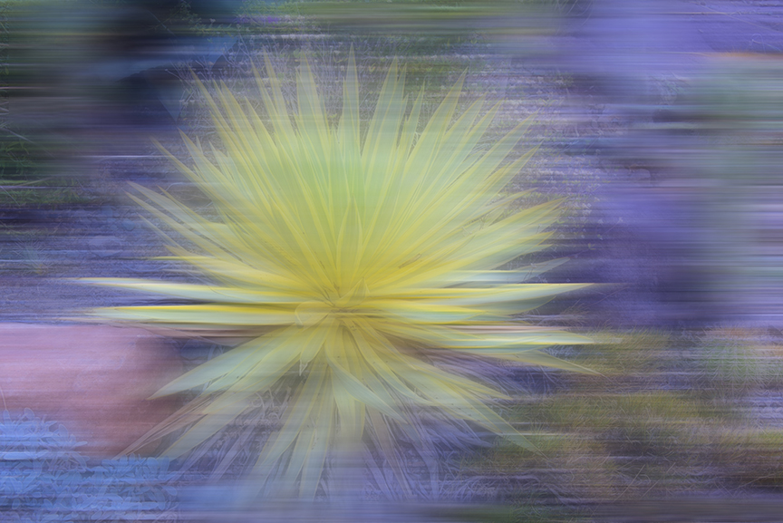
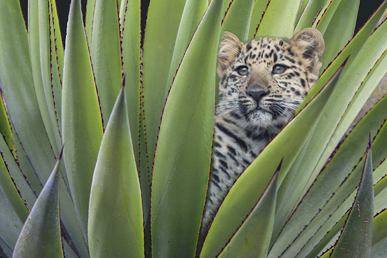
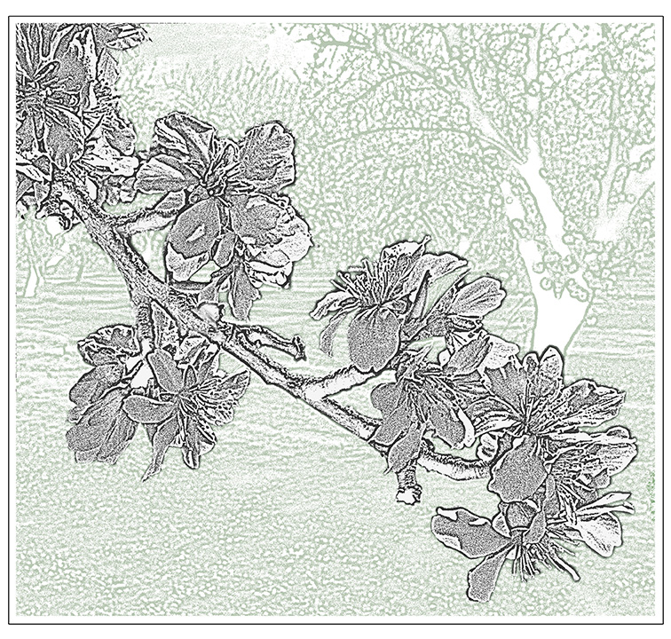
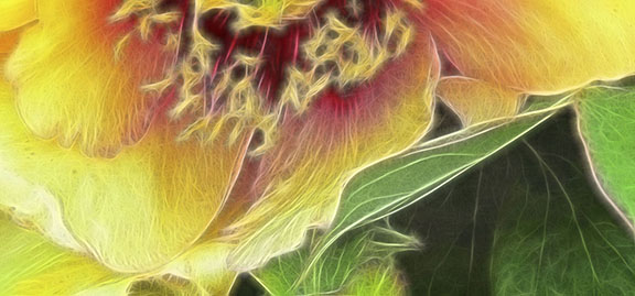
Jeri, I like the star shape that the plant has given you and the soft white pillows of fluff around it. I agree that you should crop in from the top and rid yourself of the extra green in the corners. Also, since you have a choice, the cutoff of the cactus on the left side is a bit distracting since all the other parts are within the frame. Just back off a little. One of my rules for myself is to take a wider angle than what is showing in the original viewfinder and crop the photo later to suite the purpose. But your exposure is right o and the concept works wonderfully. Looking at it again, I think you could crop a little off the bottom, as well to make a cute cuddly picture. |
Nov 25th |
| 15 |
Nov 20 |
Comment |
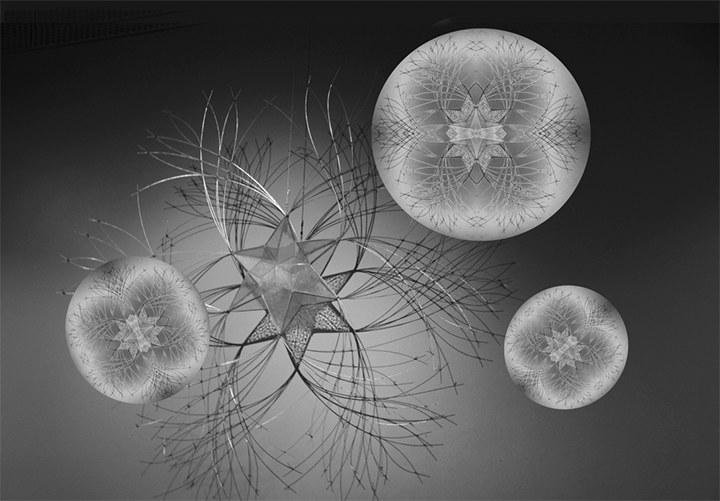
Rick,
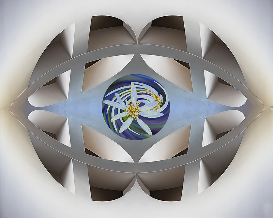
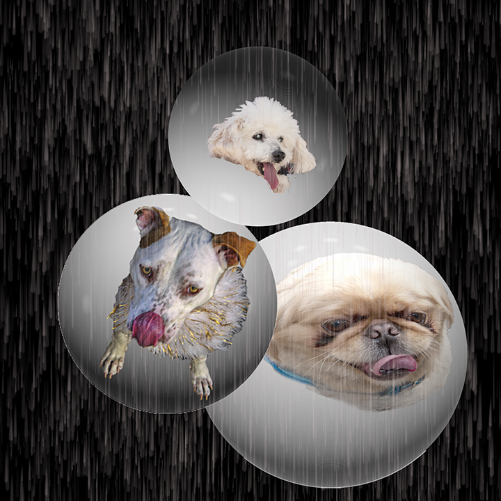
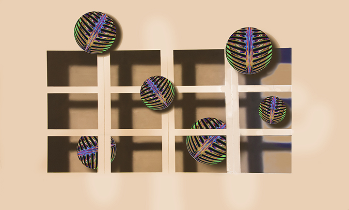
Great composition, and wonderful creative thrust, as usual. I would like tio know more exactly, what you did. I have been trying to make spheres unsuccessfully, ever since one of my old programs went belly up. How do you do that?
Excellent work!
|
Nov 25th |
| 15 |
Nov 20 |
Comment |
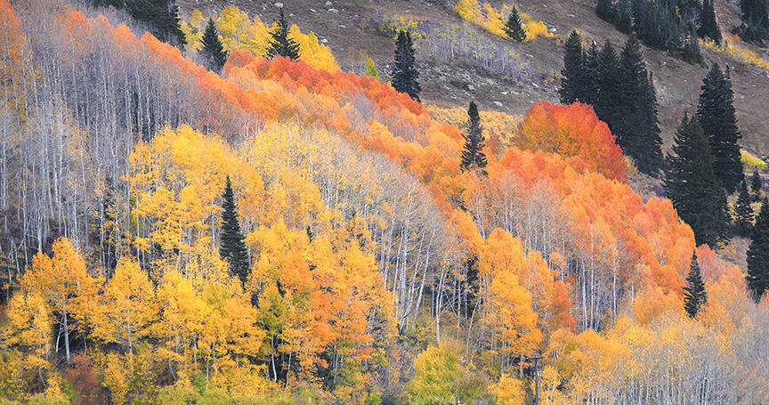
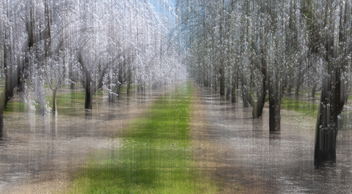
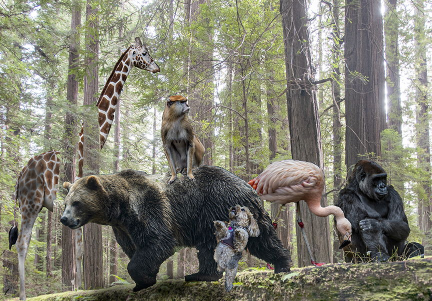
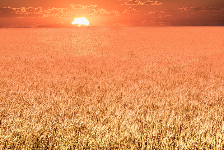
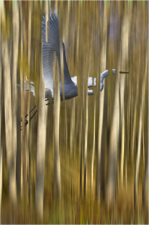
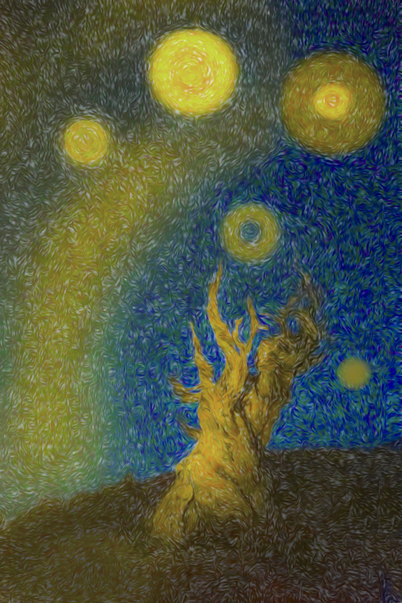
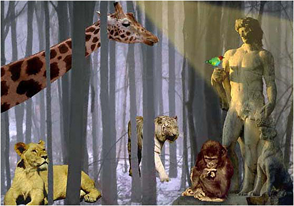
The colors are really beautiful. I love that there is a bright yellow foreground area that matches the light at the top of the trees. When I was in college I lived in a dorm that had ginkgo trees outside. We loved the trees but not the smell. Crushed seed pods were pretty stinky. Your forest is lovely and I wish I had it for an idea I have of putting animals between the trees. The up and down motions has become famous for the Canadian photographers, Freeman Patterson, Richard Martin, Stephen Patterson (no relation to Freeman), and Andre Gallant.
You carried out the upend down motion perfectly.
|
Nov 25th |
| 15 |
Nov 20 |
Comment |
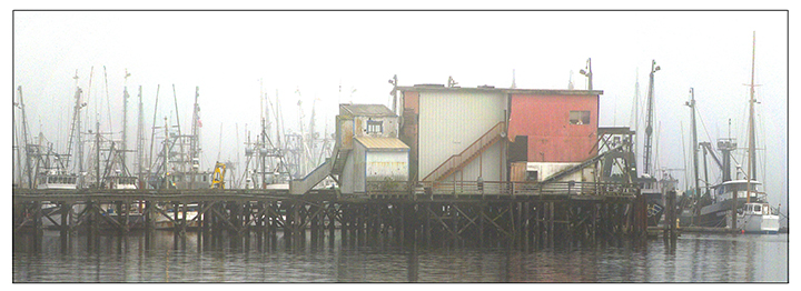
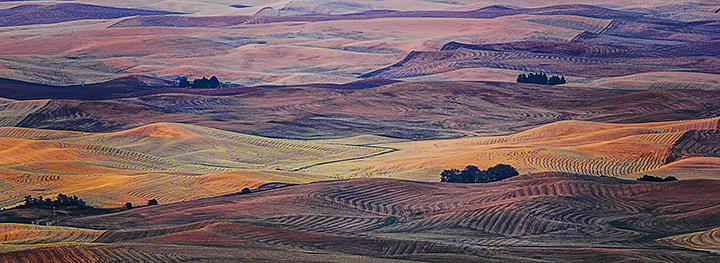
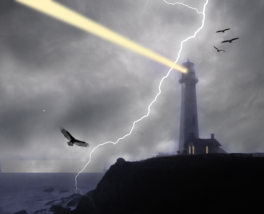
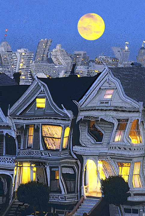
This is a great shot with your enhancements. That you were able to keep the light on the window frame is a wonderful capture. I love the feel of the view through the windows. I do notice that you darkened the sky, maybe using a graduated filter, but that works well. Love the light on the boats, as well. Excellent job. You should do well in your specialize category as well as in pictorial. |
Nov 25th |
| 15 |
Nov 20 |
Reply |
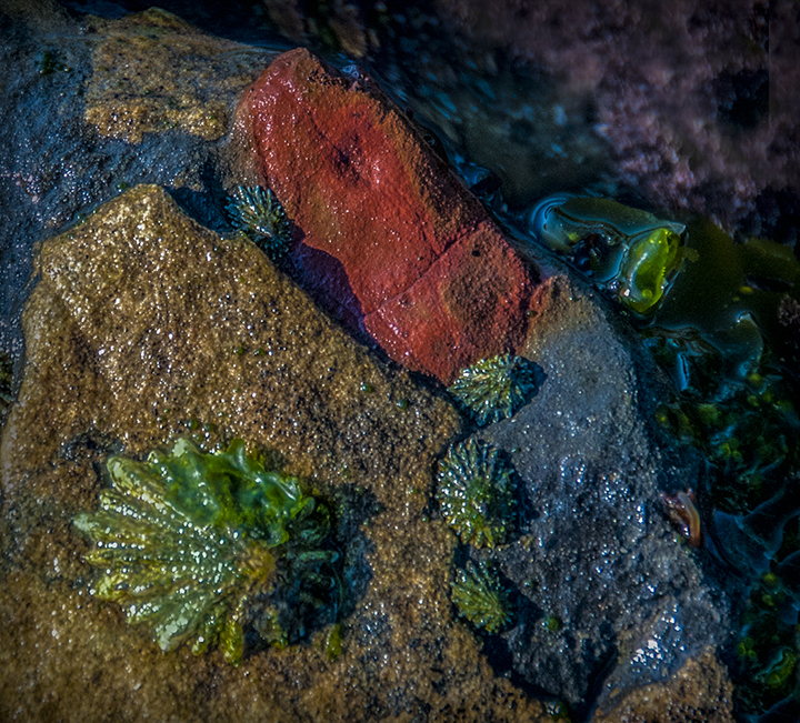
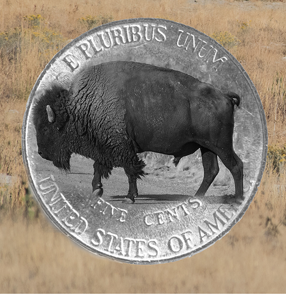
I agree that cropping the right hand corner off would bring us in better to the limpets and enhance the composition. Thanks for your comments. |
Nov 25th |
| 15 |
Nov 20 |
Reply |
Bob,
There are four limpets there. The colors are within range of reality. I certainly did use the vibrance control to enhance them, but those colors were present. Thanks for your comments. |
Nov 25th |
5 comments - 2 replies for Group 15
|
| 21 |
Nov 20 |
Comment |
Phill,
I have to say that the dark mode is a little too dark for my pleasure. I love your painting, by the way. Original 2 is my favorite and I am looking for something in-between the really dark image and that. Charles' suggestion is getting there. Since you tried out all of the blending modes, what caught your fancy was something that was quite different from the original, which might be expected. We are always looking for something unusual. Your composition with the wide-angle lens is excelling. I love the way the leading line of the pottery leads to the flowers. |
Nov 25th |
| 21 |
Nov 20 |
Comment |
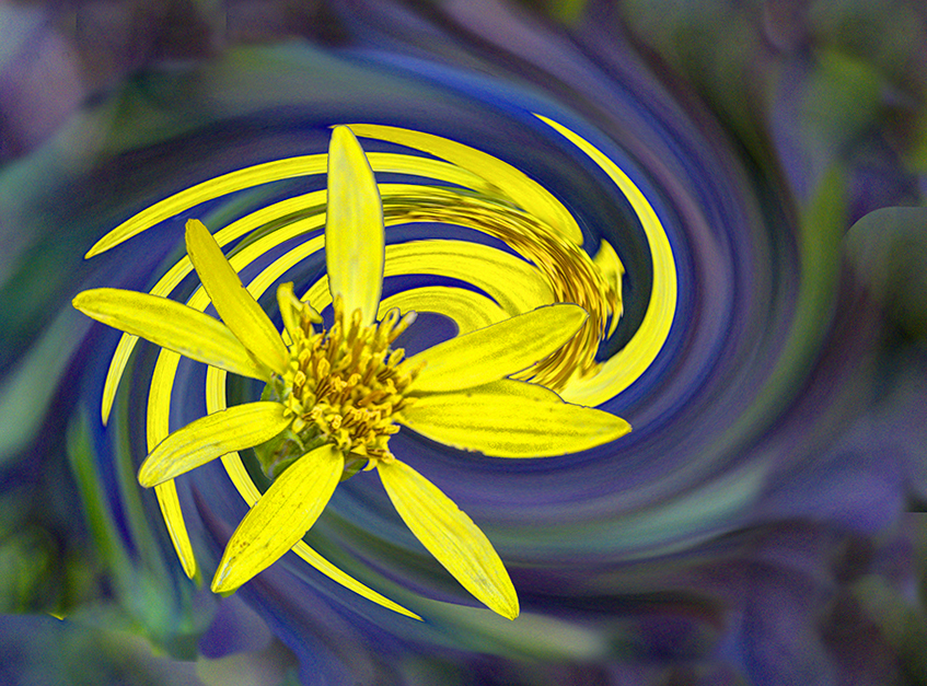
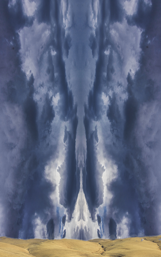
If you look at it with your eyes had closed, you will see a giant emerald surrounded by gold. I am not familiar with the Samsung 360, but it sounds fascinating and a fun tool to play with. Talk about fisheye lenses. I see you turned the original upside down. Those leading lines are interesting. Because this is creative, maybe you might consider adding something in the middle of the sky such as a UFO or an eye so we have a prize after following the trees up into the sky.
But I like it as is, as well. |
Nov 25th |
| 21 |
Nov 20 |
Comment |
Peter,
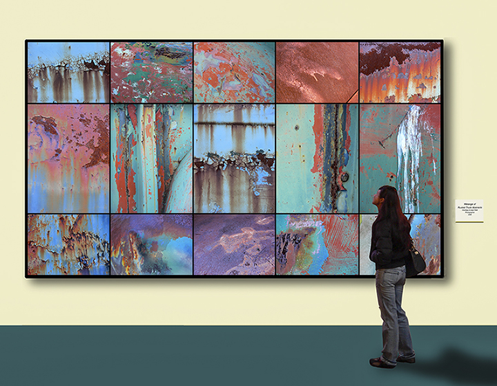
The tryptich idea works so well for this. Rather than a rusty pipe, this reminds me of a flattened concept of the world map, much distorted and colored in a wonderful way, which is what you wanted to convey. Maybe making the colors a little sharper would help with it. As is, the "continents" are kind of fuzzy, which is OK for creative. I assume this is the division you entered it in. The preponderance of warm colors makes the world appear in rose-colored glasses. Too bad it doesn't.
You did a lot of work on this in many applications with which I am not familiar. I recognize you for all of your work |
Nov 25th |
| 21 |
Nov 20 |
Comment |
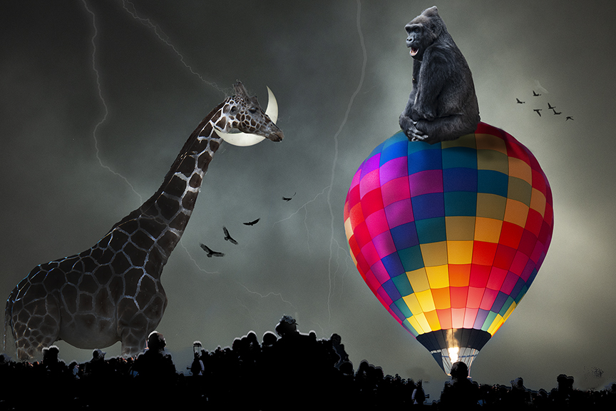
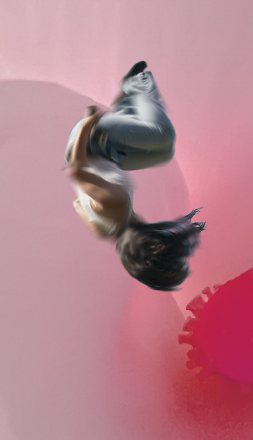
This composite is wonderful. Although Brian has a great alternative, I do like your original version. Maybe you could ad a bit of motion blur to the lady so she looks more like she's slipping down a slippery slope. The blue and gold colors are complimentary and work very well together. I agree with Brian, that I would never have thought about putting those three images together. The brain works in mysterious ways. I'm sorry your alternative image didn't show up, but you could try again. There's still a few day until the end o the month . |
Nov 25th |
| 21 |
Nov 20 |
Reply |
Reminds me of interesting clouds over the Earth. |
Nov 25th |
| 21 |
Nov 20 |
Comment |
Here's the one using his technique all the way though. |
Nov 13th |
 |
| 21 |
Nov 20 |
Comment |
Looks like I can only add one photo at a time. I will now add the other two. The one that looks the furthest from the original was using Brian's technique all the way through. The first one showing was with the blend mode changed. |
Nov 13th |
 |
| 21 |
Nov 20 |
Comment |
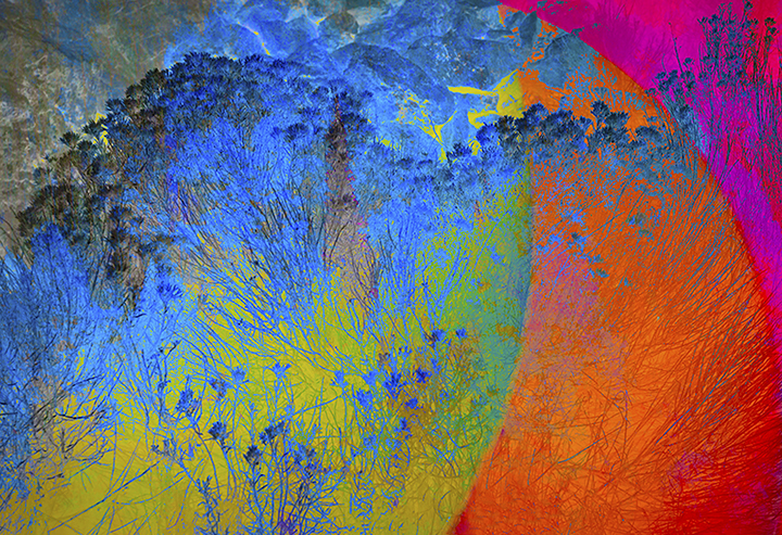
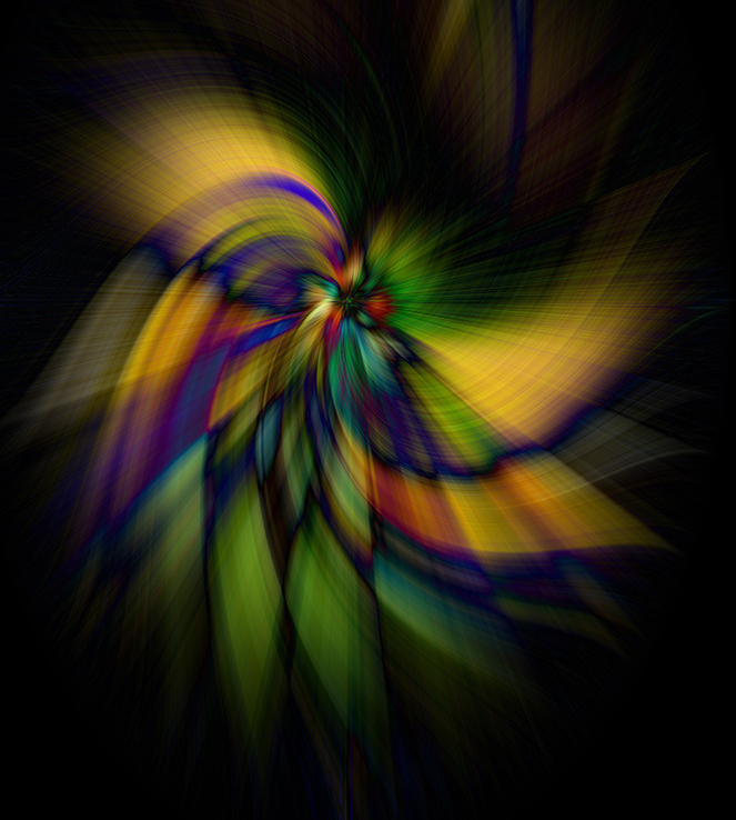
Brian, I tried your technique on one of my pictures. Then I did the same thing but changed the blending mode. I can see countless possibilities. The first image is the original. The second was following your description as closely as possible. The third was using Lighten as the blending mode. A lot of fun.
|
Nov 13th |
 |
| 21 |
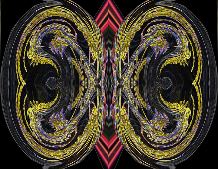
Nov 20 |
Comment |
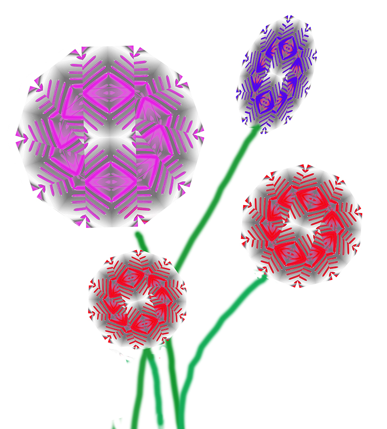
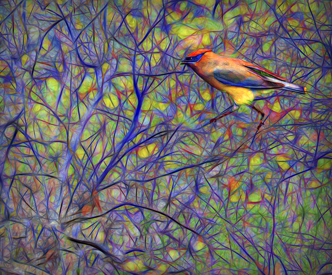
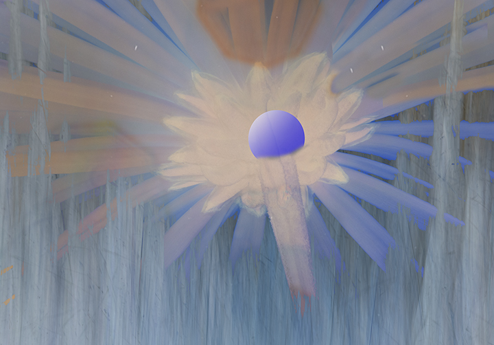
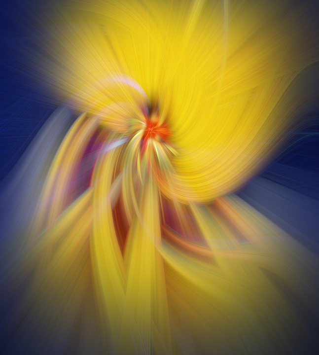
Brian, I love what you did to produce and extraordinary abstract from a living being.
You colors work well together and the final composition is perfect. I do prefer it in the middle instead of moving it to the right or left. I will also copy your technique. Maybe you could put it into Shared or Helpful links.
I particularly like the brightness in the middle with the wonderful lines radiating out. You can just sit and look at this image for quite some time, appreciating the nuances you have created. |
Nov 13th |
| 21 |
Nov 20 |
Comment |
Thank you all for your comments. Yes, the purple section on the upper right is unique to the image and maybe one color too many. I do like the bright colors. |
Nov 13th |
| 21 |
Nov 20 |
Reply |
Brian,
I put in a new image. You were so fast, you beat me to the change.
I would appreciate it if you would comment on my new image.Thanks, Joan |
Nov 13th |
9 comments - 2 replies for Group 21
|
14 comments - 4 replies Total
|