|
| Group |
Round |
C/R |
Comment |
Date |
Image |
| 15 |
Aug 20 |
Comment |
Maybe too late. Great video. You used a lot of wonderful shots that seem to bring us photographers together. Good us of voice over. I'm glad we cn share our videos, as well as our photos.
|
Aug 26th |
| 15 |
Aug 20 |
Comment |
This works quite well. Sorry, I am not knowledgable in Luminar, which most of you are using. I am on old-fashioned operator of PS. In any case, you have done good.
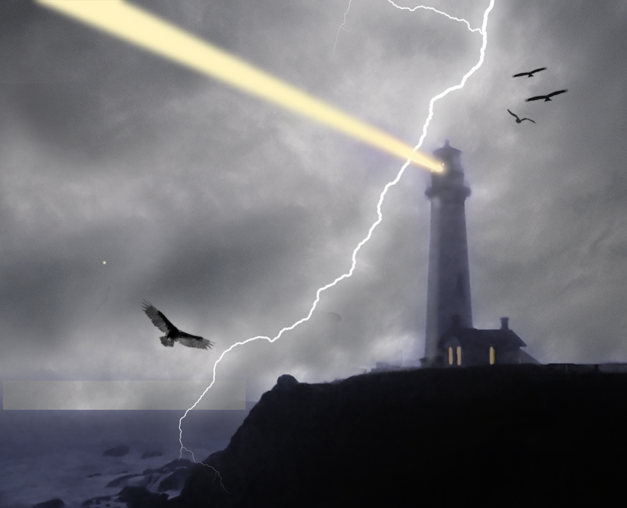
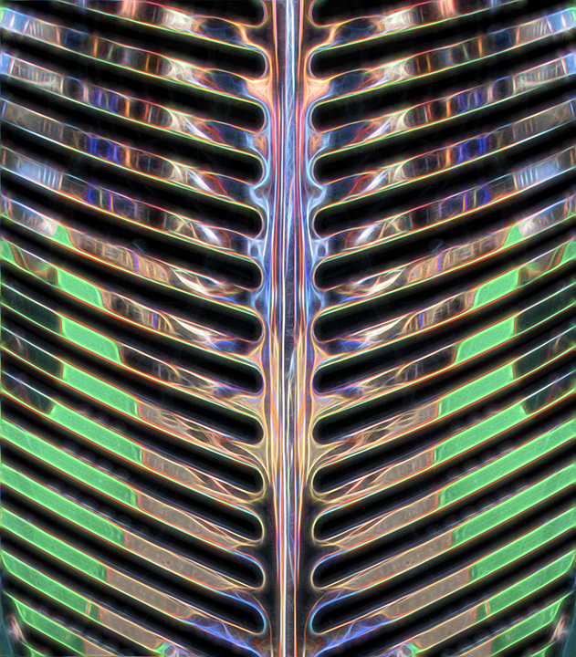
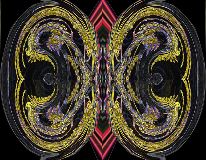
The bright blue around the lamp reflection with the kind of white line rippled reflection above makes it look like the energy is coming from that ripple. It was an excellent idea to make this image more exciting. The flipped view is also better than the original. |
Aug 22nd |
| 15 |
Aug 20 |
Comment |
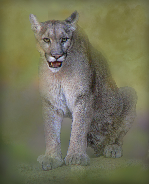
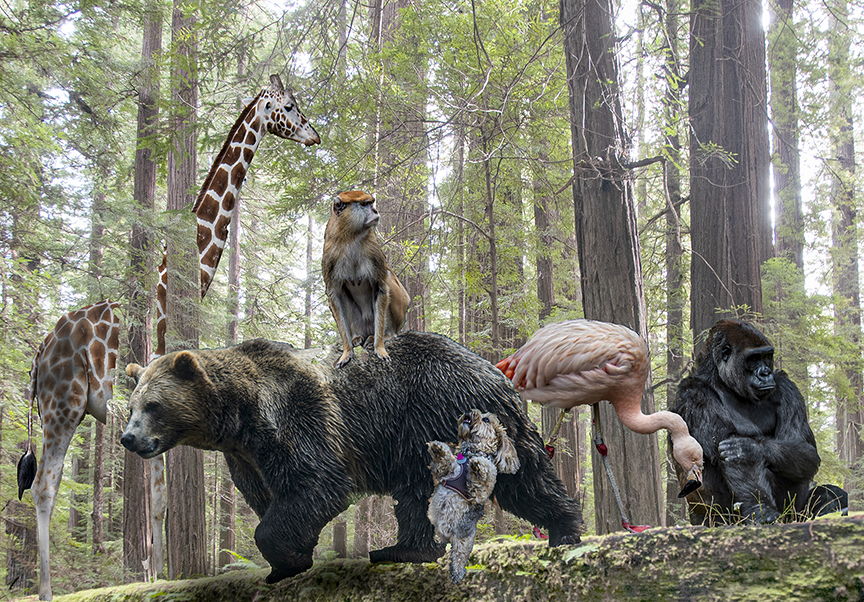
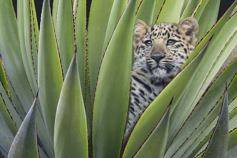
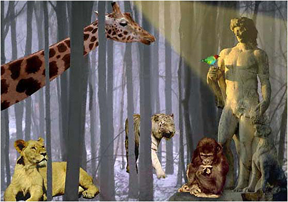
For me, the photo with most of the arm removed is the better one. I love the intensity of his face and gaze. I've never seen a baboon that looked like that so it's of great interest to me. The small white area of the arm that remains can be easily darkened using a black brush tool set on a lower opacity. Also if you set the brush tool in PS to color blend, it will retain the lines below where you paint. That vines are interesting as they show the habitat of the ape. My biggest problem with the photo is the lack of sharpness, which is almost impossible to fix. |
Aug 22nd |
| 15 |
Aug 20 |
Comment |
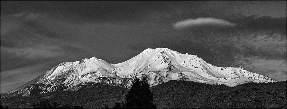
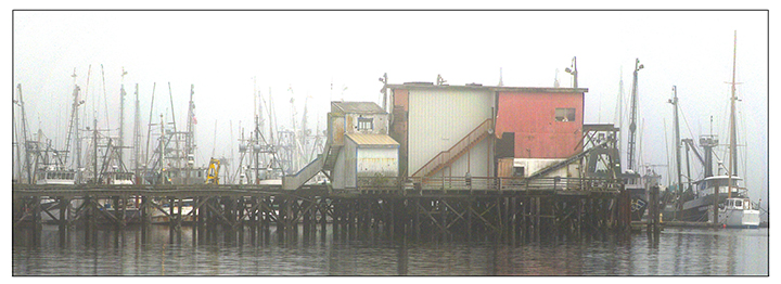
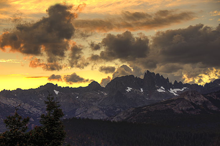
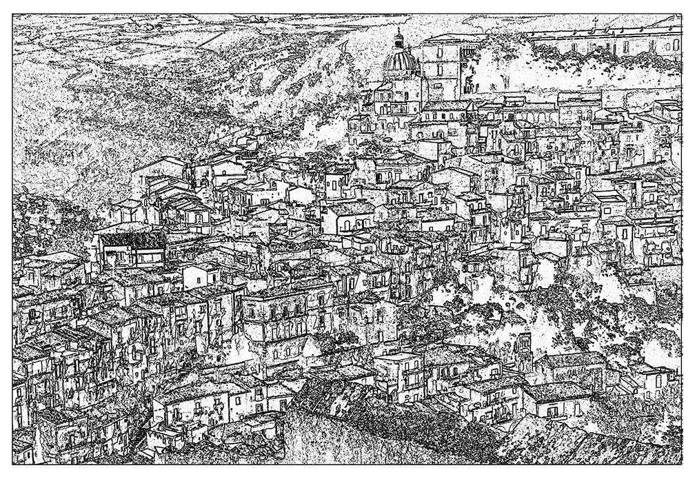
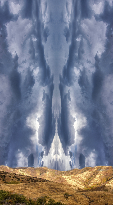
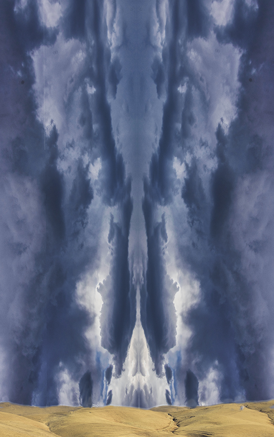
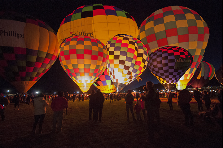
Converting to monochrome really makes the image pop, especially the sky. It is now much more menacing than in the original color image. This looks like an excellent trial of your wide-angle iPhone lens. I might suggest getting even closer to the back of the truck to create an even more distorted shape, maybe positioning yourself much closer to the tire. I love the way the clouds look like they're coming out of the mountain to fill the s ky with such threatening weather. Nicely done and a great test for your new toy . I say "toy" only in a positive way.
|
Aug 22nd |
| 15 |
Aug 20 |
Comment |
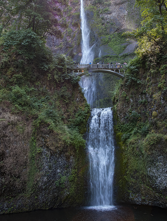
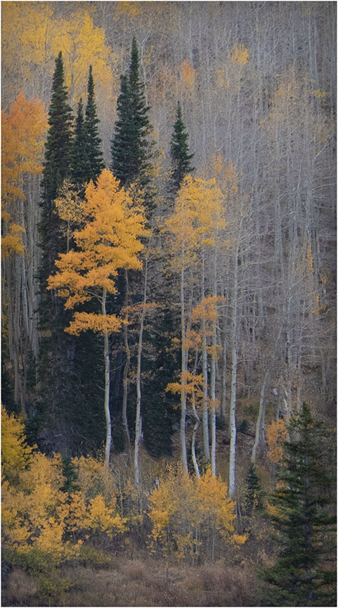
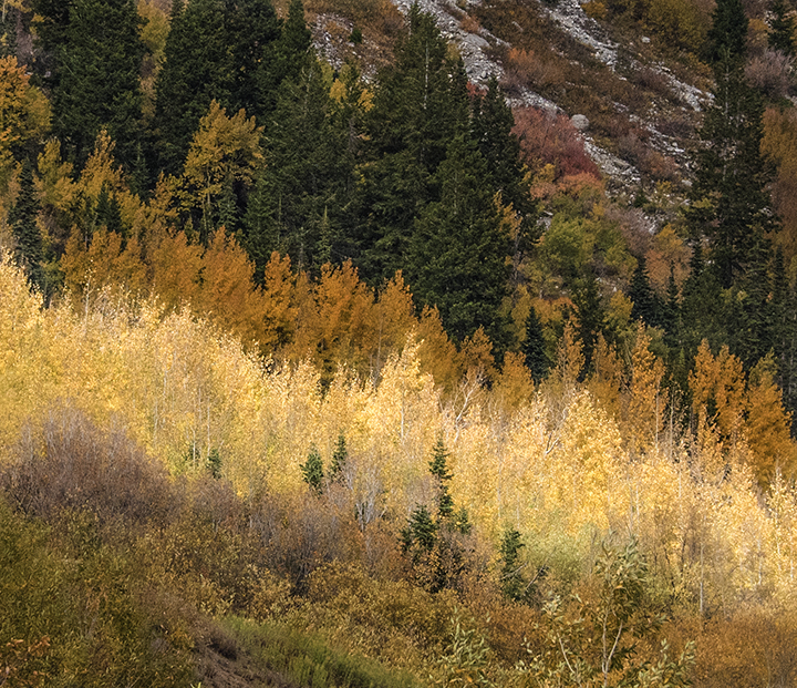
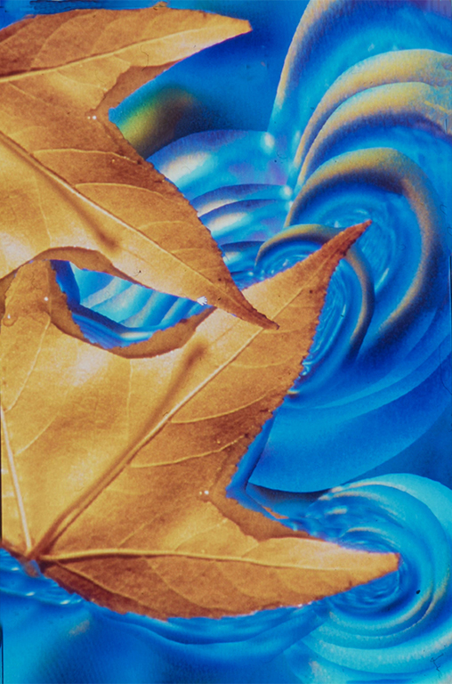
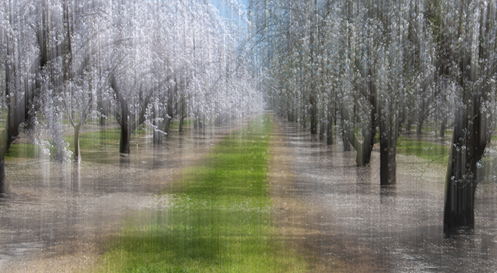
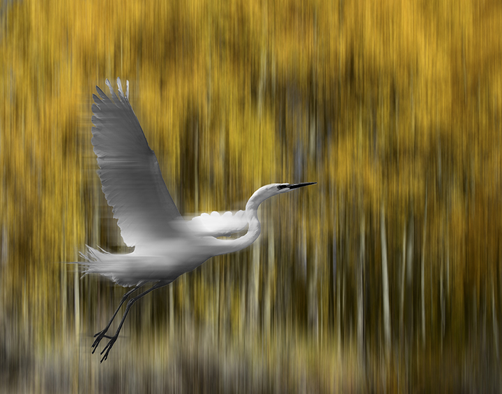
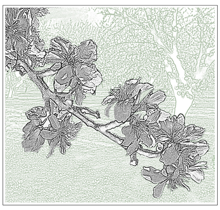
The colors scream Autumn! The wide-angle which encompasses so many small waterfalls that re all contributing to the image was a great choice, while the swirling pool in the foreground really makes the photo exciting. You avoided or fixed any areas that were too bright. I love the brightest spot at the top which draws our eye up through all of this beauty of reds, oranges, yellows and greens. Your long exposure really gives a sense of motion to the image, which normally would be quite static. Congratulations on a job well done.
I don't use Luminar, but it looks like a very useful program. |
Aug 22nd |
| 15 |
Aug 20 |
Comment |
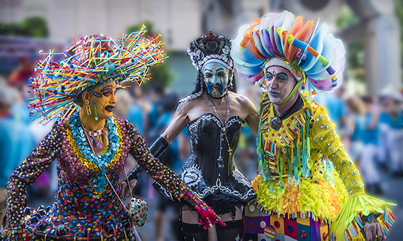
The triumvirate of colorful clowns is quite fascinating . First of all the colors really catch your eye. I noticed that the card actually said, "Life, Liberty and the Pursuit of Happiness " and they certainly seen to epitomize all of those traits. There's something very positive about this. They stand out so well from the crowd in the background which seems to be going in the opposite direction. I wonder if this is a big political statement of today's options. One of them seems to have a mirror in her hand, which adds to the mystery. It's fun just to look at each of them and enjoy their varied existence.
Well captured with your iPhone. |
Aug 22nd |
| 15 |
Aug 20 |
Comment |
Great composition, even without the guy leaning out over the edge of the boat. You have definitely succeeded in capturing the energy that went into the anchor raising. Not a common topic one sees in camera Clubs. I'm glad you had a low angle of view of this effort. To me, the rails and angles in the curve of the boat are very important in bringing us to this seaman. If I did anything, I would remove the other guy altogether, mostly because he can't be seen clearly as to his part in the operation. |
Aug 22nd |
7 comments - 0 replies for Group 15
|
| 21 |
Aug 20 |
Reply |
We could have a conversation on the use of nudes in our Bulletin Board, if anyone is interested. |
Aug 26th |
| 21 |
Aug 20 |
Reply |
There are no limits to my knowledge of showing nude women or men, provided it is artistic and in good taste. After all, there are so many paintings of them that we admire in the museums. |
Aug 26th |
| 21 |
Aug 20 |
Comment |
Barrie,
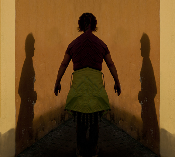
I really enjoy what you did with creative cropping. Whoever said that cropping had to be rectangular. It wa a wise decision to remove her head in the mirror, since even after so many years, someone might call you out. If that is the origin of your cropping it worked really well. The unusual shape is what makes the image so creative. |
Aug 18th |
| 21 |
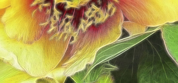
Aug 20 |
Comment |
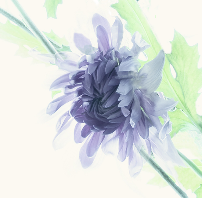
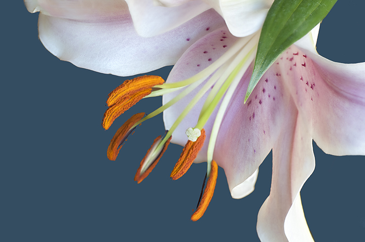
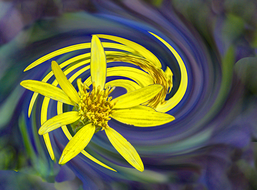
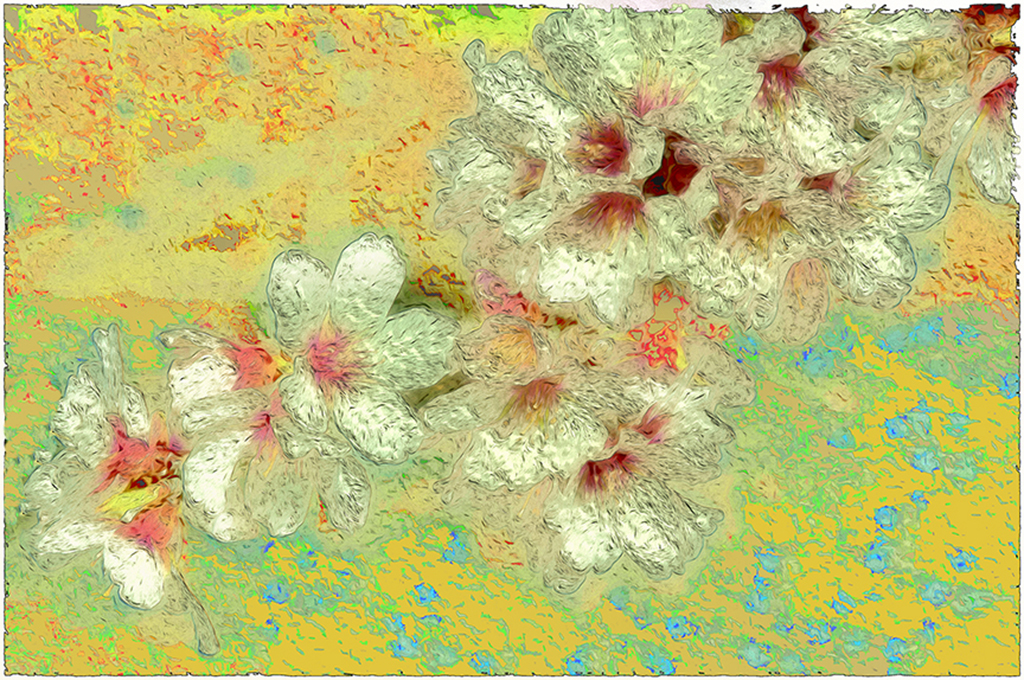
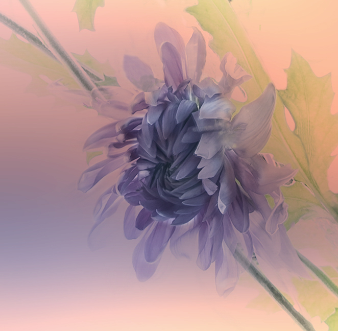
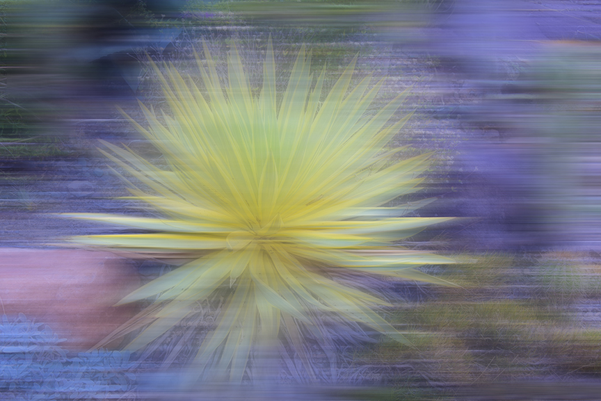
Phill,
I don't have a problem with the yellow stamens. I think they help bring us into the photo. I agree with both Peter and Brian that the placement is a bit stodgy, a term I learned in the Great British Baking Show. I would crop more off one side so that the hybiscus is not dead center, but not allowing a ping pong effect that Peter has created. Even more of the daisy-like petals on one side might be more appealing.
But you did a great job with the concept. |
Aug 18th |
| 21 |
Aug 20 |
Comment |
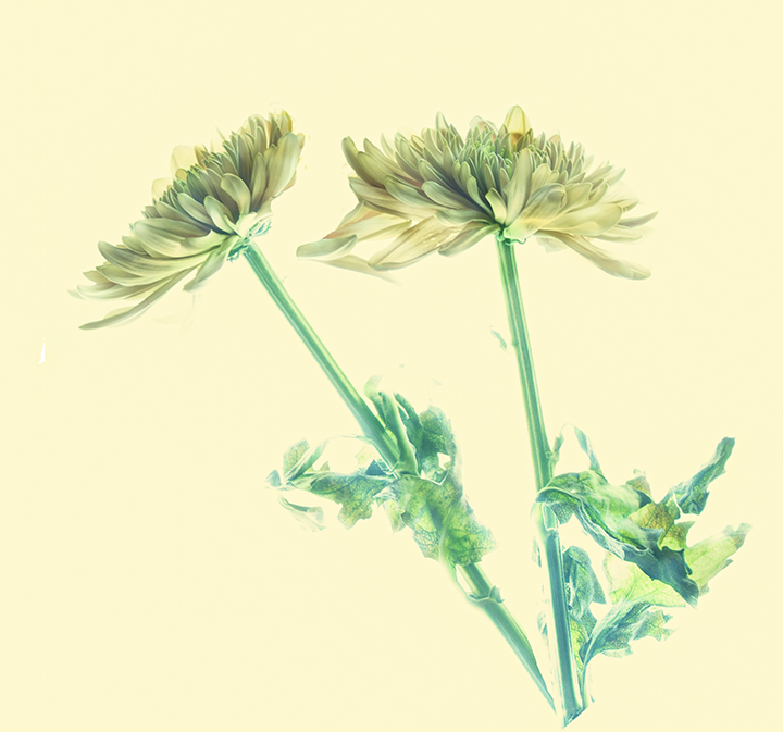
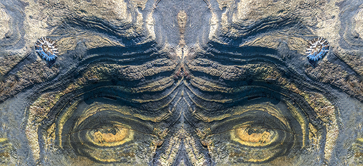
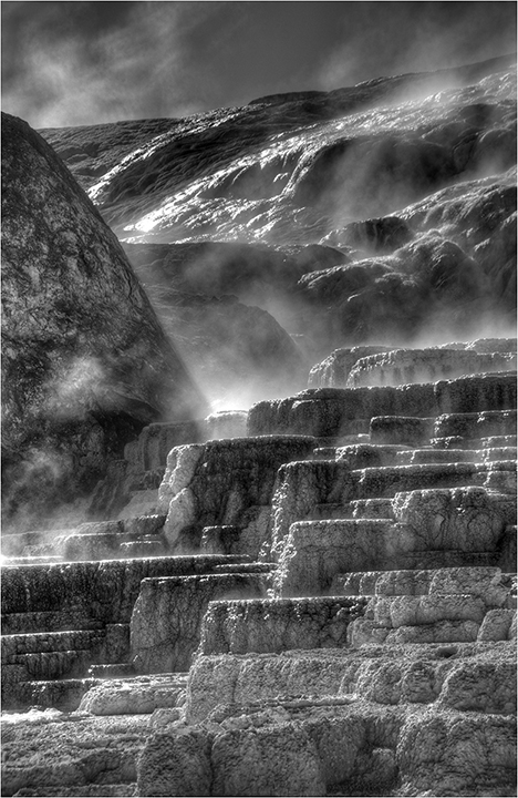
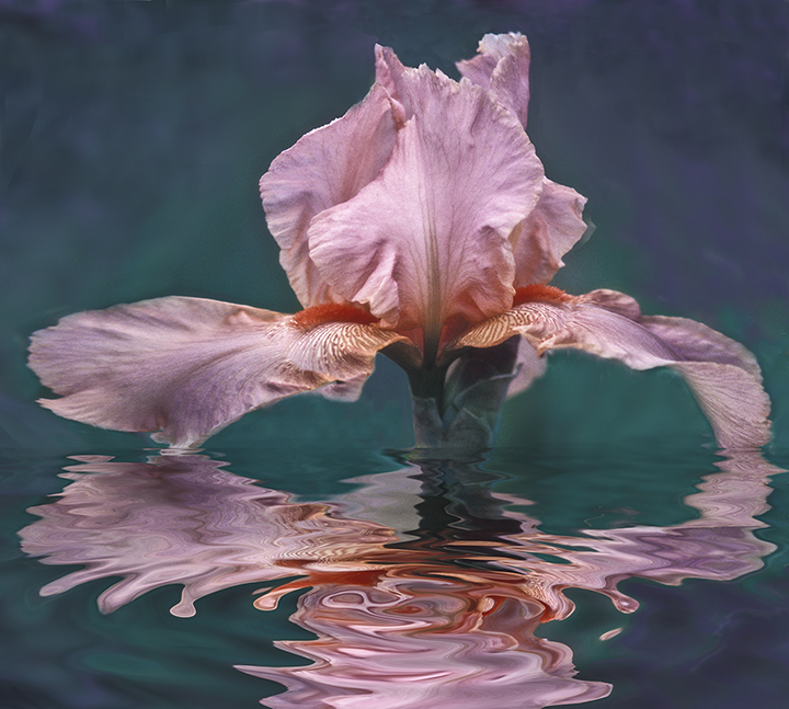
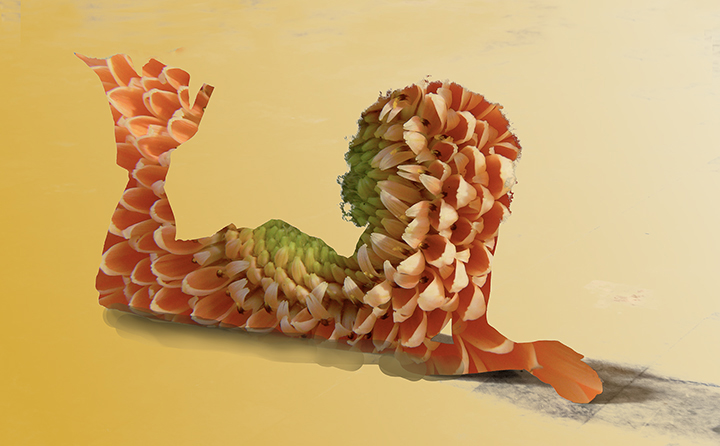
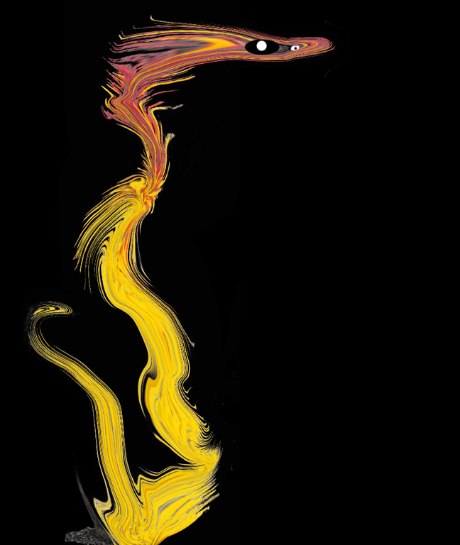
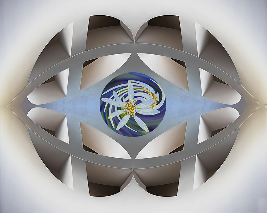
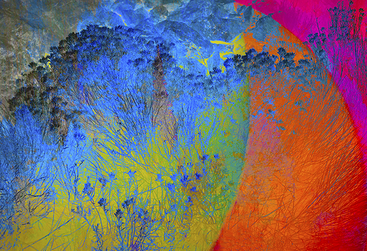
Peter,
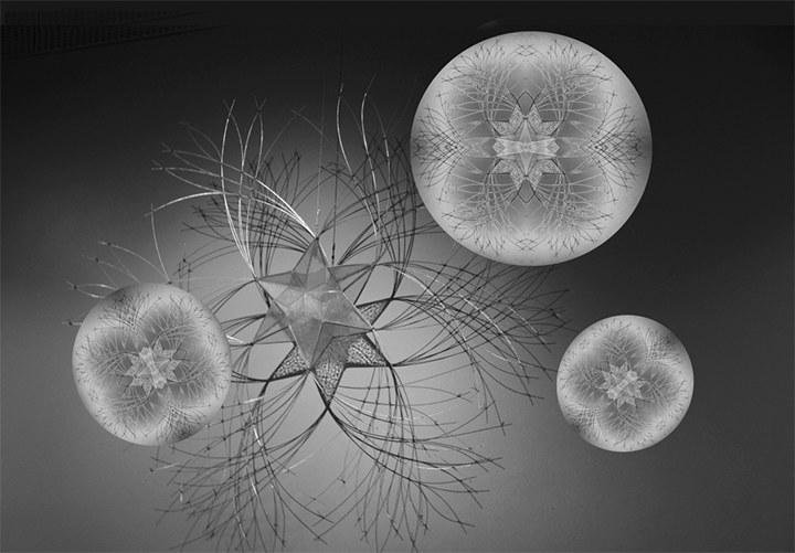
I very much like your revision over the original. It reminds me of some of the strange creations one sees at Yellowstone near one of the hot springs. I would suggest that you consider adding more color to this image to pop it up. Something you might see in a MOMA. I am enclosing a sample of something whipped up using Curves in PS.
Your basic monochrome may appeal to you more, as this is but a suggestion. |
Aug 18th |
 |
| 21 |
Aug 20 |
Comment |
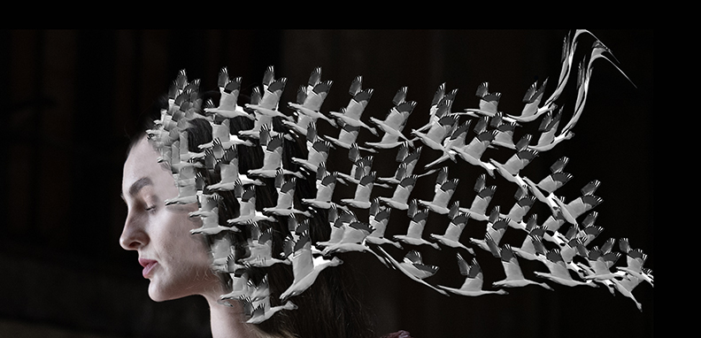
Charles,
A very good idea. I like the colors you have chosen. I'm partial to purple, I guess. She becomes a bit more of a belly dancer with the separate top showing part of her body. So if you want a flamenco dancer, fill in the top; bellydancer, leave as is. You could have cropped in a bit closer as suggested and the BG amethyst under her feel should be sharper as someone suggested. All in all, I think it is creative and a really great use of the creepy look of the poppy to produce the skirt. |
Aug 18th |
| 21 |
Aug 20 |
Comment |
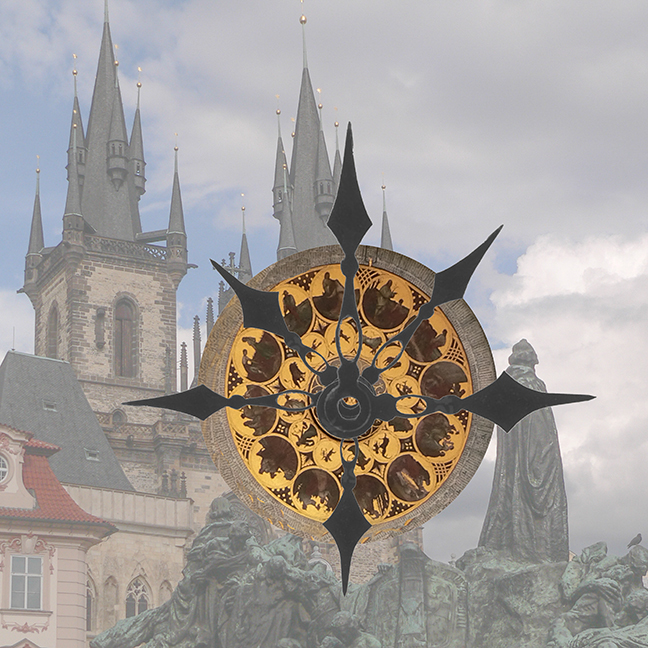
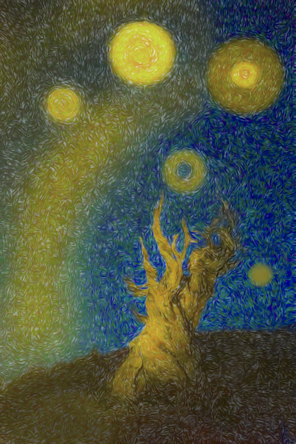
Brian,
This is so Dali-esque, if there is such a word. I love all of the stretching and movement in the clock, as well as the extruded outside. I would also love to see a pair of wings on the clock helping it to fly. Very well done. I like the way it emulates a sense of dis integration approaching the clock itself, only a matter of time. |
Aug 18th |
5 comments - 2 replies for Group 21
|
12 comments - 2 replies Total
|