|
| Group |
Round |
C/R |
Comment |
Date |
Image |
| 15 |
Jul 20 |
Reply |
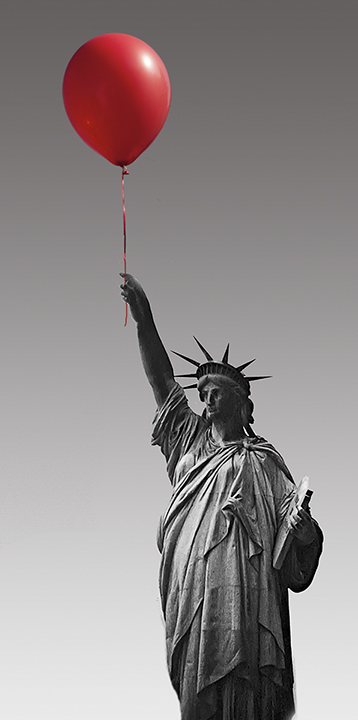
From what Tom Pickering said, no, you cannot use other people's skies for competitions. He did say for the DD it wold be acceptable, however,
|
Jul 22nd |
| 15 |
Jul 20 |
Comment |
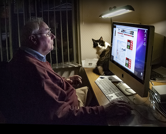
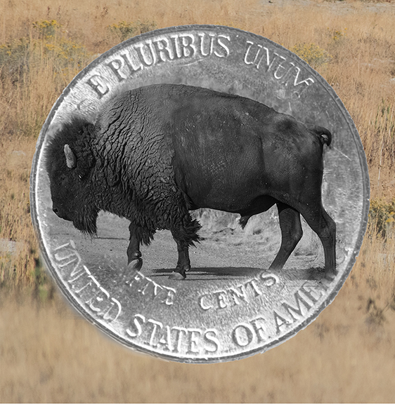
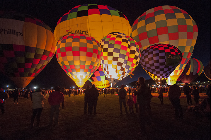
Another comment: I am not a Luminar user for one, so don't know exactly what it's supposed to do. I just wanted to point out that our council does not allow skies that you have not taken in the photograph. I really don't know what PSA allows.
Another reason for building up your skies folder.
|
Jul 20th |
| 15 |
Jul 20 |
Reply |
Bob,
It will remain a mystery as to what happened to your original critique. Thaks for responding again. Yes, I should have increased the ISO, thanks for reminding me. |
Jul 20th |
| 15 |
Jul 20 |
Comment |
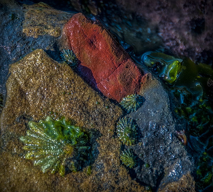
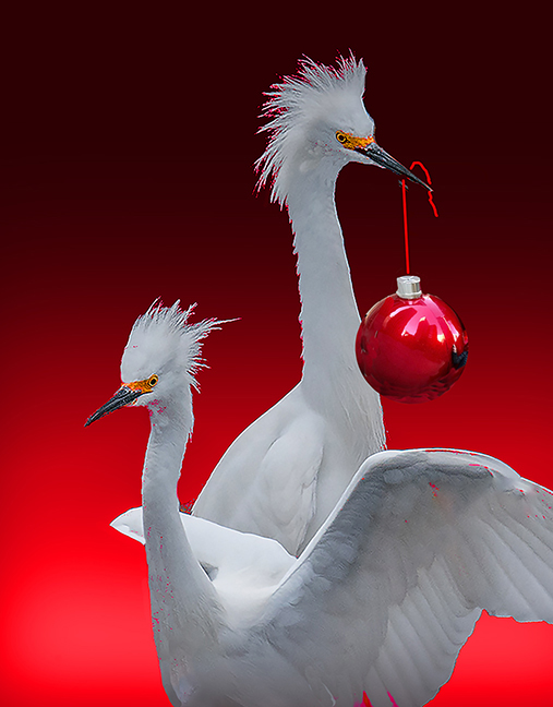
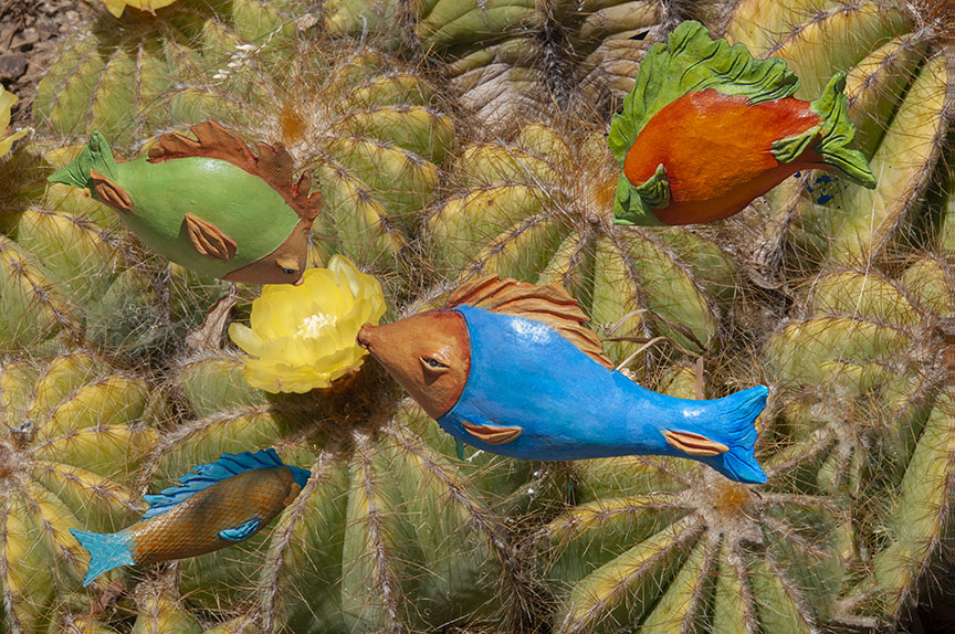
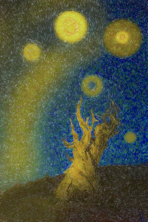
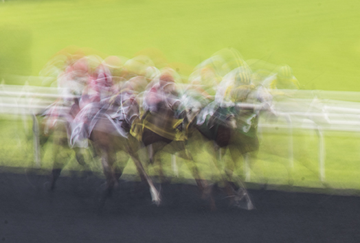
Wow, you guys were busy. That's exactly what the DD is for. I have to say that the rock doesn't bother me. It fills the negative space. To make your creature more creative still or funnier, I would put eyes on the end of the four furthest reaching tentacles! |
Jul 11th |
| 15 |
Jul 20 |
Comment |
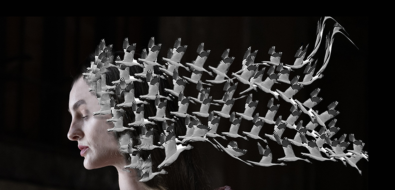
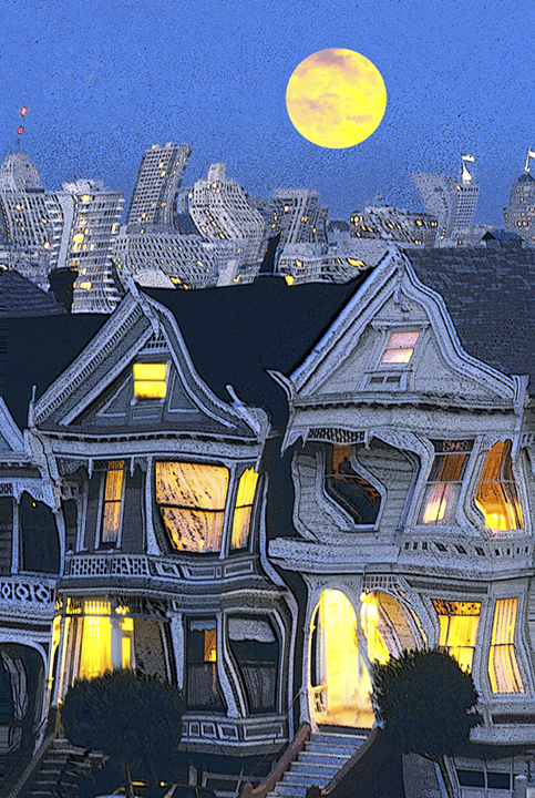
Simple, yet so well done. The sky is fantastic, Your addition of the birds and the moon work so well. It was wise of you to make the moon so transparent so it is a subtle feature rather than a major one. The frame also works well, picking up the sunrise colors. It's wonderfully pleasing to admire. |
Jul 11th |
| 15 |
Jul 20 |
Comment |
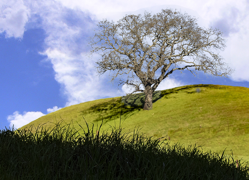
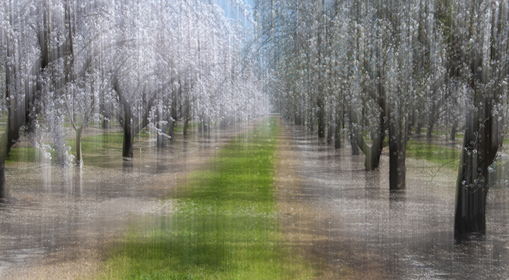
Bob, Great composition. I love the darker sky best as it gives the image a more dynamic cast. Darkening the tractor works so well here. It is very well photographed and I love the low viewpoint you have taken.
I would suggest cropping a little more of the foreground grass off. Even though it is sharp, it doesn't add much to the photo in my opinion.
Very nicely done. Your sky replacement is nicely done. |
Jul 11th |
| 15 |
Jul 20 |
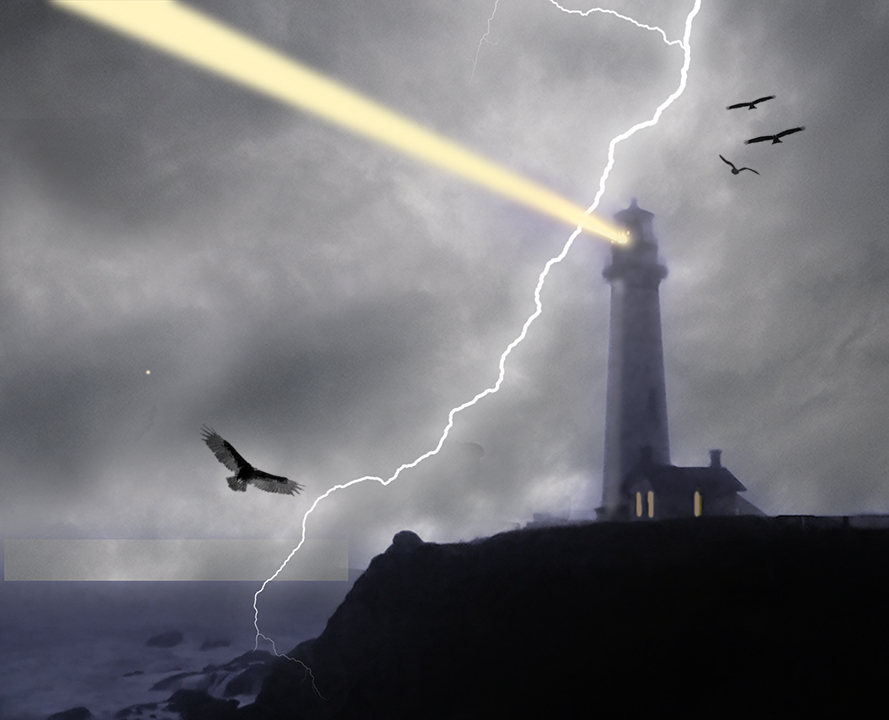
Comment |
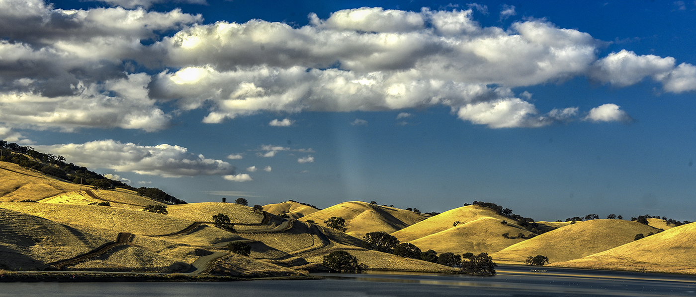
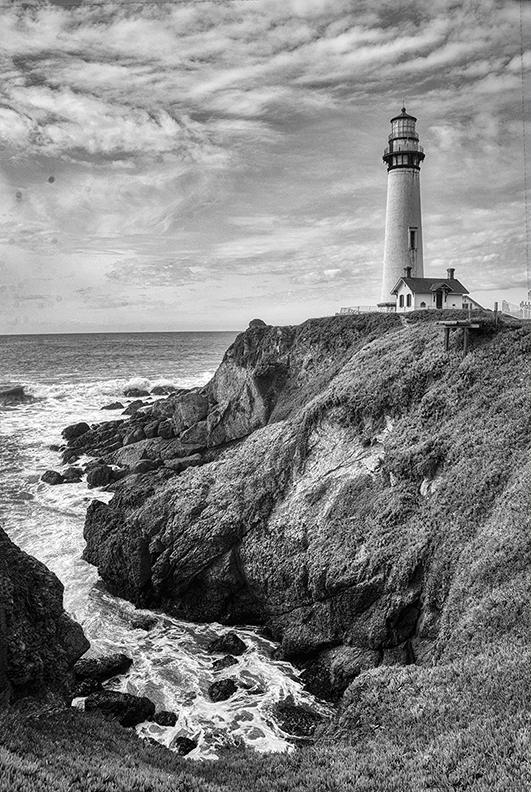
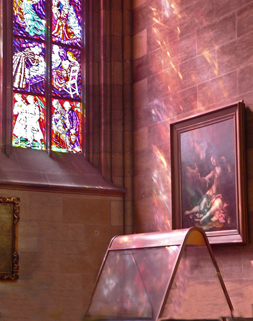
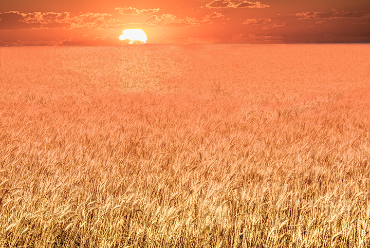
Simple and beautiful sunset. The lighthouse looks like it's leaking slightly to the right and I notice a thin line going up to the light. Is it being held upright by the line?
Kristi and Jeri are correct that the grass, which is amazingly in focus, makes the shot so much more interesting and impressive. The sun's last rays fill the negative space, but not so much as to be competing with the lighthouse.
|
Jul 11th |
| 15 |
Jul 20 |
Reply |
Also, that was an already revised original. It had been cropped and some clone work was already done on it. |
Jul 11th |
| 15 |
Jul 20 |
Comment |
There was a comment up there from Bob Legg, which has mysteriously disappeared. My comment below. was for him. He also wanted the metadata. Imagine my surprise to find that it was a .jpg file, not RAW. I always shoot raw. Nikon D750, didn't show lens, but it was either my regular zoom, 28 - 300 Nikkor, or a macro lens, can't remember, ISO 500, 1/1000 sec, f 5.6. I'm using Bridge 2020 and not used to it yet. |
Jul 11th |
| 15 |
Jul 20 |
Reply |
The very left side didn't bother me, but where to cut the branch could have been looked at more carefully. Cloning is one of the most important tools in Photoshop. at least for me. I have rescued many a shot that way. Thanks for your comments |
Jul 10th |
| 15 |
Jul 20 |
Comment |
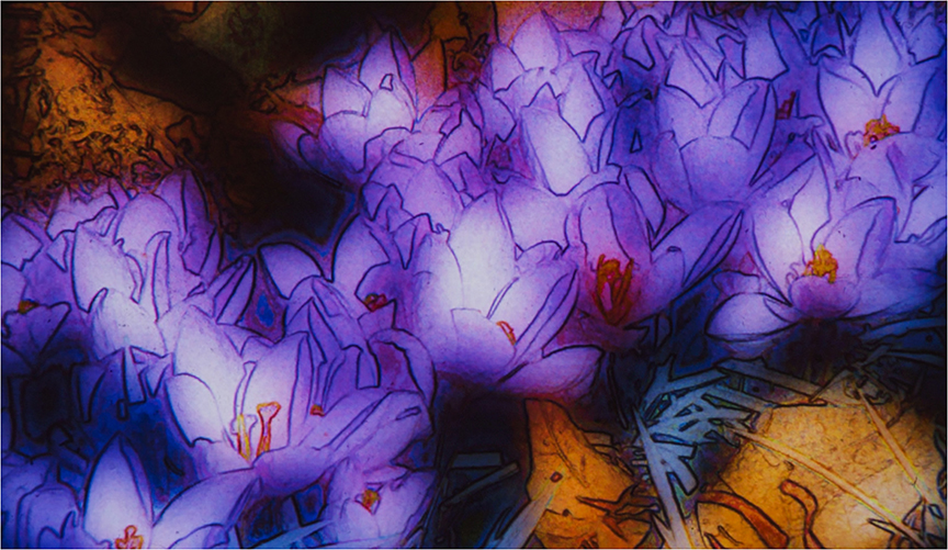
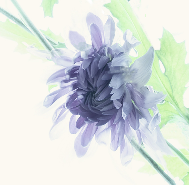
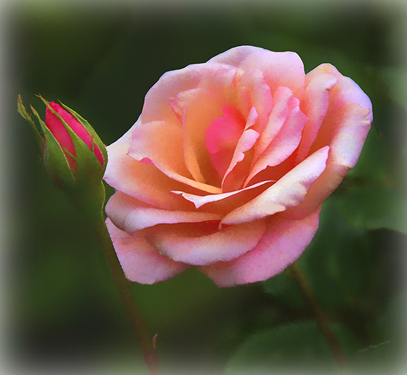
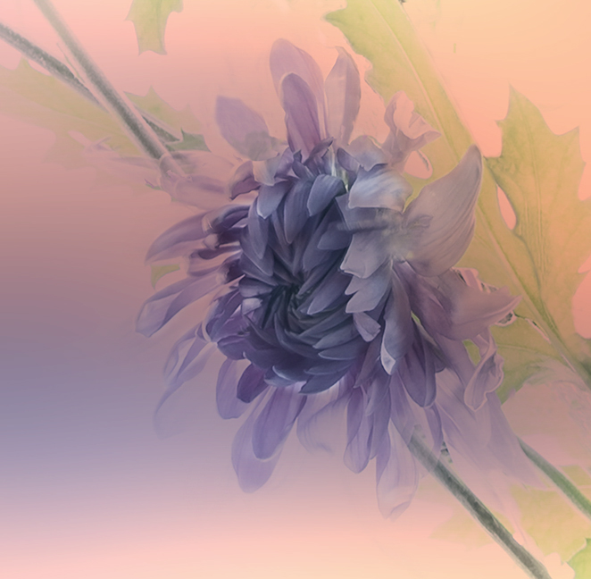
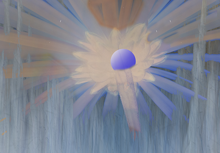
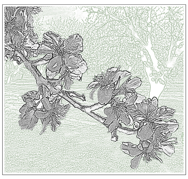
Jeri,
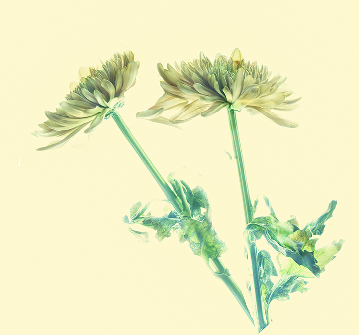
lYour flower was WAA Y too big. The maximum size is 1 meg. I sent you an email suggesting how to achieve that, so won't discuss it here. However, I could do with a title. It doesn't have to be the name of the flower, but something. I put in "Yellow Flower" for you.
Your flower is really sharp; those phones are pretty darn good!! Sharp where it had to be sharp, so good photography. The background, could be darkened using the brush at a lower opacity, say 25%, and the black swatch. A couple of runs through and it will work really well to darken it to almost black.
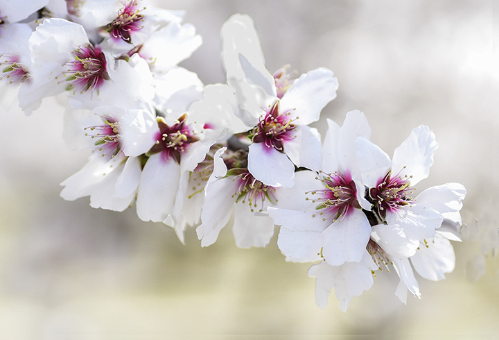
I like the way the blossom fills the frame and its symmetry makes it a candidate for center placement. |
Jul 7th |
7 comments - 4 replies for Group 15
|
| 21 |
Jul 20 |
Comment |
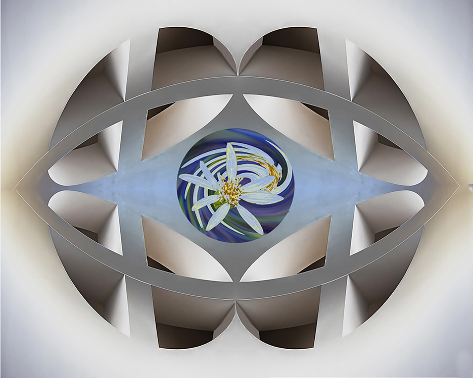
Barrie,
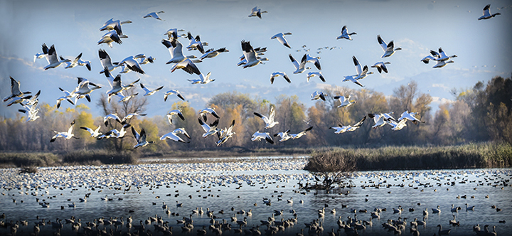
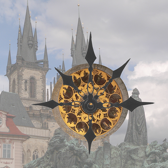
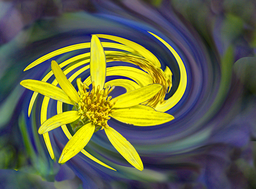
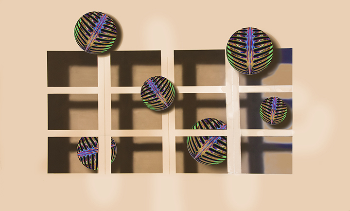
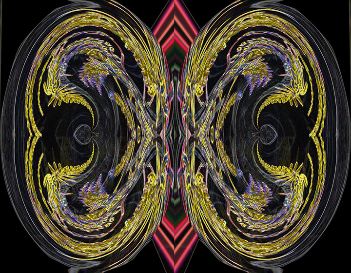
The effect I am looking at does not seem to be the ripple effect, but some posterization effect. Your composition is good and I like the colors you have achieved. A sort of pastel look with a flavor of Georges Seurat. Despite the ripples, the sky is pretty blank, so possibly putting in a new more interesting sky might be in order. |
Jul 12th |
| 21 |
Jul 20 |
Comment |
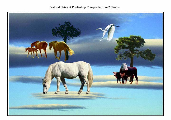
Another composite! Phil, you showed us in original #2 the cloud already over your paints. I would love to see the absolute original. However, the idea is extremely creative. Who would thin of setting up a rogue's gallery from their paint box?
You executed this quite well. I love that you changed the angle, size and color of each adaptation of the mask, so that not one looks like any other. The use of all of the blend modes is very original and a wonderful idea. I think you have done an excellent job! |
Jul 11th |
| 21 |
Jul 20 |
Comment |
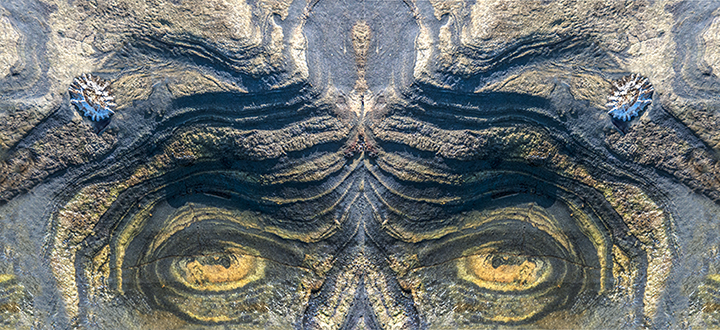
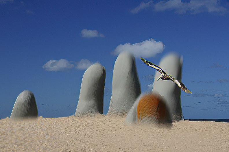
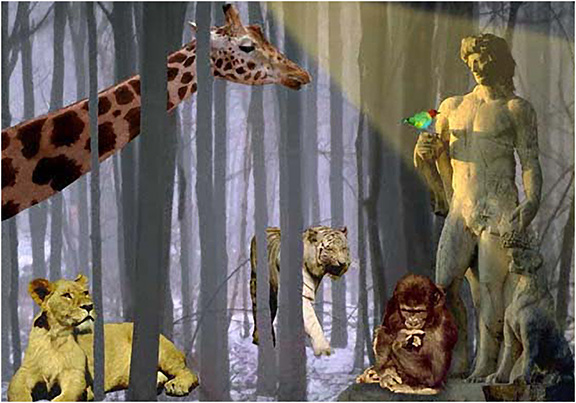
I had forgotten abut the hand. I'm not sure it adds to the image as one is left wondering is there is a human behind the hand covered in the waves or did the creature eat him all up except for the hand. A bot gruesome for me. As for the eyes, I imagined them covered up by the water of the wave, so didn't miss them at all.
|
Jul 11th |
| 21 |
Jul 20 |
Comment |
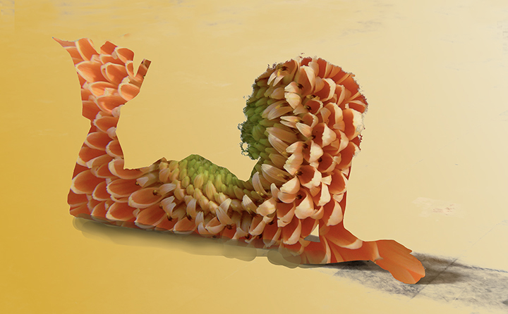
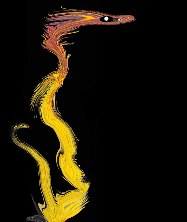
You have, indeed, created a frightening sea monster emerging from the wonderful waves. I had to laugh at the horns you put on it. Maybe you could have made them a bit more intimidating. Got any cow pictures? Great placement in the frame and altogether a wonderful concept idea. It's amazing you thought of a creature when you looked at the fountain's bubble head.
Great job! |
Jul 11th |
| 21 |
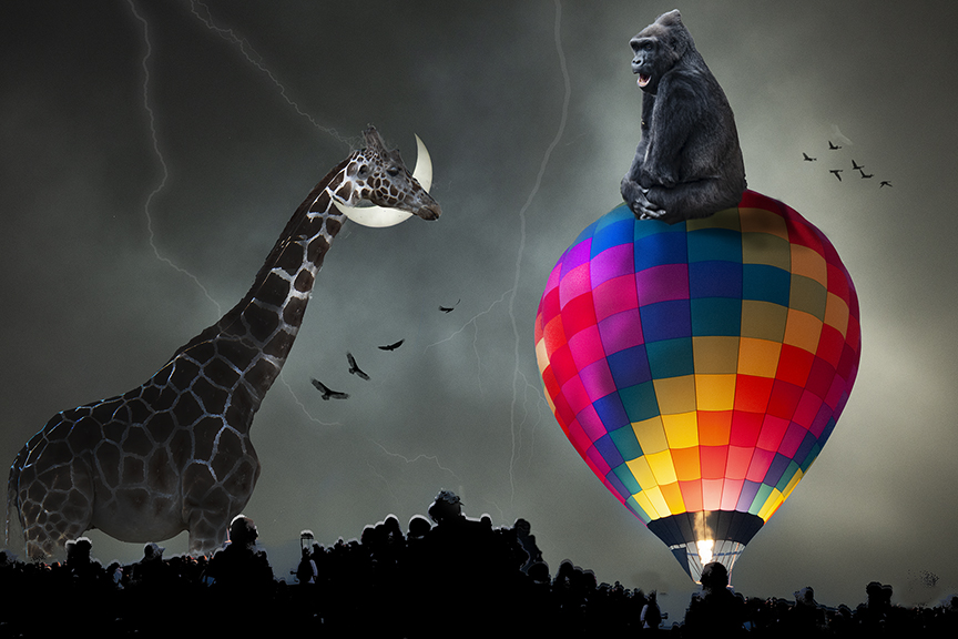
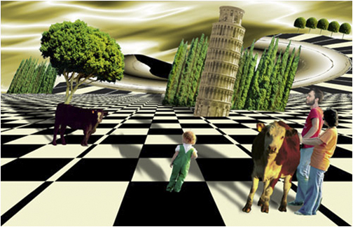
Jul 20 |
Comment |
You show great creativity in your concept. My favorite creative images are composites that are previously thought up and then put together. This certainly fulfills that idea. The suggestions that the cowboy be bigger and/the moon, perhaps less bright are OK, but you need to be sure that you don't lose the concept. As for the lighting, that is always the trickiest part of putting a composite together. Brian is right that the lower part of the horse should be the lights, but that is not easy to do, so I commend you on what you HAVE done, which is to show us a wonderful twist of a child't nursery rhyme. |
Jul 11th |
| 21 |
Jul 20 |
Comment |
Brian,
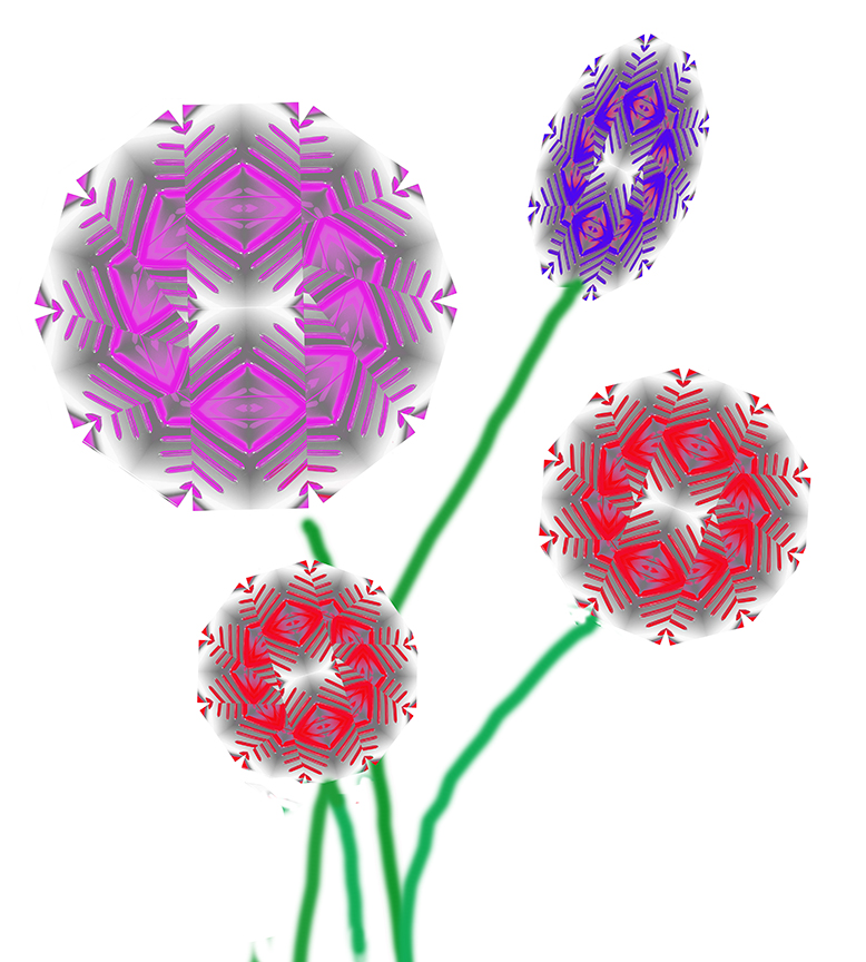
I like it just the way it is. The bright colors are eye-catching. After all, this is creative. We're not producing things that are realistic, in most cases. It also reminds me of a pinwheel in motion. Your ultimate result does resemble a tartan weave, especially with a fringe. So your titling is right on, Much better in a vertical position, IMHO.
Well done! |
Jul 11th |
| 21 |
Jul 20 |
Comment |
I also wanted to say that I tried this with another sky, and it is difficult to find skies that work. The best I could do, I didn't like anywhere as much as this one. I kind of lucked out finding the right sky. See how it goes when you try it. |
Jul 11th |
| 21 |
Jul 20 |
Comment |
Thank you all for your positive comments. Charles, I can't see the matching problem, but my eyes are going bad quickly with Macular Degeneration and I am having more and more trouble seeing details. Don't know how much longer I will be able to keep up my photography. In the meantime, I will do the best I can. |
Jul 11th |
8 comments - 0 replies for Group 21
|
15 comments - 4 replies Total
|