|
| Group |
Round |
C/R |
Comment |
Date |
Image |
| 15 |
Aug 18 |
Comment |
Rick, Your sunflower really stands out, very sharp, as well as the bee. If it were mine, I would have cropped in tighter and made the background a bit darker and blurrier to make the beautiful flower stand out even more. If you make another layer in PS and blur it, then erase the sunflower within it to its original sharpness that would work. It's quite a lot of work, however, to do it carefully.
I'm glad you're stretching the capabilities of your iPhone. |
Aug 25th |
| 15 |
Aug 18 |
Comment |
Who's the beautiful boy? Very well photographed. We can really appreciate the "horns" on Horton and his whimsical look. Very well placed on the tree trunk and in the frame. Sharp throughout. Nicely done. |
Aug 25th |
| 15 |
Aug 18 |
Comment |
Tianji,
It was worth the effort. A really beautiful set of falls. Is this just the bottom of the falls and there is more above because without an item in the picture to use for scale, it is really hard to tell. The best clue are the trees, but in this case, it must be only part of the falls that we are looking at. I like so much that they are not overexposed, which is a common mistake, that you used a slow shutter speed to give us a foamy look in the water at the bottom, and that you filled the frame so well. Very well exposed. Excellent job! |
Aug 25th |
| 15 |
Aug 18 |
Comment |
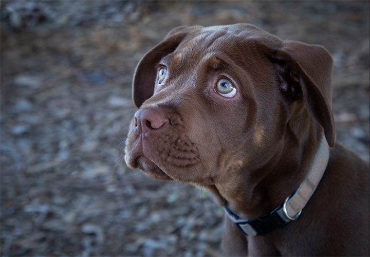
Some more comments. The dog's eyes have many colors in them, so it is not easy to use the color picker (dropper) tool to find the right color. You have to experiment. When I used the Color Range tool, even with a low setting, a lot of the BG was also chosen. I was able to remove it with the lasso tool and the option key, however. When you go to Fill under the Edit menu, you must use the Option-Delete keys instead if the color is the foreground color. Also be sure to set the Mode to Color. |
Aug 25th |
| 15 |
Aug 18 |
Comment |
A beautiful baby, well photographed. His eyes are definitely the crux of this image. He is well-placed in the frame and the BG colors match his colors, especially of the collar. In PS, I would have used the Select Color Range tool on the collar. If it picks up more colors around him that you don't want, you can remove them by using the lasso tool on Option (Alt). With the collar highlighted, just use the dropper tool to choose the color, then Command-delete to fill in the color. However, it is critical to set the blending mode to Color to retain any darker areas on the collar. Otherwise you will get a solid color throughout which does not resemble real life. The other way to choose the collar is to use the Pen tool, or the lasso tool, if you have steady hands. I hope that helps. |
Aug 25th |
 |
| 15 |
Aug 18 |
Comment |
Very well done. She is a striking model, so you were lucky to get her acceptance for photography. The frame is filled extremely well and, I agree that finding and keeping the words "I love New York" is perfect for a background. It both places your photo and also probably gives the concept to the young woman, who looks like a New Yorker. I wonder if she was. Great work, one of your best. |
Aug 25th |
6 comments - 0 replies for Group 15
|
| 21 |
Aug 18 |
Comment |
Peter,
I can't see any difference between the original and the final, sorry to say. Next time please send your original in larger resolution. As long as it's less than 1 meg., the program will accept it.
I think your three fireworks are a bit different from what we usually see. First of all your colors are great, very strong. There is a tendency for those colors to wash out. The composition is excellent. To me it makes no difference if your orient right or flipped as I guess I'm not so strong as Brian on the lead in lines. I do, however, agree that the foreground should be darkened and the bright area totally removed. I like your final outcome shown here. |
Aug 25th |
| 21 |
Aug 18 |
Comment |
Susan,
The texture you chose behind the tree is beautiful. The colors are lovely, and the streak of light coming down from the upoper left could be lightning attracted to this dead tree. Well framed. I'm amazed you were able to get the color back into the tree as the original looks almost like a silhouette. A simple image well executed. |
Aug 25th |
| 21 |
Aug 18 |
Comment |
John, the use of texture does help make this more creative. Your balloon placement next to each other and to the lighthouse makes the composition rather heavy on the right hand side. I would have moved the balloons further away from the lighthouse, but that is always subjective. |
Aug 25th |
| 21 |
Aug 18 |
Comment |
Barrie,
I like the use of your ink outlines filter. It works well with this image. Since the trees are so dark anyway, I don't feel that they need to be played with further. Nice composition and color range, the blues and golds complement each other. |
Aug 25th |
| 21 |
Aug 18 |
Comment |
Brian,
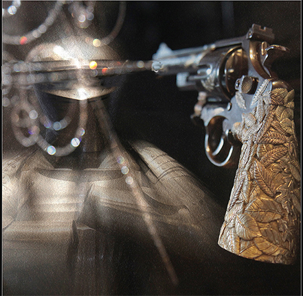
Your image this month is quite intriguing. The gun, which is beautiful and so well placed in the image, looks like it's being fired at the object (armor) to the left. I wonder if it would be possible to get the line of interest more directly from the gun barrel toward the armor, giving a stronger impression that the gun is firing. I like the way you faded the depth of field of focus of the gun so that it matches the armor. The retaining of the spiral loops of light echo the gun trigger, which really adds to this. |
Aug 25th |
 |
5 comments - 0 replies for Group 21
|
11 comments - 0 replies Total
|