|
| Group |
Round |
C/R |
Comment |
Date |
Image |
| 15 |
May 18 |
Comment |
The diagonal approach works well. I agree with Carmen and then I might crop dramatically to give the center of interest more importance. You were in a good spot at a good time. |
May 18th |
 |
| 15 |
May 18 |
Comment |
Rick,
Your lily is well-photographed with the water droplets adding some excitement. A couple of suggestions:
1) Make the background totally black instead of the grayish black.
2) I might remove the stem and come in even closer on the flower, even if cutting off part of some of the petals.
But a stellar job, in any case.
|
May 18th |
| 15 |
May 18 |
Comment |
This is beautifully captured. Your point and shoot did a really admirable job here. Everything is sharp that needs to be and the BG is properly out of focus. Your placement of the bee in the picture is spot on and I love the cheerful yellow flowers. You must have been just the right distance away. RAW is not everything. Did you blow up the frame at all? |
May 18th |
| 15 |
May 18 |
Comment |
I have seen quite a few pictures taken here, and the tonal qualities are right on target. It is one of the most beautiful spots on earth and you were so lucky to go there. The lake reflection as is doesn't bother me. I appreciate the way you've given the image so much more punch and brought out the shadows. A truly unique and exquisite place. |
May 18th |
| 15 |
May 18 |
Comment |
This is a strong image which grows on you the more you look at it. The red door really stands out against the blue and Steve above made an interesting comment about the optical illusion you have produced. I think you chose your perspective and composition with great care and it works! |
May 18th |
| 15 |
May 18 |
Comment |
Oops, This particular copy did not have the the distracting reeds removed. |
May 10th |
7 comments - 0 replies for Group 15
|
| 21 |
May 18 |
Reply |
Joe,
Good to see you. I just took one of my photos from a slides to music program called the Adventures of the Red Balloon and that's why it is only red. I like your idea, however. |
May 28th |
| 21 |
May 18 |
Comment |
Nancy sent me an update on the colors. The white is still white, but the blue is a different color. |
May 26th |
 |
| 21 |
May 18 |
Comment |
Intersting idea, and so typical of how we go about creating our final images. Start with one idea and decide something else is better or more interesting. Your use of noise is perfect and the composition is intriguing. However, I'm not sure your motion on part of one piece works as well as motion for the whole piece or no motion at all. I understand what you are trying to achieve, but I feel like the motion end of that piece is facing the wrong direction. Head in. Very creative concept, Brian.
|
May 12th |
| 21 |
May 18 |
Comment |
You have cropped this perfectly. I love the look of concentration on his face and his position in the frame. Great you caught the ball in there. What makes this creative for me is the Topaz work you did. The texture on his uniform is highly attractive, almost a plastic feel. I agree that the white letters in the background could have been darkened a little, but all in all, an excellent catch of peak of action, rendered creatively. |
May 12th |
| 21 |
May 18 |
Comment |
Marie,
The color you used for this lily is so effective. I'm not sure how the textures work as there don't seem to be any directly over the lily as it glows through so well. Your composition is excellent and I also disagree with Brian on this one. You come in from the left and are immediately hit with the face of the flower. It has become a duotone which works exceeding well. Very nicely conceived. |
May 12th |
| 21 |
May 18 |
Comment |
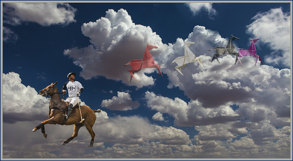
There was a famous Johnny Cash song - Ghost Riders in the Sky, but you have only one rider.How about Ghost Horses in the Sky?
I like the way you've got the jockey looking at the other horses, be they origami or not. The blue horse gets a little lost in the sky, maybe placing it against a cloud would work better. You could switch the blue and white horse.
Also the racehorse might have something more solid under him, but that depends on your concept.
Great idea, just needs a little tweaking. |
May 5th |
5 comments - 1 reply for Group 21
|
12 comments - 1 reply Total
|