|
| Group |
Round |
C/R |
Comment |
Date |
Image |
| 15 |
Apr 18 |
Comment |
George,
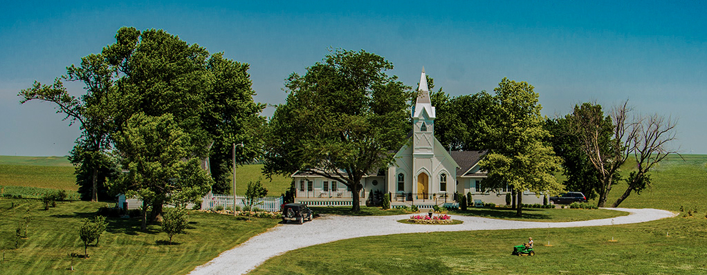
The concept of a quiet, beautiful country church is lovely. I would just crop in a bit to make the buildings stand out a bit more. |
Apr 22nd |
 |
| 15 |
Apr 18 |
Comment |
Rck,
I love your dog, as usual. The mandala is quite exciting in both forms and color. I'm not sure how well it goes with your dog, but I really like the concept. I, too, would like to know how you made the mandala. Actually, I had never heard of it until recently.
If you could give us a short tutorial that would be wonderful. |
Apr 22nd |
| 15 |
Apr 18 |
Comment |
Carmen,
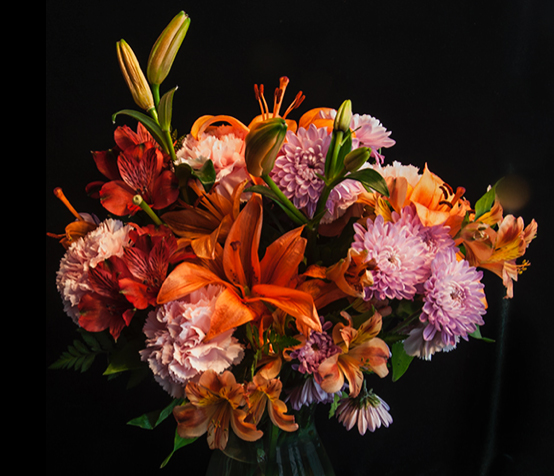
Your colors are great, but the background looks mostly black. Maybe it would be even more impressive if you would have cropped in closer to the flowers, maybe dropping the bottom of the vase. I have put in an example and I also darkened the stems on the bottom. This is just a suggestion. |
Apr 22nd |
 |
| 15 |
Apr 18 |
Comment |
Tianji,
Glad you had a chance to send something in. I like the way he fills the frame, but I do wish I could see his eyes a little better. The lighting was pretty harsh. He is certainly well-caught as a weathered, but still handsome member of the Argentinian society. |
Apr 22nd |
| 15 |
Apr 18 |
Comment |
Your concept is great. I love your angle. True, the buildings are keystoned, but bound to happen with this kind of shot. George did an excellent job of straightening the buildings, which you can do using the transform tool in PS. I'm not sure that the statue goes with the buildings, but it does look like someone contemplating how the city has grown. The lampposts don't bother me, but the small whitish object on the lower left could be cropped out. |
Apr 22nd |
5 comments - 0 replies for Group 15
|
| 21 |
Apr 18 |
Comment |
Nancy,
To tell you the truth, I prefer the original in this case as I find the orange vignette a bit too much. I still love your idea of making note cards from these lovely flowers. Flipping it does help in the composition. Nice work, Nancy. |
Apr 22nd |
| 21 |
Apr 18 |
Comment |
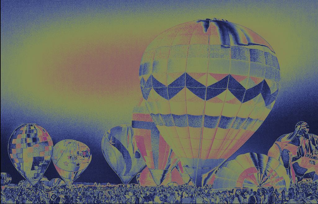
Tending to agree with the others. I would have preferred this in color. The reversal suggested by Brian, to me, works better that what you have sent us. I suspect you got lost in all of those wonderful filters and lost track of the impact. And, yes, your composition is excellent. You can try playing with it again.
I added some colors by altering all three of the red, green and blue curves in curves. Just for fun. |
Apr 22nd |
 |
| 21 |
Apr 18 |
Comment |
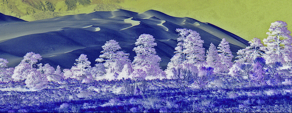
Your reversal of the trees works very well. Their feathery look is quite enchanting. I think to make it even stronger I would crop out the top third of the image bringing out eye into the blues and away from the sky. The green mountains could be cropped way in, allowing the blues to dominate the photo. |
Apr 22nd |
 |
| 21 |
Apr 18 |
Comment |
The mystery in this entry is that only the lamp has a zoomed look. The hanger remains steadfast. A simple treatment, which creates a strong image, brings a simplicity to our creative efforts. |
Apr 22nd |
| 21 |
Apr 18 |
Comment |
Marie,
I would have loved to see the original as comparison. You have done a stellar job improving this image, a lot of work. We appreciate that you have given us detailed information as to what you did. The sketchy look is quite appealing and the colors look like a real sunset. Your complete reflection in the quiet pool works well compositionally. My only suggestion would be to think about changing the green which circles the pool to a color that matches the rest of the image. You have achieved a wonderful metamorphosis. Thank you so much to our favorite applications. |
Apr 22nd |
| 21 |
Apr 18 |
Reply |
Marie,
This was a concept image. I had thought of using the clouds as pasture and found various animals that fulfilled that concept. I want it the way it is, not split up. |
Apr 11th |
5 comments - 1 reply for Group 21
|
10 comments - 1 reply Total
|