|
| Group |
Round |
C/R |
Comment |
Date |
Image |
| 15 |
Dec 17 |
Comment |
Interesting landscape. The high clouds simplify the range of our perspective. The colors are very muted, but our eyes go right to the sun, which is quite bright, the only flaw in my opinion. The faint reddish colors really help with this image.
|
Dec 30th |
| 15 |
Dec 17 |
Comment |
Rick,
This is one of your best. It works very well in both color and B & W. Although the surrounds of the two men are not directly related to them, it still helps enhance the image. The dynamics of the two fighting gives a sense of yin-yang to it which is fascinating. I hope your computer has been fixed by now and that you enjoy a wonderful new year! |
Dec 30th |
| 15 |
Dec 17 |
Comment |
Your composition is excellent. I like the leading line of the wharf. Choosing B & W is a good choice, although it would be interesting to see the original for comparison. I agree that the boat should be a bit brighter and the contrast a bit higher to get a little more oomph out of it. |
Dec 30th |
| 15 |
Dec 17 |
Comment |
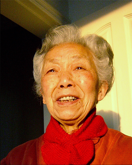
Your mother is a lovely woman and clearly, a happy one. The only change I saw you made was to crop in on her, which is a good choice. The sun is very yellow and although our eyes take that into account, maybe toning it down in ACR in the Temperature section would look more realistic. |
Dec 30th |
 |
| 15 |
Dec 17 |
Comment |
Your composition is excellent. You have cut the legs at about the right spot. The window lighting on your model is just right. I might try to darken the sky background, if possible, but all in all, a great job! |
Dec 30th |
| 15 |
Dec 17 |
Comment |
Linda,
The colors match each other so well, especially the reds and blues- brings the image together. Great contrast between the old and new. The only suggestion I have is to line up the sides using the Transform tool so the edges are really straight. It's hard to avoid keystoning when pointing the camera up. |
Dec 30th |
| 15 |
Dec 17 |
Comment |
Carmen,
I really like the b & w image. Thanks,
Joan |
Dec 22nd |
7 comments - 0 replies for Group 15
|
| 21 |
Dec 17 |
Comment |
Marie,
Welcome aboard! This certainly works for a haunted house, especially with the lightning stroke. It looks like Topaz must have had a great glow brush, as it really enhances the front of the building. I agree with the others about the placement of the lightning bolt. To me, it seems to be pushing the rays from the glow away from it, which is logical. Very nicely done.
Happy New Year! |
Dec 30th |
| 21 |
Dec 17 |
Comment |
Sweet and simple. Your iris looks like it was made for that screen, although the screen was kind of made for the iris. The colors are lovely, as is the reflection. You did a really nice job with this, Nancy. |
Dec 30th |
| 21 |
Dec 17 |
Comment |
P.S I wrote this before I saw the other comments. |
Dec 30th |
| 21 |
Dec 17 |
Comment |
Sorry to be so late with my comments. This image reminds me of a forest in winter; personally I don't see the Schindler's list comparison, but I can see where you may have come up with it. The overall is a wonderful simple expression of abstract art, which does seem to convey the forest in snow to me. Everyone may see something different in this, but it is a very strong image and makes the viewer think about it, which is what it's all about. |
Dec 30th |
| 21 |
Dec 17 |
Reply |
I was using Starry Night only as a concept. If you look at the original Van Gogh, the stars are big yellow areas with short circular strokes around them. My original idea was to emulate those stars and that is why there are so many. Maybe I should have put in the moon! |
Dec 10th |
| 21 |
Dec 17 |
Comment |
Although I didn't mind the shoe last time, I think it is better without it because the shoe was very predominant in the photo. Maybe if it had been less opaque, it would have worked better. It's a lovely image that you have made here. |
Dec 6th |
5 comments - 1 reply for Group 21
|
12 comments - 1 reply Total
|