|
| Group |
Round |
C/R |
Comment |
Date |
Image |
| 11 |
Jan 18 |
Comment |
I was browsing the various Digital Dialogues when I came across your image, Maria! I love it! But I noticed that you were not happy with the tones. I hope you don't mind but I tried using a curves adjustment layer on it to bring in some of the darker hues. (I didn't want to make it too dark.) But that accentuated that the perspective was off a bit - something I hadn't noticed before so I changed the perspective with the transform tool in Photoshop. Might this be more pleasing to you? I still like your version better though!
- Marie Altenburg, DD21 |
Jan 9th |
 |
1 comment - 0 replies for Group 11
|
| 21 |
Jan 18 |
Reply |
I'll have to give that a try, Carol! Thanks! |
Jan 27th |
| 21 |
Jan 18 |
Reply |
I tied flipping it, John, so that it would be looking from left to right but somehow it just didn't look quite right to me. I also have this bird on a blue textured background hoping it would resemble the sky but again, I didn't care for it as much. Maybe it was just the wrong type of texture. Thanks for the suggestions though! |
Jan 27th |
| 21 |
Jan 18 |
Reply |
Thanks so much, Joan! |
Jan 23rd |
| 21 |
Jan 18 |
Reply |
Thanks, Alan! |
Jan 23rd |
| 21 |
Jan 18 |
Comment |
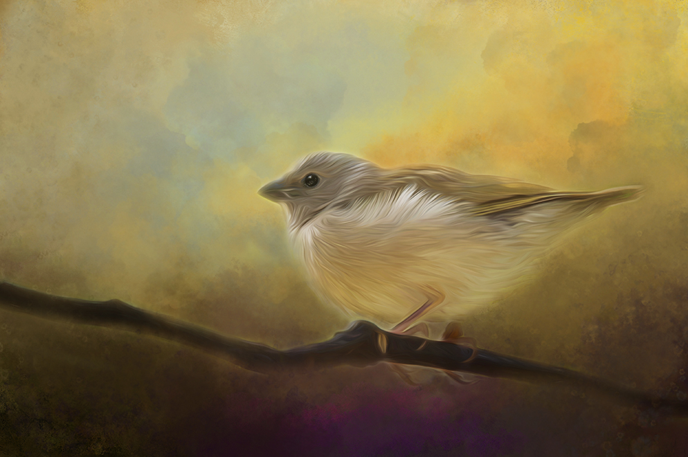
Your image is lovely, Nancy! The bird is beautifully captured and composed, and the texture is distinctive. I tend to agree with Brian that the white border was distracting so I tried changing the white border to a deeper tone of the beiges in your background but wasn't happy with the result I got. I think I'd try using the vignette you have but at a lower opacity. That way you'd still have the attractive shape of that vignette but it might be less of a distraction from the beautiful image you've created. |
Jan 16th |
| 21 |
Jan 18 |
Reply |
Thanks so much, Bryan. This was my first attempt at a new technique in using a texture. I'm glad you like it. |
Jan 14th |
| 21 |
Jan 18 |
Comment |
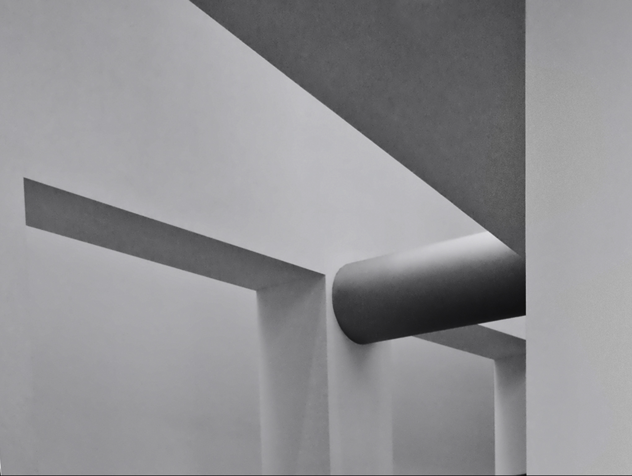
Alan, creating a room like yours has been on my bucket list for quite some time. The perspective and shading are beautiful. I can't help wishing though that the subject of this image were simpler and more easily understood. The images on the wall and the apple near the bottom of the image seem to distract me and without your explanation, I would have no idea what the purpose of the chess pieces were. I'd love to see a step-by-step process on how you created the room though. That's what I would love to do myself and could use your expertise with that. |
Jan 13th |
| 21 |
Jan 18 |
Comment |
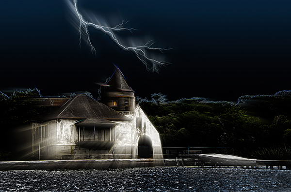
John, you've transformed a normal farm scene into something quite mysterious. I can't help wondering what is lurking inside the barn where that white light is glowing. The only area I'd like to see changed is the sky. It looks like it was "placed into" the scene with the tops of the trees glowing with the light tones of the original sky. I've found that changing skies can be difficult to do if the range of colors or shading is extremely different from the original. I applaud your efforts though. I like your idea. |
Jan 13th |
| 21 |
Jan 18 |
Comment |
Barry, your image has me wondering what the woman is looking at. Might this be Eve looking for that infamous apple in the Garden of Eden? Or is it one of those "Find the Hidden Object" pictures we played with as kids where a shape is hidden somewhere in the image. But it's a very interesting image and I admire what you've done. The only suggestion I'd make might be to change the colors or at least the shading of them so they seem more subtle. As it is now, the colors seem to take dominance over the scene itself. Then again, that might be adding to my sense of wonderment about the woman in the picture. I like it! |
Jan 13th |
| 21 |
Jan 18 |
Comment |
Brian, you've created an image that gives the viewer "food for thought". I've never had luck with the plastic wrap filter myself but the way you've used it here is ingenious! The colors and the composition are excellent. I love what you've created! |
Jan 13th |
| 21 |
Jan 18 |
Comment |
Joan, I love the sculpture and the spheres and find that your method of creating them is awesome! I also like the fact that you have three different sizes and the shading around the edges of the image seems to tie it all together. But there's something about the placement of the sculpture and the spheres that I find distracting and I'm not sure what I would suggest to remedy that. I wonder if you could use the sculpture as a background and fill the entire space with it. Then add the three spheres stacked one behind the other in a diagonal angle. I think that would accentuate the repeated shapes and keep your eye focused on the image. Just a suggestion! |
Jan 13th |
6 comments - 5 replies for Group 21
|
| 41 |
Jan 18 |
Comment |
I love this image, Carol! The texture of the fur is beautiful, and the way it extends past the frame - an out-of-box technique - adds to the uniqueness of the image. Great work!
- Marie, DD 21 |
Jan 23rd |
| 41 |
Jan 18 |
Comment |
I like your final image, Charles, but I'm blown away by your original image #3. I love that and hope you might enter that one into a mono competition. It's very creative, too! |
Jan 9th |
| 41 |
Jan 18 |
Comment |
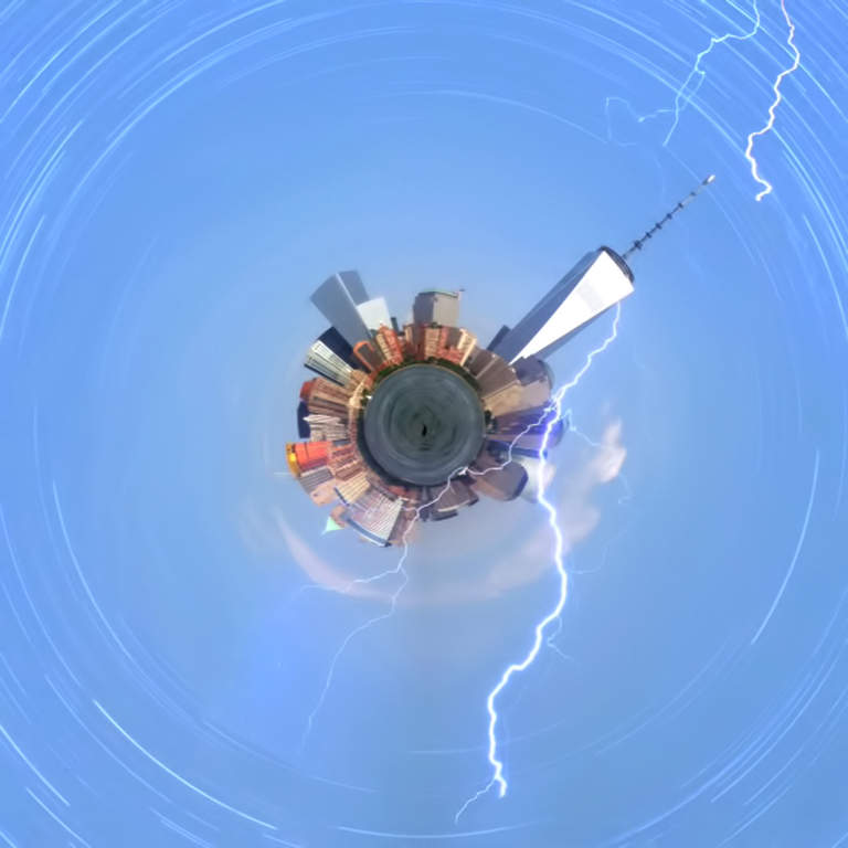
This is very creative, Lisa! I like what you've done. It's not the simple polar coordinates image that most of us have tried. You've added another dimension to it by your selective use of duplicated images.
- Marie Altenburg, DD21 |
Jan 9th |
3 comments - 0 replies for Group 41
|
| 56 |
Jan 18 |
Comment |
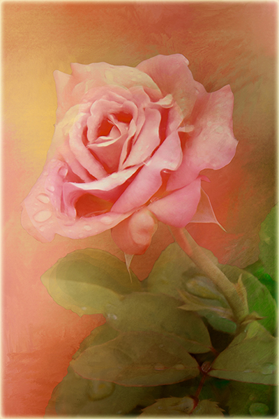
Your image is beautiful, Nancy, and the addition of the butterflies was clever and resulted in an exceptional image.
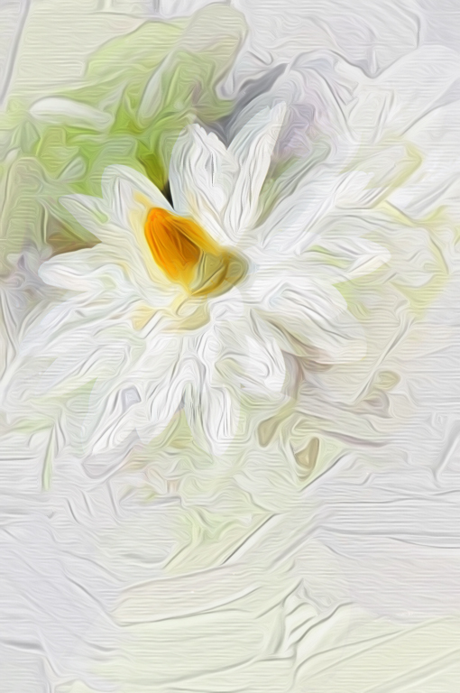
You mentioned different painting programs. I recently downloaded Topaz Studio and I absolutely love it. it's free for the basic presets and if you already own any Topaz products, they are incorporated free of charge. You might want to give it a try if you haven't already done so. I now try it on almost every photo I process when I want to give it an artsy look.
- Marie Altenburg, DD 21 |
Jan 23rd |
1 comment - 0 replies for Group 56
|
11 comments - 5 replies Total
|