|
| Group |
Round |
C/R |
Comment |
Date |
Image |
| 24 |
Oct 17 |
Comment |
Thanks for your suggestions, Alan, as well as all who have offered suggestions. Your comments are appreciated and I am anxious to try them all. |
Oct 20th |
| 24 |
Oct 17 |
Comment |
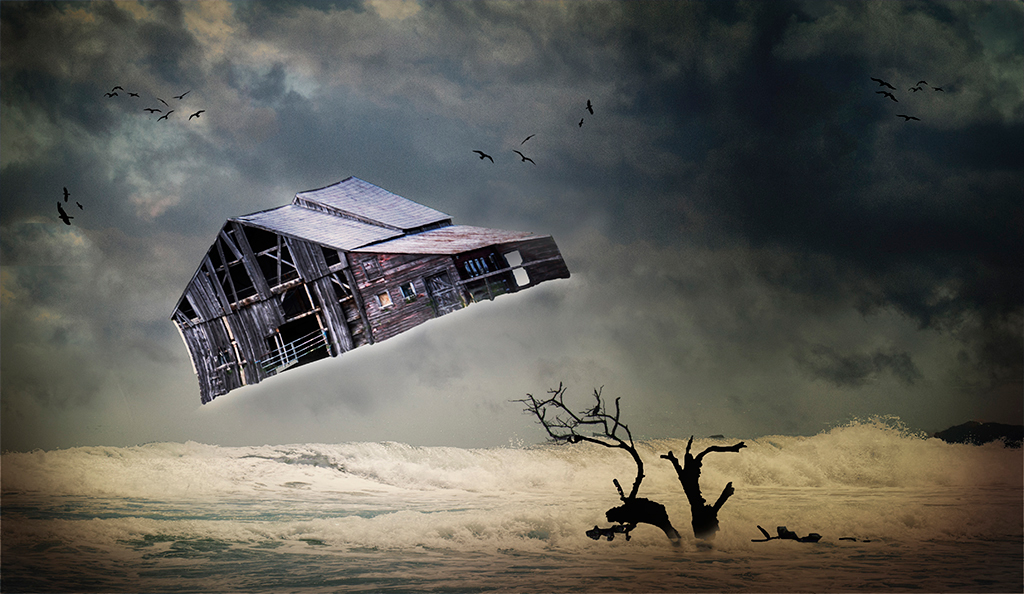
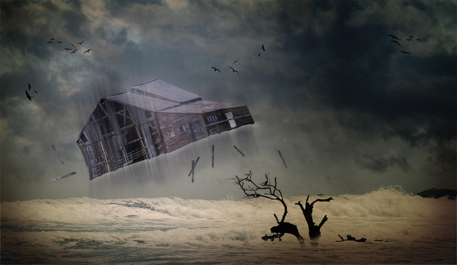
Yes, Ian. We had just escaped the wrath of Hurricane Irma here in Florida although other parts of the state were not as fortunate. So working on this photo was time-appropriate for me, too.
I can try eliminating the birds and adding leaves but adding branches had been very difficult when I tried it in the first go-round. I hope all the effort will be worth it. |
Oct 18th |
| 24 |
Oct 17 |
Comment |
Ian, just for clarification, the double lines I was referring to are the 2 lines that are actually part of the original photo's background. I think it's part of the wall. |
Oct 18th |
| 24 |
Oct 17 |
Comment |
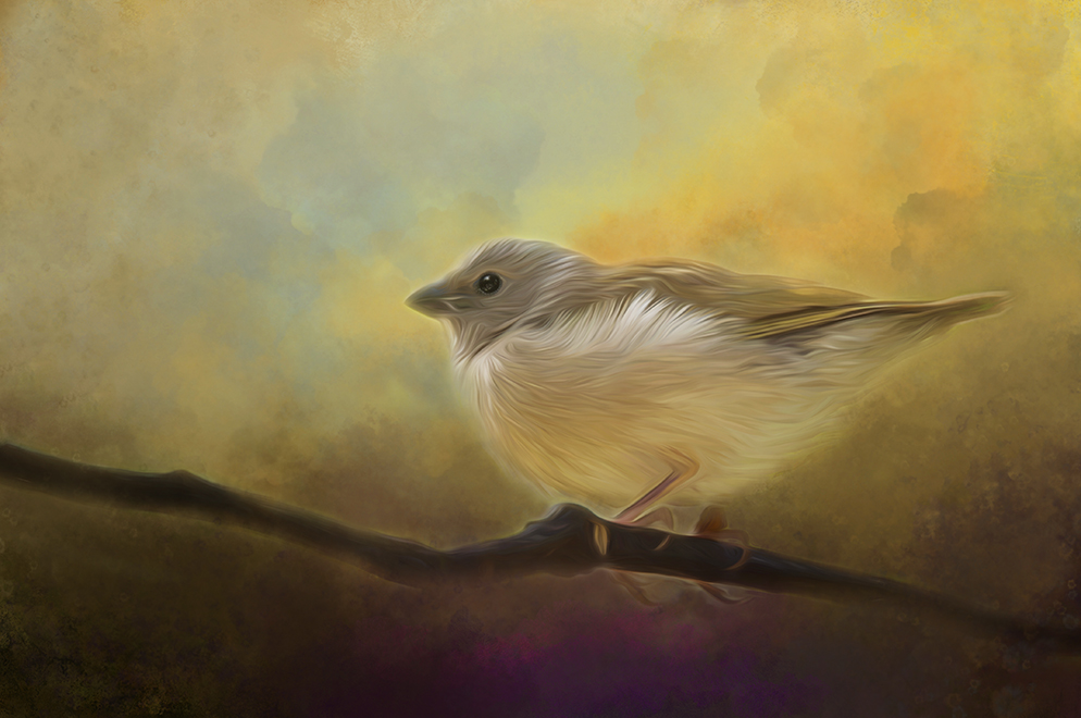
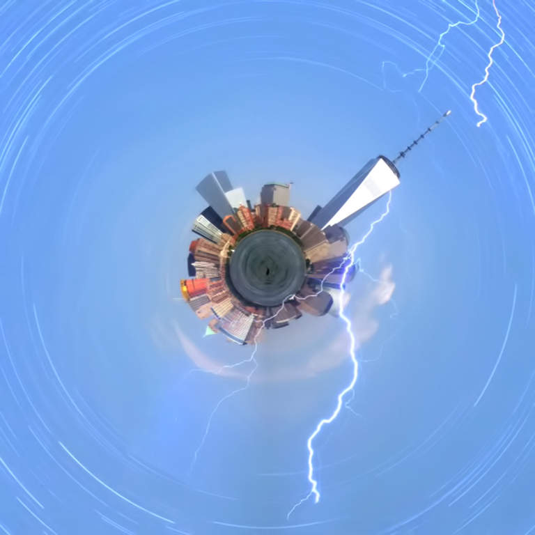
Very creative, Tom! I like your imagination. I wish the foreground planet was sharper although I don't mind the blurriness of the background objects. I also like the 4-point star effect you added. BTW, my N.Y camera club recently took a field trip to the Custer Observatory on Long Island where they photographed the Milky Way in the evening sky. Your image reminds me of what they may have seen. LOL |
Oct 17th |
| 24 |
Oct 17 |
Comment |
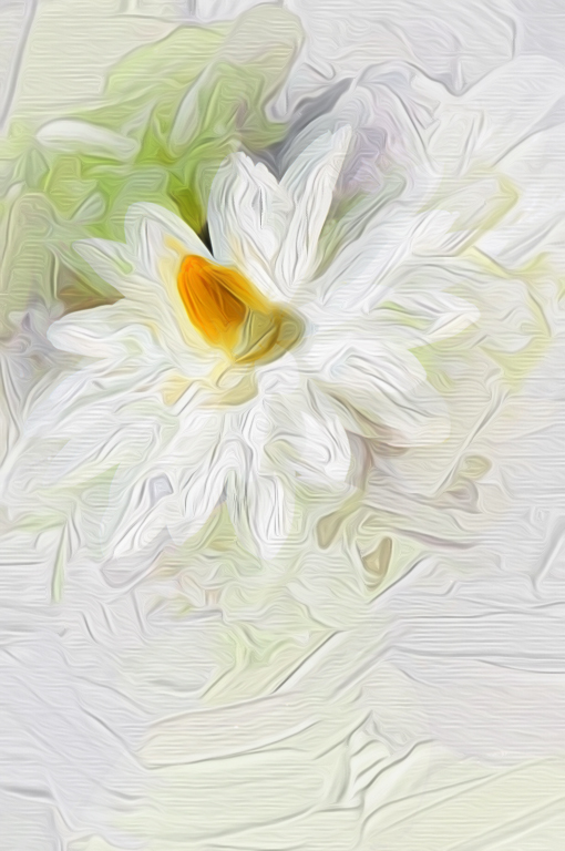
Hi, Judith. Your photo is very attractive. Like Jerry, I'm not sure what you did to process the image to make it creative. But even as is, I think I'd crop the bottom third of the photo so that the viewer's eye would go to the interaction of the boys. |
Oct 17th |
| 24 |
Oct 17 |
Comment |
This is a very nice graphic, Jerry. I think I'd prefer it without the change of colors, though. I think I'd try Nik's Viveza to add some realistic texture to the metal via the Structure slider. You have a very creative mind. I never would have thought of doing what you did! |
Oct 17th |
| 24 |
Oct 17 |
Comment |
I like your image very much, Ian. I agree with Jerry that the elimination of the double lines between the heads. The pink layer doesn't bother me though although I wish the top layer weren't so green - at least it looks green on my monitor. I really do like this image, Ian. It's very creative! |
Oct 17th |
| 24 |
Oct 17 |
Comment |
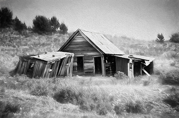
The idea of adding a motion blur to the barn got my creative juices flowing. And adding the flying boards was not as difficult as I had anticipated. I think those suggestions improved the image but I'm not sure it's quite there yet. Any additional comments are always appreciated. Thanks again! |
Oct 17th |
 |
8 comments - 0 replies for Group 24
|
| 34 |
Oct 17 |
Comment |
Really! How did I miss that! I guess I was too busy taking pictures if and through the arches on the upper level, and the church next door. Maybe it's time for me to look through those photos again! Thanks for the inspiration, Candy. |
Oct 20th |
| 34 |
Oct 17 |
Comment |
Your photo is beautiful, Candy! I visted Budapest earlier this year and loved it. Was this the interior of the Parliament building? I photographed the exterior but not the interior of that one. Your photo makes me want to go back! |
Oct 20th |
2 comments - 0 replies for Group 34
|
| 48 |
Oct 17 |
Comment |
Like the others in your group, I like this image, Bev. As for the skin tones, you might want to try selecting the skin areas and applying a color filter in PS using a pinkish tone. I'm not certain it would work but it might be an easy fix. |
Oct 20th |
1 comment - 0 replies for Group 48
|
11 comments - 0 replies Total
|