|
| Group |
Round |
C/R |
Comment |
Date |
Image |
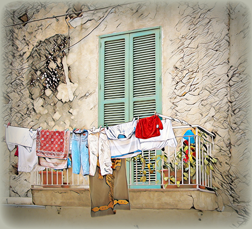
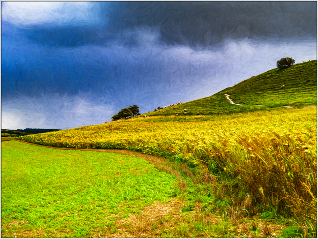
| 5 |
Aug 19 |
Comment |
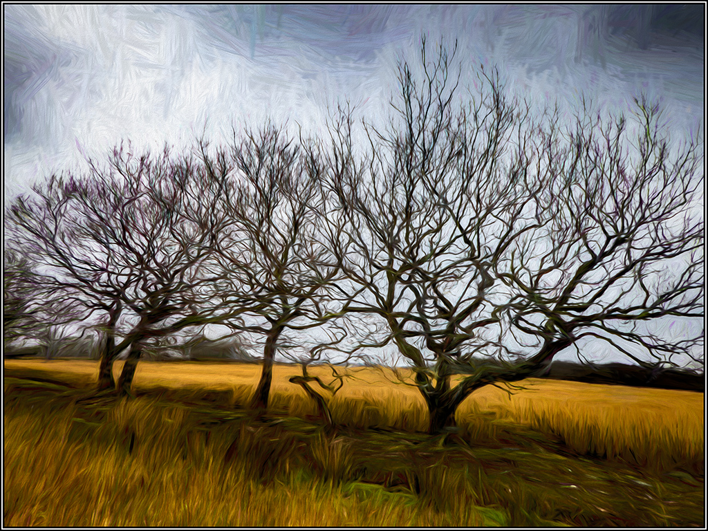
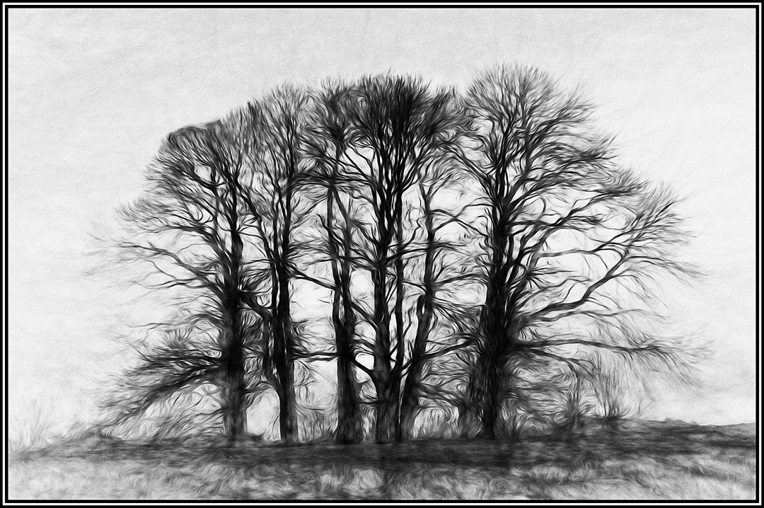
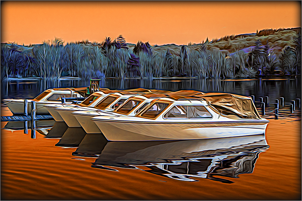
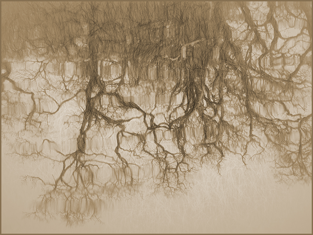
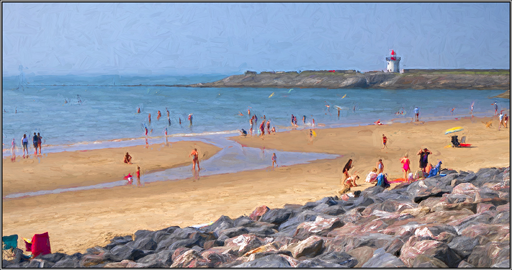
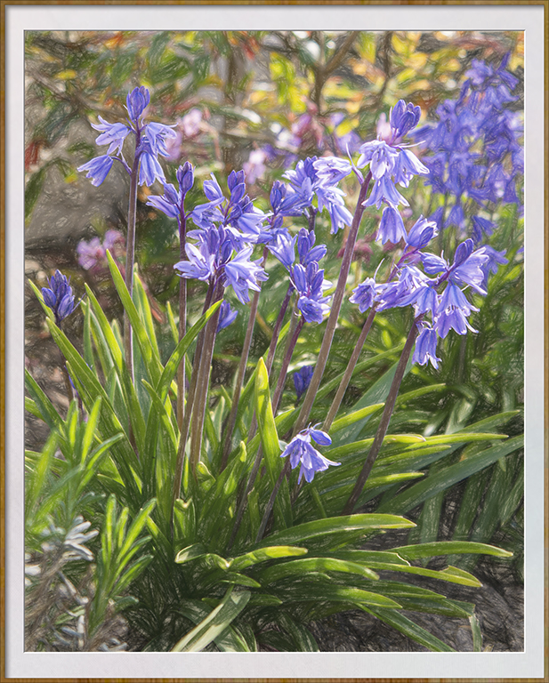
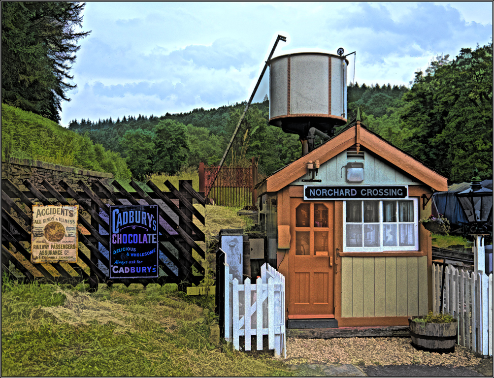
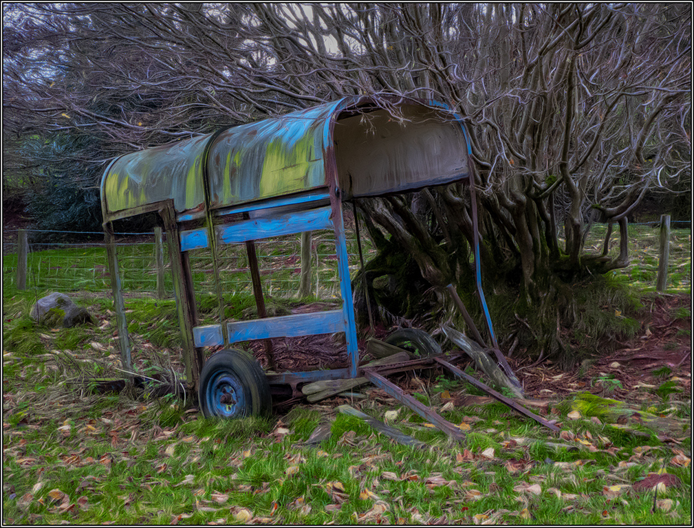
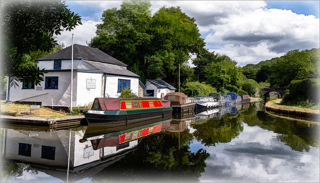
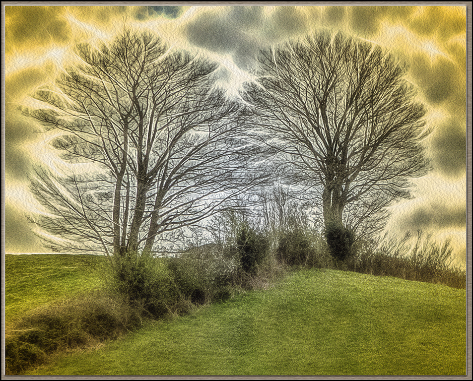
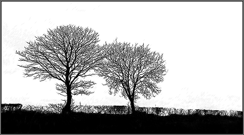
A pleasing 'scenic' as you describe it. Certainly a tree to snap and your phone obviously did a good job. The swans are a useful addition but I think Mark has the right idea in cloning out those distracting items under the tree. This is the type of image with which I would be tempted to develop futher by using the Oil paint option in PS. |
Aug 17th |
1 comment - 0 replies for Group 5
|
| 18 |
Aug 19 |
Comment |
Your version works well too - back to the drawing(key) board! |
Aug 28th |
| 18 |
Aug 19 |
Reply |
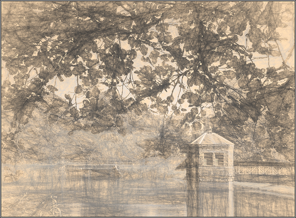
Just tried a mono version. Used Nik Black and White choosing the fine art preset and tweakig and using the selenium tone effect. I quite like it. Thanks for prompting me to do a little more work. But what do you think?? |
Aug 28th |
 |
| 18 |
Aug 19 |
Reply |
Now that's an idea I might try. |
Aug 26th |
| 18 |
Aug 19 |
Reply |
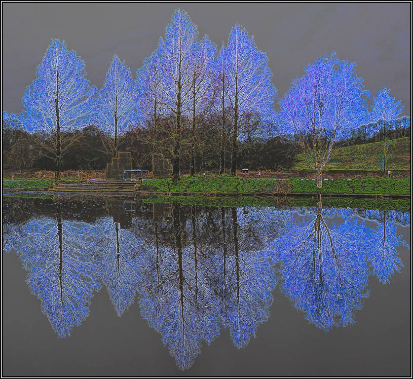
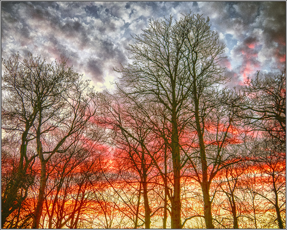
There is another Topaz pre set which offers blue options but I tried them and for me they did not have the same impact as the golden colours. At the end of the day it's all a matter of personal choice. |
Aug 26th |
| 18 |
Aug 19 |
Reply |
Thanks Jerry - just downloaded version 2 and will investigate further.
Now to take a peek at your contributions this month. |
Aug 17th |
| 18 |
Aug 19 |
Comment |
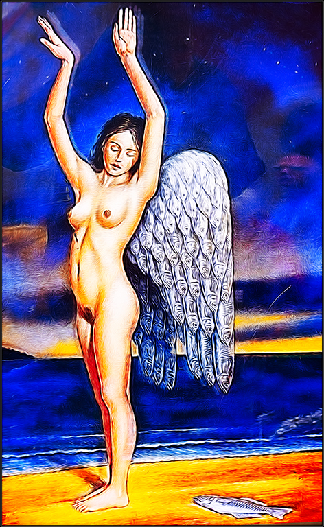
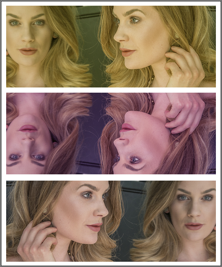
You certainy deserve bonus points for arising so early in the morning Kerstin. But you do loose some for missing that wonky horizon which was the first thing to catch my eye. The soft colours suit the subject but as Mike mention the fairy needs to be smaller so that there is some added depth to the image. |
Aug 11th |
| 18 |
Aug 19 |
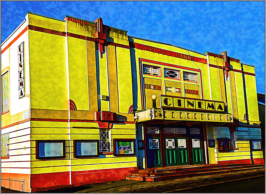
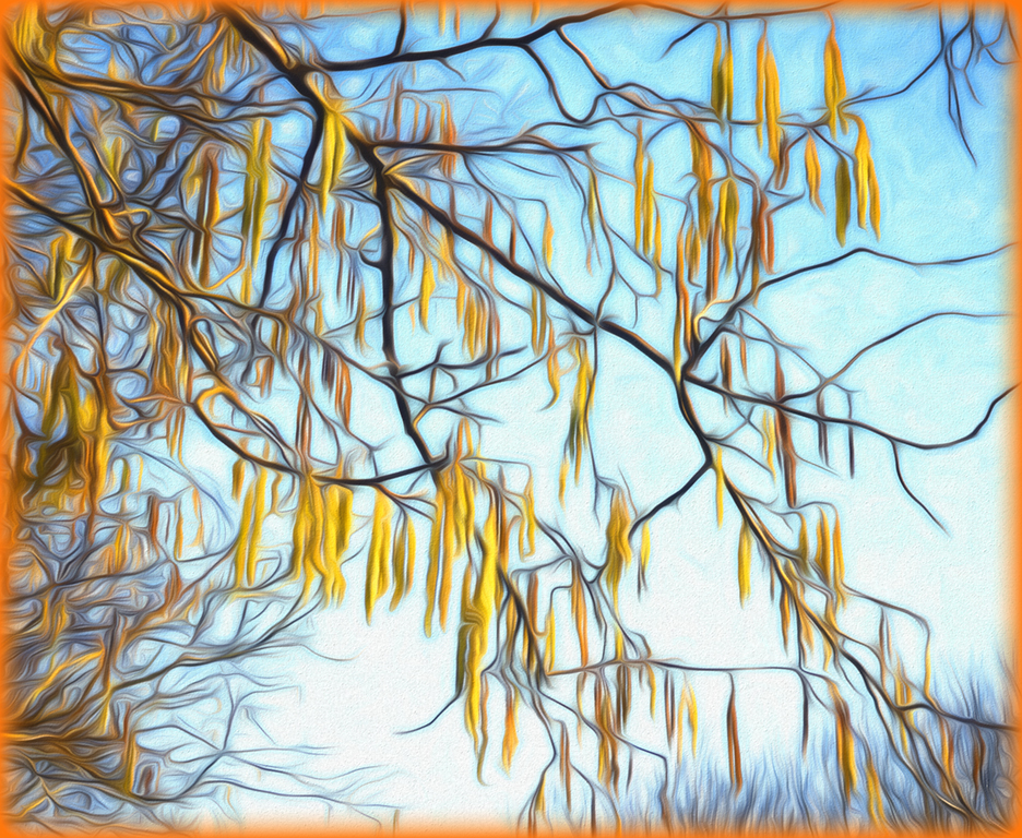
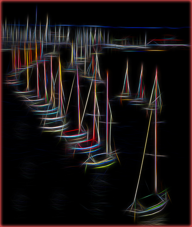
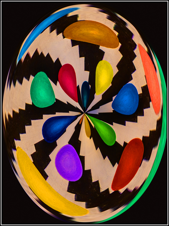
Comment |
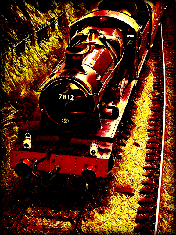
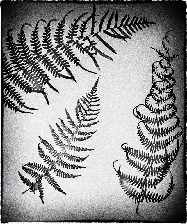
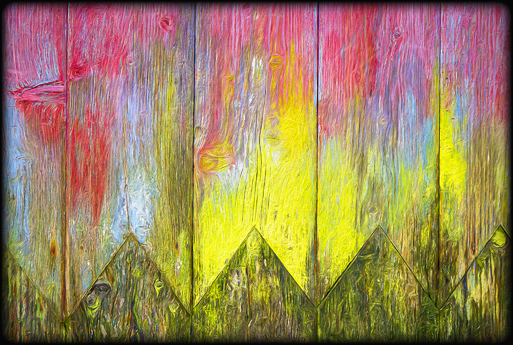
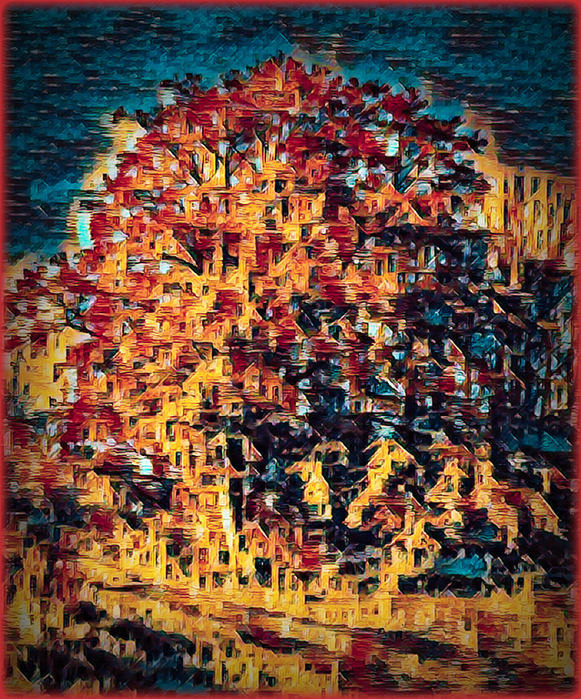
Well that does hit you in the face!! I do find it rather to busy for my taste and prefer your version two where the leaf shapes are still just visible. With this type of image you should consider using a coloured border to compliment you artistic intent. |
Aug 11th |
| 18 |
Aug 19 |
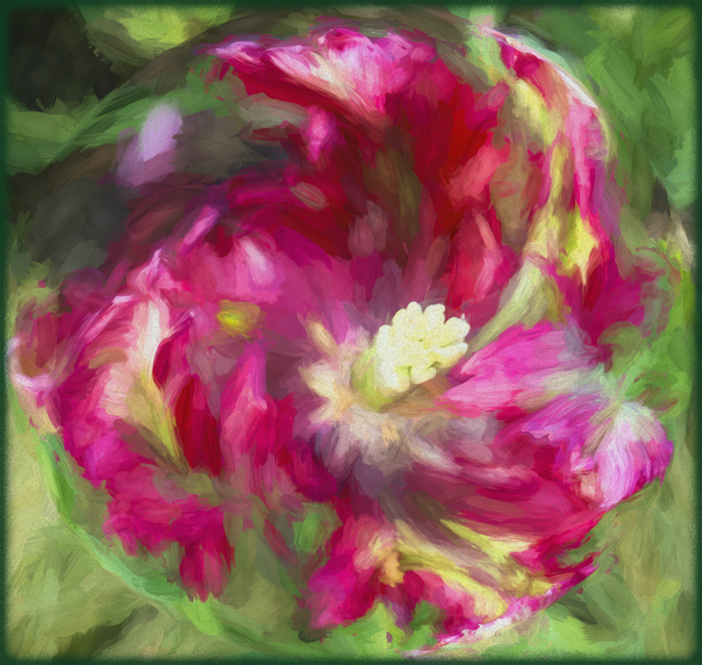
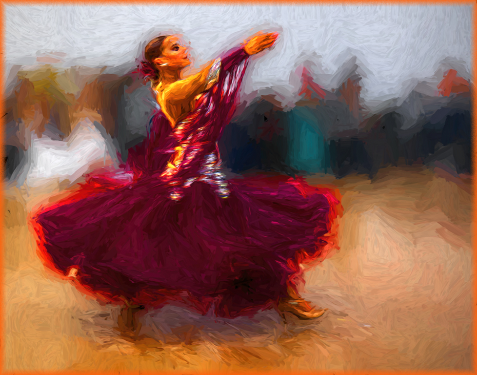
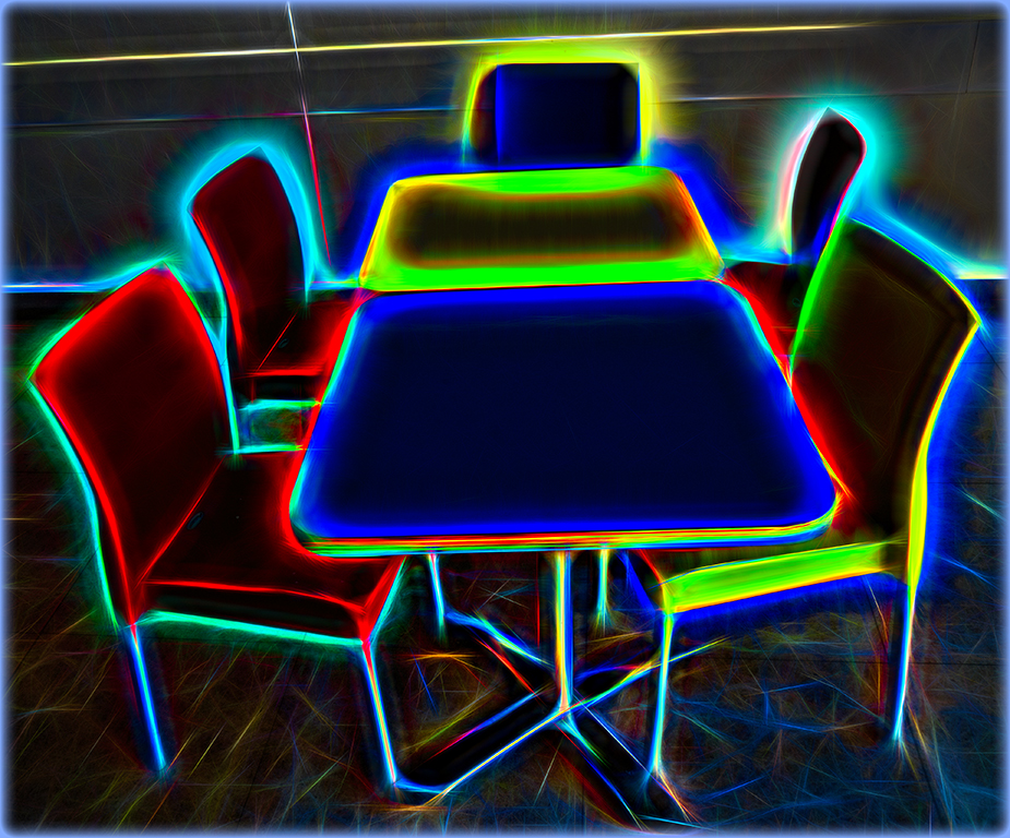
Comment |
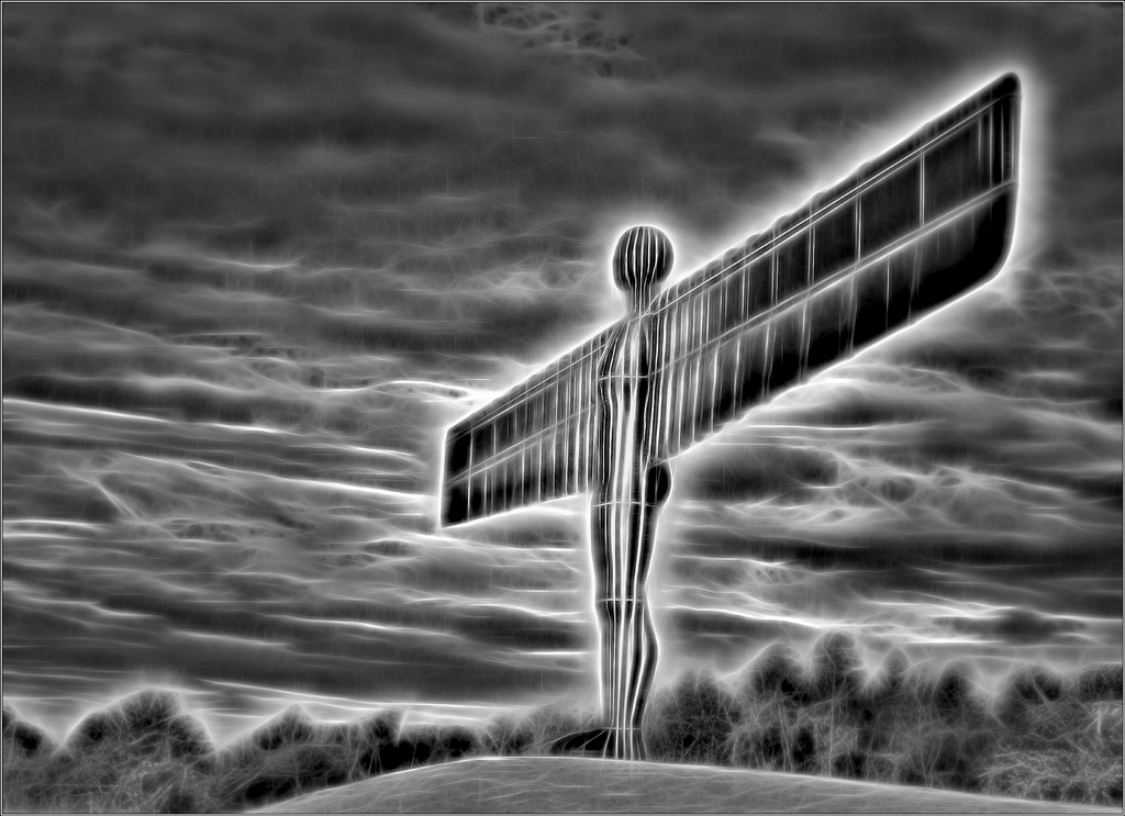
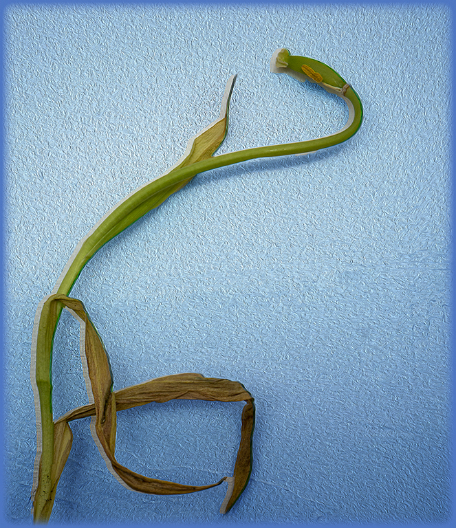
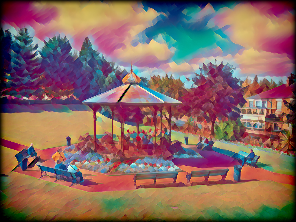
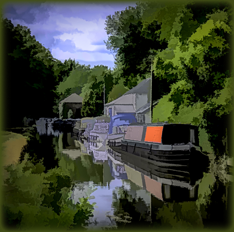
Agree with Mike about the rotation - in landscape format it rests easy on the eye. I would add a little sharpness but would not wish to crop it - it is those additional elements that, for me, add interest to the shot. There would be endless possibilites to create alternatives by playing with hue/saturation which might produce exciting results. |
Aug 11th |
| 18 |
Aug 19 |
Comment |
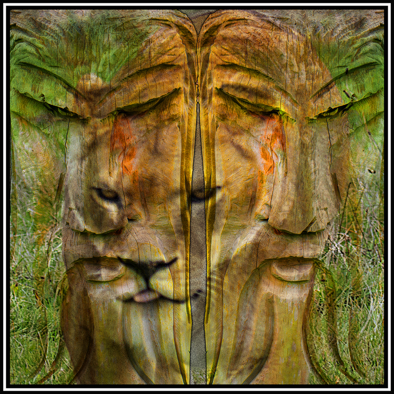
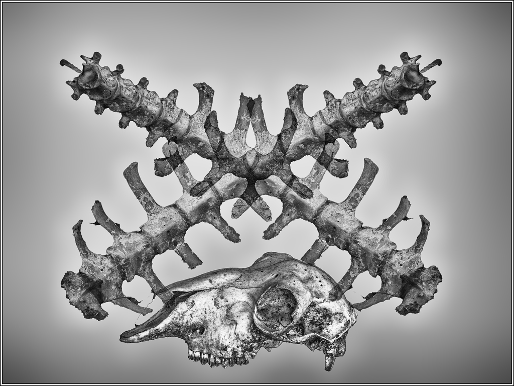
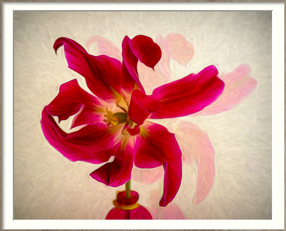
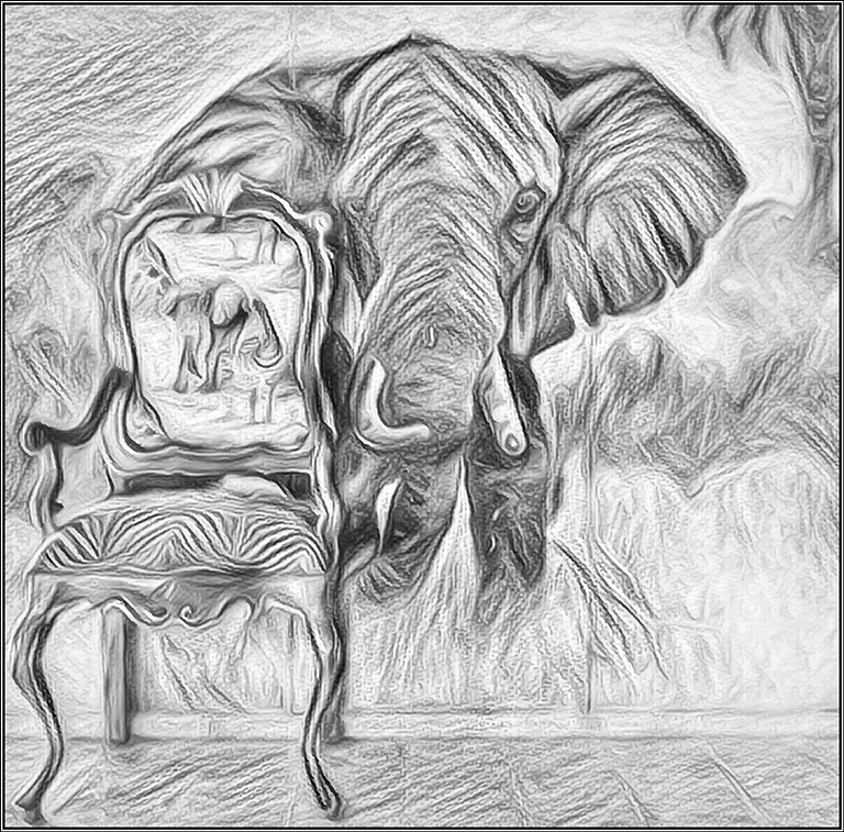
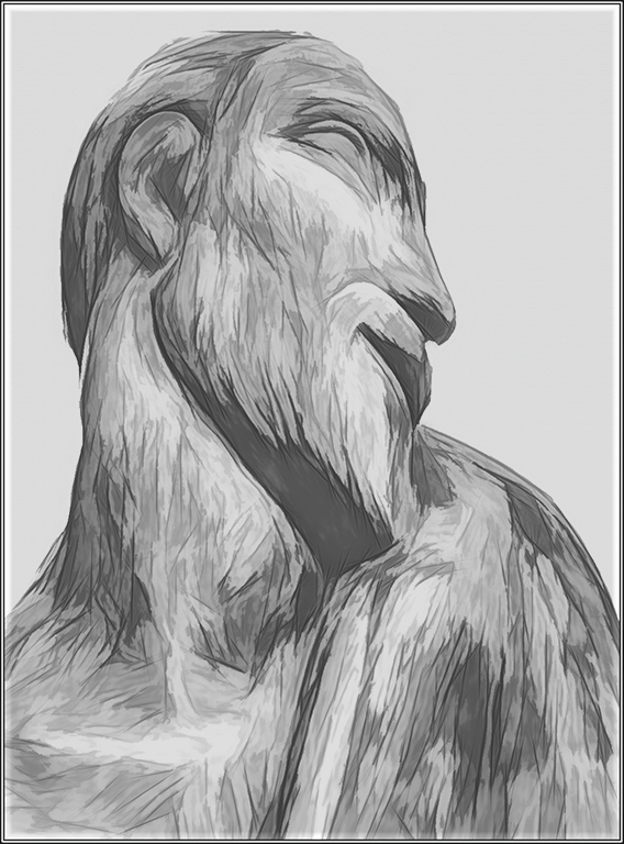
Mike you are a master with the Da Vinci technique. I really like this image. The only thing that bothers me is the greenish tinge on the belly of the deer which clashes a little with you colour pallet. |
Aug 11th |
| 18 |
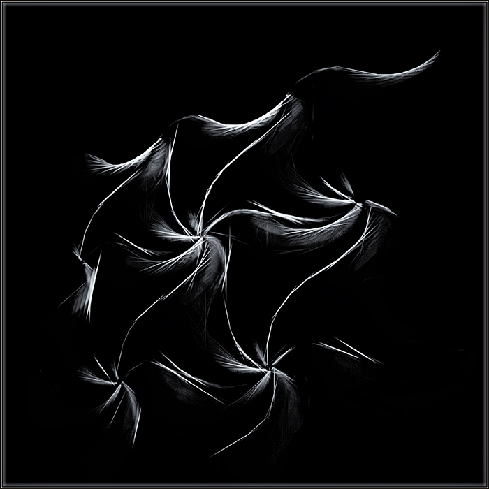
Aug 19 |
Comment |
Isn't it amazing what we are able too see in natural history shots. Adding the eyes was the master touch. |
Aug 11th |
| 18 |
Aug 19 |
Reply |
Thanks for looking at Group 18 and sharing your comments with us.
Not sure about having a strucural eye! I just find it is all about continual experimentation with the software tools that are available to us. I had several versions before settling on this one. |
Aug 11th |
| 18 |
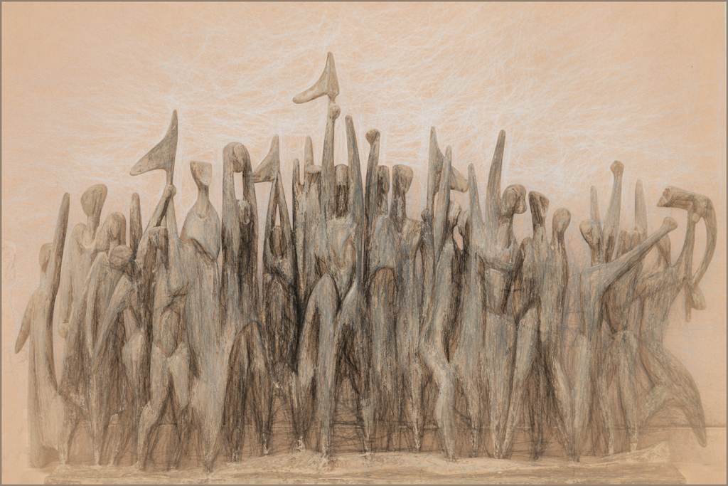
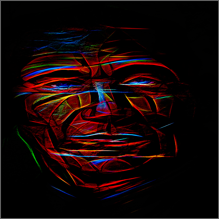
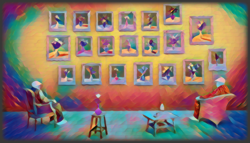
Aug 19 |
Comment |
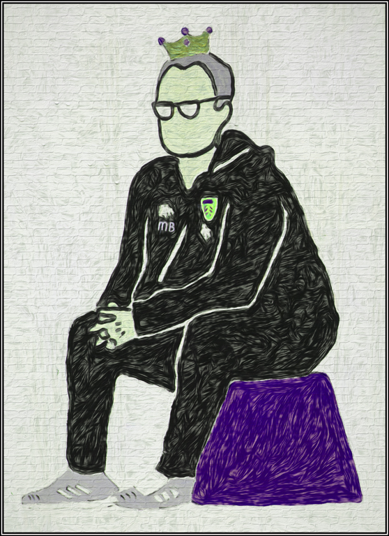
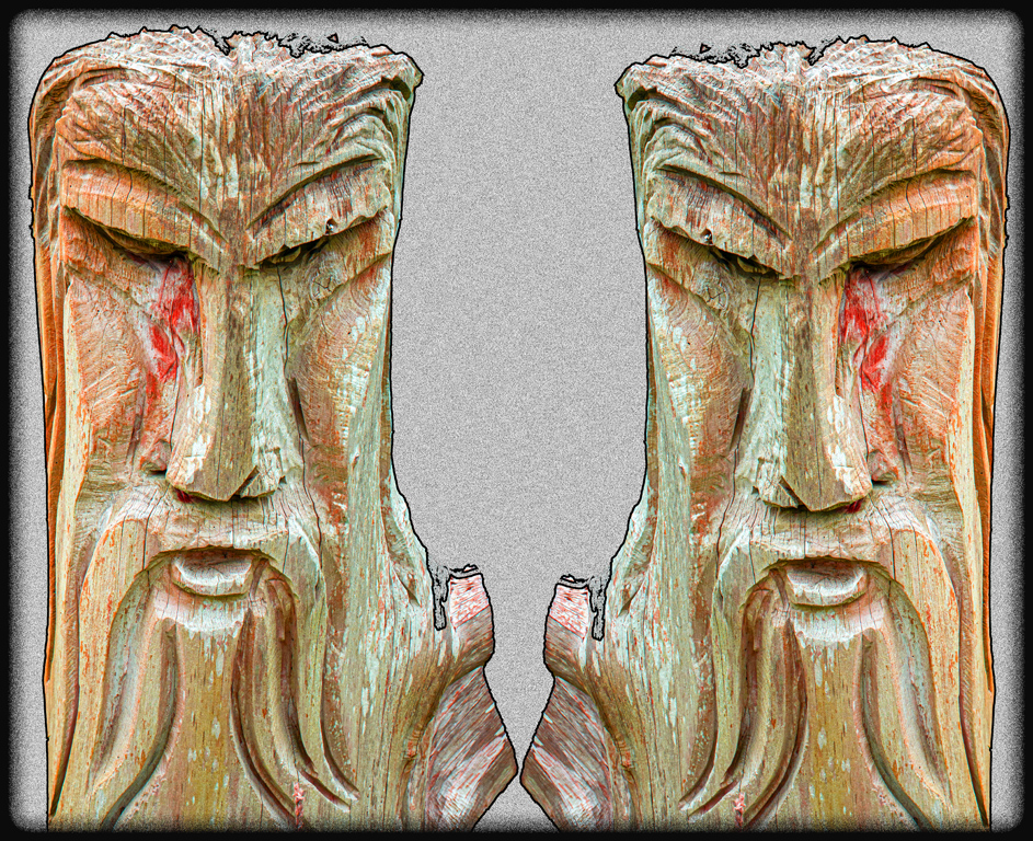
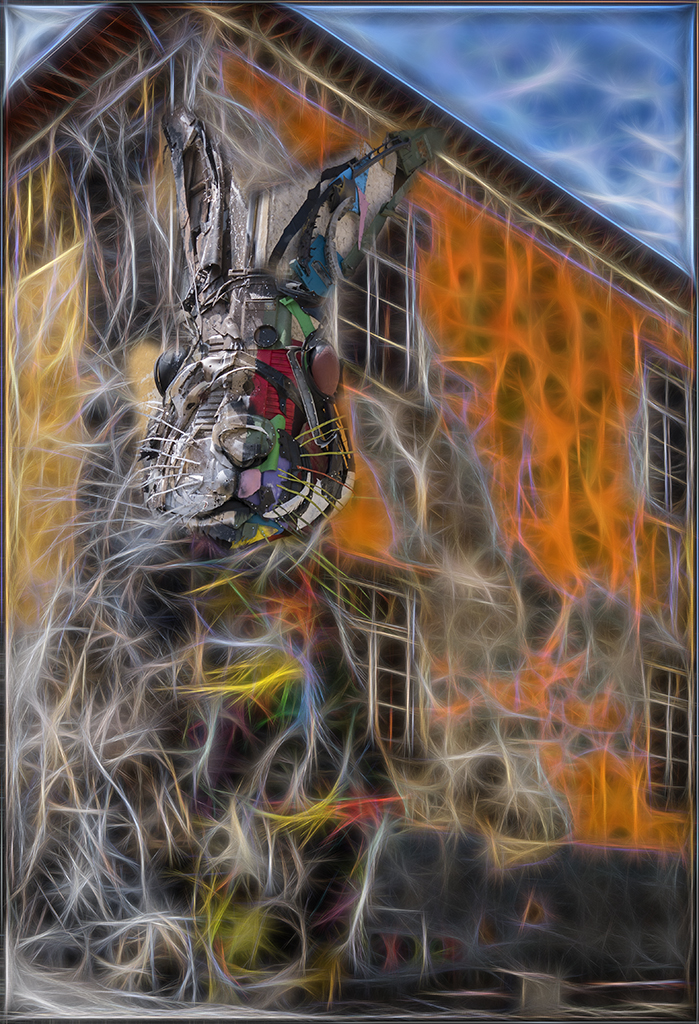
I have just looked at your previous version Andrew. It contained just flashes of colour and a very busy background.
I post it below for those who may not have seen it.
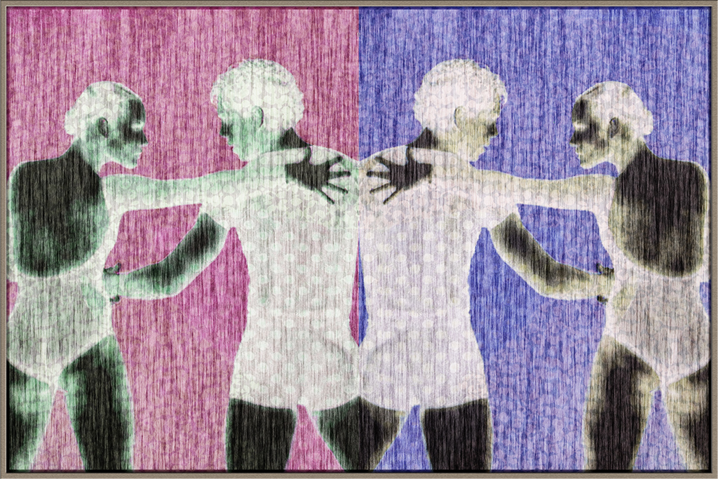
I feel that this mono version works much better because of the background is less intrusive despite the tree Alison mentions. Perhaps it needs a tweak or two and I would suggest brightening the two upper ghouls as the appear rather muddy. |
Aug 11th |
 |
| 18 |
Aug 19 |
Reply |
Angela, there is so much in Topaz not just the presets themselves but the options available to tweak the settings. Some results come almost by accident others by trial and error. I'm still experimenting and I encourage you to do so and you will soon find a few favourite pre sets to tweak. |
Aug 3rd |
7 comments - 6 replies for Group 18
|
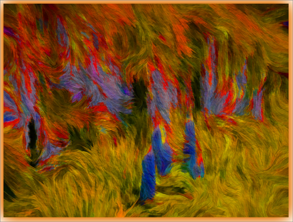
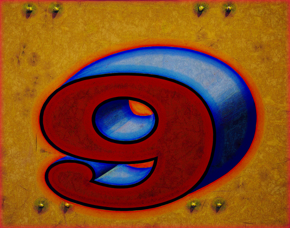
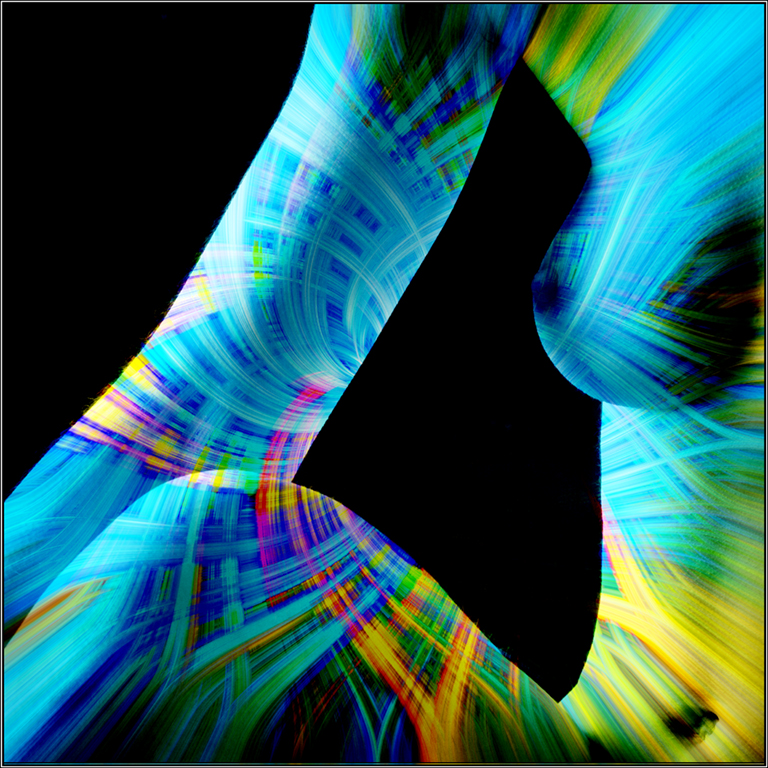
| 20 |
Aug 19 |
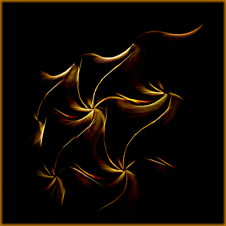
Comment |
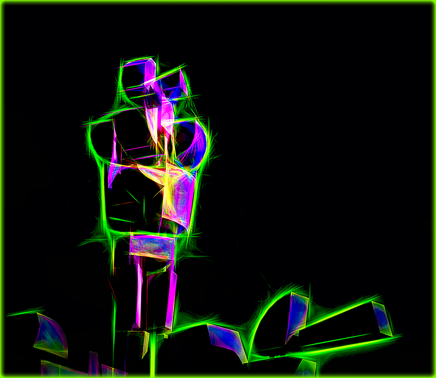
This is a really great image and very much to my taste. It could easily be taken for the work of a talented young child - no offence ment!
I fully endorse you comments about abstract images and your statement 'it's what you see'.
Keep up the good work. |
Aug 17th |
1 comment - 0 replies for Group 20
|
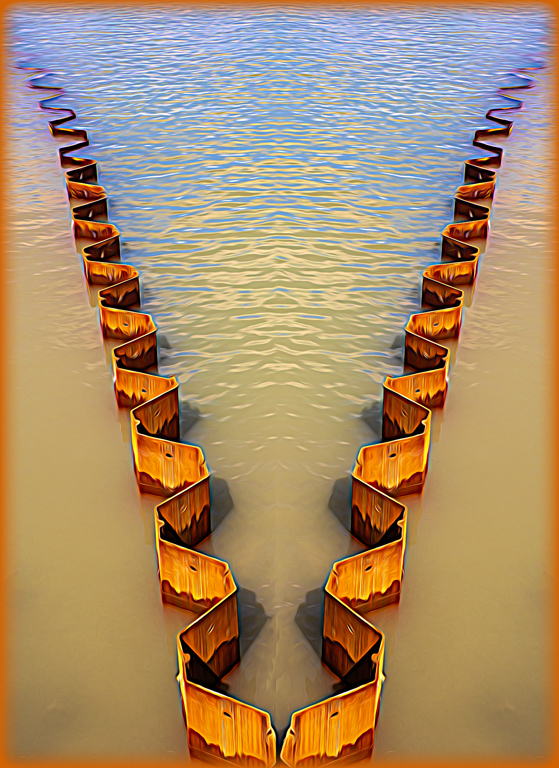
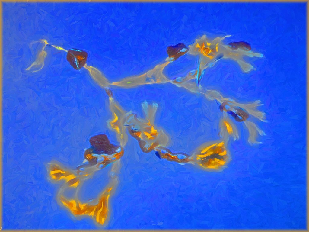
| 54 |
Aug 19 |
Comment |
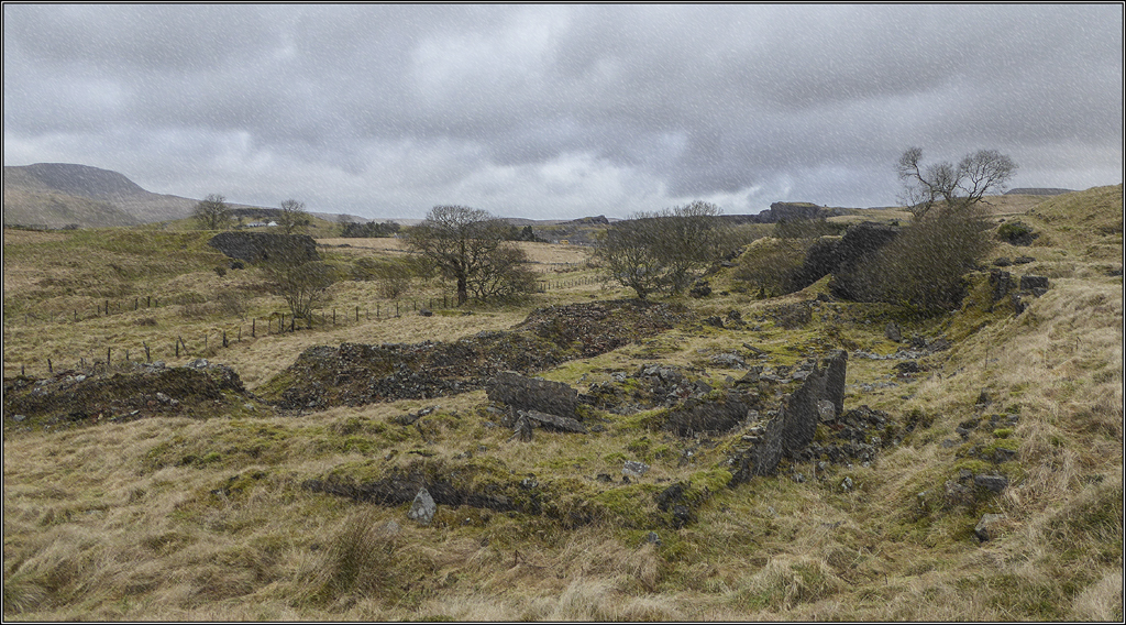
I thik Arvo is correct with his suggestion of cropping out the people especially because there is a distracting halo under their shoes. Without them and the image squared up you have a great result. |
Aug 17th |
1 comment - 0 replies for Group 54
|
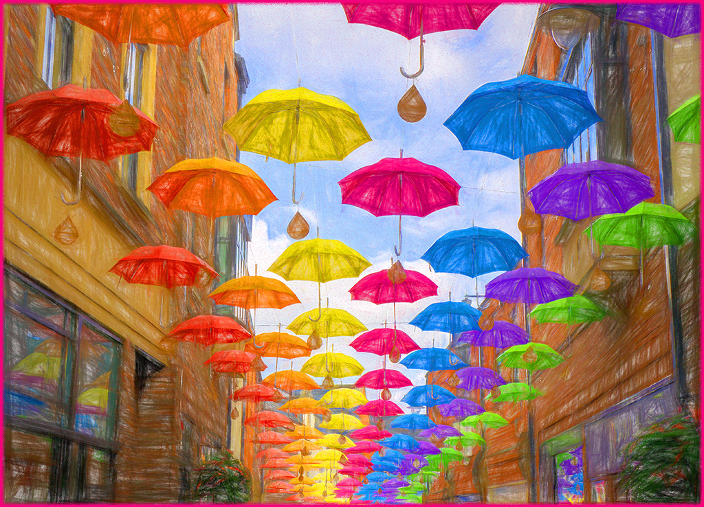
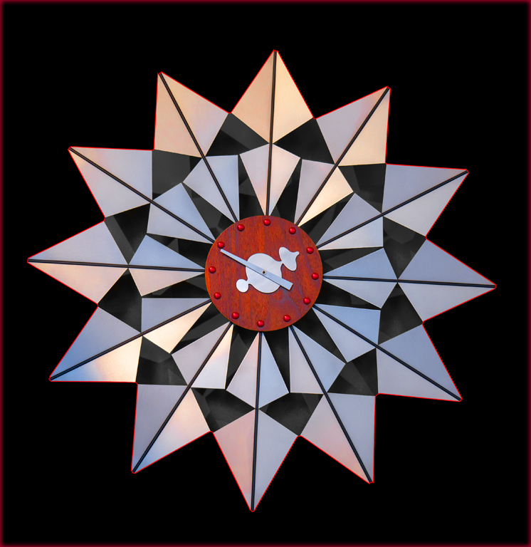
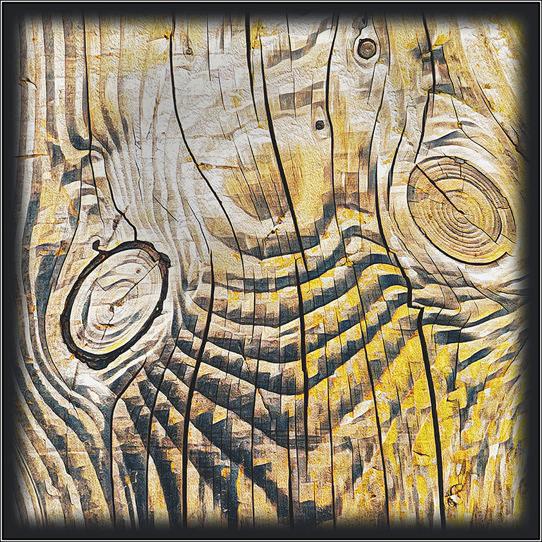
| 64 |
Aug 19 |
Comment |
You have taken a pleasing colour shot and created an marvellous piece of art. All your work with the edits has paid off and I wouldn't change a thing. |
Aug 17th |
1 comment - 0 replies for Group 64
|
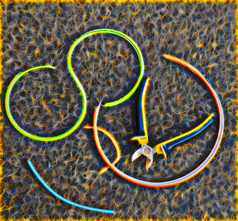
| 81 |
Aug 19 |
Comment |
Angela, thanks for reminding us that our image making is fun.
Great idea from everyday items and great imagination in the first place. |
Aug 17th |
1 comment - 0 replies for Group 81
|
12 comments - 6 replies Total
|