|
| Group |
Round |
C/R |
Comment |
Date |
Image |
| 23 |
Apr 17 |
Reply |
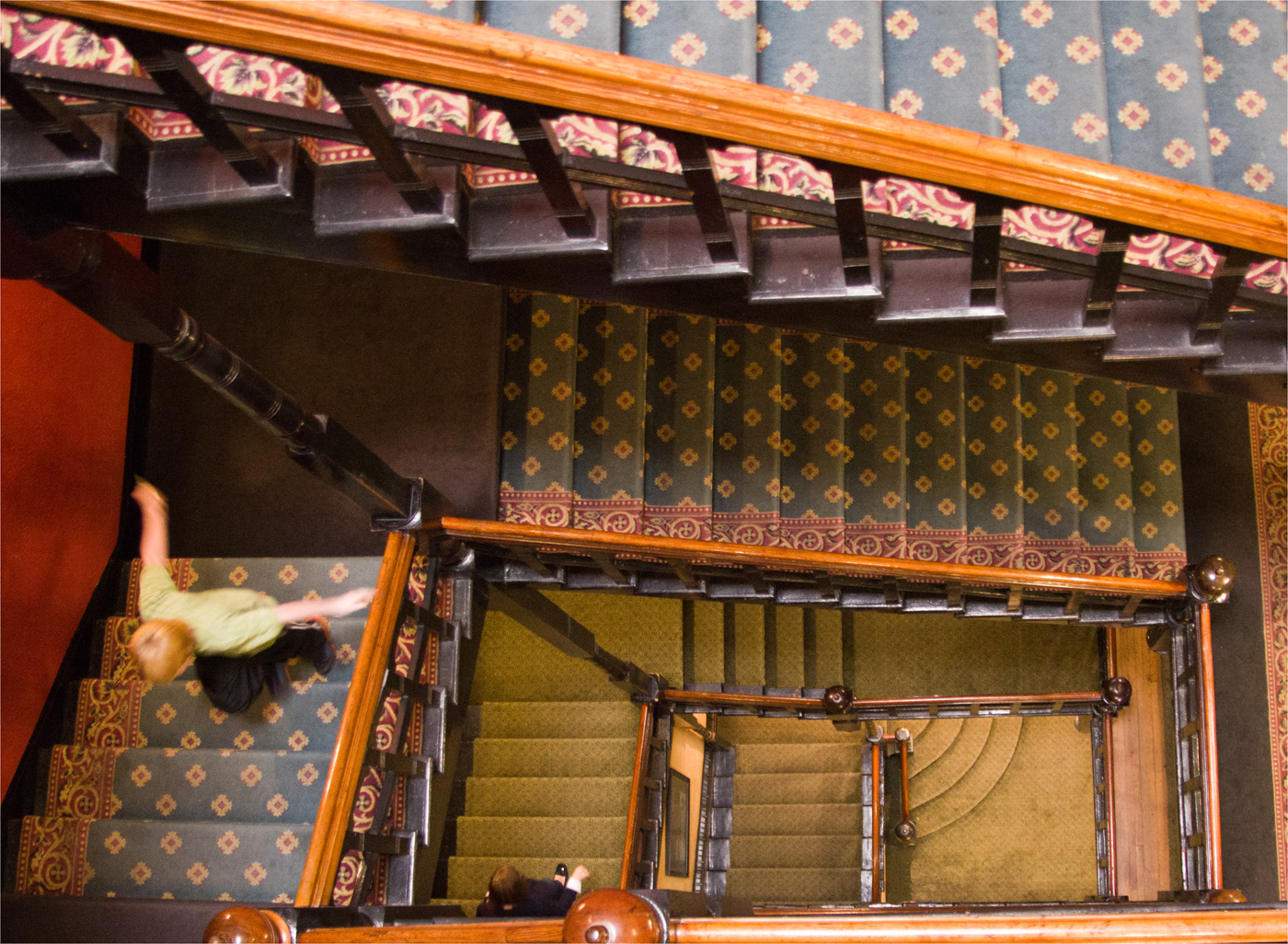
I didn't catch any ghostly images with my eye or my camera lens. I was only trying to get the best angle of the staircase.
This old mansion had a mysterious air to it, though!
Who knows? |
Apr 17th |
| 23 |
Apr 17 |
Reply |
I didn't chat with these children so I don't know if they are aware of the haunting stories. This mansion did give off an air of mystery. |
Apr 17th |
| 23 |
Apr 17 |
Reply |
Thanks Shirley. It is one of those images that grows on you. The more I study it, the more I like it. |
Apr 17th |
| 23 |
Apr 17 |
Reply |
Brian, I like the image without the girl and the knobs cropped off the best. Thanks for that suggestion. The girl isn't necessary but I do like the blurred boy scampering up the staircase. |
Apr 17th |
| 23 |
Apr 17 |
Comment |
Good sharp stop action on the player and his facial expression. I am always trying for a good PJ shot but with all the editing, it isn't PJ competition worthy. I think otherwise I would prefer an all blurred background. Good Job! |
Apr 17th |
| 23 |
Apr 17 |
Comment |
I love your original scene. Compositionally, it is well designed. One of the 'pop' effects does brighten the image. PSA competitions seem to be morphing into a contest of filters and more filters.
They make for more interesting images in many cases. I like it regardless! |
Apr 17th |
| 23 |
Apr 17 |
Comment |
I love the light in this image. This will make a nice piece of art. If your wife can't be encouraged to entertain a different crop then maybe she can accept the two different large prints with the crop suggested by Shirley. For competition Brian's second image crop is my favorite.
Great colors! |
Apr 17th |
| 23 |
Apr 17 |
Comment |
Your imagination never ceases to amaze me. How do you think up these combinations? I agree that the white space does scream too bright. I think that something is needed to balance the right corner space but the spider is macabre and creeps me out.
I like the lined effect to add texture to the entire dream sequence.Not really sure what you were going for but the composition is almost balanced regardless of the subject matter:) |
Apr 17th |
| 23 |
Apr 17 |
Comment |
This treatment for under the bridge is great. The diagonal space pops and there is just enough negative space. Really nice image! |
Apr 17th |
| 23 |
Apr 17 |
Comment |
I think I like the original edit the best. Another image I wish I had taken! The black and white tones are very interesting to me for this kind of portrait. Nice treatment of a pleasant subject. |
Apr 17th |
6 comments - 4 replies for Group 23
|
6 comments - 4 replies Total
|