|
| Group |
Round |
C/R |
Comment |
Date |
Image |
| 23 |
Jun 19 |
Comment |
Well caught. I like the way that the background reflections cross over into the scene, then there is that little plant at front left. A wonderful picture. |
Jun 14th |
| 23 |
Jun 19 |
Comment |
This reminds me of one of the old time actors, who was noted for saying - Here's looking at you Kid. For the bird surely is? The head and beak are captured very sharp. |
Jun 9th |
| 23 |
Jun 19 |
Comment |
Had another look at this, but came to mind the wonderful coloring of a Cardinal Bird on the front cover of this months PSA Journal. |
Jun 9th |
| 23 |
Jun 19 |
Comment |
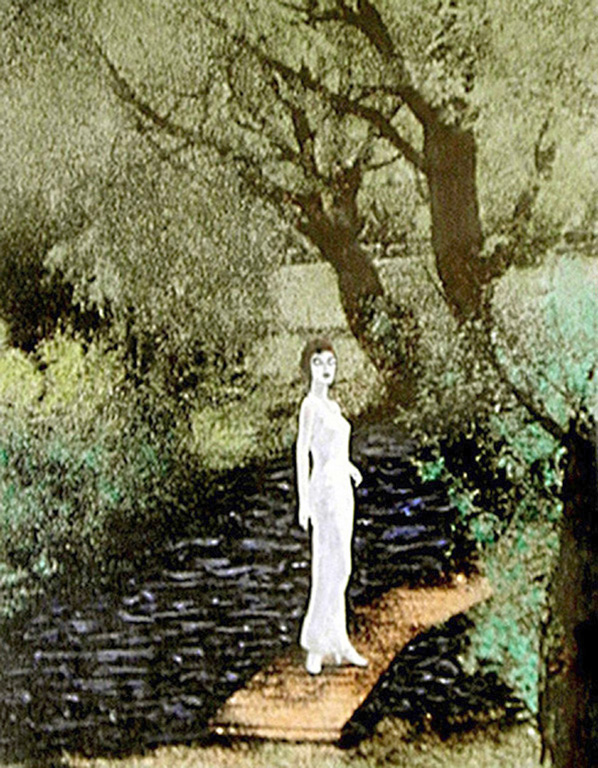
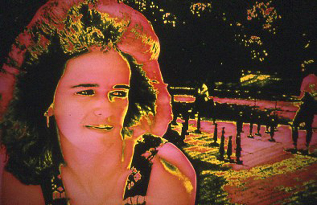
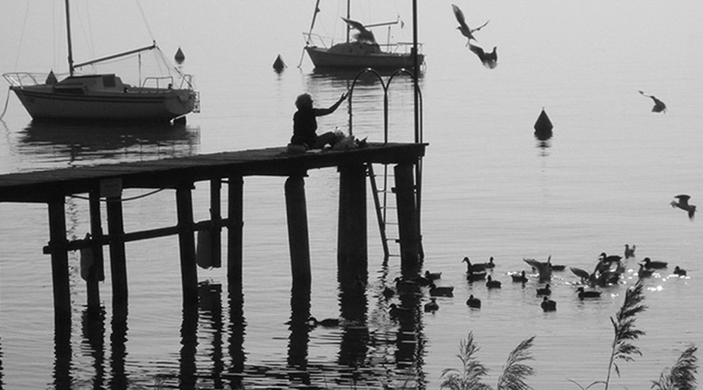
I think that closing in on the little girl was the right thing to do. Depends on what you want, but I would also crop out the tree trunk. |
Jun 9th |
| 23 |
Jun 19 |
Comment |
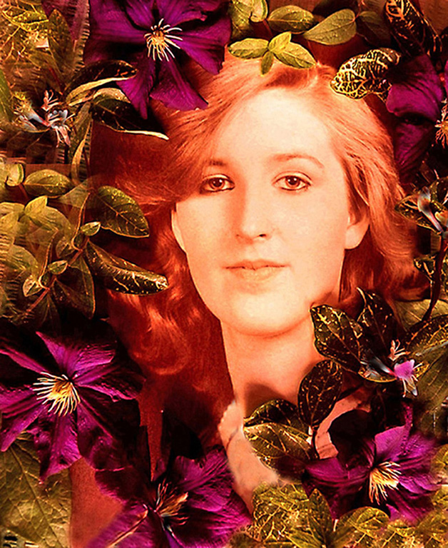
Well, the image came out well. I see what appears to be a small bug at top left and, may be, something it was eating at top right. |
Jun 9th |
| 23 |
Jun 19 |
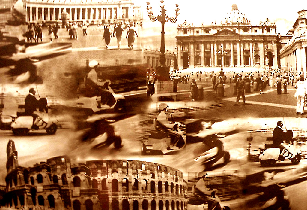
Comment |
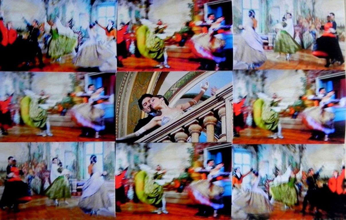
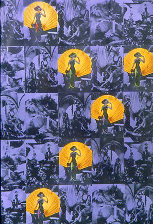
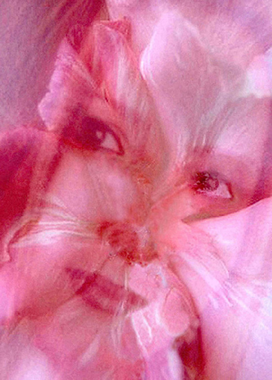
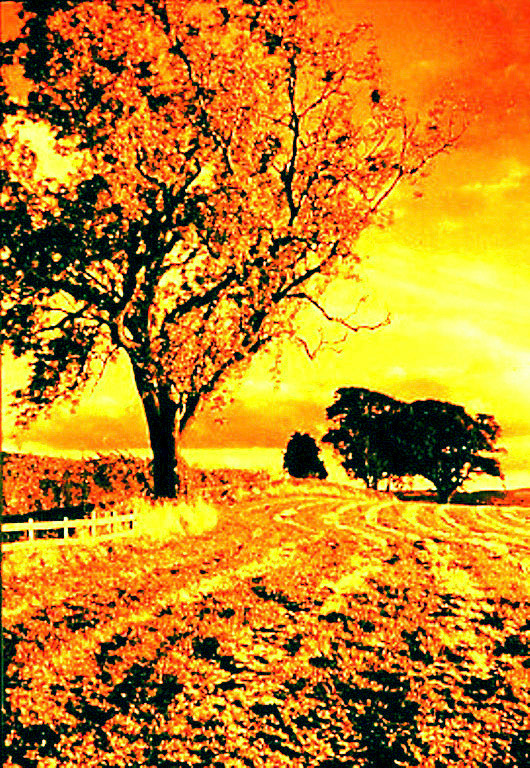
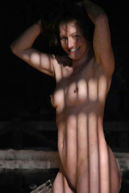
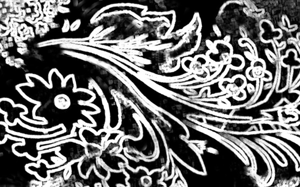
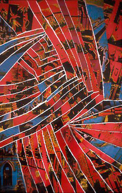
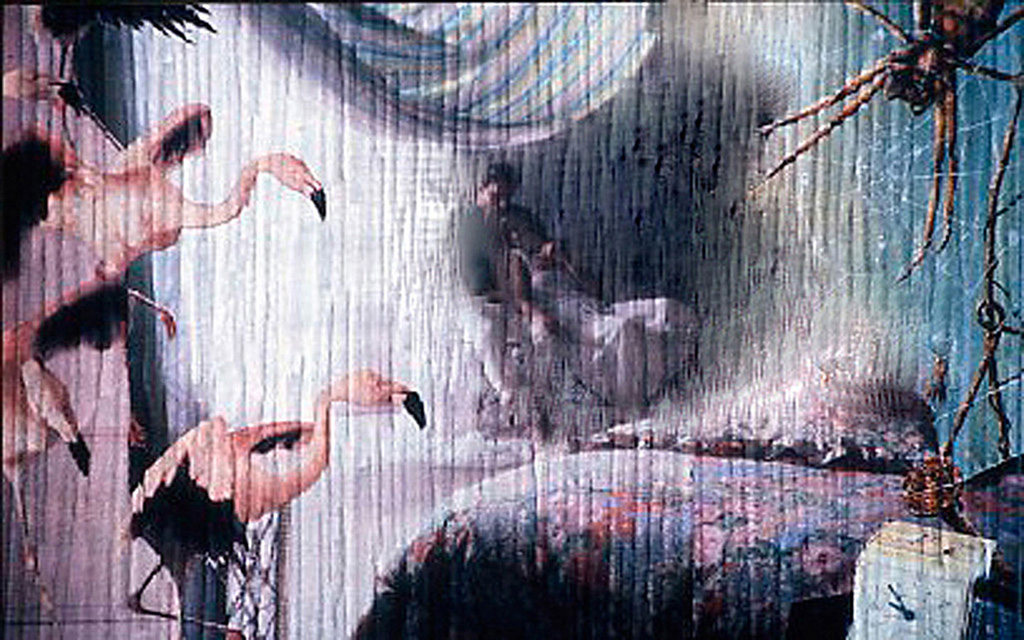
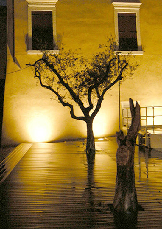
This was one Í made up on the spur of the moment. You will find that there are many other different scenes criss/crossing the scene. |
Jun 1st |
| 23 |
Jun 19 |
Comment |
This tells an interesting story. It was well caught and is One for your family record book. |
Jun 1st |
| 23 |
Jun 19 |
Comment |
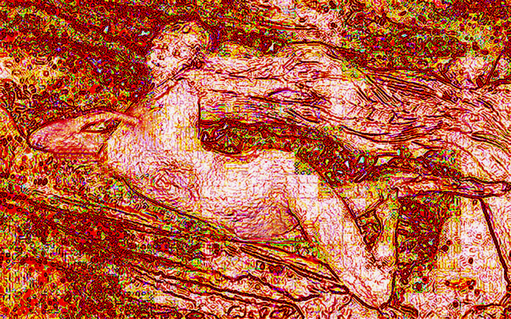
Lovely details of the Osprey including its catch.
It's funny to me, but the ends of the wing feathers of these birds, while soaring, are always tipped up. |
Jun 1st |
8 comments - 0 replies for Group 23
|
| 48 |
Jun 19 |
Comment |
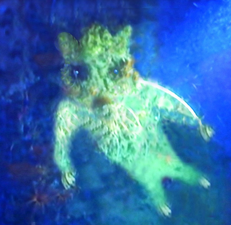
Not for me. I am 96. He has a grubby face and a horrible beard, which I detest. The hat does not help. |
Jun 19th |
1 comment - 0 replies for Group 48
|
| 70 |
Jun 19 |
Comment |
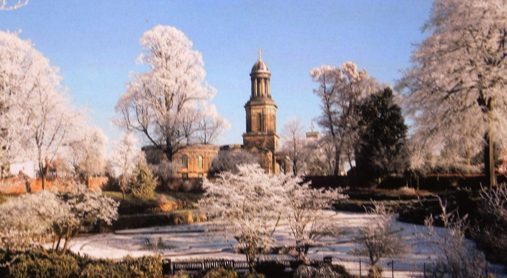
As others have indicated, it would be as well to crop most of the black area at the top. I like the way that there is a sparkle above the snow on the left. Otherwise, have you considered cropping most of the snow line, to give more emphasis to the rock structure. |
Jun 30th |
| 70 |
Jun 19 |
Comment |
I like Glen's version. The building looks more realistic and even the tree tops have more shape.
|
Jun 30th |
| 70 |
Jun 19 |
Comment |
For me, it looks a bit surreal, being slightly out of focus.
Could it be sharpened more, to give the detail more impact ? |
Jun 30th |
3 comments - 0 replies for Group 70
|
| 80 |
Jun 19 |
Comment |
I like the crispness of the architecture in this shot. Pity that it was cropped short at the top, which has lost the angle of the top corner. The bottom left is a bit messy. I would crop the bottom just below the man's arm, which would improve the storytelling. |
Jun 28th |
| 80 |
Jun 19 |
Comment |
I like the out of focus attitude of this picture. Do they meet here often, and what are they discussing? It makes me feel like we are intruders looking in. It is very slightly out of verticality, but if you corrected that, then the inside pillar would be out of true. Have you noticed, the ghostly head on that pillar? |
Jun 24th |
2 comments - 0 replies for Group 80
|
14 comments - 0 replies Total
|