|
| Group |
Round |
C/R |
Comment |
Date |
Image |
| 20 |
Nov 18 |
Comment |
You have a good idea but I don't think you used the right model stance for your composite. The one you used is a bit too stiff of leg and arm - looking more like a dress store mannequin. Also, I think I would have cloned out her gold sandals. But as I said, it's a good idea. Loved your breakfast egg shells! |
Nov 14th |
| 20 |
Nov 18 |
Comment |
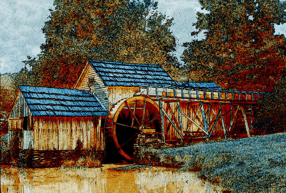
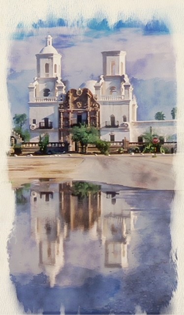
The duo tone process greatly enhanced the lamp but I don't think the digital frame did much for it - the colours weren't right for the subject. I think Cindy's frame looks better but in both cases it bothered me that the top and bottom of the lamp were cut off by the frame. |
Nov 11th |
| 20 |
Nov 18 |
Comment |
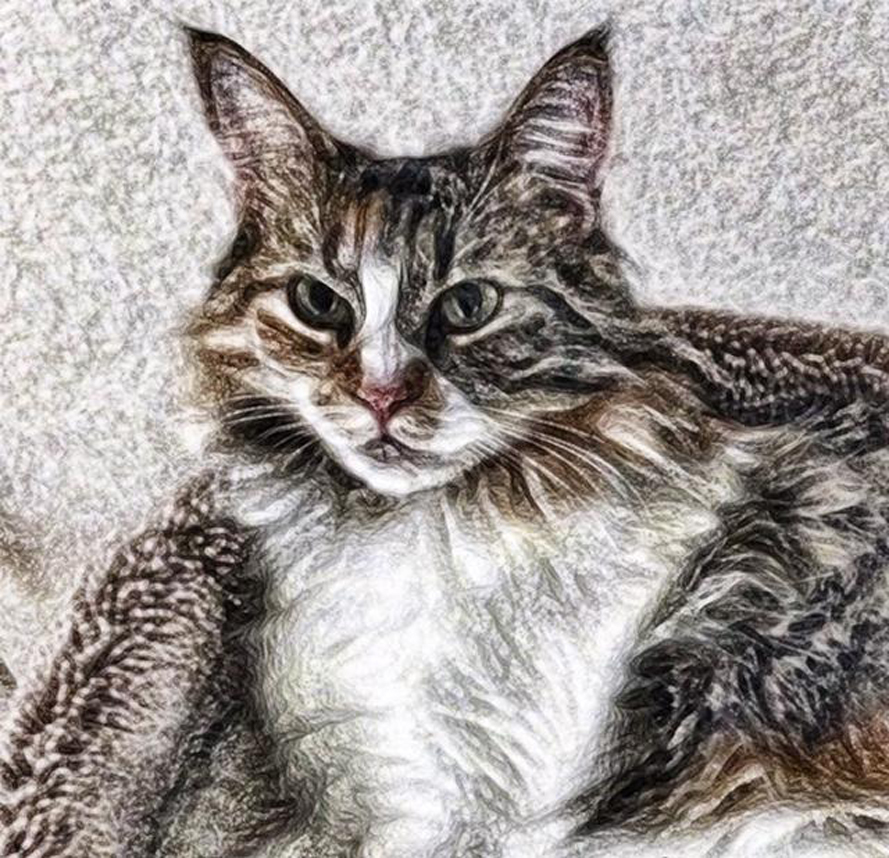
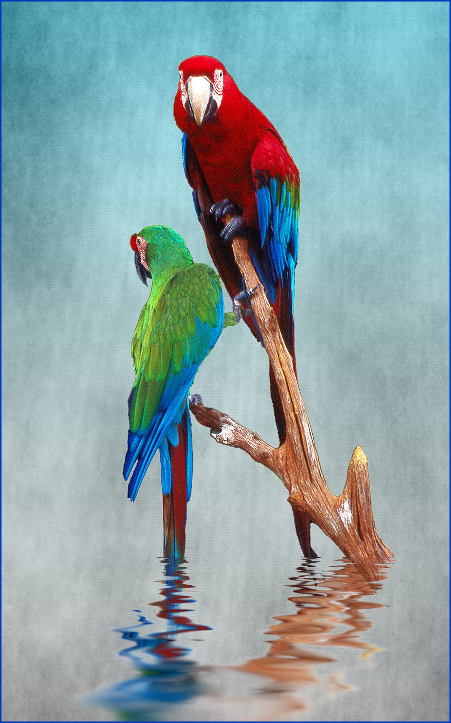
I didn't really like your image too much at first but after looking at it five or six times it "grew" on me. You did a good job. But just to be perverse, I like the original more! |
Nov 11th |
| 20 |
Nov 18 |
Comment |
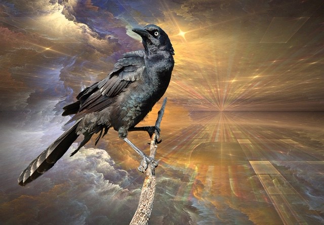
Peter, I wish I had your artist's eye. You see possibilities for photos everywhere! I would not have shot that fire! Love what you have done with it. You have turned that smoky fire into a thing of beauty!
Excellent effort! |
Nov 11th |
| 20 |
Nov 18 |
Comment |
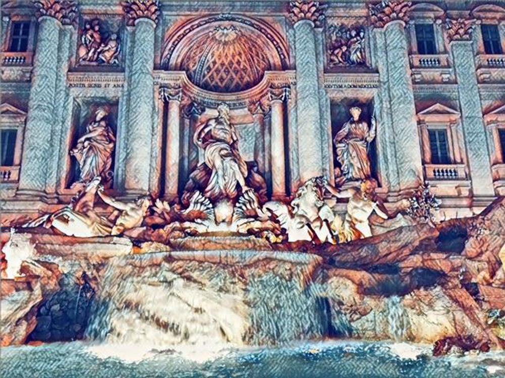
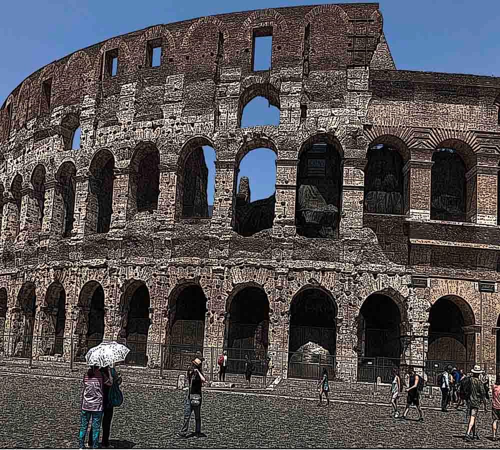
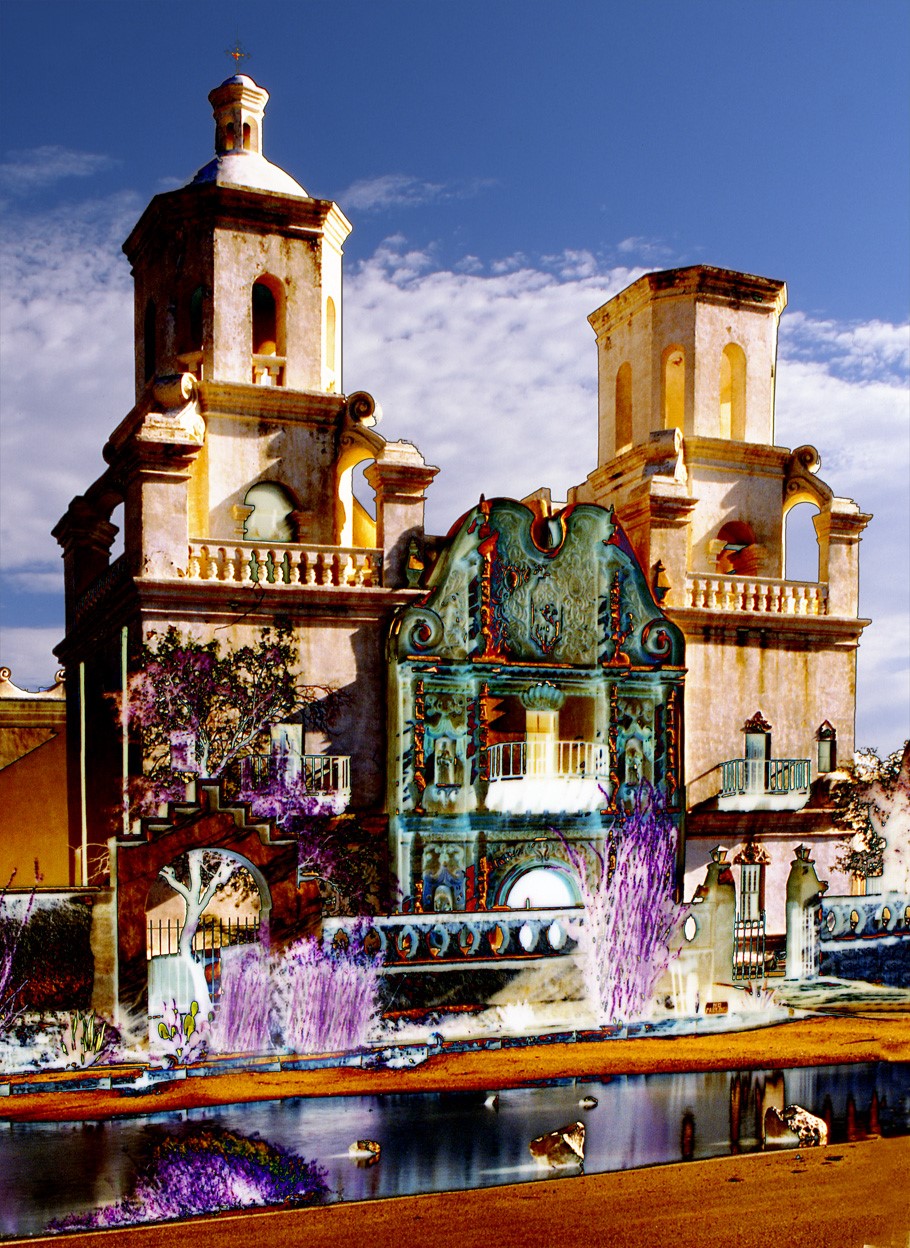
I really like what the oil painting filter has done to your original - it almost gives it a 3D feel. But I feel the frame competes too much with the scene. I think a simple stroke would have been adequate. Also I would have cloned out the three small people in the background to leave the woman as the center of interest. |
Nov 11th |
| 20 |
Nov 18 |
Comment |
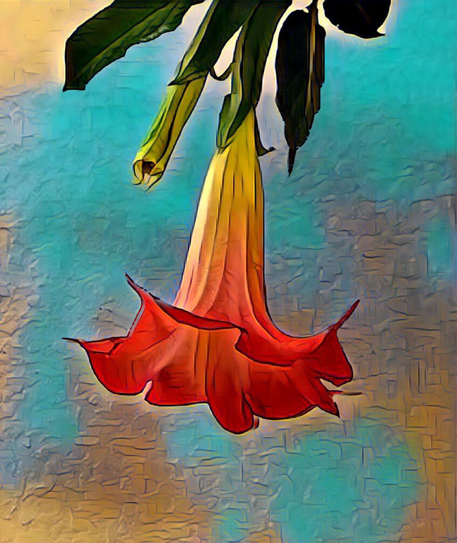
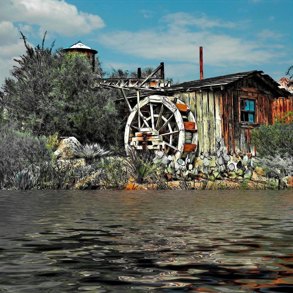
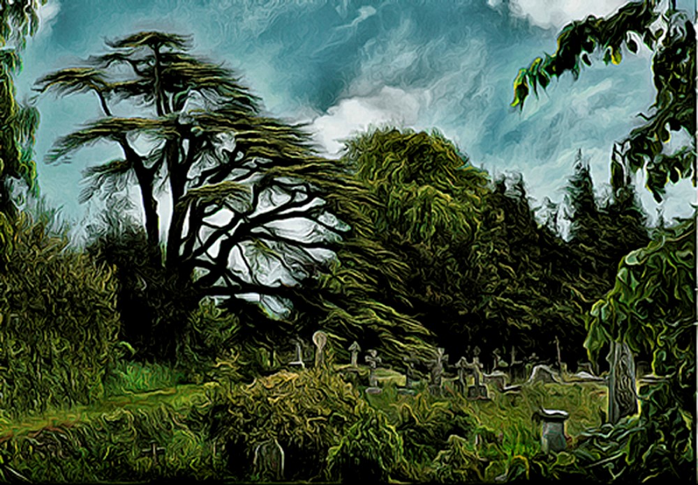
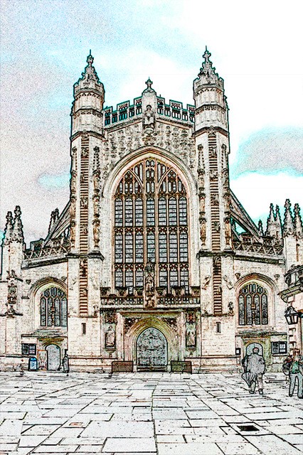
I'm not quite sure what I like best. I think I would like to see either the whole sky area pale blue or no blue at all - just white sky. I rather like the texture idea but I think as presented it is a little too "heavy".
Maybe a bit softer on the texture. |
Nov 11th |
6 comments - 0 replies for Group 20
|
6 comments - 0 replies Total
|