|
| Group |
Round |
C/R |
Comment |
Date |
Image |
| 19 |
Nov 18 |
Comment |
I think a little selective burning on the far shore would tone down the color, strengthen the shadows, and make good use of contrast rather than having the shore so bright. |
Nov 17th |
| 19 |
Nov 18 |
Comment |
another excellent foto. connecting the fire to the monk by positioning his right arm is exceptionally clever. I, on the other hand am worried about the condition of his left lower leg. It looks like he may have elepohantiasis.
Great composition, love the upward aim of the camera, the colors or colours, the sharpness and how you make an excellent image of such a simple task. |
Nov 17th |
| 19 |
Nov 18 |
Comment |
I'd say that the author is entitled to any explanation attributed to the picture. Is the locale oriented toward future (down with immigrants) or toward the past (send me your tired, your poor)? My grandfather and grandmother came thru Ellis Island, perhaps thru this room. the empty chair could improve things slightly if it was rotated on it's axis to either an open (future) or closed (past) position or left ambiguous as it is. I'm surprised by how much this photo grabs my attention and my thoughts. If I had a copy it would be on the living room wall. |
Nov 17th |
| 19 |
Nov 18 |
Comment |
This is such a good picture that it seems unfair to criticize it ust to have something to say. The colors are excellent with strong reds and greens as well as the gray area to separate them. The lines of the hull and the dock work very well together. This should be a site that is frequently revisited to take advantage of the changing light. Frame it and put it on the wall! |
Nov 17th |
| 19 |
Nov 18 |
Comment |
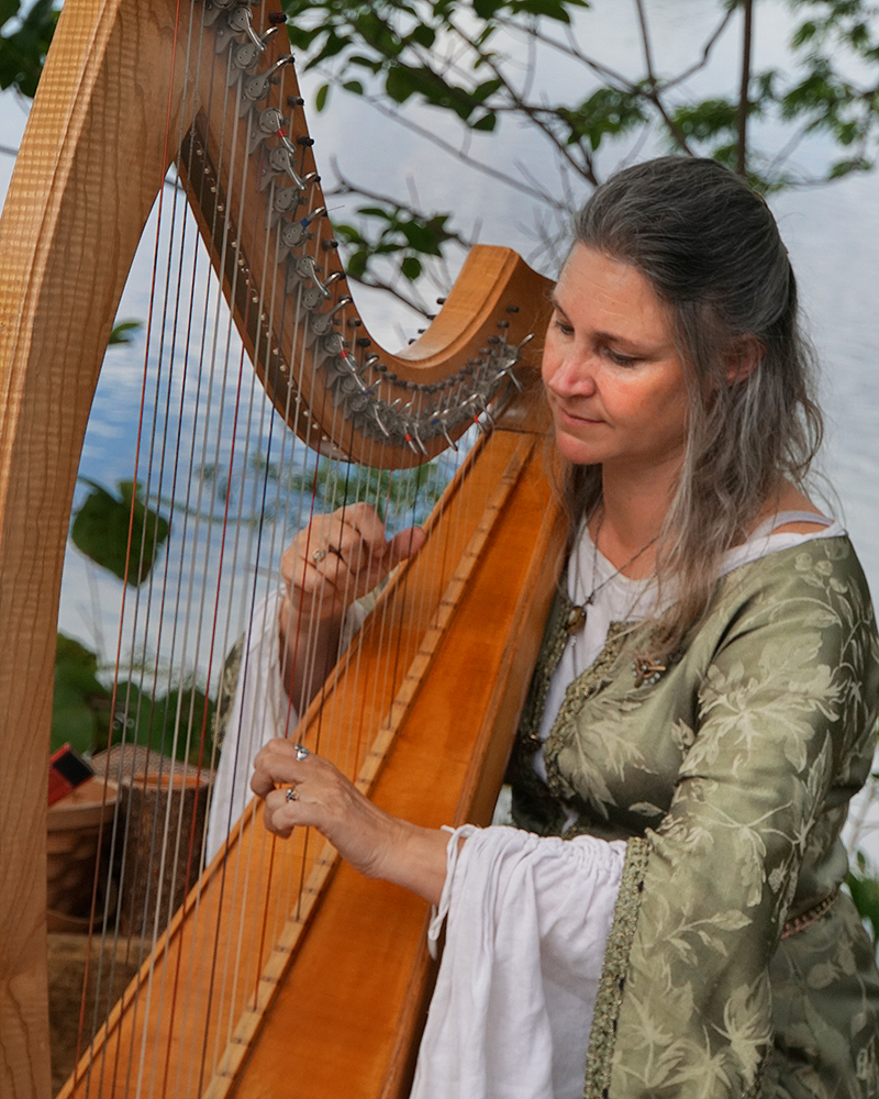
What a sweeheart! She looks so relaxed and happy.I echo the sharpness comment; but for me, it is the nose and muzzle areas. The catch-light in each eye is essential and looks great. I'd prefer only the suggestion of a design from the leaves. This is another excellent photo. |
Nov 17th |
| 19 |
Nov 18 |
Comment |
What an excellent photo! The sharpness and the choice of B&W were excellent decisions. There are only a few areas that are "hot" with no detail in the highlights. Perhaps toning those areas down a bit would be an incremental improvement. I'd similarly suggest that the black areas in the corners could actually go fully black. this is really such a good picture that nothing really needs to be done. |
Nov 17th |
6 comments - 0 replies for Group 19
|
6 comments - 0 replies Total
|