|
| Group |
Round |
C/R |
Comment |
Date |
Image |
| 19 |
Feb 18 |
Comment |
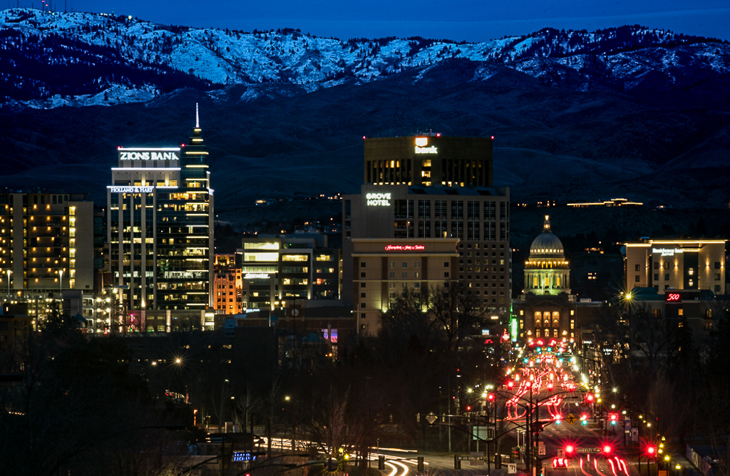
Nice night shot of the lit up city against the snow-capped mountains. Gives a sense of place. I also like the capitol dome and the leading line of the street filled with bright lights leading the eye into the capitol building. You also got really great starlight effects in the lights. I suggest a couple things: Crop the bottom off to get rid of that large overhead sign. When doing that, crop so that there are no bright elements left sitting on the bottom margin to distract the viewer. In the VF image, I also brought the highlights down a bit, opened the shadows just slightly, increased contract and clarity - all of which I think helped to define the building lines a bit more. Its subtle,,, A thin border would also help to make the image jump out. See what your think. |
Feb 21st |
 |
| 19 |
Feb 18 |
Comment |
Nice night shot of the lit up city against the snow-capped mountains. Gives a sense of place. I also like the capitol dome and the leading line of the street filled with bright lights leading the eye into the capitol building. You also got really great starlight effects in the lights. I suggest a couple things: Crop the bottom off to get rid of that large overhead sign. When doing that, crop so that there are no bright elements left sitting on the bottom margin to distract the viewer. In the VF image, I also brought the highlights down a bit, opened the shadows just slightly, increased contract and clarity - all of which I think helped to define the building lines a bit more. Its subtle,,, Also added a slight border so we can see the edges of the image. See what your think. |
Feb 21st |
| 19 |
Feb 18 |
Reply |
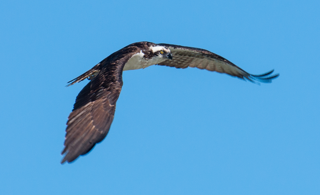
HDR would have been difficult - on a boat that was rocking slightly, no tripod use due to engine vibration! I have tons of shots of this subject from different angles and also some after dark. Hard to know which I like best! |
Feb 20th |
| 19 |
Feb 18 |
Reply |
I could do that Norm, but I think the skyline might feel a bit too heavy at the bottom - like it was sinking... Plus I like the shimmer it adds to an image taken on a dull overcast day at dusk. |
Feb 20th |
| 19 |
Feb 18 |
Comment |
I'll be a bit contrarian here - I like the composition as it is. I think the bucket sitting in the stream is an important part of the story, and the water moving left to right complements the water dropping from her gourd - it is falling top to bottom. Stream also adds a bit of shine on the left. Love the light on her sleeve, the beautiful folds of the cloth there. I also LIKE the blue snow tinge; complements the red of her robe. The one thing I would suggest is slightly opening the shadows on the right side of her garment. |
Feb 20th |
| 19 |
Feb 18 |
Comment |
Wonderful image Bob! I've seen quite a few shots of this subject and I'd say yours is one of the best. I think its due to the wonderful rich light on the underside of the arch and the detail in the foreground rocks. A lot of images I've seen miss the detail there. Picayune suggestion..clone out he tiny bright spot on the lower left corner. A super shot! |
Feb 20th |
| 19 |
Feb 18 |
Comment |
Its a good mid-day shot of an amazing venue. We were there in 2008 - stayed 3 days so I had the opportunity to shoot this village cascading into the sea at dusk...if only I had a decent camera at the time! Its a good composition as is - I like the 2 trees that feel like they are marching up the mountain while the strong diagonal of the houses is going down. Try a vertical crop to see what you think of that. I realize it wont give the expanse of the view, but sometimes a vertical crop of a horizontal shot gives the viewer a greater sense of drama - IMHO ! |
Feb 20th |
| 19 |
Feb 18 |
Comment |
What a great auto! Color, shapes and lines demand instant attention. I agree with Norm though - the photo to the right of the auto really competes with the main subject. And my eye is also drawn to the slightly off kilter green gas pump as well as the black sign touching the left margin. A suggestion - I suspect there are some great crop images in this car, particularly at the front end. |
Feb 20th |
| 19 |
Feb 18 |
Comment |
Three things stand out most for me in this image. The color - the black on the gold is striking. The second is the repeating shape of the arches that soften as the eye is drawn deeper into the image vs. the very graphic horizontal and vertical lines of the lamps and their support rods. The lights strike a very dramatic diagonal as well. Love those three. I do feel the weight of the trailing flower containers is a bit visually heavy at the bottom of the image and the splash of deep pink at the bottom margin also draws my eye down to the edge. |
Feb 20th |
7 comments - 2 replies for Group 19
|
| 60 |
Feb 18 |
Comment |
Lovely Denise, just lovely. Great composition on the diagonal. The entire creature is sharp, including the antennae. Beautiful subject - great patterns - dots, stripes, slashes of white. It was very cooperative of him to sit on a bright yellow flower - complements him perfectly. Wonderful! |
Feb 23rd |
| 60 |
Feb 18 |
Comment |
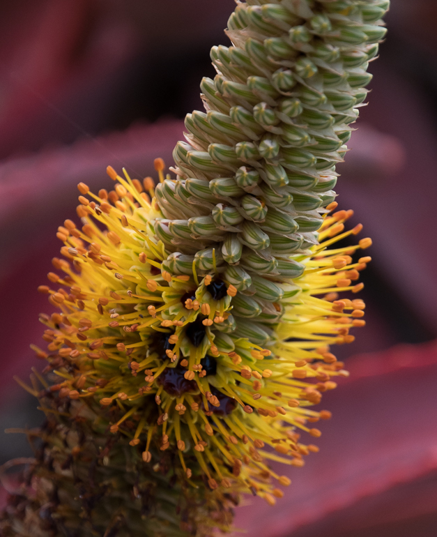
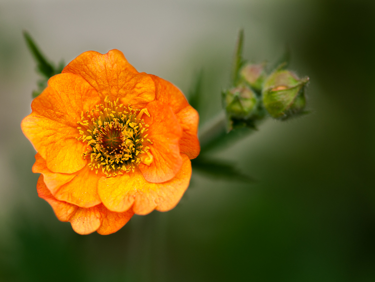
Welcome Doug - nice initial image! Great spiky flower elements, many of which are sharp. The bright pink against the green background is very esthetically pleasing. The light streaming through the flower and bee are wonderful. We can even see the little hairs on the bee's thorax and abdomen. The flower was far enough from the background elements so that your aperture made the leaves into round elements which makes for a nice background pattern. Some suggestions: I find the berry element distracting, particularly so close to the lower margin; suggest cropping it out. Also some of the background is so bright it is competing with the bee and the flower. Be wary that elements like the bits of bright blue that sit on the margins - things like that make the composition more complicated, so it would improve the image to crop them out as well IMHO. Having shared my thoughts, it's still a really nice image! See VF... I cropped to make the bee more noticeable, cut out the bits by the margins, and used the adjustment brush to decrease background clarity and brightness. |
Feb 23rd |
 |
| 60 |
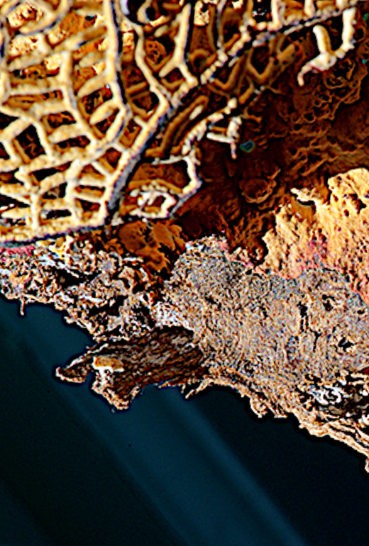
Feb 18 |
Comment |
Lou - I am so impressed by the folks in this group trying new techniques and subject matter. Never would have thought to do this. I like the way the sea fan is lit from the bottom creating a shadow in the darker rust area,giving the image depth. The texture is wonderful as are the colors. I don't know how you created that diagonal shaft of gray, or the green edging on the right, but they both add to the subject interest. What misses here is the fact that nothing is in focus, which I confirmed when taking it into LR to play with crops. Its harder to nail focus now manually with all the AF features on our cameras, particularly at shallow DOF. I'd treat this as an abstract and find a crop you like best...one example in my VF. |
Feb 23rd |
 |
| 60 |
Feb 18 |
Comment |
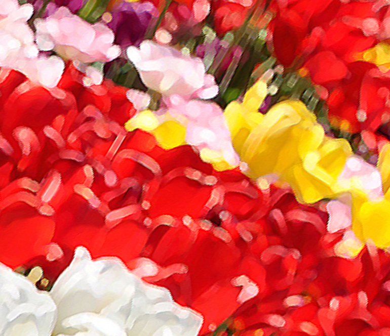
Didn't we get a notice that Macro groups are now going to include close-up shots? I wish they had defined that change a little more specifically. Anyway, Bill, good on you for thinking "what if?". I am really interested in pursuing what you have done - taking images into a more painterly direction. You have nice elements of color, a pleasing diagonal, and an impressionistic approach.
I suggest thinking about how to best crop this image. The 2 vertical pink tulips on the right are a bit jarring as are the odd white and yellow tulips above. A suggested crop in my VF...I tilted it to give more drama to the diagonal line, and realized the white tulips are a bit overwhelming, so I cropped much of them out to a supporting role. |
Feb 22nd |
 |
| 60 |
Feb 18 |
Reply |
Good suggestions - all - thanks Lou |
Feb 22nd |
| 60 |
Feb 18 |
Reply |
It definitely lacks the brightness and sharpness that I see on my display. The light behind the yellow spikes just popped on my screen. I THINK I finally have the color calibration issue under control. Turns out my photography ISP model of Dell is known for rejecting color profiles. I had X-rite help me tic all the right buttons on both Color Munki and my advance display settings. Hopefully, this wont be an issue from now on! |
Feb 22nd |
| 60 |
Feb 18 |
Comment |
Stunning image Carol. You chose the sweet spot perfectly - having the top of the Xmas ball in sharp focus with everything else soft is just beautiful. This is a wonderful monochrome that is described by shape, leading curved lines, texture, sparkle and great use of shallow DOF. The only slight issue that caught my eye is the bit of off-color netting at the bottom of the bow loop on the right. Is there some way you can get its color to match the rest of the image? Or clone it out. The tan color just stands out among all of that amazing gold. |
Feb 22nd |
5 comments - 2 replies for Group 60
|
12 comments - 4 replies Total
|