|
| Group |
Round |
C/R |
Comment |
Date |
Image |
| 60 |
Dec 17 |
Comment |
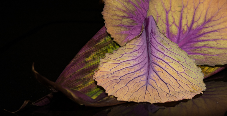
So many great things about this image! The display of 3 yellow leaves against the green and purple longer leaves at an angle behind creates a really interesting backdrop. And the purple of the veins is echoed in those back leaves, tying the front and back leaves together color-wise. The soft reflection in the counter top is lovely - and it also grounds the entire composition to keep it from just floating in black. But what is particularly neat is the way you placed the of the long leaf pointing toward the lower left corner. Reminds me of a European painting. I really like it the way it is, but something made me want to play with it. There are 3 main areas for my eye - the bright yellow leaves, the strong purple veins, and more subtly, that amazing over on the left. So I tried a crop for another take, zeroing in even more on the 3 main elements. Hard for me to decide which I prefer - love your original! |
Dec 21st |
 |
| 60 |
Dec 17 |
Comment |
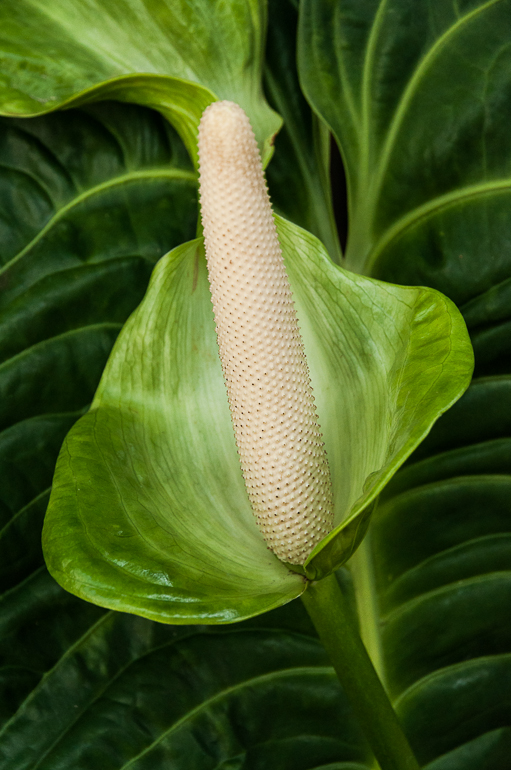
Simple image with a lot of interesting clout. The curve draws the eye around it right to the interesting patterns in the center. Reminds me of the of an ocean wave with the surf represented by the tessellated area at the bottom of the shell. The iridescence also adds great interest. I didn't realize at first that the heavy vignette was actually describing the shape of the shell edges giving those edges more dimension. I actually like that in this instance. I'd just suggest a thin white border to demarcate it from our web page background. |
Dec 21st |
| 60 |
Dec 17 |
Comment |
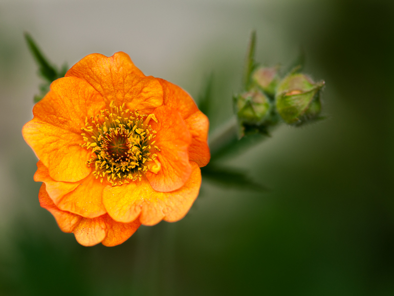
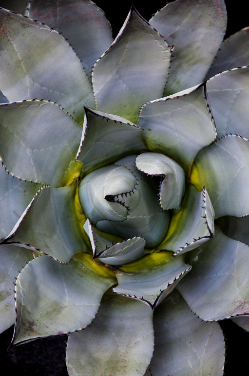
Super sharpness in the left corner up to and including the first ring of petals - then softly fading the rest of the flower is a nice presentation. At 2.8 F stop, much of the flower with this DOF is going to be soft. I like that the deep pink edges really outline the petals. Nice touch to have the light coming from below the flower rather than a 'standard' angle. But for me, the light is much too bright. If you are playing with this set up, I suggest decreasing the light intensity if possible, using a diffuser, etc. |
Dec 21st |
| 60 |
Dec 17 |
Comment |
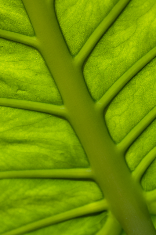
Amazing texture and line pattern swirling amongst all that texture. I can see why this caught your eye - one almost wants to reach out and touch it; trace the lines. Since it is such a simplistic image with no obvious subject, I suggest you narrow in on the most interesting lines to 'make' a subject of them. Please excuse my VF if the color is off; I just got a new Color Munki screen calibrator, loaded it, - but have not run the calibration yet today. I cropped your image and played with it to zero in on some of the more interesting lines. I also took it into Color Efex Pro and applied a blur filter to really direct the eye to those lines - a different take on your image. See what you think. |
Dec 21st |
 |
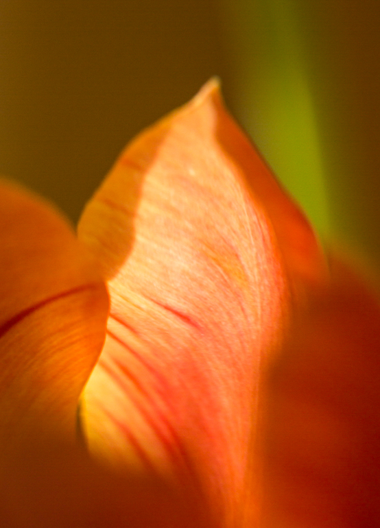
| 60 |
Dec 17 |
Comment |
Some very nice elements here. Lovely softness, great light suffusing in from the back through the tulip and leaf. Nice how the darker orange lines accentuate the curve of the tulip petal. However, this composition just does not work at all for me. There are 4 bright light areas that are competing with one another; 2 in the green and 2 in the tulip petal. Plus the 2 brightly lit spots on the tulip compete with the large blurry mass of the tulip at the bottom of the screen. My eye just doesn't know where to go! I tried a crop to simplify the image but keep the softness you had in the image...see VF. It reduces the weight of the blurred area, reduces the areas of light, makes the tall point on the petal the primary spot on the subject matter. |
Dec 21st |
 |
5 comments - 0 replies for Group 60
|
5 comments - 0 replies Total
|