|
| Group |
Round |
C/R |
Comment |
Date |
Image |
| 19 |
Nov 17 |
Comment |
Oh Herb - sorry to see you go! I will miss your submissions and input - good luck, whatever tasks are taking you from us! |
Nov 21st |
| 19 |
Nov 17 |
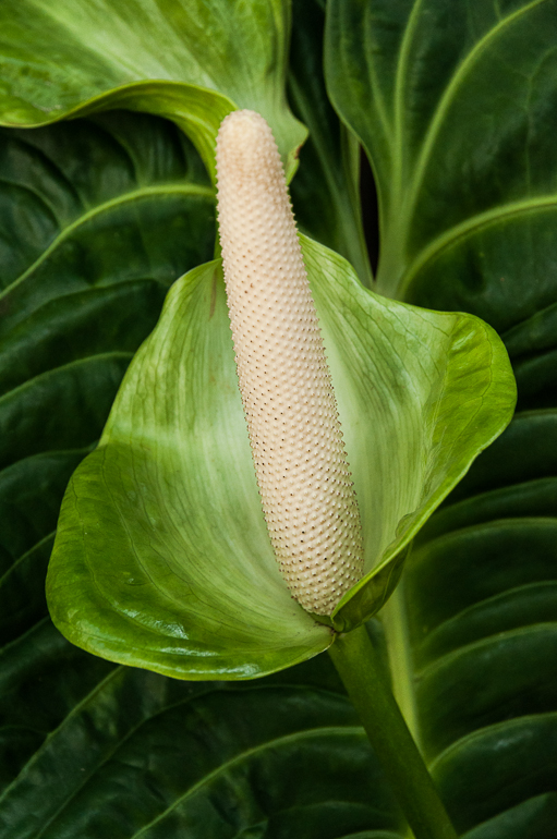
Comment |
I actually prefer the original (second) image as well. It gives a sense of place, while the crop made me initially wonder - what the heck is it? The transmitted light and light on the rocks is gorgeous. Great texture. Nice how the rock face provides a diagonal line, to the almost cloth-like folds of the stalactite. |
Nov 21st |
| 19 |
Nov 17 |
Comment |
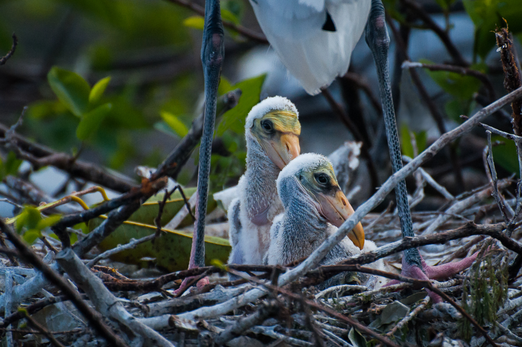
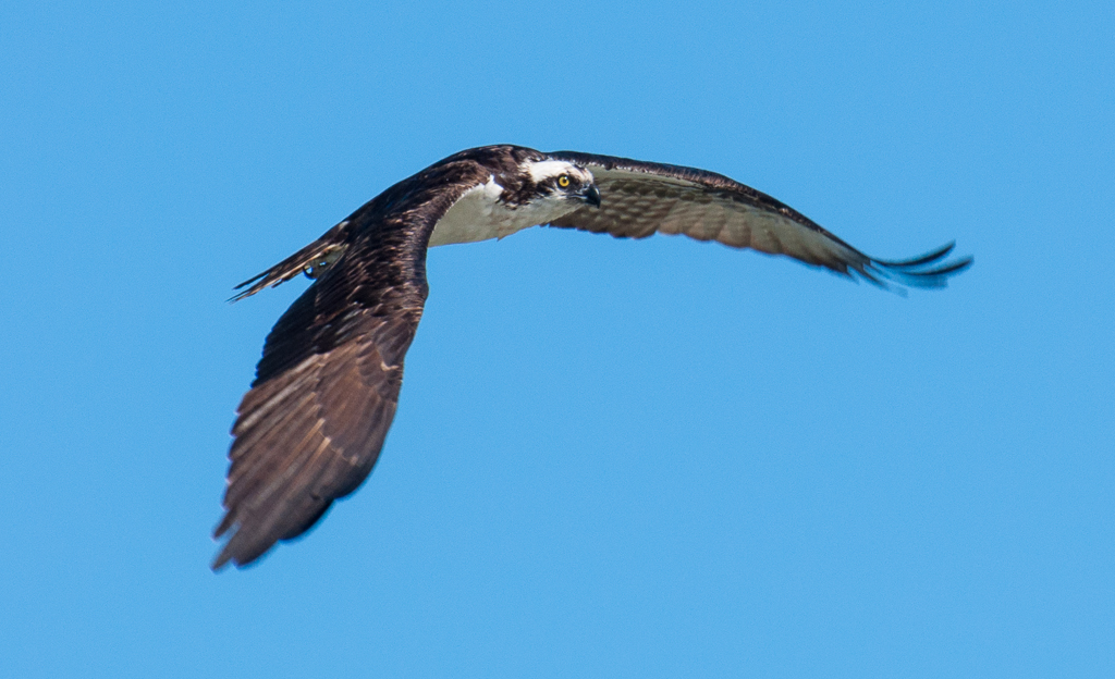
Bob - I suspect this IS the bright colors they are! With the reddish feathers turning to yellow the natural coloration. Yes? Nice that you caught them both apparently staring at something. Sharp eyes and feathers. No mouse ears visible! Softening or darkening the background would be good, but not a huge issue. |
Nov 21st |
| 19 |
Nov 17 |
Comment |
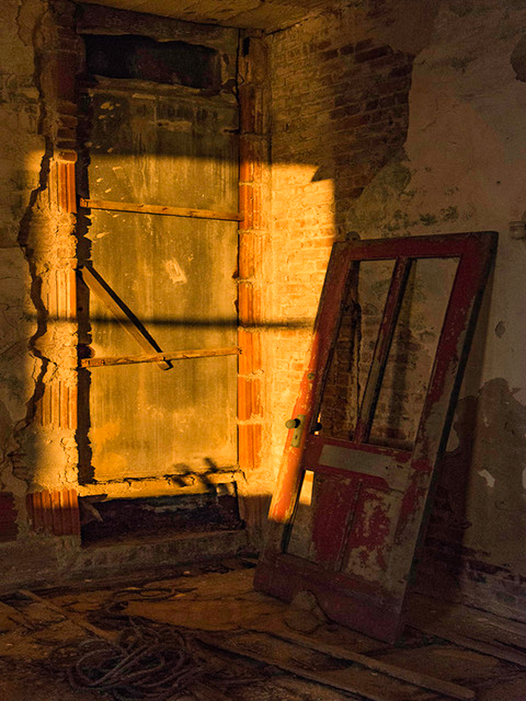
Nice abandoned image! I thought just a bit of opening of the shadows would be worth trying and a smidge more clarity. Nothing major - wanted to keep that nice late in the day gold glow you captured. All the texture is great, as is the juxtaposition of the two doors. Image suggests to me someone tried desperately to get in, but the door was barred even after the outer door was ripped off. Denial! Abandoned attempts... |
Nov 21st |
 |
| 19 |
Nov 17 |
Comment |
Looks as if there are lots of possible shot angles with this scene. I like that you chose to take the image with the corner foremost. Gives us a wide view of the incredible detail on this structure. Nice that the people surround the base adding visual softness and implied movement to the stolid stone building. I particularly like that there are 3 figures closer to the viewer - the couple and man heading to the left and the man bending over a stroller. They provide a sense of depth to the scene. Noted that left lines are parallel to margin, but right side is slightly tilted. I likely would have spent a long time on this structure - looking for close-up vignettes of windows, statues, etc. |
Nov 21st |
| 19 |
Nov 17 |
Comment |
Interesting two color image - brown and shades of green. What makes it works is al the texture - swirls of metal on the boar vs. the straight line texture of the foreground grasses. nice how the grass parts a bit right where his forelegs are - breaks up the patterns. What attracts my eye are the ears, eye, snout and curve of the boar's jowl line. Must have been a real surprise if you were looking for birds! |
Nov 21st |
6 comments - 0 replies for Group 19
|
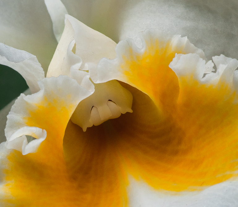
| 60 |
Nov 17 |
Comment |
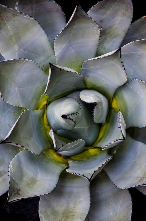
I was trying to shoot one of these - not bi-colored - and discovered its not easy to get that sense of depth, pattern and sharpness. Good composition - the leaves and the red line emanate from (or into) the center point. Great color contrast in a simple subject. I looked to see where the sharp focus is and realized its along the upright edges of the leaves near the center. The problem is an edge doesn't permit the viewer enough area to perceive as sharp, even allowing for the fact you wanted the center somewhat OOF. I DO like the base of the center fading into softness. So I tried sharpening the edges that were most in focus, using both 'sharp' and clarity sliders - but left the base of the center soft. See VF. Or, you might want to try to reduce the clarity of the entire image to give it more obvious softness and see what you think of that. |
Nov 21st |
 |
| 60 |
Nov 17 |
Comment |
I really like your composition. Its all about the achingly sharp head, eye, thorax, and base of the wings. I think the fact you opted to let the abdomen fade away on a diagonal angle adds interest. That diagonal line is repeated strongly in the wing angle and also in the way the legs are folded. Great shine on head and eye too. I for one don't think we MUST see every single part of things we shoot - that's where the artistic decision comes in to play. Great job! My only suggestion - I think the border is a bit too wide... |
Nov 21st |
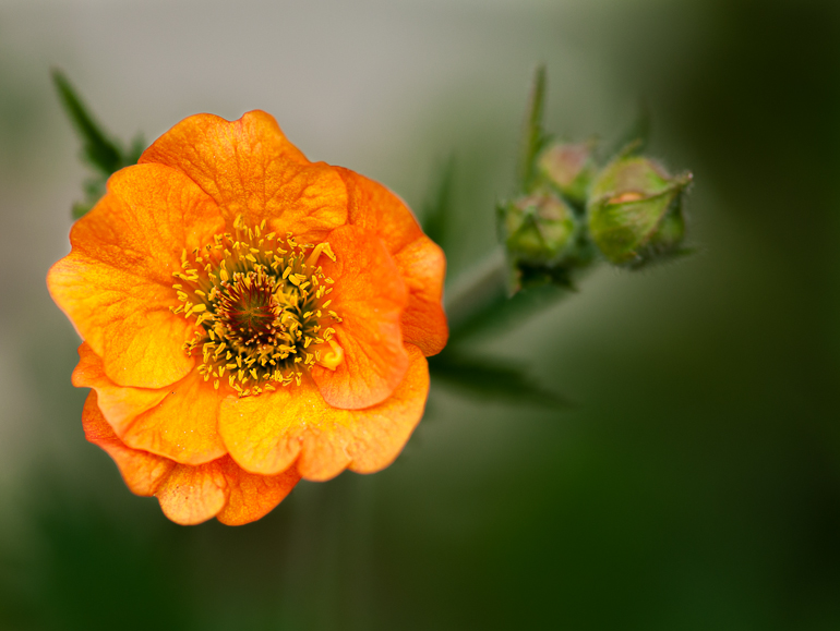
| 60 |
Nov 17 |
Comment |
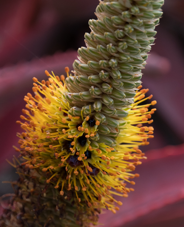
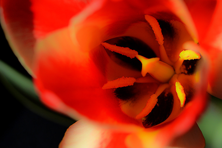
Nice shot, nice light Bill! The stamens are nicely sharp with all other flower parts softly out of focus. Really like the angle of light which has put the background into complete darkness. Outdoor shot or staged indoors? The colors are also wonderful - red, spots of white, black and very soft green. I prefer the image with the bright white area on the right cropped out - its so bright it pulls the eye over there away from the stamens. I cropped it a bit, sharpened a bit. I also took the luminance on the 2 brightest stamen heads down just a tad. But then played with it and discovered I also like this shot with the clarity slider taken all the way to -100 - very soft artistic image! See VF for the soft version. |
Nov 21st |
 |
| 60 |
Nov 17 |
Comment |
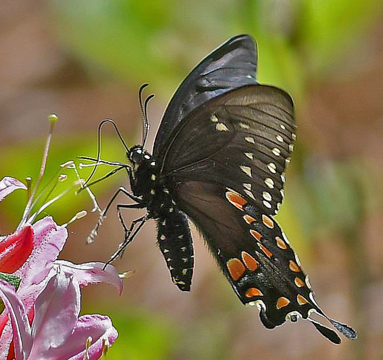
Nice capture Bill! Butterfly is sharp almost throughout its body, which is amazing given the f stop you used! We even see its long proboscis very sharply. It sits at a great diagonal angle, giving close shot more dynamism. I made few adjustments - cropped a bit to get rid of some odd bits at the flower margin, increased the luminance to decrease noise which takes away the sense that some felt it was over sharpened. Used adjustment brush in LR to reduce highlights along a vine in background, and reduced pink luminance slider to reduce highlights on the flower. See what you think. |
Nov 21st |
 |
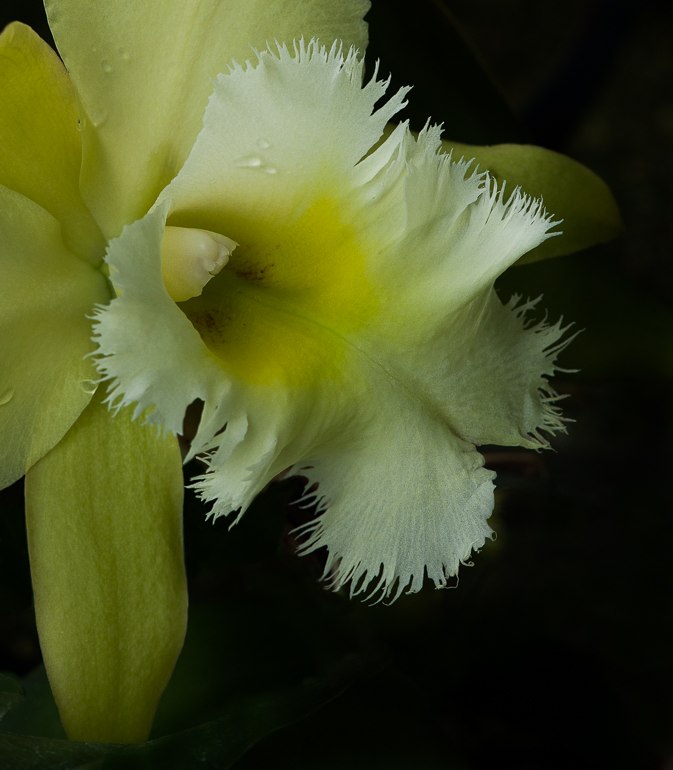
| 60 |
Nov 17 |
Comment |
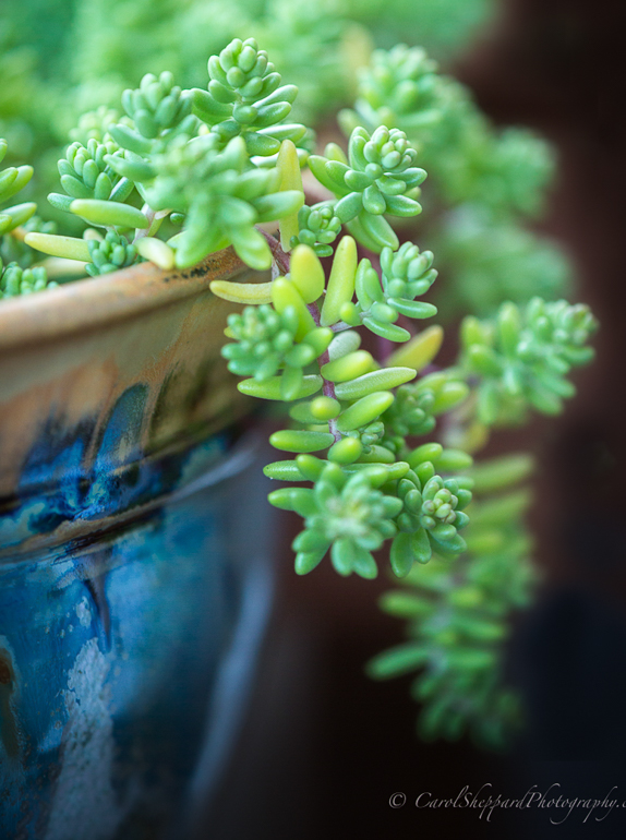
Carol - this is lovely composition and lighting, great subject. Love the way it trails out of the pot, particularly the hazy trailing frond behind the foreground branch. The blues, soft gray-green and deep brown are very pleasing. I think though what is giving us a push-pull reaction to this image is that not so much the fact that the rear elements are very out of focus. What bothers me is that the OOF appears to be very edited, unnatural - along with the obvious halo around those elements that I assume are a result of darkening the background via editing. You've got a lovely subject here - can you shoot again pulling the pot away from the backdrop and using a smaller aperture to get a bit more DOF - at least bringing the front branch more into focus? I did a crop as well to eliminate some of the unnatural OOF bits...but I like your composition best. |
Nov 21st |
 |
5 comments - 0 replies for Group 60
|
11 comments - 0 replies Total
|