|
| Group |
Round |
C/R |
Comment |
Date |
Image |
| 19 |
Oct 17 |
Comment |
Herb - I usually find small things in submitted images, but I think this one is great just as you present it. There are elements of the light and dark - aside from the main silhouette - that really make this image stand out. The fact there is some slight detail in the sky. The shine of the tiles adds real punch to the image - without that it would be less interesting visually. The mist adds a very interesting detail. Without these 3 elements, the image would be very static. I also like where you placed the man and the line of the roof. Having the peak off-center and the diagonal longer adds a dynamic viewing line. Placing it as you present it so we view it from left to right works best. I have to say one reason I enjoy this study group is WHAT you all discover to photograph. I never would have thought of this as a photo op. Thanks for opening my mind to things like this! |
Oct 20th |
| 19 |
Oct 17 |
Comment |
Super image! You capture this man in a perfect place in terms of the light behind him. As a result, his figure impacts the viewer powerfully. We immediately know the story due to the cane, chipped cup, missing buttons, worn collar, resigned look. Stans comments about contrast are right on; a fuller understanding of what is really happening when we look at any image. Another thought - we enjoy, seek, and value these images because they are different from us. They also tell a story about the human condition. But I wonder if people from other countries take pictures of US - viewing US as exotic? |
Oct 20th |
| 19 |
Oct 17 |
Comment |
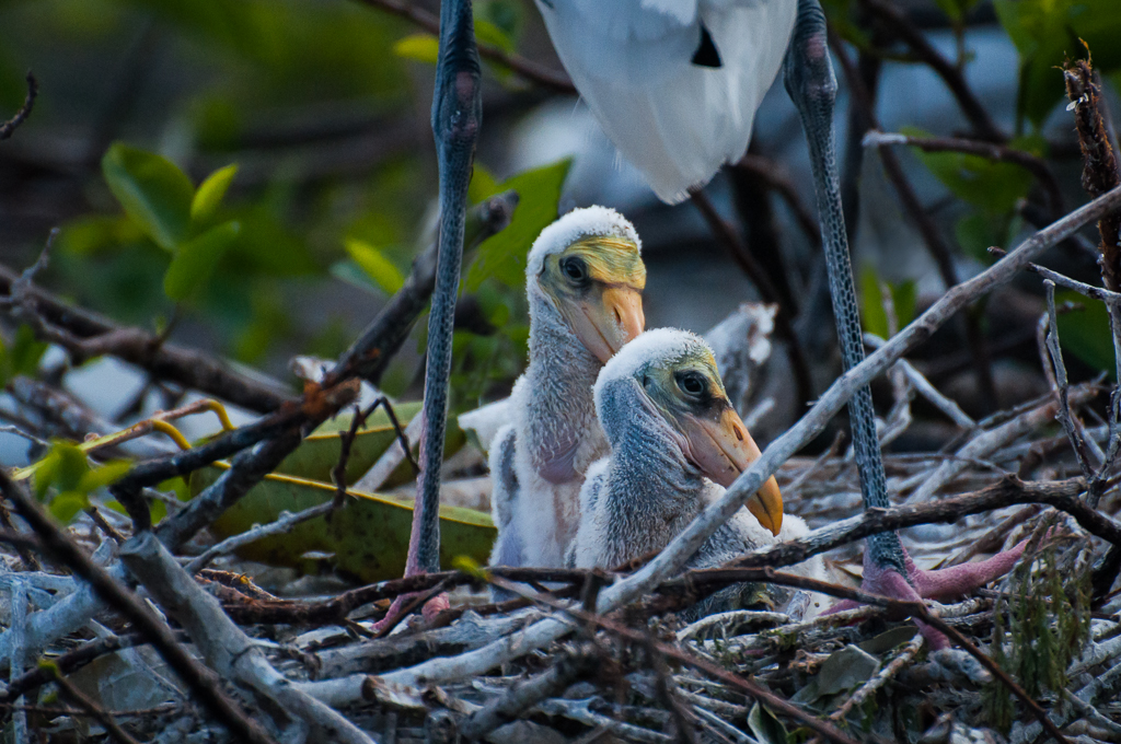
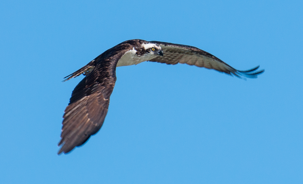
You captured a wonderful composition of the parents with the unruly teenager beneath. He is protected by the cage created by their legs. Very natural, great detail, great image! They provided you with a nice implied triangle from their head down their wings and the great S-curve of their necks is a real eye catcher. Were you using a polarized filter? Would darken the water and help with reflections on feathers. I have my polarizer on much of the time. |
Oct 20th |
| 19 |
Oct 17 |
Comment |
Coming in last - I agree with the suggestions above. The butterfly on the flower is a very nice capture. Wings are sharp, good DOF on both flower and butterfly, esp. at F5.9. I'd increase saturation on the butterfly wings just a bit. You mention that you didn't want to take the background flower out, but it looks as if you tried to darken it to the point it created a big black blob, which is likely much more unnatural looking and distracting than the flower. I don't use PS, but I know there is some way you can blur the background while keeping subject sharp via layers or use of content aware tools? |
Oct 20th |
| 19 |
Oct 17 |
Comment |
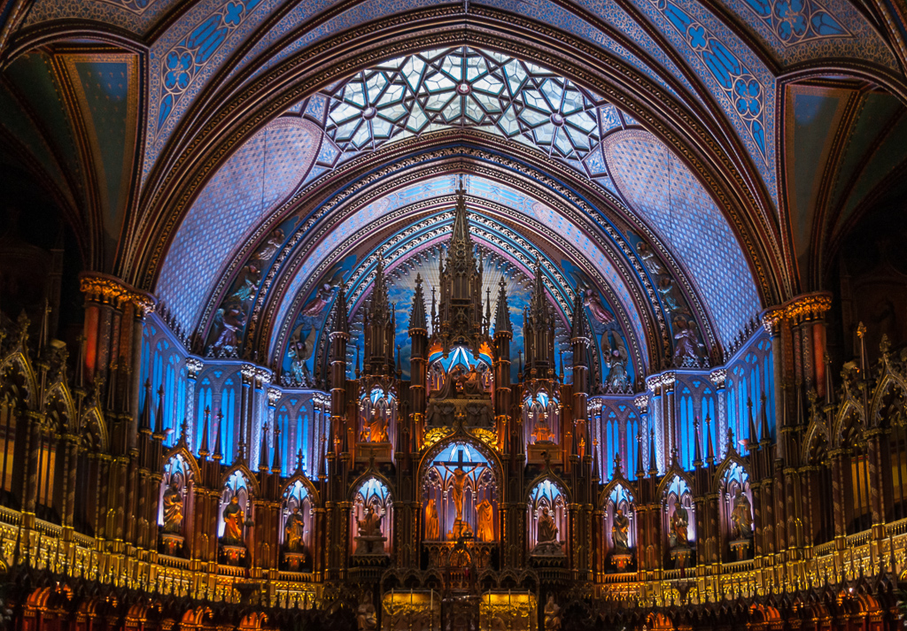
OK I'll be the dissenter. I think its perfect just the way it is. Beautiful soft colors and lovely capture of the designs. Although we are told to look for odd numbers in images, I think having a bit of that 4th pillar works just fine in this image. If he crops on the left he will lose the arch of the ceiling and the design there and the image will feel very cramped - overpowered by the front pillar. If he crops from the bottom, it will get rid of the interesting addition of the tops of the windows and hallway - which I think add to the viewer's sense of place Great image. |
Oct 20th |
| 19 |
Oct 17 |
Comment |
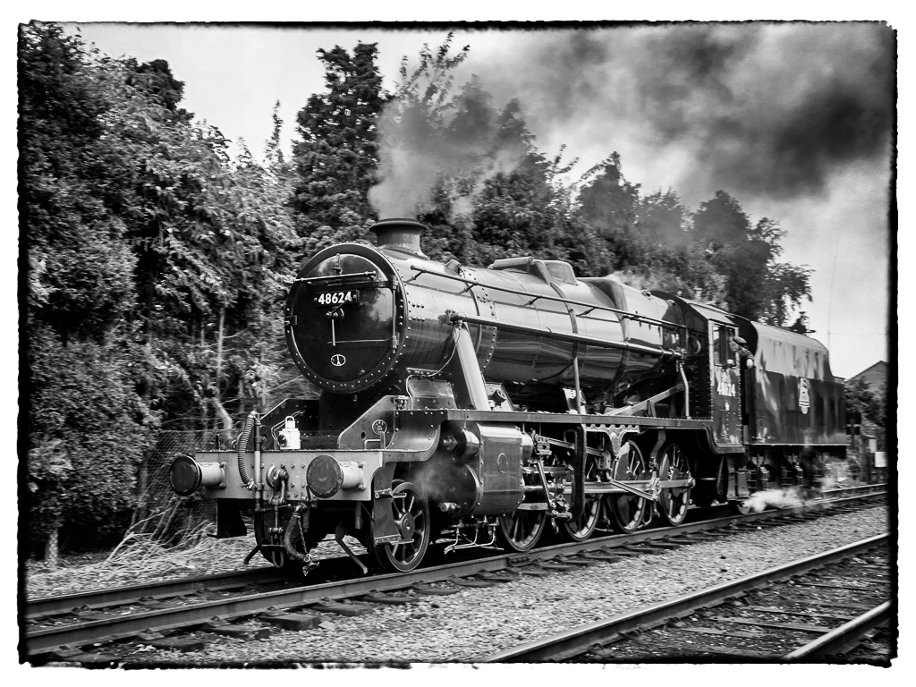
I agree with all Stan's comments. I like the inclusion of the double track, but would darken the white object behind the train. Had fun playing with this to see if I could get the train to stand out from the trees a bit. I like this treatment in Silver Efex Pro: Used 105 Full Dynamic (harsh), Lens Fall Off 2, Type 12 image border. Even though the train and trees are still the same grayscale, the shine on the engine makes it stand out much more. What do you think? |
Oct 20th |
 |
| 19 |
Oct 17 |
Reply |
No I wasn't able to do that. Would have been in front of the petitioners. Plus, I wanted to capture the entirety of the scene. That amazing ceiling and the way the blue becomes softer toward the dome really makes one feel like heaven is just above - and I wanted to capture that essence of the place. You really feel like God is JUST hovering above all that magnificence. |
Oct 20th |
| 19 |
Oct 17 |
Reply |
Thanks Stan. Enjoyed seeing your images at PSA. |
Oct 20th |
6 comments - 2 replies for Group 19
|
| 60 |
Oct 17 |
Reply |
You've heard me comment that I often like negative space in my images, but I think you are right about cropping this one a bit! |
Oct 20th |
| 60 |
Oct 17 |
Comment |
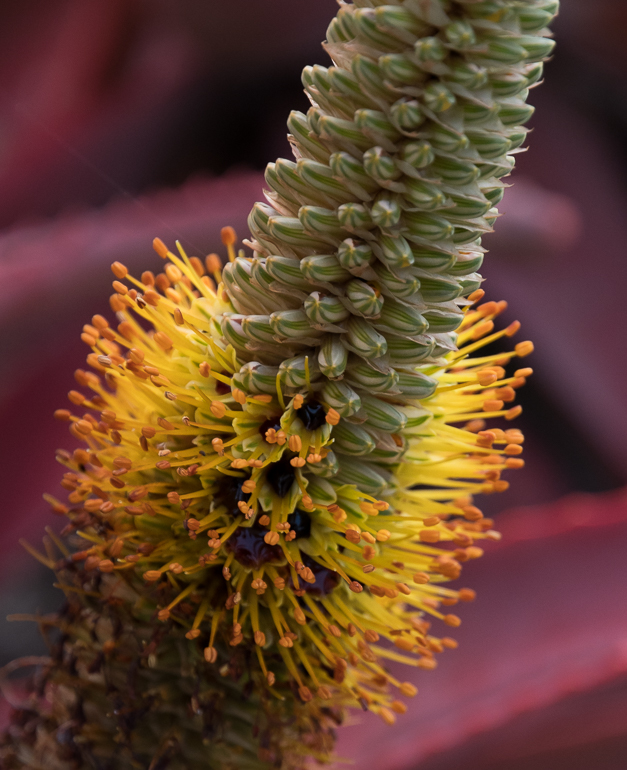
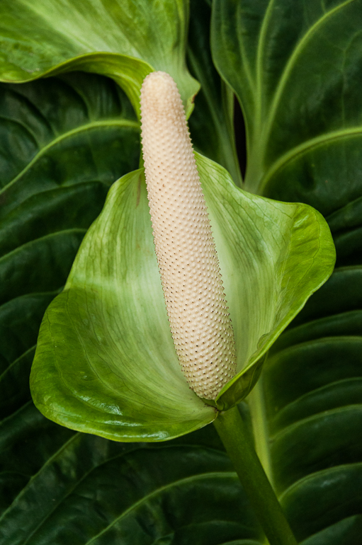
Really nice capture Bill. The 2 things that strike me are the delicate array of the flower fibers and the way the light seems to be reflecting off the center of the flower. The blurred flower behind it adds depth to the image overall. The pink against the green is very enticing as well. Per carol's comment - I think you have several options depending on you interpretation goal: 1. use small aperture as you did to get as many of the fibers in focus as possible. 2. Use a more open aperture to blur the background and decide which area of the front flower you want sharp. 3. Choose a specimen in which the flower and stems behind it are much further away from the plane of the sensor to blur them more. |
Oct 20th |
| 60 |
Oct 17 |
Comment |
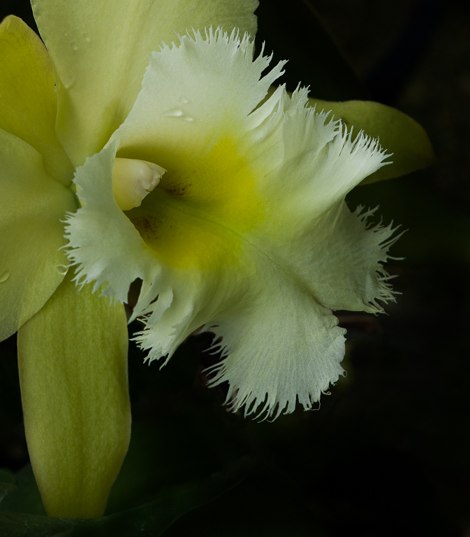
Superb capture Bill. Sharp, sharp! And the flash light is very natural. How far away were you with the 150mm lens? I assume you can keep more distance with that lens which would be helpful. I really like the way you have tilted the composition to take full advantage of its antennae spread. The diagonal makes the image more interesting, as does your inclusion of just a bit of the bud. Makes me feel like he was crawling up one side to the top, while you might be another bug crawling up the other side. Very intimate perspective! Addition of a bit of pink flowers burred in background adds sense of place. I applaud your choice to anchor him in the corner and leave a bit of negative space above him. I've learned negative space does not appeal to everyone - but in some cases, that sense of space is part of the story or feeling the photographer is trying to elicit. |
Oct 20th |
| 60 |
Oct 17 |
Comment |
I assume from your comments and Lou's that you are using PS to get the softness of the entire image? The softness is lovely - but the flower is still definitive which is good. We can clearly see the pistils and edges. I love the soft green surrounding the flower. I just wish you could have isolated it from the out of focus parts in the foreground at the top of the image. It draws my eye to the top and out of the image. When I learn how to use PSE15 I just installed, I want to explore making the lovely softness you use on some of your images! |
Oct 20th |
3 comments - 1 reply for Group 60
|
9 comments - 3 replies Total
|