|
| Group |
Round |
C/R |
Comment |
Date |
Image |
| 19 |
Jan 19 |
Comment |
I am entering this in the Grand Canyon Winter Circuit closing on the 28th. I took the advice of the group and darkened some of the details in the lower left. |
Jan 23rd |
| 19 |
Jan 19 |
Comment |
You have the lighting and color on the man perfect. He looks great. Frankly I like the positioning of his hand close but not intersecting any part of his face. The textures of his clothing and his rugged hand and face make the image. They both contribute significantly and being close they are like one subject element. You might want to work on the background a bit. The white band is unfortunate but you can't do much if you want to keep it a "photo travel" image. Darken it and it becomes an ugly grey. You might consider playing with the tones and colors of the rest of the background. Interesting that you went mirrorless. The high quality f/2.8 lens was perfect for the shot. Background as soft as you could make it. A high quality image in my opinion. |
Jan 11th |
| 19 |
Jan 19 |
Comment |
A well composed shot with a minimal number of picture elements to keep us focused us on what is important. I like the painterly effect, but I also understand Norm's comment. I think it is often good to selectively apply these effects. In this case you could consider the painterly effect on the top layer and the image without it below and selectively mask down the painterly effect to only slightly soften the horses eyes, head and mane. Good depth with horse in foreground, fence in mid-ground and everything composed in the background of the hills. |
Jan 11th |
| 19 |
Jan 19 |
Comment |
You didn't report how you shot the image, but it worked. The ball and flag are very close to the camera yet the background is adequately in focus. Well done. I can't help but speculate on the story behind the shot. Sometimes the intrigue is what makes us dwell on the shot and that is the case here. Tracy's interest in the RIP is exactly where I was coming from. If it does say RIP would it be cheating to turn the ball a bit so we knew for sure or is it more intriguing this way? |
Jan 11th |
| 19 |
Jan 19 |
Comment |
Nice image with a foreground object, the brush on the left, a mid-ground with the trees and the dark background of the rock wall. I think Norm has a point in that you might try darkening the path a bit and I would probably darken the grass a bit also. It might help concentrate on the trees which I consider the center of interest. I am not a vignette fan if it obvious, but yours is nice and subtle. I might even go a bit more in the lower left. I am curious what others will say about the path leading straight in from the bottom. I think I would of preferred shooting from off the path to the right a bit and let it lead in from the bottom left. It works the way it is however. |
Jan 11th |
| 19 |
Jan 19 |
Comment |
Nice job of using HDR and not looking like you did. The doors are well placed about 1/3 in from the left. The door and the peak through it seems to greatly enhance the image. The subdued tones are perfect for what I believe you were trying to accomplish. You did a good job. |
Jan 11th |
| 19 |
Jan 19 |
Comment |
Interesting comments from both Norm and Tracy. I did a lot of selective darkening or even cloning black or near black at an opacity of about 50% over some light spots. I wanted to maintain a small amount of detail in some of the dark areas, but I can see that I should of darkened more than I did. Interesting, the tree truck originally was distracting with spots of light. I cloned over it in darken mode to tone down these areas, yes, perhaps I should go further with this. Thanks to both of you for the input. |
Jan 11th |
7 comments - 0 replies for Group 19
|
| 64 |
Jan 19 |
Comment |
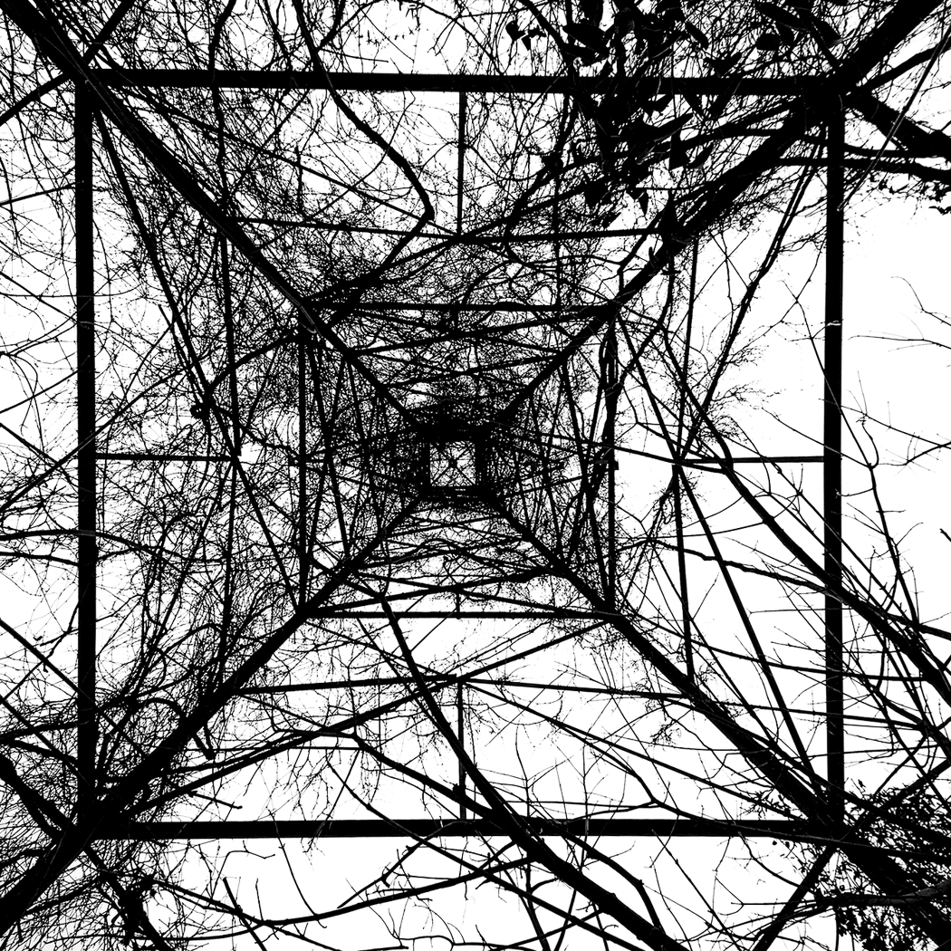
I think perhaps it is better with a more formal treatment. This is more extreme black and white with the lines of the tower straightened both vertical and horizontal. Not the way it really was, but I think I like it this way. |
Jan 23rd |
 |
| 64 |
Jan 19 |
Comment |
I think your first try at changing it was a lot better. I didn't like the cropped version. I can accept that the walls and rubble are the subject littering a pleasant landscape. that works for me. There is some haloing on the tree, not severe, but obvious compared to the color version. I guess some artifact from the conversion. Some software seems to do this. In this case, it would not be all that obvious if we didn't have the color version to look at. I don't think I would zap the house. Perhaps a distraction, or perhaps an interesting picture element in the image. |
Jan 23rd |
| 64 |
Jan 19 |
Comment |
Interesting, we all seem to like playing with the image. It is best in the abstract, so perhaps taking it further from reality is a good thing to do. I am thinking make it lines with virtually no mid-tones. Set the white point so the sky is white and the black point so everything else is black as an example. In Lightroom or a lot of other software you could make the near horizontal lines completely horizontal and the vertical lines completely vertical. I think I would like this. Who cares about reality? |
Jan 11th |
| 64 |
Jan 19 |
Comment |
I was having trouble thinking about my feelings about this image and then I read Jerry's comments. I think he feels about like I do about it. I think I would like those walls to pop more from the grass. The stone walls have significantly different colors than the grass and I think you can get them to standout more and that would help. I am not an Affinity user, but playing with color sliders should enable creating significant contrast with the grass which I think would improve the image. |
Jan 11th |
| 64 |
Jan 19 |
Comment |
I would of expected a mono conversion with birds against that background to not work very well. Sometimes birds get lost in background vegetation in mono, but these stand out pretty well and the drops are wonderful. Nice job. |
Jan 11th |
| 64 |
Jan 19 |
Reply |
Good point, perhaps I should do some selective noise reduction or blurring on it. I love it and it does pretty well in exhibitions, but, you are right, I think it could be improved. |
Jan 11th |
| 64 |
Jan 19 |
Reply |
Your point is well taken on that tyre, but I don't think many would think about it. After I posted this I decided this was indeed a NIK Sliver Efex conversion. I forgot that the original color version is pretty old, but the monochrome was created much later. This is Silver Efex. |
Jan 11th |
| 64 |
Jan 19 |
Comment |
An amazing job of conversion from that original. You took a light sky to a blocked up black (I like those skies) to set off the image in areas that originally were lacking good contrast. Well done. The conversion is so much better than the original that it is amazing. The composition seems to zig zag me on diagonals through the image taking me from bottom to top enjoying the textures all the way. Well done. |
Jan 11th |
| 64 |
Jan 19 |
Comment |
I like the very dark tones on this image. Frankly, I think on-camera flash unless used sparingly would not improve the image. Perhaps some reflected light or something from the right would help it. I don't think it matters much, this is a good image. I think Stuart's comments about light spots is very good. There are probably even more of them particularly near the edges that could be toned down. I might like a little more detail in the large wheel to the right, but if it is not there, it is not a big thing. Good job! |
Jan 11th |
| 64 |
Jan 19 |
Comment |
Before I read all the comments I was thinking just a bit more of the vegetation at the bottom would sort of make a base for the church. That is the only thing I would consider for the crop if the original had it. This is a very good monochrome. The tones of the church make it the clear center of interest with very little distraction in the image. If I would suggest anything it would be to try to bring out the texture of the bricks more, but I think you all know I am a bit of a nut about this. The image tends to prove wrong the "experts" statements about keeping the center of interest in light tones. The center of interest needs to have good contrast with the rest of the image and this achieves that very well. |
Jan 11th |
8 comments - 2 replies for Group 64
|
15 comments - 2 replies Total
|


