|
| Group |
Round |
C/R |
Comment |
Date |
Image |
| 19 |
Jul 17 |
Reply |
I never had the opportunity to experience serious B&W darkroom work in the "old days" . My first experience in the darkroom was in 9th grade and then I turned my mother's storage room in the basement into a contact dark room, so I don't have the experience to say this, but I rather suspect that the control we have for monochrome in the digital darkroom would be envied by any of the old time darkroom experts. |
Jul 12th |
| 19 |
Jul 17 |
Reply |
I tend to agree with Bob. We do not need to strive for realism in all our work. Besides that seeing in perspective is real. |
Jul 12th |
| 19 |
Jul 17 |
Reply |
You can see the uncrossed image next to the image I posted. I didn't feel it gave the proper focus on the chicks. I know this is probably controversial and was wondering what feedback I would get. |
Jul 11th |
| 19 |
Jul 17 |
Reply |
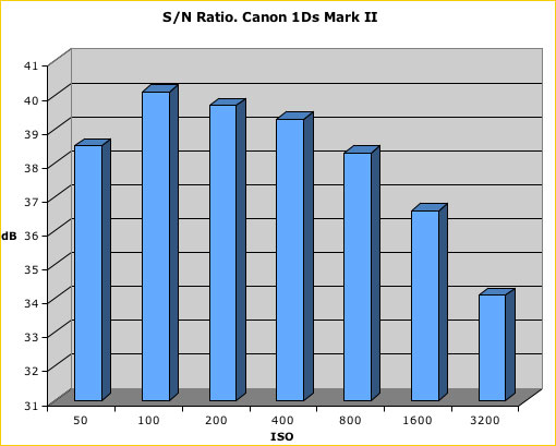
That seems like a strange ISO, but I guess that camera supports it. On some cameras noise actually increases if you go to an ISO lower than the "native" ISO of the camera. I have added an example in the form of a graph. This graph is signal to noise ratio, so the higher the bar the better. ISO 50 is not much different than ISO 800 for this camera. |
Jul 10th |
 |
| 19 |
Jul 17 |
Reply |
Thanks Herb. I never thought about cropping both wings. I will give it some thought. The head of one chick is in the shade of the wing. I tried to lighten the head without great results. Working on just the eye is a great idea. With wildlife flipping is always an option but I find the results don't always accomplish what I expect. I will give it a try. |
Jul 10th |
| 19 |
Jul 17 |
Reply |
Turning my laptop sidewise helped me appreciate a nice image. Technology seems to be filled with gremlins. |
Jul 10th |
| 19 |
Jul 17 |
Comment |
I suspect you meant ISO 800, but in any case aren't these smaller cameras wonderful for their depth of field even at f/2.8. I like the sky with the gradient of tones from top to bottom, but nothing to distract. A great subject for an unusual night shot and mono served it well. Positioning it to the left with some lower buildings and lights on the right worked well. Being at the top of a three story building might explain that the perspective is for a slight shift to make the top of the building look larger than the base. If you don't like this it helps to insure the camera is level side to side and front to back, but it should not be hard to correct the perspective. In this case, I think I would prefer this be done. |
Jul 10th |
| 19 |
Jul 17 |
Comment |
A very nice shot. I can tell it was difficult technically. You needed relatively high ISO to get a fast shutter speed. The f/4.5 doesn't provide a lot of depth of field, but it appears to be adequate. Well done. I liked seeing the whip sharp way to the end. Some might like some motion blur, but I like it like this. With groups of horses like this it is difficult to find a place to crop without leaving part of a horse that you would prefer not having in the picture and inherently they are running out of the frame. You wanted to show driving a group of horses, but you might also try cropping one horse farther in from the right. There is no place you will not leave a fragment of a horse. |
Jul 10th |
| 19 |
Jul 17 |
Comment |
When traveling to distant places, pictures of people looking out windows like this are a bit of a treat. There is some mystery about it. Just a glimpse that makes you wonder what is in the apartment and what this person is thinking. This is an interesting example. For some reason it is rotated 90 degrees when I look at it, but I enjoyed it anyway. |
Jul 10th |
| 19 |
Jul 17 |
Comment |
I like the image and the story is well worth knowing. I think the sky is excellent and the gunpowder store well located in the image. I think I would try to tone down the highlights in the rocks a bit. |
Jul 6th |
| 19 |
Jul 17 |
Comment |
Everything is sharp as a tack and the colors seem to work so well together. I like the negative space with the stem off to the side. Pictures like this can be turned in many ways and work, but I like the angle you picked with the butterfly turned just a bit to the left. Background is very good. I might try a horizontal flip of the image. I never am sure about what it will do, but it seems that stem leading you in from the left to the butterfly on the right just might work well. |
Jul 6th |
5 comments - 6 replies for Group 19
|
| 64 |
Jul 17 |
Comment |
I think Jerry's comments are right on. The image is a bit too "somber" I think. Pure black is fine in things like a sky where often if there is "detail", it is really just noise to me, but getting some detail in the stone work and the roof would improve this image. I still really like the composition and it is a building of interest.
Another interesting point is when does a dramatic sky contribute interest to an image, and when does it distract? I am not sure of the answer to that question on many images, but it seems like judges really like them. |
Jul 16th |
| 64 |
Jul 17 |
Comment |
This image has a real "fine art" feel to it. It has mist in some areas and strong contrasts in others. The vegetation makes no attempt to look like documentation of how it really was. I think this all makes a strong composition with a lot of interest. You might want to consider bringing out some detail in the white or near white areas of the ground, but they certainly contribute to a strong composition just the way they are. |
Jul 10th |
| 64 |
Jul 17 |
Comment |
My first reaction was to the strong textures in the skin. Generally there is dirt or even mud that hides some of this. Your words explained it all, but the texture is very nice. If you are not using it in Nature, I would zap a couple of white spots or lines probably from some straw or something on the skin. I think I might try to bring out more detail in the ground and the tusk perhaps a little dodging would help. If you use the photoshop dodge/burn tools you might experiment by selecting different options of highlights, midtowns, or shadows. |
Jul 10th |
| 64 |
Jul 17 |
Comment |
Another "fine art" feeling image. It is an example that in B&W you can get away with blocked up blacks and blown out whites and in many cases it just provides a strong dramatic composition. There are strong lines throughout this image but the lines of the railing dominate as they should. Well done. |
Jul 10th |
| 64 |
Jul 17 |
Comment |
I like the tree and there is something about it for me that the dead center left to right worked. The horizon does follow the rule of thirds. i like the rather high key treatment in the image, but I think I would try to tone down some areas on the right side of the tree and the log on the ground to show more detail. |
Jul 10th |
| 64 |
Jul 17 |
Comment |
I like the rails and the textures of the cobblestone surface. The different heights of the areas of the building provide a lot of interest and you highlighted the most interesting highest part of the building with the rest providing depth. When you replace a sky you have the option of enlarging, shrinking, or positioning it where you want it. you have picked a position to highlight and give good separation of the building from the sky. There seems to be a bit of perspective shift with the building growing a bit wider at the top. I think I would play with this a bit, but it is a very nice shot. |
Jul 10th |
| 64 |
Jul 17 |
Comment |
I think the 1/13 second served you well. I like the resulting effect of motion on the water. It seems just right to me. Frankly, to me it seems like a lot of black or near black tones. |
Jul 10th |
7 comments - 0 replies for Group 64
|
12 comments - 6 replies Total
|


