|
| Group |
Round |
C/R |
Comment |
Date |
Image |
| 19 |
Jun 17 |
Reply |
I never take an image as B&W. Some do this just to see the B&W on the LCD, but do RAW + B&W. You generally would throw away the B&W. With a RAW image which inherently provides all the colors, you have a lot more data to work with. This allows a lot more flexibility in setting the tones. Remember old wedding pictures when photographers shot in B&W, a lot of brides had black dresses in the pictures, but they were really shades of red. If you shoot in B&W you have little control and red becomes black. If you shoot in RAW and set the tones later, you can make that dress many different tones of gray. I sometimes feel I have lost some of this control going to NIK Silver Efex, but I like a lot of other things about it. Any monochrome conversion software with sliders for each color allow you to set a color light or dark. It is only the near gray tones that provide very little control. |
Jun 11th |
| 19 |
Jun 17 |
Comment |
|
Jun 10th |
| 19 |
Jun 17 |
Comment |
This is a very strong monochrome and composition. It is clear documentation that what we say about in monochrome all zones need to be represented, clearly there are exceptions to every rule. There is a great deal of zone 0 or 1 in this image and that is important to what you were doing. I struggle to believe that I understand your comment about 90 degrees clockwise. I never would of guessed that this had been rotated, but it certainly is a strong composition this way. The mixing of diagonals with the vertical and horizontal works very well. The stroke is probably very important in this image. Our digital work is generally displayed on a black background and we need to set most images off from it. |
Jun 10th |
| 19 |
Jun 17 |
Comment |
I think Herb is right, but I would probably would of just said 2 degree. Herb, you certainly know how to use the tools you are given. You have caught an unusual moment and I don't know if you had to wait for the action you wanted, but rolling the paint looking up at the light points us to the center of interest positioned 1/3 from the left and 1/3 down from the top. A well composed image. |
Jun 10th |
| 19 |
Jun 17 |
Comment |
You drove the depth of field to the minimum with your f/4, but it seems to be adequate and focuses attention, as if this image needed that. You caught the action right at the critical moment for a shot that would be featured prominently if you were a newspaper photographer. I think the image would benefit by taking the exposure down a bit or playing with some of the lighting oriented sliders. The sliding players arm might not be able to recover detail, but I think the grass and dirt would look better. Great capture. |
Jun 10th |
| 19 |
Jun 17 |
Comment |
Well after seeing that picture, I am glad you are still with us. I think this is beyond anything I could do. I think this is an image to be very proud of, but I think it could use some processing. The rock color does not look natural to me. A saturation layer making adjustments of saturation and luminance for each color might do wonders for this image. I never know what adjustments will work best, but it gives me a lot of sliders to tune with. Some might think the boots at the top are a distraction and they probably are. it depends on what you think, but I think they help tell the story. The green plant in the rocks helps give it balance and helps hold me in the middle of the image. |
Jun 10th |
| 19 |
Jun 17 |
Comment |
The background on this image is beautiful. I really like the misty sky and trees. The foreground is a flower bed which is rather busy by its very nature, but the placement and size of the single bloom dominates the scene. What should be in focus is and what should not be in focus is not. Well done. It might be worth trying darkening the flower bed a bit, particularly out toward the sides, but I personally don't like a vignette to be obvious in most cases. |
Jun 10th |
6 comments - 1 reply for Group 19
|
| 37 |
Jun 17 |
Comment |
I am just a guest that happens to be looking at your group. Everything any of us say is only our opinion, but I really like this image, but agree with the comment to eliminate the sky. I have found in my work that I get married to things in an image, sometimes they have meaning to me, but that doesn't necessarily apply to others or judges. Just try gradually sliding the image up to let the top be "cropped". When I do it I like the trees as the background without the sky. Congratulations on a great capture. |
Jun 24th |
1 comment - 0 replies for Group 37
|
| 64 |
Jun 17 |
Reply |
The image in the latest Who's Who is my favorite of the mosque and one of my favorite images ever. I worked very hard trying to insure that every marble plate showed detail. This image was slightly more exposed and not zoomed in as much and that could not be accomplished. You can get a sense of scale in the one in Who's Who because there is a man on top of one of the domes. Look close and you will see him. |
Jun 25th |
| 64 |
Jun 17 |
Reply |
I think I have improved this image. The mistake I made here is understanding what the center of interest is. It is not the butt of the adult, it is the chicks. The crop is not correct above. I think I will share it with you in July. |
Jun 11th |
| 64 |
Jun 17 |
Comment |
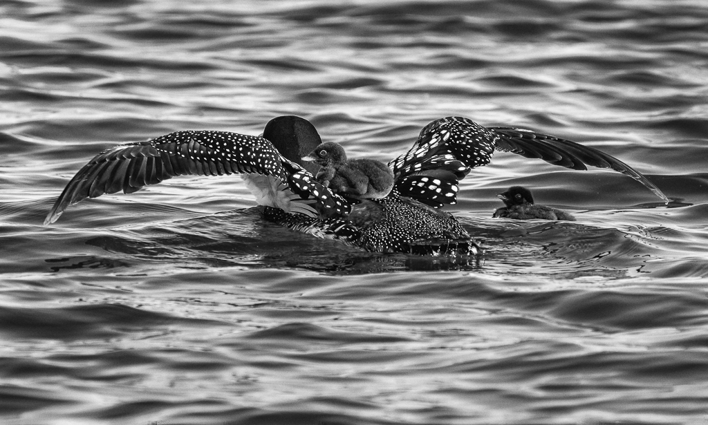
Sorry I did not make it into this round. I violated John's request to get in early. I guess to much going on with our move from AZ to MN and the following technical challenges. I was also out enjoying shooting loon chicks on our Minnesota lake. We are watching five nests on the lake. Two nests so far have provided three chicks. While this image might suffer from being the rear end of the parent, I think it is compensated by the view of the real subjects, the chick on the back and the other framed by the wing of the parent. |
Jun 10th |
 |
| 64 |
Jun 17 |
Comment |
I have a feeling that this image in color would not be anything to talk about. In monochrome it is very interesting and I never would of considered it in the field in the first place. We learn from each other. Your comment about the histogram bathtub curve indicates as we can clearly see that there are very few pixels in the middle zones of this image. Another lesson that rules are to be violated when it works. I think I am concluding that as long as we have both high tones and low tones a lot of images are strong even with very little mid-tones. This probably wouldn't of worked if the divide between high and low wasn't on a diagonal. Very nice. |
Jun 10th |
| 64 |
Jun 17 |
Comment |
It hurts just looking at him, and that makes the image very interesting. I had to give some thought to would I leave as much space on the right, I am not very good at doing that, but I think I like it the way you did it. This is great documentation of the life of these people. I think without an adjustment doing anything to him, I would try taking down the highlights particularly and maybe all the tones in areas other than the man and perhaps his load. A barely noticeable vignette might help focus also. |
Jun 10th |
| 64 |
Jun 17 |
Comment |
A great example of we don't always need good representation of all zones in a strong monochrome. Images with a lot of near black and a lot of near white can have strong impact. While I am impressed with the image, I can understand the comments about the line through behind the window, and the large areas of near white. I like the image in any case. It might become even stronger with a crop up from the bottom and another in from the right. |
Jun 10th |
| 64 |
Jun 17 |
Comment |
This certainly rivets our attention where you wanted it and makes us marvel at the detail. Shot 90 degrees to the plain of the insect or it would not of worked, even now some detail was lost in the feet which I don't consider serious. I don't know if you could of gone to f/8 for a bit more depth of field, but it might of held the feet in focus. I like the soft feel of the petals and the very nice background. I agree that if you are exhibiting this outside of the Nature Division, I would take of the wiggly at the end of the petal. |
Jun 10th |
| 64 |
Jun 17 |
Comment |
I think this is a great image. The textures of the feathers and the details in the eyes are great. Personally I think the detail in the whites of the eyes and the reflection in the eyes make them. It might be interesting to experiment with crops of the sides to move the owl out of the center, or zoom in even more on the owl, but I think the image stands strong as it is. Some of the white feathers in the breast have lost some detail, but it isn't very serious. If you are intending to exhibit it in PID or PPD, I would consider doing some low opacity or flow cloning on darken to put a hint of detail in these areas. It takes study for awhile, at least for me to notice the highlights on the tops of the ears and that might be hard to do much with. |
Jun 10th |
| 64 |
Jun 17 |
Comment |
A great example of an exception to what we are told so often that our eyes are drawn out of the frame by near white. It is pretty hard to draw your eyes away from the highest contrast in the frame which is the black engine on the white. I like the foggy effect, but I think I would consider bringing up the black on the engine some. In any case, it is a very nice image exactly the way it is. |
Jun 6th |
8 comments - 2 replies for Group 64
|
15 comments - 3 replies Total
|


