|
| Group |
Round |
C/R |
Comment |
Date |
Image |
| 62 |
May 17 |
Reply |
Much better for my taste! It fits in with the softness appeal! |
May 14th |
| 62 |
May 17 |
Comment |
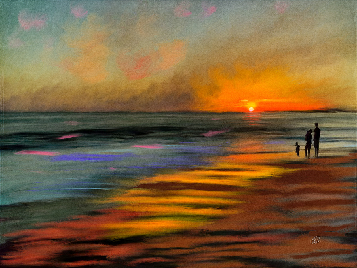
That is a great suggestion Tom. It is more pleasing to the eyes I think. Kind of hard to tell but definitely something to consider in the future. |
May 14th |
| 62 |
May 17 |
Comment |
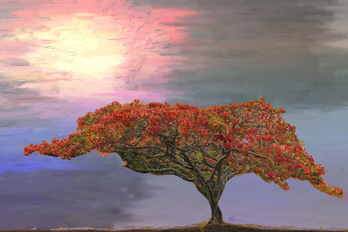
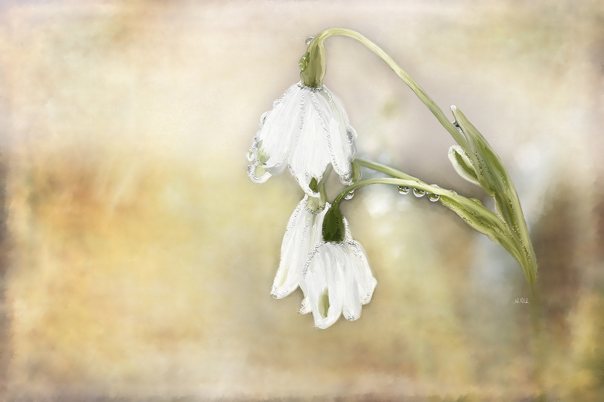
It is very nicely done Gloria. I love the simplifications and the more vibrant colors than on the original image. Very pleasant on the eye. I wouldn't change a thing. |
May 12th |
| 62 |
May 17 |
Comment |
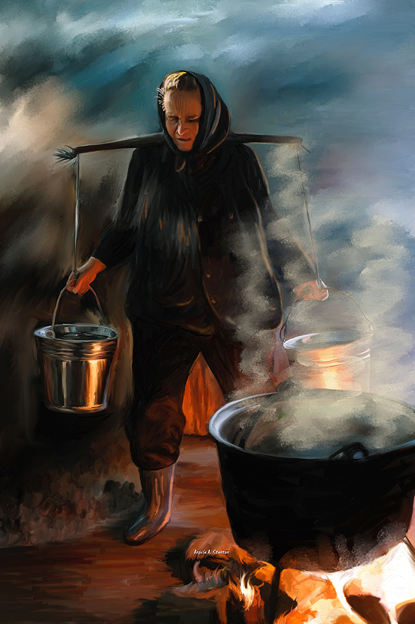
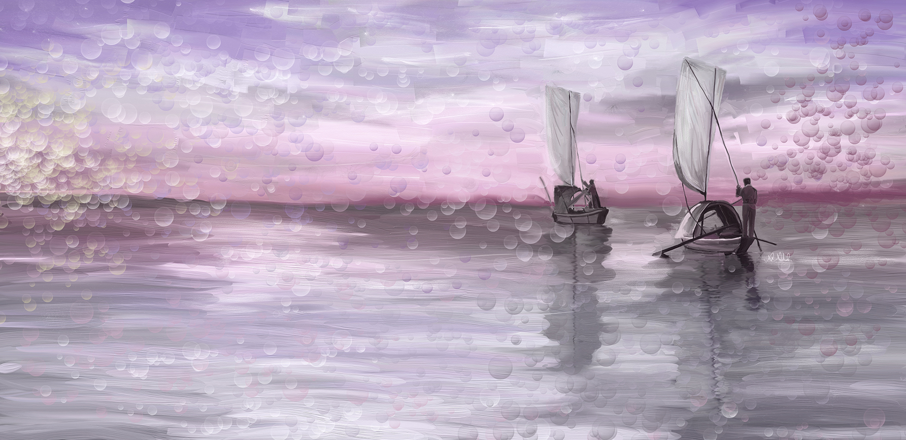
Wow, I wish there was a chance for you to post the stacked images. That is one thing I never tried (I actually tried but I think did it wrong since I had no examples).
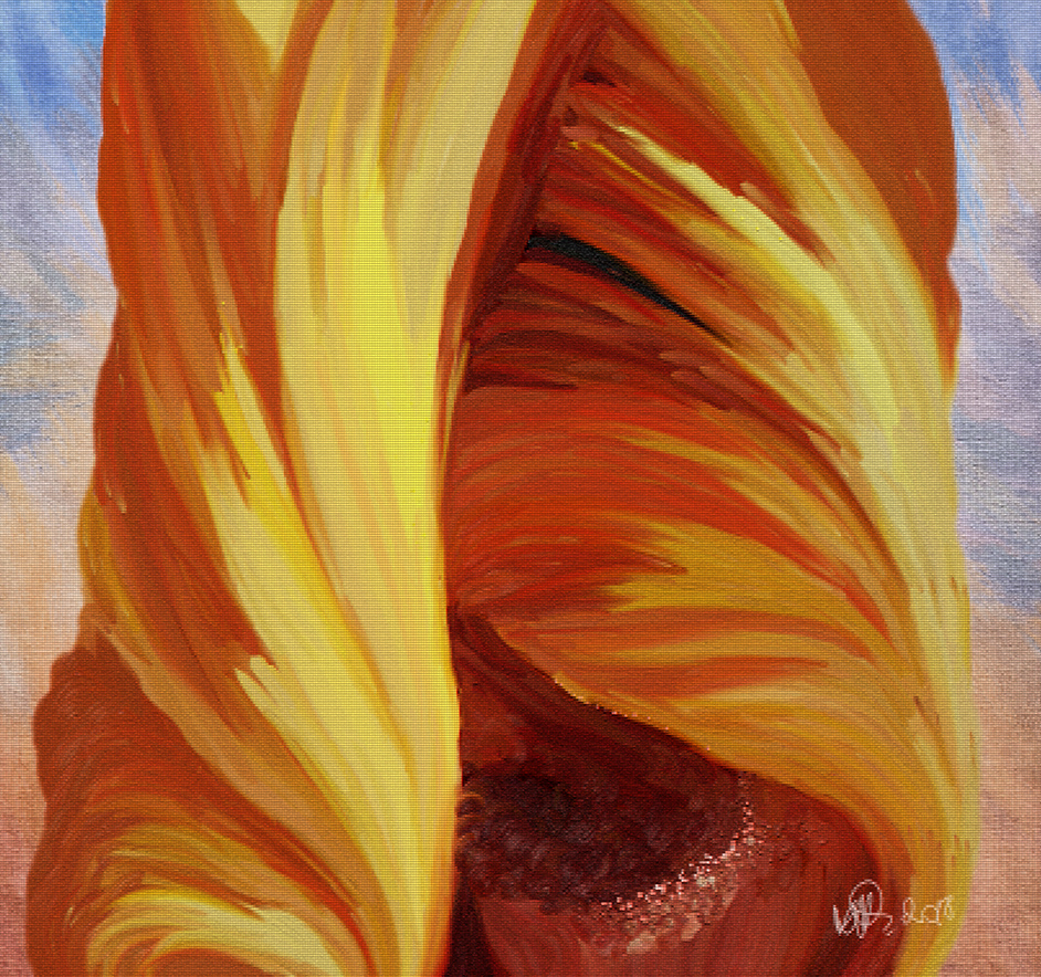
The painting is lovely; nicely focused! The only thing that caught my eye is the very straight line over the left side just above the flower. It may be natural but looks unnatural. I think I would smoosh that a tad into less straight line. The rest looks perfect. |
May 12th |
3 comments - 1 reply for Group 62
|
3 comments - 1 reply Total
|