|
| Group |
Round |
C/R |
Comment |
Date |
Image |
| 62 |
Apr 17 |
Comment |
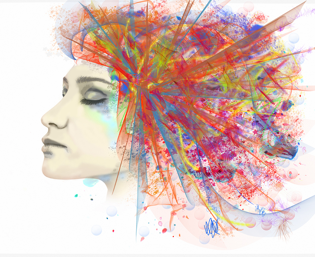
Indeed! Less is definitely more. I very much like your technique here. Looks like a highly impressionistic watercolor. Very nicely done Gloria. :) |
Apr 11th |
| 62 |
Apr 17 |
Comment |
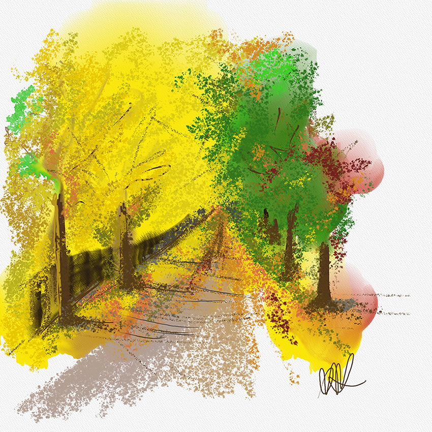
It is a really nice first try Elinor! You did a great job. I can see you experimented also with the oil brush. I find that is is great to mimic those lines in the petal. nice job. When you are done using the colors from the same as the image, if you click on the palette on the bottom right, it lets you chose colors. What I normally try to do is add another layer and add the deeper colors (like for the center of the flower) and highlights on yet another layer. Then you can export it all as a photoshop DPS file that retains the layers. When you open in Photoshop then you select blending modes to look the best. Lots of tricks of the trade there! :) |
Apr 11th |
| 62 |
Apr 17 |
Comment |
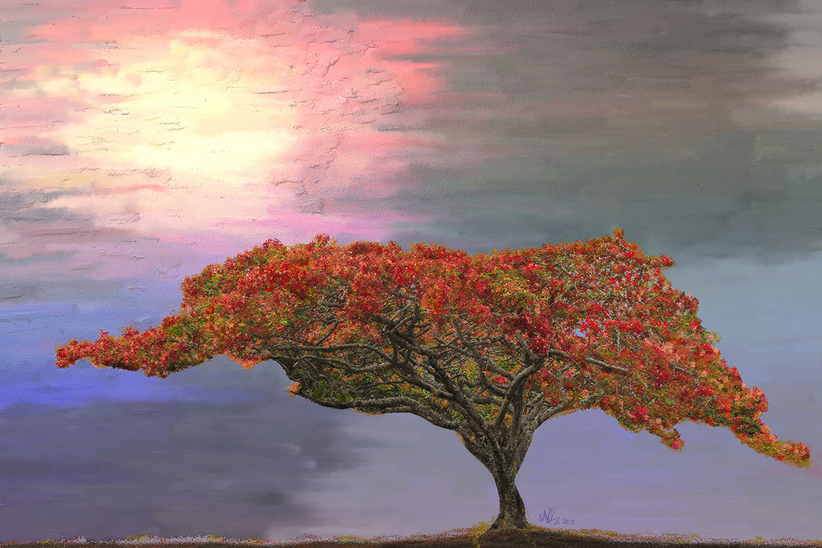
Very nicely done Gerhard. I like how you livened up the color and the light. It definitely places the emphasis on the family. Nicely done! |
Apr 11th |
| 62 |
Apr 17 |
Comment |
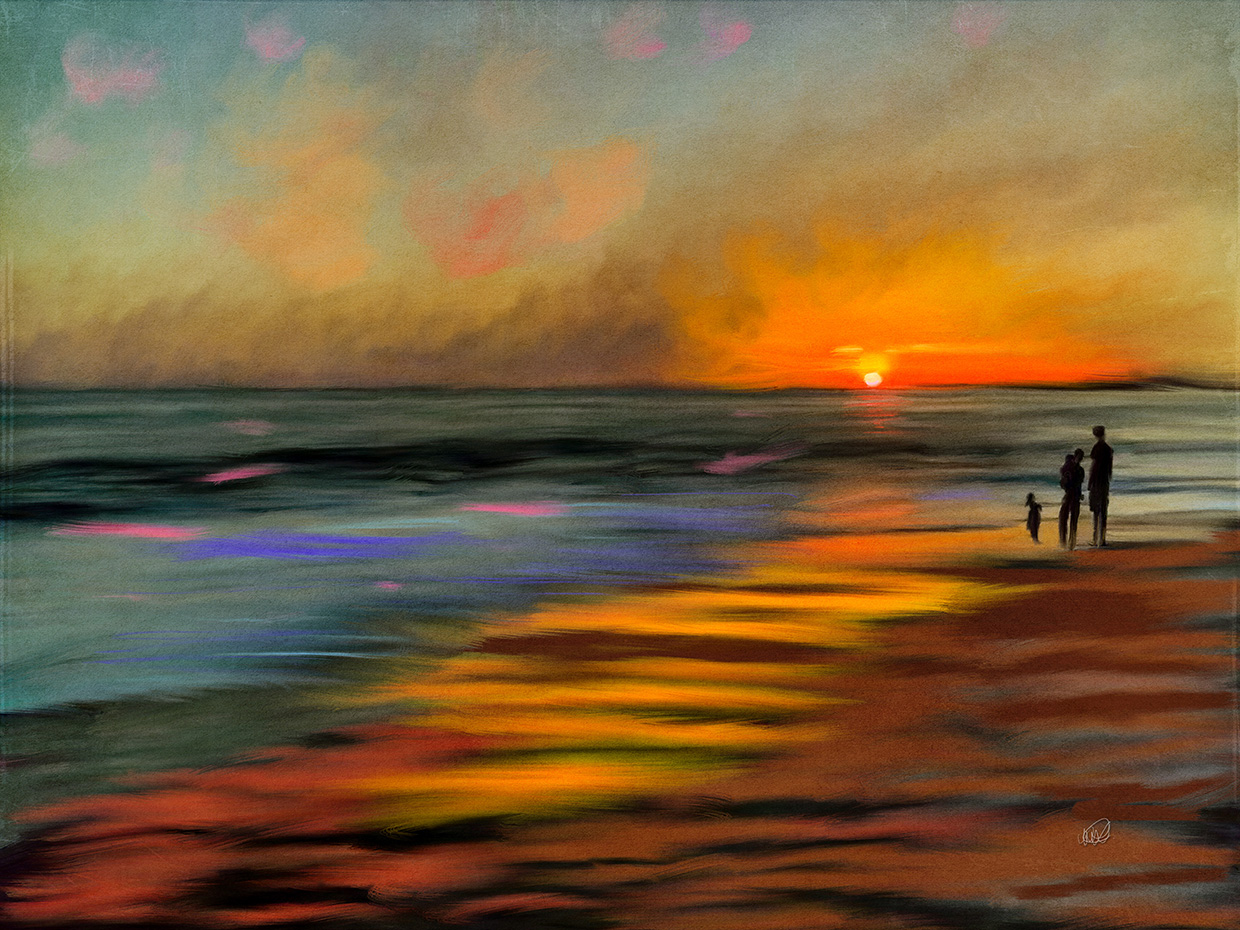
It looks wonderful Tom. A really nice color composition. Not sure where the car is hidden in all this but it is not important. The thing just looks great! I also like the softened colors and the watercolor effect as Elinor noted. Nicely done. |
Apr 10th |
4 comments - 0 replies for Group 62
|
4 comments - 0 replies Total
|