|
| Group |
Round |
C/R |
Comment |
Date |
Image |
| 62 |
Mar 17 |
Reply |
I tested it tonight Gloria. I found it not nearly as good for water color as otehr software--it doesn't "bleed" and that is essential for watercolor... I didn't like it enough to even show an example. Artrage is really great for textured paintings--particularly oil and also pastel and pencil but not watercolor. |
Mar 15th |
| 62 |
Mar 17 |
Reply |
I have not had success with their water color yet--I am really not a watercolor painter so it is hard to say. I will test it later today and post a comment on how it went Gloria... wish me luck! |
Mar 14th |
| 62 |
Mar 17 |
Reply |
You should get it again Tom. It does very different kind of work. :) |
Mar 14th |
| 62 |
Mar 17 |
Reply |
Glad you like it Elinor. I lately only use ArtRage. :) |
Mar 14th |
| 62 |
Mar 17 |
Reply |
Thanks Elinor. Agreed. :) |
Mar 14th |
| 62 |
Mar 17 |
Reply |
I highly recommend this painting software Tom. It is called Artrage and has some very good features! It is a combination of Painter and Photoshop simplified. It is also inexpensive compared to the others. If I could only keep one software, it would be that one. :) |
Mar 14th |
| 62 |
Mar 17 |
Reply |
I agree Gloria. In watercolor less is more. This isn't the case in other mediums though--perhaps in some like charcoal and pastel also. |
Mar 13th |
| 62 |
Mar 17 |
Reply |
I like this significantly more Tom! |
Mar 13th |
| 62 |
Mar 17 |
Reply |
That is always a possibility that someone's eyes move to that spot first but perhaps not all. I understand your viewpoint and it is not really a question of agreement or not but taste I suppose? |
Mar 13th |
| 62 |
Mar 17 |
Comment |
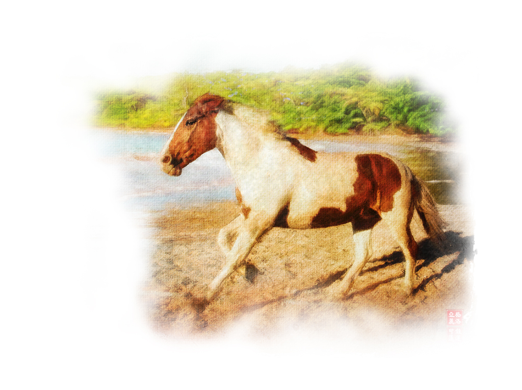
Wonderfully done Gloria--as always. My only observation is the very "controlled" background, which is watercolor is typically missing. I posted a picture on Tom's painting that is not mine to depict what the sense of a water color "look and feel" is though I tried to apply that to your horse a tad with just a 1-minute deleting in Photoshop. So my reduction is not even close to what a real watercolor would be like but it captures (or at least I tried to capture) the importance of the irregular background.
Otherwise, the simplification of the background and the emphasis on the single horse is wonderfully done and the fuzzy look of speed and motion is also very well captured. |
Mar 13th |
 |
| 62 |
Mar 17 |
Comment |
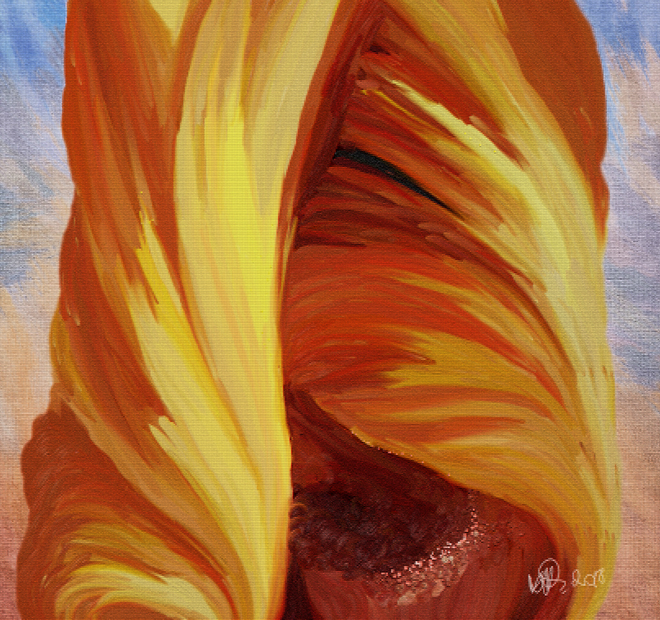
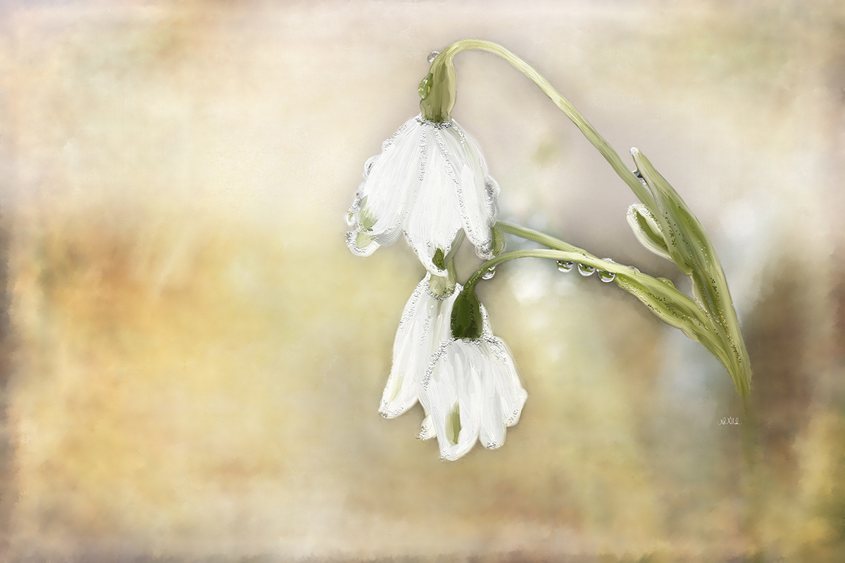
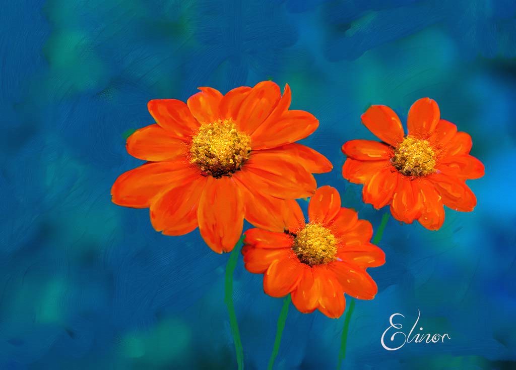
I am just as surprised that Tom discovered the 3rd flower. ;) I guess as hard as we try we miss very good things. Lovely composition.
I do have one are of concern and that is the center of the flowers. On the photo they pop and stand out of the image. I know it is hard to do that when we use painting software that doesn't automatically add texture.
In Photoshop a texture can be created if you paint the center of the flowers as dots on a fresh clear layer and for blending mode choose "beveled" and then "drop shadow" and select each to set it to liking.
In Painter you can create it as well only it is harder since Painter doesn't show the outcome until you saved your work in another form that you can open in Photoshop or in jpeg.
My personal preference is ArtRage for this since it has a particular brush selection that can do very nice 3D. |
Mar 13th |
 |
| 62 |
Mar 17 |
Comment |
This is truly magnificent Gerhard! You did an amazing job in making it way nicer than the photo! I find it the hardest to paint fog. Your depiction of it is amazing. |
Mar 13th |
| 62 |
Mar 17 |
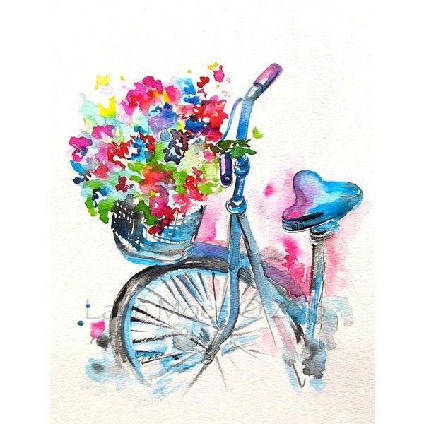
Comment |
Wonderfully captured bike. I totally agree with Gloria. I have one more suggestion Tom, something I often note to Gloria as well, who is our watercolor champ.
In general, one of the hallmarks of a real watercolor is that is doesn't cover the entire paper but much of the paper is left without any painting on it. The painting of the bike should sort of "appear" from the background with lots of nothing around it with a little hint of the background.
Since I am really not an expert at watercolor myself, I am just posting a picture here from google so you can see what I mean of a watercolor painting of a bike (not motorbike) but it depicts what I mean |
Mar 13th |
 |
| 62 |
Mar 17 |
Reply |
Thanks Gloria |
Mar 13th |
| 62 |
Mar 17 |
Reply |
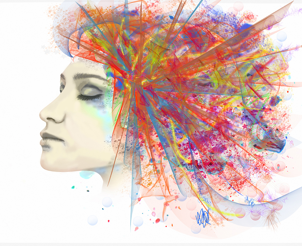
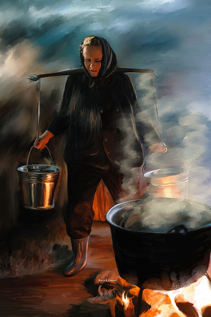
Thanks Tom for your suggestion. I think the two painting depict a different feeling. The one you created depicts the pain from the heavy weight but not the heat and burning. Note the redness disappeared from the image though her hand is still reflecting red. I think that while removing the burning red did bring more attention to her face, it removed something that I miss. To me it reduced the environment to a "common" fire in the open for cooking. Don't you agree? Whereas the original could even be metal melting for all I know. |
Mar 13th |
4 comments - 11 replies for Group 62
|
4 comments - 11 replies Total
|