|
| Group |
Round |
C/R |
Comment |
Date |
Image |
| 62 |
Jan 17 |
Reply |
Thanks Gloria. I was not actually aware of that! Greatly appreciate the knowledge! :) |
Jan 15th |
| 62 |
Jan 17 |
Comment |
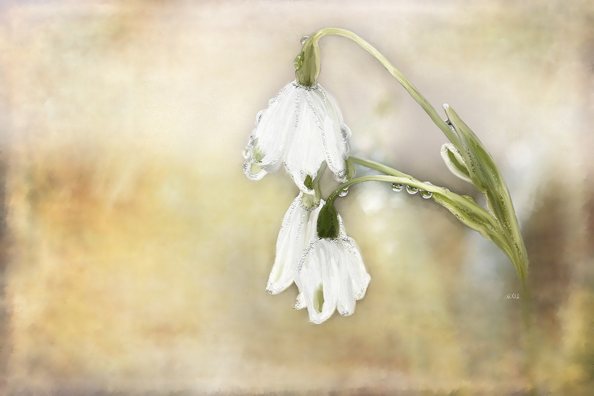
Interesting that two of you would like 3. I wonder why. Is there something similar to how bull's eye is not desired by judges? I never thought that 3 woudl look more balanced. I wonder why? |
Jan 14th |
| 62 |
Jan 17 |
Comment |
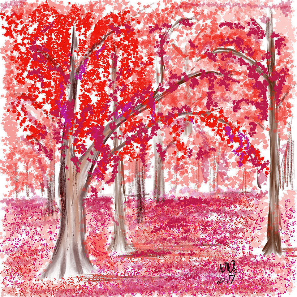
lol, indeed, I guess spring is in the air in the dead of winter! :) Love the work Gloria. I still miss your skillful fading of your watercolor effect. In painting with real watercolor, it is not possible to create straight lined like this at all and so that gives away the digital nature of the painting. There is nothing wrong with that only I personally aim to show no digitalness (if that is a word) in my digital painting, trying to make them as real to the medium I select as possible. It is a good practice that way and is a definite advantage from marketing point. Very good job on the flower and its immediate background. |
Jan 12th |
| 62 |
Jan 17 |
Comment |
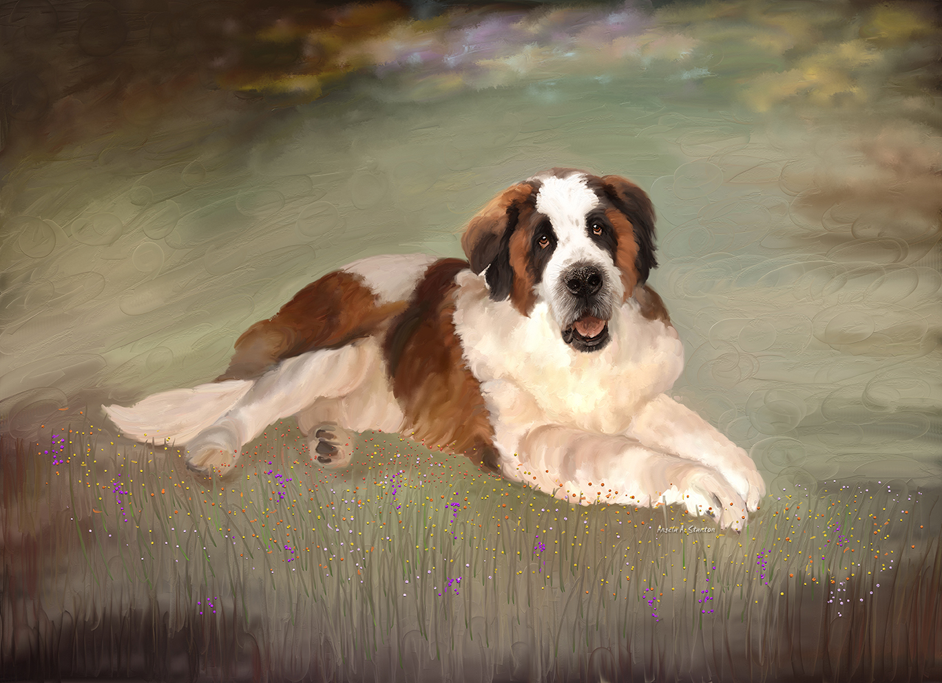
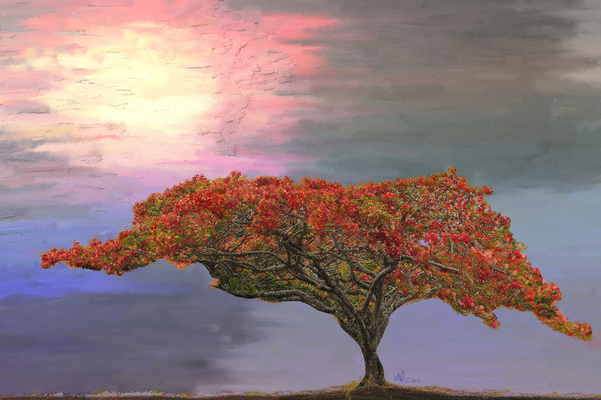
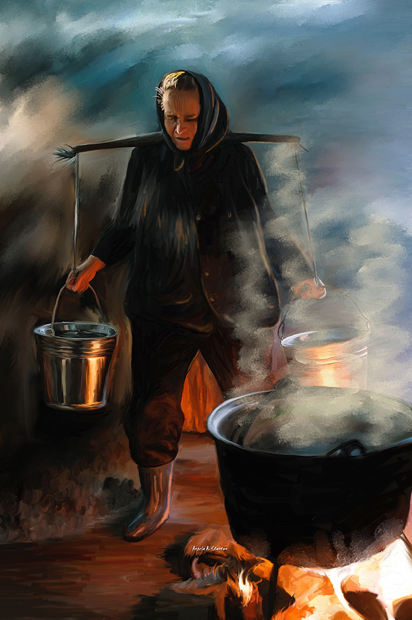
Lovely work James. I love the fresco effect. Very good match to the subject. I think I would recommend only to enhance the flag bases. They seem to be standing on nothing in the painting--especially the one further back. |
Jan 12th |
| 62 |
Jan 17 |
Comment |
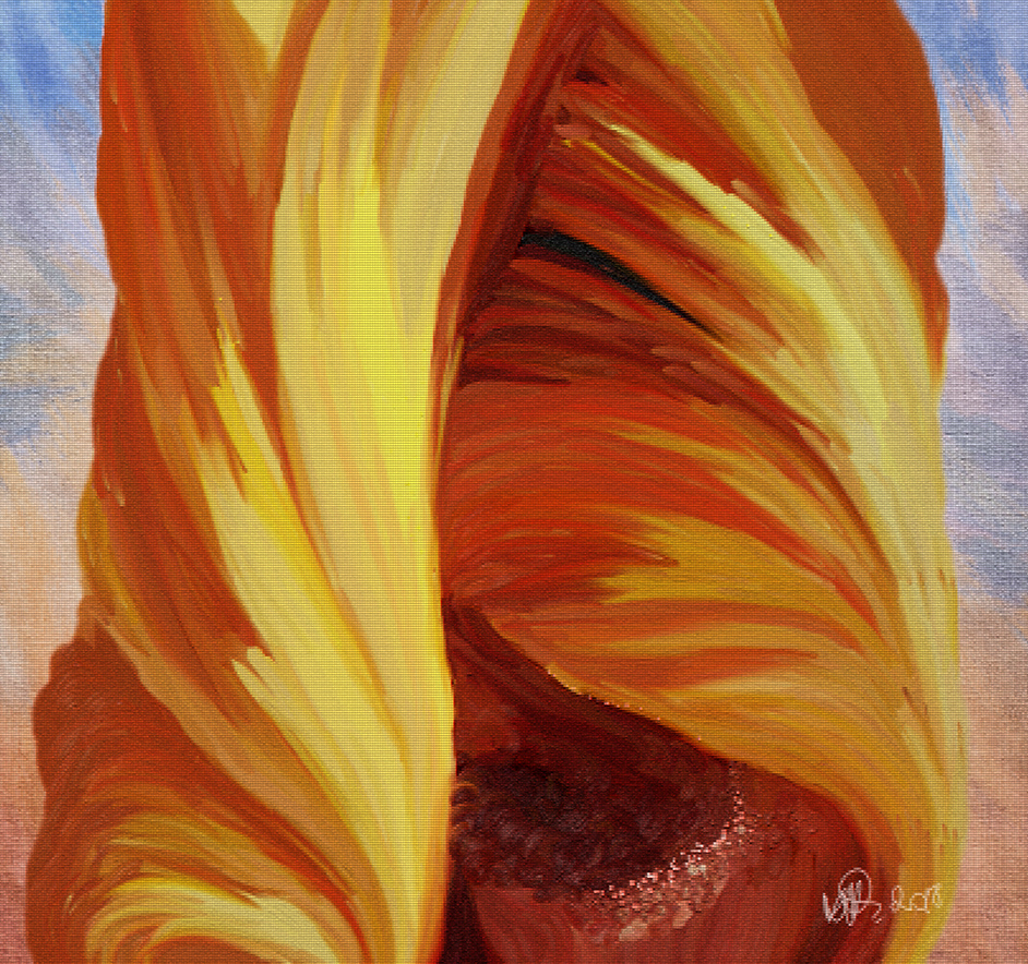
Nicely done Elinor. I do see a bit of pixellation in the shadows where the petals overlap and at the base where the petals collect. I very much enjoy your change of color to be a richer more orange type. Lovely composition! |
Jan 12th |
| 62 |
Jan 17 |
Comment |
I agree with Gloria on the positioning the flower in the center--I know tastes differ. This is called (technically) a "bull's eye" positioning that is frowned upon in art judging, where they hate that so badly that they consider that point #1 for exclusion. However, over time I noticed that Gerhard has a preference to the bull's eye and I had clients--while still doing photography by request--who also all preferred the bull's eye. So I suppose to each his/her own. :)
My note here refers rather to the brush strokes in the background. It seems to be that the technique of mixed styles is not as inviting to my eyes--in some places you brushed it smooth and in others it is rough. I think that either would do on its own but not mixed. I also have a preference to the lighter green on the bottom left--perhaps because this flower is a spring flower here. Nice work Gerhard! |
Jan 12th |
| 62 |
Jan 17 |
Reply |
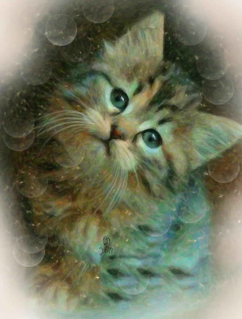
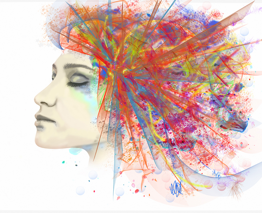
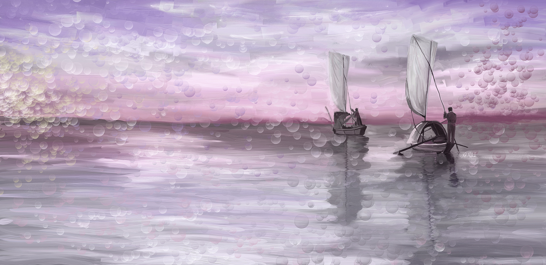
Gloria it is not called "bubble" brush but it is a brush that you paint with on the canvas and it paints many bubbles (globes) like above in different sizes all at once. It looks like soap bubbles, the toys of kids. So I call it bubble brush. I use this quite often and have many kinds. It has no name only a number. I no longer remember what company I purchased it from. I have several types: stars, footsteps, leaves, etc. They come in quite handy |
Jan 12th |
5 comments - 2 replies for Group 62
|
5 comments - 2 replies Total
|