|
| Group |
Round |
C/R |
Comment |
Date |
Image |
| 20 |
Jan 18 |
Comment |
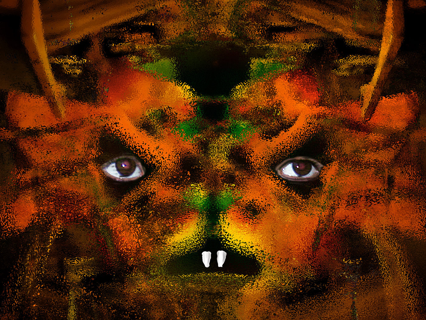
Peter, I think you have done a marvelous job on this image. Amazing how you have extracted those lovely colours to make a really interesting picture. Very good indeed. |
Jan 9th |
| 20 |
Jan 18 |
Comment |
Jerry, Who or what is DxO please as I would love a copy of NIK |
Jan 9th |
| 20 |
Jan 18 |
Comment |
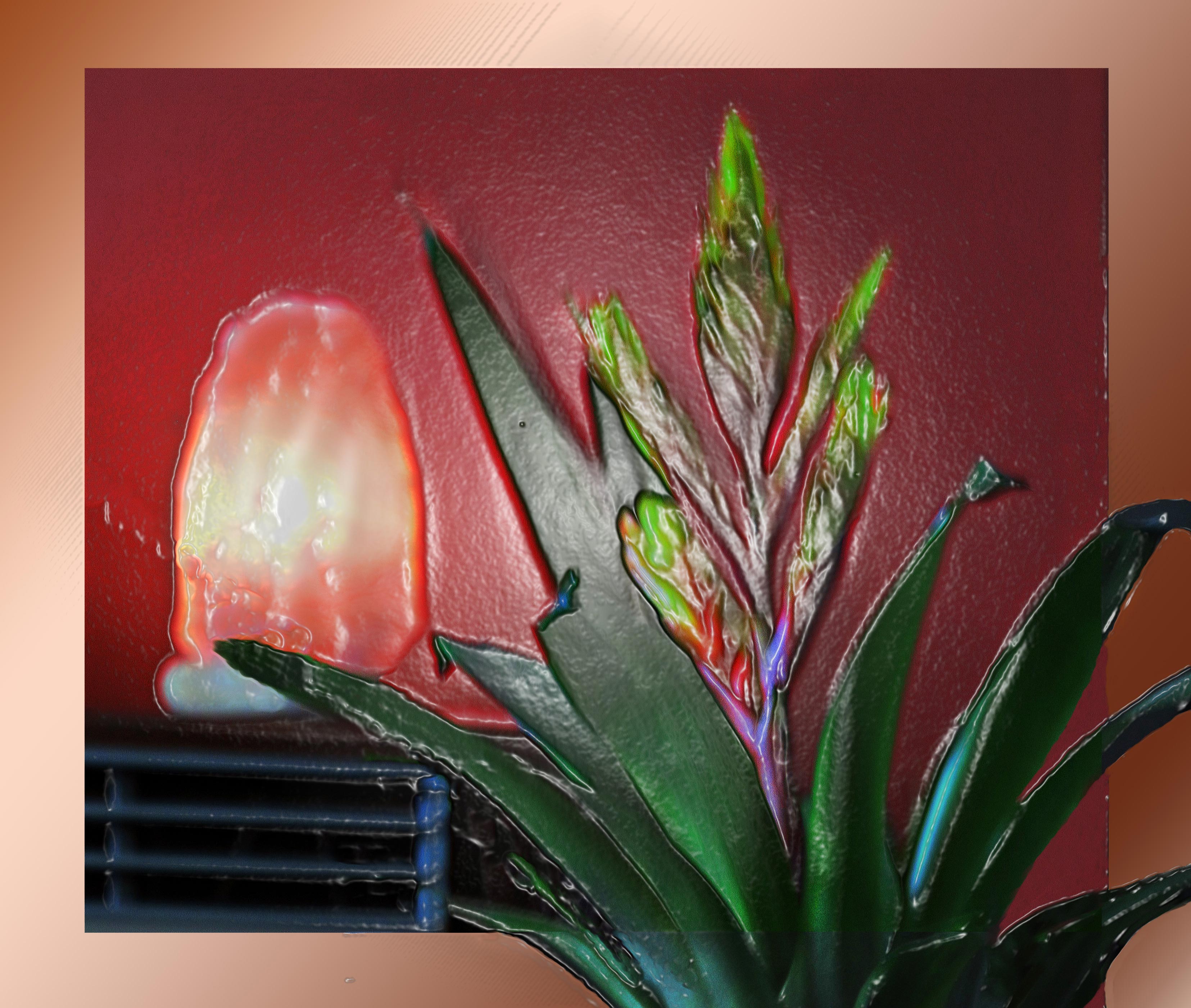
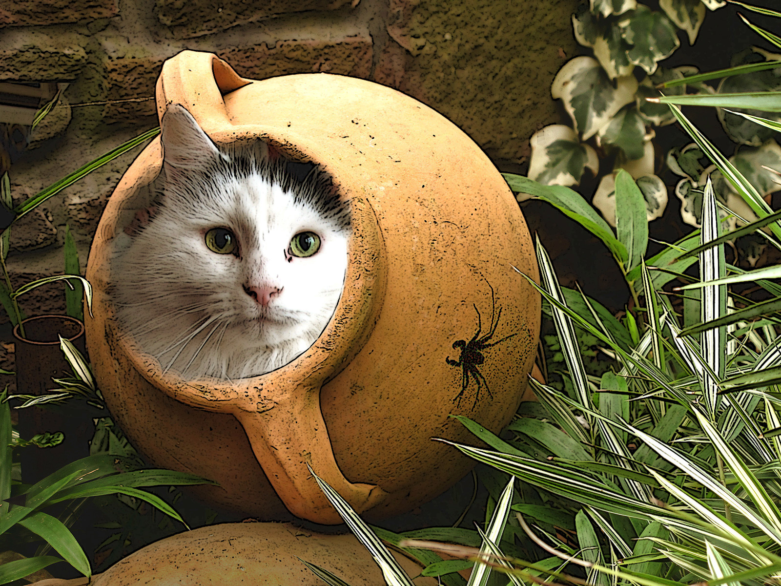
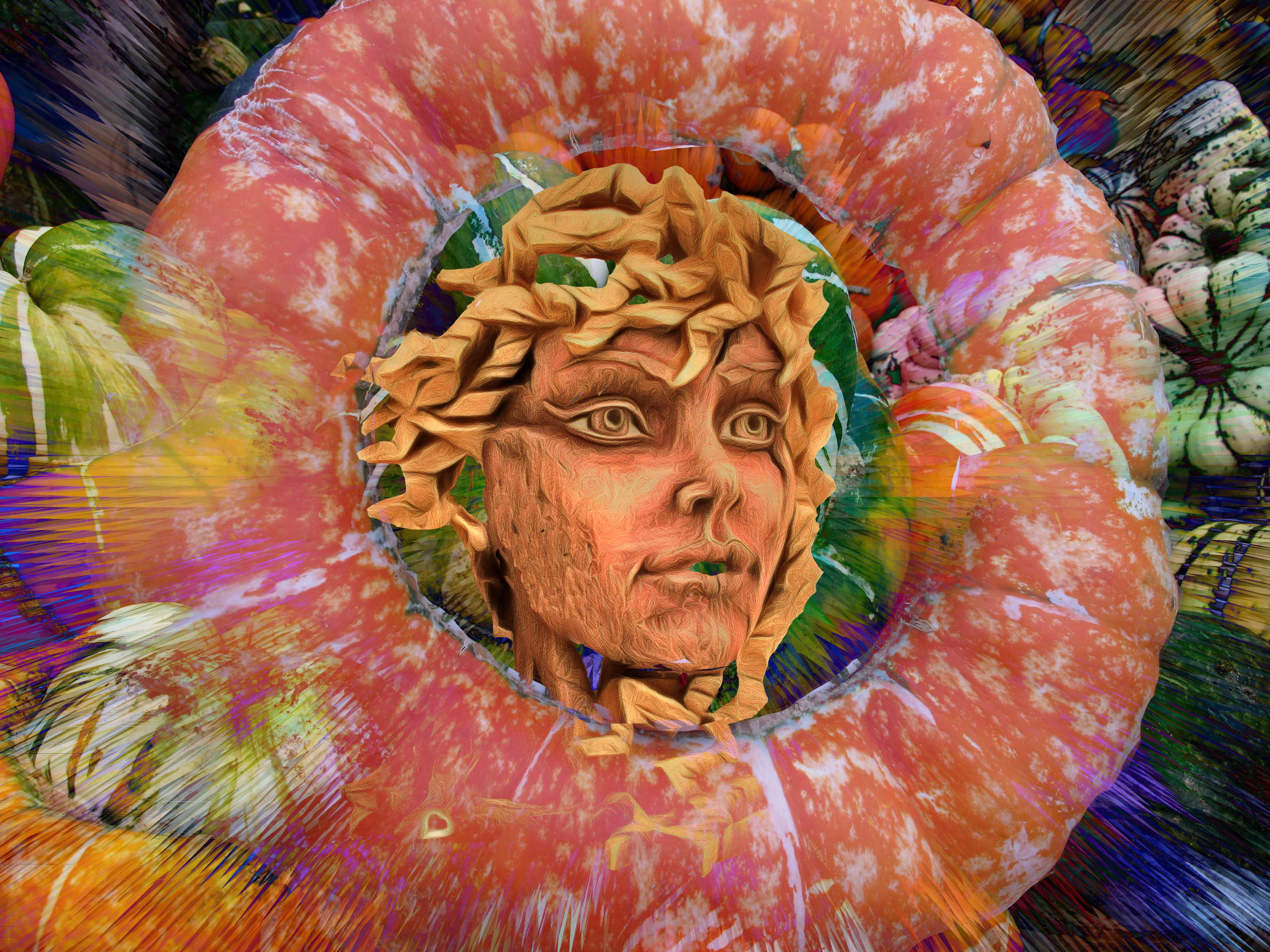
I think these squashes had better be eaten fast! I feel this filter had aged them somewhat. Pity you didn't lift one to make it stand out a bit as you usually do. Agree the blue is a distraction. Sorry |
Jan 9th |
| 20 |
Jan 18 |
Comment |
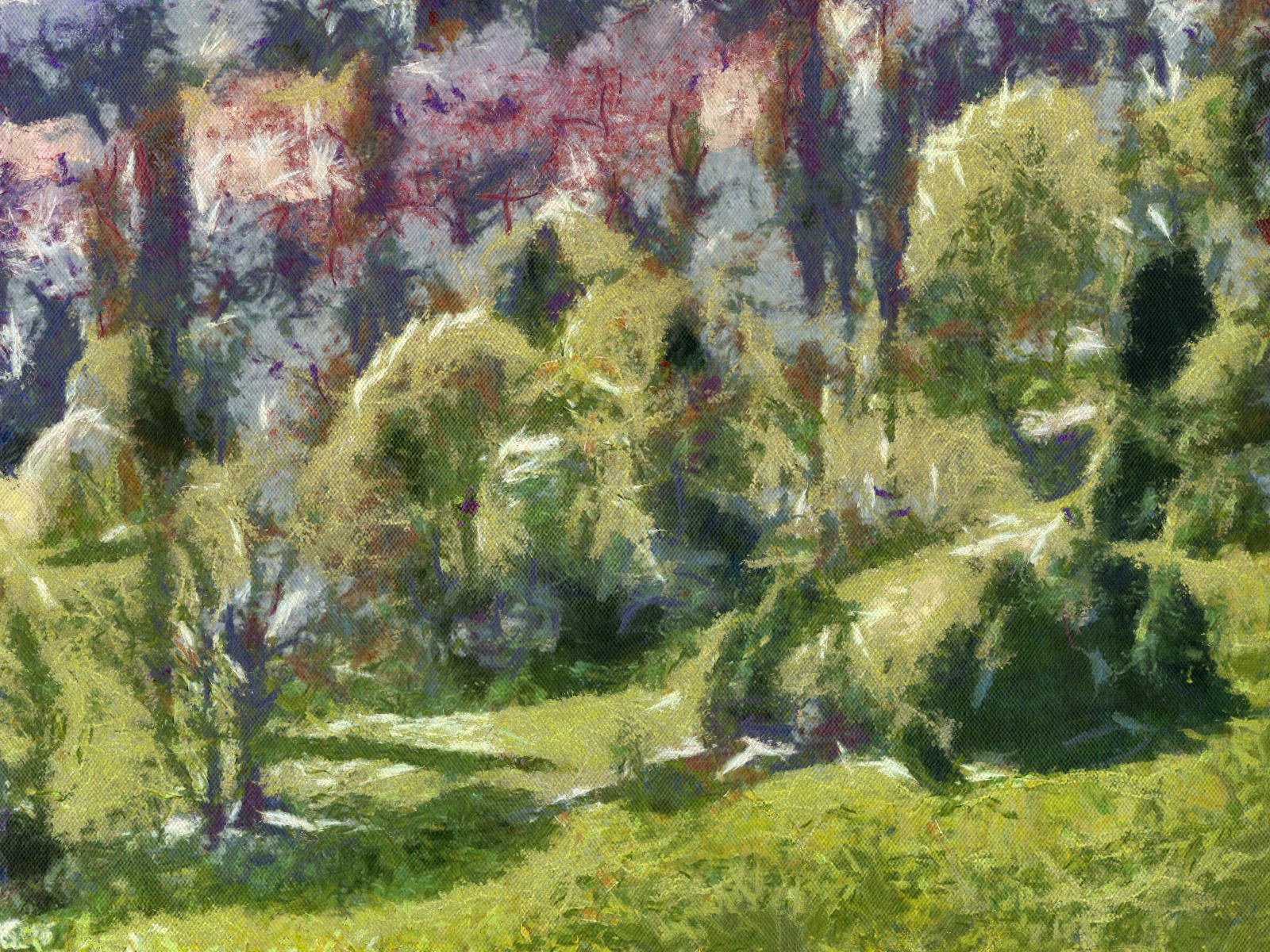
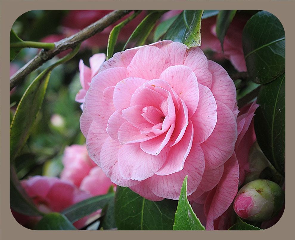
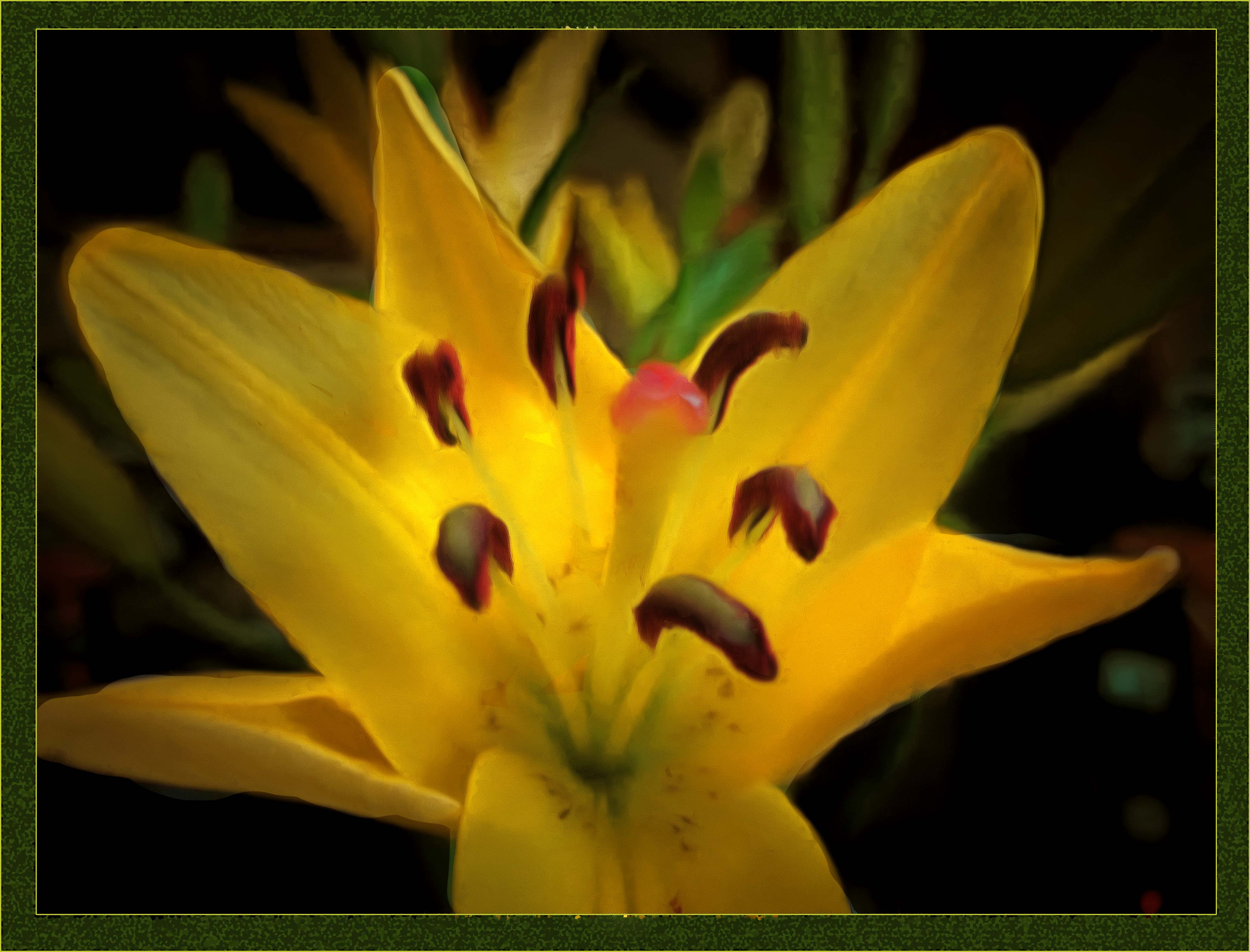
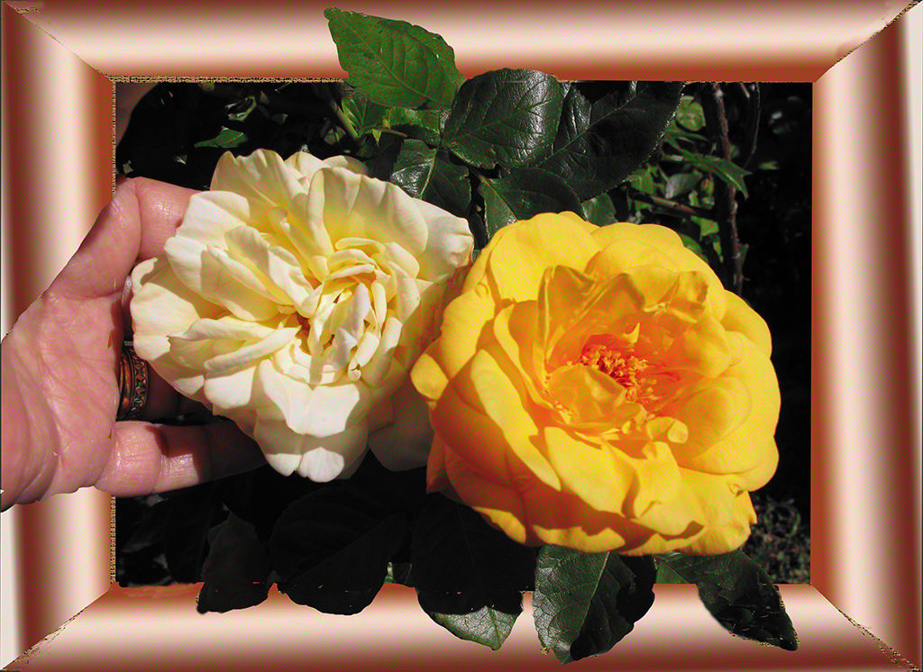
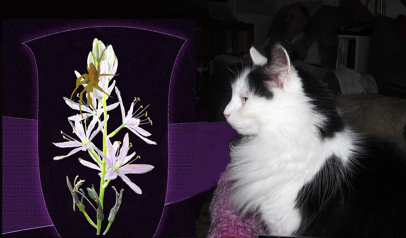
I love this delicate picture. I use this filter often but will have to experiment further for this is outstandingly beautiful. Love the lavender background but would prefer the lighter corner to the top with dark to the bottom. Suggest you cut along the yellow stamens with a very soft brush so the edge is not so hard. For a realistic picture I like the single flower but for an artistic image to hang on the wall I think I would prefer the double flower. It is difficult to choose for I love both. |
Jan 9th |
| 20 |
Jan 18 |
Comment |
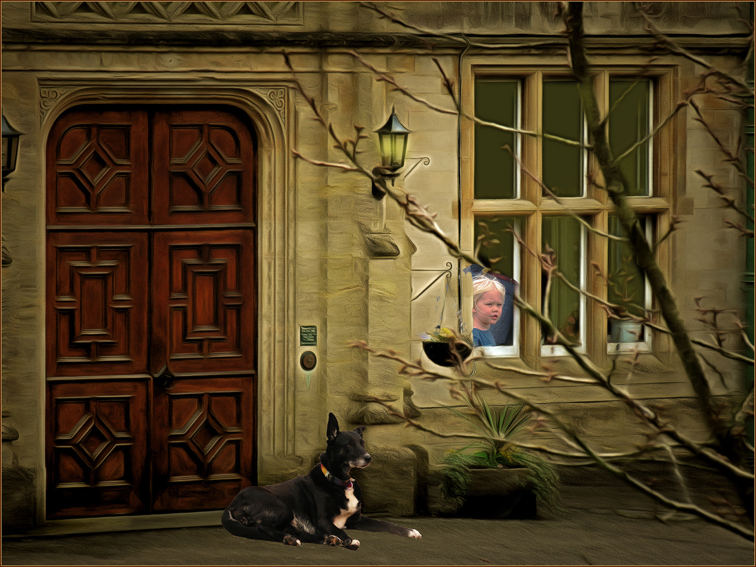
Tinkerbell wins yet again! I love the background and subtle colours in it. Had to smile at her little ears poking up eagerly from behind. Bet she's wagging her tail by now!! Top job Nellie. |
Jan 9th |
| 20 |
Jan 18 |
Comment |
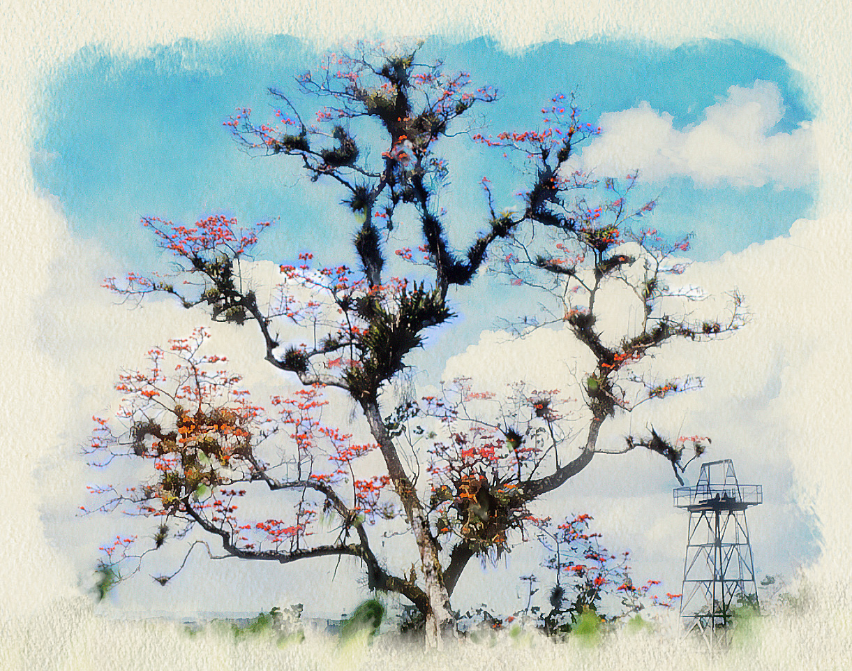
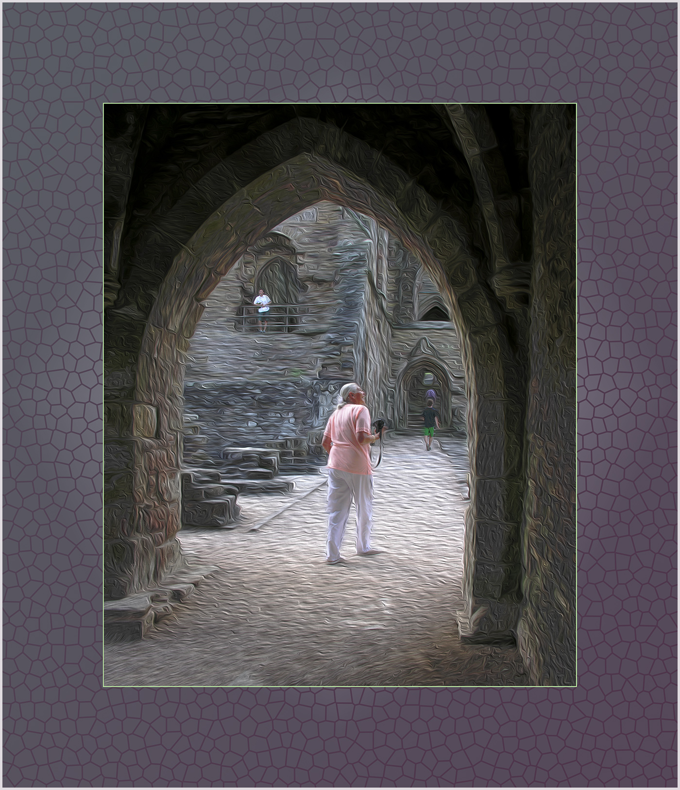
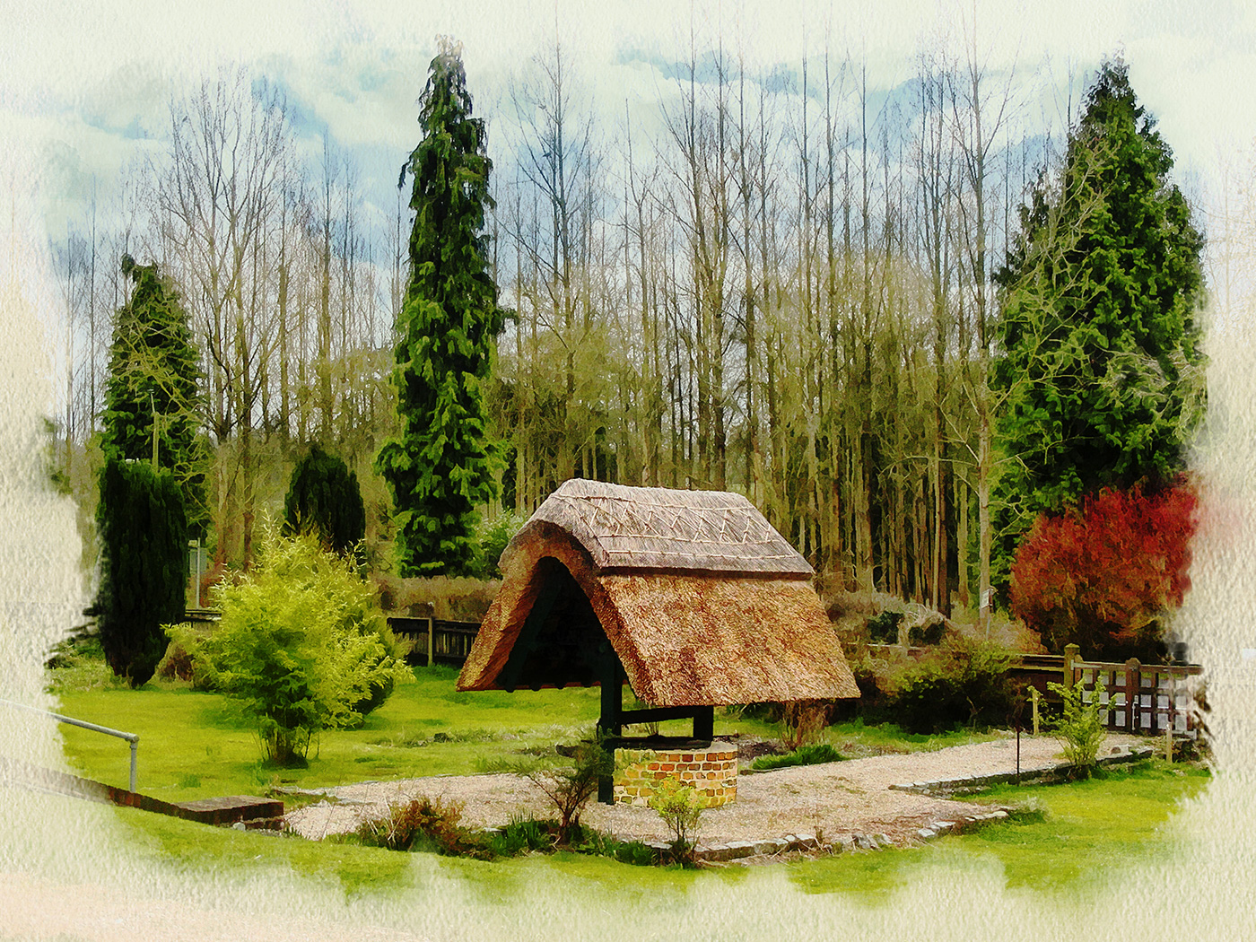
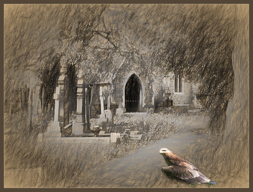
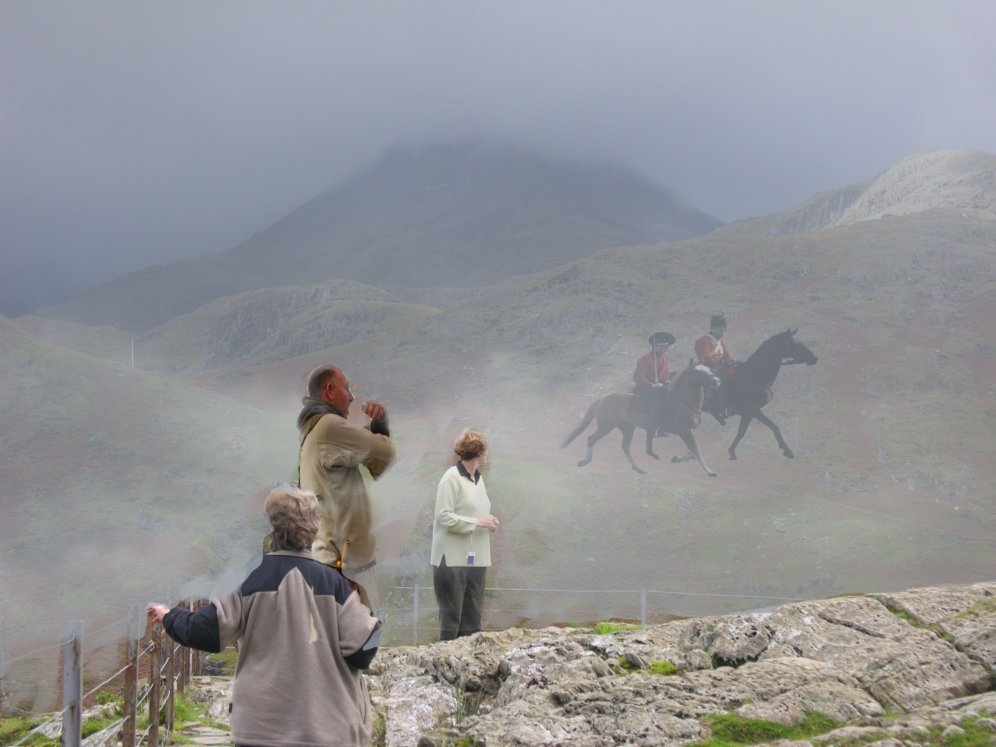
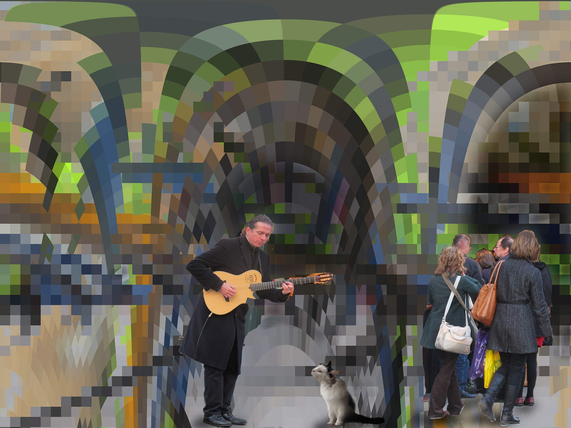
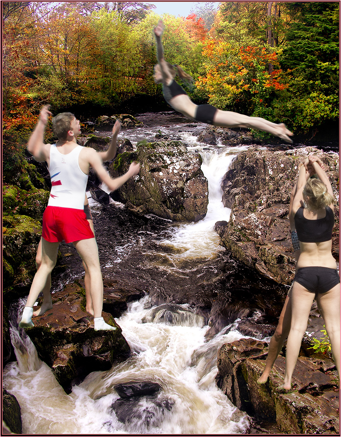
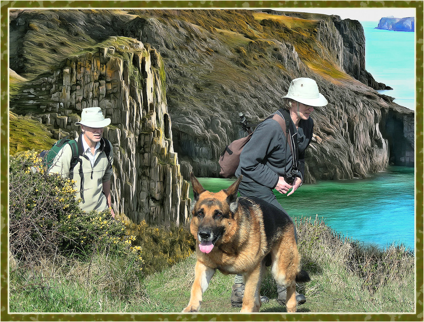
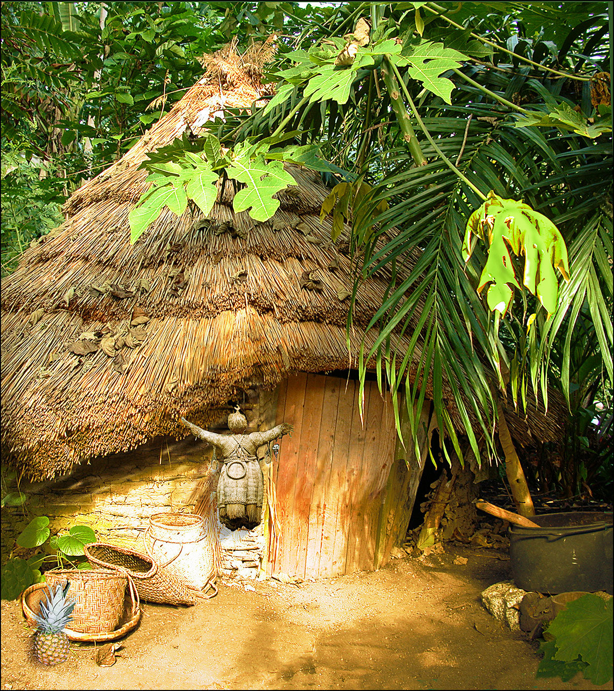
I too have spent hours watching such belching puddles but mine in Trinidad, gave an occasional squirt for about six inches upwards. That would have added a "centre of interest" to the big puddle. I wonder if one could drop something into water and catch that upwards splash and then colour it to match your puddle? But I transgress. You have made a fascinating picture and brought out the texture and colours very well. I personally think the frame enhances the whole and puts that finishing touch - but without drop shadow please. Black background, yes that would be preferable or just cut closely round the frame. I often use frames but not in Salons - they don't like it. |
Jan 9th |
| 20 |
Jan 18 |
Comment |
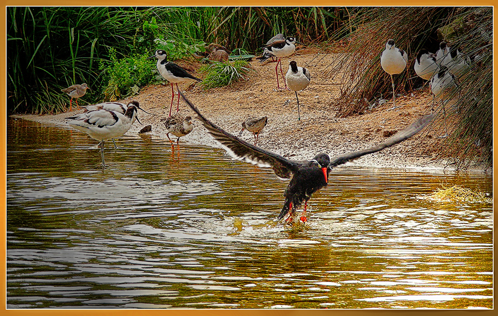
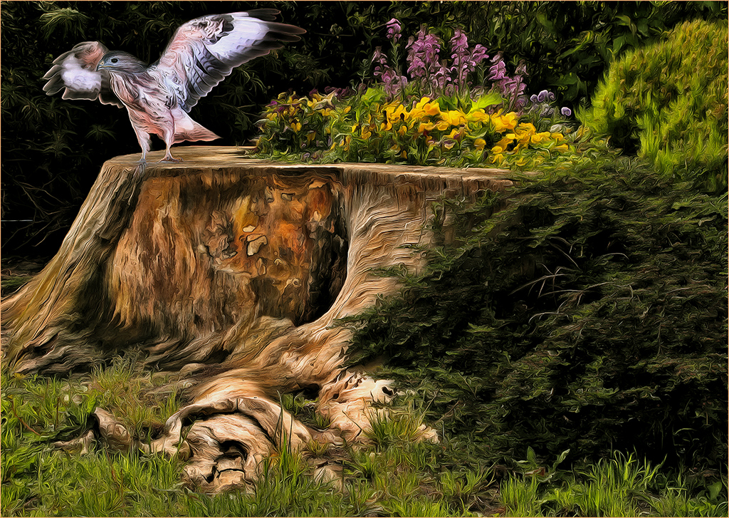
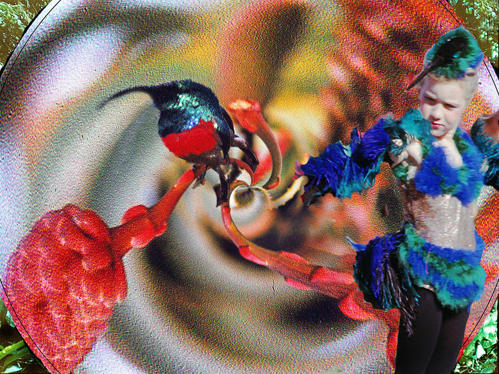
A Superb picture Kathrin, so delicate, quite beautiful. Welcome to the group and I'm eager to see more of your beautiful birds. |
Jan 9th |
| 20 |
Jan 18 |
Comment |
Tried your idea Cindy and it looks better - thanks. |
Jan 9th |
8 comments - 0 replies for Group 20
|
| 54 |
Jan 18 |
Comment |
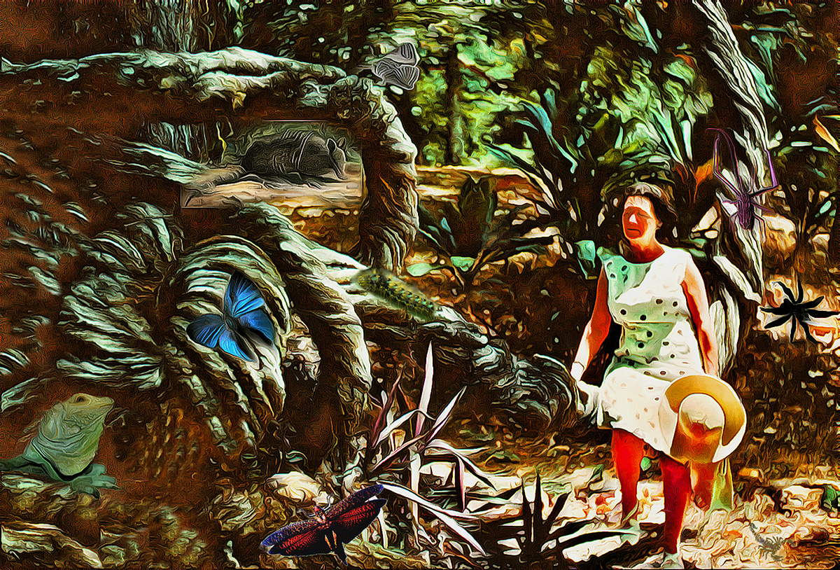
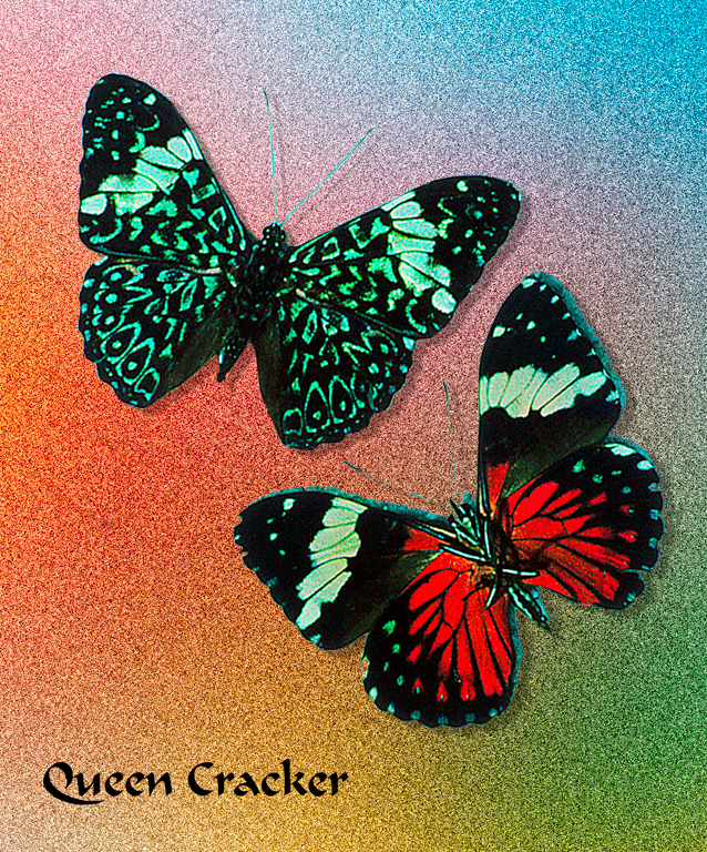
Oh how I wish butterflies did happen like that! A lovely idea and clever of you to produce it using the shaped brush. A stunning picture but to my mind somewhat spoilt by the dirty rag as background. I know you obviously went to a lot of trouble to produce it but why I ask myself. You don't want the background to detract from the message of flower = butterfly so why not something pleasantly green? |
Jan 9th |
| 54 |
Jan 18 |
Comment |
Not familiar with the programmes you speak of it is difficult to comment. I feel it would tell the story better if she were holding or at least touching one of the shoes. The background provides a lot of interest though does not really give much indication as to where she is. Did you do that on purpose to leave us wondering? |
Jan 9th |
| 54 |
Jan 18 |
Comment |
This gives a very strong message and I like it very much for that sake. It tells a story, and forcefully, and you have done a great job. Well done. |
Jan 9th |
| 54 |
Jan 18 |
Comment |
Mother and child in this picture are so wonderful and full of emotion you really can't go wrong no matter what you do! However this is now a superb picture and the soft colouring only adds to the emotion. Beautiful as is. I find the fish irrelevant - what have they to do with the nursing mother? I am glad they are so abstract they have virtually disappeared and myself I would lighten the orange patches on her hair made by the fish. Perhaps darken the right hand of the baby just a trifle? It's a super picture you have made and as I said the soft colours only add to the emotion. |
Jan 9th |
4 comments - 0 replies for Group 54
|
12 comments - 0 replies Total
|