|
| Group |
Round |
C/R |
Comment |
Date |
Image |
| 51 |
Mar 25 |
Reply |
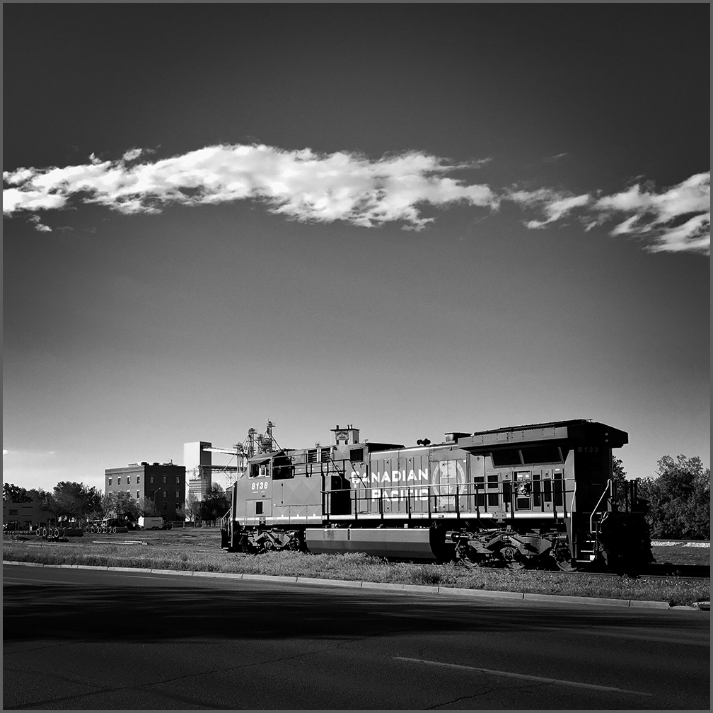
Thank you, Lynne. I guess I'm stuck in the BW film days, and I often like to use BW editing. You are right, the color version is warmer and more inviting.
|
Mar 12th |
| 51 |
Mar 25 |
Reply |
Thanks. I agree. The two versions do present different feelings. I prefer the drama of the BW a bit more.
|
Mar 12th |
| 51 |
Mar 25 |
Reply |
Thank you. I agree the BW has more impact, and I like it better, too.
There is a vignette around the color version. The foreground could be darker, but at some point, the colors would get muddied. No pun intended.
|
Mar 7th |
| 51 |
Mar 25 |
Reply |
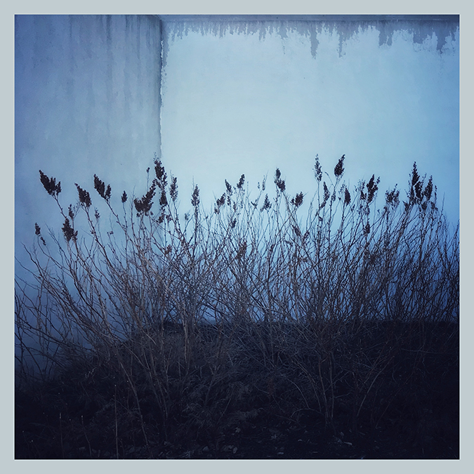
I understand. I was thinking about warming the scene, and you were thinking about the coldness of the stone. Different perspectives.
|
Mar 7th |
| 51 |
Mar 25 |
Reply |
Thank you. I like the BW more myself, but then I'm stuck in the days of BW photography. The two versions were edited in a similar way, but... Just thinking about it, if I darkened the entire color image a lot more, and brushed the far end back, it would yield something closer to the BW. The sky would be very dark blue. Or I could brighten the far end even more, but that might not look realistic. I don't know. I'll have to try it and see.
|
Mar 5th |
| 51 |
Mar 25 |
Reply |
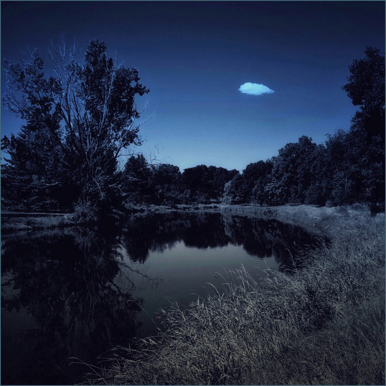
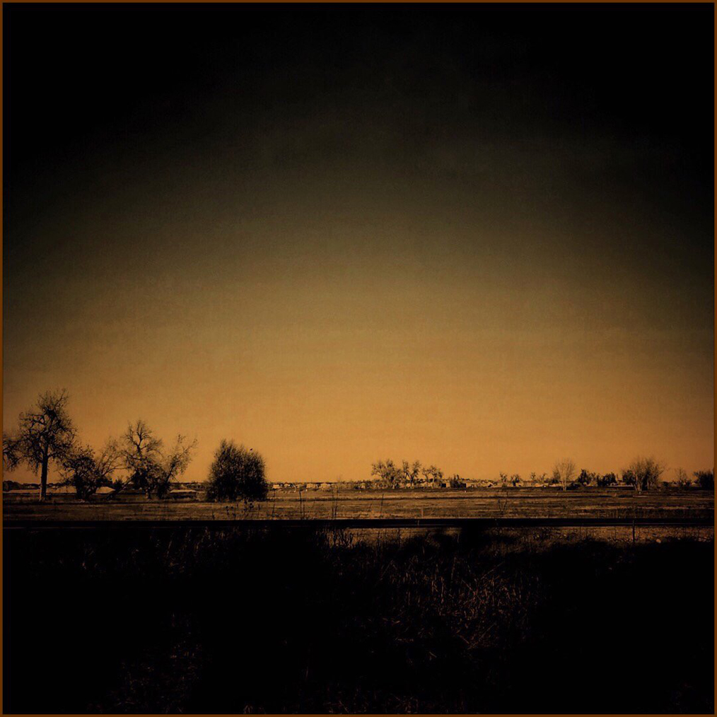
Thank you, Jerry. I thought it might be interesting to show both color and BW versions. The BW version is dark enough to muddle some of the details as you mentioned. An acquaintance said that the BW version almost looks like a moonlit scene, and I do understand that. I pushed the brightness slider pretty far (and then brushed it out at the center).
|
Mar 5th |
| 51 |
Mar 25 |
Comment |
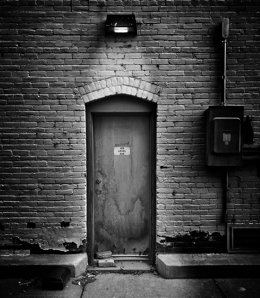
This beautiful building looks like a fortress or castle with all the stonework. I do think it looks sort of foreboding in this image. I might suggest adding brightness and lowering contrast to open it a bit. I've been working with more pastel edits recently and that's why I thought about that. I haven't been to the art center, so I don't know how it actually looks. I have attached a version edited in Snapseed with increased brightness, lowered contrast, and a little added warmth. Just an alternative.
|
Mar 5th |
 |
| 51 |
Mar 25 |
Comment |
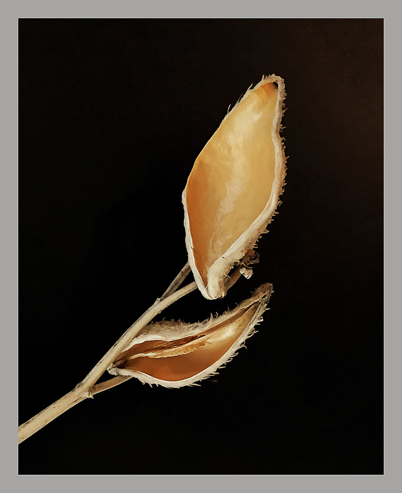
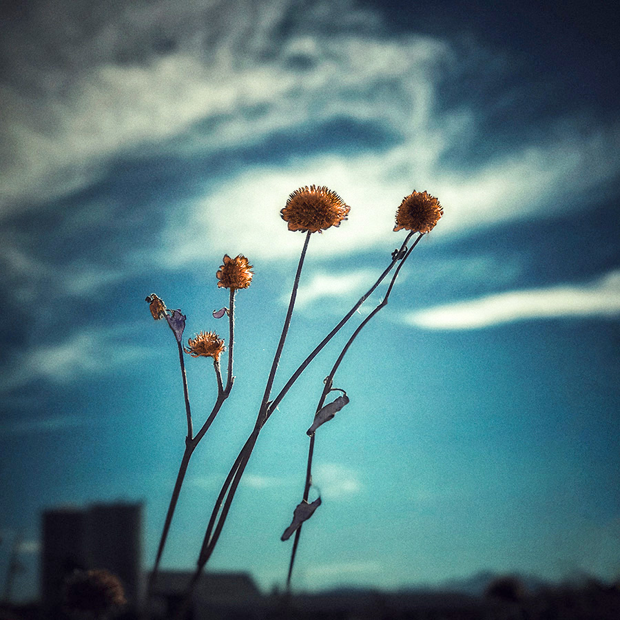
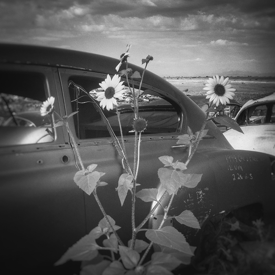
Your technique worked very well on this image. The flower stands out on the black background. Good colors and saturation. The water droplets add a nice dimension. As Jerry mentioned, it is great that you could do this on your 'phone. I have to resort to using an iPad so my images are large enough for me to see the details!
|
Mar 5th |
| 51 |
Mar 25 |
Comment |
Freshly sheared, too! Usually, we see them when they have full fleece coats. Nice composition with the animals in the foreground and the wall of green behind them. The lack of shadows and the saturated colors suggest an overcast sky. It's a pastoral, peaceful scene. Nice.
|
Mar 5th |
| 51 |
Mar 25 |
Comment |
Another nice capture of a PNW scene. The ship, the water, the clouds, and the sky give the viewer lots to look through. The wooden material on the shoreline adds interest.
I wonder if adjusting the brightness (up) and the contrast (down) might open the image a bit. There might be some interesting detail in the ship that is hidden in the darkest areas. Just a thought.
|
Mar 5th |
| 51 |
Mar 25 |
Comment |
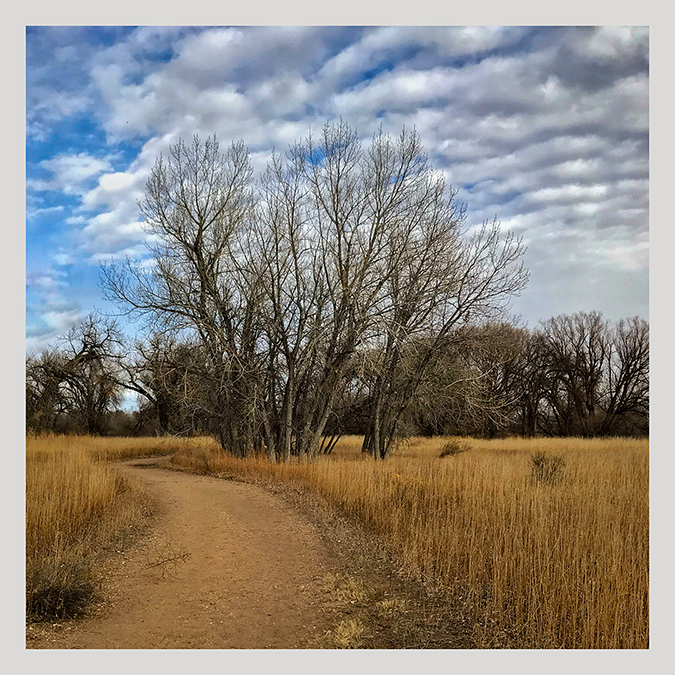
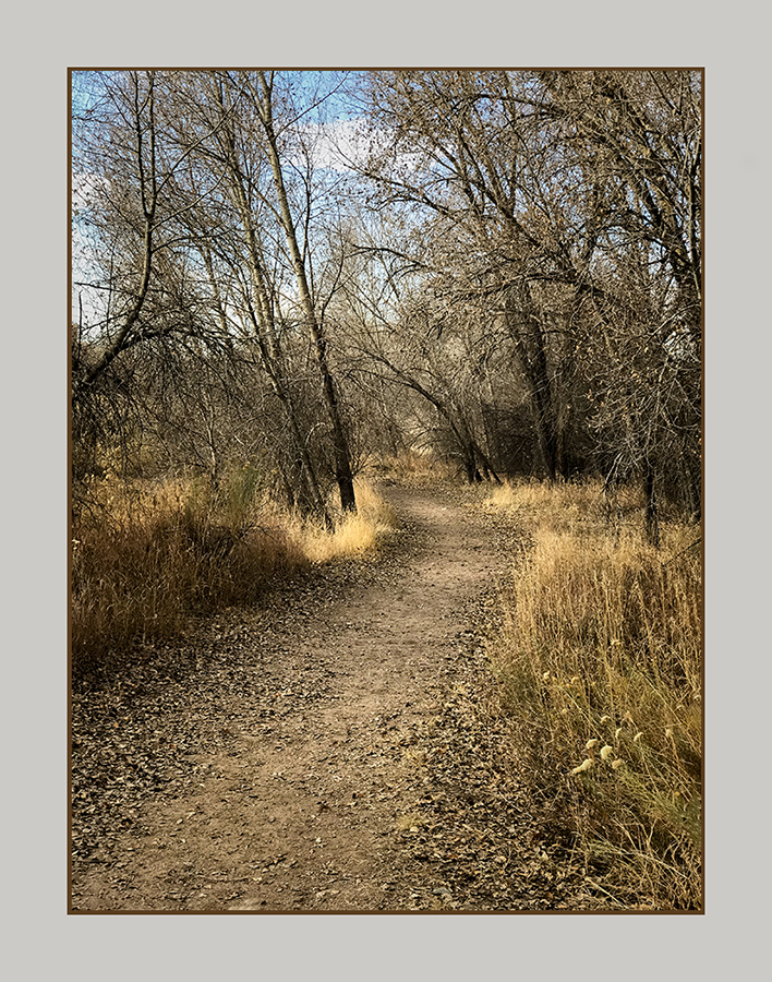
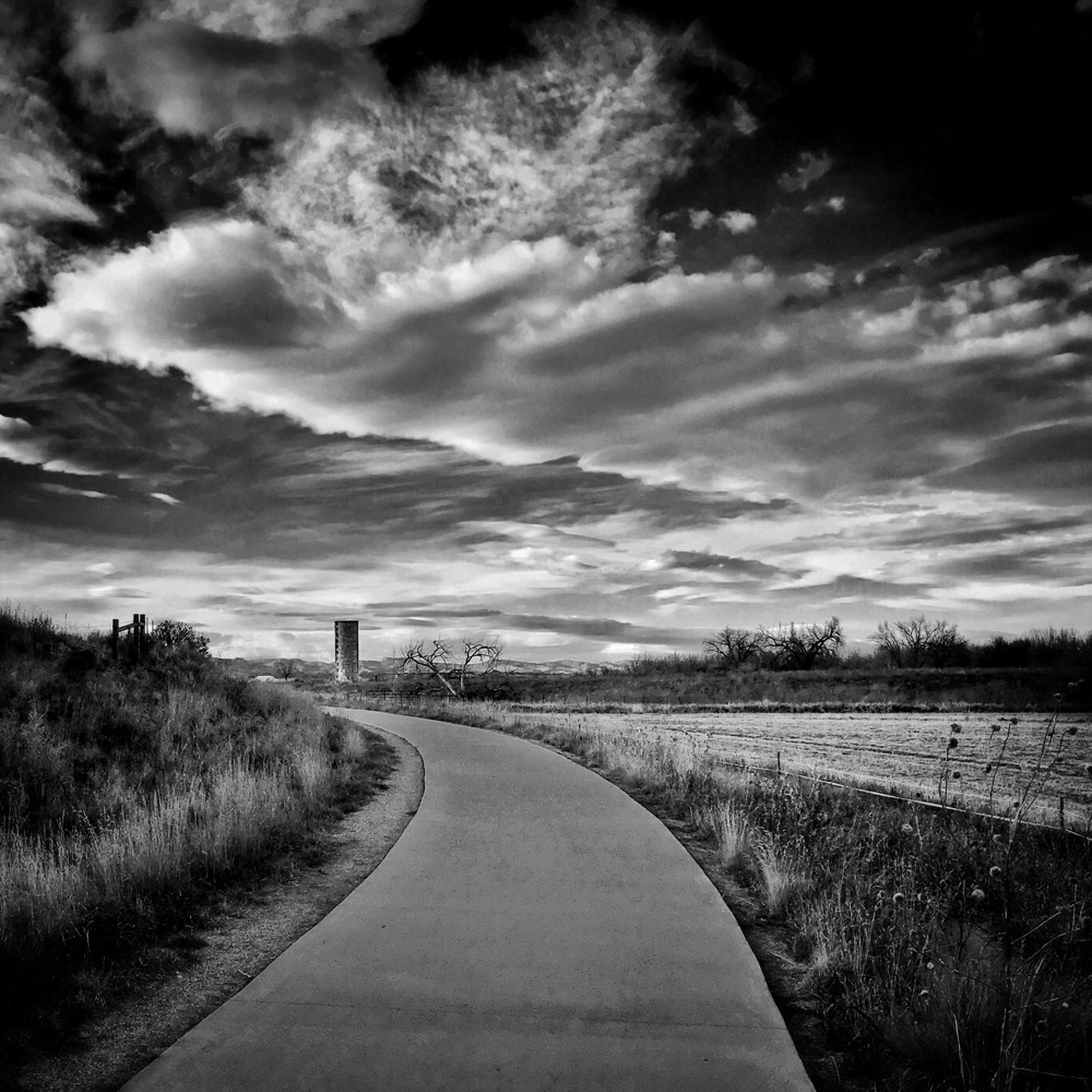
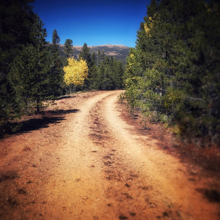
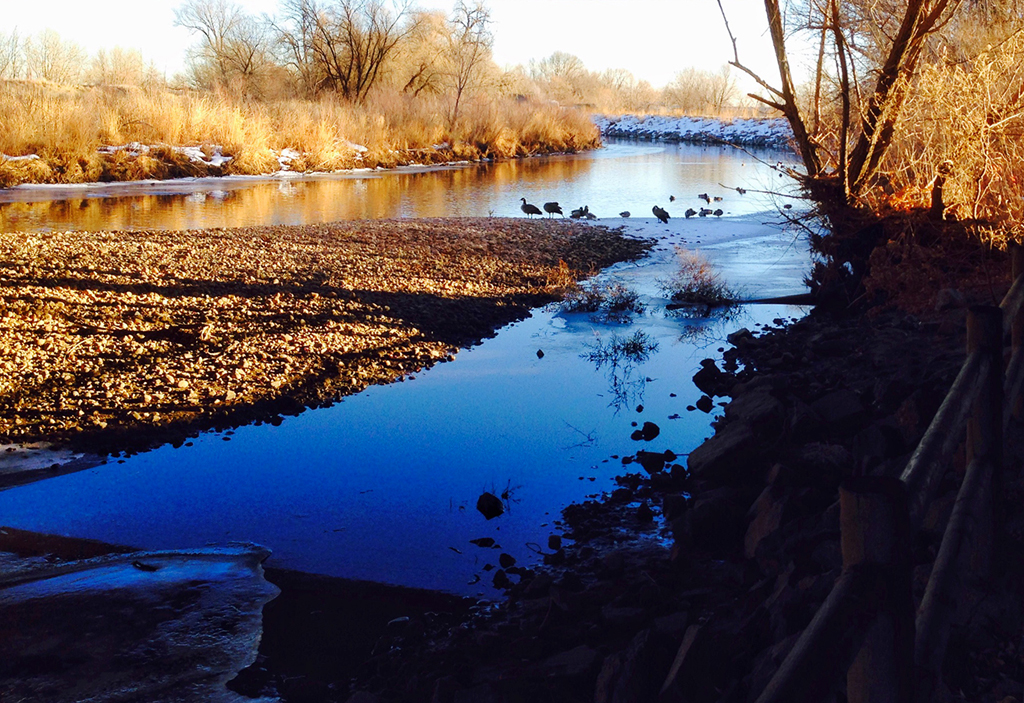
I like the composition. I think the tree adds a lot to the scene and it tells the story about the season. The animals add to the landscape. As Jerry mentioned, the image is not over-saturated which makes it feel natural. The lines of the vegetation and the rocks lead the viewer's eyes to the tree. Nice capture.
|
Mar 5th |
5 comments - 6 replies for Group 51
|
5 comments - 6 replies Total
|