|
| Group |
Round |
C/R |
Comment |
Date |
Image |
| 51 |
Jun 23 |
Reply |
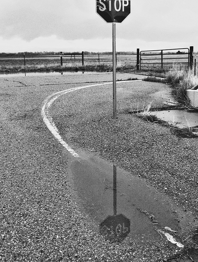
Thank you for your comments. I looked at cropping the top of the image as you suggested, and it could work that way. We all use our own preferences when we take photographs and do post-processing. It's the vanilla vs. chocolate thing.
|
Jun 10th |
| 51 |
Jun 23 |
Reply |
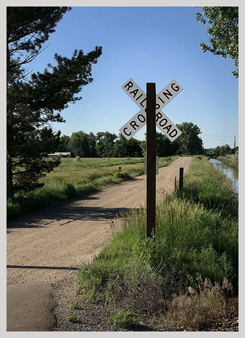
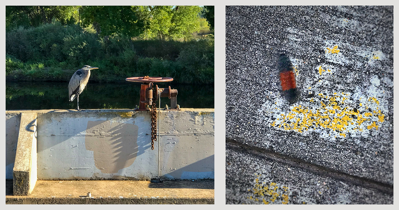
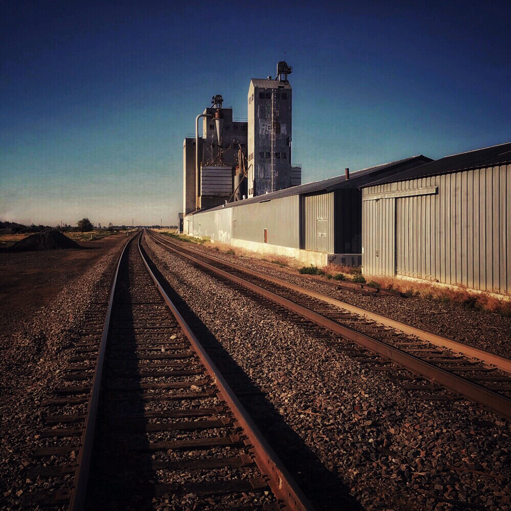
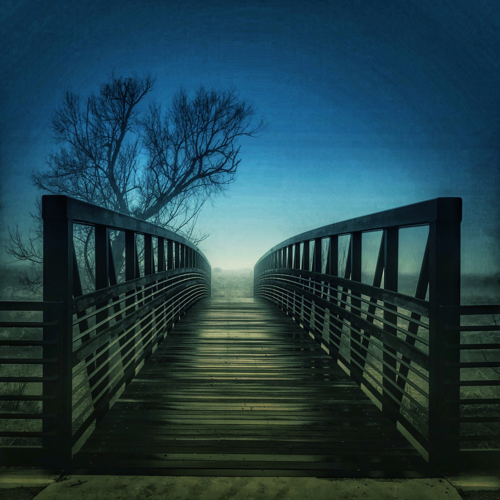
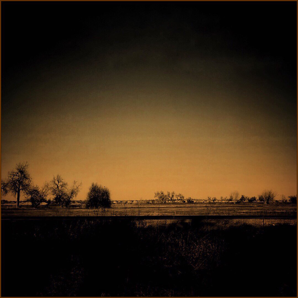
Thanks, Pam, for your comments. I absolutely agree that that stop sign makes no sense. The road goes no further in any direction except back where I came from. Some future planning, no doubt... My thinking about the missing top of the stop sign is that it didn't add to the story. Note that the reflection doesn't include the entire sign either.
|
Jun 5th |
| 51 |
Jun 23 |
Reply |
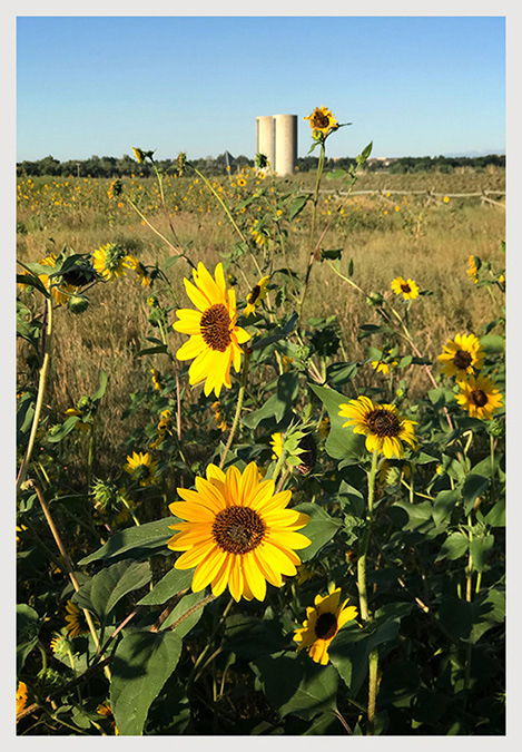
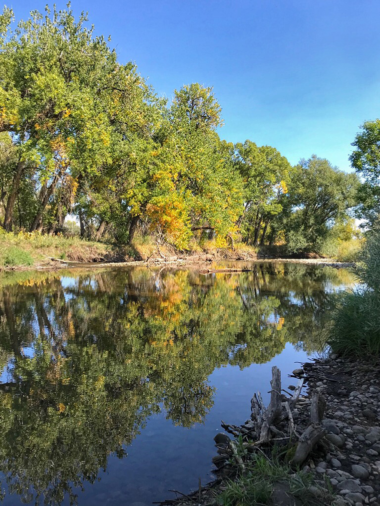
Thanks, Jerry, for your comments. I think you may see this image much as I do. I question why someone would place a stop sign on a dead-end road. Rain is something I don't get to photograph often here in this semi-arid region, so I was out shooting during the rain and as it paused, I found that nice puddle shot. I do understand that not everyone will understand why I cropped the image like I did, but it was intentional.
|
Jun 5th |
| 51 |
Jun 23 |
Reply |
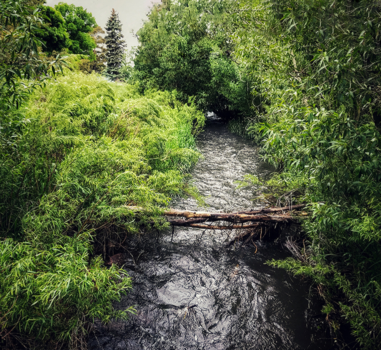
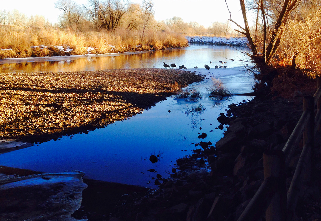
Thanks, Dave, for your comments. I thought there were some interesting things to think about in this image. I live in a semi-arid region, so steady rain can be an unusual thing and I wanted to photograph it.
|
Jun 5th |
| 51 |
Jun 23 |
Reply |
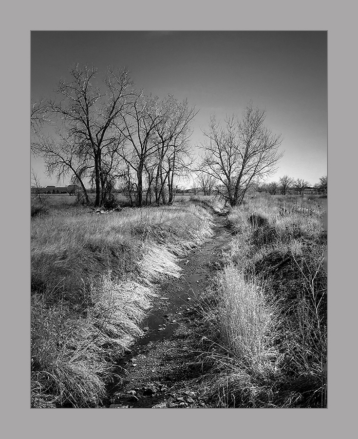
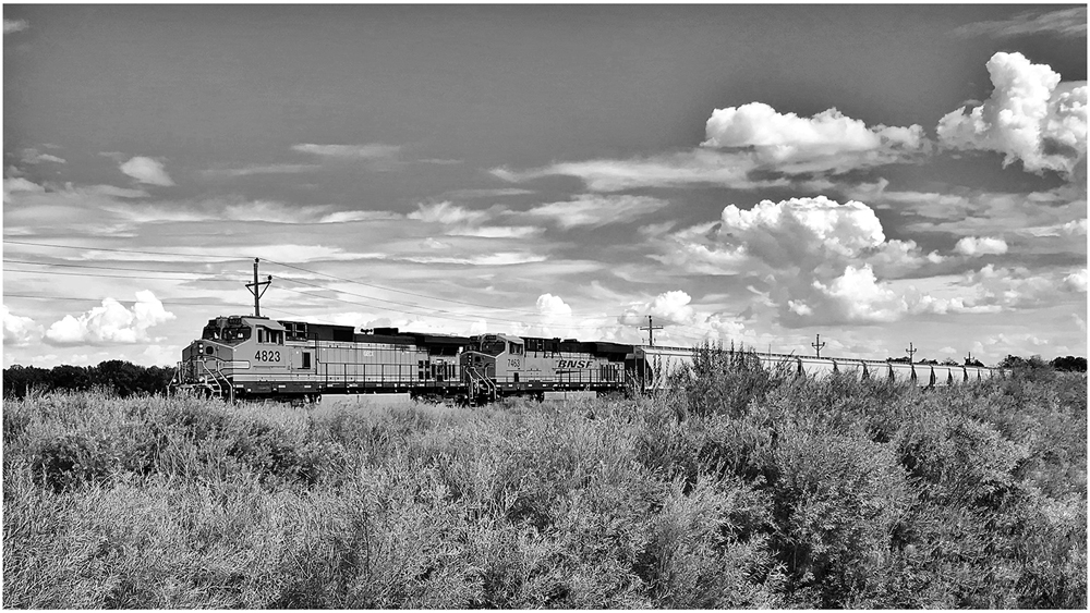
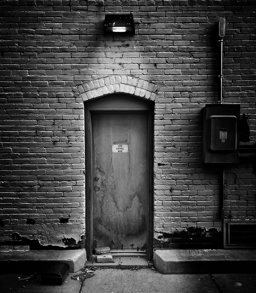
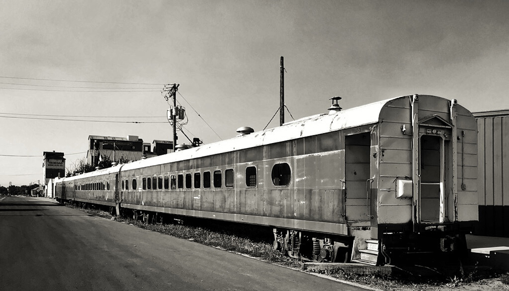
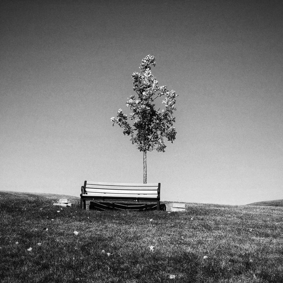
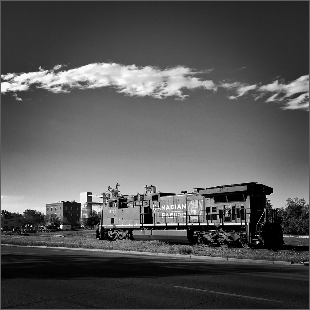
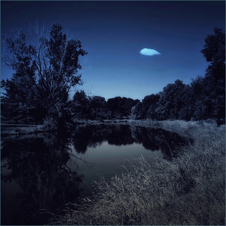
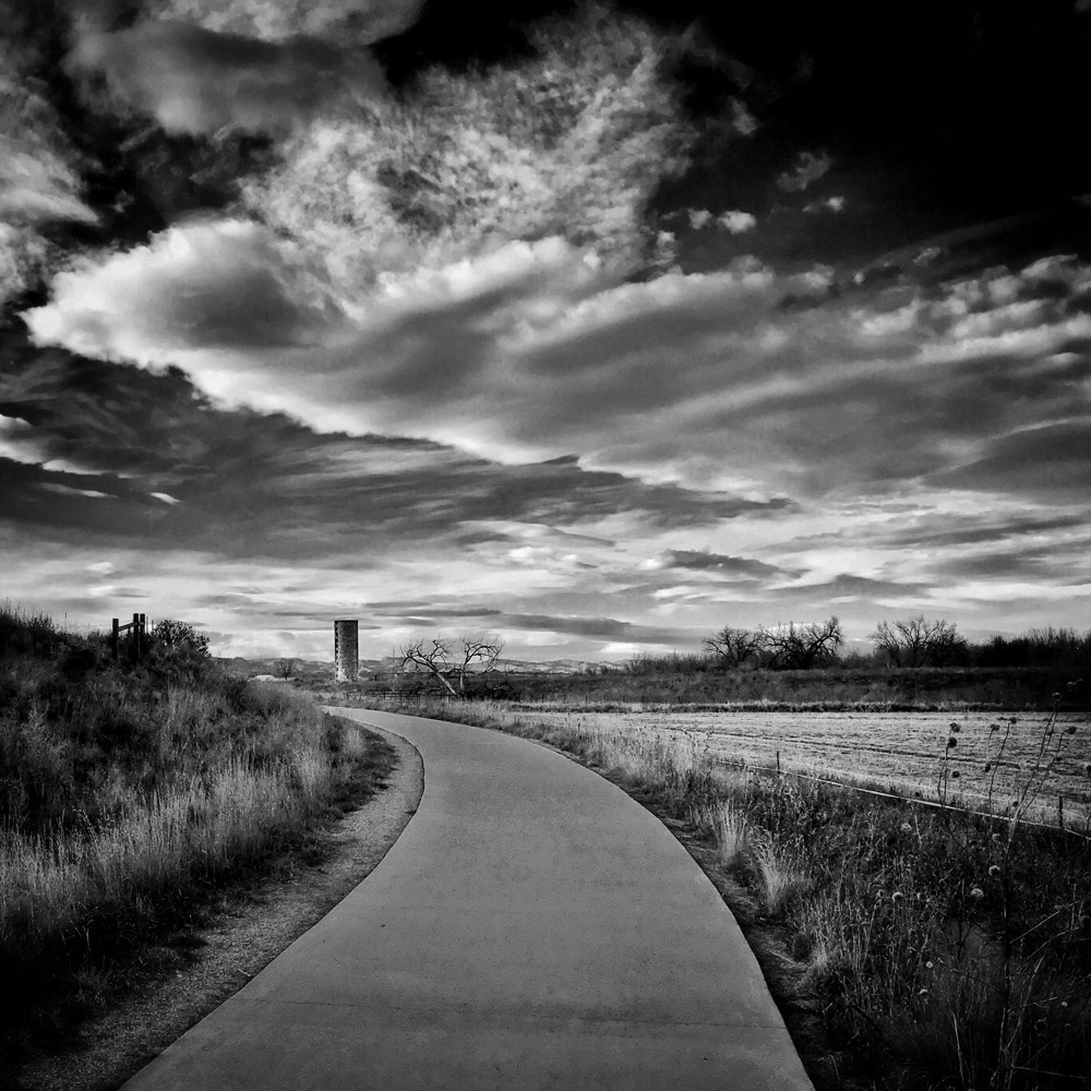
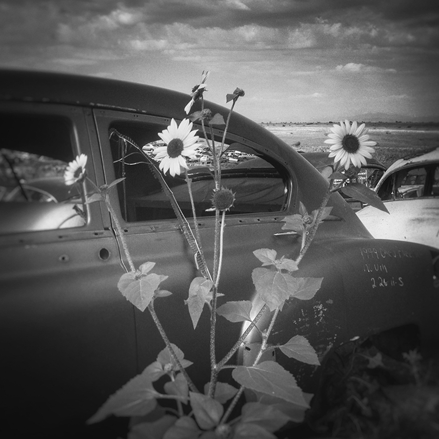
Thank you for your comments. It was originally a color image, and it wasn't very straight. First, I straightened it with the Rotate tool. (I may have tuned it a little bit next, but I don't exactly remember.) Then I used the regular Black&White tool with the default Neutral filter, and selected the Film preset. I liked the added contrast and the grain. It was a relatively simple edit, and I was pleased with the results. I still shoot BW film occasionally, and I'm fond of that ISO 400 look.
|
Jun 3rd |
| 51 |
Jun 23 |
Comment |
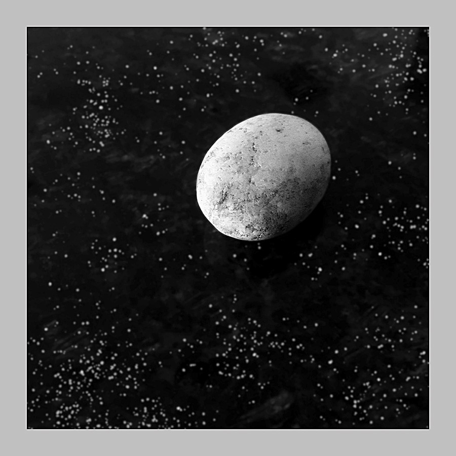
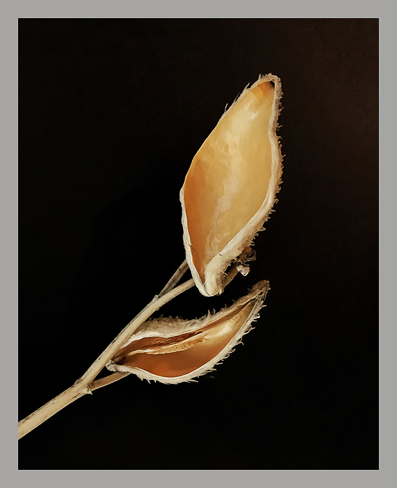
Sol, this is a good result. Bright vibrant colors against a black background. I'd have to add that the flower is quite saturated in real life, so might appear a bit too much so against the black. The flower is not directly pointed at the viewer, which adds more shape and dimension to the flower, leaves, and stem. Good detail and sharpness over the entire subject. Nice experiment.
|
Jun 2nd |
| 51 |
Jun 23 |
Reply |
So just to add a thought to this thread: If one used Image Blender, could one just place the selected flower on a solid black photo? I don't know since I haven't tried IB, but it sounds possible. Maybe worth testing.
|
Jun 2nd |
| 51 |
Jun 23 |
Comment |
Brr-r-r. I feel the cold. Nice Alpen glow on the peaks. The snow looks windswept and crusty. The sky is dry and cloudless. Great panoramic winter scene for the December or January calendar page. Nice.
|
Jun 2nd |
| 51 |
Jun 23 |
Comment |
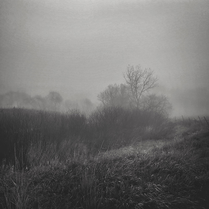
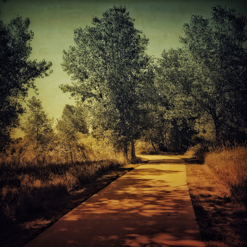
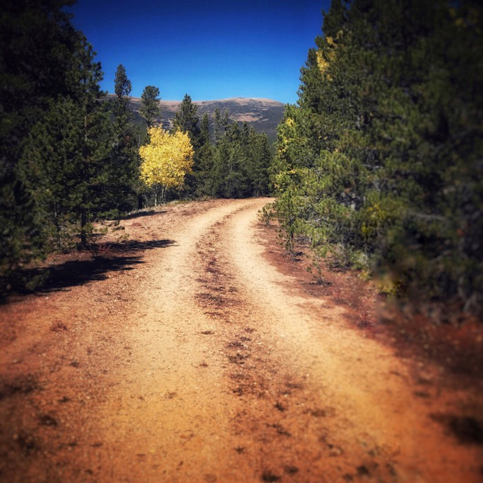
I like this shot a lot. My first thought was that you used a Holga with HP5+. I've had similar results that way. I have to disagree with you though, your original color shot was pretty good in my opinion. I like the leading line going into the fog in both versions. The BW version has a brighter spot at the end of the path which draws my eyes there. The color shot is warmer than the BW, but I do generally prefer BW photos. Just my opinion.
|
Jun 2nd |
| 51 |
Jun 23 |
Comment |
This is an interesting combination of separate images. I'll have to look into Image Blender. I have to say that the line between the rocks and the sky seems quite sharp, but I suppose that could be natural. I think there is a color temperature difference between the sky and the waterfall which sort of gives away the secret. Maybe it's that the light on the rocks doesn't seem to agree with the direction of the sun on the clouds. I don't know exactly. It was an interesting experiment, and it was a good effort with the app.
|
Jun 2nd |
| 51 |
Jun 23 |
Comment |
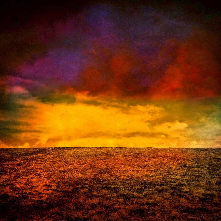
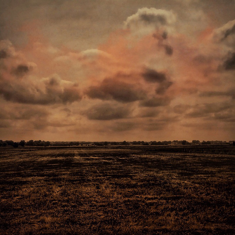
Another nice desert scene, Dave. Dramatic clouds and sunset. I like the halo effect under the sun. That seems like just how it would appear if I glanced in that direction. Nice warm colors against the darker mountains. The wide semi-panoramic crop seems appropriate for the scene. If I had a suggestion, I'd say that the saguaros seem to be listing to the port side, and a little straightening might relieve that.
|
Jun 2nd |
| 51 |
Jun 23 |
Comment |
Thank you for your comments. It was originally a color image, and it wasn't very straight. First, I straightened it with the Rotate tool. (I may have tuned it a little bit next, but I don't exactly remember.) Then I used the regular Black&White tool with the default Neutral filter, and selected the Film preset. I liked the added contrast and the grain. It was a relatively simple edit, and I was pleased with the results. I still shoot BW film occasionally, and I'm fond of that ISO 400 look.
|
Jun 2nd |
6 comments - 6 replies for Group 51
|
6 comments - 6 replies Total
|