|
| Group |
Round |
C/R |
Comment |
Date |
Image |
| 51 |
Oct 22 |
Reply |
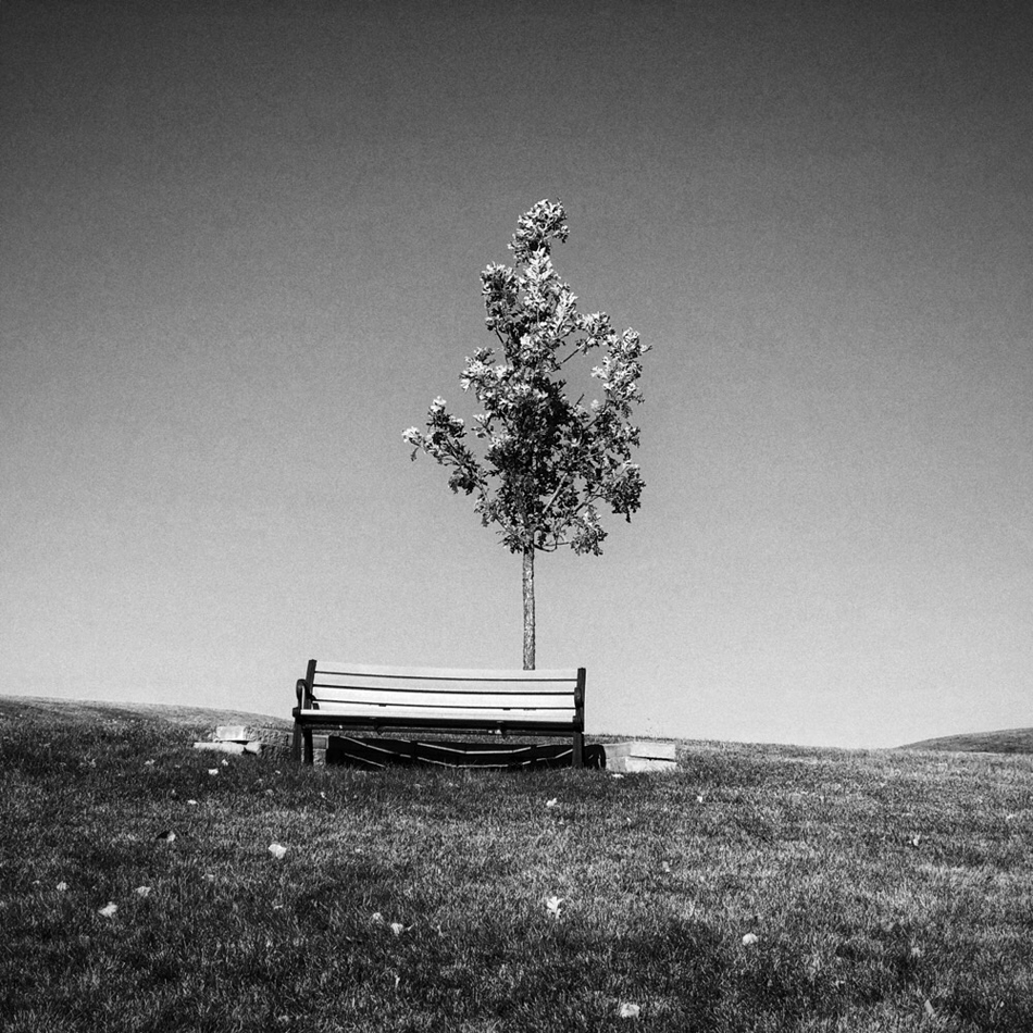
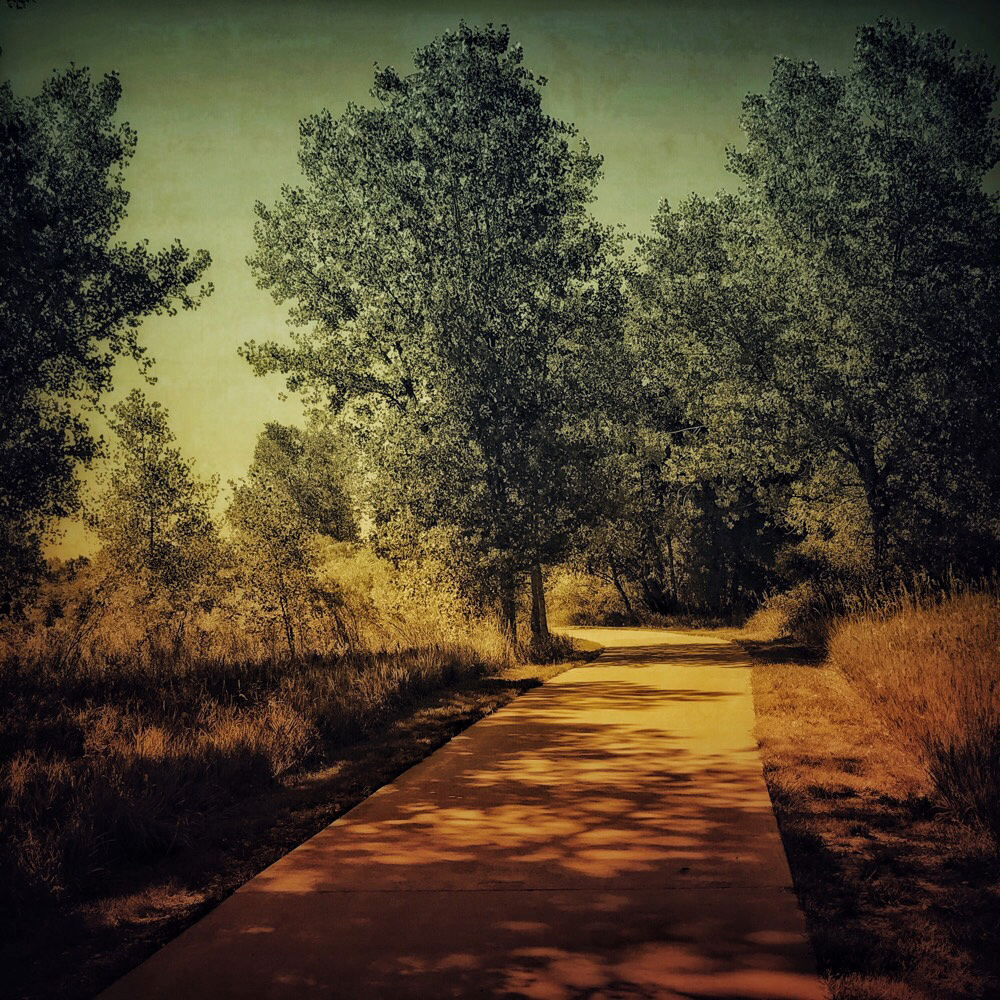
You are welcome, of course. I was thinking about your calendar shots when I mentioned the aspect ratio, so that aside, I think a square crop would work well. But then, I like square images. I think that comes from 120 film and 6x6 negatives which I still use occasionally.
|
Oct 10th |
| 51 |
Oct 22 |
Reply |
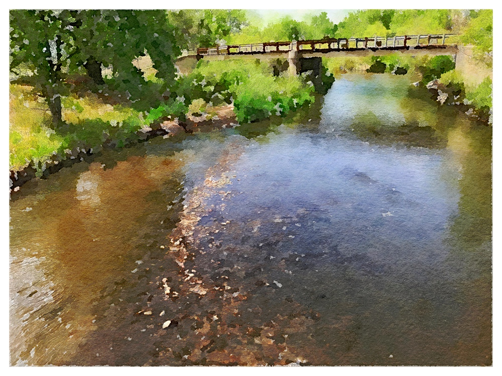
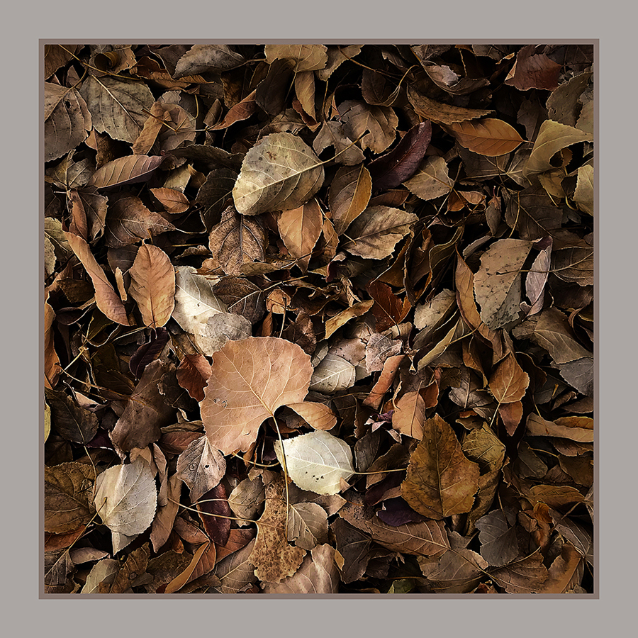
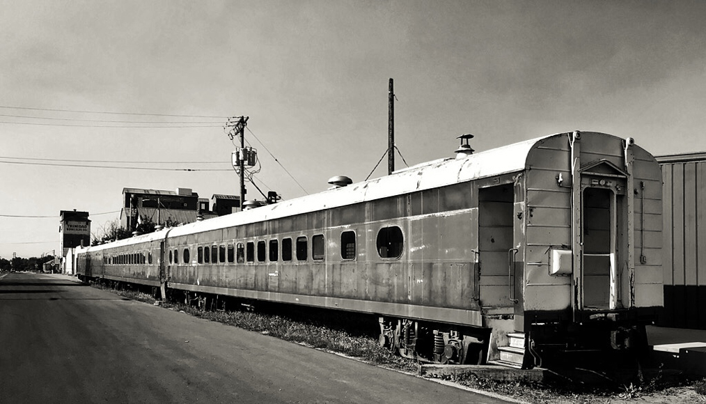
Thank you for your comments. I've included the original with only the crop so you can compare. I think BW improved the image and gave it some life. My mat choice was intended to suggest how the photo might appear in a gallery setting.
|
Oct 10th |
 |
| 51 |
Oct 22 |
Reply |
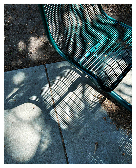
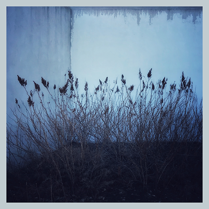
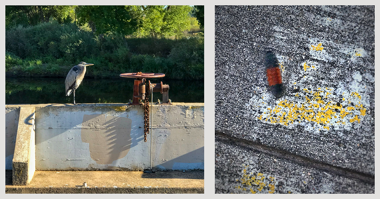
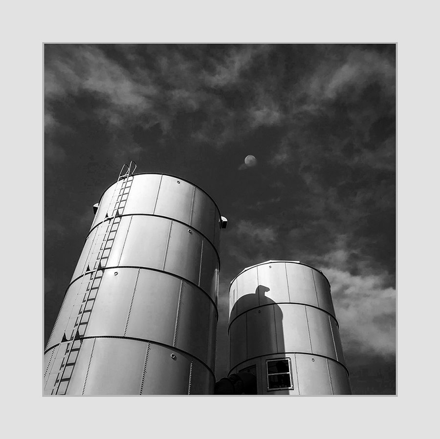
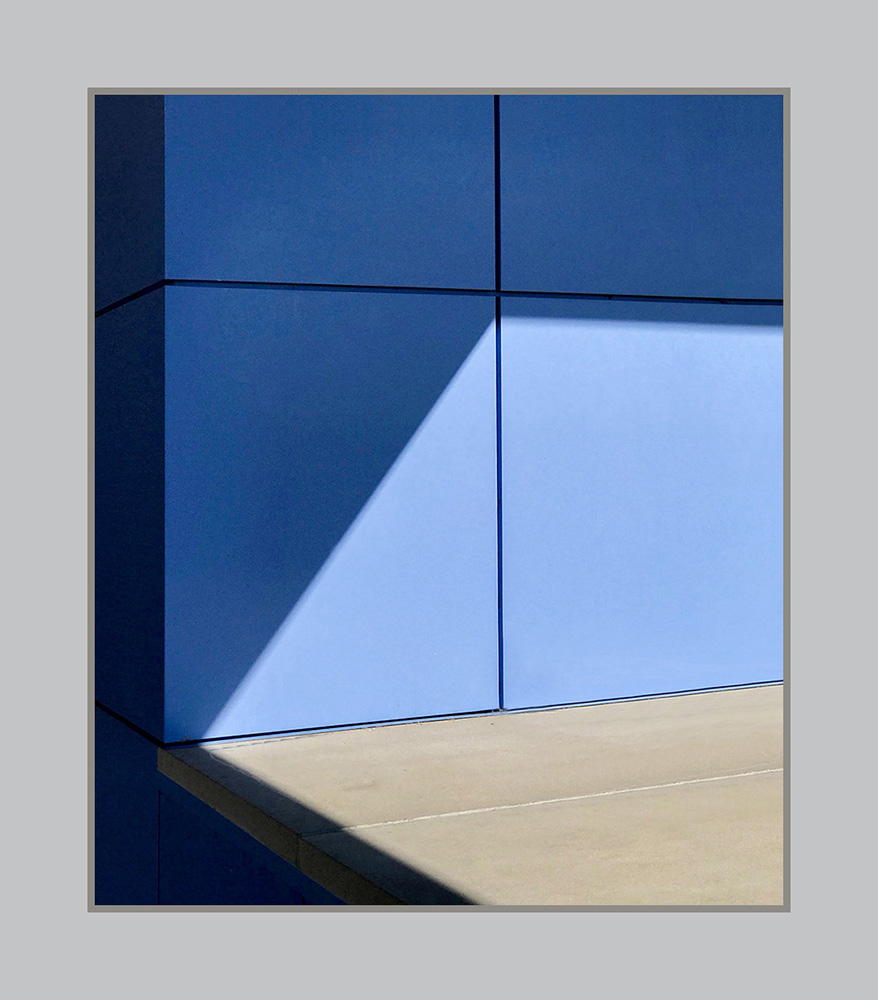
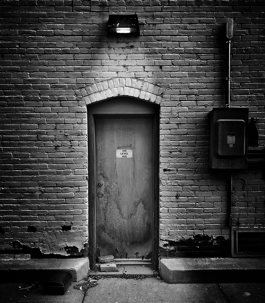
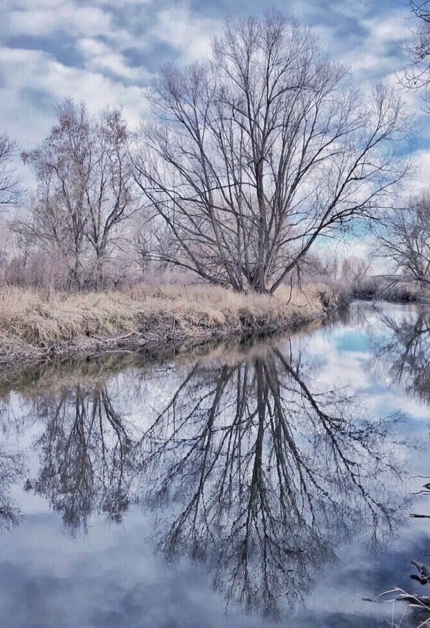
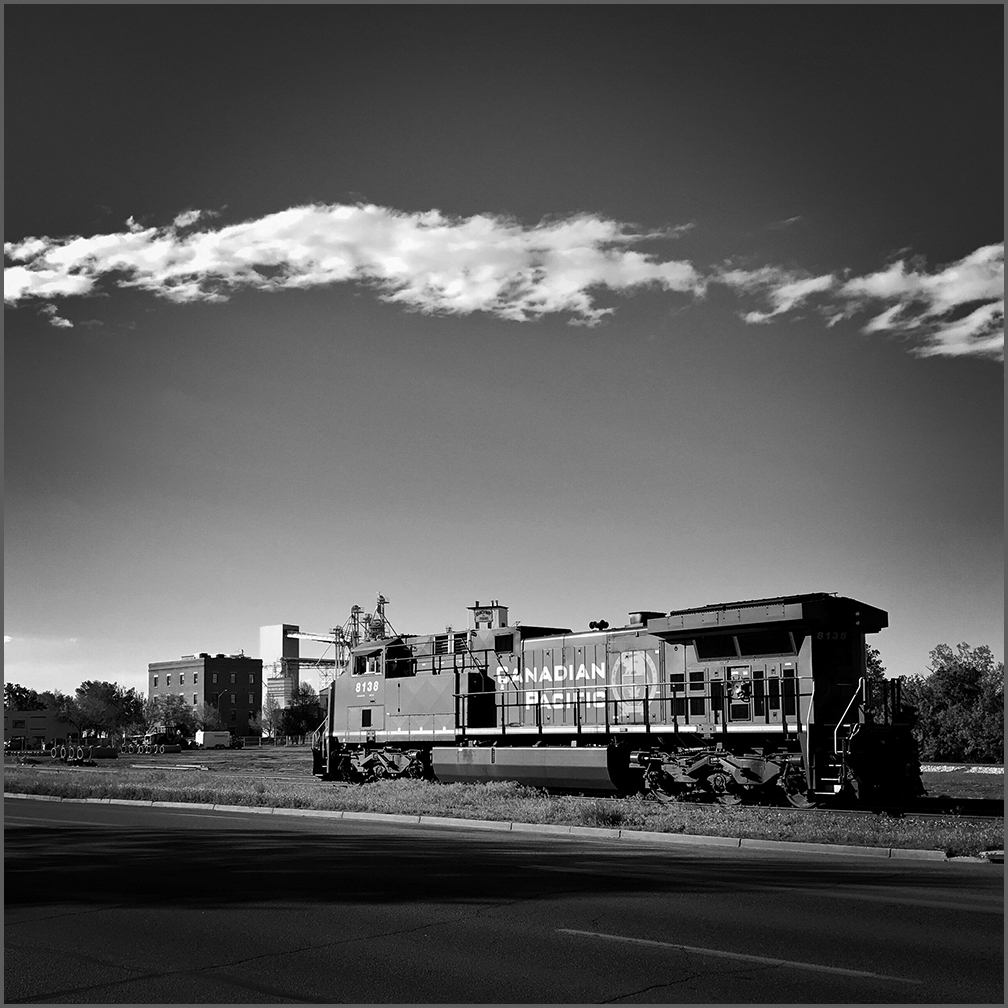
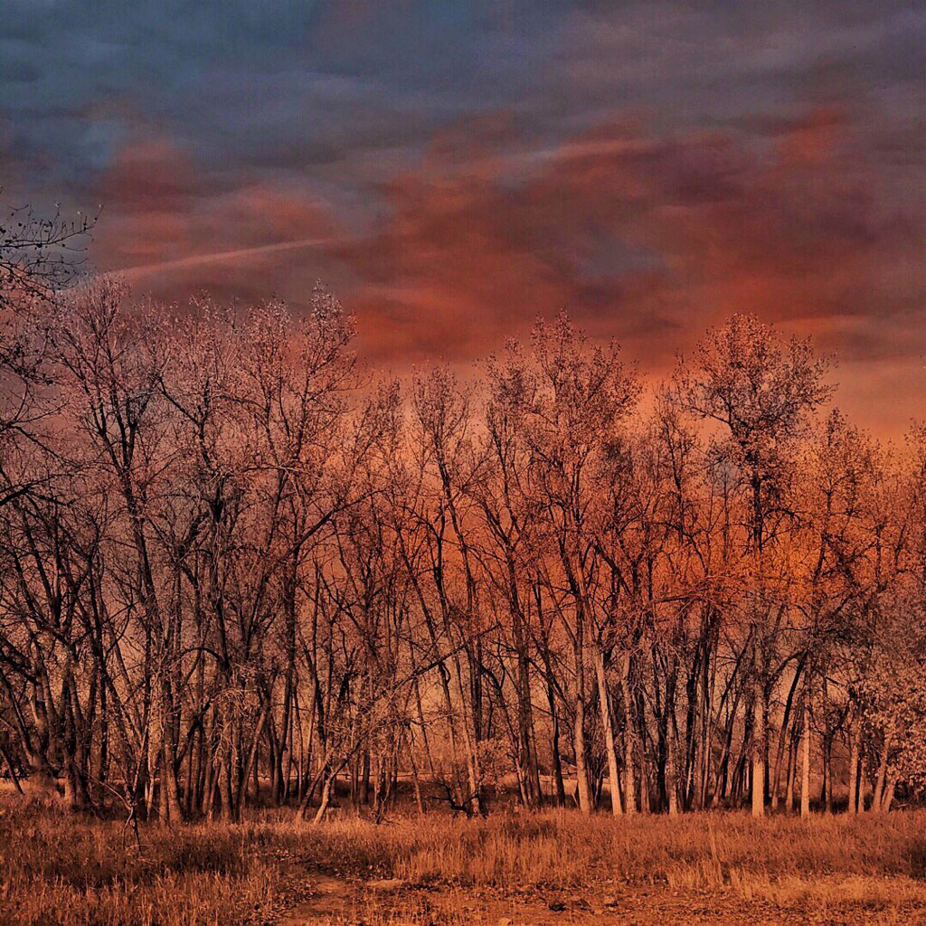
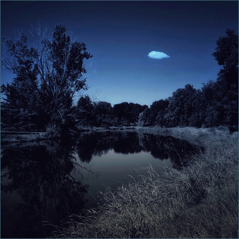
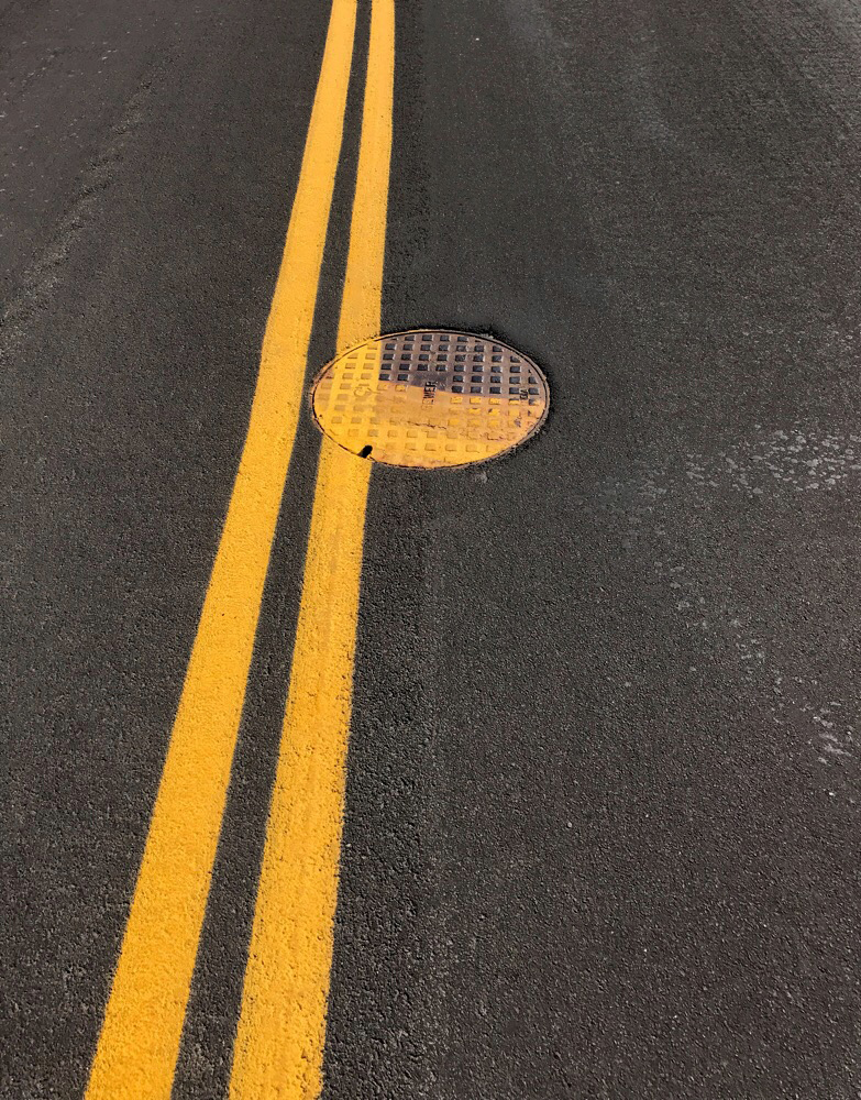
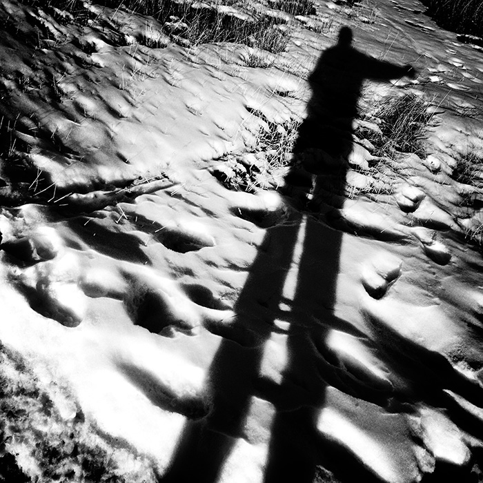
Thank you for your comments. I like your description of the shadow. I hadn't thought about that, but you're right. When I first captured this shot, I wasn't especially excited about it. After fiddling with it a bit, it became more interesting. That's a crutch in a way, and I'd prefer to get the shot right. But I try to remember that I'm a photo-hobbyist and I'm not making a living at it.
|
Oct 5th |
| 51 |
Oct 22 |
Reply |
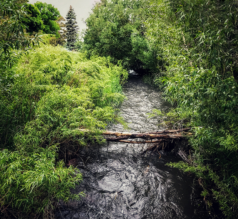
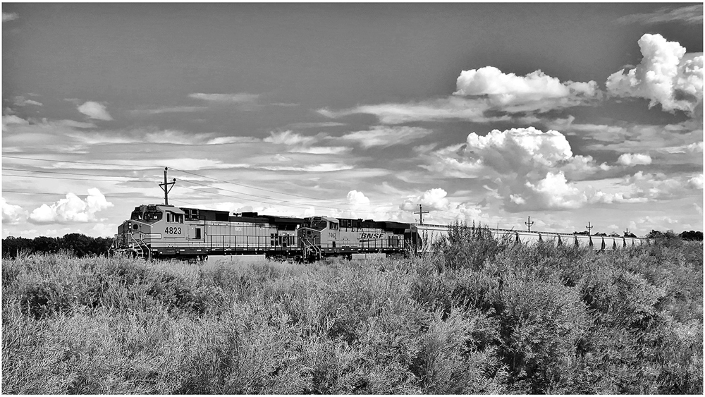
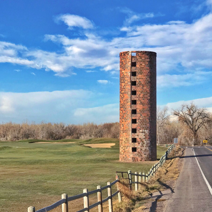
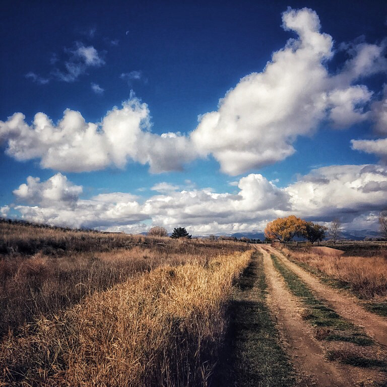
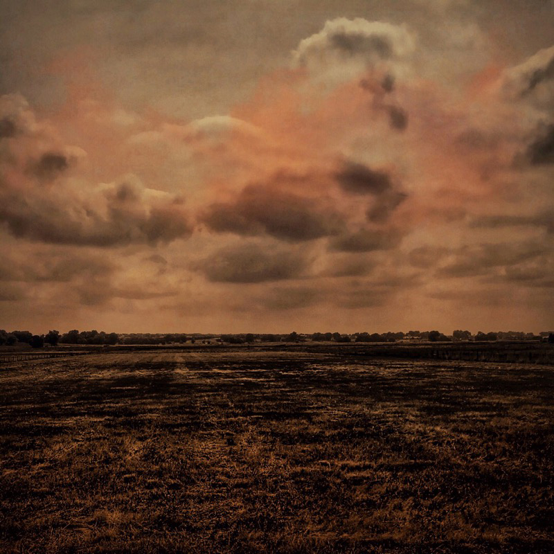
Thank you for your comments. The natural light was a challenge, but I think it worked pretty well.
|
Oct 5th |
| 51 |
Oct 22 |
Reply |
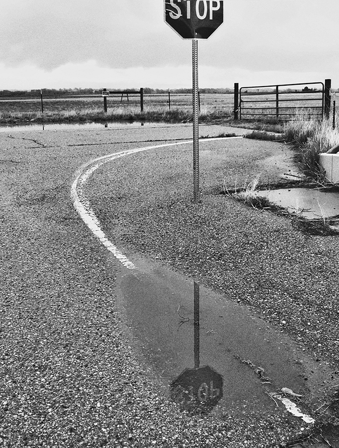
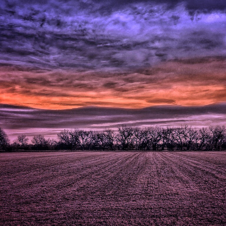
Thank you for your comments. Lighting certainly was an issue. The shadows and highlights came with the moment. I suppose if I had a raw file, I might have been able to decrease their impact, but my iPhone 7+ only produces compressed files.
|
Oct 5th |
| 51 |
Oct 22 |
Reply |
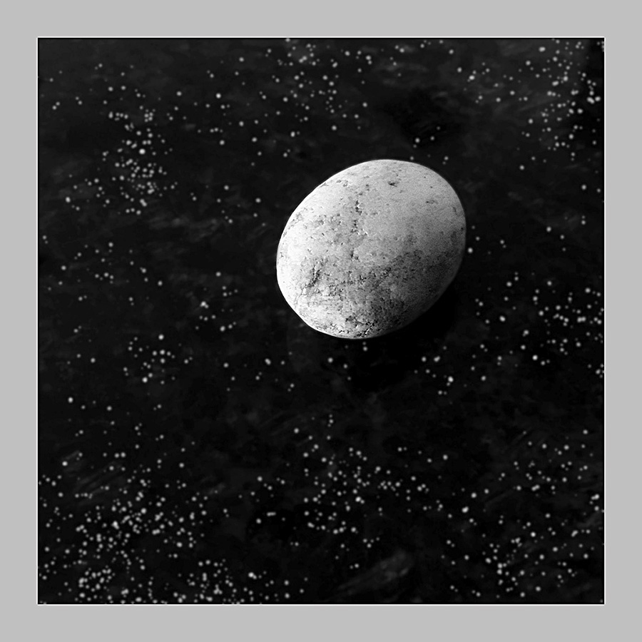
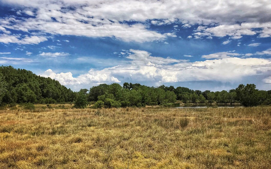
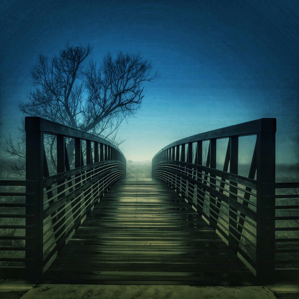
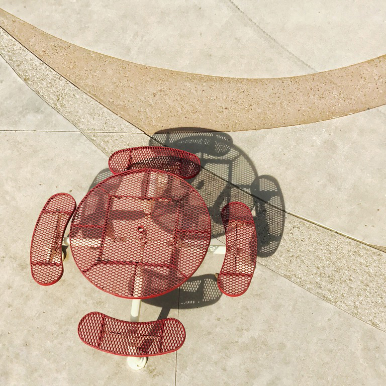
Thank you for your comments. It was one of those captures that I thought might be okay, but it wasn't without challenges.
|
Oct 5th |
| 51 |
Oct 22 |
Comment |
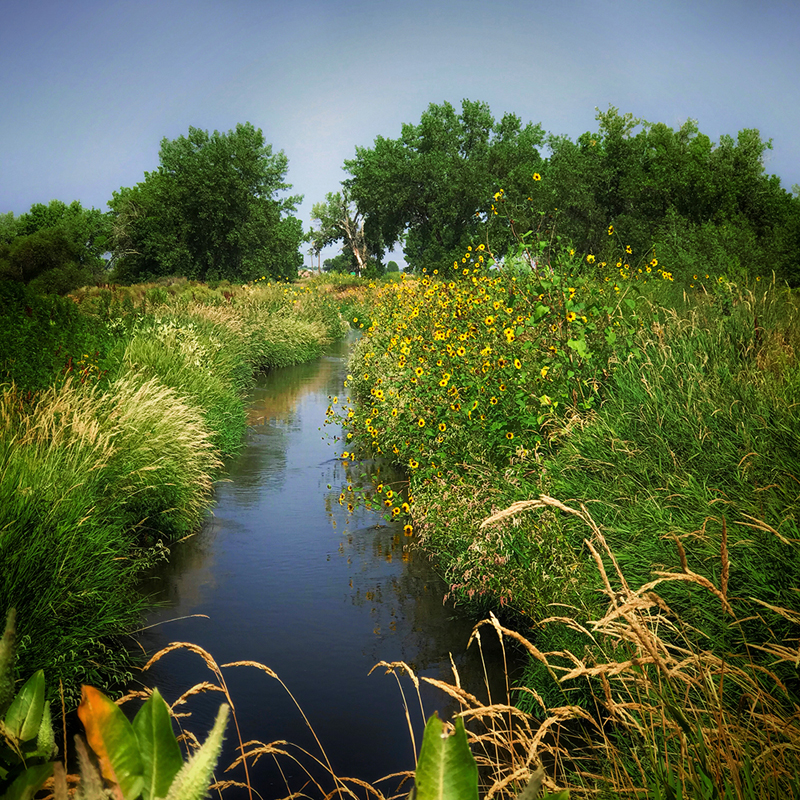
Wow! Dazzling colors. Nice reflections. I like the frame, too. Nice shot. The strong colors and the sharp shadows suggest bare flash might have been used. Maybe something to soften the light could have reduced those artifacts.
|
Oct 5th |
| 51 |
Oct 22 |
Comment |
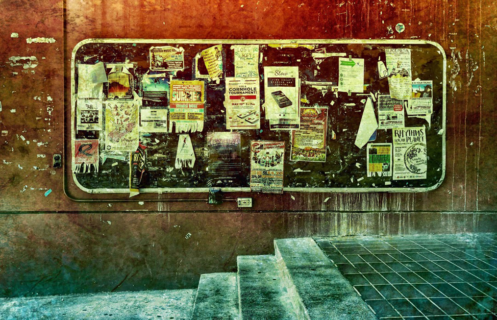
This is great. I like the reflection with all the window frames. The colors are great, and I like the angle. It would have lost some appeal if it was just a face-on shot. There are a couple of small white lozenges in the sort of lower right third intersection which are probably just lighting inside the building, but my initial thought was "You photographed some UFOs!" Makes me smile. Anyway, nicely seen and captured.
|
Oct 5th |
| 51 |
Oct 22 |
Comment |
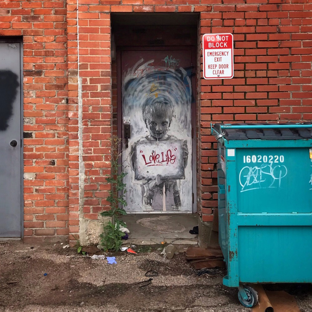
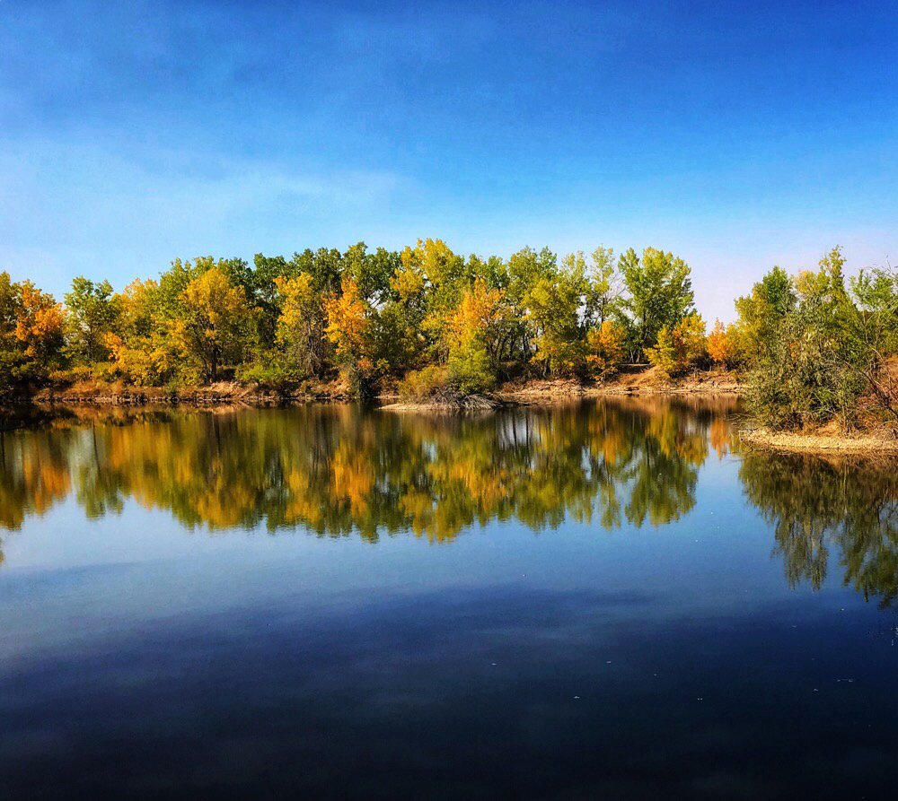
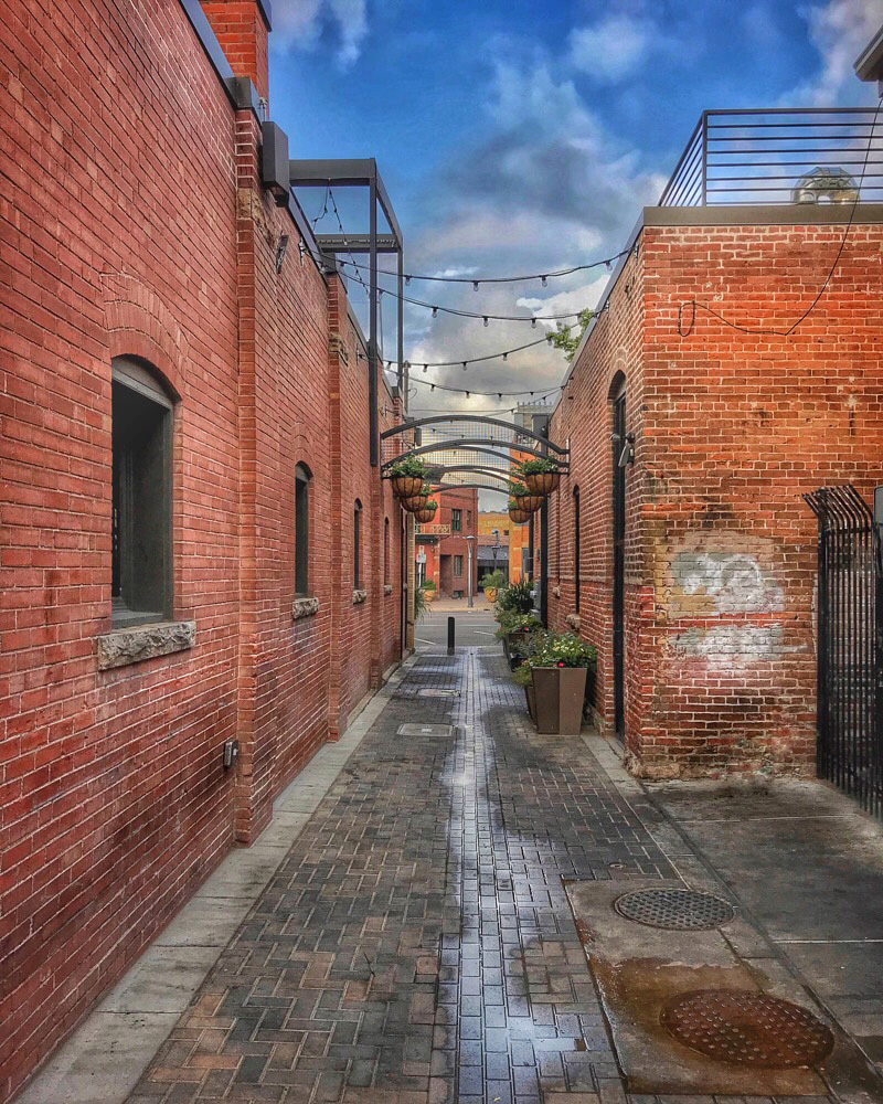
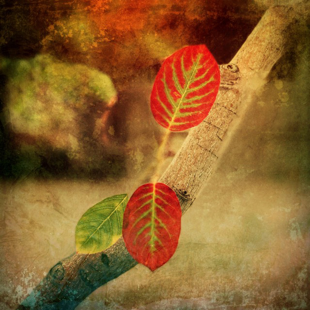
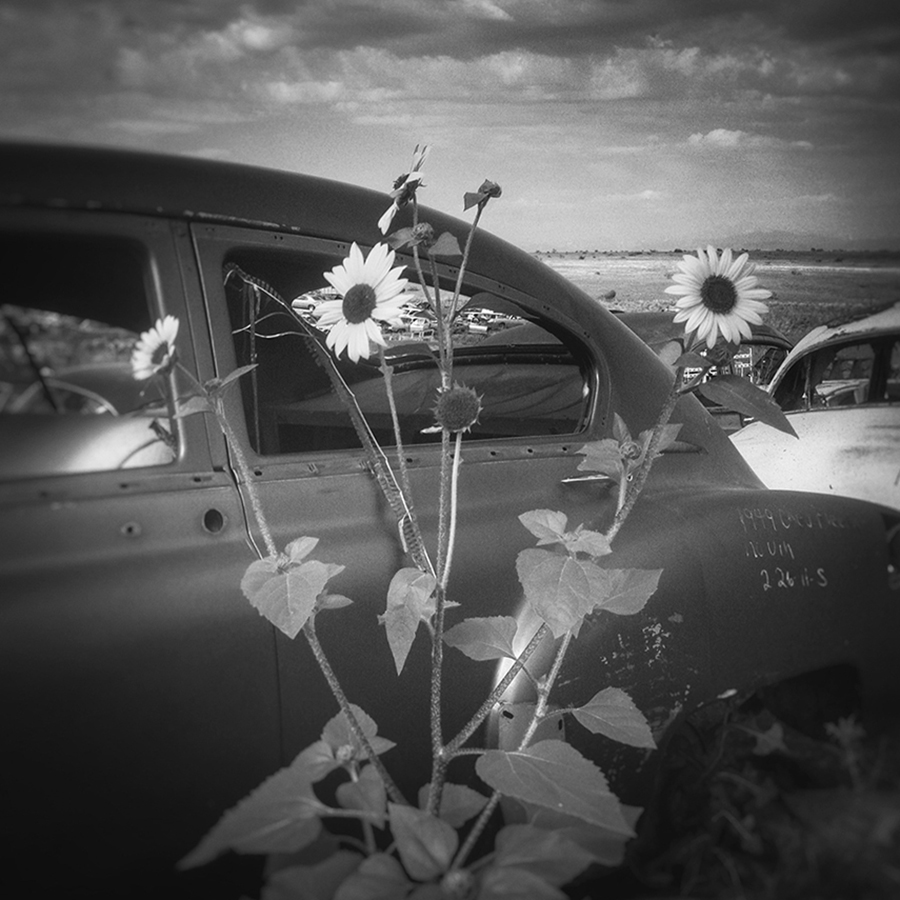
Your edits created a pleasing image. The purple and yellow colors are complementary, so they draw the viewer's gaze. As Lynne mentioned, the L-shaped arrangement is adds to the composition. Nicely done. I like the added frame, too.
|
Oct 5th |
| 51 |
Oct 22 |
Comment |
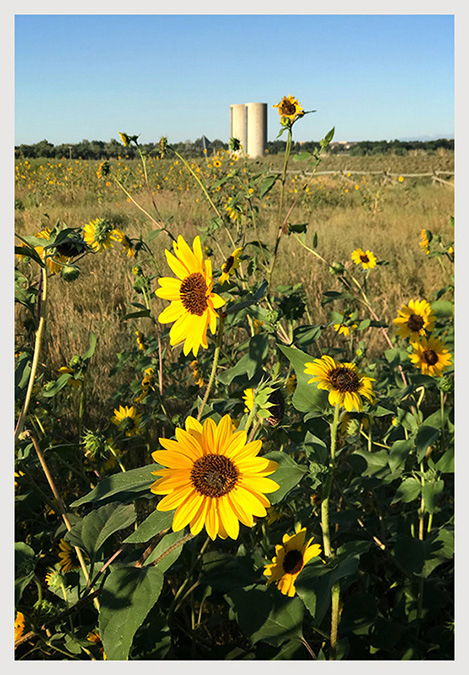
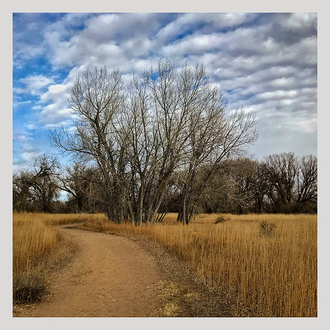
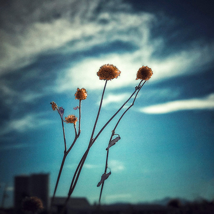
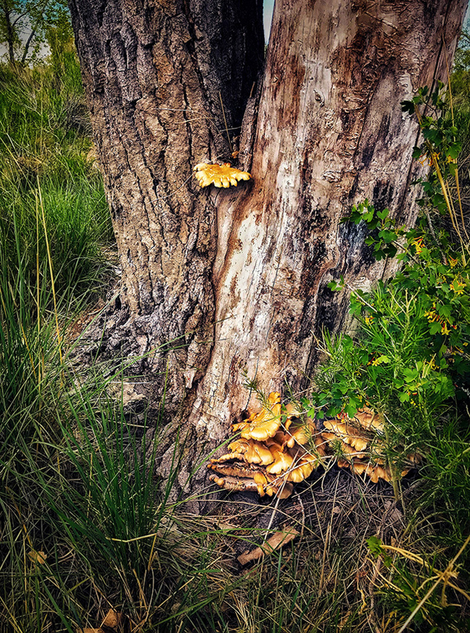
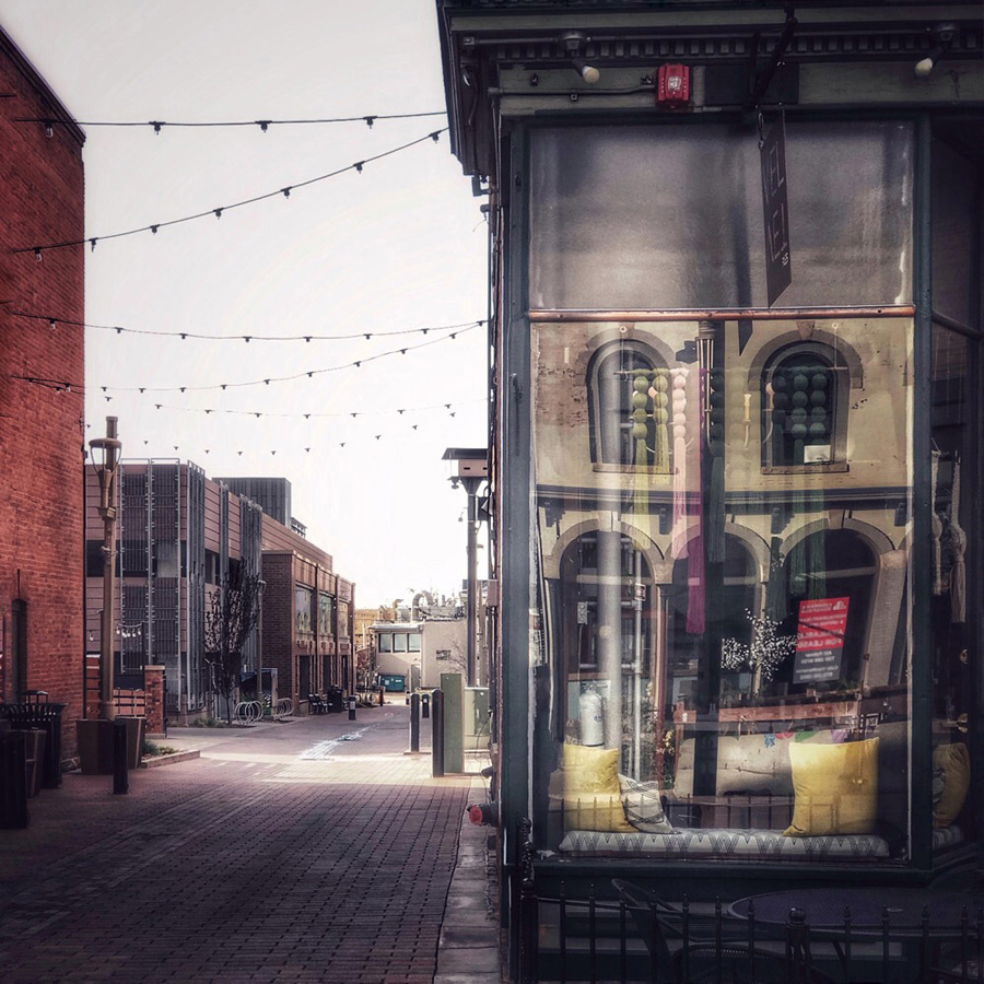
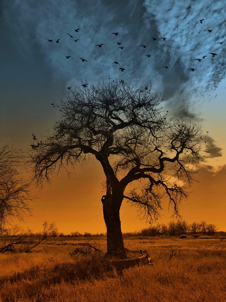
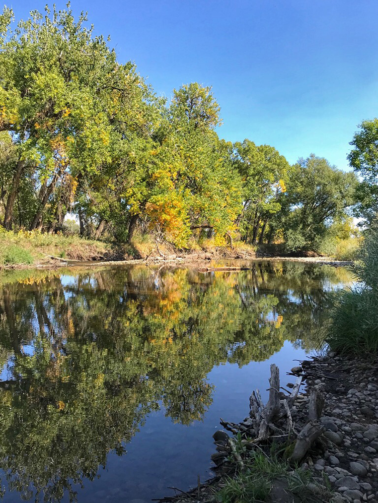
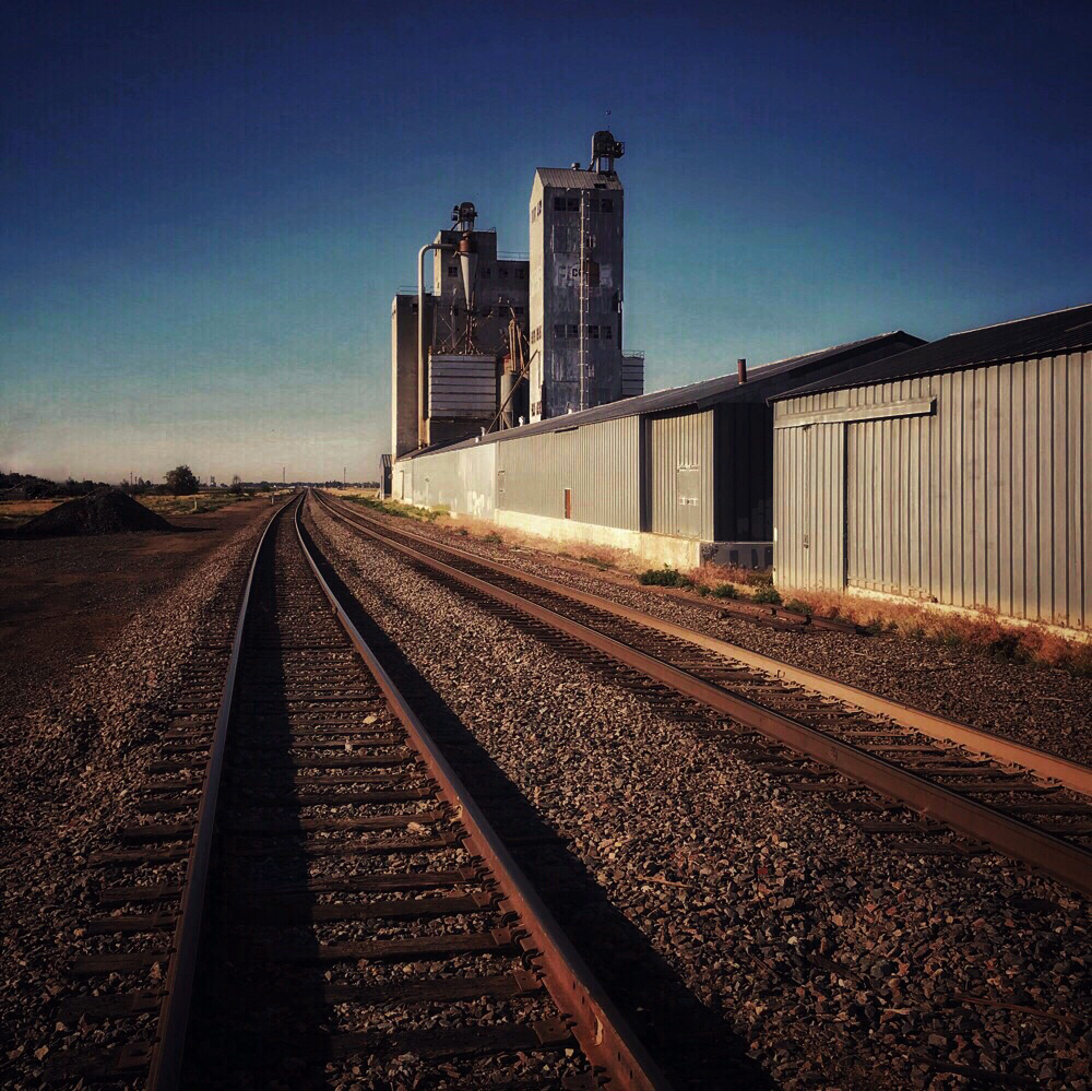
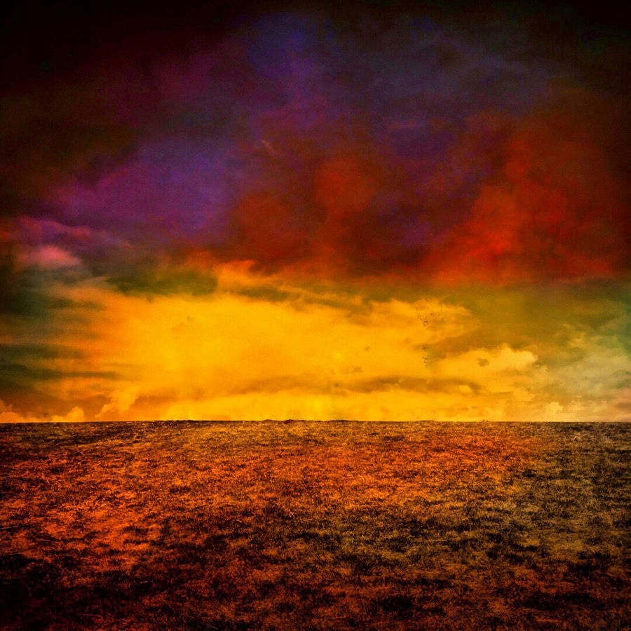
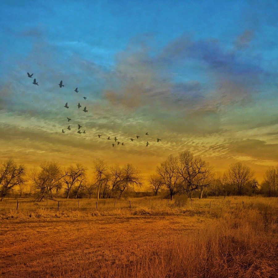
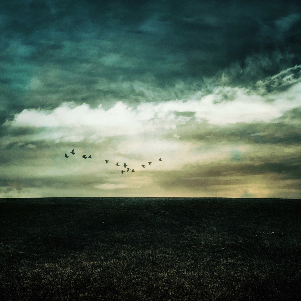
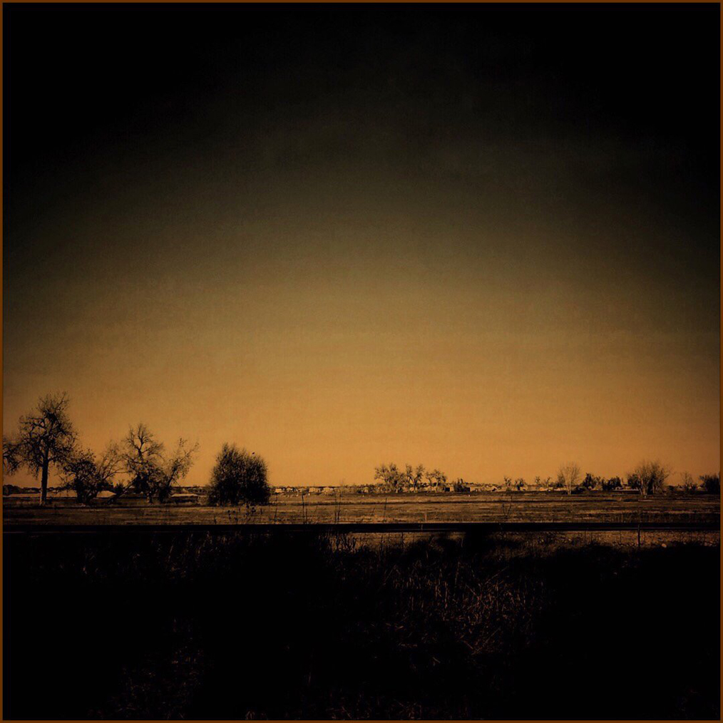
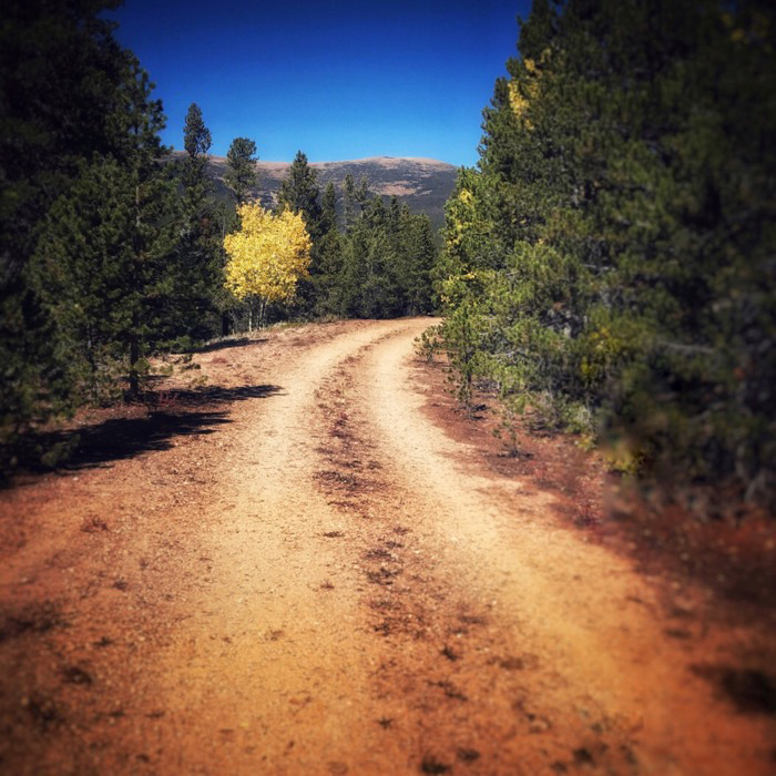
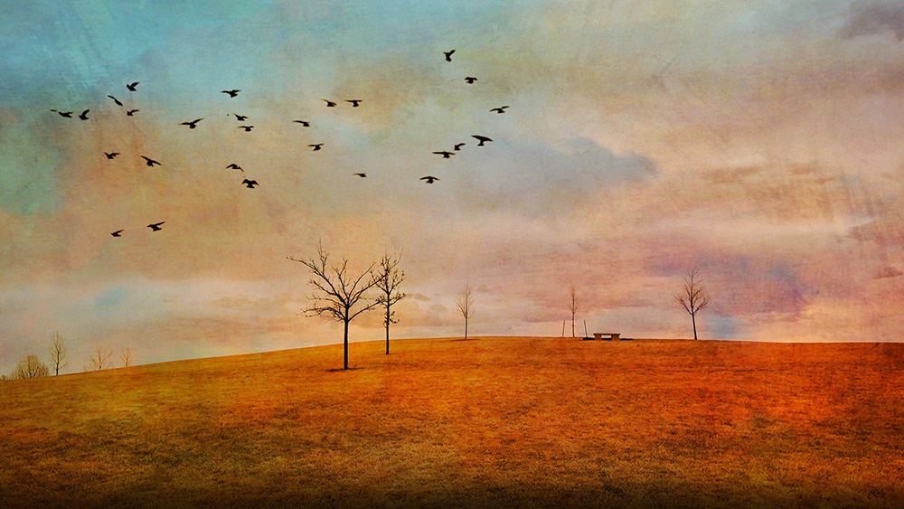
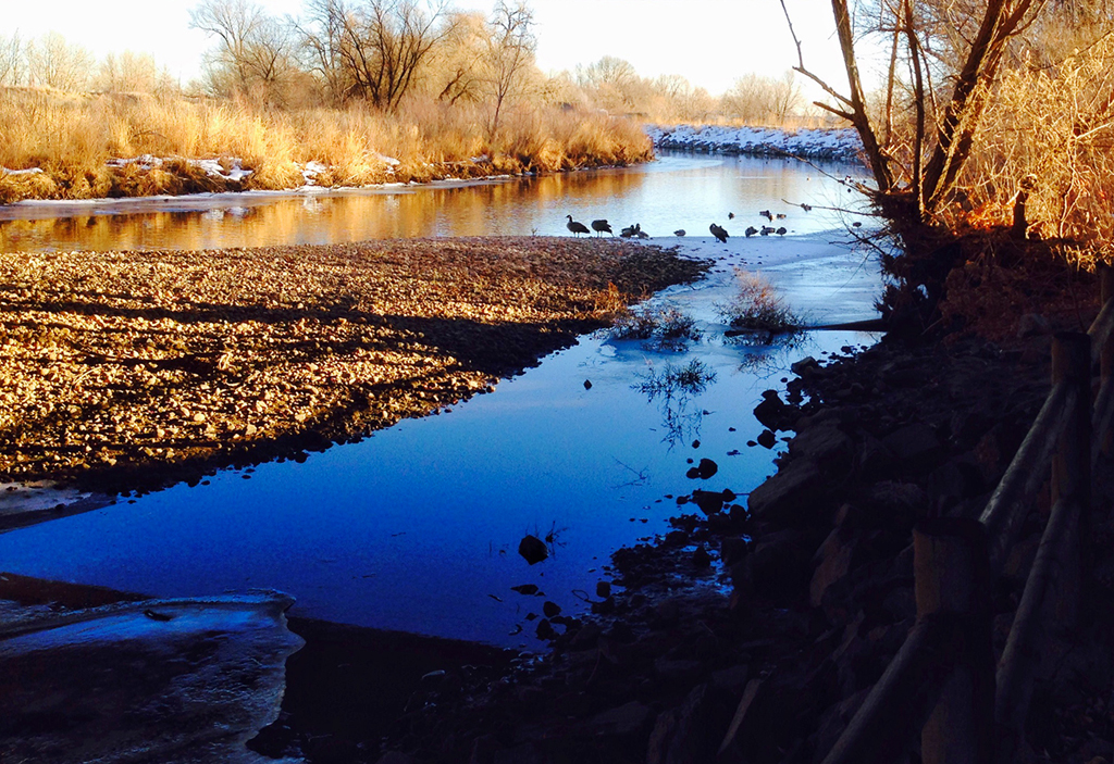
Another very nice image. The strong golden tones really make the image for me. It's a very nice capture. I understand that you like to use a particular aspect ratio for other purposes, but if it were not for that, I'd suggest cropping the left side inward until the shot is nearly square.
|
Oct 5th |
| 51 |
Oct 22 |
Comment |
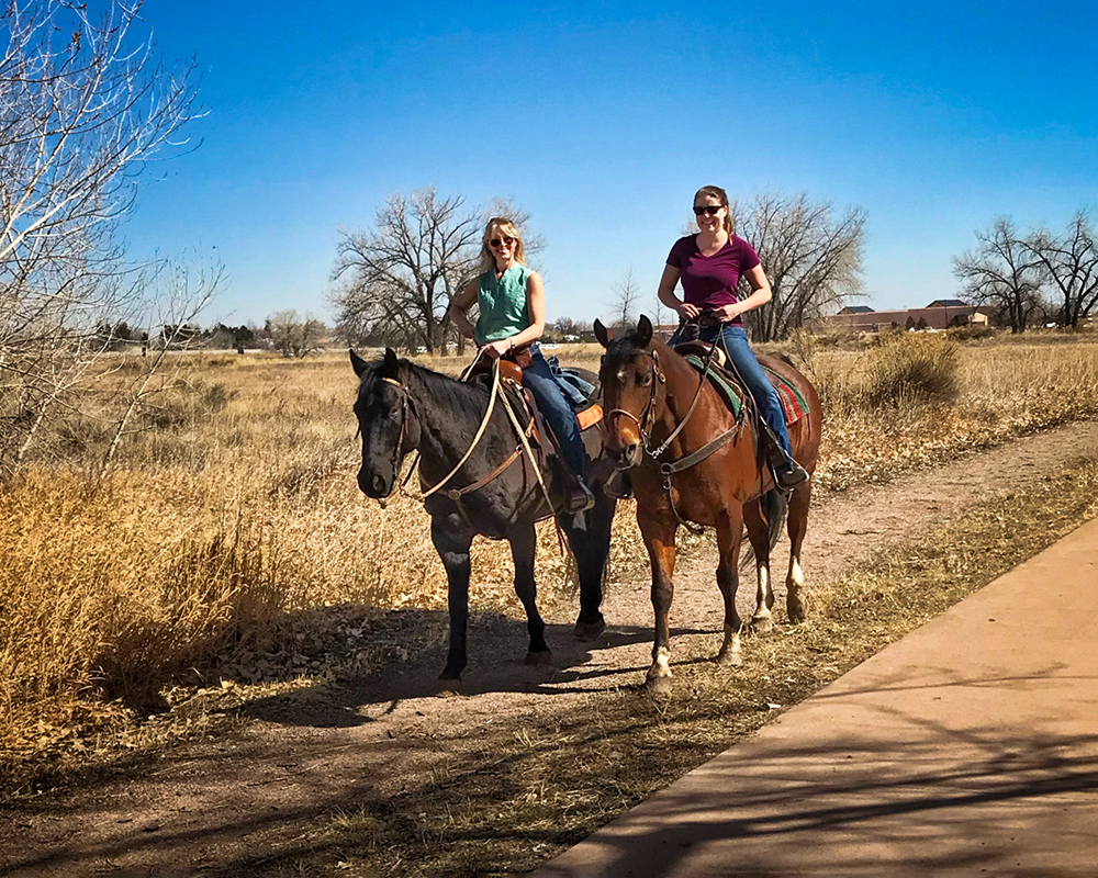
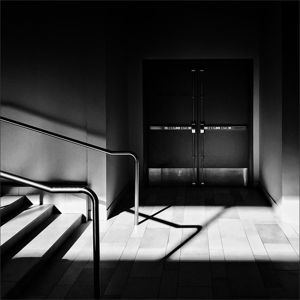
This building looks substantial and official with all that stonework. Your composition demonstrates scale by including the people and it adds a nice leading line up those stairs. In my opinion, the brightness on the left side pulls the viewer's eyes away from the people and the stairs. So, reducing the highlights on the left and brushing in a little brightness on the people might reduce that a bit. Nice capture. |
Oct 5th |
| 51 |
Oct 22 |
Comment |
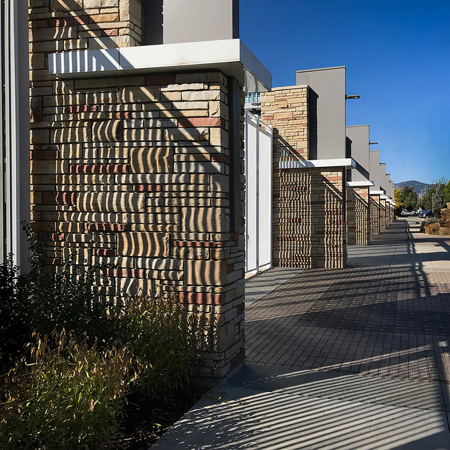
Dave, this is really nice. The composition, the colors, and the setting are great. It's one of those images that makes one want to be there to experience it all. It's like a promotional brochure image. I wouldn't change anything.
|
Oct 5th |
6 comments - 6 replies for Group 51
|
6 comments - 6 replies Total
|